The Wear OS ecosystem is made up of devices that have a wide variety of screen sizes. Utilizing adaptive UI principles is critical to delivering the highest quality experience for all users.
What is adaptive UI?
Adaptive UIs stretch and change to make the best possible use of all available screen space, no matter what size screen they're rendered on.
Adaptive UIs change responsively, using components and methods built directly into the layout logic. These layouts also utilize screen size breakpoints—applying a different design on different screen sizes—to create an even richer experience for users.
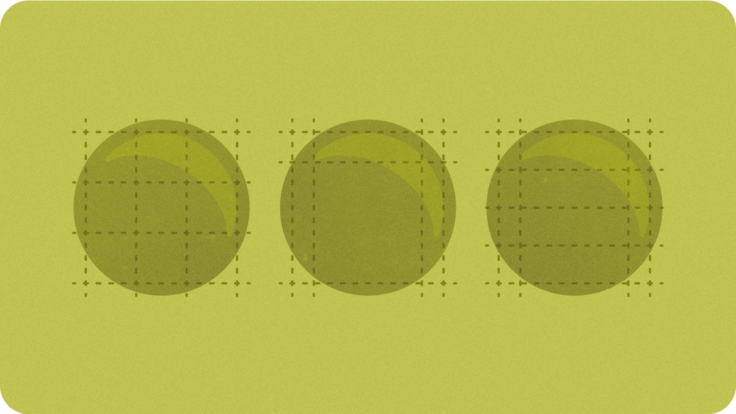
Key screen sizes
Learn about key reference sizes to keep in mind as you design new experiences

Types of layouts
When designing for adaptive layouts on the round screen, scrolling and non-scrolling views each have unique requirements for scaling UI elements and maintaining a balanced layout and composition.
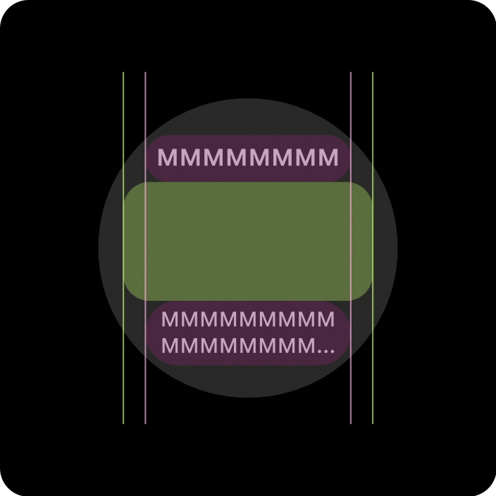
Scrolling views
All top, bottom, and side margins should be defined in percentages to avoid clipping and provide proportional scaling of elements.
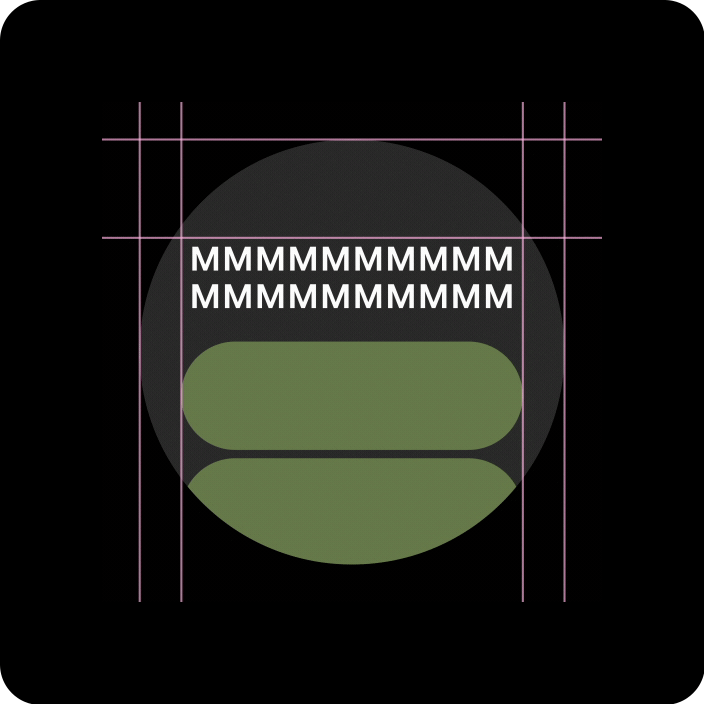
Non-scrolling views
All margins should be defined in percentages and vertical constraints should be defined such that the main content in the middle can stretch to fill the available area.
Add value through adaptive layouts and design practices
When designing for adaptive layouts on the round screen, scrolling and non-scrolling views each have unique requirements for scaling UI elements and maintaining a balanced layout and composition.
The following images are broad suggestions; examples are for illustrative purposes only. View each component or surface page for detailed, contextual, responsive guidance.
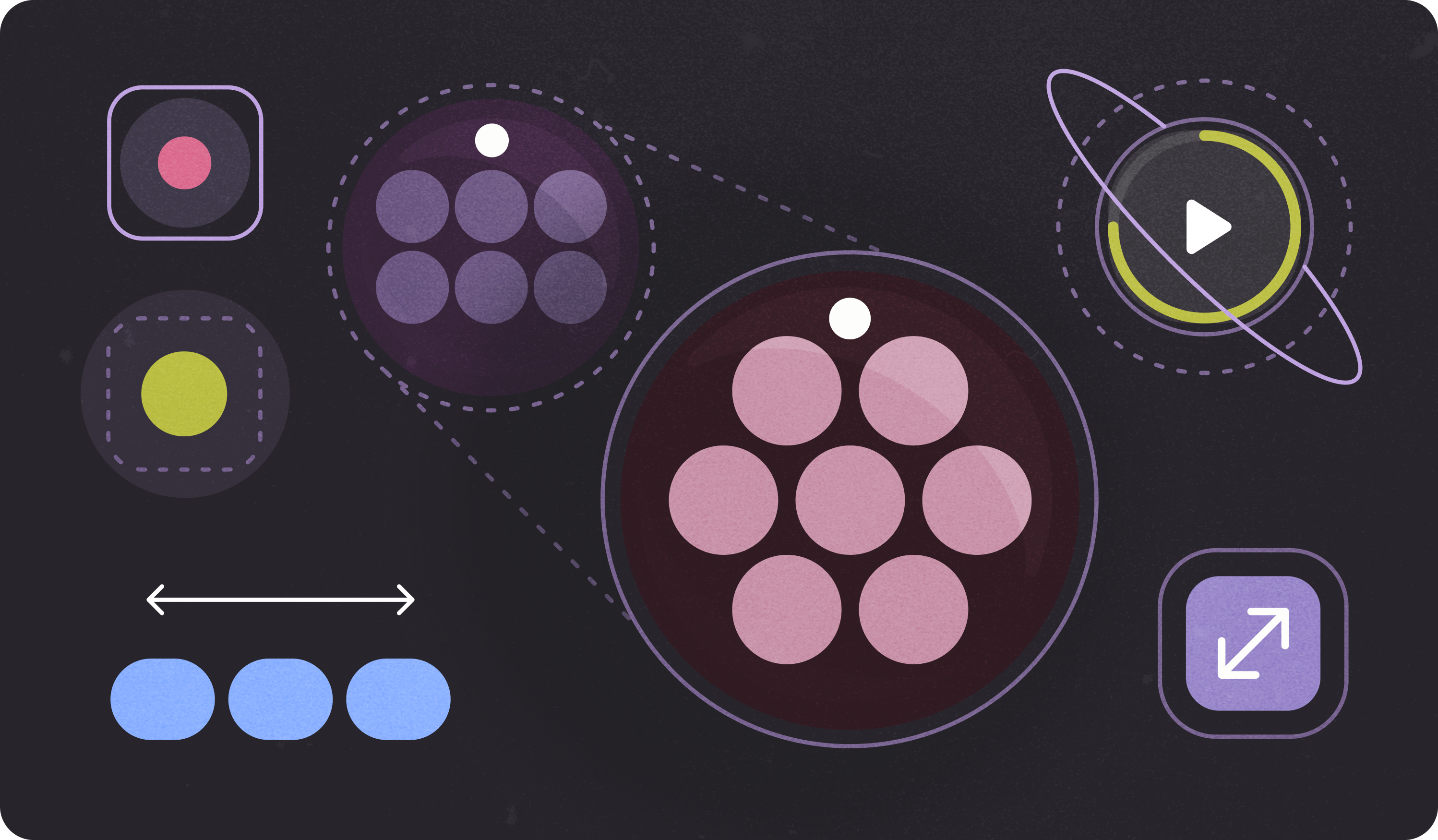
More content at a glance
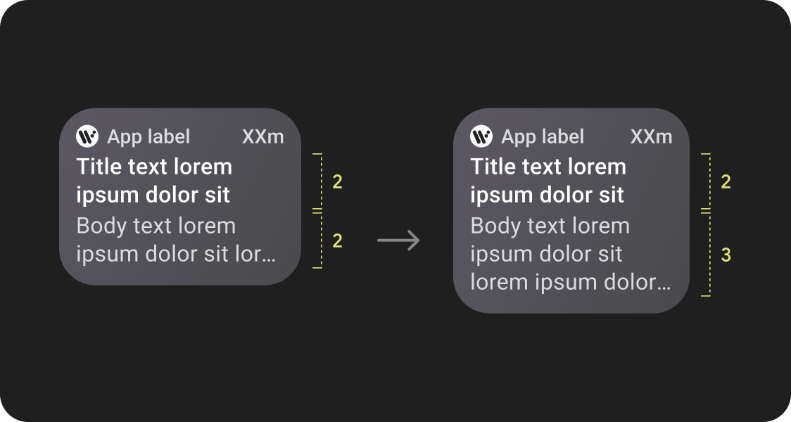
Responsive layouts allow for more chips, more cards, more lines of text, and more buttons to fit on a single screen
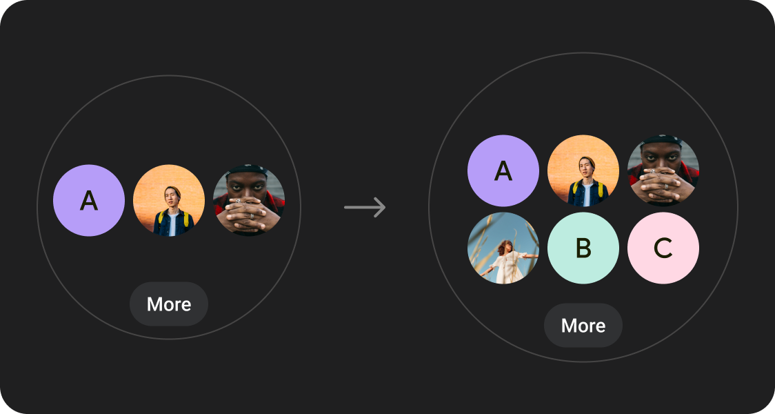
More content elements visible
Utilize new layouts, applied at defined screen size breakpoints, to allow for the introduction of new content when possible, giving the user additional value on devices with larger screen sizes.
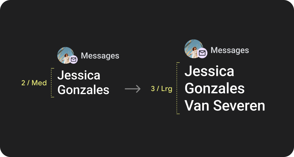
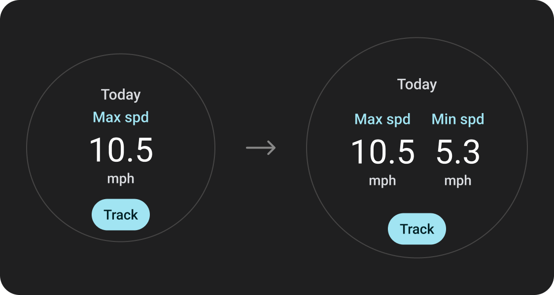
Improved glanceability
Use extra screen space to provide larger containers, larger text, thicker rings, and more granular data visualization to provide better glanceability for users.
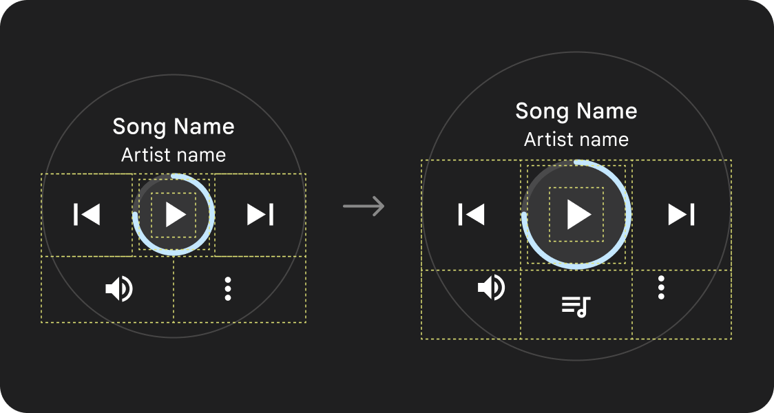
Improved usability
Use extra screen space to provide bigger tap targets, greater visual hierarchy, and additional space between content items to make interfaces easier and more comfortable to interact with.
Optimized compositions
Utilize our updated components and templates to offer a better look and feel for our UIs across all screen sizes.
App quality
Our quality guidelines are organized into three levels. Enable the best possible experience for your users by meeting guidelines in all three tiers.
Ready for all screen sizes
Make sure your app is delivering a quality experience across all screen sizes. Create layouts that fully use the available app space.
Responsive and optimized
Deliver more content to users on devices which allow for it, and utilize responsive layouts that automatically adapt to different screen sizes.
Adaptive and differentiated
Make the most of additional real estate by utilizing breakpoints to offer powerful new experiences on larger screens which are not possible on devices with smaller screens.
Utilize established canonical layouts
Use established canonical layouts to help your UIs adapt smoothly across a range of device sizes.
Our canonical layouts have been developed thoughtfully to offer a high quality experience across all screen sizes.