الخطوط
تنظيم صفحاتك في مجموعات
يمكنك حفظ المحتوى وتصنيفه حسب إعداداتك المفضّلة.
استبدِل جميع مثيلات Roboto بـ Roboto Flex. خصِّص مقياسًا لنوع الخطوط الأساسية
يكون محسَّنًا للساعات ولغة التصميم التعبيري في Material 3.
استخدام محور متغيّر وعرض متغيّر ووزن متغيّر لتنظيم طريقة تصميم النص الكبير
في العرض والعنوان لتحسين النمط وتوفير المزيد من الفائدة وسهولة القراءة
للمقاسات الأصغر
Roboto Flex
يوفّر Roboto Flex مجموعة من المحاور المتغيّرة التي تخدم حالات استخدام تطبيقك.
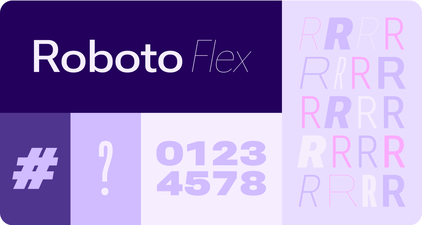
المحاور القابلة للتعديل
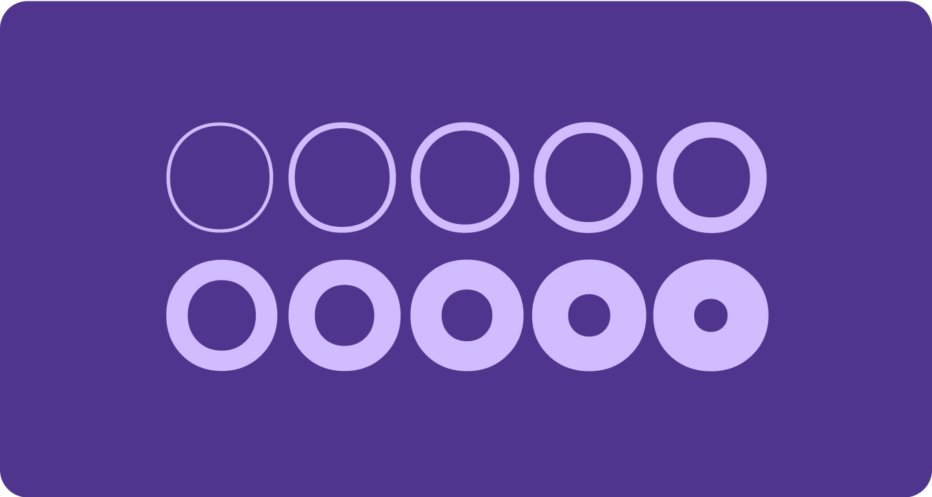
على الرغم من أنّ الخطوط المتغيّرة يمكن أن تتضمّن العديد من سمات الخطوط المتغيّرة للتعبير، هناك سمتان من سمات التصميم (أو المحاور) المخصّصة (أو المحاور) اللتان هما الأنسب لتصميم المنتجات: السمتَان "السُمك" و"العرض".
الوزن
السماكة هي السمة الأساسية التي تحدّد السمك العام لخطوط
الخط في أي خط معيّن. إنّ الوزنَين الأكثر شيوعًا هما الوزن العادي والوزن المميّز، ولكن يمكن أن تتراوح الأوزان بين الخفيف جدًا والثقيل جدًا. إذا كان نوع الخط متغيّرًا، يقدّم نطاقًا كاملاً ومتواصلًا لسماكة الخطوط، ما يجعل عدد الأوزان غير محدود بشكلٍ فعّال.
ملاحظات يجب تذكرها
warning
تنبيه
احرِص على عدم استخدام نوع كثافة خفيف جدًا لنص النص الرئيسي.
قد تواجه الشاشات ذات الدقة المنخفضة صعوبة في عرض الخطوط الدقيقة، خاصةً الخطوط
الصغيرة. استخدِم كثافات أخفّ في أحجام الخطوط الأكبر، مثل نوع
الشاشة.
warning
تنبيه
في المقابل، قد يؤثّر الوزن الزائد في الأحجام الأصغر في قراءة النص. قد يصعب قراءة النص إذا كان الخط كثيفًا جدًا.
العرض
العرض هو نتيجة المساحة الأفقية التي تشغلها
أحرف الخط. يسمح العرض الضيق بعرض المزيد من الأحرف في كل سطر،
في حين أنّ العرض الأوسع قد يمنح التطبيق طابعًا شخصيًا أكبر.
ملاحظات يجب تذكرها
check_circle
الإجراءات التي يُنصح بها
يمكن أن يسمح العرض الأضيق بعرض المزيد من الأحرف عند استخدام أحجام صغيرة، مثل اسم أو رقم طويل.
cancel
الإجراءات غير المُوصى بها
وبما أنّ الأنماط الأوسع تستهلك مساحة أكبر، تجنَّب استخدامها في
المناطق التي تتوفّر فيها مساحة محدودة، مثل عنوان صفحة التطبيق.
يخضع كل من المحتوى وعيّنات التعليمات البرمجية في هذه الصفحة للتراخيص الموضحّة في ترخيص استخدام المحتوى. إنّ Java وOpenJDK هما علامتان تجاريتان مسجَّلتان لشركة Oracle و/أو الشركات التابعة لها.
تاريخ التعديل الأخير: 2025-07-27 (حسب التوقيت العالمي المتفَّق عليه)
[[["يسهُل فهم المحتوى.","easyToUnderstand","thumb-up"],["ساعَدني المحتوى في حلّ مشكلتي.","solvedMyProblem","thumb-up"],["غير ذلك","otherUp","thumb-up"]],[["لا يحتوي على المعلومات التي أحتاج إليها.","missingTheInformationINeed","thumb-down"],["الخطوات معقدة للغاية / كثيرة جدًا.","tooComplicatedTooManySteps","thumb-down"],["المحتوى قديم.","outOfDate","thumb-down"],["ثمة مشكلة في الترجمة.","translationIssue","thumb-down"],["مشكلة في العيّنات / التعليمات البرمجية","samplesCodeIssue","thumb-down"],["غير ذلك","otherDown","thumb-down"]],["تاريخ التعديل الأخير: 2025-07-27 (حسب التوقيت العالمي المتفَّق عليه)"],[],[],null,["# Fonts\n\nReplace all instances of Roboto with Roboto Flex. Tailor a baseline type scale\nthat is optimized for the watch and the Material 3 Expressive design language.\n\nUsing variable axis, variable width and weight to curate how we style big\ndisplay and title text to elevate style and bring more utility and legibility\nfor smaller sizes.\n\nRoboto Flex\n-----------\n\n\nRoboto Flex offers a set of variable axis that serves your app's use cases. \n\n\u003cbr /\u003e\n\nAdjustable axes\n---------------\n\nWhile variable fonts can have a multitude of variable font attributes for\nexpression, there are two customizable stylistic attributes (or axes) that are\nmost applicable for product design: weight and width.\n\n### Weight\n\n\n[Weight](https://fonts.google.com/knowledge/choosing_type/exploring_typefaces_with_multiple_weights_or_grades) is the primary attribute that defines the overall thickness of a\ntypeface's strokes in any given font. The most common weights are regular and\nbold, but weights can cover extremes from the very light to the very heavy. If\nthe typeface is variable, it provides a full, continuous range of stroke\nthicknesses, making the number of weights effectively unlimited. \n\n\u003cbr /\u003e\n\n#### Things to remember\n\nwarning\n\n### Caution\n\nBe careful of using too light a weight type for body text.\nLower resolution displays can struggle with delicate, especially small\ntypography. Use lighter weights at larger font sizes, such as display\ntype. \nwarning\n\n### Caution\n\nConversely, excessive weight at smaller sizes may affect\nlegibility. Too thick a type may be difficult to read.\n\n### Width\n\n\n[Width](https://fonts.google.com/knowledge/glossary/width) is the result of how much horizontal space is taken up by a\ntypeface's characters. A narrow width allows more characters to fit per line\nwhile a wider width may offer more personality. \n\n\u003cbr /\u003e\n\n#### Things to remember\n\ncheck_circle\n\n### Do\n\nA thinner width can allow for more characters to fit at\nsmall sizes, such as name or a long number. \ncancel\n\n### Don't\n\nSince wider styles take up more space, avoid using them for\nareas with limited space, such as in the app page header."]]