
يُنشئ مظهر Material 3 Expressive لنظام التشغيل Wear OS تسلسلاً هرميًا مرئيًا من خلال منح قيم مختلفة للتدرّج اللوني ودرجة التشبّع ودرجة اللون لوظائف الألوان، ما يؤدي إلى تمييز الألوان المميزة الجريئة عن ألوان السطح المحايدة بفعالية. إنّ تضمين النظام لدور الألوان الأساسية والثانوية والثالثية لا يعزّز فقط الإمكانيات التعبيرية، بل يوفّر أيضًا إمكانية التحكّم بدقة أكبر في التسلسل الهرمي المرئي من خلال خيارات ألوان متميزة. يضمن هذا الاستخدام المقصود للألوان مظهرًا متسقًا ومتماسكًا في واجهة مستخدم الساعة، حتى مع استخدام المظاهر.
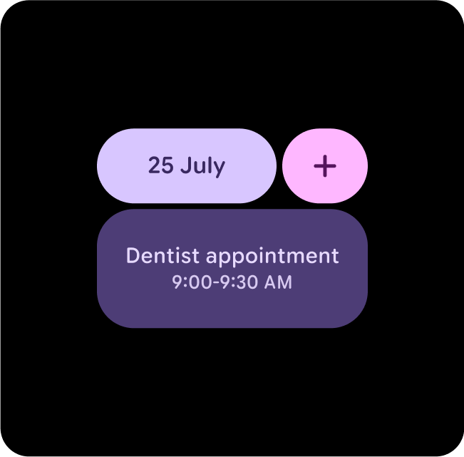
مثال على تنسيقات ومكوّنات وواجهات مستخدم مختلفة في مظاهر مختلفة، مع الحفاظ على تباين ألوان كافٍ
إقران الألوان وطبقاتها
للحفاظ على إمكانية الوصول البصري، لا تطبِّق الألوان إلا في أزواج الرموز المخصّصة للألوان. قد يؤدي دمج الألوان بشكل غير صحيح إلى إزالة التباين الضروري لتوفير إمكانية استخدام مرئية، لا سيما عند تعديل الألوان من خلال اللون الديناميكي.
اختيار الألوان وتنسيقها بشكل صحيح
لضمان ملاءمة العناصر المرئية وسهولة الاستخدام، تأكَّد من ربط الرمز المميّز الصحيح بموقعه الصحيح. يمكن أن يؤدي ربط الألوان بشكل غير صحيح إلى استخدام مواد مرئية غير مقصودة وتعطيل أدوات تسهيل الاستخدام.
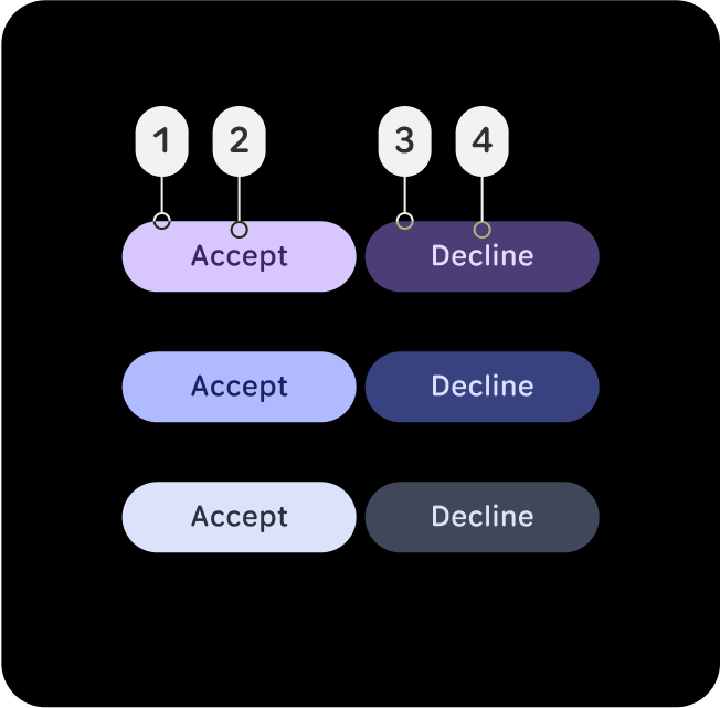
الإجراءات التي يُنصح بها
اربط أدوار الألوان وطبقها بشكل صحيح لضمان ملاءمة العناصر المرئية وتسهيل الاستخدام.
في هذا المثال، تظل الأزرار التي تحتوي على (2) on-primary في (1) primary أو (4) on-primary-container في (3) primary-container قابلة للقراءة عند تغيُّر مستوى التباين وتحصل على تقييم AAA بنسبة تباين 7:1 أو أكثر.
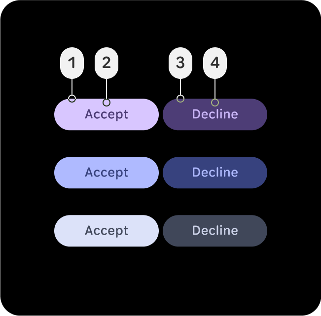
الإجراءات غير المُوصى بها
يمكن أن تؤدي عمليات ربط الألوان غير الصحيحة إلى ظهور صور مرئية غير مقصودة وتعذُّر استخدام المحتوى.
في هذا المثال، تصبح الأزرار التي تحتوي على (2) primary-container في (1) primary أو (4) primary-dim في (3) primary-container غير مقروءة بسبب تغيُّر مستويات التباين وعدم اتّباع الحدّ الأدنى لنسبة التباين 7:1 للنص العادي. تنطبق مستويات التباين هذه على الأدوار الأساسية والثانوية والثالثية.
مجموعات الألوان المقترَحة
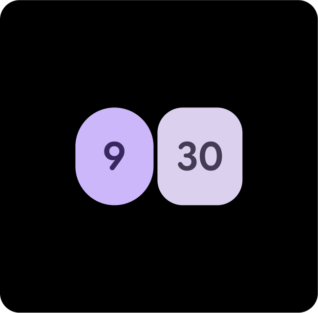
السمة الأساسية + السمة الأساسية للعنصر
استخدِم Primary للإجراءات الرئيسية، وPrimary-Dim للعناصر التكميلية. ويؤدي ذلك إلى إضفاء عمق مع ضمان بروز الإجراء الأساسي.
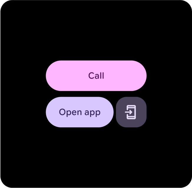
السمة الأساسية + السمة الثانوية
استخدِم Primary-Dim لإبراز العناصر المهمة، واستخدِم Tertiary لتقديم ملاحظات ملفتة، مثل ردود النقر.

الحاويات الأساسية والثانوية
استخدِم Secondary-Container للمحتوى الأقل بروزًا، بينما يتم تطبيق Primary على العناصر الرئيسية لضمان تميّزها وجذب الانتباه.
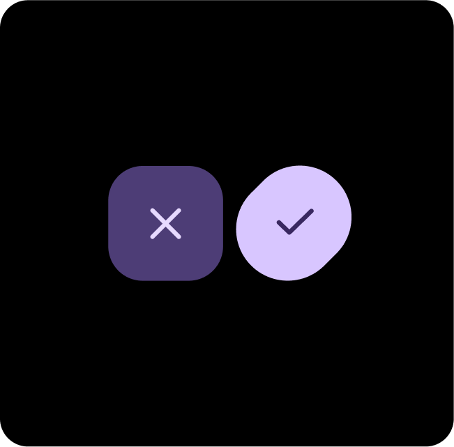
Primary + Primary-Container
استخدِم Primary للإجراءات الرئيسية، وPrimary-Container للعناصر التكميلية أو الثانوية. ويؤدي ذلك إلى إضفاء عمق مع ضمان تميّز الإجراء الأساسي.
السمة الأساسية + السمة الثانوية
استخدِم السمة الأساسية لإبراز العناصر المهمة والسمة الثانوية لتقديم ملاحظات مهمة، مثل تحقيق هدف معيّن.
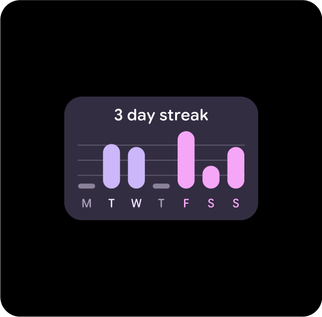
الحاويات الثانوية والأساسية والثالثية
عندما لا يكون الإجراء الرئيسي واضحًا، استخدِم مجموعة من العناصر الثانوية والأساسية للإجراءات الرئيسية وSecondary-Container للإجراءات التكميلية.
الحاويات الثانوية والحاويات الأساسية
استخدِم Primary-Dim وSecondary عندما تريد عرض خيارَين أو حاويتَين مهمتَين بالتساوي، ولكن مع الحفاظ على التباين بينهما.
الحاويات الأساسية والثالثية والحاويات الأساسية
عندما لا يكون الإجراء الرئيسي واضحًا، استخدِم مجموعة من العناصر الثانوية و الأساسية للإجراءات الرئيسية و"الحاوية الأساسية" للإجراءات التكميلية.
السمة الأساسية + السمة الثانوية
استخدِم السمة الأساسية للإجراءات الرئيسية والسمة الأساسية للعناصر التكميلية. ويؤدي ذلك إلى إضافة عمق إلى المحتوى مع المساعدة في إبراز الإجراء الأساسي.