
แอปเป็นหนึ่งในแพลตฟอร์มหลักใน Wear OS แอปแตกต่างจากข้อมูลแทรกหรือการ์ด ซึ่งเป็นการแสดงเนื้อหาแอปที่มองเห็นได้อย่างรวดเร็ว แอปจะแสดงข้อมูลมากขึ้นและรองรับการโต้ตอบที่สมบูรณ์ยิ่งขึ้น ผู้ใช้มักจะเข้าสู่แอปจากแพลตฟอร์มอื่น เช่น การแจ้งเตือน ข้อมูลแทรก ไทล์ หรือการดำเนินการด้วยเสียง
AI
โปรดคำนึงถึงหลักการต่อไปนี้เมื่อออกแบบแอป
มุ่งเน้น: มุ่งเน้นที่งานสำคัญเพื่อช่วยให้ผู้ใช้ได้งานภายในไม่กี่วินาที
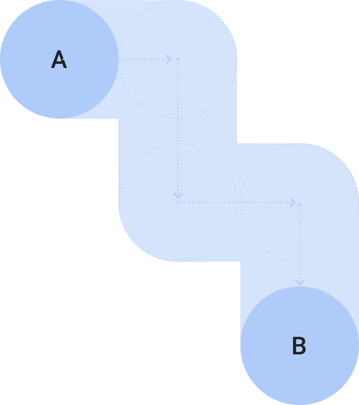
เป็นลำดับชั้นแบบไม่ซับซ้อนและตรงไปตรงมา: หลีกเลี่ยงการสร้างลําดับชั้นที่ลึกเกิน 2 ระดับ พยายามแสดงเนื้อหาและการนำทางในบรรทัดเดียวกันเมื่อเป็นไปได้
การเลื่อน: แอปสามารถเลื่อนได้ ซึ่งเป็นท่าทางสัมผัสที่ผู้ใช้ทำเป็นปกติเพื่อดูเนื้อหาเพิ่มเติมบนนาฬิกา
หลักเกณฑ์
โปรดทำตามหลักเกณฑ์เหล่านี้เมื่อออกแบบแอป
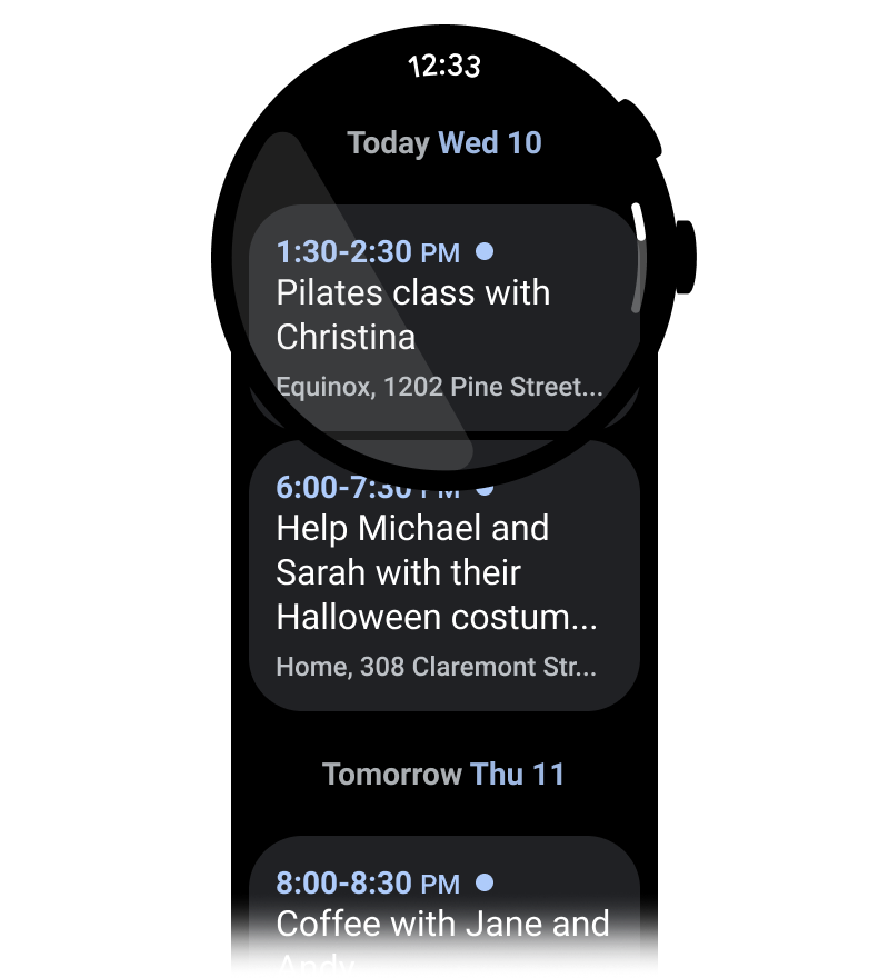
เพิ่มประสิทธิภาพสำหรับเลย์เอาต์แนวตั้ง
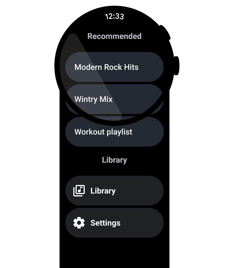
ลดความซับซ้อนของการออกแบบแอปโดยใช้เลย์เอาต์แนวตั้ง ซึ่งช่วยให้ผู้ใช้เลื่อนไปในทิศทางเดียวเพื่อไปยังส่วนต่างๆ ของเนื้อหาได้
ควรทำ
ไม่ควรทำ
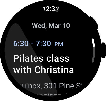
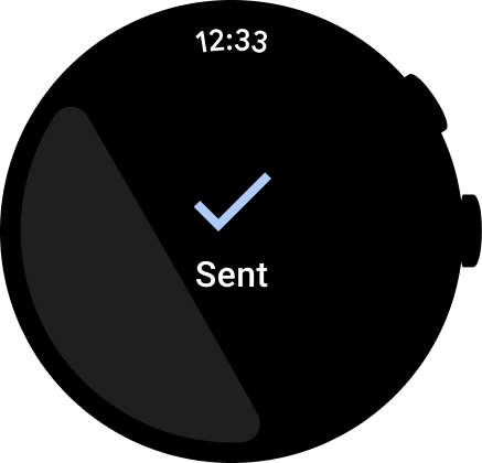
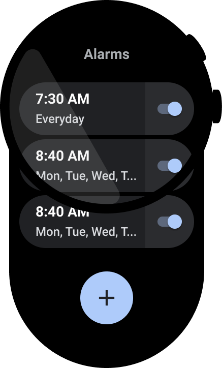
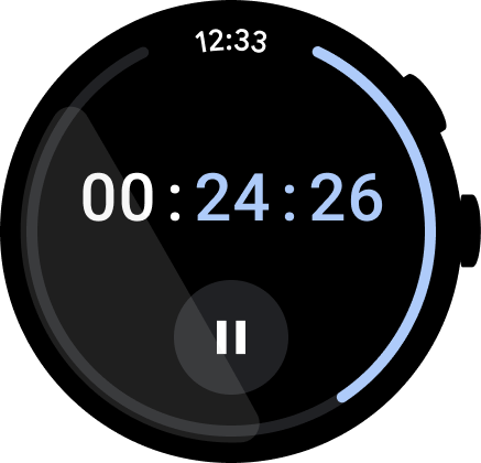
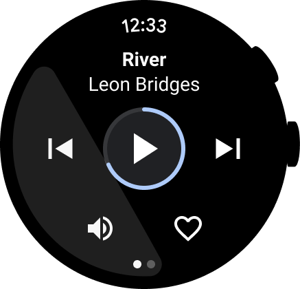
แสดงเวลา
ผู้ใช้มีแนวโน้มที่จะใช้เวลาในแอปนานขึ้น จึงควรให้การเข้าถึงเวลาอย่างรวดเร็ว
ควรทำ
ไม่ควรทำ
ดูข้อมูลเพิ่มเติมเกี่ยวกับการออกแบบและการใช้งานได้ที่ข้อความเวลา
จุดแรกเข้าในบรรทัดที่มีให้เข้าถึง
ตรวจสอบว่าการดำเนินการทั้งหมดแสดงในบรรทัดโดยใช้ไอคอนและป้ายกำกับที่ชัดเจนเพื่อรองรับการช่วยเหลือพิเศษ ซึ่งรวมถึงจุดแรกเข้าสำหรับการตั้งค่าและค่ากําหนด
ควรทำ
ไม่ควรทำ
ยกระดับการดําเนินการหลัก
ช่วยให้ผู้ใช้ดำเนินการในแอปได้โดยดึงการดําเนินการหลักไปไว้ที่ด้านบนของแอป ยกระดับการดําเนินการหลักที่ไม่คลุมเครือไปไว้ที่ด้านบนของแอป
ใช้ป้ายกำกับเพื่อบอกทิศทางแก่ผู้ใช้
สําหรับแอปที่ยาวขึ้น ให้ช่วยแนะนําผู้ใช้ด้วยป้ายกํากับขณะที่เลื่อนดูเนื้อหา
ควรทำ
ไม่ควรทำ
แสดงแถบเลื่อน
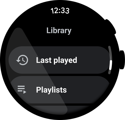
แสดงแถบเลื่อนหากมีการเลื่อนทั้งมุมมอง ดังที่แสดงในภาพต่อไปนี้ ดูข้อมูลเพิ่มเติมได้ที่ตัวบ่งชี้ตำแหน่ง

คอนเทนเนอร์เนื้อหา
ดูตัวอย่างคอนเทนเนอร์เนื้อหาต่อไปนี้
รูปที่ 1 คอนเทนเนอร์ที่มีความสูงคงที่
รูปที่ 2 คอนเทนเนอร์ที่มีความสูงไม่เท่ากัน
รูปที่ 3 คอนเทนเนอร์ที่มีความสูงและความกว้างมากกว่าวิวพอร์ต
รูปที่ 4 คอนเทนเนอร์แบบแบ่งหน้า
รูปที่ 5ก หน้าเนื้อหาที่ใช้ขนาดเต็มของหน้าจอและแบ่งหน้าในแนวตั้ง