
التطبيق هو أحد مساحات العرض الأساسية على نظام التشغيل Wear OS. تختلف التطبيقات عن الملحقات أو المربّعات التي تعرض محتوى التطبيق بشكل سريع. تعرض التطبيقات المزيد من المعلومات وتتيح تفاعلاً أكثر ثراءً. غالبًا ما يدخل المستخدم إلى تطبيق من سطح آخر، مثل إشعار أو شاشة معلومات أو مربّع أو إجراء صوتي.
المبادئ
يُرجى مراعاة المبادئ التالية عند تصميم التطبيقات:
التركيز: يمكنك التركيز على المهام المهمة لمساعدة المستخدمين في إنجاز المهام في غضون ثوانٍ.
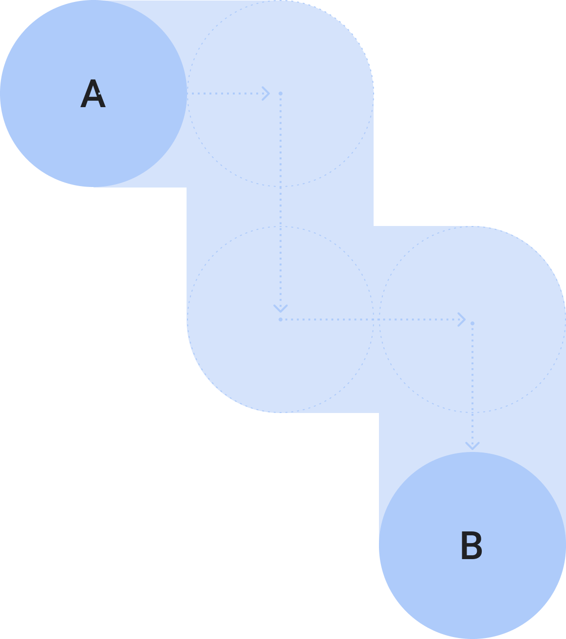
السطحية والخطية: تجنَّب إنشاء تسلسلات هرمية أكثر من مستويَين. احرص على عرض المحتوى وعناصر التنقّل مضمّنة في الصفحة كلما أمكن ذلك.
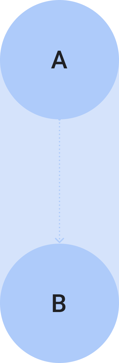
الانتقال للأعلى أو للأسفل: يمكن للتطبيقات الانتقال للأعلى أو للأسفل. هذه إيماءة طبيعية للمستخدمين لعرض مزيد من المحتوى على الساعة.
الإرشادات
اتّبِع هذه الإرشادات عند تصميم التطبيقات.
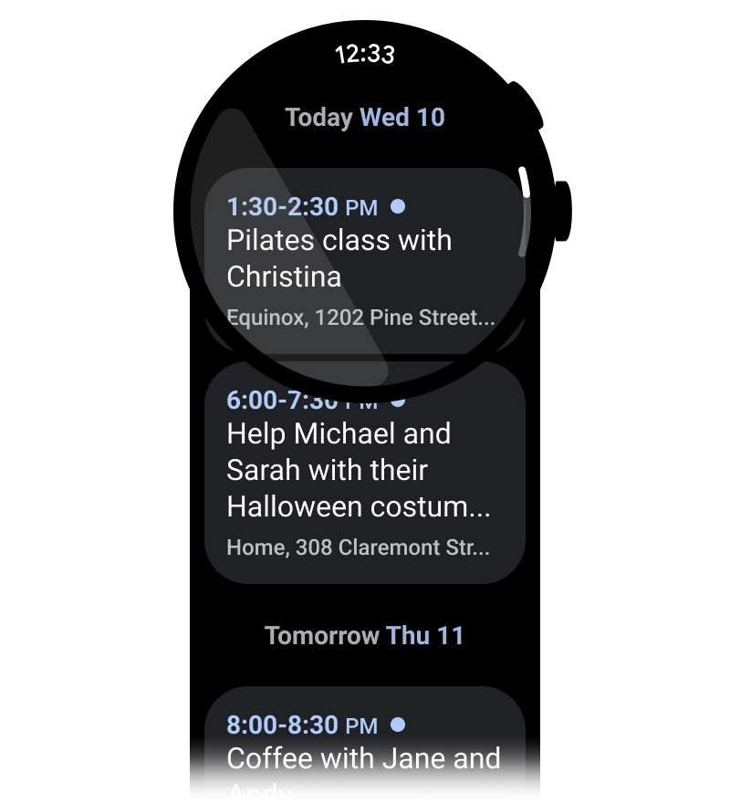
تحسين المحتوى للتنسيقات العمودية
يمكنك تبسيط تصميم تطبيقك باستخدام التنسيقات العمودية التي تسمح للمستخدمين بالتمرير في اتجاه واحد للتنقّل في المحتوى.
الإجراءات التي يُنصح بها
الإجراءات غير المُوصى بها
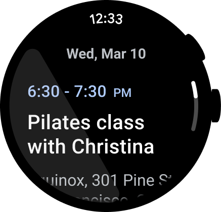
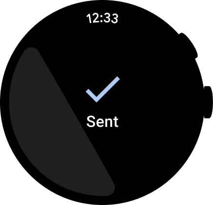
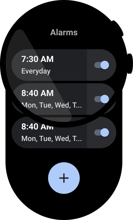
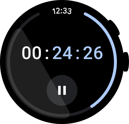
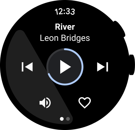
عرض الوقت
يميل المستخدمون إلى قضاء وقت أطول في التطبيقات، لذا من المهم توفير إمكانية الوصول السريع إلى الوقت.
الإجراءات التي يُنصح بها
الإجراءات غير المُوصى بها
لمزيد من المعلومات عن التصميم والاستخدام، يُرجى الاطّلاع على نص الوقت.
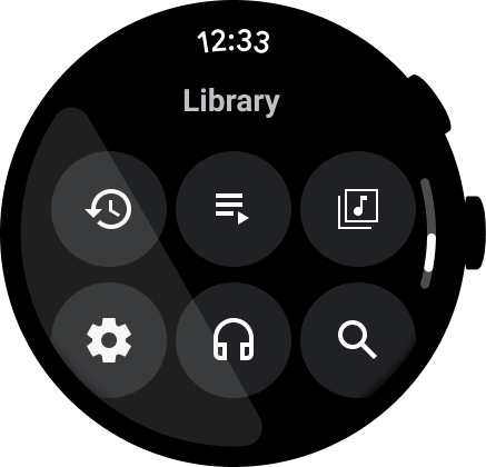
نقاط الدخول المضمّنة القابلة للوصول
تأكَّد من عرض جميع الإجراءات مضمّنةً، باستخدام رموز وتسميات واضحة لأجل تسهيل الاستخدام. ويشمل ذلك نقاط الدخول إلى الإعدادات والإعدادات المفضّلة.
الإجراءات التي يُنصح بها
الإجراءات غير المُوصى بها
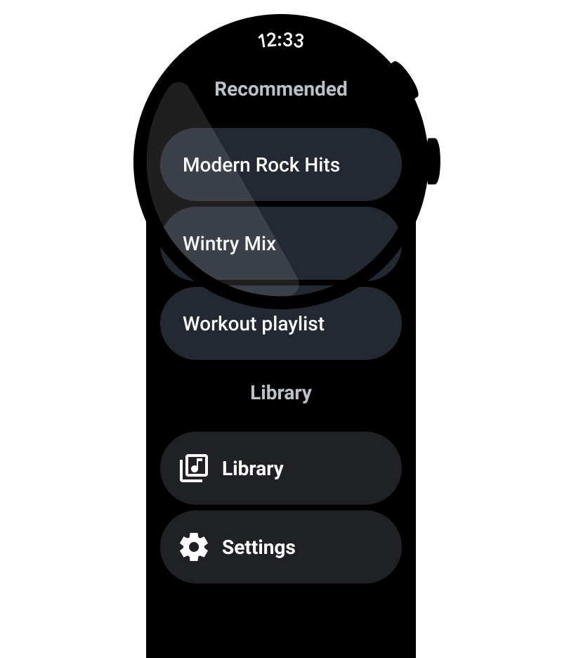
ترقية الإجراءات الأساسية
يمكنك مساعدة المستخدمين على اتّخاذ إجراء في تطبيقك من خلال نقل الإجراءات الأساسية إلى أعلى التطبيق. ويجب وضع الإجراءات الأساسية غير المُربكة في أعلى التطبيق.

استخدام التصنيفات لتوجيه المستخدمين
بالنسبة إلى التطبيقات الأطول، يمكنك مساعدة المستخدم في التعرّف على المحتوى من خلال التصنيفات أثناء تصفّحه.
الإجراءات التي يُنصح بها
الإجراءات غير المُوصى بها
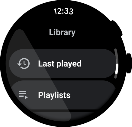
إظهار شريط التمرير
أظهِر شريط التمرير إذا كان بالإمكان الانتقال للأعلى أو للأسفل في العرض بالكامل، كما هو موضّح في الصورة التالية. لمزيد من المعلومات، يُرجى الاطّلاع على مؤشر الموضع.

حاويات المحتوى
اطّلِع على الأمثلة التالية لحاويات المحتوى.
الشكل 1: حاوية ذات ارتفاع ثابت
الشكل 2: حاوية بارتفاع متغيّر
الشكل 3: حاوية ذات ارتفاع وعرض أكبر من إطار العرض
الشكل 4: حاوية مُقسّمة إلى صفحات
الشكل 5(أ). صفحات المحتوى التي تشغل البُعد الكامل للشاشة ويتم تقسيمها عموديًا إلى صفحات