
يساعد أداة الاختيار المستخدمين في اختيار بيانات معيّنة وضبطها.
أداة الاختيار
يجب استخدام أدوات الاختيار للسماح للمستخدمين بالاختيار من بين عدد محدود من العناصر.
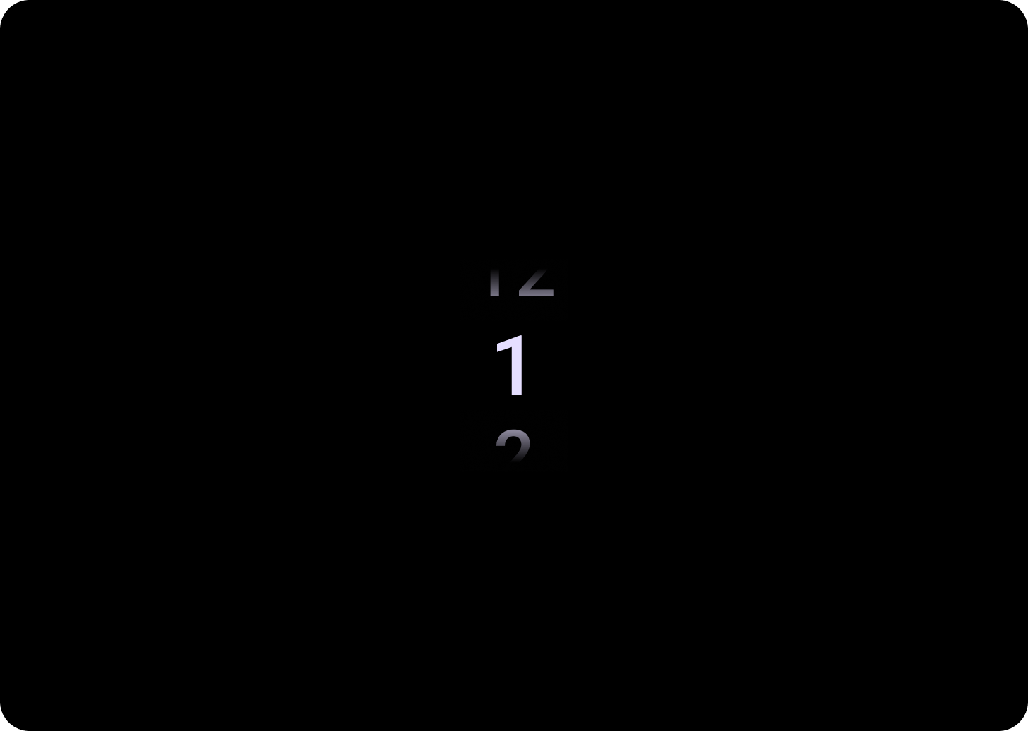
سيتم تكرار العناصر تلقائيًا بشكل لانهائي في كلا الاتجاهين. ننصحك بإيقاف هذا السلوك إذا كان الترتيب في القائمة مهمًا، أو للسماح للمستخدمين بالوصول إلى العنصر الأول والأخير من خلال التمرير سريعًا.
علم التشريح
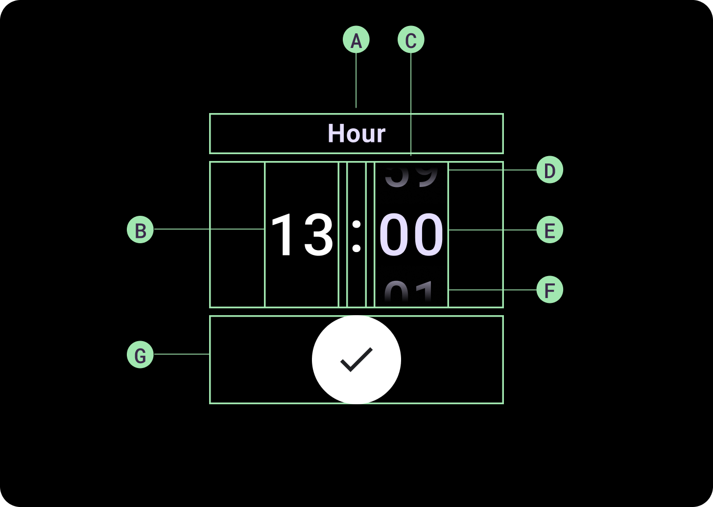
البنية
أ. العمود غير النشط
ب. Colon Breaker
ج. عمود أداة الاختيار
د. أهم المحتوى
هـ. المحتوى الأوسط
و. المحتوى في أسفل الصفحة
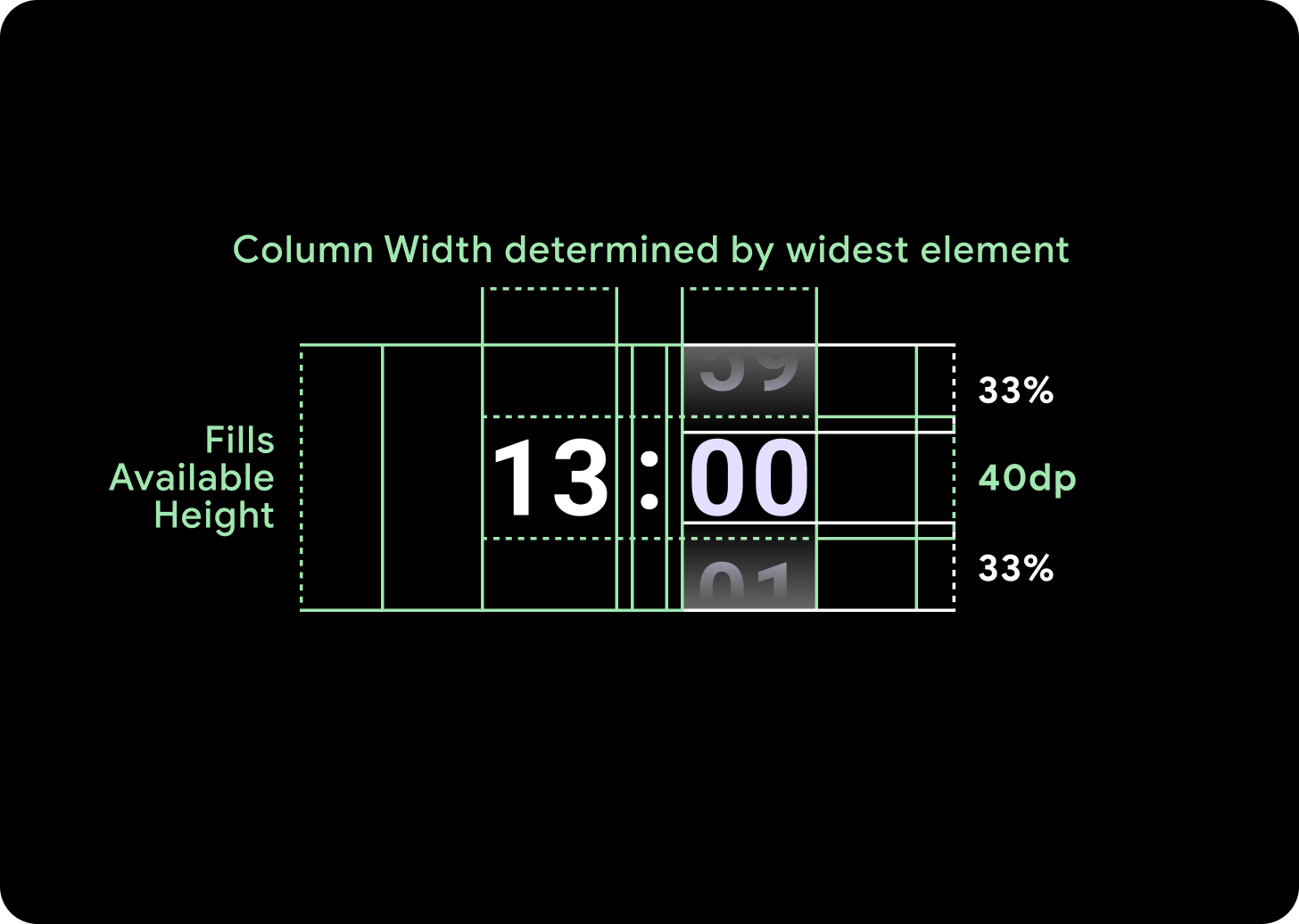
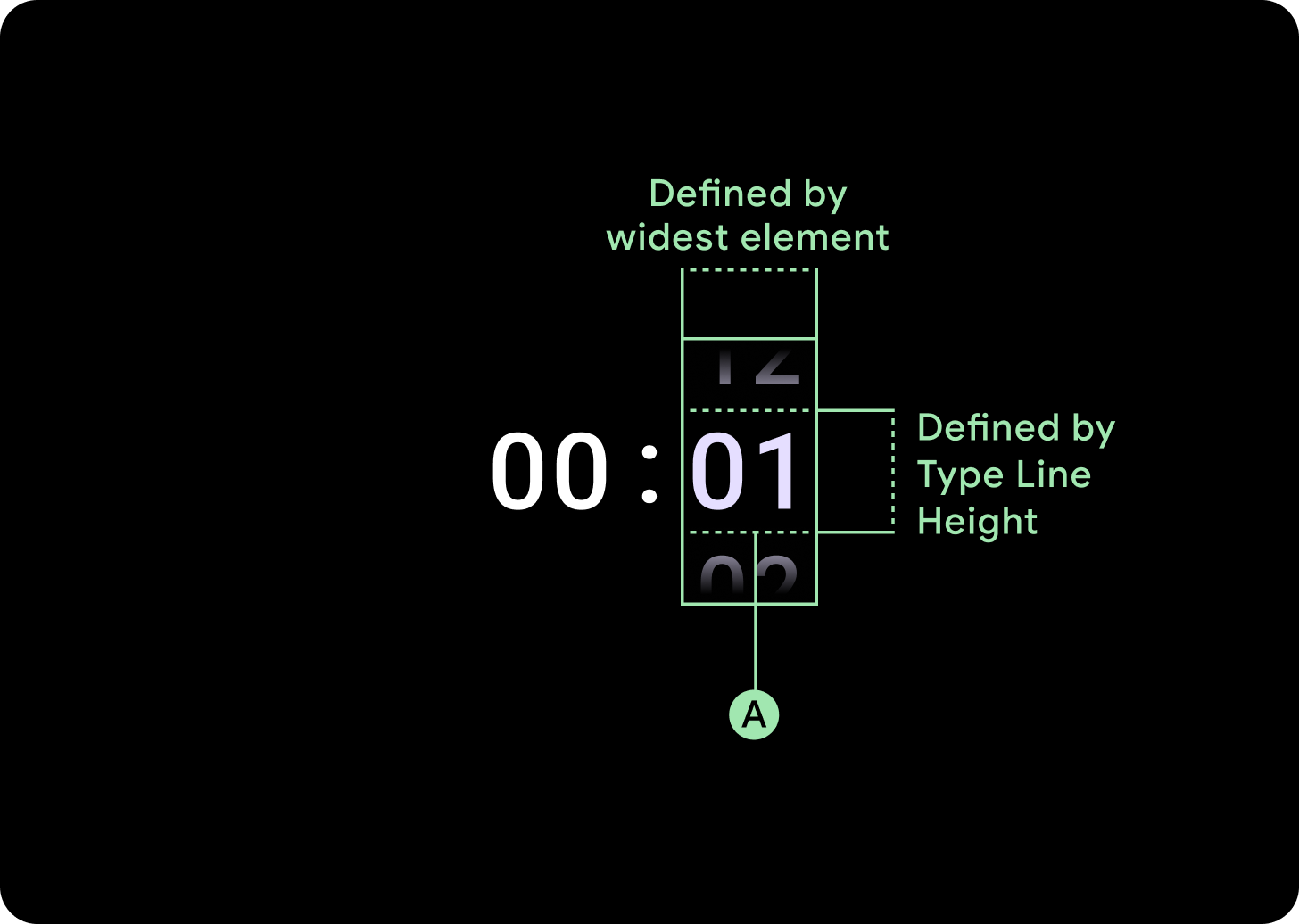
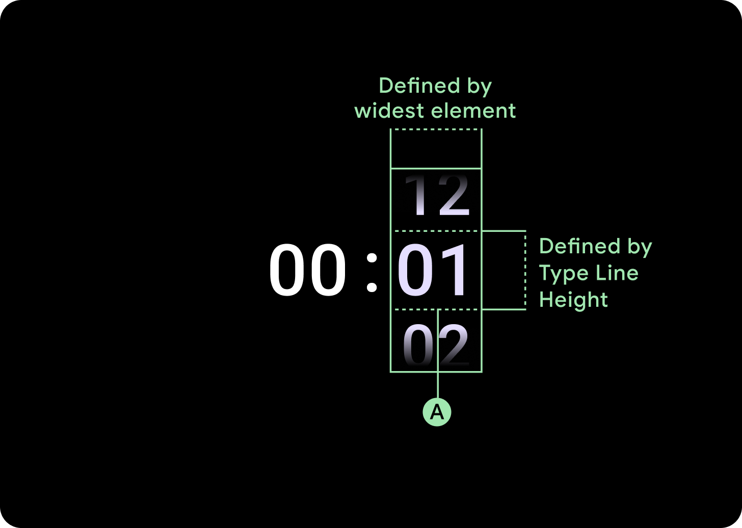
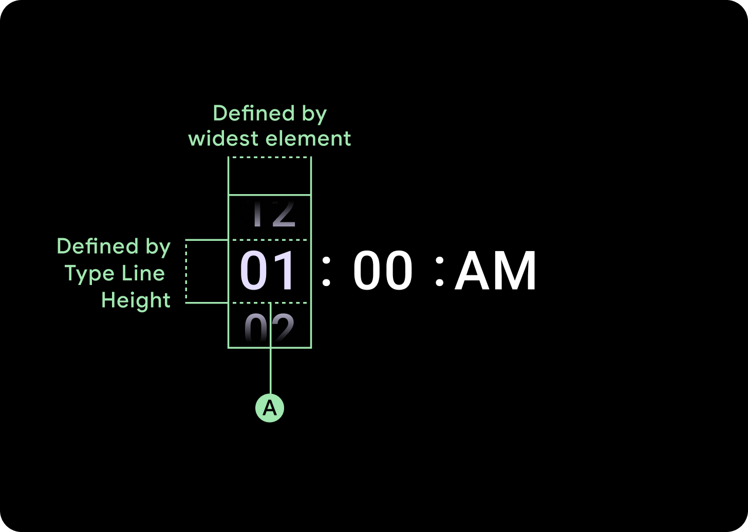
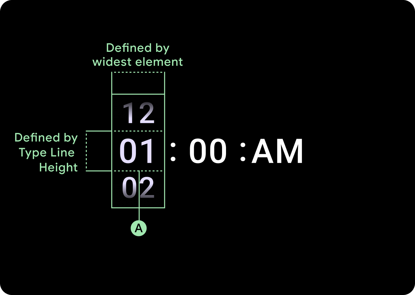
العرض والارتفاع
تملأ مجموعة "أداة الاختيار" الارتفاع والعرض المتاحَين. هناك أربعة خيارات للتخطيط لأعمدة أداة الاختيار. يتم وضع كل تنسيق في المنتصف وملء الارتفاع المتاح. يتم تحديد عرض الأعمدة حسب العرض المطلوب لاستيعاب عدد الأرقام المطلوبة في الخط، باستثناء أداة اختيار التاريخ التي تملأ الشاشة أفقيًا وتتجاوز الحافة.
على سبيل المثال، ستحسب الأرقام عرض "00" ثم تضبط العرض. بالنسبة إلى الحقول النصية، مثل حقل الشهر، سيتم احتساب العرض على أنّه عرض "MMM" (وهو أوسع حرف في الأبجدية اللاتينية). وبالتالي، سيتأثر العرض والارتفاع (وهو ارتفاع السطر لأسلوب الكتابة المستخدَم) بالخط المستخدَم.
يختلف حجم عناصر أداة الاختيار على مستوى نقطة التوقف.
الاستخدام
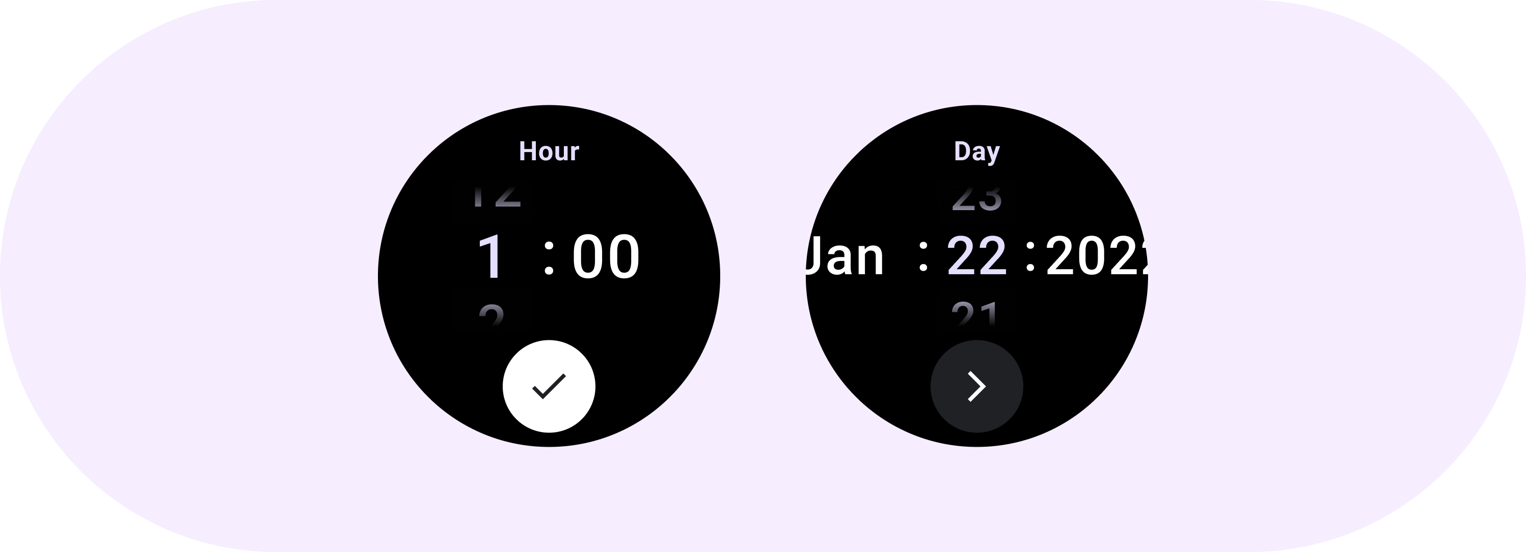
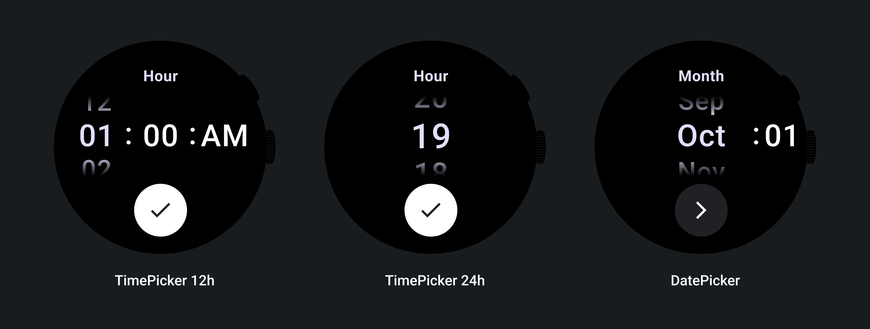
اطّلِع على الأمثلة التالية لأدوات اختيار التاريخ والوقت.
لتنفيذ أداة اختيار التاريخ والوقت مُسبقة الإنشاء، يمكنك الاطّلاع على Horologist Library على GitHub.
إذا كنت تريد إنشاء تجربة مشابهة، حيث يختار المستخدمون قيمة متعددة الأجزاء من بين أدوات اختيار متعددة، استخدِم المكوّن المضمّن PickerGroup. يستخدم هذا الكائن كائنًا منسِّقًا للتركيز لتحديد التركيز على عنصر "أداة الاختيار" الصحيح.
التنسيقات التكيُّفية
TimePicker 24H
TimePicker 12H
أداة اختيار التاريخ
السلوك الاستباقي
زيادة حجم النص
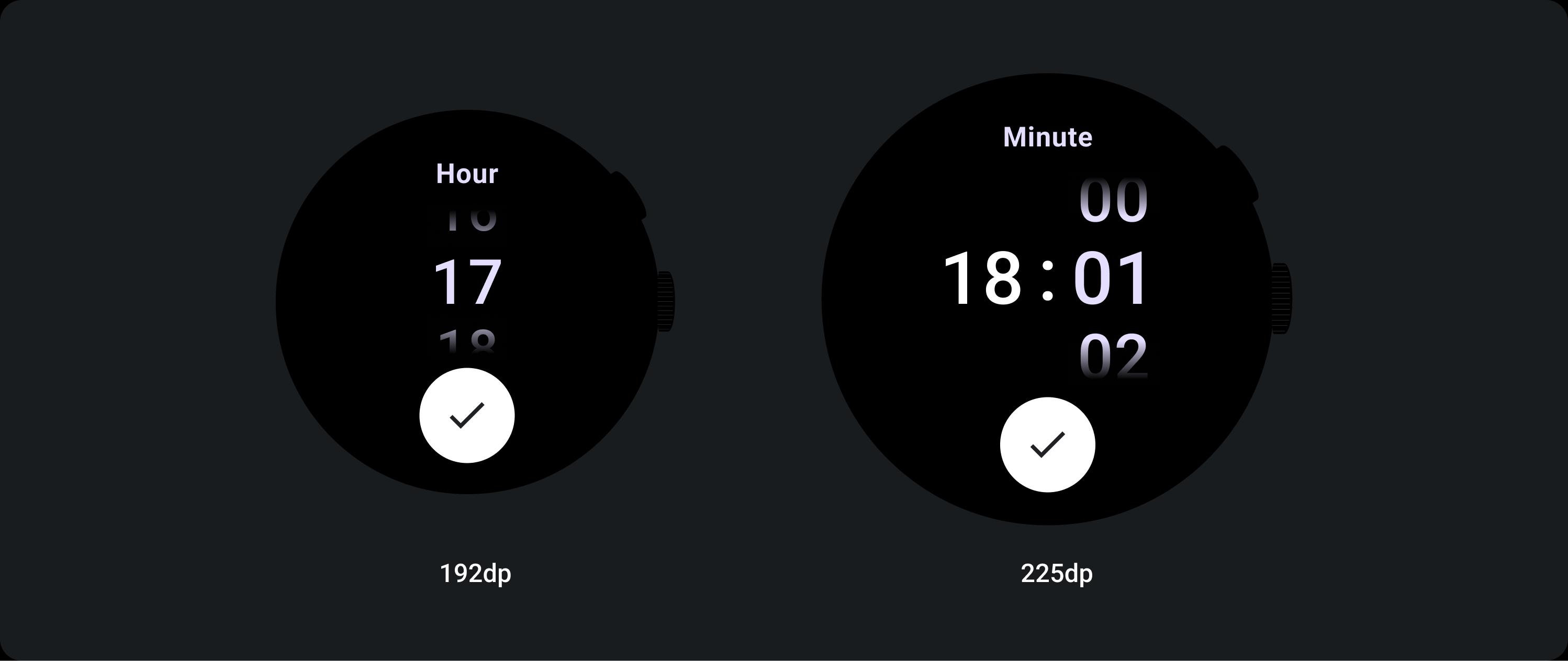
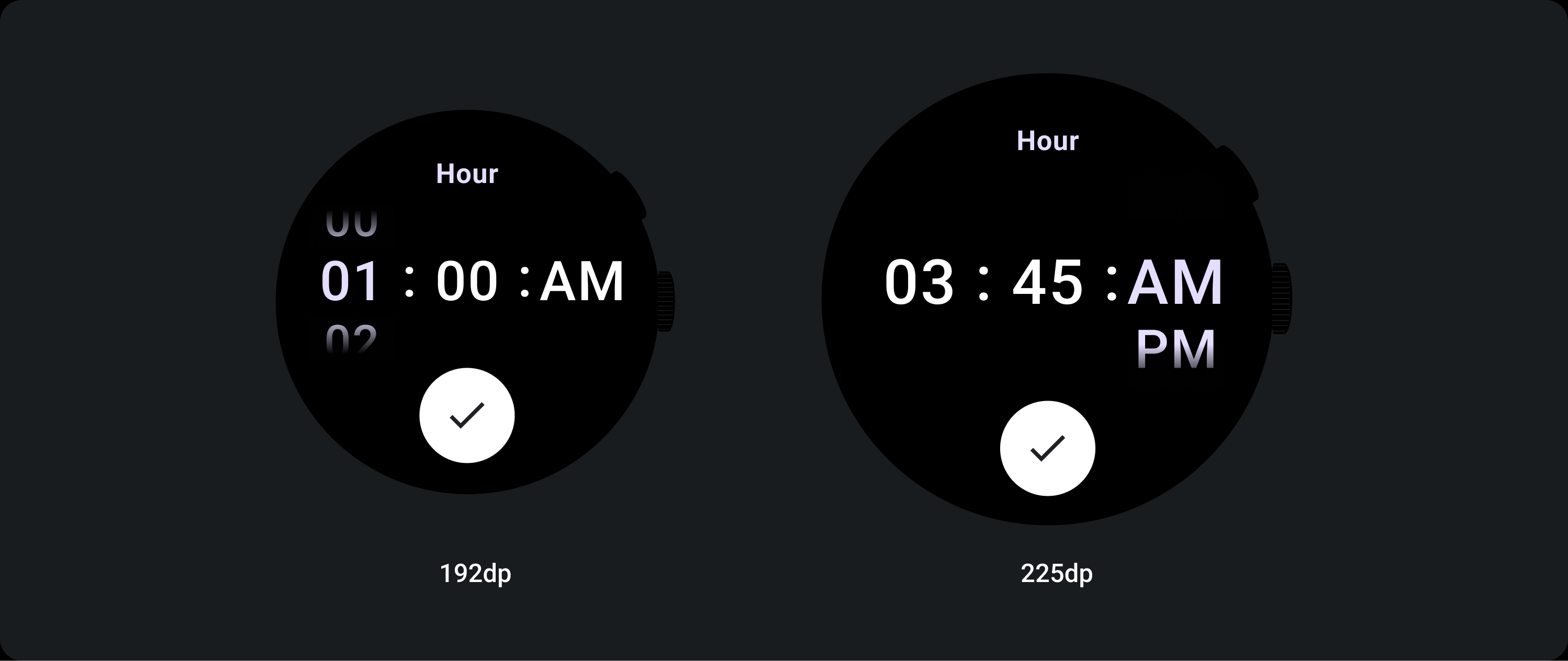
بعد نقطة التوقف التي تزيد عن 225، يتغيّر حجم خط عنصر "أداة الاختيار". يتم تعديل نسختَي "أعلى" و"أسفل" ضمن عمود "الانتقال السلس للمحتوى" (أ)، كما هو الحال مع النسخة "الأوسط". في ما يلي بعض الأمثلة على ذلك:
تنسيق من عمودَين
أدنى من نقطة الإيقاف التي تبلغ 225 dp
الخط: Display 2
أعلى من نقطة الإيقاف التي تبلغ 225 نقطة كثافة بكسل
الخط: شاشة 1
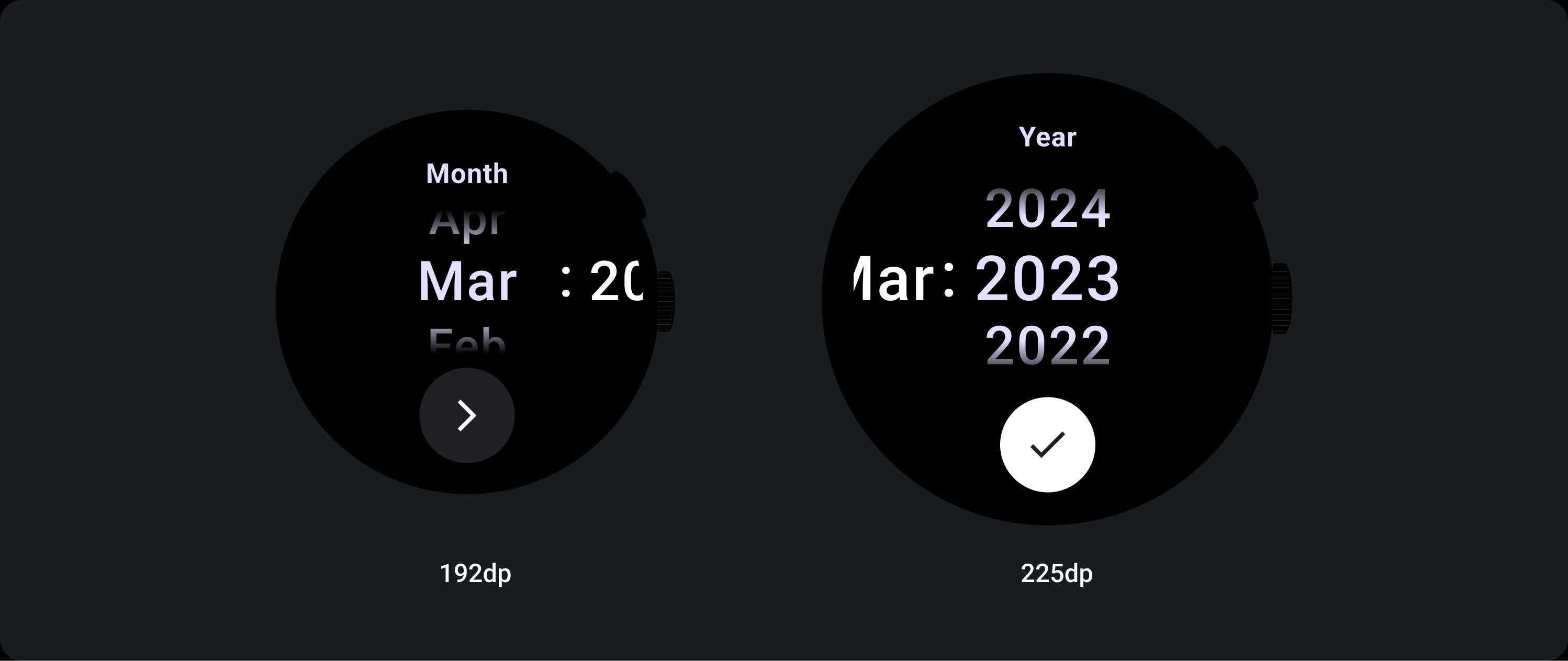
تنسيق من ثلاثة أعمدة
أدنى من نقطة الإيقاف التي تبلغ 225 dp
الخط: شاشة 3
أعلى من نقطة الإيقاف التي تبلغ 225 dp
الخط: شاشة 2
زيادة حجم التدرّج
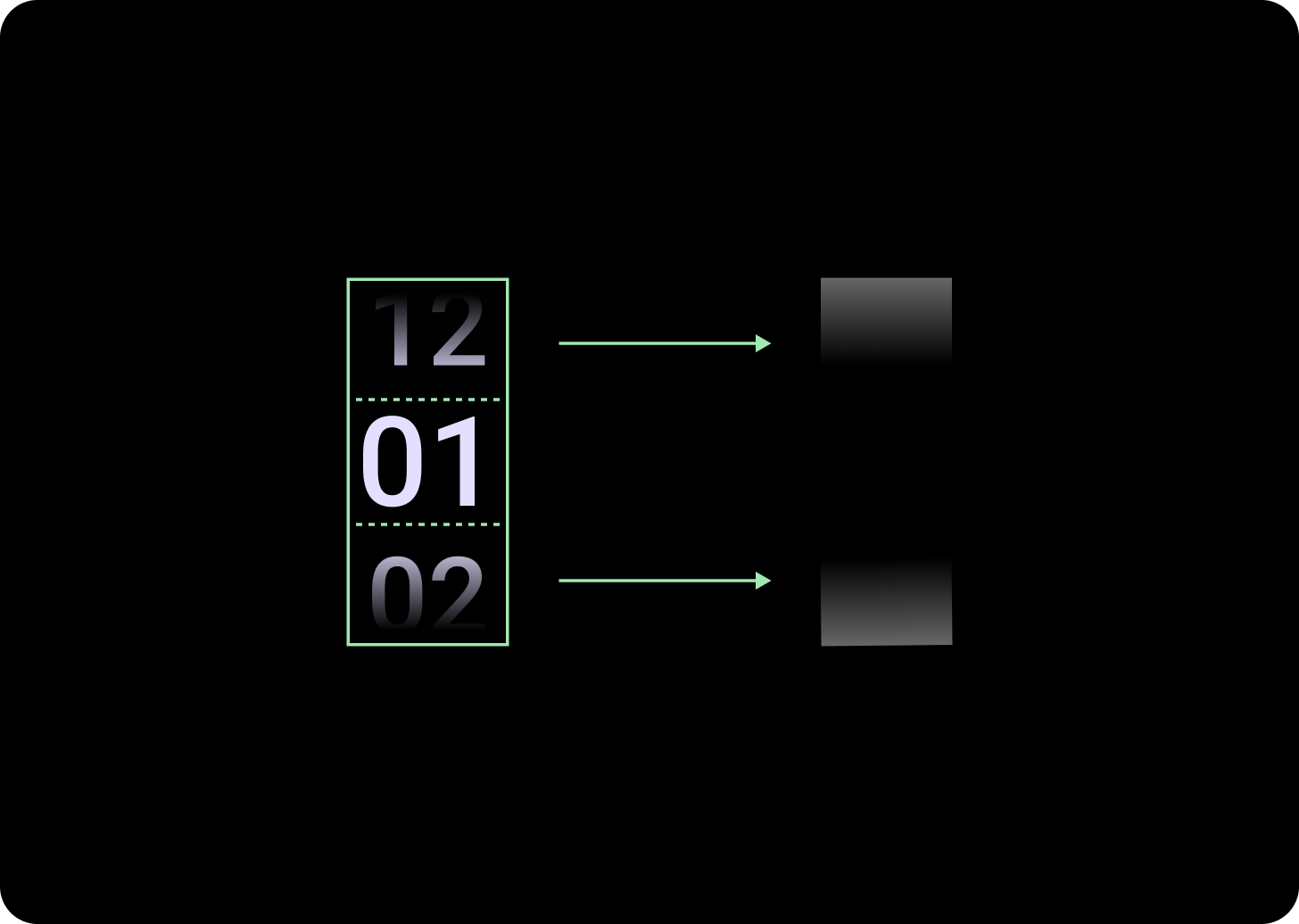
يتم تحديد ارتفاع التدرّج في عمود "أداة الاختيار" حسب المساحة المتوفّرة. يتم ضبط كلا من التدرّج العلوي والسفلي على ثلث (33%) من الارتفاع المتاح. وهذا يعني أنّه في كل حجم شاشة متاح، يتم تكبير التدرّج بشكلٍ نسبي. تكون مستقلة عن تنسيق الأعمدة.
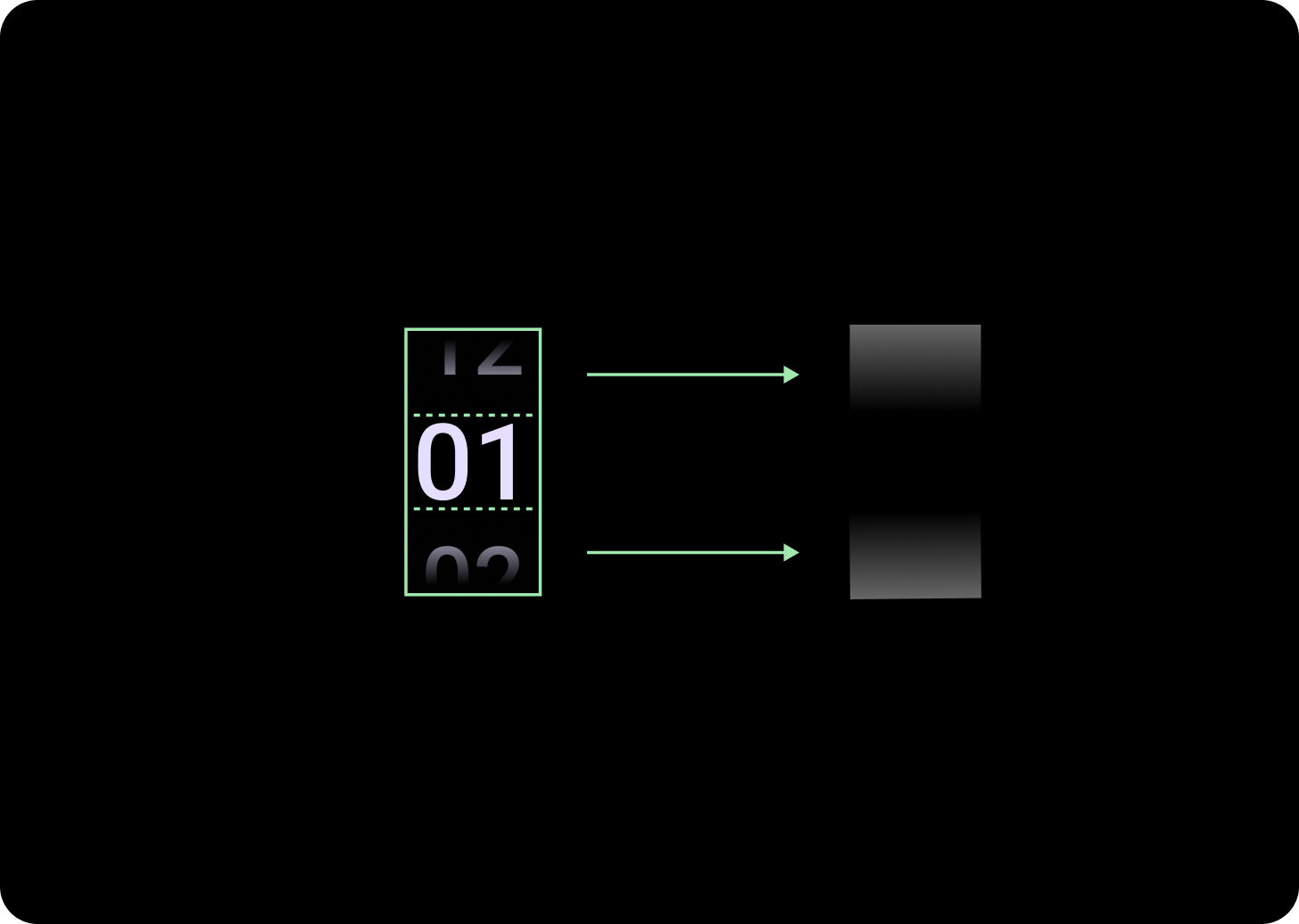
أدنى من نقطة الإيقاف التي تبلغ 225 dp
الحجم: 33% من ارتفاع العمود
أعلى من نقطة الإيقاف التي تبلغ 225 نقطة كثافة بكسل
الحجم: 33% من ارتفاع العمود
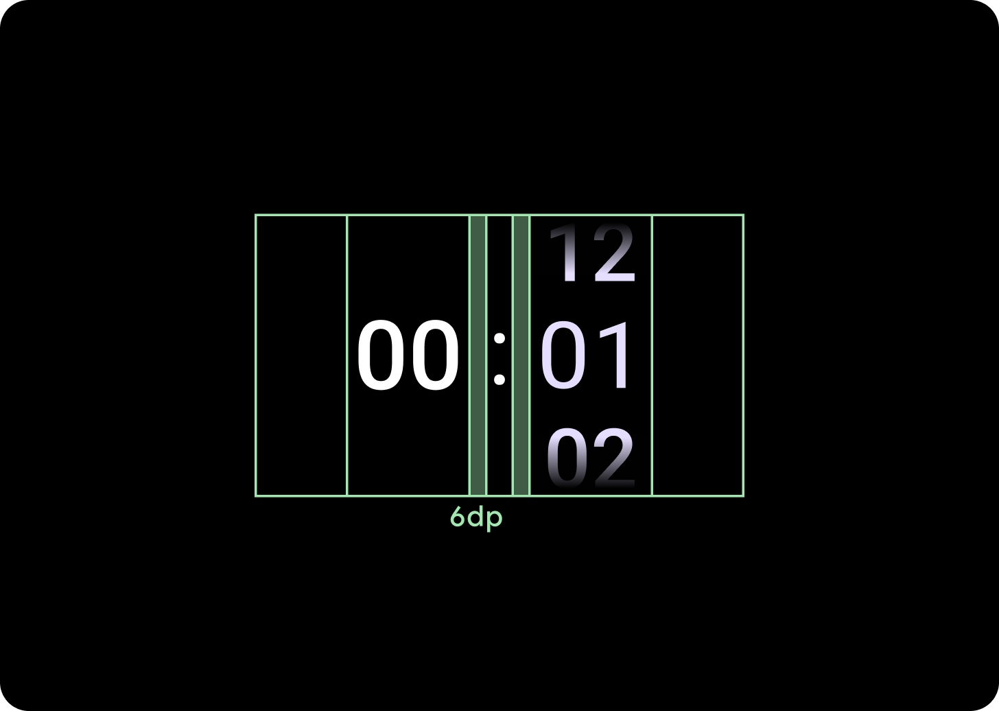
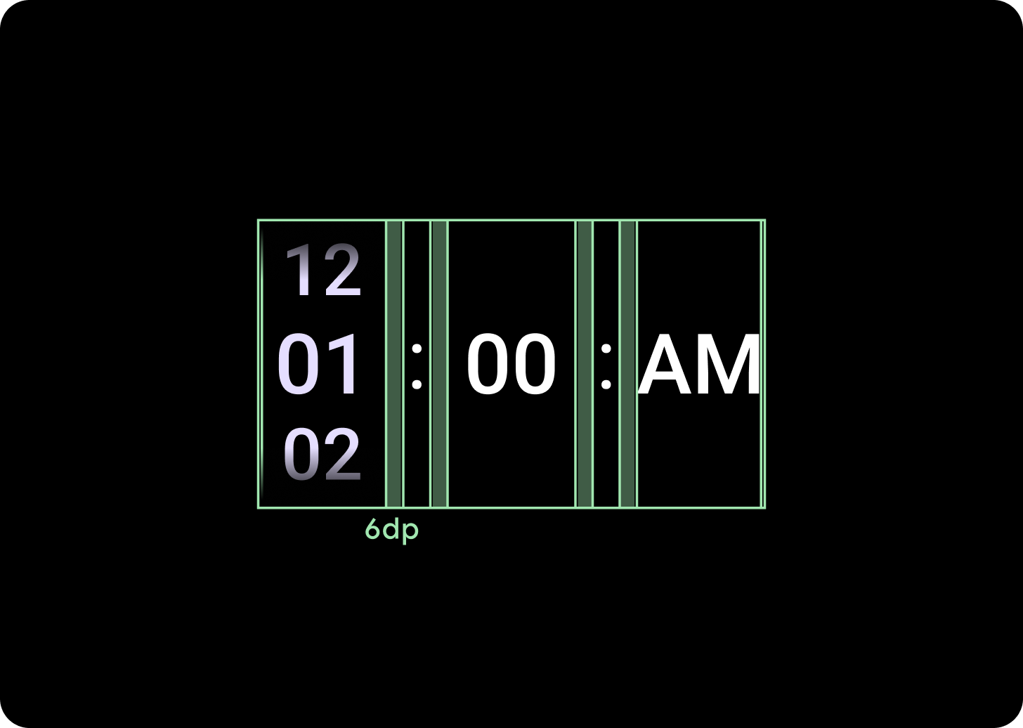
زيادة تباعد الأعمدة
يتم تكبير المسافة بين الأعمدة بعد نقطة التوقف التي تزيد عن 225، إما من 2 dp أو 4 dp إلى 6 dp. يعتمد ذلك على التنسيق الذي اخترته، سواء كان تنسيقًا من عمودَين أو 3 أعمدة.
تنسيق من عمودَين
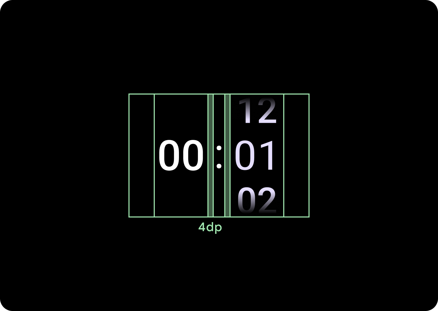
أدنى من نقطة الإيقاف التي تبلغ 225 dp
تباعد الأعمدة 4 نقاط كثافة
أعلى من نقطة الإيقاف التي تبلغ 225 نقطة كثافة بكسل
6 نقاط تباعد بين الأعمدة
تنسيق من ثلاثة أعمدة
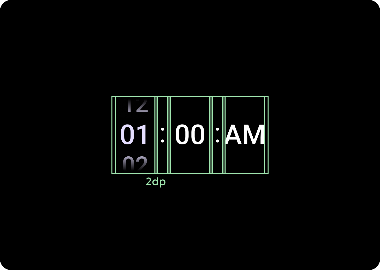
أدنى من نقطة الإيقاف التي تبلغ 225 نقطة كثافة بكسل
تباعد الأعمدة 2 نقطة كثافة
أعلى من نقطة الإيقاف التي تبلغ 225 نقطة كثافة بكسل
6 نقاط تباعد بين الأعمدة