 Google uses AI technology to translate content into your preferred language. AI translations can contain errors.
ตัวระบุหน้า
จัดทุกอย่างให้เป็นระเบียบอยู่เสมอด้วยคอลเล็กชัน
บันทึกและจัดหมวดหมู่เนื้อหาตามค่ากำหนดของคุณ

คอมโพเนนต์ HorizontalPageIndicator ใช้เพื่อแสดงหน้าเว็บที่ใช้งานอยู่ในปัจจุบันและหน้าเว็บทั้งหมดของการวางซ้อน
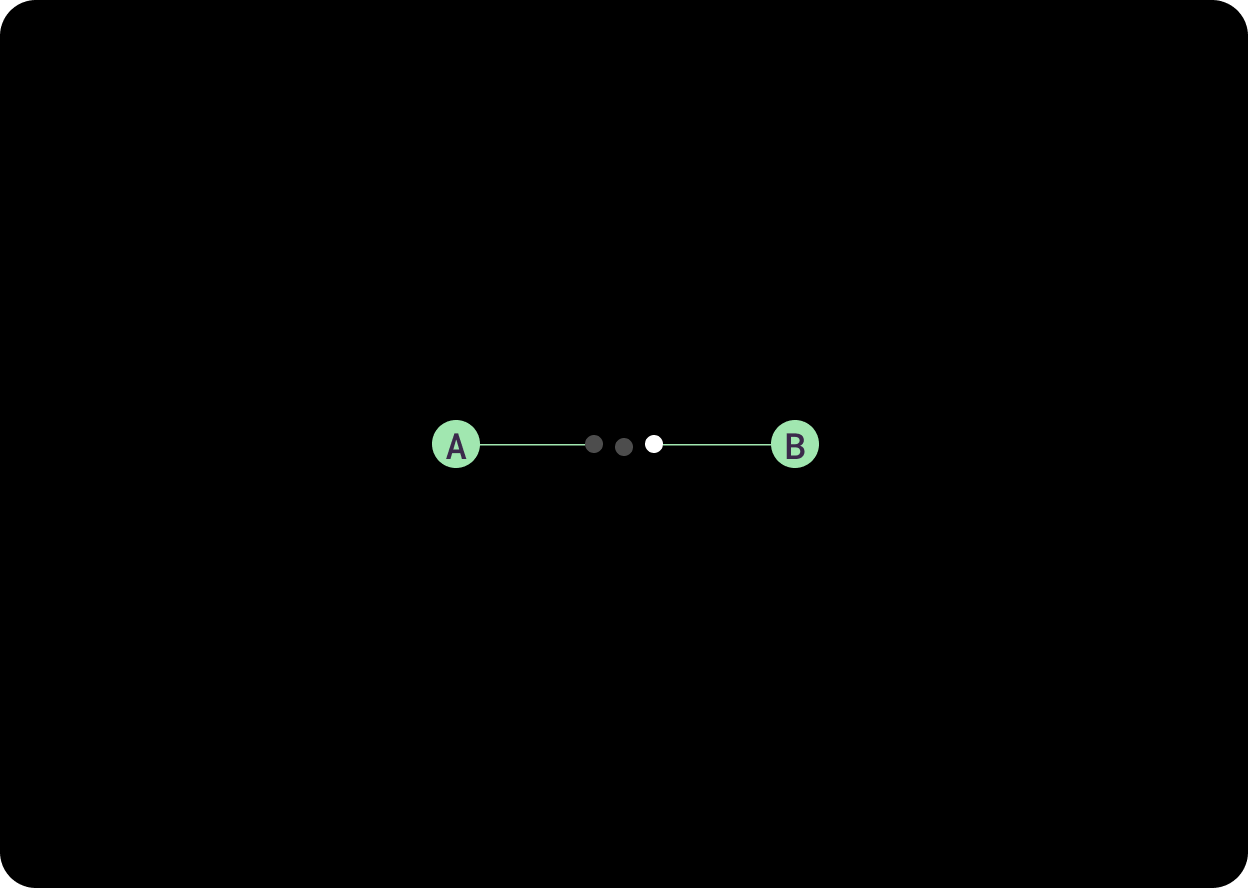
ในจอแสดงผลทรงกลม ตัวบ่งชี้หน้าเว็บจะเป็นทรงโค้ง ลักษณะการทำงานนี้ใช้ในคลาส HorizontalPageIndicator ประกอบด้วยตัวบ่งชี้ที่ใช้งานอยู่ 1 รายการและตัวบ่งชี้ที่ไม่ได้ใช้งานอย่างน้อย 1 รายการ
ก. ตัวบ่งชี้ที่ไม่ได้ใช้งาน
ข. สัญญาณบอกสถานะ "ใช้งานอยู่"
ใช้ตัวบ่งชี้เพื่อแสดงตําแหน่งในภาพสไลด์ จัดวางเนื้อหาจากซ้ายไปขวา
การใช้งาน
เลย์เอาต์แบบปรับอัตโนมัติ
ศูนย์กลางของเส้นรอบวงจุด (ตัวบ่งชี้) อยู่ใกล้หรือบนตารางกริดวงกลมเพื่อความสมดุลของภาพ ซึ่งหมายความว่ามุมโค้งจะเปลี่ยนไปเล็กน้อยเมื่อขนาดหน้าจอเพิ่มขึ้น
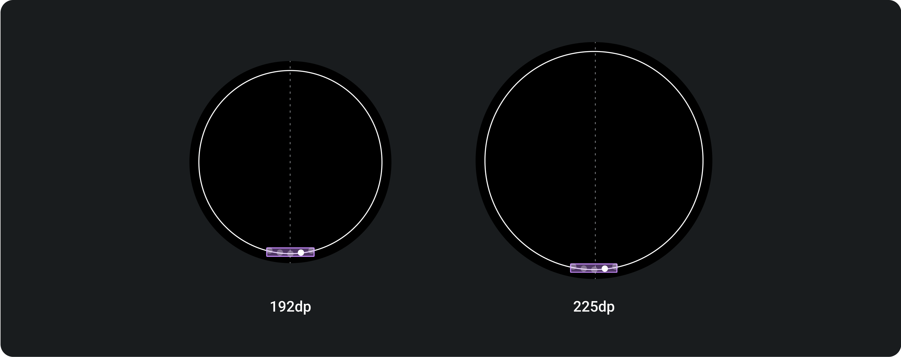
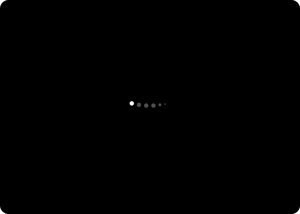
การแบ่งหน้าจะแสดงจุดสูงสุด 6 จุดเสมอ ไม่ว่าหน้าจอจะมีขนาดเท่าใดก็ตาม
ตัวอย่างเนื้อหาและโค้ดในหน้าเว็บนี้ขึ้นอยู่กับใบอนุญาตที่อธิบายไว้ในใบอนุญาตการใช้เนื้อหา Java และ OpenJDK เป็นเครื่องหมายการค้าหรือเครื่องหมายการค้าจดทะเบียนของ Oracle และ/หรือบริษัทในเครือ
อัปเดตล่าสุด 2025-07-27 UTC
[[["เข้าใจง่าย","easyToUnderstand","thumb-up"],["แก้ปัญหาของฉันได้","solvedMyProblem","thumb-up"],["อื่นๆ","otherUp","thumb-up"]],[["ไม่มีข้อมูลที่ฉันต้องการ","missingTheInformationINeed","thumb-down"],["ซับซ้อนเกินไป/มีหลายขั้นตอนมากเกินไป","tooComplicatedTooManySteps","thumb-down"],["ล้าสมัย","outOfDate","thumb-down"],["ปัญหาเกี่ยวกับการแปล","translationIssue","thumb-down"],["ตัวอย่าง/ปัญหาเกี่ยวกับโค้ด","samplesCodeIssue","thumb-down"],["อื่นๆ","otherDown","thumb-down"]],["อัปเดตล่าสุด 2025-07-27 UTC"],[],[]]
