תיבות דו-שיח
קל לארגן דפים בעזרת אוספים
אפשר לשמור ולסווג תוכן על סמך ההעדפות שלך.
אפשר להשתמש בDialog
כדי למקד את תשומת הלב של המשתמשים בפעולה או במידע רלוונטי.

אנטומיה
תיבת דו-שיח צריכה להופיע בתגובה למשימה או לפעולה של המשתמש, עם מידע רלוונטי או מידע לפי הקשר. בניגוד לדו-שיח בנייד, תיבת הדו-שיח ב-Wear OS תופסת את כל המסך ומופיעה בשכבה מעל תוכן אחר.
תיבת הדו-שיח תומכת בתנועת החלקה כדי לסגור. כשהמשתמש מבצע את מחווה החלקה הזו, המערכת חושפת את תוכן ההורה ברקע.
לתיבות דו-שיח יש משבצת אחת לתוכן של תיבת דו-שיח עם דעה, כמו
אזהרה או אישור.
התראה
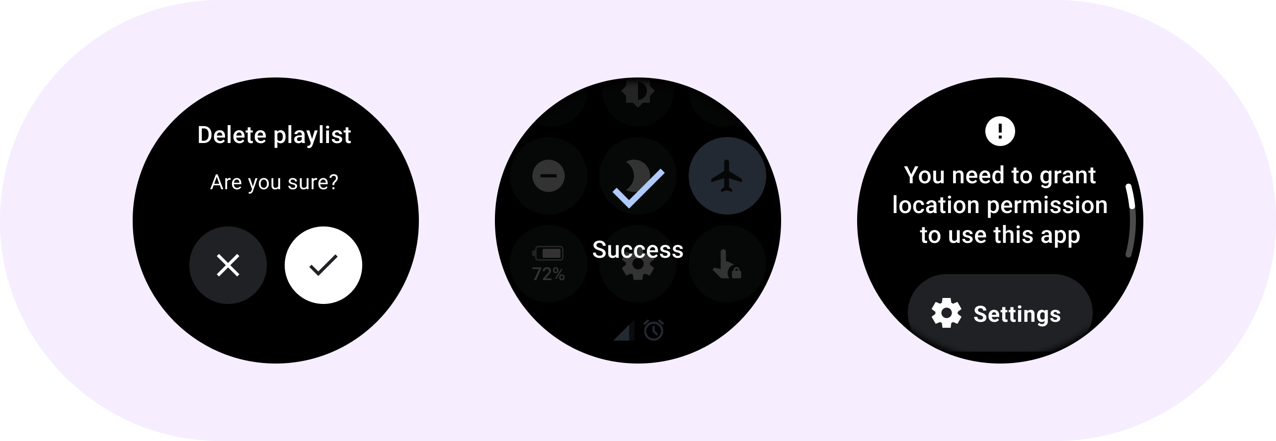
שימוש ברכיב התראה כדי לקבל את התשובה של המשתמש למשימות חשובות.
ההתראות משביתות את כל הפונקציונליות של האפליקציה כשהן מופיעות, והן נשארות במסך עד שמבצעים פעולה כלשהי. ההתראות נועדו להפריע בכוונה, ולכן צריך להשתמש בהן במשורה.
אם תוכן ההתראה ארוך יותר משלוש שורות טקסט, מומלץ לרכז את התוכן בצד ימין כדי שיהיה קל יותר לקרוא אותו. אחרת, הטקסט מיושר למרכז כברירת מחדל.
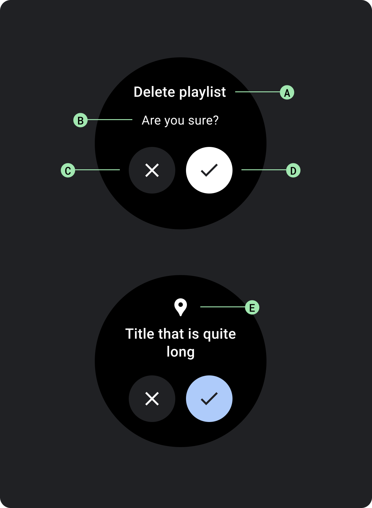
א. שם
ב. תוכן (אופציונלי)
ג. כפתור שלילי
ד. לחצן חיובי
ה. סמל (אופציונלי)
Confirmation
רכיב האישור מציג למשתמשים הודעת אישור לזמן קצר. בניגוד לרכיב האישור ב-Material, רכיב האישור ב-Wear OS לא מאפשר למשתמשים לספק אישור סופי של בחירה.
אפשר להשתמש ברכיב הזה כדי למשוך את תשומת הלב של המשתמש אחרי ביצוע פעולה.
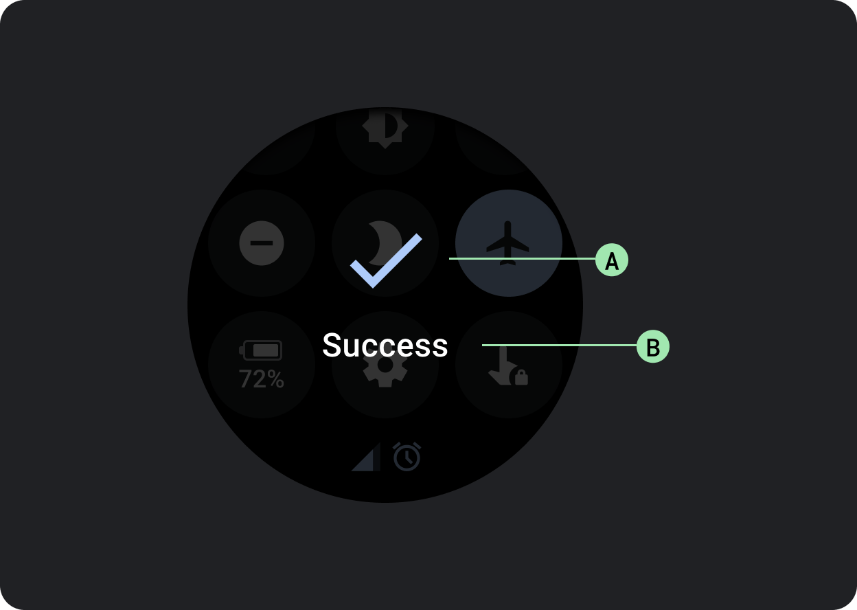
א. סמל
ב. תווית
דוגמאות התוכן והקוד שבדף הזה כפופות לרישיונות המפורטים בקטע רישיון לתוכן. Java ו-OpenJDK הם סימנים מסחריים או סימנים מסחריים רשומים של חברת Oracle ו/או של השותפים העצמאיים שלה.
עדכון אחרון: 2025-07-27 (שעון UTC).
[[["התוכן קל להבנה","easyToUnderstand","thumb-up"],["התוכן עזר לי לפתור בעיה","solvedMyProblem","thumb-up"],["סיבה אחרת","otherUp","thumb-up"]],[["חסרים לי מידע או פרטים","missingTheInformationINeed","thumb-down"],["התוכן מורכב מדי או עם יותר מדי שלבים","tooComplicatedTooManySteps","thumb-down"],["התוכן לא עדכני","outOfDate","thumb-down"],["בעיה בתרגום","translationIssue","thumb-down"],["בעיה בדוגמאות/בקוד","samplesCodeIssue","thumb-down"],["סיבה אחרת","otherDown","thumb-down"]],["עדכון אחרון: 2025-07-27 (שעון UTC)."],[],[],null,["# Dialogs\n\nUse a [`Dialog`](/reference/kotlin/androidx/wear/compose/material/dialog/package-summary) to focus users' attention on a timely action or piece of\ninformation.\n\nAnatomy\n-------\n\n\nDialogs should appear in response to a user task or an action, with\nrelevant or contextual information. Unlike their mobile counterparts,\nDialogs in Wear OS occupy the whole screen and are layered over other\ncontent.\n\n\nDialogs support a swipe-to-dismiss gesture. When the user performs\nthis swipe gesture, the system reveals the parent content in the\nbackground.\n\nDialogs have a single slot for opinionated dialog content, such as an\n[Alert](/reference/kotlin/androidx/wear/compose/material/dialog/package-summary#Alert(kotlin.Function1,kotlin.Function0,kotlin.Function0,androidx.compose.ui.Modifier,kotlin.Function1,androidx.wear.compose.material.ScalingLazyListState,androidx.compose.ui.graphics.Color,androidx.compose.ui.graphics.Color,androidx.compose.ui.graphics.Color,androidx.compose.ui.graphics.Color,androidx.compose.foundation.layout.Arrangement.Vertical,androidx.compose.foundation.layout.PaddingValues,kotlin.Function1)) or\n[Confirmation](/reference/kotlin/androidx/wear/compose/material/dialog/package-summary#Confirmation(kotlin.Function0,androidx.compose.ui.Modifier,kotlin.Function1,androidx.wear.compose.material.ScalingLazyListState,kotlin.Long,androidx.compose.ui.graphics.Color,androidx.compose.ui.graphics.Color,androidx.compose.ui.graphics.Color,androidx.compose.foundation.layout.Arrangement.Vertical,androidx.compose.foundation.layout.PaddingValues,kotlin.Function1)).\n\n\u003cbr /\u003e\n\n\n**Alert**\n\nUse an alert component to get the user's response for important\ntasks.\n\nAlerts disable all app functionality when they appear, and remain on\nscreen until an action has been taken. Alerts are purposefully interruptive,\nso use them sparingly.\n\nIf the content of the alert is longer than three lines of text, consider\nleft aligning the content to improve its readability. Otherwise the text\nis center aligned by default.\n\n\n**A. Title\nB. Content (optional)\nC. Negative button\nD. Positive button\nE. Icon (optional)**\n\n\u003cbr /\u003e\n\n**Confirmation**\n\nThe confirmation component displays a confirmation message to the user\nfor a short period of time. Unlike its Material counterpart, the\nconfirmation component in Wear OS doesn't allow users to provide final\nconfirmation of a choice.\n\nUse this component to capture a user's attention after an action has been\nexecuted.\n\n\n**A. Icon\nB. Label**"]]