
משתמשים ברכיב לחצן לפעולות שהמשתמשים מבינים היטב ולא צריך להוסיף להן תווית טקסט. הלחצנים נבדלים מהצ'יפים בכך שהם עגולים.
אנטומיה
א. תוכן
לכפתורים יש חריץ אחד שמוגדר לשימוש בסמל או בטקסט. בוחרים סמל שרלוונטי לפעולה שהלחצן מבצע. אם אי אפשר לתאר את הפעולה הרלוונטית באמצעות סמל, אפשר להשתמש בטקסט של עד שלושה תווים. כדאי להשתמש ברכיב צ'יפ אם אי אפשר לתאר בבירור את הפעולה באמצעות סמל
ב. מאגר
קונטיינרים של לחצנים מוגבלים למילוי בצבע אחיד אחד.
סוגי לחצנים
לחצנים קומפקטיים
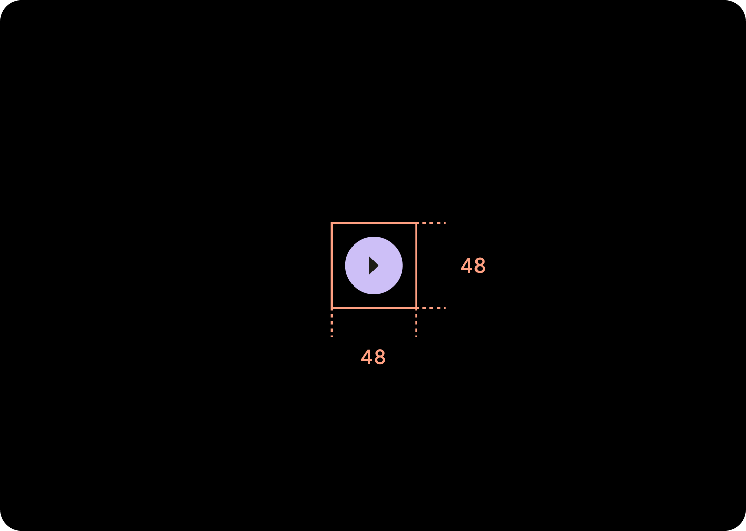
לחצנים קומפקטיים נראים קטנים יותר, אבל יש להם אזור גדול יותר שניתן להקיש עליו. ברירת המחדל של אזור הקשה היא 48x48 dp.
היררכיה
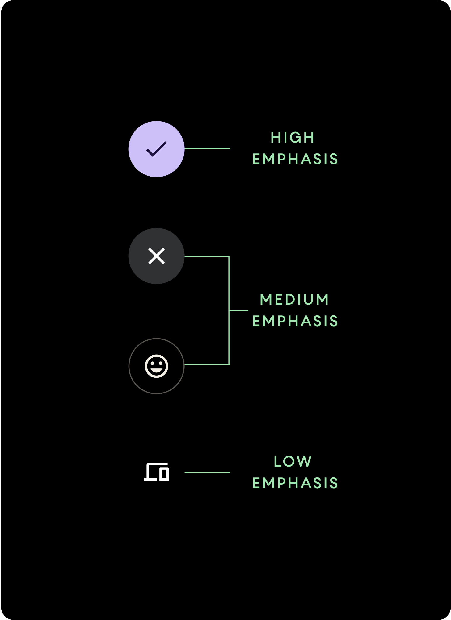
כדאי להשתמש במילוי בצבעים שונים כדי לציין את היררכיית הלחצנים.
דגש גבוה
לחצנים עם הדגשה חזקה מכילים פעולות שהן עיקריות לאפליקציה. לחצנים עם הדגשה חזקה צריכים להיות בצבע ראשי או משני למארז, ובצבע ראשי או משני לתוכן. מידע נוסף זמין במאמר עיצוב לפי נושאים ב-Material Design ל-Wear.
דגש בינוני
כפתורים עם הדגשה ברמה בינונית נבדלים על ידי מילוי בצבע פחות מנוגד. הם מכילים פעולות שפחות חשובות מהפעולות הראשיות. משתמשים בצבע 'פני השטח' למאגר ובצבע 'בפני השטח' לתוכן.
לחלופין, אפשר להשתמש ברכיב המותאם אישית OutlinedButton כדי ליצור לחצן הדגשה ברמה בינונית. הוא כולל רקע שקוף, קו בצבע של וריאנט ראשי בשקיפות של 60% ותוכן בצבע ראשי.
דגש נמוך (סמל בלבד)כפתורים עם דגש נמוך נבדלים בכך שאין להם מילוי. הן מתאימות במיוחד לאזורים קטנים יותר בתצוגת השעון שבהם צריך סידור קומפקטי. משתמשים בצבע 'בממשק' לתוכן.
גדלים
אפשר להשתמש בכפתורים בגדלים שונים כדי להדגיש פעולות או להפחית את הדגשתן.
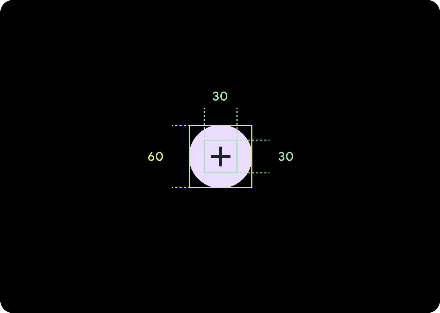
גדול
סמל (30 x 30 dp)
מאגר (60 x 60 dp)
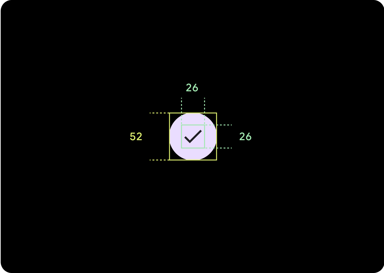
ברירת מחדל
סמל (26 x 26 dp)
מאגר (52 x 52 dp)
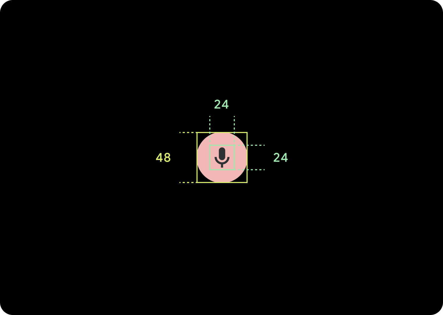
קטן
סמל (24 x 24 dp)
קונטיינר (48 x 48 dp)
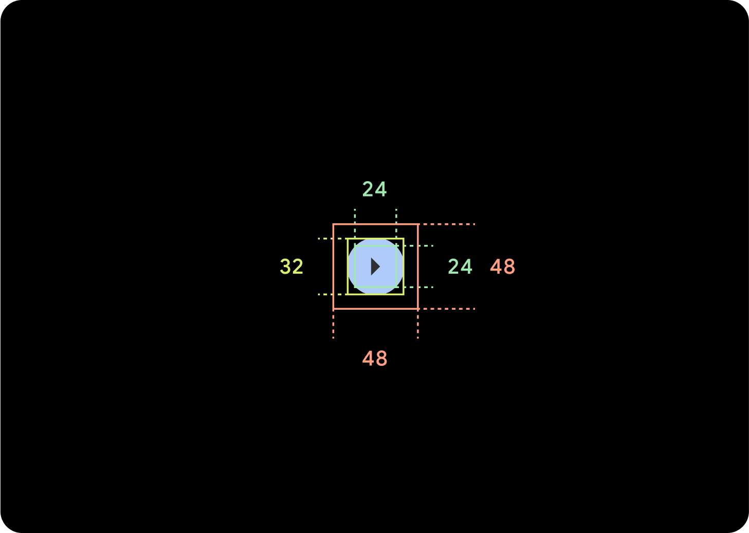
אקסטרה-סמול
סמל (24 x 24 dp)
מאגר (32 x 32 dp)
מומלץ להוסיף עוד רווח מסביב לכפתור הזה כדי ליצור יעד הקשה בגודל של לפחות 48dp. זהו הגודל המינימלי של יעד ההקשה שלנו לשם נגישות.
שימוש
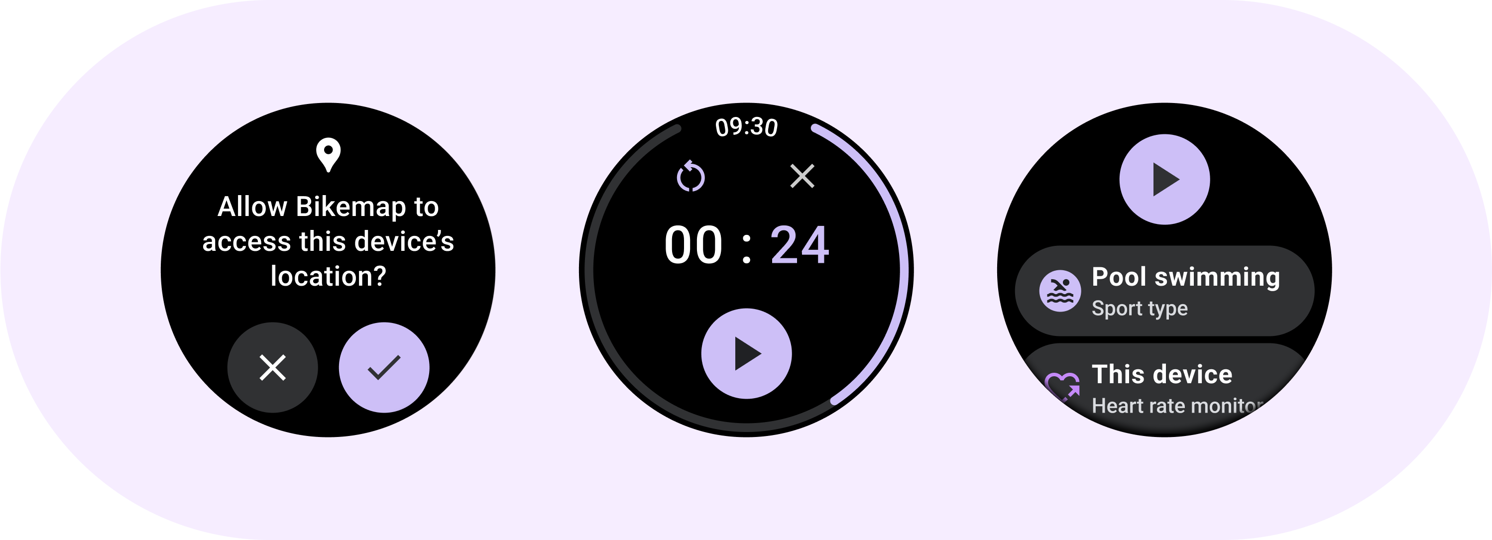
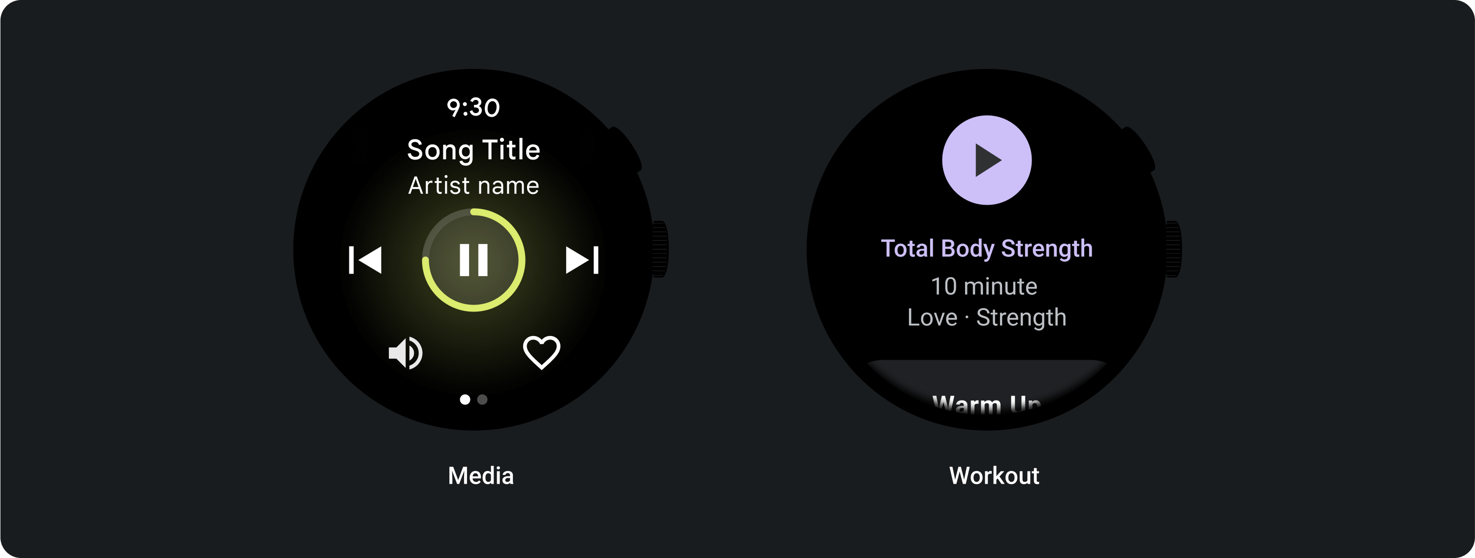
כדאי להשתמש בלחצנים רגילים כדי לאפשר למשתמש לבצע פעולה אחת, כמו קבלה או דחייה של שיחה או הפעלת טיימר.
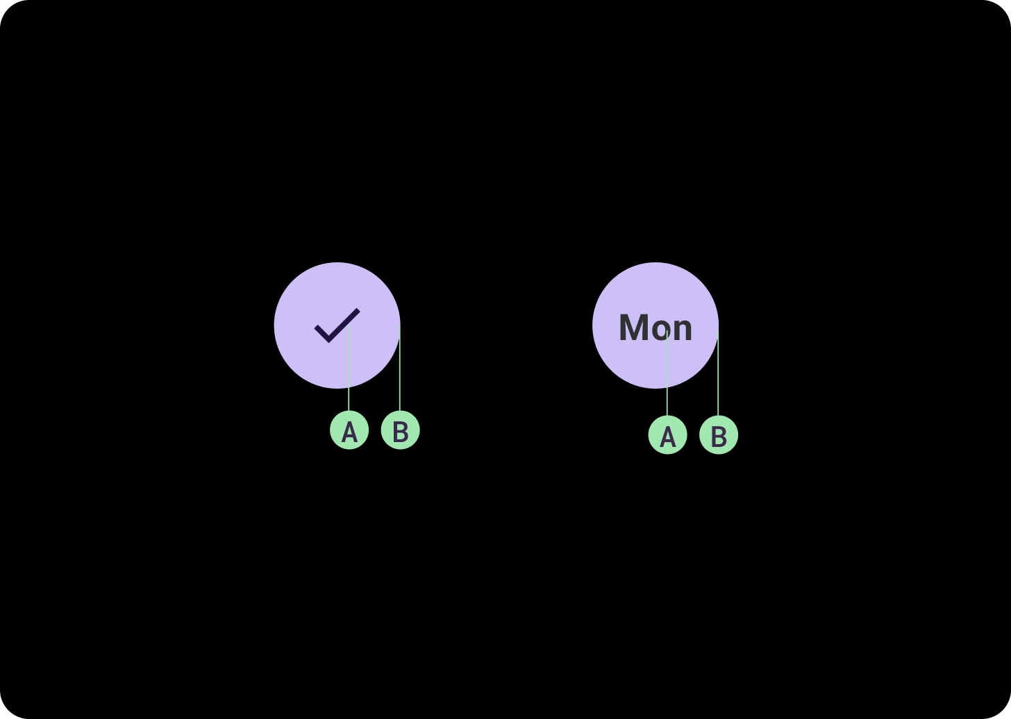
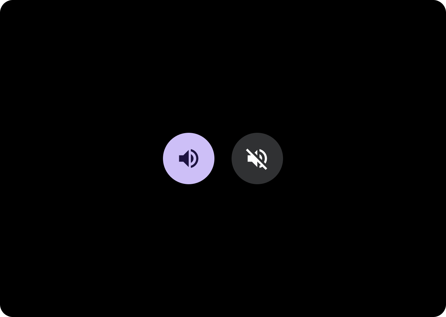
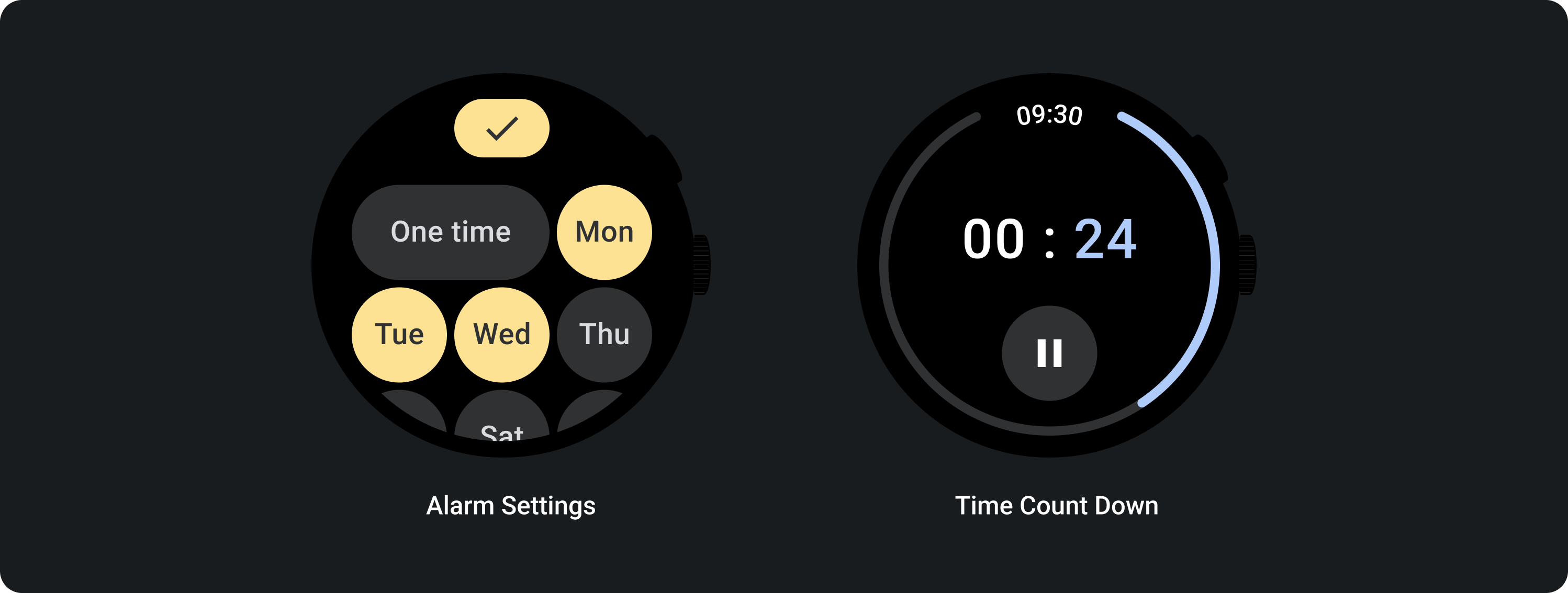
אפשר להשתמש בלחצני החלפת מצב כדי לאפשר למשתמש להפעיל או להשבית אפשרות, למשל לבחור ימים בשבוע ולהסיר את הבחירה שלהם, או להשהות ולחדש את הטיימר.
פריסות דינמיות
התנהגות תגובה
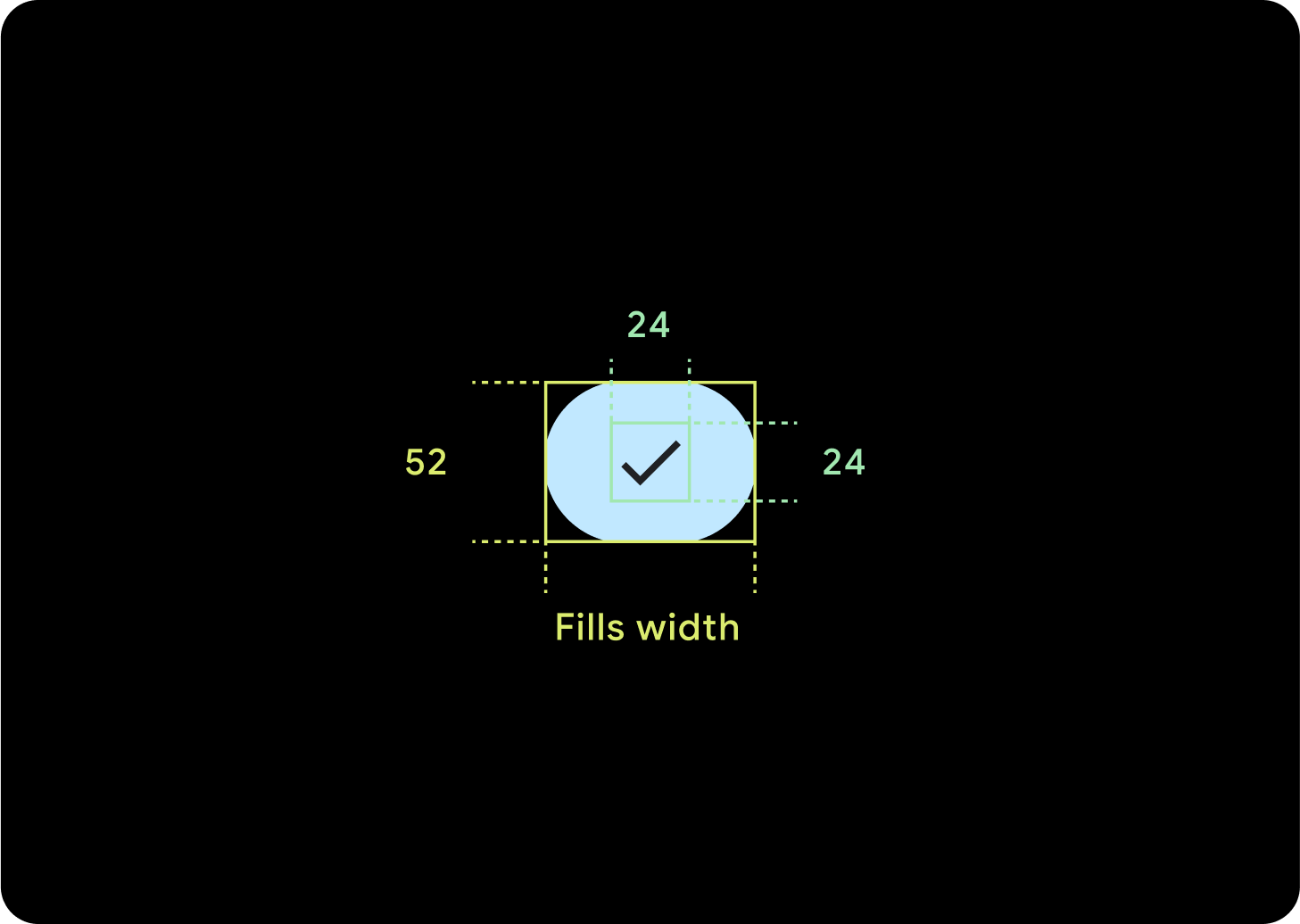
לחצן אחד
המילוי הפנימי יישאר ללא שינוי, והשוליים צריכים להיות בפרמטרים של אחוזים כדי למנוע מתיחה מוגזמת של הלחצנים ולשמור על גודל יחסי.
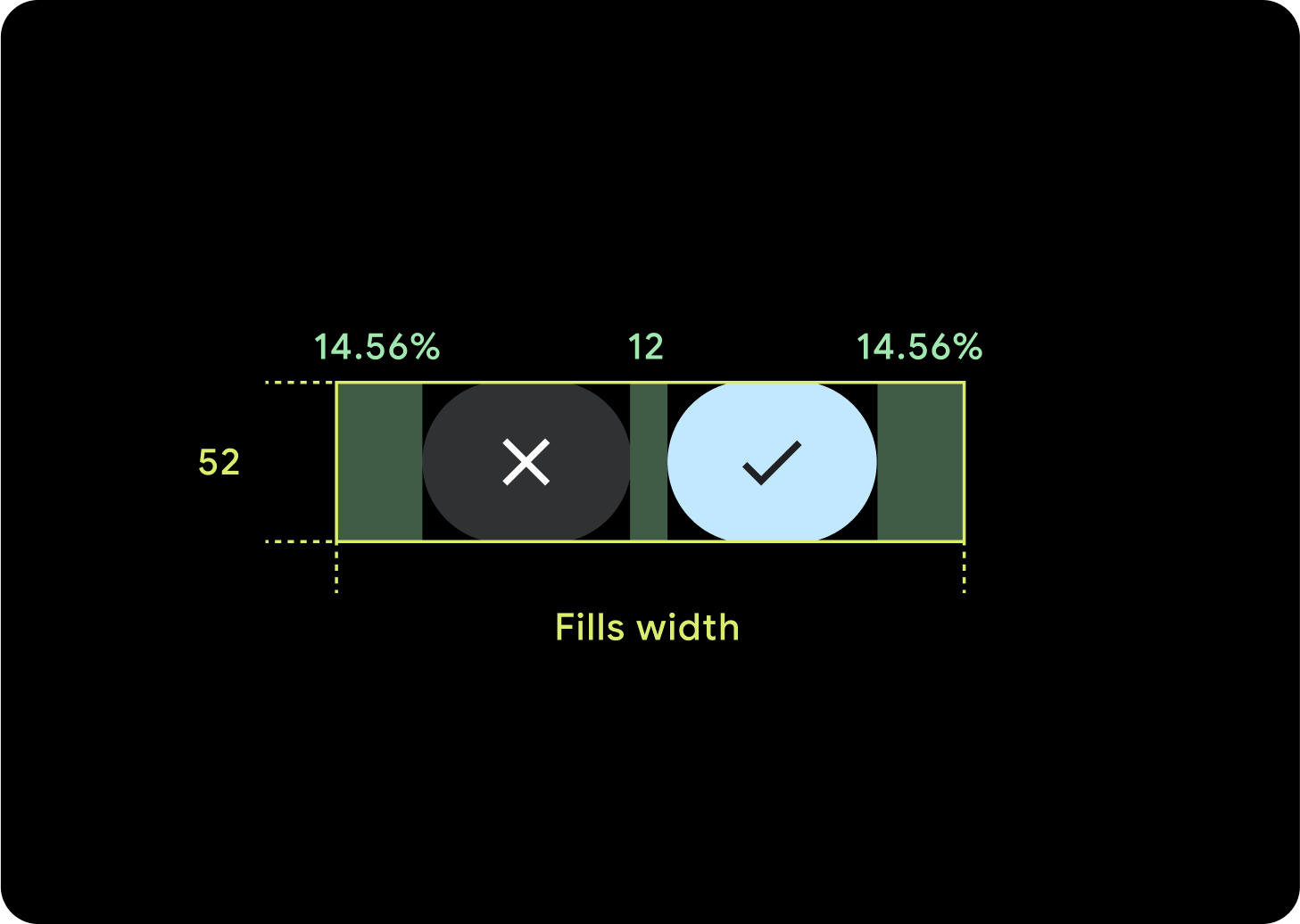
2 לחצנים
כשיש 2 לחצנים, מתווספים שוליים פנימיים באחוזים כדי למנוע מתיחה מוגזמת של הלחצנים ולשמור על גודל יחסי.
IME
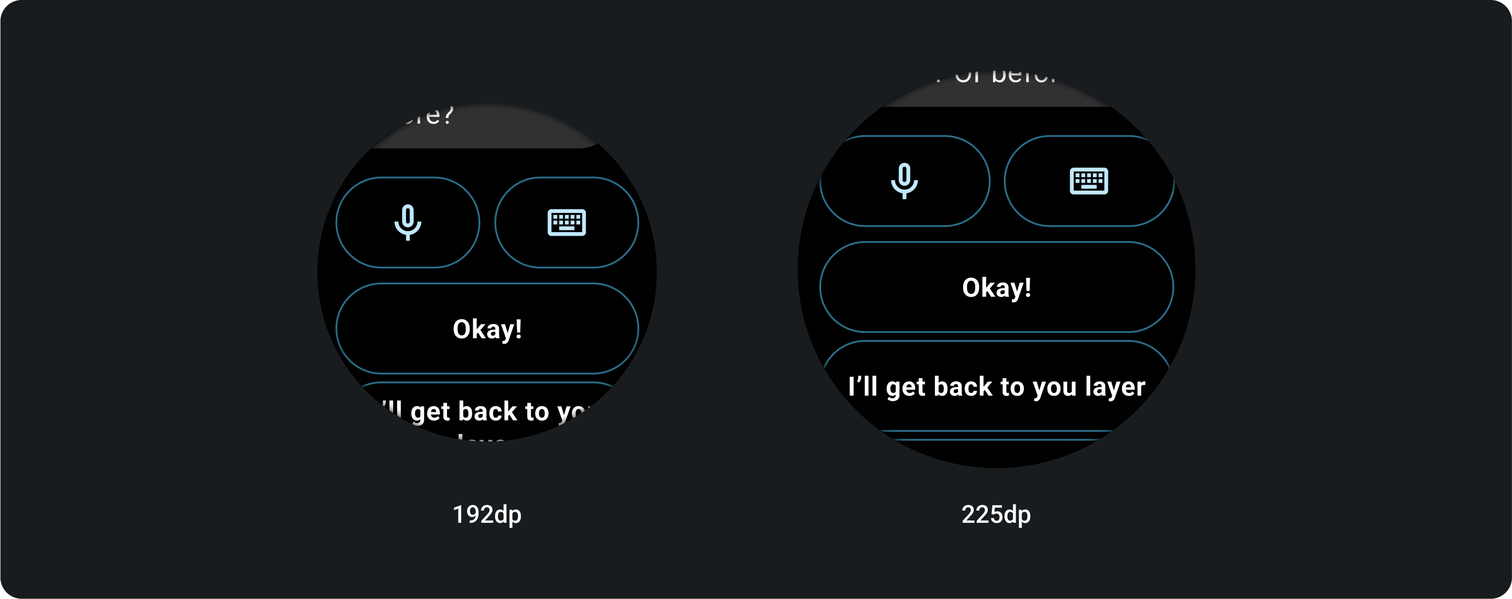
1 או 2 כפתורים
IME עם 2 לחצנים נעולים או עם לחצן נעול אחד תמיד נמתחים עד לשוליים הצדדיים, ללא קשר לגודל המסך.
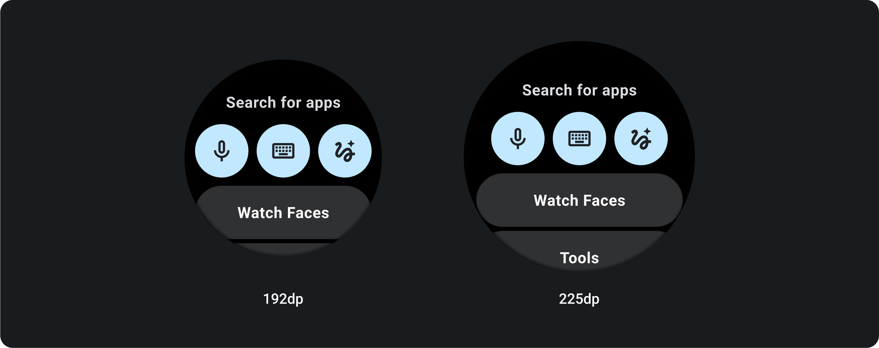
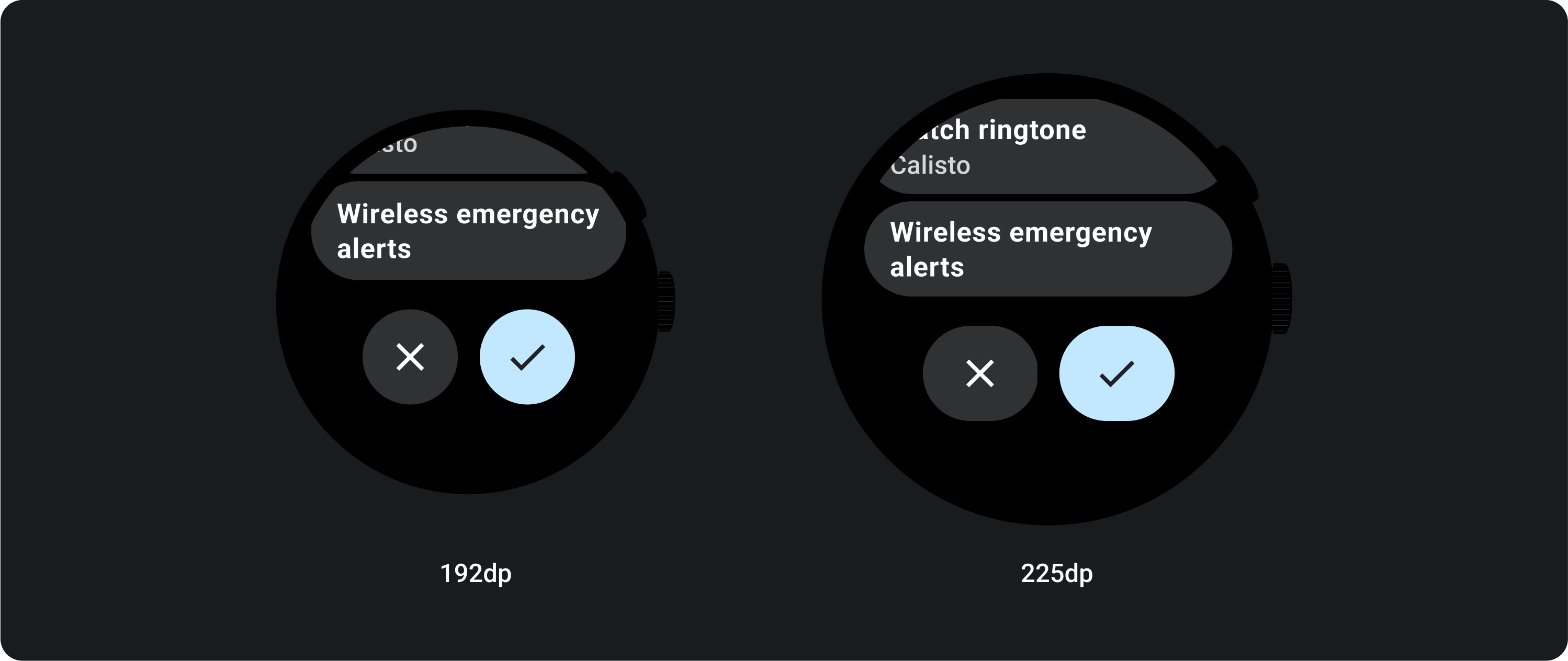
3 לחצנים
במסכים קטנים מ-225dp, הלחצנים נשארים עגולים ולא נמתחים. במסכים גדולים יותר, בגודל 225dp או יותר, הלחצנים נמתחים עד לשוליים הצדדיים.