
استخدِم مكوّن زر للإجراءات التي يفهمها المستخدمون جيدًا ولا تحتاج إلى تصنيف نصي. تتميز الأزرار عن الشرائح بشكلها الدائري.
علم التشريح
(أ). المحتوى
تحتوي الأزرار على خانة واحدة مخصّصة لرمز أو نص. اختَر رمزًا ذا صلة بالإجراء الذي يؤديه الزر. يمكنك استخدام نص يتألّف من ثلاثة أحرف كحدّ أقصى إذا لم يكن بإمكان الرمز وصف الإجراء ذي الصلة. ننصحك باستخدام مكوّن شريحة إذا لم يكن بإمكان الرمز وصف الإجراء بوضوح.
(ب). الحاوية
تقتصر حاويات الأزرار على تعبئة لون واحد ممزوج.
أنواع الأزرار
الأزرار المكثّفة
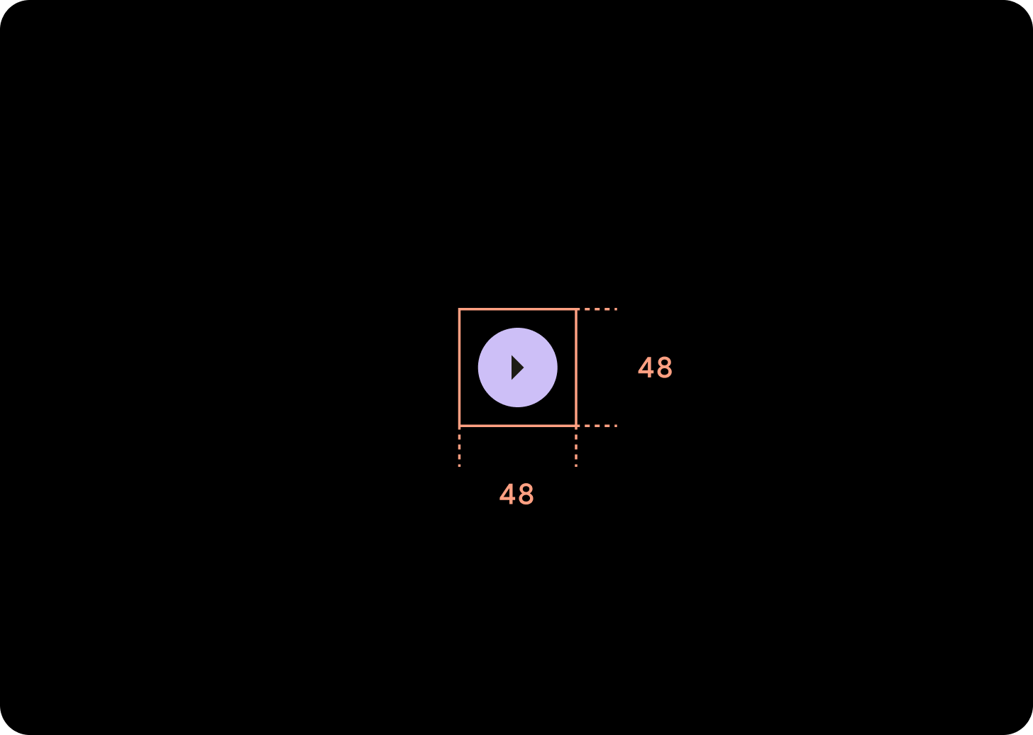
تظهر الأزرار المكثفة أصغر حجمًا، ولكنّها توفّر مساحة أكبر يمكن النقر عليها. تكون المساحة التلقائية التي يمكن النقر عليها 48×48 dp.
تسلسل هرمي
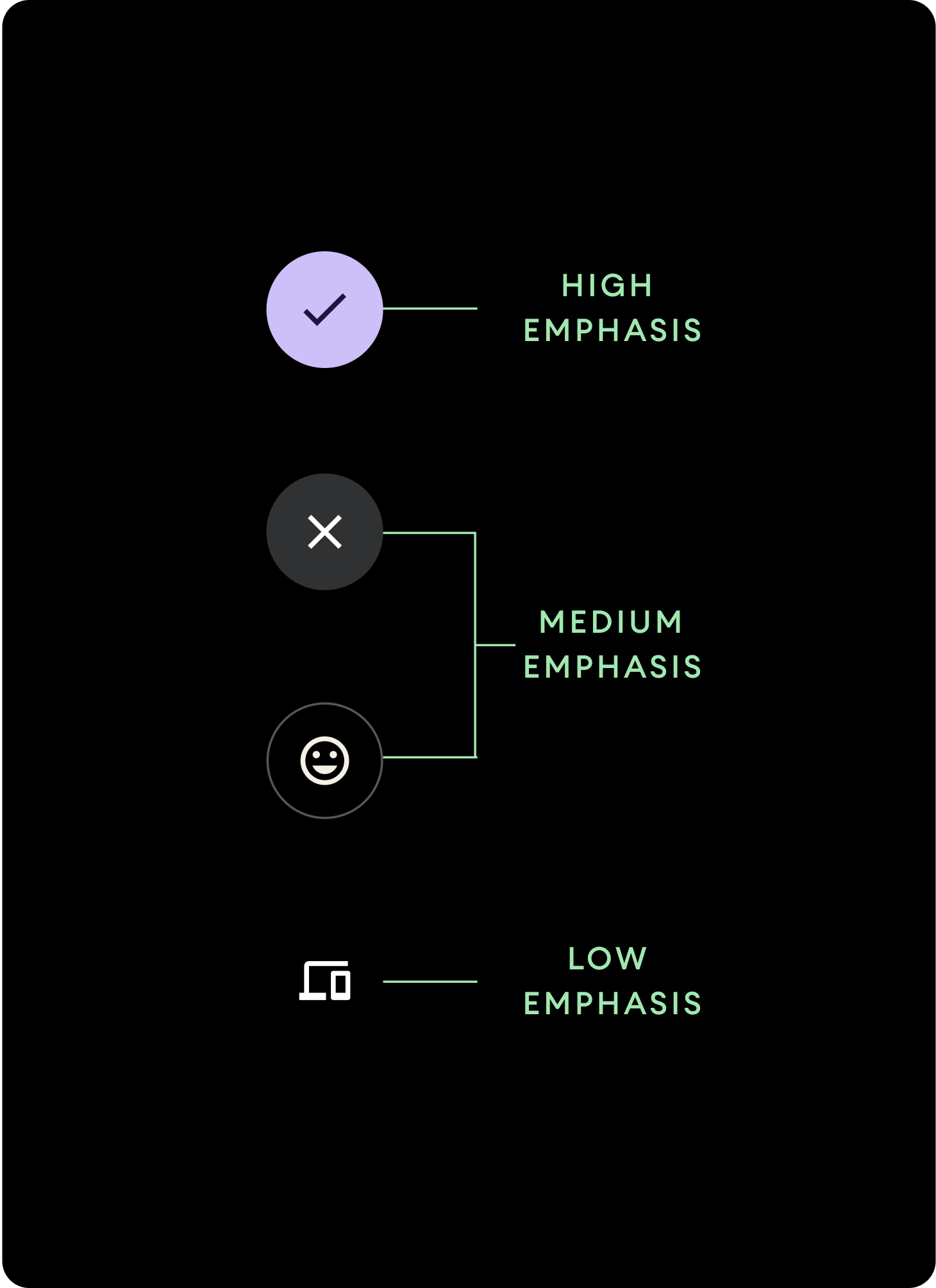
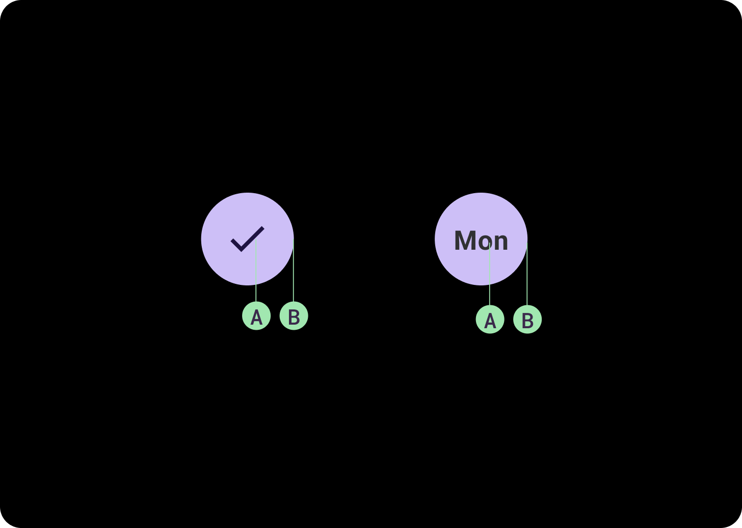
استخدِم ألوانًا مختلفة لملء الأزرار للإشارة إلى التسلسل الهرمي للزر.
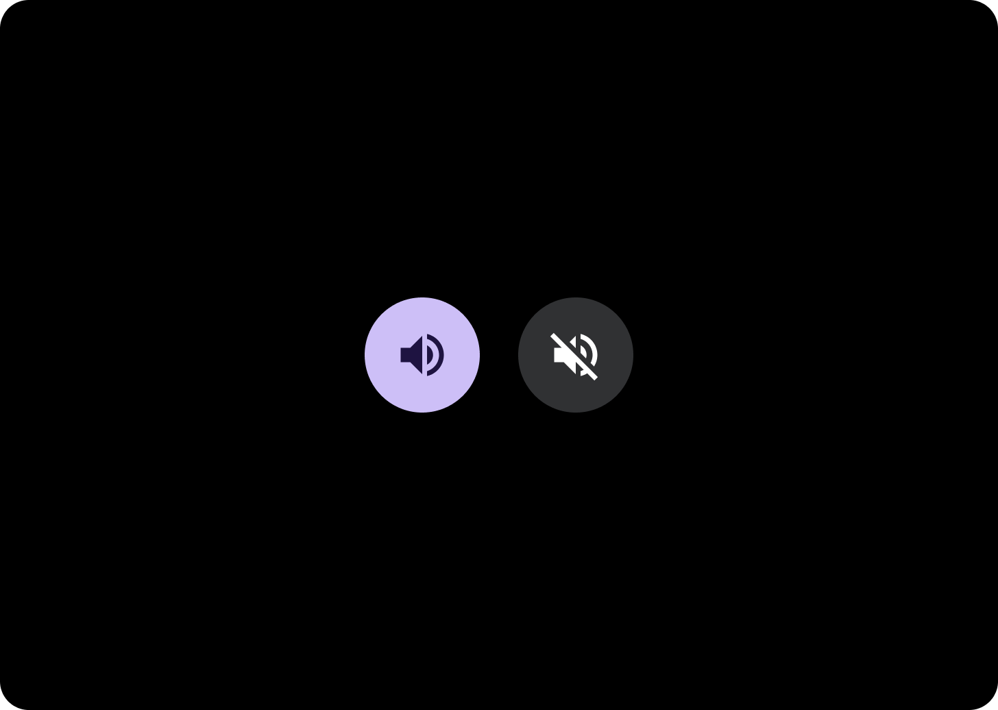
تركيز عالٍ
تحتوي الأزرار التي تُبرز المحتوى على إجراءات أساسية للتطبيق. بالنسبة إلى الأزرار التي تُبرز المحتوى، استخدِم الألوان الأساسية أو الثانوية للحاوية والألوان "مفعَّل" و"غير مفعَّل" للمحتوى. لمزيد من المعلومات، يُرجى الاطّلاع على استخدام مظاهر Material Design على Wear OS.
إبراز متوسط
تتميز الأزرار ذات التأكيد المتوسط بملء لون أقل تباينًا. وتحتوي على إجراءات أقل أهمية من الإجراءات الأساسية. استخدِم لون السطح للحاوية ولون "على السطح" للمحتوى.
بدلاً من ذلك، استخدِم المكوّن المخصّص OutlinedButton لزر يُبرز العنصر بدرجة متوسطة. يحتوي هذا التصميم على خلفية شفافة، وخطّ أساسي بدرجة تشويش 60%، ومحتوى بلون أساسي.
مستوى منخفض من التركيز (الرمز فقط)تتميز الأزرار ذات الأهمية المنخفضة بعدم استخدام أيّ لون تعبئة. وهي مناسبة بشكلٍ أفضل للمناطق الأصغر حجمًا على خلفية شاشة الساعة حيث تكون هناك حاجة إلى ترتيب مكثّف. استخدِم اللون "على السطح" للمحتوى.
الأحجام
استخدِم أزرارًا بأحجام مختلفة لتسليط الضوء على الإجراءات أو عدم تسليط الضوء عليها.
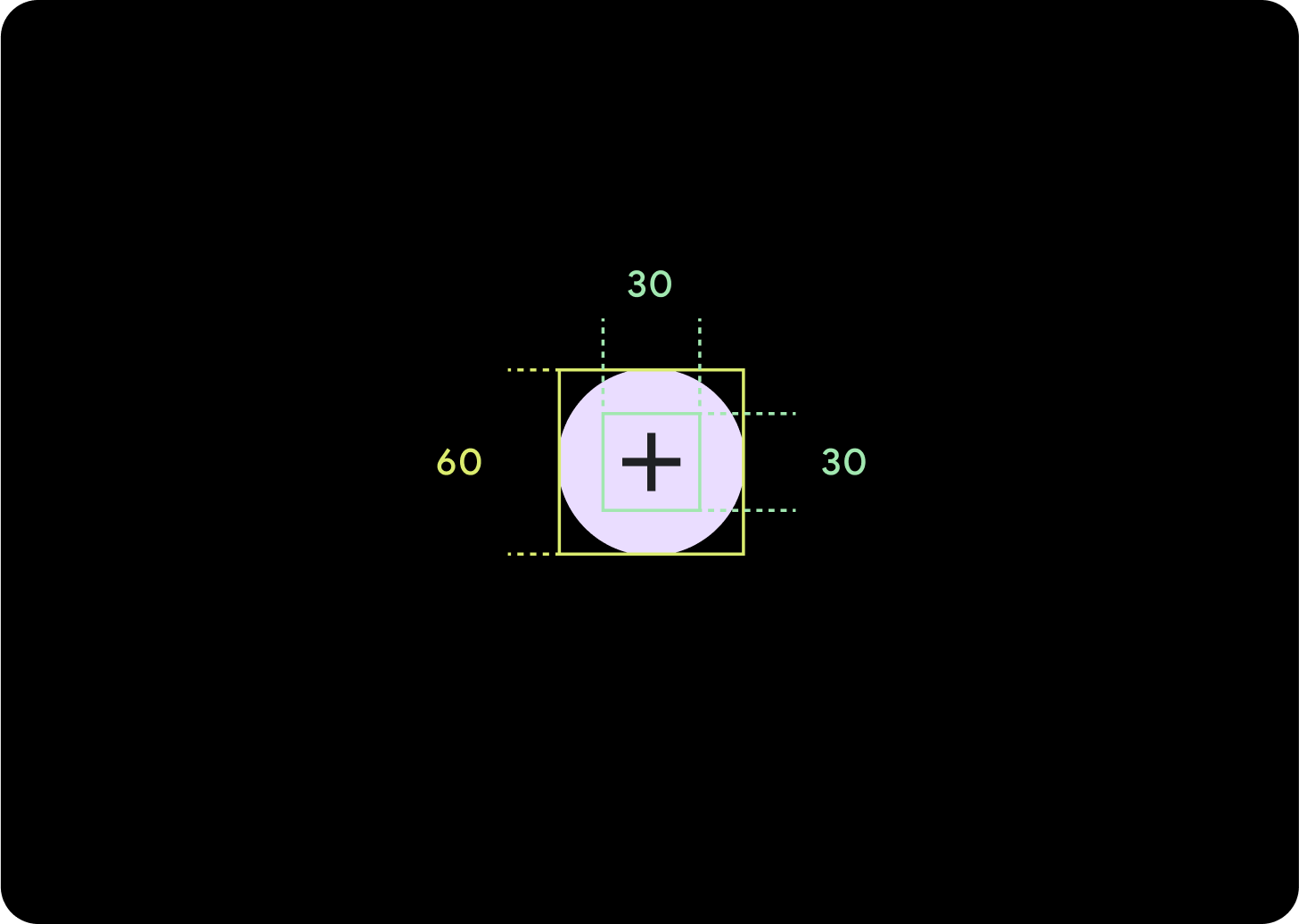
كبير
الرمز (30 x 30 dp)
الحاوية (60 x 60 dp)
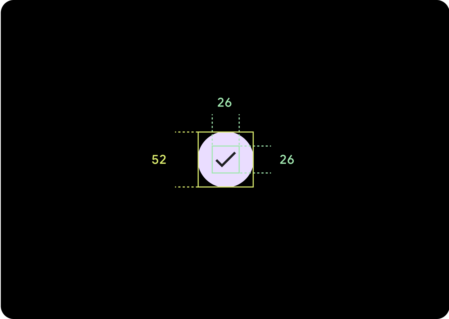
إعداد تلقائي
الرمز (26 x 26 dp)
الحاوية (52 x 52 dp)
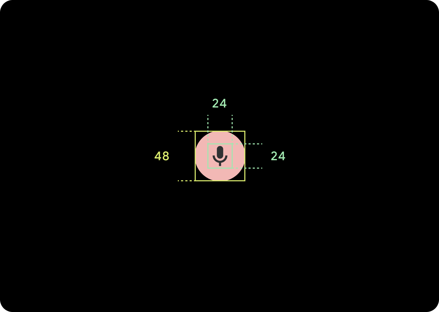
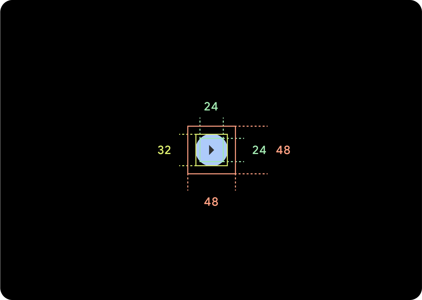
صغير
الرمز (24 x 24 dp)
الحاوية (48 x 48 dp)
صغير جدًا
الرمز (24 x 24 dp)
الحاوية (32 x 32 dp)
ننصحك بإضافة مساحة إضافية حول هذا الزرّ لإنشاء هدف لمس بحجم 48 dp على الأقل. هذا هو الحد الأدنى لحجم هدف النقر من أجل تسهيل الاستخدام.
الاستخدام
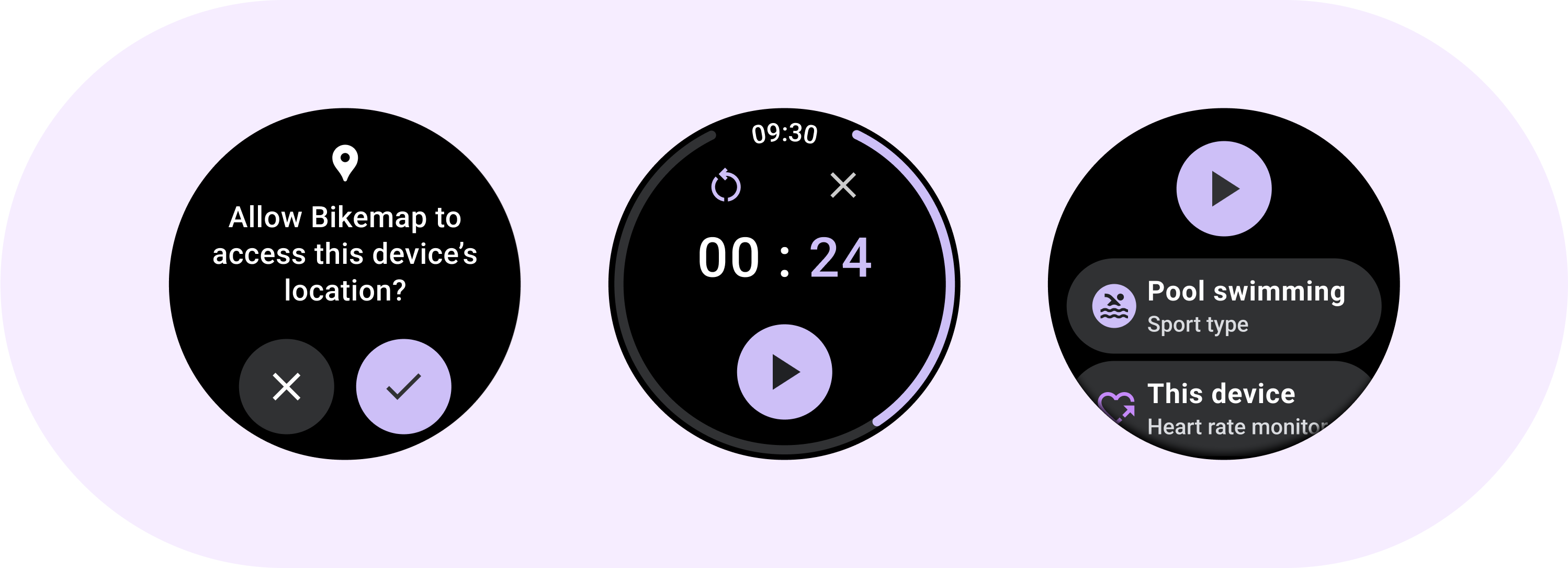
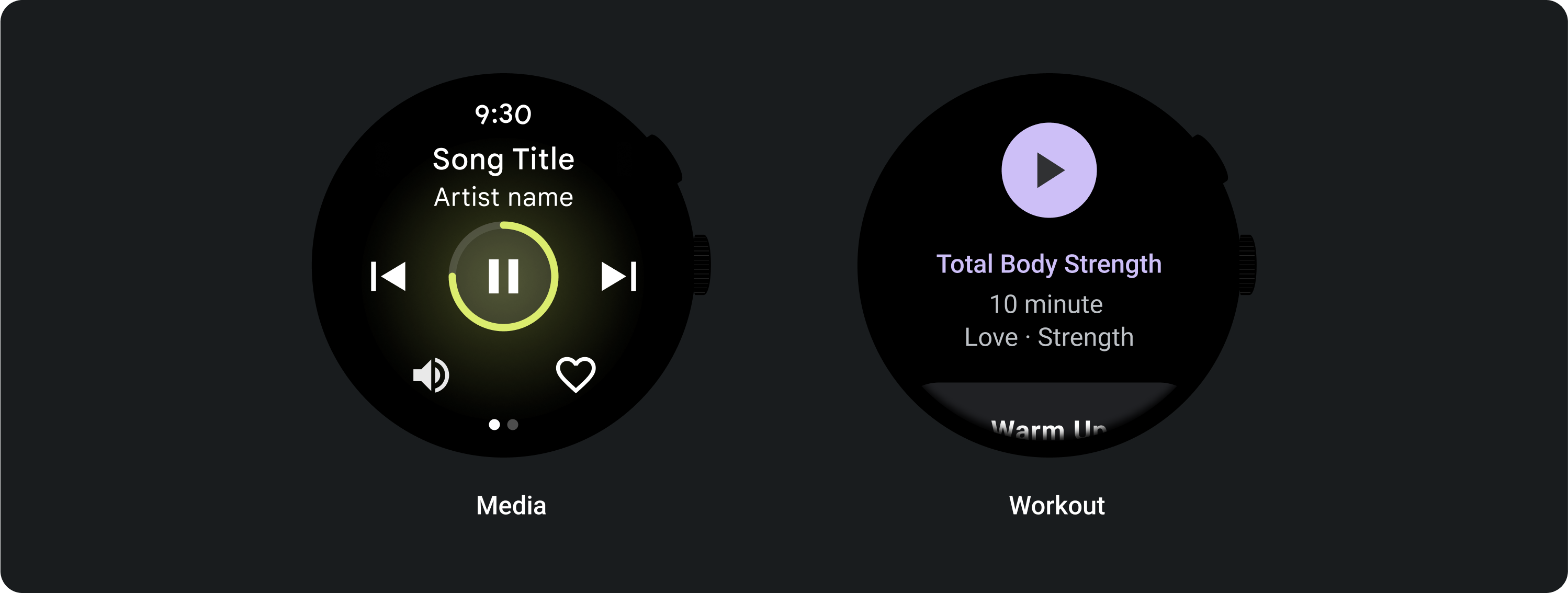
استخدِم الأزرار العادية لتمكين المستخدم من اتّخاذ إجراء واحد، مثل قبول مكالمة أو رفضها أو بدء موقّت.
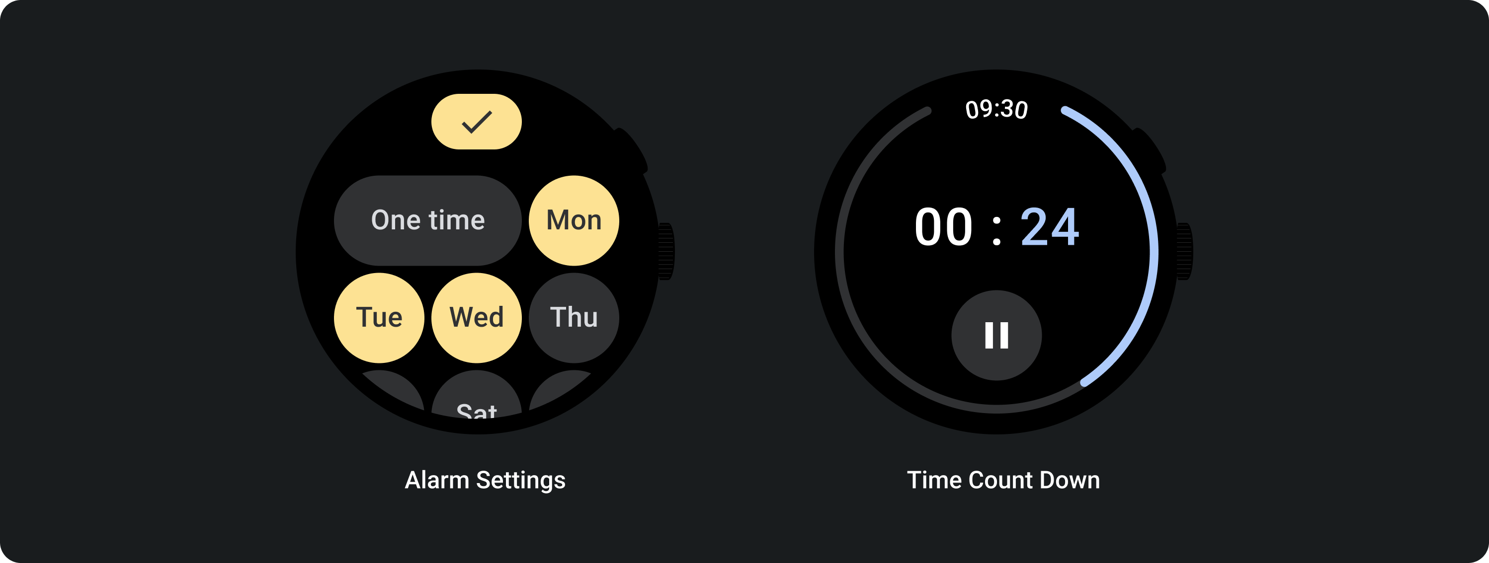
استخدِم أزرار الإيقاف/التفعيل للسماح للمستخدم بتفعيل خيار أو إيقافه، مثل اختيار أيام الأسبوع وإلغاء اختيارها أو إيقاف مؤقت ومُجدوَل لوقت معيّن وإعادة تشغيله.
التنسيقات التكيُّفية
السلوك الاستباقي
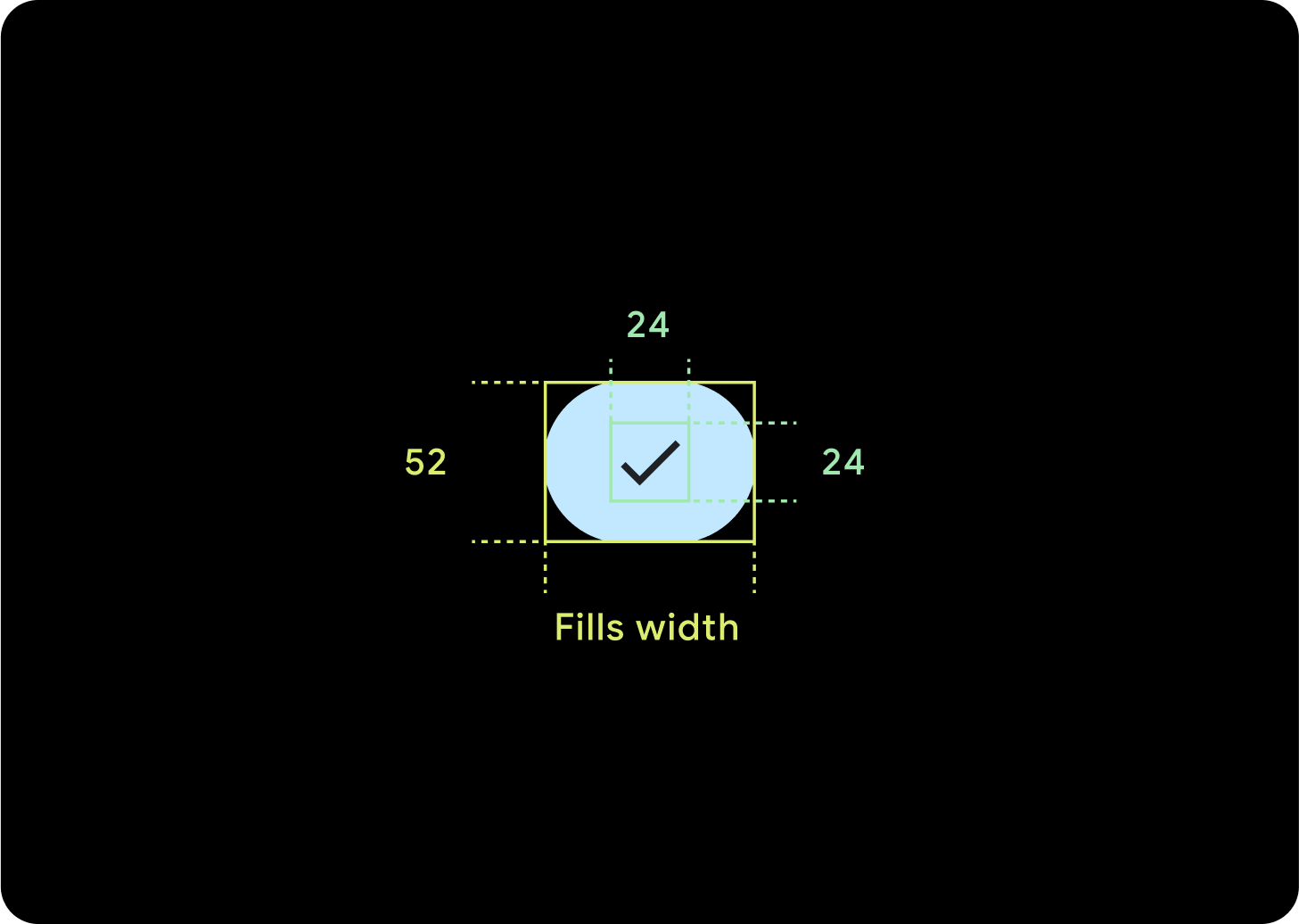
زر واحد
سيظلّ الحشو الداخلي كما هو، ويجب أن تكون الهوامش نسبًا مئوية لمنع تمديد الأزرار أكثر من اللازم والحفاظ على حجم نسبي.
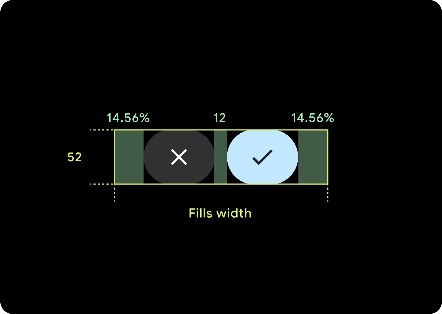
زرَّان
عندما يكون هناك زران، تتم إضافة الهوامش الداخلية كنسبة مئوية لمنع تمديد الأزرار أكثر من اللازم والحفاظ على حجم نسبي.
برامج معالجة النصوص (IME)
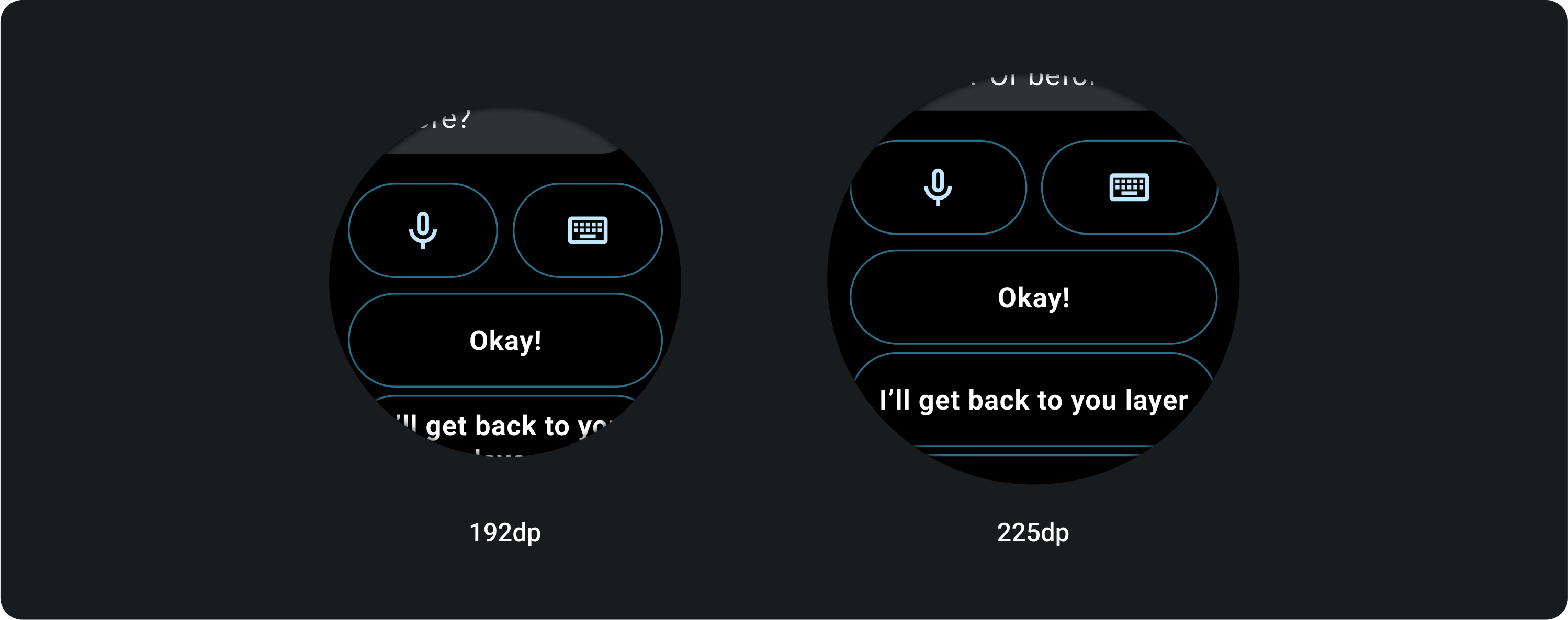
زر واحد أو زران
تمتد تطبيقات IME التي تتضمّن زرَّين أو زرًا واحدًا لتأمين الشاشة دائمًا إلى الهوامش الجانبية بغض النظر عن حجم الشاشة.
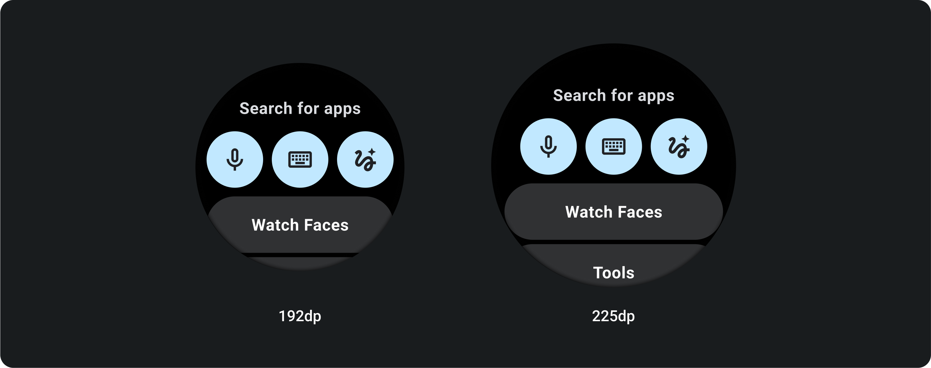
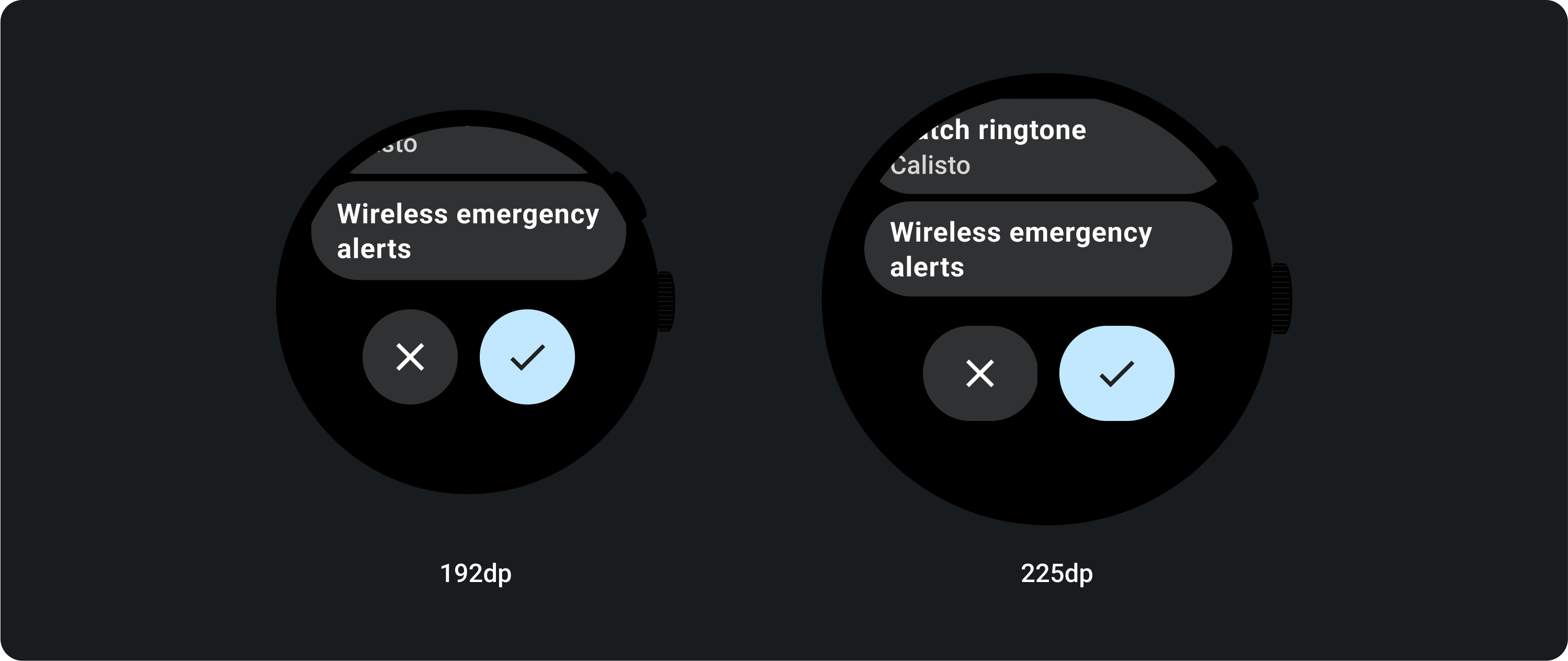
3 أزرار
على الشاشات التي يقلّ قطرها عن 225 dp، تظل الأزرار دائرية ولا يتم تمديدها. على الشاشات الأكبر حجمًا، التي تبلغ دقتها 225 dp أو أكثر، يتم تمديد الأزرار إلى الحواف الجانبية.