منع اقتطاع النص واقتصاص المحتوى
تنظيم صفحاتك في مجموعات
يمكنك حفظ المحتوى وتصنيفه حسب إعداداتك المفضّلة.
تتميز الساعات الذكية بأحجام شاشة أصغر من الأجهزة المحمولة باليد، لذلك من المهم
ترتيب العناصر وعرضها بطريقة يمكن للمستخدمين الوصول إليها وتستخدم
مساحة الشاشة المتاحة بكفاءة. للمساعدة في ملاءمة العناصر للشاشة، استخدِم القدر الصحيح من المساحة المتروكة والهوامش على النحو المحدّد في
إرشادات المواد.
حتى عندما يناسب تصميمك الشاشة، قد يتم اقتطاع عناصر واجهتك
أو اقتصاصها عندما يقوم المستخدم بأحد الإجراءات التالية:
- يغيّر هذا الزر لغة العرض.
- لتغيير حجم النص
- تُفعِّل هذه السياسة إعداد النظام تغميق النص.
من الأهمية بمكان اختبار تصميماتك مع وضع هذه الاعتبارات في الاعتبار للتأكد من
أنها تتكيّف بسلاسة مع بيئات المستخدمين المختلفة.
إبقاء العناصر التفاعلية مرئية بالكامل
إذا كانت واجهتك تحتوي على عناصر تفاعلية، فتحقق من أنه يمكن للمستخدمين تمرير هذه العناصر بالكامل في العرض، خاصةً إذا كانت هذه العناصر موضوعة على
حافة الصفحة. إذا كان تطبيقك يستخدم مكتبة Horology، يمكنك استخدام مصنع تصميم responsive()
. بخلاف ذلك، يمكنك استخدام الفواصل وإضافة الهوامش إلى أعلى وأسفل العنصر ScalingLazyColumn
لمنع اقتصاص عناصر القائمة الأولى
والأخيرة بشكل دائم.
استخدام الشرائح بدلاً من البطاقات للحصول على تخطيطات كثيفة
إذا كنت بحاجة إلى تنسيق أكثر كثافة، استخدِم CompactChip
بدلاً من البطاقات. تجعل المساحة السطحية الأكبر للبطاقات من الصعب جدًا منع اقتطاع النص واقتصاص المحتوى.
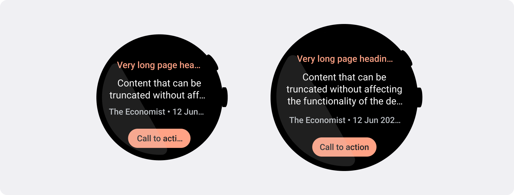
مراعاة تأثيرات حجم الشاشة عند الاقتطاع والاقتصاص
بناءً على حجم شاشة جهاز Wear OS، تتوفّر لك مساحة أصغر أو أكبر لإظهار المزيد من النصوص والأزرار:
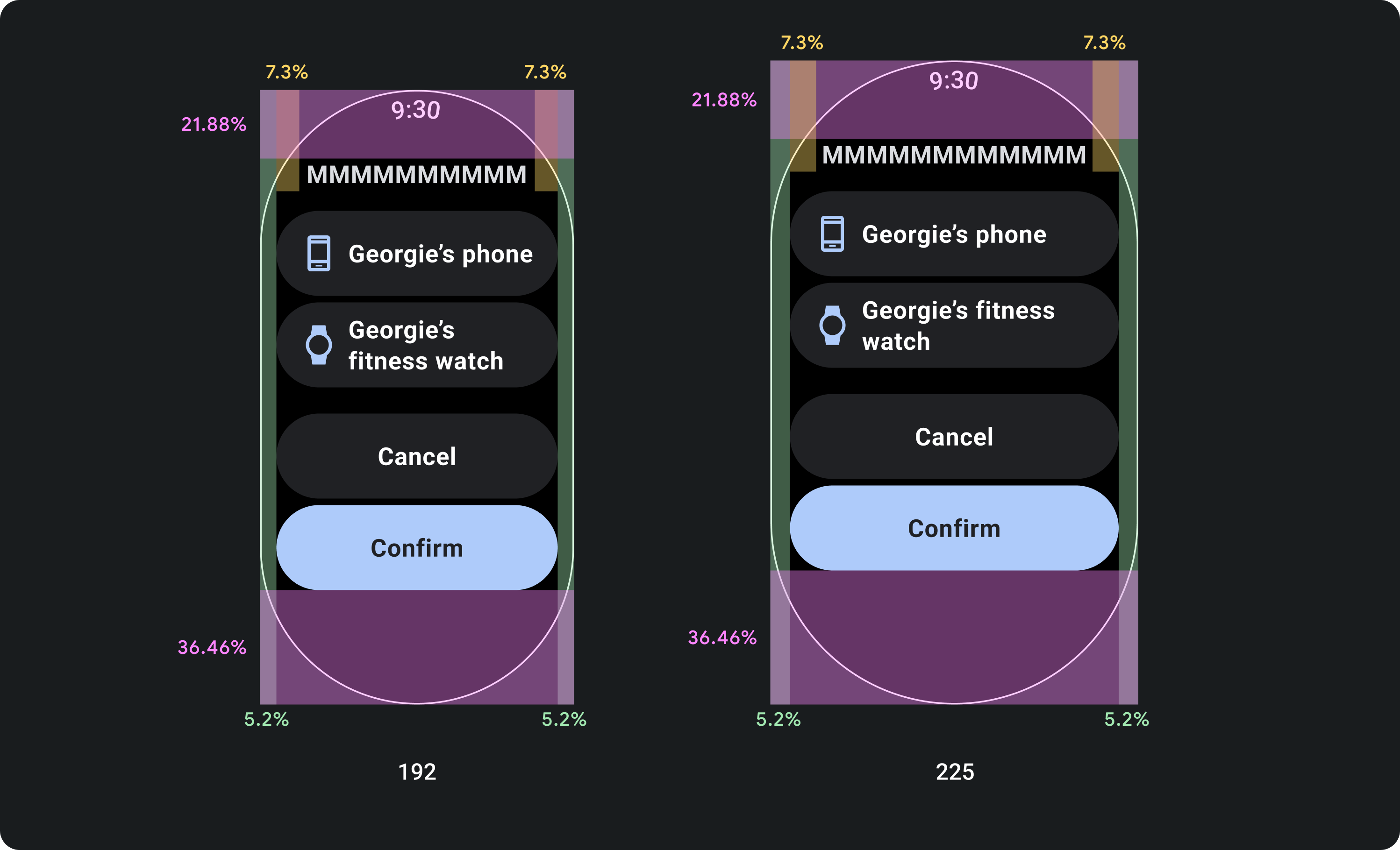
تصميم للهوامش المئوية، وليس هوامش ثابتة
لإنشاء محتوى يتكيّف مع حجم شاشة جهاز Wear OS، عليك تطبيق هوامش النسبة المئوية، حيث يكون حجم كل هامش متناسبًا مع حجم الشاشة. في الحالات التي تظهر فيها العناصر على الجزء العلوي أو السفلي من الشاشة، يجب تطبيق مساحة داخلية إضافية لتقليل اقتصاص المحتوى من حافة الشاشة المنحنية. في المقابل، تزداد المساحة في الجزء العلوي والسفلي عندما تكون مجموعة من
المحتوى صغيرة بما يكفي لتلائم شاشة واحدة.

check_circle
الإجراءات التي يُنصح بها
ويجب أن تلتزم المكوّنات بالهوامش المئوية كي يتغيَّر
حجمها مع حجم الشاشة. بهذه الطريقة، يملأ محتوى شاشتك دائمًا المساحة المتاحة ولا يتم اقتصاصه حسب حواف الشاشة.

cancel
الإجراءات غير المُوصى بها
ولا تستخدم الحد الأقصى للمساحة المتاحة للنص بدون
مراعاة كيفية اقتطاعه على الشاشات الأصغر حجمًا والتأثير في
وظائف التصميم.
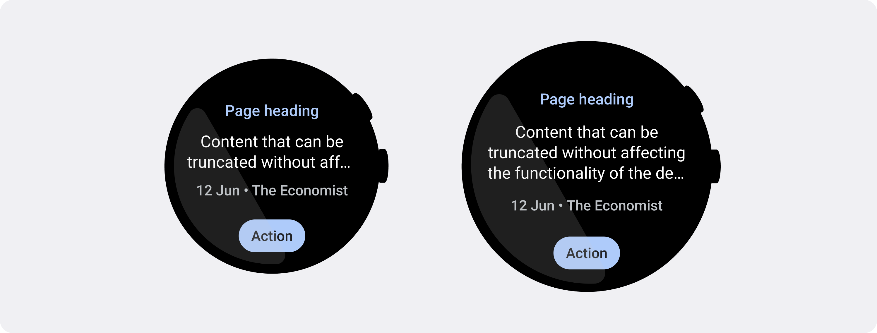
استخدِم عدد الأحرف المسموح به الذي تطلبه الشاشات الأصغر حجمًا
في معظم الحالات، يمكن أن تعرض الشاشات الأكبر حجمًا مزيدًا من النص والمحتوى قبل الاقتطاع.
على الرغم من أنه قد تتوفر مساحة أفقية أكبر، ومع ذلك، صمِّم دائمًا
لأصغر حجم شاشة لإنشاء تجربة متسقة عبر الأجهزة.
على سبيل المثال، قد يحتوي أحد الأزرار على مساحة لمزيد من الأحرف على شاشة أكبر قبل الاقتطاع، ولكن إذا كانت عبارة مهمة تحث المستخدم على اتخاذ إجراء ضرورية لتجربة المستخدم، فاستخدم نصًا قصيرًا بما يكفي ليظهر بالكامل، بدون
اقتطاع، على شاشة جهاز صغير.
بدلاً من ذلك، إذا كان المربّع يعرض محتوى متغيّرًا، مثل النص الذي يتم استرجاعه من خادم، ننصحك بالتخطيط لاحتمالية اقتطاع هذا النص على شاشات أصغر حجمًا.

check_circle
الإجراءات التي يُنصح بها
تم تصميم النص الذي يؤثر في وظائف تصميمك، مثل أزرار الحث على اتخاذ إجراء، مع مراعاة أصغر شاشة. يمكن أن تعرض المساحة الإضافية على الشاشات الأكبر حجمًا سطورًا إضافية من النص بعد نقطة التوقف. ويعتمد عدد سطور النص على المكوِّن والسياق.

cancel
الإجراءات غير المُوصى بها
لا تكتب نصًا يستهلك الحد الأقصى من المساحة المتاحة على شاشة أكبر بدون مراعاة الطريقة التي قد يتم اقتطاعها على الشاشات الأصغر حجمًا ويؤثر في وظائف التصميم.
يخضع كل من المحتوى وعيّنات التعليمات البرمجية في هذه الصفحة للتراخيص الموضحّة في ترخيص استخدام المحتوى. إنّ Java وOpenJDK هما علامتان تجاريتان مسجَّلتان لشركة Oracle و/أو الشركات التابعة لها.
تاريخ التعديل الأخير: 2025-07-27 (حسب التوقيت العالمي المتفَّق عليه)
[[["يسهُل فهم المحتوى.","easyToUnderstand","thumb-up"],["ساعَدني المحتوى في حلّ مشكلتي.","solvedMyProblem","thumb-up"],["غير ذلك","otherUp","thumb-up"]],[["لا يحتوي على المعلومات التي أحتاج إليها.","missingTheInformationINeed","thumb-down"],["الخطوات معقدة للغاية / كثيرة جدًا.","tooComplicatedTooManySteps","thumb-down"],["المحتوى قديم.","outOfDate","thumb-down"],["ثمة مشكلة في الترجمة.","translationIssue","thumb-down"],["مشكلة في العيّنات / التعليمات البرمجية","samplesCodeIssue","thumb-down"],["غير ذلك","otherDown","thumb-down"]],["تاريخ التعديل الأخير: 2025-07-27 (حسب التوقيت العالمي المتفَّق عليه)"],[],[],null,["# Prevent text truncation and content clipping\n\nSmartwatches have smaller screen sizes than handheld devices, so it's critical\nto arrange and display elements in a manner that users can access and that\nefficiently uses the available screen space. To help your items fit the screen,\nuse the correct amount of padding and margins as specified by the\n[Material guidelines](https://m3.material.io/foundations/layout/understanding-layout/spacing).\n\nEven when your design fits the screen, elements of your interface may be\ntruncated or clipped when the user does one of the following:\n\n- Changes the display language.\n- Changes the text size.\n- Enables the **Bold text** system setting.\n\nIt's crucial to test your designs with these considerations in mind to ensure\nthey adapt seamlessly to different user environments.\n\nKeep interactive elements fully visible\n---------------------------------------\n\nIf your interface includes interactive elements, check that users can scroll\nthese elements fully into view, especially if these elements are placed at the\nedges of a page. If your app uses the [Horologist](https://github.com/google/horologist) library, use the\n[`responsive()` layout factory](https://github.com/google/horologist/blob/main/docs/compose-layout.md). Otherwise, use spacers and add margins to\nthe top and bottom of a [`ScalingLazyColumn`](/reference/kotlin/androidx/wear/compose/foundation/lazy/package-summary#ScalingLazyColumn%28androidx.compose.ui.Modifier,androidx.wear.compose.foundation.lazy.ScalingLazyListState,androidx.compose.foundation.layout.PaddingValues,kotlin.Boolean,androidx.compose.foundation.layout.Arrangement.Vertical,androidx.compose.ui.Alignment.Horizontal,androidx.compose.foundation.gestures.FlingBehavior,kotlin.Boolean,androidx.wear.compose.foundation.lazy.ScalingParams,androidx.wear.compose.foundation.lazy.ScalingLazyListAnchorType,androidx.wear.compose.foundation.lazy.AutoCenteringParams,kotlin.Function1%29) object to prevent the first and\nlast list items from always being clipped.\n\nUse chips instead of cards for dense layouts\n--------------------------------------------\n\nIf you need a denser layout, use [`CompactChip`](/reference/kotlin/androidx/wear/compose/material/package-summary#CompactChip(kotlin.Function0,androidx.compose.ui.Modifier,kotlin.Function1,kotlin.Function1,androidx.wear.compose.material.ChipColors,kotlin.Boolean,androidx.compose.foundation.interaction.MutableInteractionSource,androidx.compose.foundation.layout.PaddingValues,androidx.compose.ui.graphics.Shape,androidx.wear.compose.material.ChipBorder)) instead of cards. The larger\nsurface area of cards makes it much more difficult to prevent text truncation\nand content clipping.\n\nConsider screen size effects on truncation and clipping\n-------------------------------------------------------\n\nDepending on the Wear OS device's screen size, you have a smaller or larger\nspace for additional text and buttons to be visible:\n\n### Design for percentage margins, not fixed margins\n\nTo create content that adapts responsively to the Wear OS device's screen size,\napply percentage margins, where the size of each margin is relative to the\nscreen size. In cases where items sit on the top or bottom of the screen, apply\nadditional inner padding to minimize content clipping from the screen's curved\nedge. In contrast, the space at the top and bottom increases when a group of\ncontent is small enough to fit on one screen.\n\ncheck_circle\n\n### Do\n\nComponents must adhere to the percentage margins so that their size scales with the screen's size. This way, the content of your screen always fills the space available and isn't cropped by the screen's edges.\n\ncancel\n\n### Don't\n\nDon't use the maximum space available for text without considering how it may truncate on smaller screens and affect the functionality of your design.\n\n### Use the character limits required by smaller screens\n\nIn most cases, larger screens can show more text and content before truncation.\nEven though more horizontal space might be available, however, always design for\nthe smallest screen size to create a consistent experience across devices.\n\nFor example, a button may have space for more characters on a larger screen\nbefore truncation, but if it's an important call to action that is vital to the\nuser experience, then use text that's short enough to appear entirely, without\ntruncating, on a small device's screen.\n\nAlternatively, if the tile shows variable content, such as text fetched from a\nserver, plan for the possibility that this text is truncated on smaller screens.\n\ncheck_circle\n\n### Do\n\nText which affects the functionality of your design, like call-to-action buttons, is designed with the smallest screen in mind. The additional space on larger screens can show additional lines of text after the breakpoint. The number of lines of text depends on the component and context.\n\ncancel\n\n### Don't\n\nDon't write text that consumes the maximum space available on a larger screen without considering how it may appear truncated on smaller screens and affect the functionality of your design."]]