रिस्पॉन्सिव लेआउट का इस्तेमाल करने वाले ऐप्लिकेशन, अलग-अलग स्क्रीन साइज़ के हिसाब से अपने-आप अडजस्ट हो जाते हैं. इससे उपयोगकर्ताओं को ज़्यादा फ़ायदा मिलता है. साथ ही, उन्हें ज़्यादा दिलचस्प और बेहतर अनुभव मिलता है.
रिस्पॉन्सिव लेआउट, बटन, टेक्स्ट फ़ील्ड, और डायलॉग जैसे एलिमेंट को डाइनैमिक तरीके से फ़ॉर्मैट और पोज़िशन करते हैं, ताकि लोगों को बेहतर अनुभव मिल सके. रिस्पॉन्सिव डिज़ाइन के तरीकों का इस्तेमाल करके, बड़ी स्क्रीन पर आपके ऐप्लिकेशन का इस्तेमाल करने वाले लोगों को अपने-आप अतिरिक्त फ़ायदे ऑफ़र करें. रिस्पॉन्सिव डिज़ाइन से बड़ी स्क्रीन का इस्तेमाल करने वाले लोगों को बेहतर अनुभव मिलता है. जैसे, एक नज़र में ज़्यादा टेक्स्ट दिखना, स्क्रीन पर ज़्यादा कार्रवाइयां करना या बड़े और आसानी से ऐक्सेस किए जा सकने वाले टैप टारगेट.
रिस्पॉन्सिव डिज़ाइन की मदद से वैल्यू जोड़ना
यह करें
- M3 Compose कॉम्पोनेंट लाइब्रेरी का इस्तेमाल करें. इसमें रिस्पॉन्सिव और अडैप्टिव व्यवहार पहले से मौजूद होता है.
- रिस्पॉन्सिव लेआउट का इस्तेमाल करें. ये लेआउट, स्क्रीन के अलग-अलग साइज़ के हिसाब से उपलब्ध जगह को भरने के लिए, अपने-आप और आसानी से अडजस्ट हो जाते हैं.
यह न करें
- ज़्यादा जगह भरने के लिए, यूज़र इंटरफ़ेस (यूआई) एलिमेंट को स्ट्रेच करें. इनमें टेक्स्ट फ़ील्ड, बटन, और डायलॉग शामिल हैं.
- फ़ॉन्ट का साइज़ बढ़ाएं. हालांकि, ऐसा तब न करें, जब फ़ॉन्ट का इस्तेमाल मुख्य रूप से ग्राफ़िक के तौर पर किया जा रहा हो.
उदाहरण
नीचे दी गई इमेज में, ऐसे ऐप्लिकेशन के उदाहरण दिखाए गए हैं जो अलग-अलग डिवाइसों के हिसाब से काम करते हैं और ऑप्टिमाइज़ किए गए हैं.
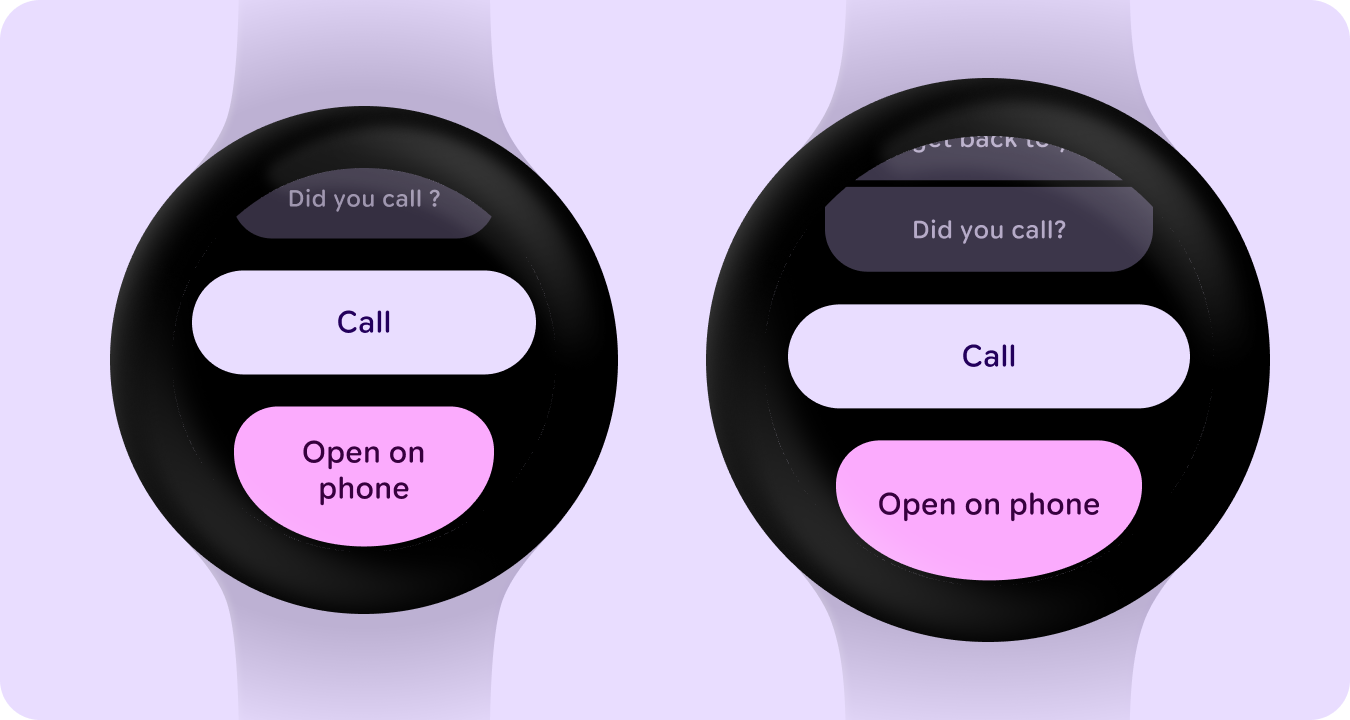
किनारे से चिपके हुए बटन
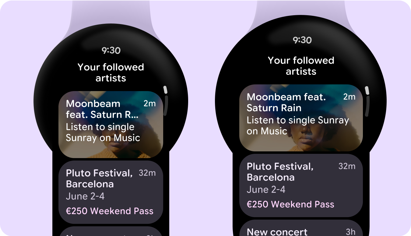
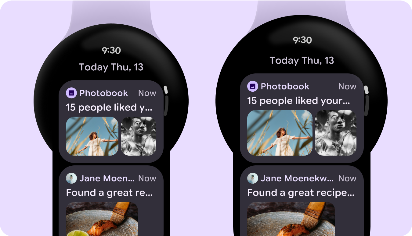
कार्ड की सूची
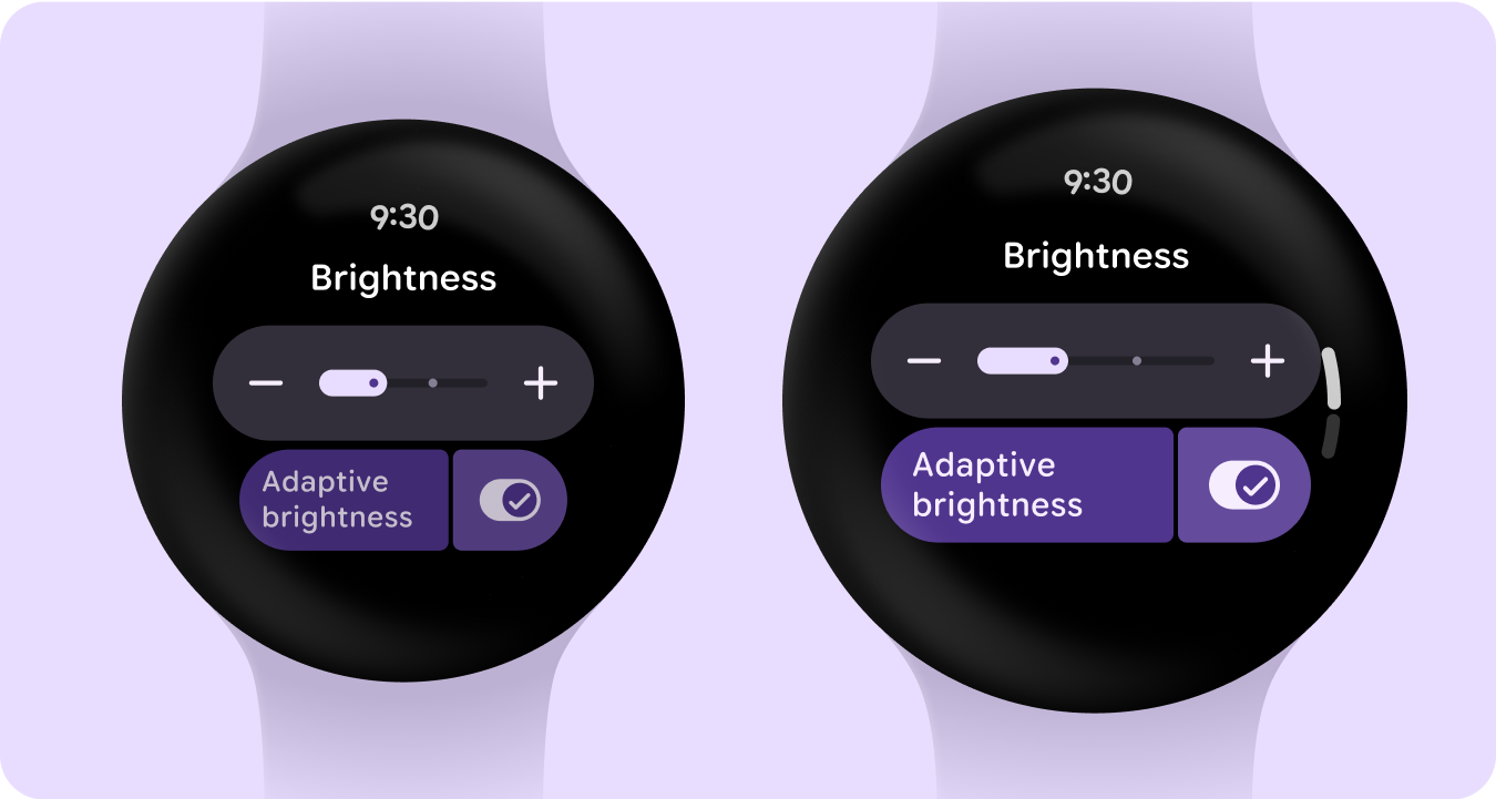
स्विचर और बटन की सूची
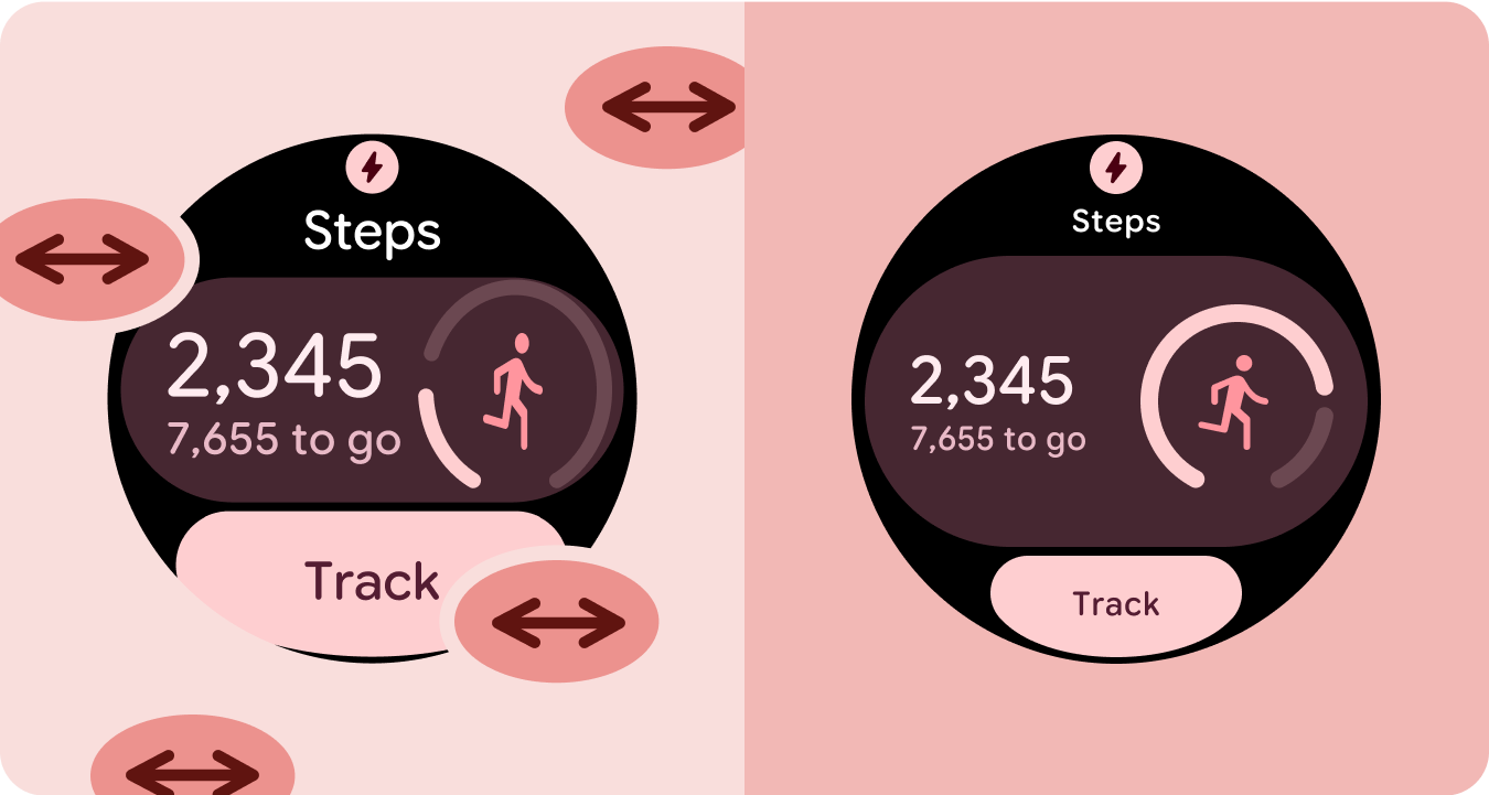
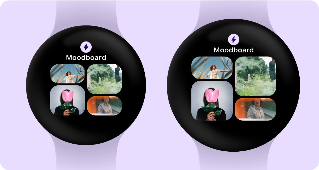
इमेज कार्ड वाली टाइल
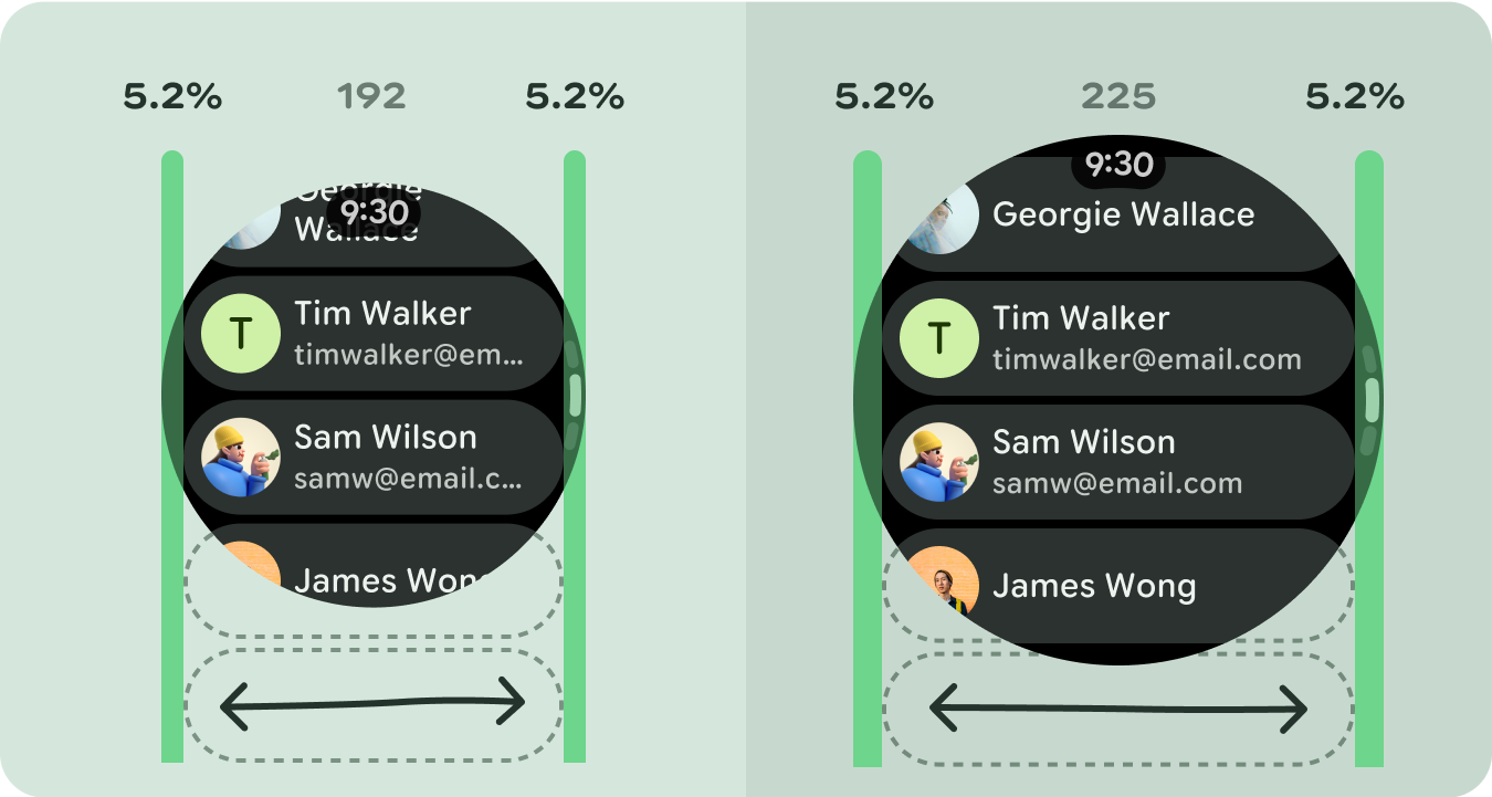
इमेज वाले कार्ड की सूची
ग्राफ़ वाली टाइल