تنظيم صفحاتك في مجموعات
يمكنك حفظ المحتوى وتصنيفه حسب إعداداتك المفضّلة.
توفّر شاشات المعلومات إمكانية الوصول السريع إلى المعلومات والإجراءات التي يحتاجها المستخدمون لإنجاز المهام. من خلال التمرير سريعًا من خلفية شاشة الساعة، يمكن للمستخدم الاطّلاع على مستوى تقدّمه
نحو تحقيق أهدافه المتعلقة باللياقة البدنية والاطّلاع على أحوال الطقس وغير ذلك. يمكنك فتح تطبيق أو تنفيذ
المهام الأساسية بسرعة من خلال المربّعات.
إنشاء تصاميم سريعة الاستجابة ومحسّنة
لمساعدتك في تكييف تصاميم التنسيقات مع أحجام الشاشات الأكبر، عدّلنا
سلوك التنسيقات والمكونات ليكون سلوكًا مضمّنًا سريع الاستجابة،
بما في ذلك الهوامش والوسائد المستندة إلى النسبة المئوية.
إذا كنت تستخدم نماذج ProtoLayout، يمكنك اكتساب هذه التعديلات
تلقائيًا من خلال أحدث إصدار تجريبي من مكتبة Wear ProtoLayout
Jetpack. بالإضافة إلى ذلك، ما عليك سوى تقديم التنسيقات التي أضفت فيها
محتوى أو مكونات إضافية بعد نقطة فاصل لحجم الشاشة. للحصول على الإرشادات والاقتراحات الكاملة حول كيفية الاستفادة من حجم الشاشة الأكبر،
اطّلِع على [إرشادات حول المربّعات][2]. يكون للشرائح ارتفاع ثابت على الشاشة، لذا عدّلنا
المسافة الفارغة لزيادة المساحة المحدودة على الشاشة إلى أقصى حدّ بدون
التسبب في اقتصاص غير مرغوب فيه.
تأكَّد من أنّ المكوّنات تملأ العرض المتاح.
يجب إنشاء جميع المكوّنات بطريقة متجاوبة. من خلال ضبط الارتفاع والعرض على
"توسيع"، تملأ المساحة المتوفّرة. يجب تضمين الهوامش اللازمة لمنع اقتصاص المحتوى من خلال الشاشة المستديرة.
إنشاء تصميمات مكيّفة ومميّزة
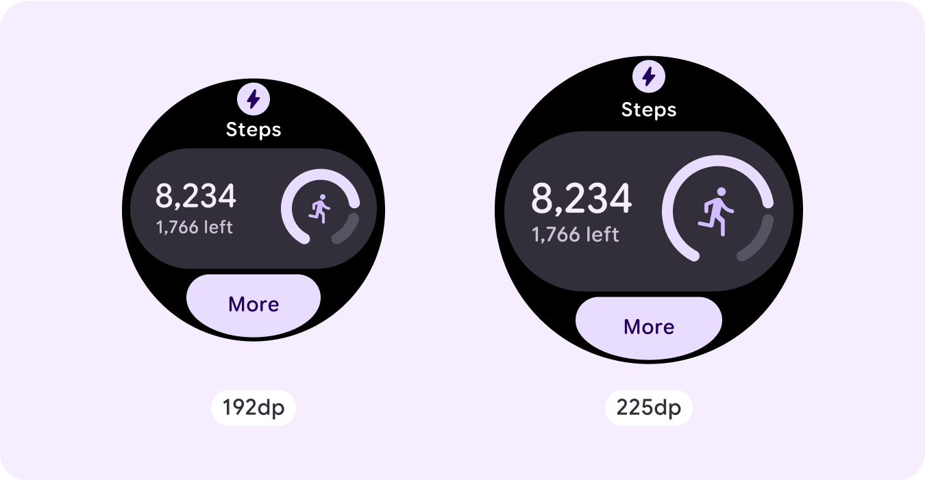
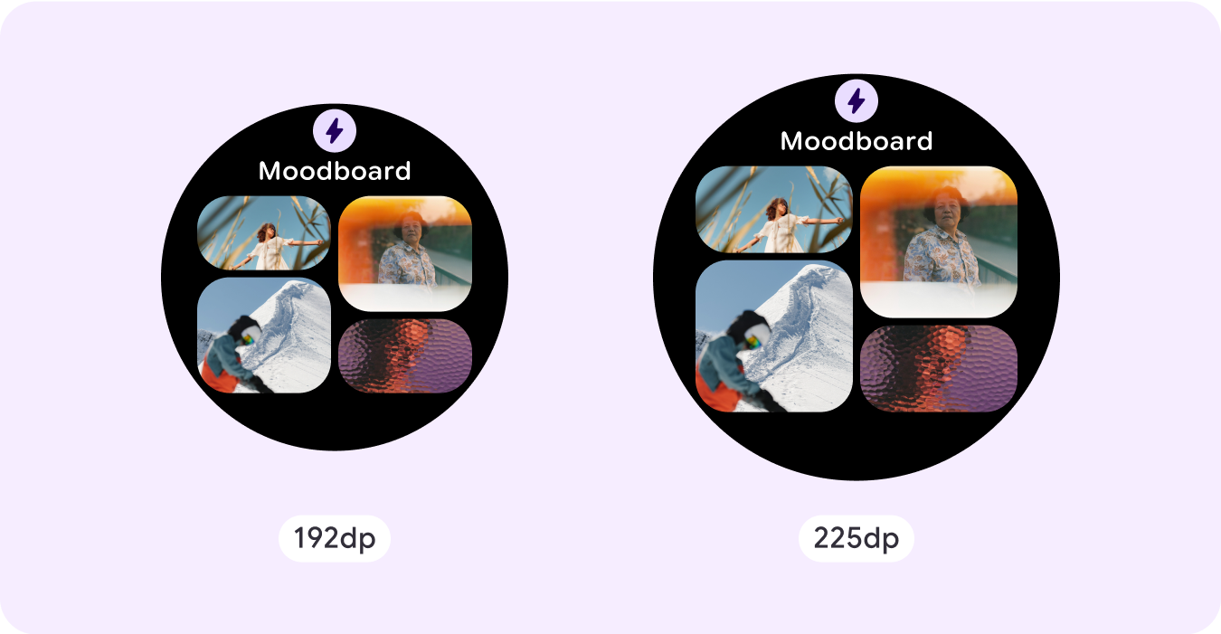
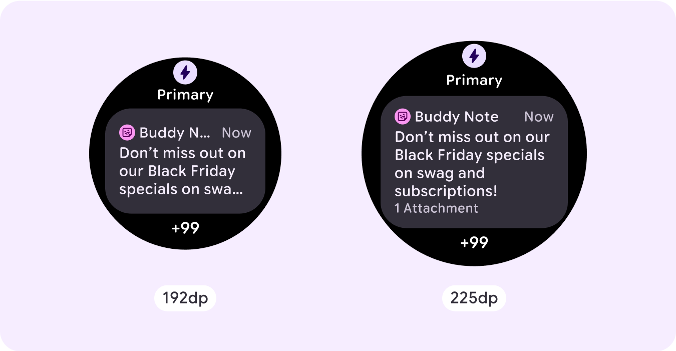
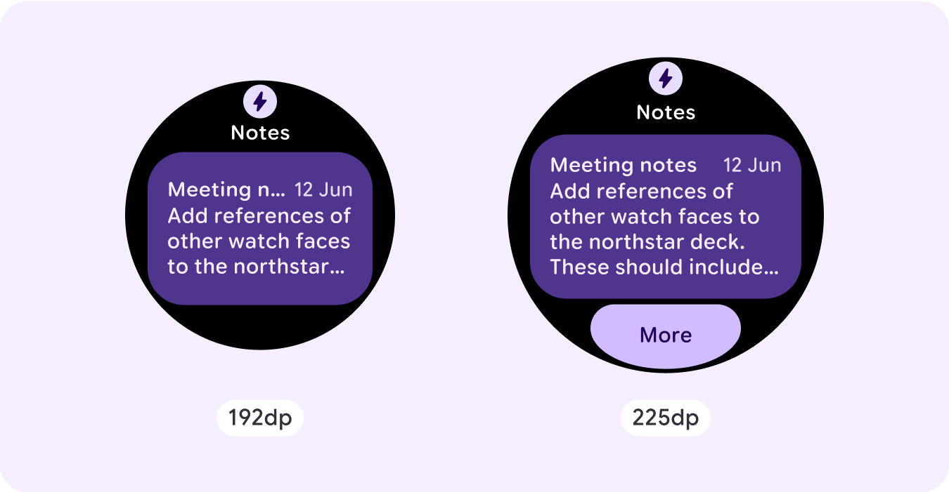
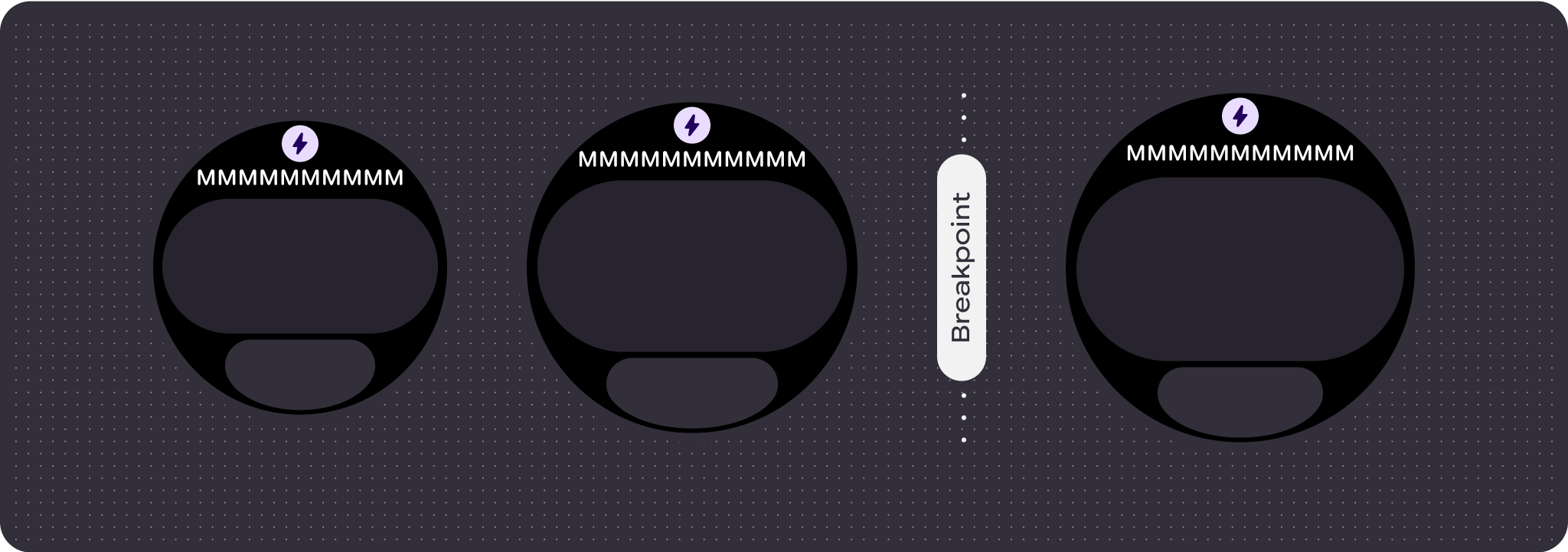
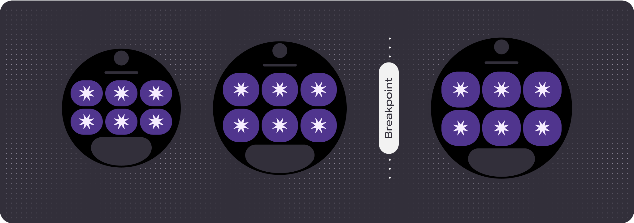
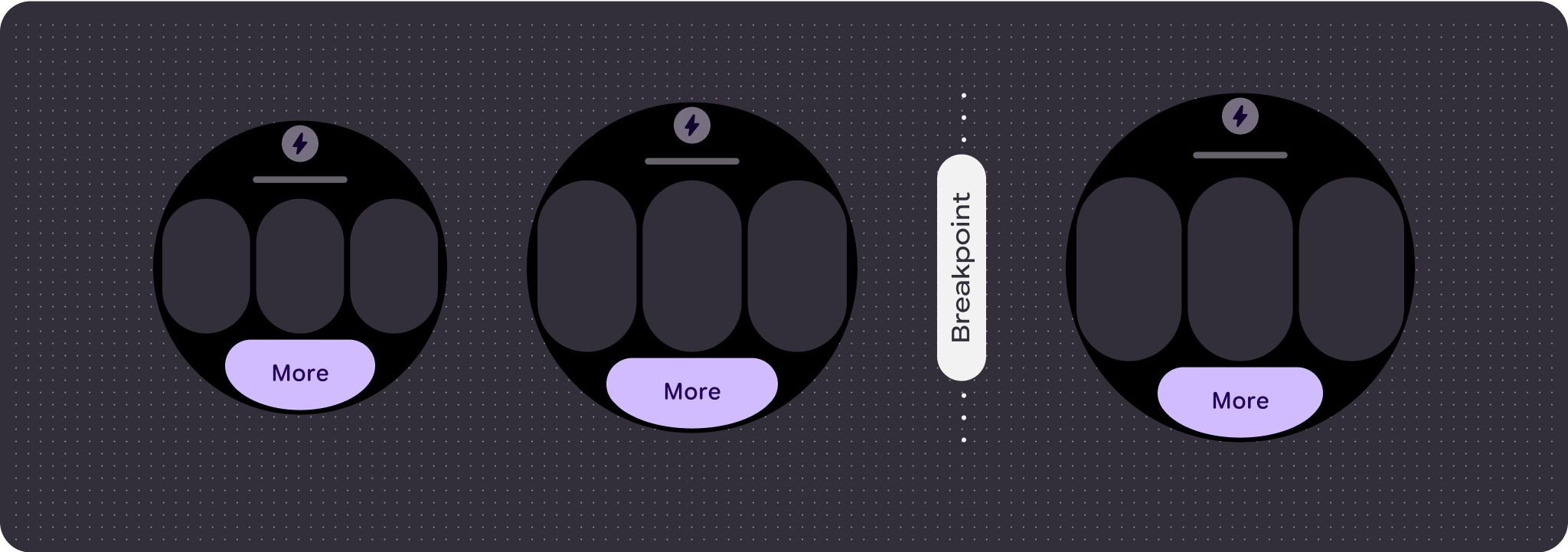
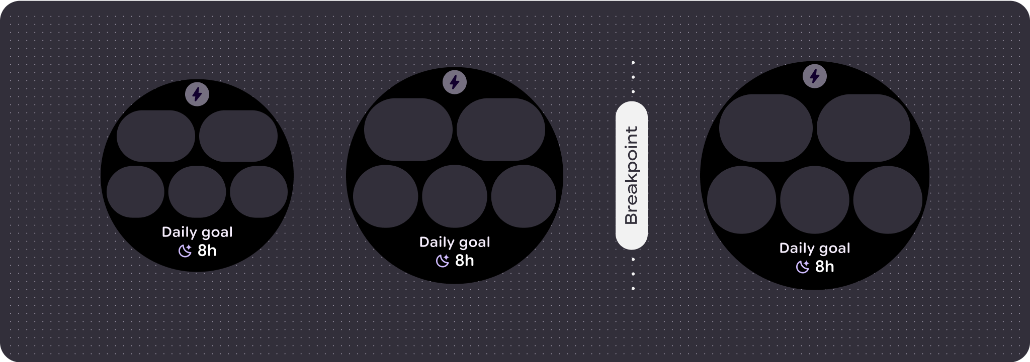
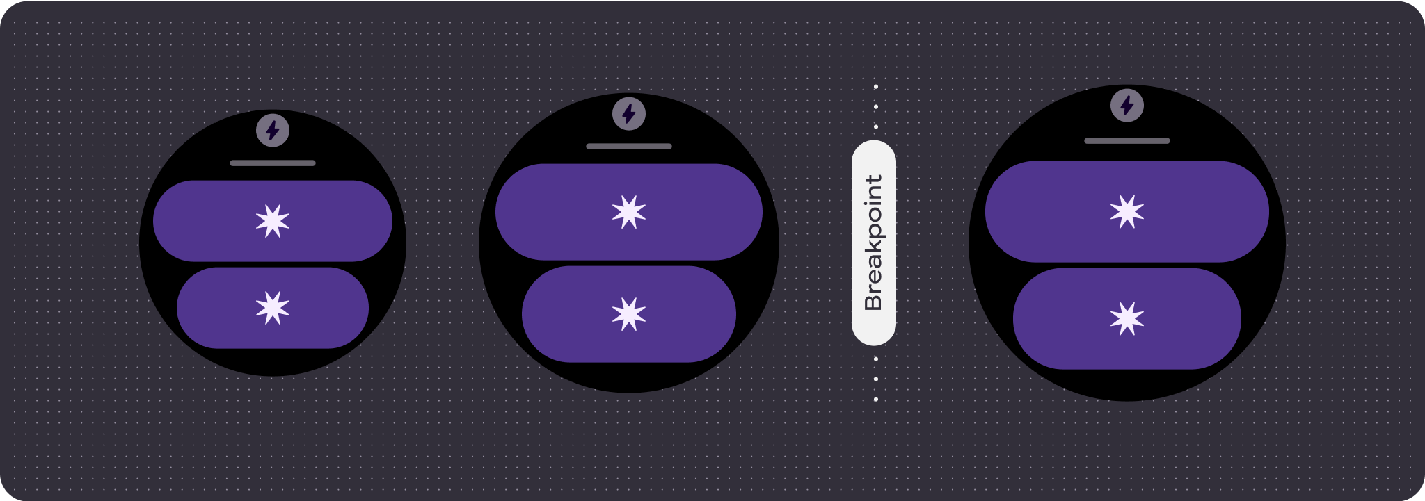
للاستفادة إلى أقصى حد من المساحة الإضافية على أحجام الشاشات الأكبر، أضِف نقطة فاصل حجم
عند 225dp. تتيح لك نقطة التوقف هذه عرض محتوى إضافي أو تضمين
مزيد من الأزرار أو البيانات أو تغيير التنسيق ليناسب الشاشة الأكبر حجمًا بشكل أفضل.
يتطلّب ذلك تصميمًا مختلفًا لكل نقطة توقّف. يمكن أن يتضمّن تصميم الشاشة الأكبر
(أكثر من 225 وحدة بكسل مستقلة الكثافة) العناصر الإضافية التالية:
إظهار خانة العنوان المخفية سابقًا
ننصح بذلك في التنسيقات التي تتضمّن صفين قبل نقطة التوقف، حيث يجب إزالة خانة العنوان
لضمان الحد الأدنى لاستهداف النقر الذي يبلغ 48 بكسل مستقل الكثافة.
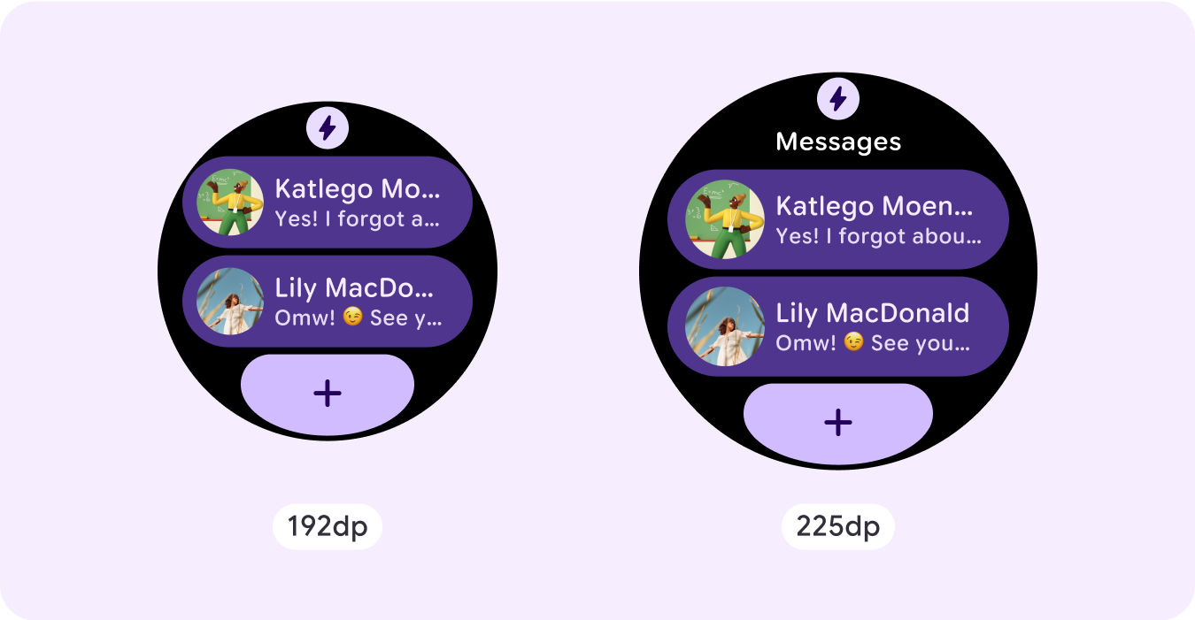
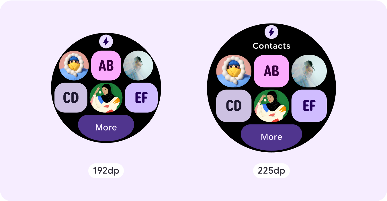
زيادة حجم المكونات الحالية أو تغيير حالتها
ويمكن إجراء ذلك لعرض المزيد من التفاصيل أو لتسهيل الاطّلاع على المحتوى.
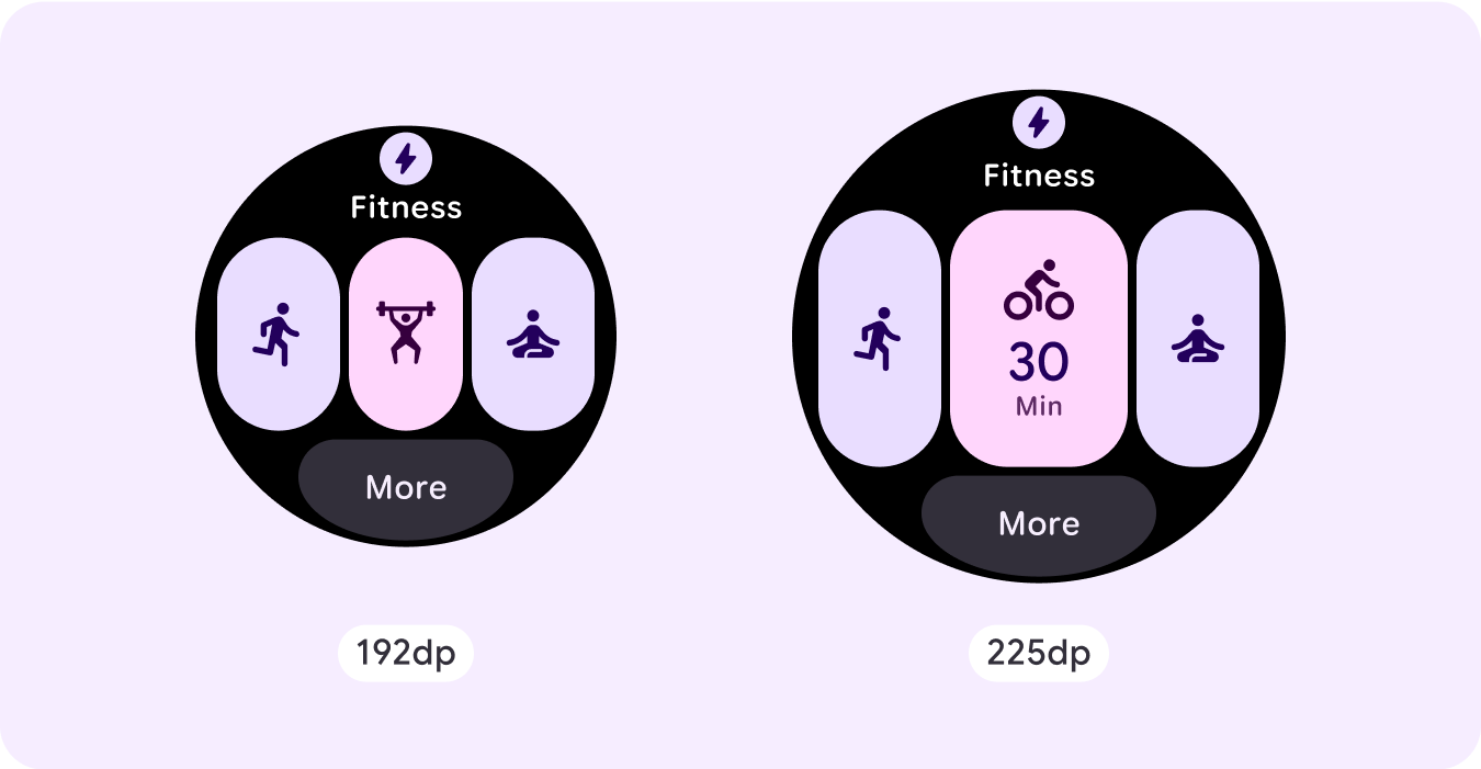
إضافة خانات للمكوّنات ضمن التنسيق الحالي
من خلال إضافة مكوّنات، يوفّر التنسيق المزيد من الخيارات أو تفاصيل إضافية.
احرص على أن يظل المحتوى سهل الاطّلاع عليه.
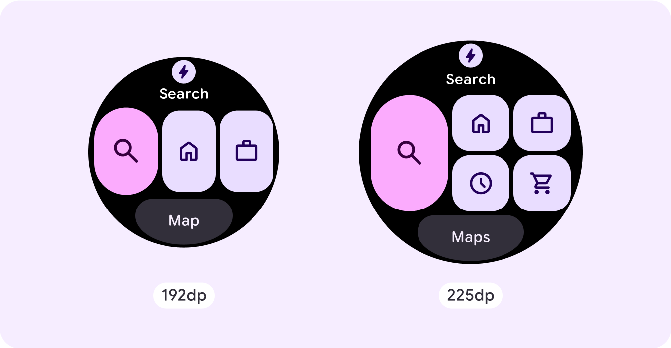
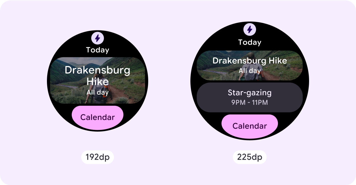
إضافة المزيد من المحتوى في أسفل الصفحة
في بعض الحالات، يكون من المنطقي إضافة أزرار إجراءات أو محتوى في
القسم السفلي، بدلاً من إضافة مكوّنات داخل الفتحة الرئيسية.
ملاحظة: يجب ألا يعرض حجم العرض الأكبر
مطلقًا معلومات أقل من الحجم الأصغر.
وينطبق ذلك بشكل خاص على السلوكيات المخصّصة التي تتم إضافتها عند نقطة التوقف.
ومن الأمثلة الشائعة على ذلك زيادة أحجام المكونات أو النصوص
بعد نقطة التوقف، ما يؤدي إلى عرض عدد أقل من العناصر على الشاشات الأكبر حجمًا. يجب أن دائمًا تعرض الشاشات قيمة أكبر مع زيادة الحجم.
السلوك المتجاوب والمكيّف
يعتمد السلوك المتجاوب والمتوافق على الفتحات (الأقسام) الثلاثة لتخطيط الإعلان.
خانة رمز التطبيق وعنوانه
لا يحدث أي تغيير في سلوك رمز التطبيق الذي يقدّمه النظام. يتم تعديل خانة عنوان المحتوى تلقائيًا لتلائم حجم الشاشة الأوسع، ما يؤدي إلى عرض أحرف إضافية. هناك هوامش داخلية نسبية (بالنسبة المئوية) في الجزء العلوي
لتجنُّب أي اقتصاص عند زيادة حجم الشاشة.
الفتحة الرئيسية (المكوّنات)
يجب ضبط العرض والارتفاع لجميع المكوّنات ضمن الخانة الرئيسية على "توسيع" لكي تتكيّف تلقائيًا مع حجم الشاشة الأوسع. هناك مَعلمات داخلية متناسبة (بالنسبة المئوية) في قسم الفتحة الرئيسية، وكل صف
داخل هذه الفتحة في بعض الحالات، لتجنّب أي اقتصاص عند زيادة حجم الشاشة. إذا كنت تستخدم مزيجًا من نصف قطر الزاوية والتنسيق، قد تتطلب الفتحة الرئيسية
هوامش أكبر.
الفتحة السفلية
لا يحدث أي تغيير في سلوك الزر أو النص في أسفل الشاشة، ولكن يتم تعديل عرض
الزر ومربّعات النص تلقائيًا ليناسب حجم الشاشة الأوسع، كما يتم إضافة
أحرف. هناك هوامش داخلية نسبية (بالنسبة المئوية) في المساحة في أسفل الشاشة لتجنُّب أي اقتصاص عند زيادة حجم الشاشة. في حال عدم توفّر خانة سفلية، تتم إضافة هامش تلقائي.
المربّعات التي تتضمّن زرًا في الفتحة السفليةالبلاطات التي تتضمّن نصًا في المربّع السفليالمربّعات التي لا تحتوي على خانة سفلية
إنشاء تجارب مختلفة
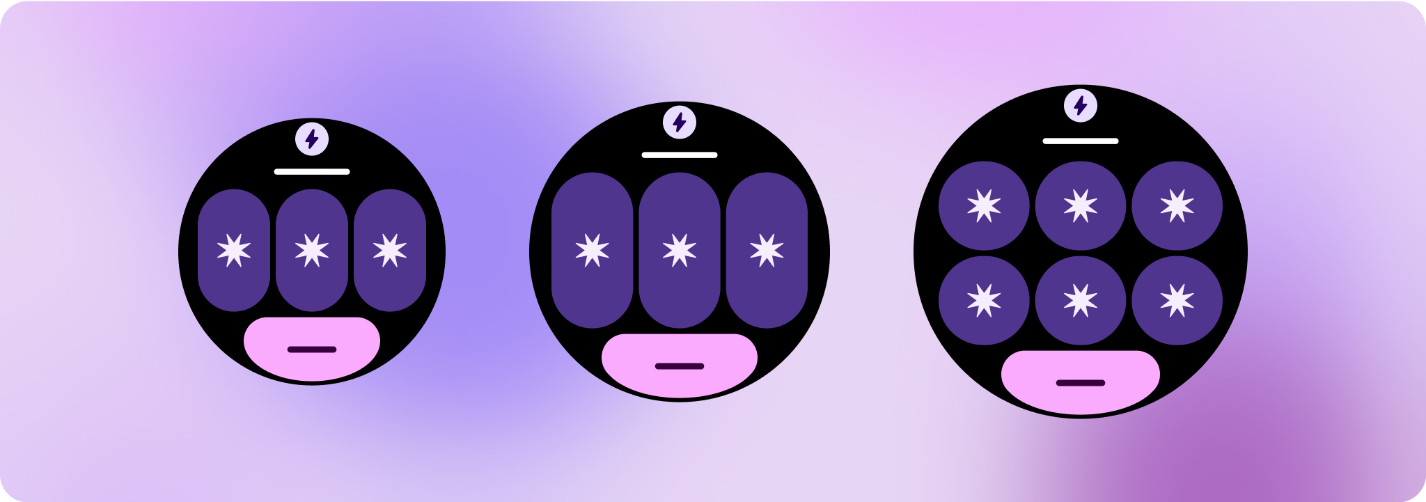
يتيح التنسيق القابل للتخصيص بالكامل، والذي يتضمّن 60 ترتيبًا أو أكثر،
تخصيصًا غير محدود تقريبًا. تم إنشاء المربّعات استنادًا إلى نظام
يستند إلى الشرائح، لذا يمكنك استبدال أي شريحة من التنسيق الأساسي بأي محتوى أو
مكوّن، وضبط المكوّن على أحد الصيغ ومجموعات
الألوان العديدة. في هذه الحالة، يجب الحفاظ على السرعة في الاستجابة واتّباع اقتراحات التصميم.
يجب أن تكون هذه التخصيصات محدودة، ويجب ألا تخرج عن نطاق ملف التنسيق الخاص باللوحة. ويهدف ذلك إلى الحفاظ على الاتساق عندما ينتقل المستخدمون بين المربّعات في لوحة العرض الدوّارة على أجهزة Wear OS.
يخضع كل من المحتوى وعيّنات التعليمات البرمجية في هذه الصفحة للتراخيص الموضحّة في ترخيص استخدام المحتوى. إنّ Java وOpenJDK هما علامتان تجاريتان مسجَّلتان لشركة Oracle و/أو الشركات التابعة لها.
تاريخ التعديل الأخير: 2025-07-27 (حسب التوقيت العالمي المتفَّق عليه)
[[["يسهُل فهم المحتوى.","easyToUnderstand","thumb-up"],["ساعَدني المحتوى في حلّ مشكلتي.","solvedMyProblem","thumb-up"],["غير ذلك","otherUp","thumb-up"]],[["لا يحتوي على المعلومات التي أحتاج إليها.","missingTheInformationINeed","thumb-down"],["الخطوات معقدة للغاية / كثيرة جدًا.","tooComplicatedTooManySteps","thumb-down"],["المحتوى قديم.","outOfDate","thumb-down"],["ثمة مشكلة في الترجمة.","translationIssue","thumb-down"],["مشكلة في العيّنات / التعليمات البرمجية","samplesCodeIssue","thumb-down"],["غير ذلك","otherDown","thumb-down"]],["تاريخ التعديل الأخير: 2025-07-27 (حسب التوقيت العالمي المتفَّق عليه)"],[],[],null,["# Common layouts for tiles\n\nTiles provide quick access to information and actions users need to get things\ndone. With a swipe from the watch face, a user can see how they are progressing\ntowards their fitness goals, check the weather, and more. Launch an app or get\nessential tasks done quickly from tiles.\n\nBuild responsive and optimized designs\n--------------------------------------\n\nTo help you adapt your design layouts to larger screen sizes, we have updated\nthe behavior of our layouts and components to have built-in responsive behavior,\nincluding percentage-based margins and padding.\n\nIf you are using our ProtoLayout templates, you can inherit these updates\nautomatically through the latest beta release of the [Wear ProtoLayout](/jetpack/androidx/releases/wear-protolayout)\nJetpack library. Also, you only need to supply layouts where you have added\nadditional content or components after a screen size breakpoint. For full\nguidance and recommendations on how to take advantage of a larger screen size,\nview our \\[tiles guidance\\]\\[2\\]. Tiles have a fixed screen height, so we've\nadjusted the padding to maximize the limited screen real estate without creating\nunwanted clipping.\n\nCheck that components fill the available width\n----------------------------------------------\n\n\nAll components should be built responsively. By setting the height and width to\n\"expand,\" they fill the available space. Include the necessary margins to\nprevent content from being clipped by the rounded screen. \n\n\n\u003cbr /\u003e\n\nBuild adaptive and differentiated designs\n-----------------------------------------\n\nTo make the most of the additional space on larger screen sizes, add a size\nbreakpoint at 225dp. This breakpoint lets you reveal additional content, include\nmore buttons or data, or change the layout to better suit the larger screen.\n\nThis requires a different design for each breakpoint. The larger screen design\n(225+ dp) could include the following additional elements:\n\n### Show the previously hidden title slot\n\n\nThis is advised on layouts with two rows before the breakpoint, where the title\nslot needs to be removed in order to ensure the min tap target of 48dp. \n\n\u003cbr /\u003e\n\n### Increase the size or change the state of the existing components\n\n\nThis could be done in order to show more detail or make the content more\nglanceable.\n**Note:** Don't just scale up the design. Instead, use components that respond and adapt to the available width and height. You could also use a different or larger component style, or graphic content with additional details. \n\n\u003cbr /\u003e\n\n### Add component slots within the current layout\n\n\nBy adding components, the layout provides more options or additional details.\nMake sure the content remains glanceable, though. \n\n\n\u003cbr /\u003e\n\n### Add more content at the bottom\n\n\nIn some cases, it makes more sense to add action buttons or content in the\nbottom section, rather than adding components within the main slot. \n\n\u003cbr /\u003e\n\n**Caution:** A larger display size should\n*never* display less information than ones that are smaller than it.\nThis is especially relevant for custom behaviors added in at the\nbreakpoint.\n\nA common example of this is when components or text sizes are increased\npast the breakpoint and end up showing less are the larger screens. Screens\nshould *always* show more value with increasing size.\n\nResponsive and adaptive behavior\n--------------------------------\n\nThe responsive and adaptive behavior depends on the three slots (sections) of\nthe layout.\n\n### App icon and title slot\n\nThere is no behavior change on the app icon that the system provides. The title\nslot automatically adapts to the wider screen size, displaying additional\ncharacters. There are proportional (percentage) internal margins on the top\nsection to avoid any clipping when the screen size increases.\n| **Note:** The title slot is optional and should be hidden before the 225dp breakpoint when using a layout with two rows in the main content section. This lets the tap targets in the main content area remain large enough on the smallest screens.\n\n### Main slot (components)\n\nAll components within the main slot should set their width and height to\n\"expand\" so that they automatically adapt to the wider screen size. There are\nproportional (percentage) internal margins on the main slot section---and each row\nwithin this slot in some instances---to avoid any clipping when the screen size\nincreases. If you use a combination of corner radius and layout, your main slot\nmight require larger margins.\n\n### Bottom slot\n\nThere is no behavior change in the bottom button or text, but the width of the\nbutton and text boxes automatically adapt to the wider screen size, and gain\ncharacters. There are proportional (percentage) internal margins on the bottom\nslot to avoid any clipping when the screen size increases. When no bottom slot\nis present, a default margin is added automatically.\nTiles that include a button in the bottom slot\n\n\u003cbr /\u003e\n\nTiles that include text in the bottom slot\n\n\u003cbr /\u003e\n\nTiles with no bottom slot\n\nCreate differentiated experiences\n---------------------------------\n\nOne fully customizable layout, with 60 or more permutations built into it,\nallows for practically limitless customization. Tiles are built on a slot-based\nsystem, so you can replace a slot from the canonical layout with any content or\ncomponent, and set the component to one of the many variants and color\ncombinations. In this case, maintain responsive behavior and follow our design\nrecommendations.\n\nThese customizations should be limited, and shouldn't deviate from the tile\ntemplate. This is to maintain consistency when users scroll through the tiles\ncarousel on their Wear OS devices."]]