التنسيقات الشائعة للتطبيقات التي تتيح الانتقال للأعلى أو للأسفل
تنظيم صفحاتك في مجموعات
يمكنك حفظ المحتوى وتصنيفه حسب إعداداتك المفضّلة.
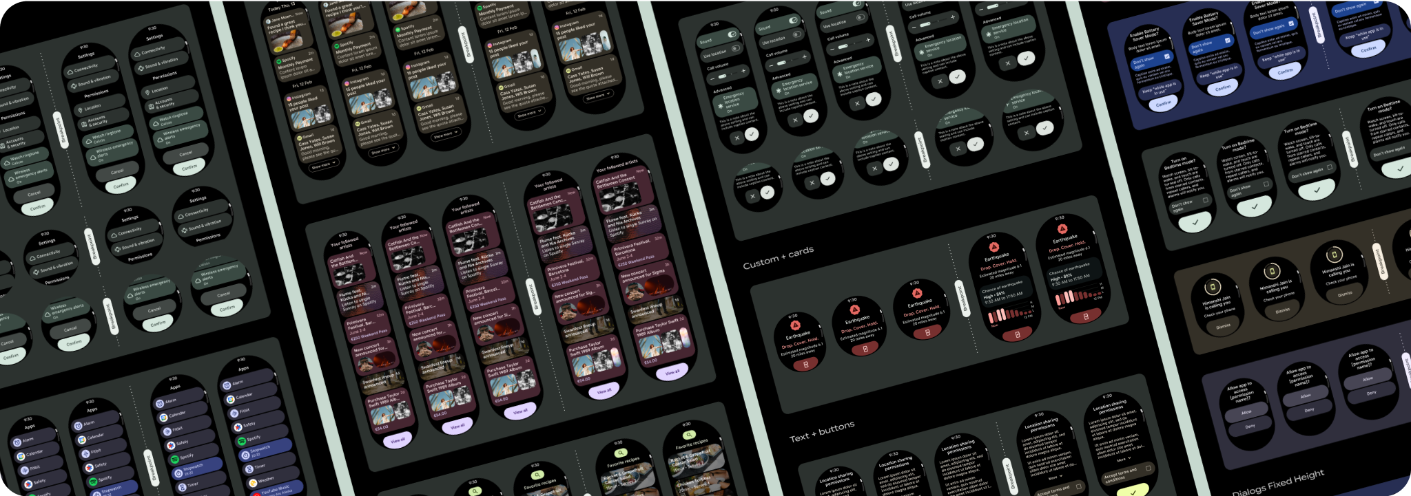
تشمل تنسيقات عرض التطبيق التي تتيح التمرير القوائم (TransformingLazyColumn
) ومربّعات الحوار.
تشكّل هذه التنسيقات معظم شاشات التطبيقات، وهي تمثّل
مجموعة من المكوّنات التي يجب أن تتوافق مع أحجام الشاشات الأكبر. تأكَّد من
أنّ المكوّنات متجاوبة، أي أنّها تملأ العرض المتاح وتتحكّم في تعديلات TransformingLazyColumn
عندما يكون هناك المزيد من ارتفاع الشاشة
متاحًا. تم تصميم هذه التنسيقات بحيث تتلاءم مع مختلف الأجهزة، ولدينا بعض الاقتراحات إضافية للاستفادة بشكل أكبر من المساحة الموسّعة.

إنشاء تصاميم سريعة الاستجابة ومحسّنة
لمساعدة تصاميمك على التكيّف مع أحجام الشاشات الأكبر، عدّلنا
سلوك التنسيقات والمكونات ليكون سلوكًا مضمّنًا سريع الاستجابة،
بما في ذلك الهوامش والوسائد المستندة إلى النسبة المئوية. لحلّ هذه المشكلة، عدّلنا
تنسيقات مكتبة واجهة المستخدم في Android ومكوناتها لتتضمّن سلوكًا متجاوبًا مضمّنًا،
بما في ذلك الهوامش والوسائد المستندة إلى النسبة المئوية. إذا كنت تستخدِم مكونات Compose
، يمكنك اكتساب ميزة الاستجابة هذه تلقائيًا.
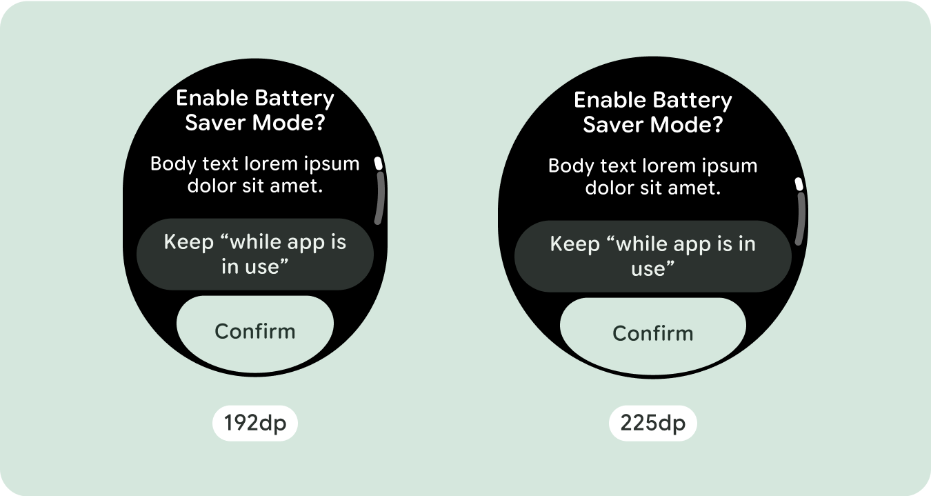
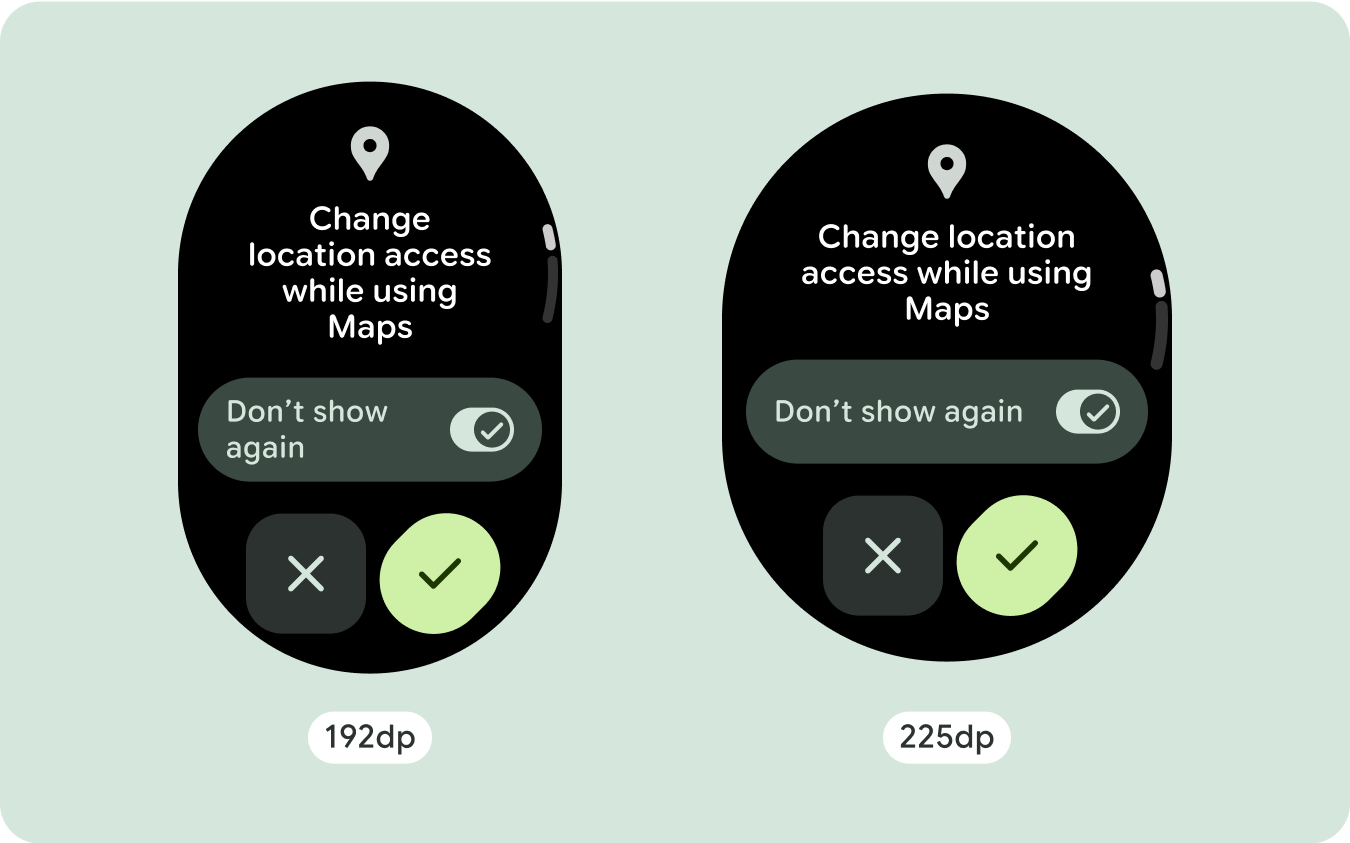
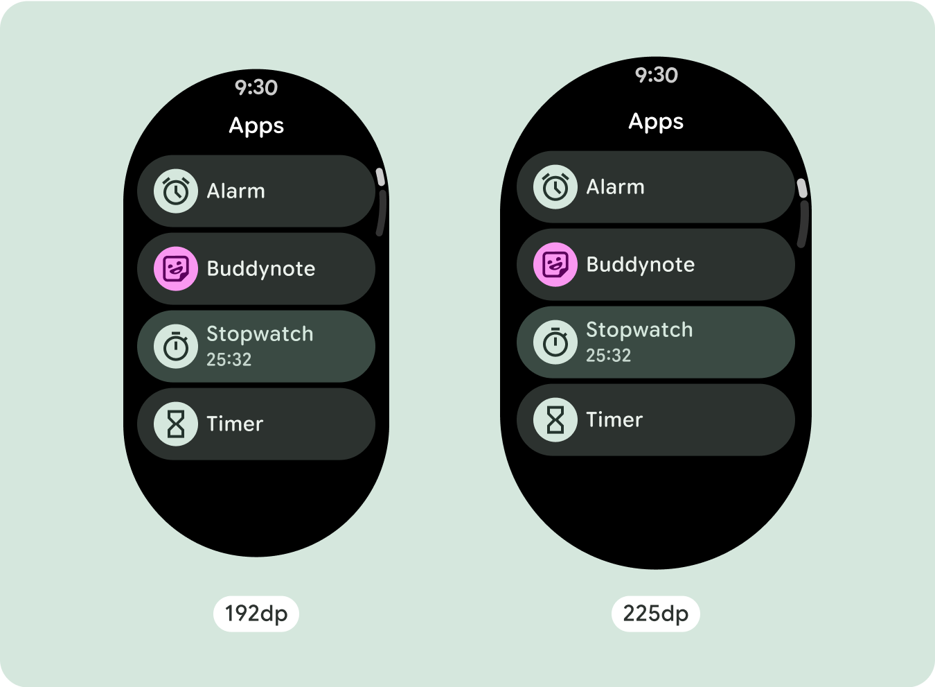
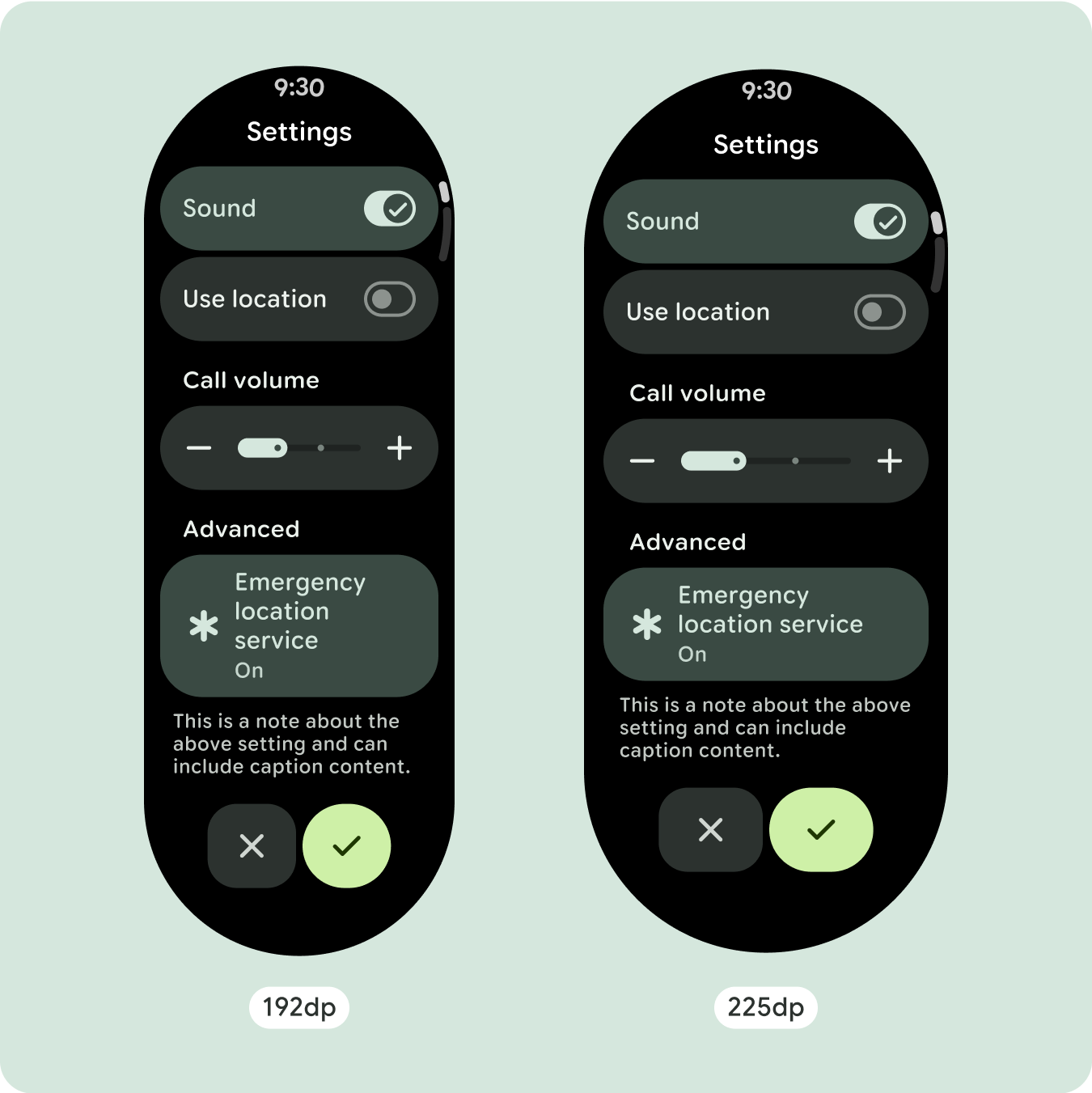
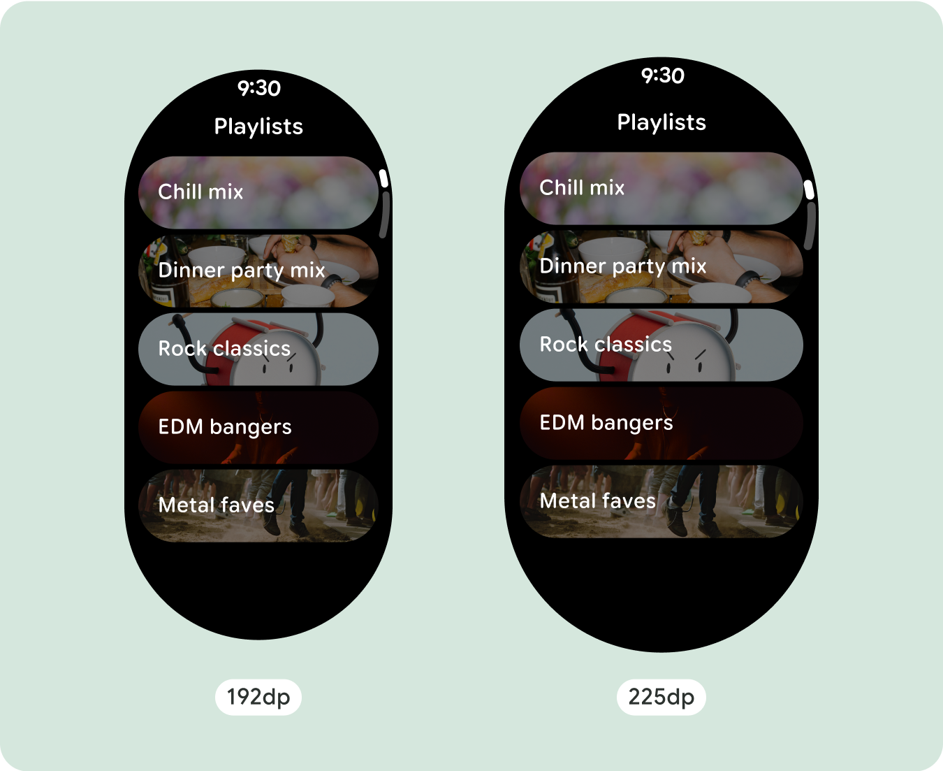
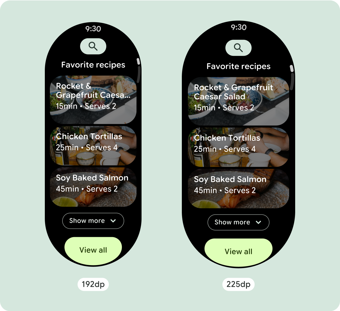
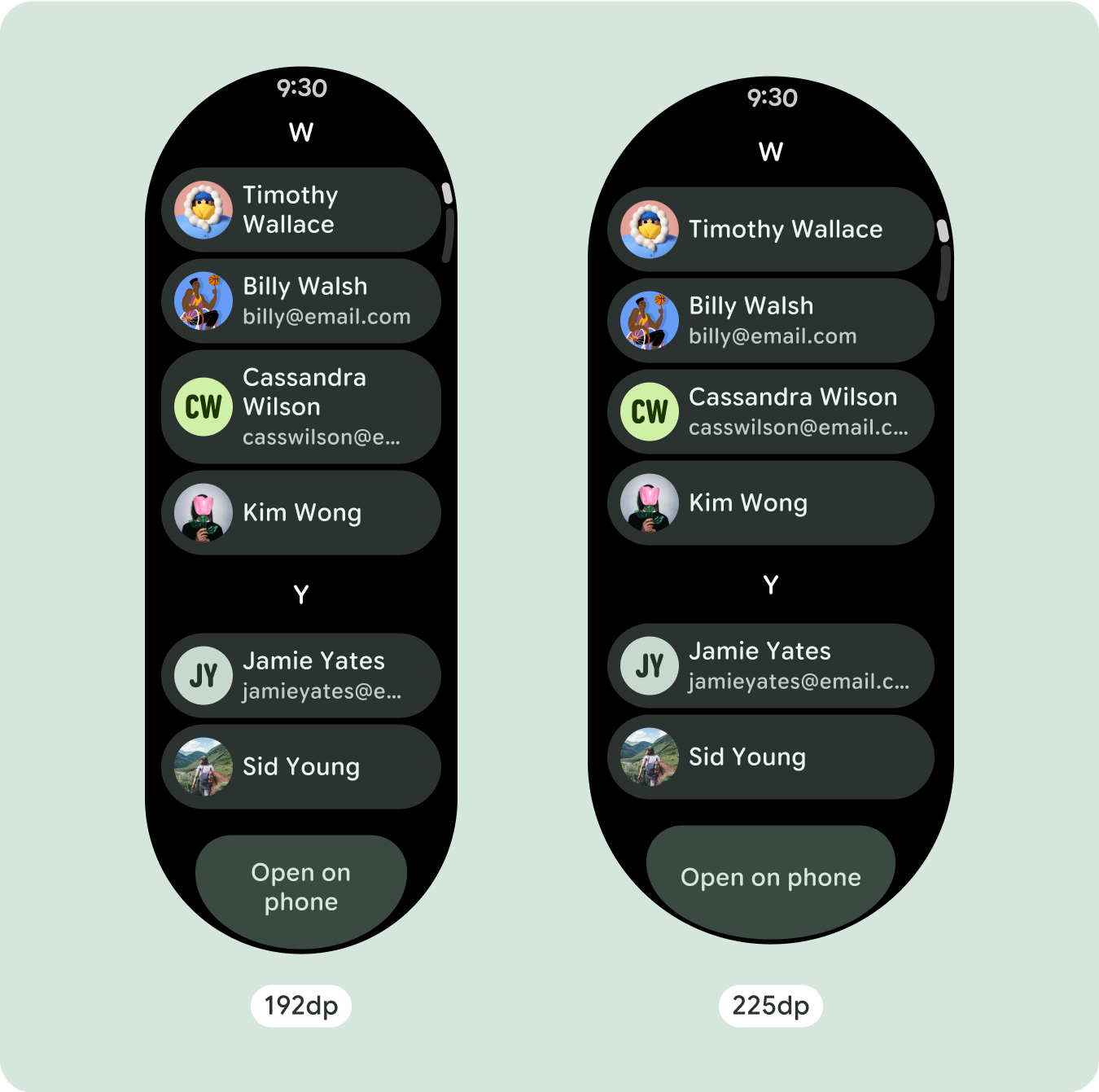
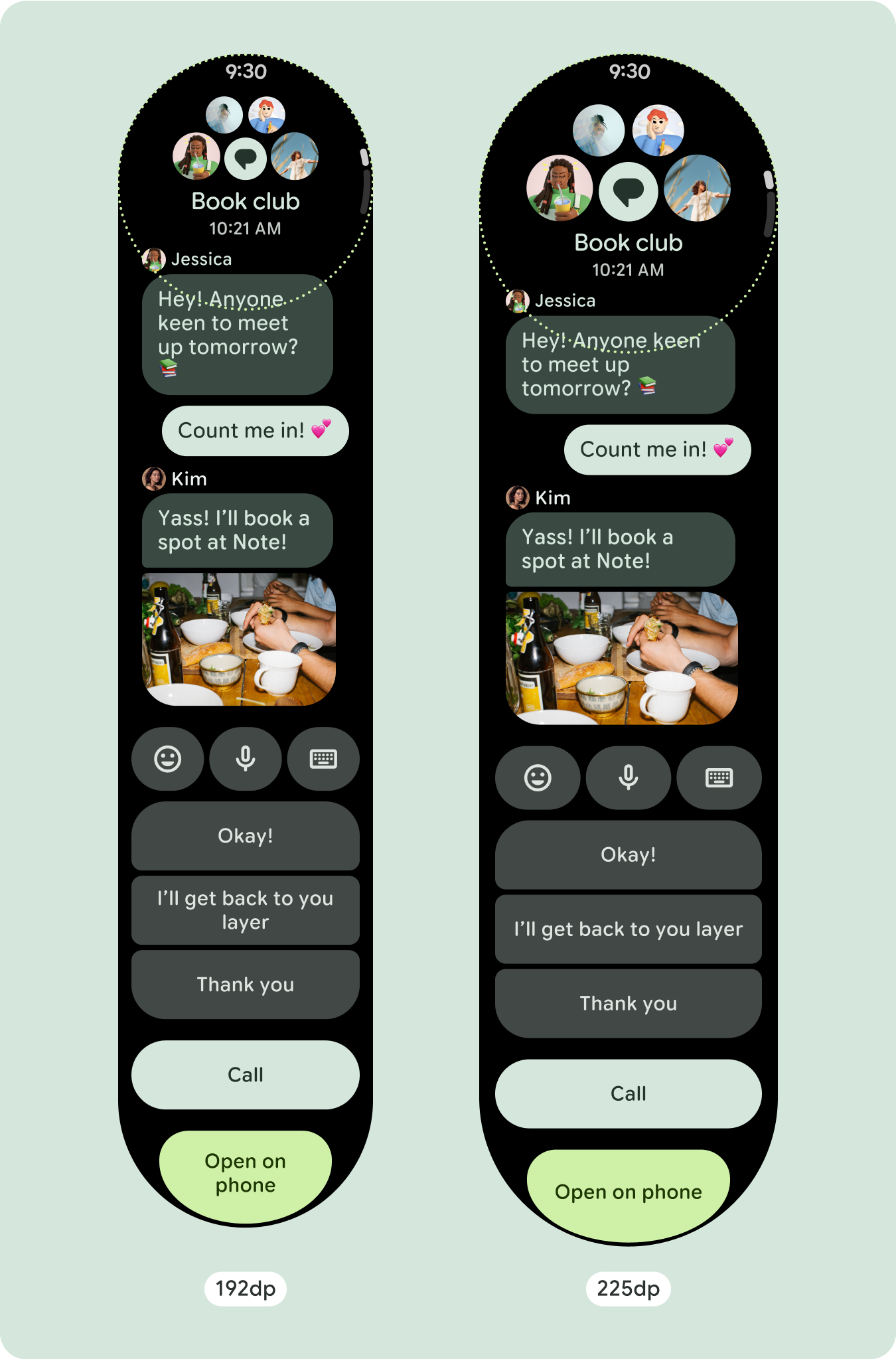
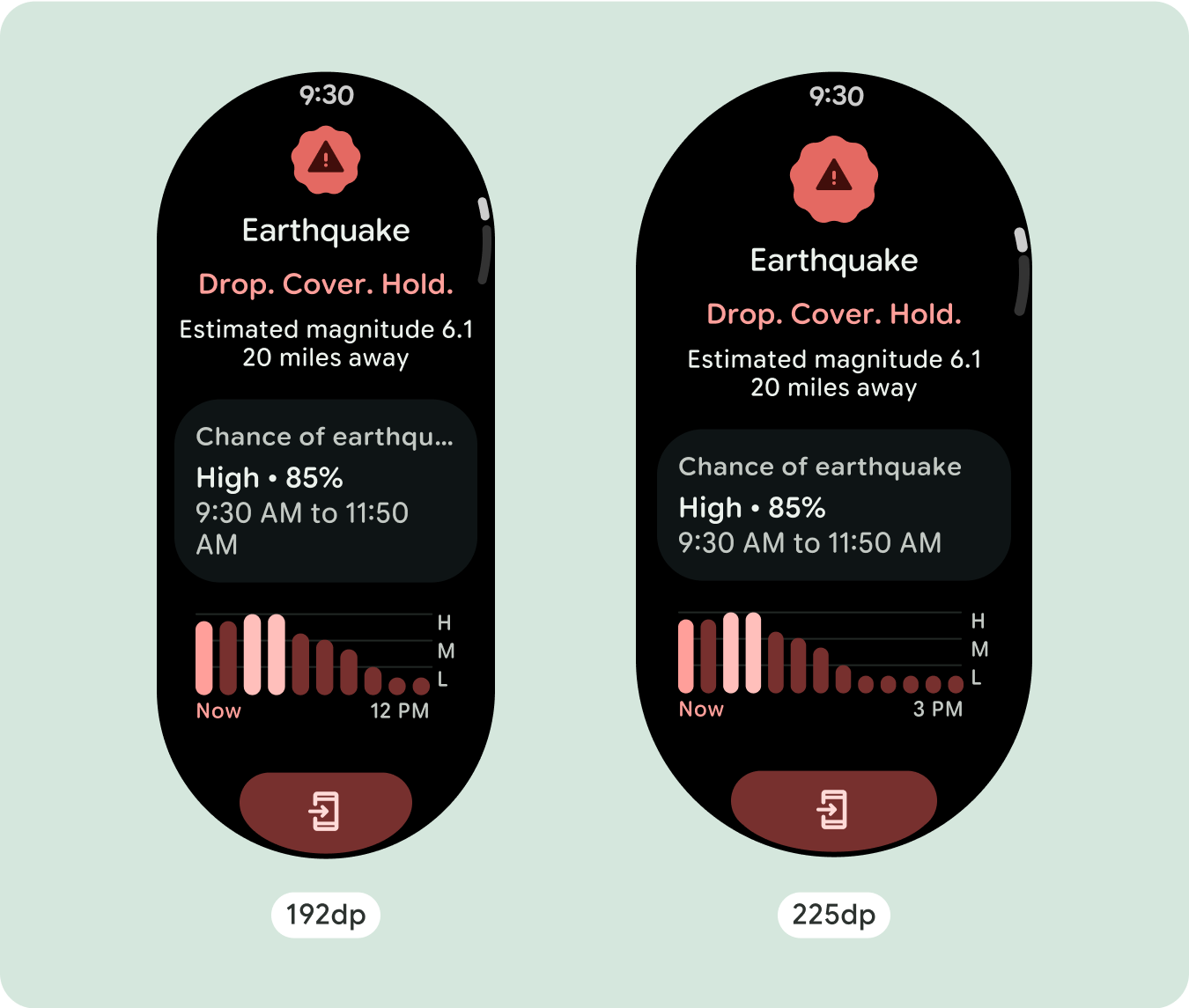
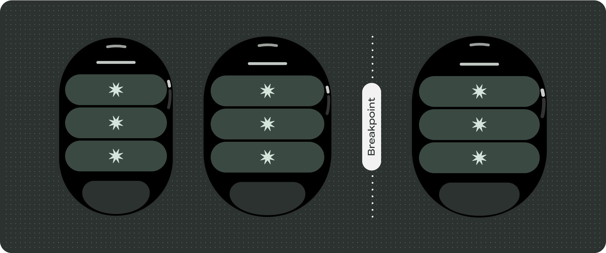
بالنسبة إلى تصميمات الشاشة الفريدة، يجب إجراء اختبار شامل على مجموعة متنوعة من أحجام الشاشة،
لضمان توافق المكونات والعناصر بسلاسة وتجنُّب اقتصاص المحتوى. تساعد علامتا
النسبة المئوية في زيادة حجم الفواصل بفعالية، وننصح باستخدام نقطة تفتيش
بمقدار 225dp لعرض معلومات إضافية ووظائف محسّنة
على شاشات الساعة الأكبر حجمًا.
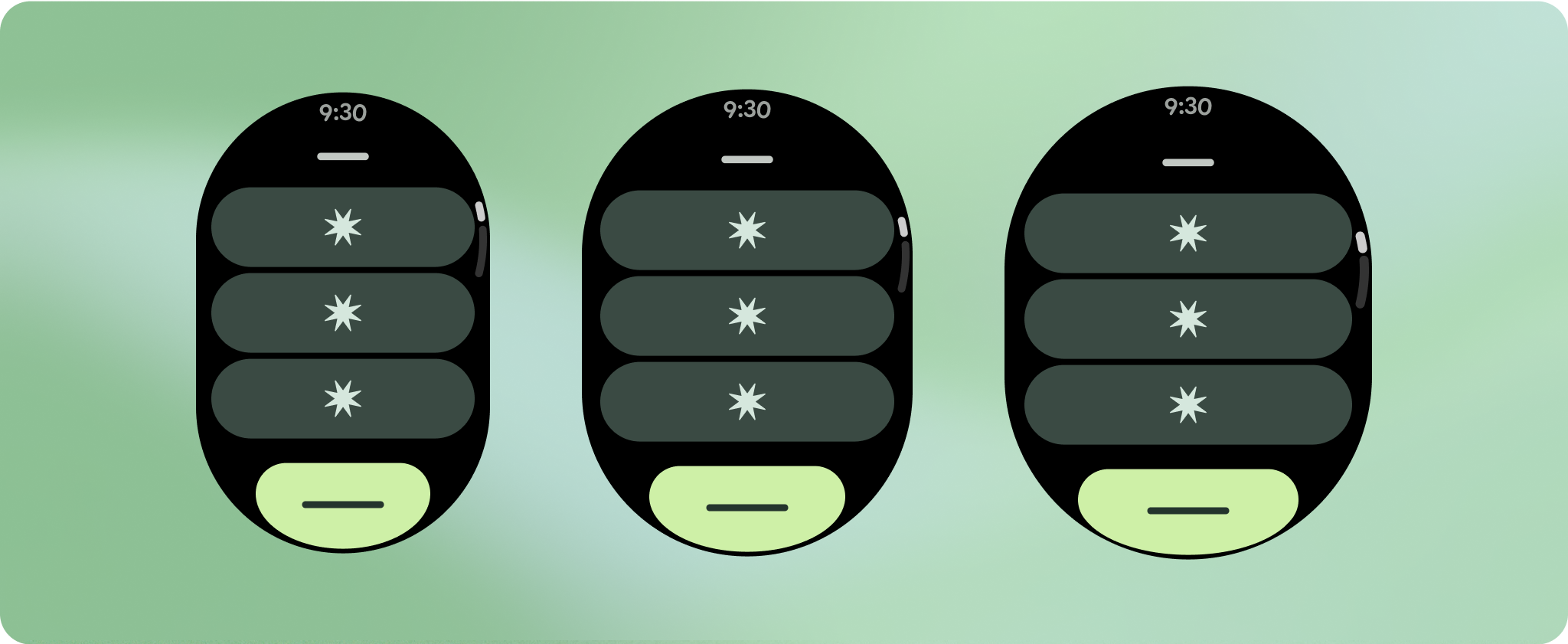
تأكَّد من أنّ المكوّنات تملأ العرض المتاح.
تم تصميم جميع المكوّنات لتتوافق مع جميع الأجهزة، ما يعني أنّها تملأ العرض المتاح
والارتفاع. تأكَّد من أنّ لديك الهوامش اللازمة لضمان عدم
اقتطاع المحتوى بواسطة الشاشة المستديرة.
عرض أحرف نصية إضافية
تحتوي معظم المكوّنات على مربّعات نص تملأ العرض المتاح. وهذا يعني أنّه
يزداد عدد الأحرف تلقائيًا مع زيادة عرض الشاشة.
إنشاء تصميمات مكيّفة ومميّزة
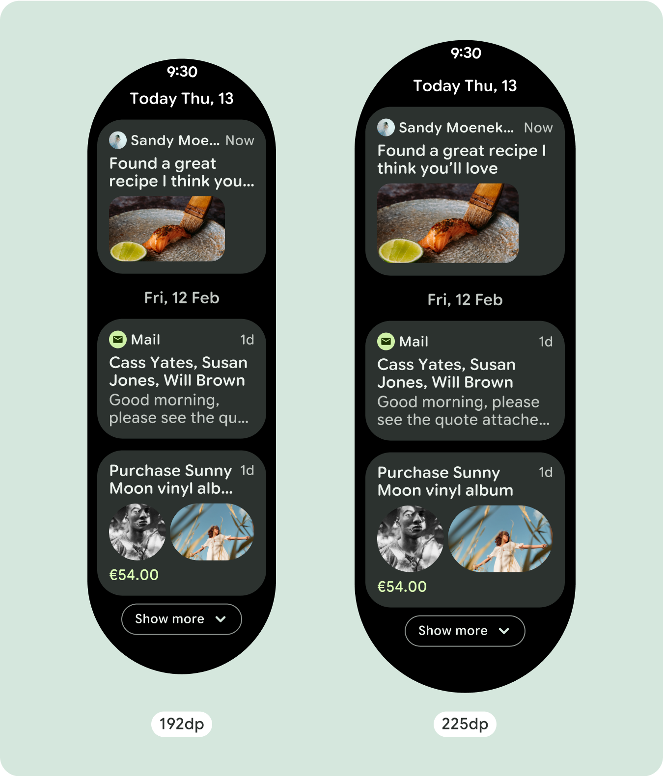
بما أنّ تنسيقات التمرير ستُظهر تلقائيًا المزيد مما كان مخفيًا سابقًا
أسفل الشاشة المُثبَّتة، ليس عليك اتّخاذ الكثير من الإجراءات لإضافة قيمة. يملؤ كل
مكوّن العرض المتاح، وفي بعض الحالات، قد يحصل المكوّن على
صفوف إضافية من النص (مثل البطاقات)، أو يتم تمديد المكوّنات لملء
العرض المتاح (مثل أزرار الرموز).
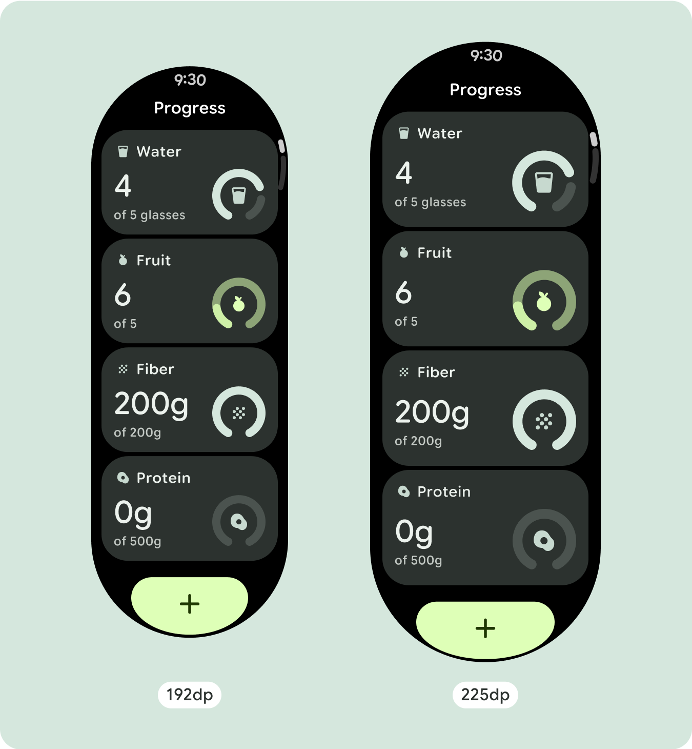
للاستفادة إلى أقصى حد من المساحة الإضافية على أحجام الشاشات الأكبر، أضِف نقطة فاصل حجم
عند 225dp. تتيح نقطة التوقف هذه عرض محتوى إضافي،
أو تضمين المزيد من الأزرار أو البيانات، أو تغيير التنسيق ليناسب الشاشة
الأكبر حجمًا بشكل أفضل. يتطلّب ذلك تصميمًا مختلفًا لكل نقطة توقّف. يمكن أن يتضمّن تصميم الشاشة الكبيرة (225 بكسل أو أكثر) العناصر الإضافية التالية:
زيادة حجم المكونات الحالية أو تغيير حالتها
ويمكن إجراء ذلك لعرض المزيد من التفاصيل أو لتسهيل الاطّلاع على المحتوى.
تنسيقات محسّنة ومتباينة
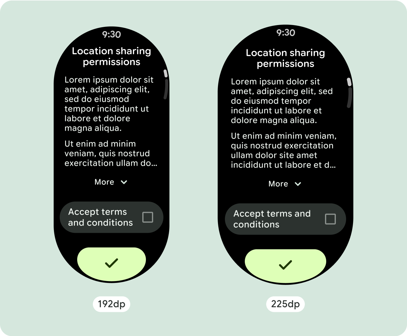
يمكن أن يتغيّر التنسيق قليلاً بعد نقطة التوقف التي تبلغ 225dp، وذلك لتحسين المحتوى
أعلى الصفحة في العرض التلقائي، ولكن يجب أن يظلّ كل المحتوى نفسه
أسفل الصفحة متاحًا بغض النظر عن حجم الشاشة.
السلوك المتجاوب والمكيّف
ستتكيف جميع المكوّنات في مكتبة "الإنشاء" تلقائيًا مع حجم الشاشة الموسّع، وستزيد من العرض والارتفاع. إنّ مشاهدات التمرير التي تستخدم ممارسات التصميم السريع الاستجابة عادةً ما تتكيّف مع مجموعة من أحجام الشاشات. ومع ذلك، في بعض الحالات الخاصة،
يمكنك استخدام نقطة توقّف لتجاهل السمات وتحسين التنسيقات التي تؤدي إلى
توسيع الوظائف أو تحسين إمكانية الاطّلاع السريع أو ملاءمة المحتوى بشكلٍ أفضل على
الشاشة.
يجب تحديد جميع الهوامش العلوية والسفلية والجانبية كنسب مئوية لتجنُّب
الاقتصاص وتوفير مقياس نسبي للعناصر. يُرجى العِلم أنّه عندما ينتقل المستخدم للأسفل أو للأعلى، يظهر الرمز
PositionIndicator
ويلتصق تلقائيًا بإطار
الشاشة بغض النظر عن حجمه.
قائمة التحقق
- طبِّق الهوامش المقترَحة للأعلى والأسفل والجانبَين.
- حدِّد الهوامش الخارجية بقيم مئوية لمنع الاقتصاص في
بداية الحاوية القابلة للتقديم أو الإيقاف ونهايتها.
- طبِّق الهوامش في قيم DP الثابتة بين عناصر واجهة المستخدم.
- ننصحك بتطبيق نقطة توقّف عند 225dp لعرض محتوى إضافي أو
لتسهيل الاطّلاع على المحتوى الحالي على شاشات أكبر حجمًا.

إنشاء تجارب مختلفة
يمكن تخصيص طرق العرض التي تتيح الانتقال للأعلى أو للأسفل بشكل كبير، مع إمكانية إضافة أي مجموعة
من المكوّنات بأي ترتيب. يمكن أن تتغيّر الهوامش العلوية والسفلية استنادًا إلى
المكونات التي تظهر في الأعلى والأسفل. ويهدف ذلك إلى منع اقتطاع المحتوى
بسبب منحنى الشاشة المتزايد.

يخضع كل من المحتوى وعيّنات التعليمات البرمجية في هذه الصفحة للتراخيص الموضحّة في ترخيص استخدام المحتوى. إنّ Java وOpenJDK هما علامتان تجاريتان مسجَّلتان لشركة Oracle و/أو الشركات التابعة لها.
تاريخ التعديل الأخير: 2025-07-27 (حسب التوقيت العالمي المتفَّق عليه)
[[["يسهُل فهم المحتوى.","easyToUnderstand","thumb-up"],["ساعَدني المحتوى في حلّ مشكلتي.","solvedMyProblem","thumb-up"],["غير ذلك","otherUp","thumb-up"]],[["لا يحتوي على المعلومات التي أحتاج إليها.","missingTheInformationINeed","thumb-down"],["الخطوات معقدة للغاية / كثيرة جدًا.","tooComplicatedTooManySteps","thumb-down"],["المحتوى قديم.","outOfDate","thumb-down"],["ثمة مشكلة في الترجمة.","translationIssue","thumb-down"],["مشكلة في العيّنات / التعليمات البرمجية","samplesCodeIssue","thumb-down"],["غير ذلك","otherDown","thumb-down"]],["تاريخ التعديل الأخير: 2025-07-27 (حسب التوقيت العالمي المتفَّق عليه)"],[],[],null,["# Common layouts for scrolling apps\n\nScrolling app view layouts include lists (`TransformingLazyColumn`) and dialogs.\nThese layouts make up the majority of app screens, and they represent a\ncollection of components which need to adapt to larger screen sizes. Check that\nthe components are responsive---that is, that they fill the available width and\nadopt the `TransformingLazyColumn` adjustments when more of the screen's height\nis available. These layouts are built responsively already, and we have some\nadditional recommendations to take further advantage of the expanded real\nestate.\n\nBuild responsive and optimized designs\n--------------------------------------\n\nTo help your design layouts adapt to larger screen sizes, we have updated the\nbehavior of our layouts and components to have built-in responsive behavior,\nincluding percentage-based margins and padding. To address this, we have updated\nour Android UI library layouts and components with built-in responsive behavior,\nincluding percentage-based margins and padding. If you're utilizing our Compose\ncomponents, you can automatically inherit this responsiveness.\n\nFor unique screen designs, thoroughly test across a variety of screen sizes,\nensuring components and elements adapt smoothly and avoid content clipping. Our\npercentage margins help spacers scale effectively, and we recommend using a\nbreakpoint at 225dp to introduce additional information and enhanced\nfunctionality on larger watch screens.\n\n### Check that components fill the available width\n\n\nAll components are built responsively, meaning they fill the available width and\nheight. Make sure you have the necessary margins to ensure content doesn't get\nclipped by the rounding screen. \n\n\n\u003cbr /\u003e\n\n### Show additional text characters\n\n\nMost components have text boxes which fill the available width. This means that\nthey automatically gain character counts as the screen width increases. \n\n\n\u003cbr /\u003e\n\nBuild adaptive and differentiated designs\n-----------------------------------------\n\nAs scrolling layouts will automatically show more of what was previously hidden\nbelow the screen fold, there isn't much you need to do to add value. Each\ncomponent fills the available width, and in some cases, a component might gain\nadditional rows of text (such as cards), or components stretch to fill the\navailable width (such as icon buttons).\n\nTo best use the additional space on larger screen sizes, add a size breakpoint\nat 225dp. This breakpoint makes it possible to reveal additional content,\ninclude more buttons or data, or change the layout to better suit the larger\nscreen. This requires a different design for each breakpoint. The larger screen\ndesign (225+) could include the following additional elements:\n\n### Increase the size or change the state of the existing components\n\n\nThis could be done in order to show more detail or make the content more\nglanceable. \n\n\u003cbr /\u003e\n\n### Optimized and differentiated layouts\n\n\nThe layout can alter slightly after the 225dp breakpoint, so that the content\nabove the fold in the default view is optimized, however all of the same content\nbelow the fold should still be available regardless of screen size. \n\n\u003cbr /\u003e\n\nResponsive and adaptive behavior\n--------------------------------\n\nAll components in the Compose library will automatically adapt to the wider\nscreen size, and gain width and height. Scroll views that use responsive design\npractices usually adapt to a range of screen sizes. However, in some special\ncases, you can use a breakpoint to override dimensions and augment layouts which\nexpand functionality, improve glanceability, or make content fit better on\nscreen.\n\nAll top, bottom, and side margins should be defined in percentages to avoid\nclipping and provide proportional scaling of elements. Consider that the\n`PositionIndicator` appears when the user scrolls, and it automatically hugs the\nscreen's bezel no matter its size.\n\n### Checklist\n\n- Apply the recommended top, bottom, and side margins.\n- Define outer margins in percentage values to prevent clipping at the beginning and end of the scrollable container.\n- Apply margins in fixed DP values between UI elements.\n- Consider applying a breakpoint at 225dp to introduce additional content or make existing content more glanceable when on bigger screen sizes.\n\nCreate differentiated experiences\n---------------------------------\n\nScrolling views are highly customizable, with the ability to add any combination\nof components in any order. The top and bottom margins can change depending on\nwhich components sit at the top and bottom. This is to prevent content from\nbeing clipped by the growing curve of the screen."]]