التنسيقات الشائعة للتطبيقات التي لا تتيح الانتقال للأعلى أو للأسفل
تنظيم صفحاتك في مجموعات
يمكنك حفظ المحتوى وتصنيفه حسب إعداداتك المفضّلة.
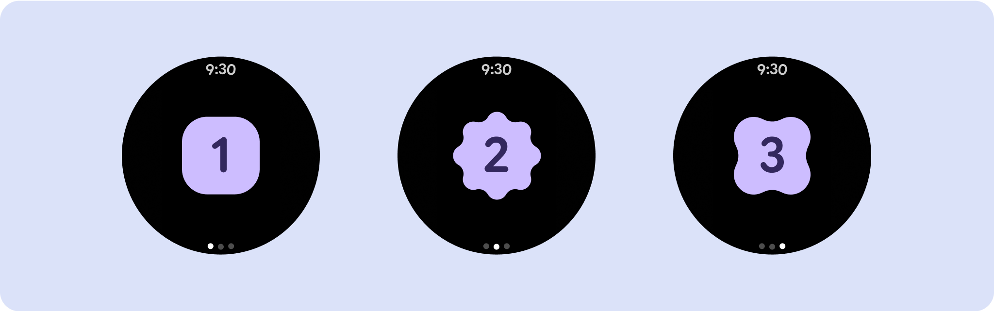
تشمل تنسيقات عرض التطبيق غير القابلة للانتقال لأعلى أو للأسفل مشغّلات الوسائط ومربّعات حوار التأكيد ومقاييس الاختيار ومبدّلات الإعدادات وشاشات خاصة باللياقة البدنية أو التتبُّع باستخدام مؤشرات التقدّم. يمكنك تقييد ارتفاع أي شاشة، ما يضمن تركيز المستخدم
على مهمة واحدة أو مجموعة من عناصر التحكّم، بدلاً من الحاجة إلى تصفُّح
قائمة الخيارات. لاستيعاب الأجهزة التي تحتوي على أحجام شاشة أصغر، يجب مراعاة
الحجم المحدود عند التصميم، مع ضمان إمكانية الاطّلاع على المحتوى بسرعة واستخدام الشاشة الدائرية
عند الاقتضاء.

إنشاء تصاميم سريعة الاستجابة ومحسّنة
تركّز طرق العرض التي لا تتيح التمرير على المعلومات التي يمكن الاطّلاع عليها سريعًا، وتوفّر للمستخدمين قيمة مع
التفاعل إلى الحدّ الأدنى. ومع ذلك، قد يكون من الصعب تضمين سلوك الاستجابة السريعة في هذه التنسيقات. لحلّ هذه المشكلة، عدّلنا مكتبة واجهة مستخدم Android
لإضافة سلوك متجاوب مضمّن إلى التنسيقات والمكوّنات، بما في ذلك
المَعلمات والهوامش المستندة إلى النسبة المئوية. إذا كنت تستخدِم مكونات Compose
، يمكنك اكتساب ميزة الاستجابة هذه تلقائيًا.
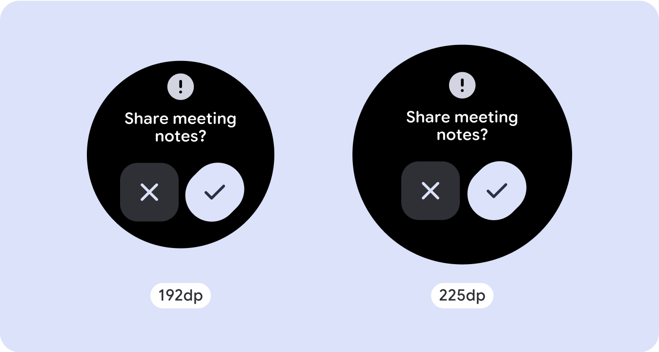
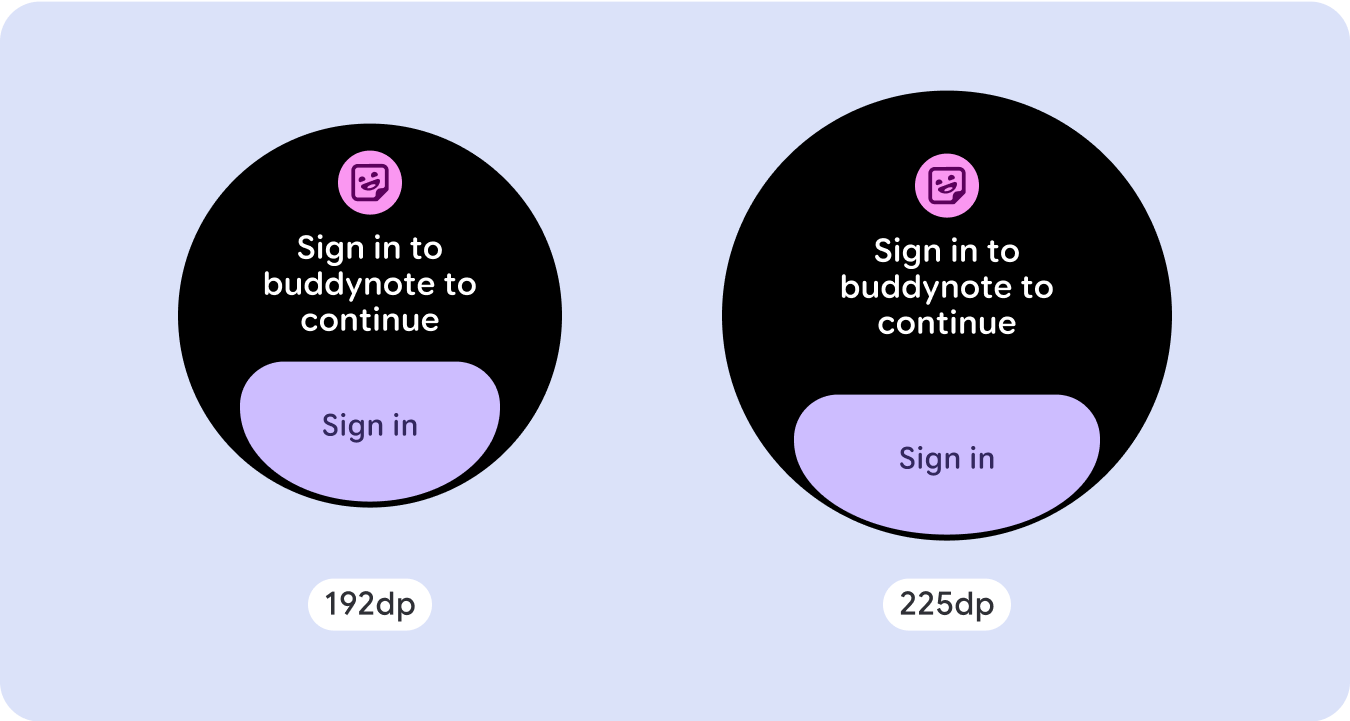
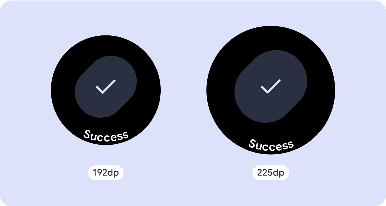
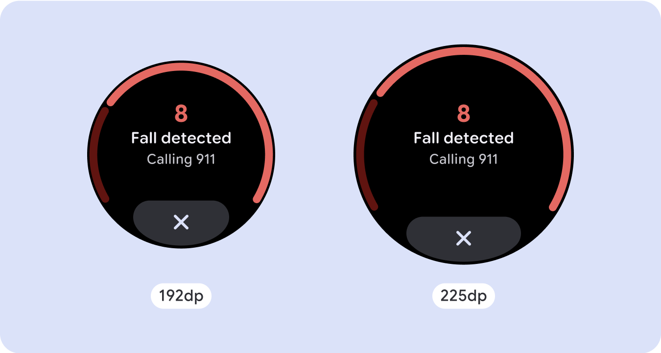
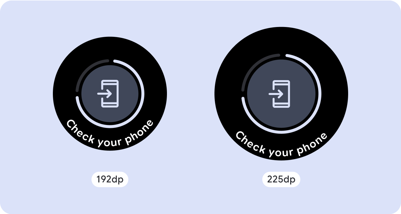
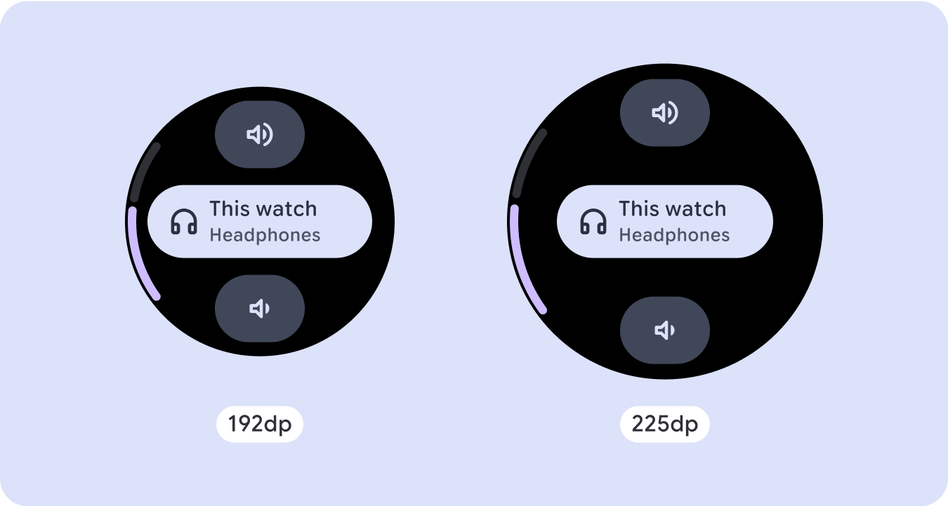
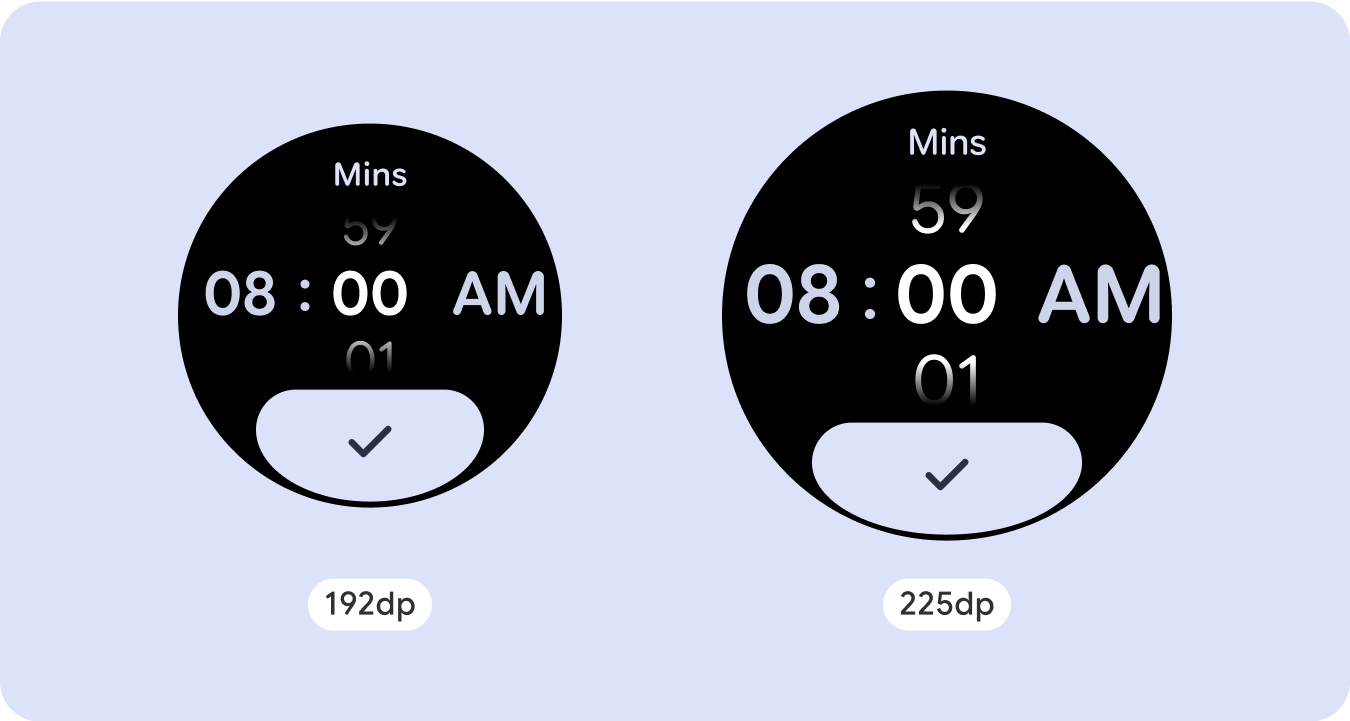
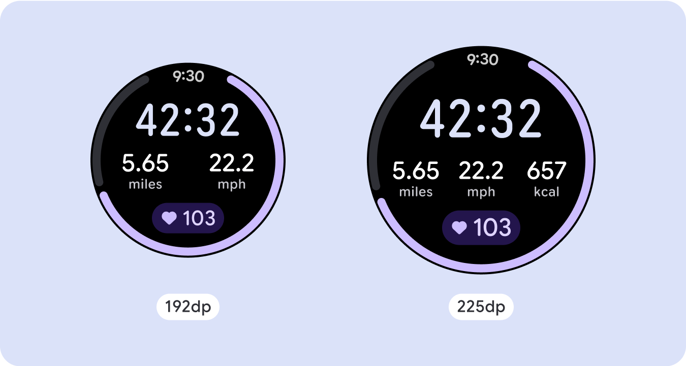
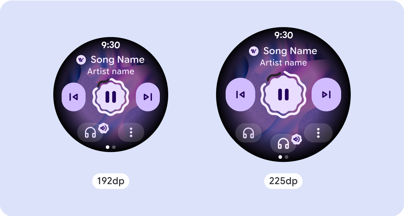
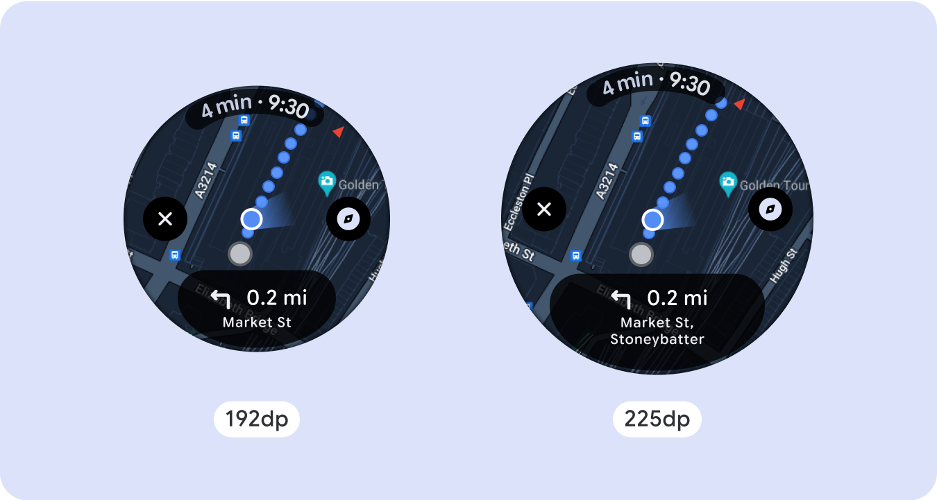
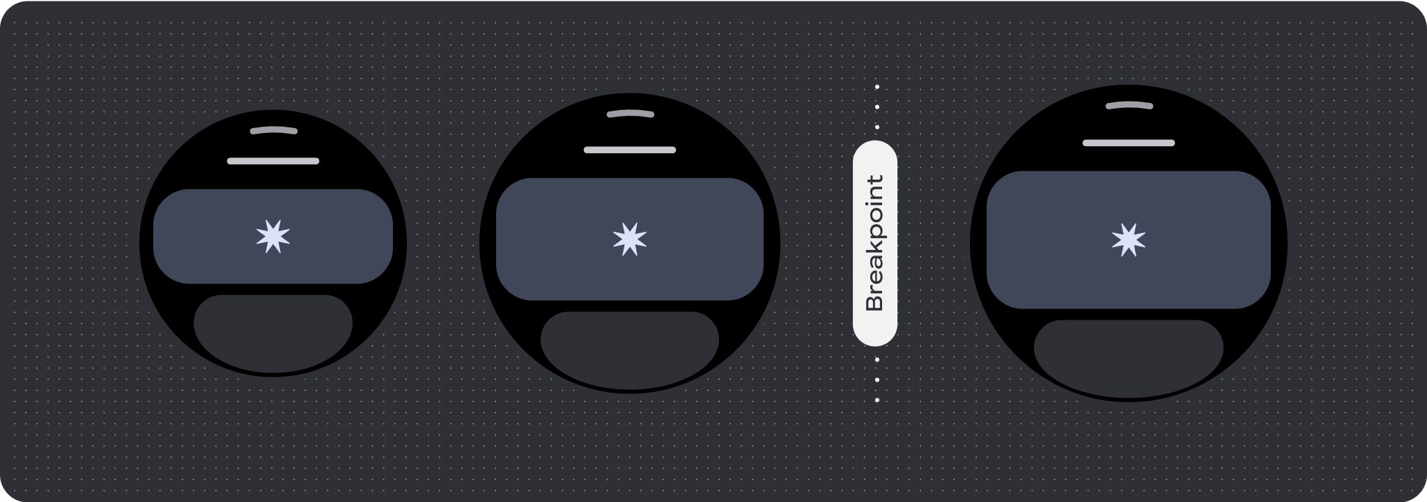
بالنسبة إلى تصميمات الشاشة الفريدة، يجب إجراء اختبار شامل على مجموعة متنوعة من أحجام الشاشة،
لضمان توافق المكونات والعناصر بسلاسة وتجنُّب اقتصاص المحتوى. تساعد علامتا
النسبة المئوية في زيادة حجم الفواصل بفعالية، وننصح باستخدام نقطة تفتيش
بمقدار 225dp لعرض معلومات إضافية ووظائف محسّنة
على شاشات الساعة الأكبر حجمًا.
تأكَّد من أنّ المكوّنات تتكيّف مع العرض والارتفاع المتاحَين.
تم تصميم جميع المكوّنات لتتجاوب مع مختلف أحجام الشاشة، أي أنّها تتكيّف مع
العرض المتاح (والارتفاع عند العرض بملء الشاشة). تأكَّد من أنّ لديك الهوامش اللازمة ل
ضمان عدم اقتطاع المحتوى بسبب منحنى الشاشة المستدير.
بالإضافة إلى ذلك، تأكَّد من السلوك اللازم للتخطيط لضمان عدم دفع محتوى الشاشة الذي لا يتدحرج
للتخطيط إلى الانتقال للأعلى أو للأسفل أو اقتطاعه.
إنشاء تصميمات مكيّفة ومميّزة
للاستفادة إلى أقصى حد من المساحة الإضافية على أحجام الشاشة الأكبر، أضِف نقطة فاصل حجم عند 225dp. تتيح نقطة التوقف هذه إمكانية عرض محتوًى إضافيًا
أو تضمين المزيد من المعلومات أو الخيارات أو البيانات أو تغيير التنسيق ليناسب بشكلٍ أفضل
حجم الشاشة الأكبر.
يتطلّب ذلك تصميمًا مختلفًا لكل نقطة توقّف. يمكن أن يتضمّن تصميم الشاشة الأكبر
(225 بكسل أو أكثر) العناصر الإضافية التالية:
زيادة حجم المكونات الحالية أو تغيير حالتها
استخدِم نقطة التوقف لعرض المزيد من التفاصيل أو لجعل المحتوى أكثر سهولة في الاطّلاع عليه. ما عليك سوى
التأكّد من أنّ التجربة أو الوظيفة تعملان على الشاشة الصغيرة وأنّ
التغييرات على الشاشة الكبيرة هي إضافية فقط.
إضافة محتوى ضمن التنسيق الحالي
من خلال إضافة مكوّنات أو محتوى، يوفّر التنسيق خيارات إضافية وتفصيلاً
وقيمة في نهاية المطاف.
ولا يُفترَض أن يؤثر ذلك في سهولة الاطّلاع على المحتوى.
في السيناريوهات التي تتطلّب تجربة ما عرض المزيد من المحتوى مع الحفاظ على تنسيق
غير قابل للتمرير، ننصحك باستخدام تنسيق على صفحات متعدّدة مع ميزة تقسيم الصفحات عموديًا أو
أفقيًا.

السلوك المتجاوب والمكيّف
ستتكيف جميع المكوّنات في مكتبة "الإنشاء" تلقائيًا مع حجم الشاشة الموسّع، وستزيد من العرض والارتفاع. بالنسبة إلى هذه المشاهدات على وجه الخصوص، يمكن أن يؤدي استخدام نقاط التوقف إلى توفير تجربة غنية ومفيدة بشكل خاص لجميع
المستخدِمين. حدِّد جميع الهوامش كنسب مئوية، وحدِّد القيود العمودية بحيث يمكن تمديد المحتوى الرئيسي في المنتصف لملء مساحة العرض المتاحة.
من الأفضل تقسيم الشاشة غير القابلة للتقديم أو الإيقاف إلى قسم علوي وقسم وسط وقسم سفلي عند التصميم. بهذه الطريقة، يمكنك إضافة هوامش داخلية إلى الجزء العلوي والسفلي
للتأكّد من عدم اقتصاص المحتوى، مع السماح للجزء الأوسط بالاستفادة من
العرض الكامل للشاشة. ننصحك باستخدام زر التمرير الدوار للتحكّم في عناصر الشاشة عندما يكون حجمها محدودًا، لأنّ التفاعلات من خلال النقر وحدها قد لا توفّر أفضل تجربة.
قائمة التحقق
- أنشئ تنسيقات مرنة تبدو مناسبة على جميع أحجام الشاشات.
- طبِّق الهوامش المقترَحة للأعلى والأسفل والجانبَين.
- حدِّد الهوامش بقيم مئوية في الأماكن التي قد يتم فيها
اقتصاص المحتوى.
- استخدِم قيود التنسيق لكي تستفيد العناصر من
المساحة داخل الشاشة على أفضل وجه ممكن وتحافظ على التوازن في أحجام
الأجهزة المختلفة.
- يجب أن يتلاءم نص الوقت مع المساحة المخصّصة له، ولكن بدون تداخل مع القسم العلوي من
الصفحة (اطّلِع على مؤشرات التقدّم التي تتضمّن فجوة في أعلى الصفحة لمعرفة المزيد).
- ننصحك باستخدام أزرار تلتصق بالجانبَين للاستفادة من المساحة المحدودة.
- ننصحك بتطبيق نقطة توقّف عند 225dp لعرض محتوى إضافي أو
لتسهيل الاطّلاع على المحتوى الحالي على شاشات أكبر حجمًا.

مؤشرات التقدم في وضع ملء الشاشة
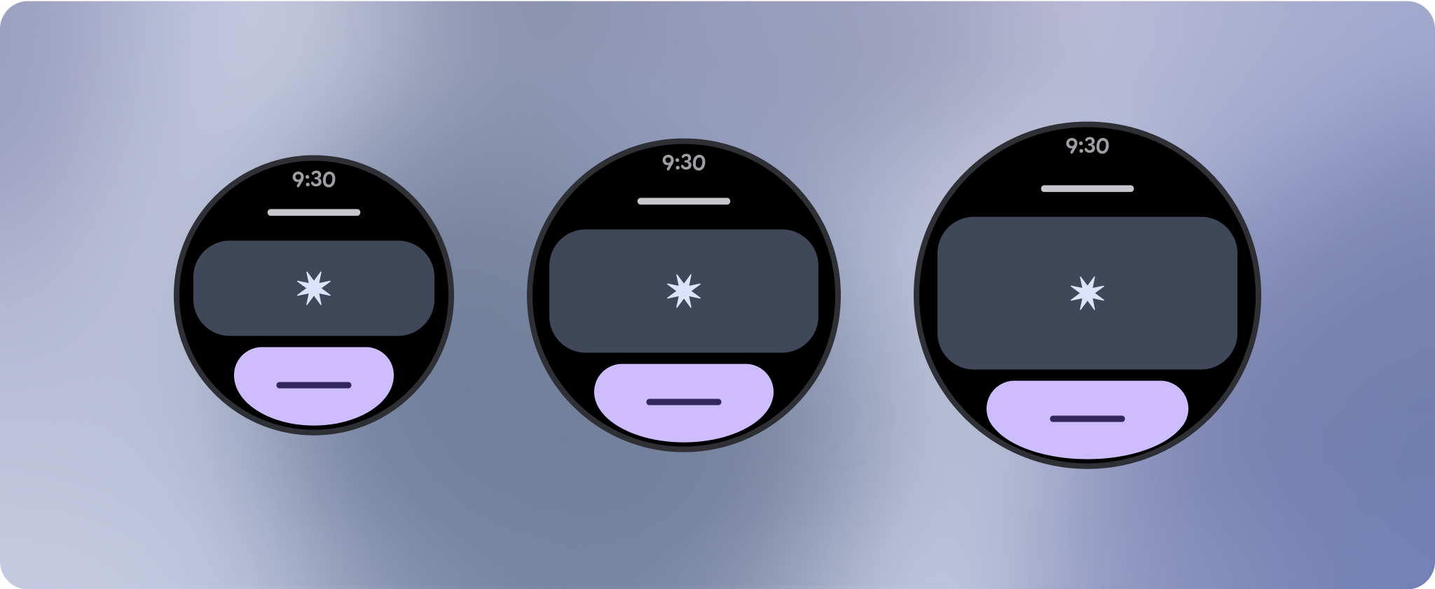
لا يحدث أي تغيير في سلوك مؤشر التقدّم لأنّه يتكيّف تلقائيًا
مع حجم الشاشة، ومع ذلك، ننصحك بتطبيق الهوامش (النسبة المئوية) ومقدار الحشو المتناسبَين (النسبة المئوية) على المنطقة المركزية للاستفادة من المساحة على أفضل نحو. ننصحك أيضًا بتحديد نقطة تفتيش
لزيادة حجم المكونات أو عددها على الشاشة الأكبر حجمًا.

إنشاء تجارب مختلفة
يمكن تخصيص التنسيقات غير القابلة للانتقال، ولكنّها تكون أكثر تقييدًا في مقدار المحتوى الذي يمكن إضافته إلى الشاشة ونوع العناصر التي تعمل بشكل أفضل. إنّ استخدام أزرار رسومية بدلاً من الأزرار الأوسع على شكل قرص يساعد في الاستفادة بشكل أفضل من المساحة المحدودة، كما تساعد الرسومات المرئية، مثل مؤشرات التقدّم ونقاط البيانات الكبيرة، في نقل المعلومات الرئيسية بطريقة مرئية. تكبر جميع العناصر التي تحيط بإطار الشاشة تلقائيًا مع حجم الشاشة، ما يجعلها أكثر فعالية.

يخضع كل من المحتوى وعيّنات التعليمات البرمجية في هذه الصفحة للتراخيص الموضحّة في ترخيص استخدام المحتوى. إنّ Java وOpenJDK هما علامتان تجاريتان مسجَّلتان لشركة Oracle و/أو الشركات التابعة لها.
تاريخ التعديل الأخير: 2025-07-27 (حسب التوقيت العالمي المتفَّق عليه)
[[["يسهُل فهم المحتوى.","easyToUnderstand","thumb-up"],["ساعَدني المحتوى في حلّ مشكلتي.","solvedMyProblem","thumb-up"],["غير ذلك","otherUp","thumb-up"]],[["لا يحتوي على المعلومات التي أحتاج إليها.","missingTheInformationINeed","thumb-down"],["الخطوات معقدة للغاية / كثيرة جدًا.","tooComplicatedTooManySteps","thumb-down"],["المحتوى قديم.","outOfDate","thumb-down"],["ثمة مشكلة في الترجمة.","translationIssue","thumb-down"],["مشكلة في العيّنات / التعليمات البرمجية","samplesCodeIssue","thumb-down"],["غير ذلك","otherDown","thumb-down"]],["تاريخ التعديل الأخير: 2025-07-27 (حسب التوقيت العالمي المتفَّق عليه)"],[],[],null,["# Common layouts for non-scrolling apps\n\nNon-scrolling app view layouts include media players, confirmation dialogs,\npickers, switchers, and special fitness or tracking screens using progress\nindicators. You can restrict the height of any screen, which ensures the user is\nfocused on one task or set of controls, rather than needing to browse through a\nlist of options. To accommodate devices with smaller screen sizes, design with\nthe limited size in mind, ensuring glanceability and embracing the circular\nscreen where relevant.\n\nBuild responsive and optimized designs\n--------------------------------------\n\nNon-scrolling views focus on glanceable information and offer users value with\nminimal interaction. However, building responsive behavior into these layouts\ncan be challenging. To address this, we have updated our Android UI library\nlayouts and components with built-in responsive behavior, including\npercentage-based margins and padding. If you're utilizing our Compose\ncomponents, you can automatically inherit this responsiveness.\n\nFor unique screen designs, thoroughly test across a variety of screen sizes,\nensuring components and elements adapt smoothly and avoid content clipping. Our\npercentage margins help spacers scale effectively, and we recommend using a\nbreakpoint at 225dp to introduce additional information and enhanced\nfunctionality on larger watch screens.\n\nCheck that components adapt to the available width and height\n-------------------------------------------------------------\n\n\nAll components are built responsively, meaning they adapting to the available\nwidth (and height when full screen). Make sure you have the necessary margins to\nensure content doesn't get clipped by the rounding curve of the screen.\nAdditionally, ensure the necessary layout behavior to ensure your non-scrolling\nscreen content doesn't push the layout to scroll or get cut off. \n\n\n\u003cbr /\u003e\n\nBuild adaptive and differentiated designs\n-----------------------------------------\n\nIn order to best use the additional space on larger screen sizes, add a size\nbreakpoint at 225dp. This breakpoint makes it possible to reveal additional\ncontent, include more information, options, data, or change the layout to better\nsuit the larger screen size.\n\nThis requires a different design for each breakpoint. The larger screen design\n(225+) could include the following additional elements:\n\n### Increase the size or change the state of the existing components\n\n\nUse the breakpoint to show more detail or make the content more glanceable. Just\nmake sure the experience or functionality isn't broken on small screen and the\nlarge screen changes are only additional. \n\n\n\u003cbr /\u003e\n\n### Add content within the current layout\n\n\nBy adding components or content, the layout provides additional options, detail\nand ultimately, value.\n\nThis should never come at the cost of the glanceability. \n\n\u003cbr /\u003e\n\nUse pagination\n--------------\n\nIn scenarios where an experience requires more content but wants to retain a\nnon-scrolling layout, consider a multi-page layout with either vertical or\nhorizontal pagination.\n\nResponsive and adaptive behavior\n--------------------------------\n\nAll components in the Compose library will automatically adapt to the wider\nscreen size, and gain width and height. For these views in particular, utilizing\nbreakpoints can deliver a particularly rich and valuable experience for all\nusers. Define all margins in percentages, and define vertical constraints such\nthat the main content in the middle can stretch to fill the available display\narea.\n\nIt's best to break a non-scrolling screen into a top, middle, and bottom section\nwhen designing. This way, you can add inner margins to the top and bottom\nsection to avoid clipping, but allow your middle section to take advantage of\nthe full width of the screen. Consider the use of the rotary scroll button to\ncontrol elements of the screen when its size is limited, as tapping interactions\nalone may not provide the best experience.\n\n### Checklist\n\n- Create flexible layouts that look reasonable on all screen sizes.\n- Apply the recommended top, bottom, and side margins.\n- Define margins in percentage values in places where content might otherwise be clipped.\n- Utilize layout constraints so that elements make the best possible use of the space within the screen and maintain balance across different device sizes.\n- Accommodate Time Text if used, but not overlapping the top section of the page (see progress indicators with a top gap for more)\n- Consider using edge-hugging buttons to utilize more of the limited space.\n- Consider applying a breakpoint at 225dp to introduce additional content or make existing content more glanceable when on bigger screen sizes.\n\n**Full screen progress indicators**\n\nThere is no behavior change on the progress indicator as it automatically adapts\nto the screen size, however, consider applying proportional (percentage) margins\nand padding on the central area to best utilize space. Also consider a\nbreakpoint to increase the size or number of components on larger screen.\n\nCreate differentiated experiences\n---------------------------------\n\nNon-scrolling layouts are customizable, but are more limited in how much content\ncan be added to the screen and what kind of components work best. Using Icon\nButtons instead of wider pill shaped Buttons makes better use of the limited\nspace, and visual graphics like Progress Indicators and large data points help\ncommunicate key information in a graphical way. All elements that hug the screen\nbezel automatically grow with the screen size, so they become even more\nimpactful."]]