Design your app's launching experience with care, because this is the first thing users encounter.
When launching your app, keep the following principles in mind.
Optimize performance
Invest in the performance of your app, as it can be uncomfortable to keep the wrist up while waiting for content to load.
Indicate activity
Reassuring users that the system is actively working on their requests can increase their tolerance for delays.
Build gradually
Gradually build content as it becomes available. This can be done in the following ways.
Display static elements
Start with static elements such as text elements, actionable buttons, and placeholder UI first, while the rest of the content loads.
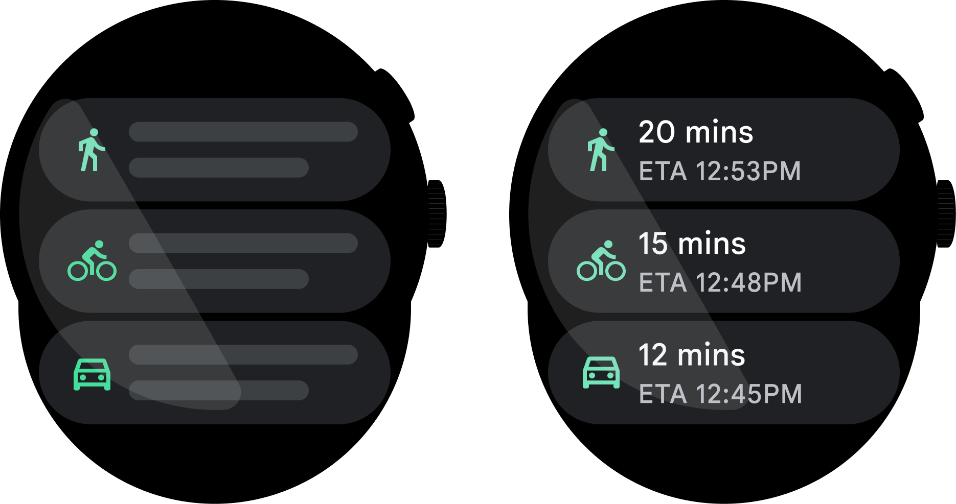
Do
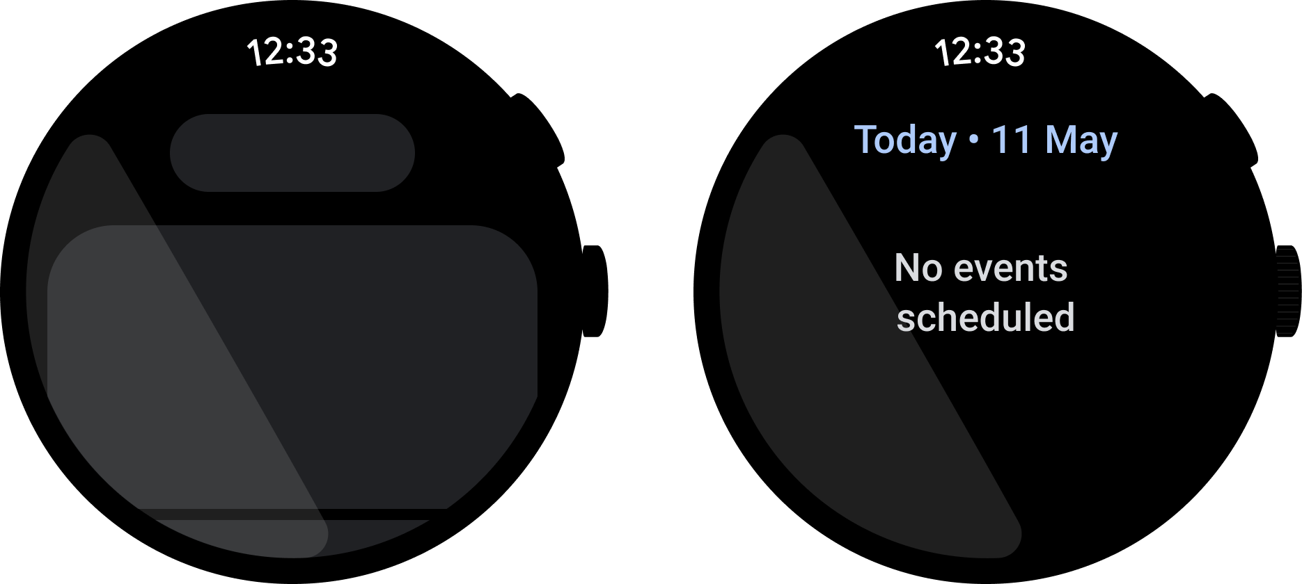
Don't
Use spinners with caution
Indeterminate loading spinners can cause latency issues. Instead show users static text or a placeholder image to indicate activity is happening.
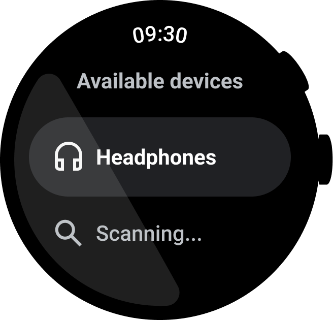
Do
Prioritize visual feedback
When users perform an action, give them visual feedback instantly. This builds confidence that the action has happened. For simple actions like tapping a button, this can be on-touch ripple feedback. For more complex actions like changing the volume of music on the phone, this can be showing the volume indicator before the volume has been changed.
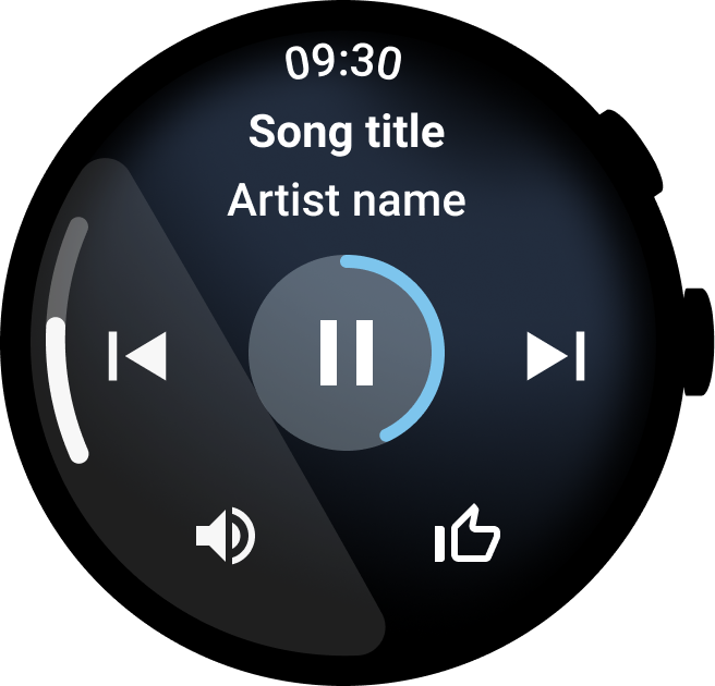
Do
Branded launch
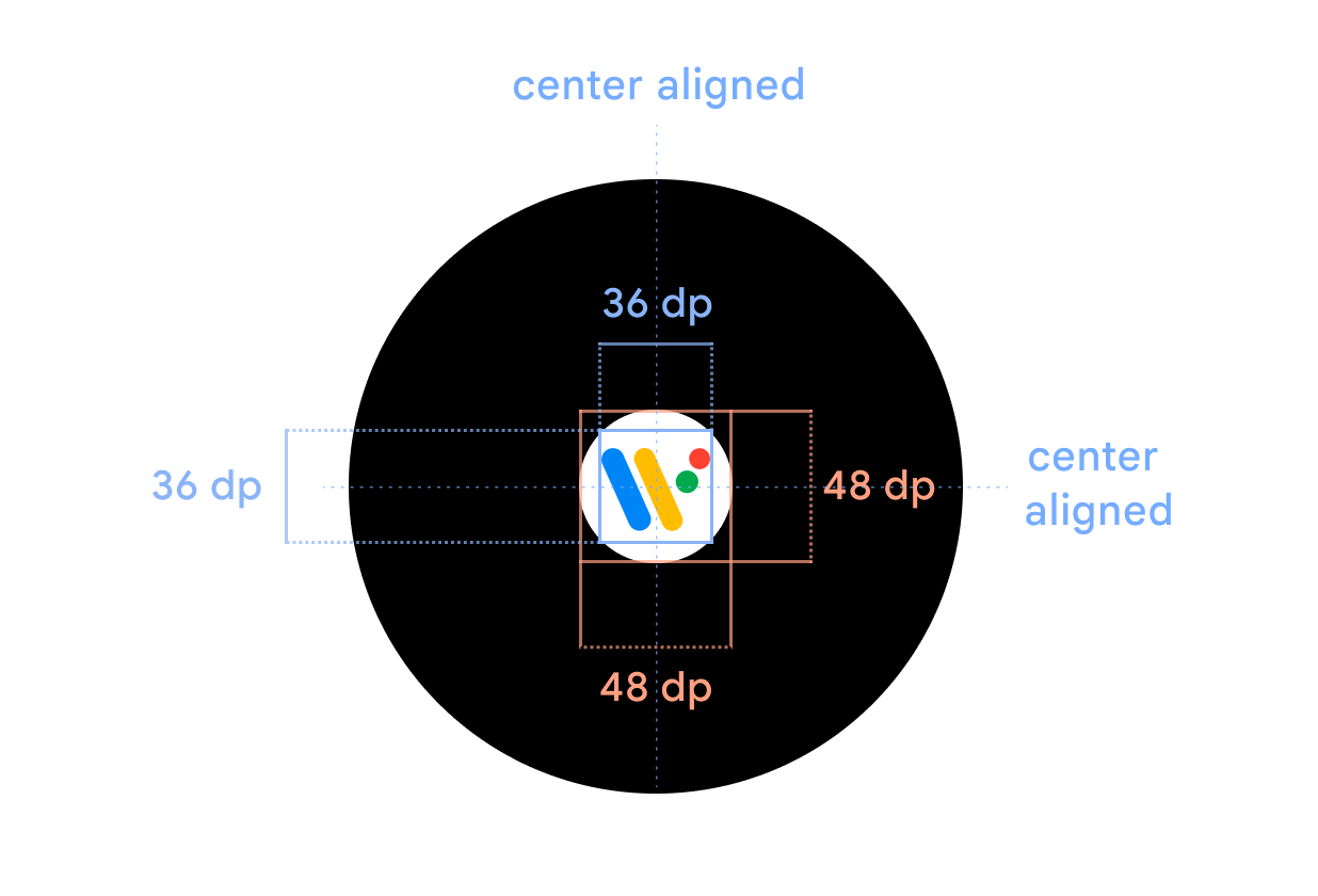
Display the app icon centrally during app starts, so users see the app icon first. This improves brand recognition and is one way to show progress. Use a black window background with the app icon. The app icon must be a 48x48dp circular icon that is positioned in the center of the watch face. The splash screen icon must match the app launcher icon. Learn more about how to add a splash screen.
