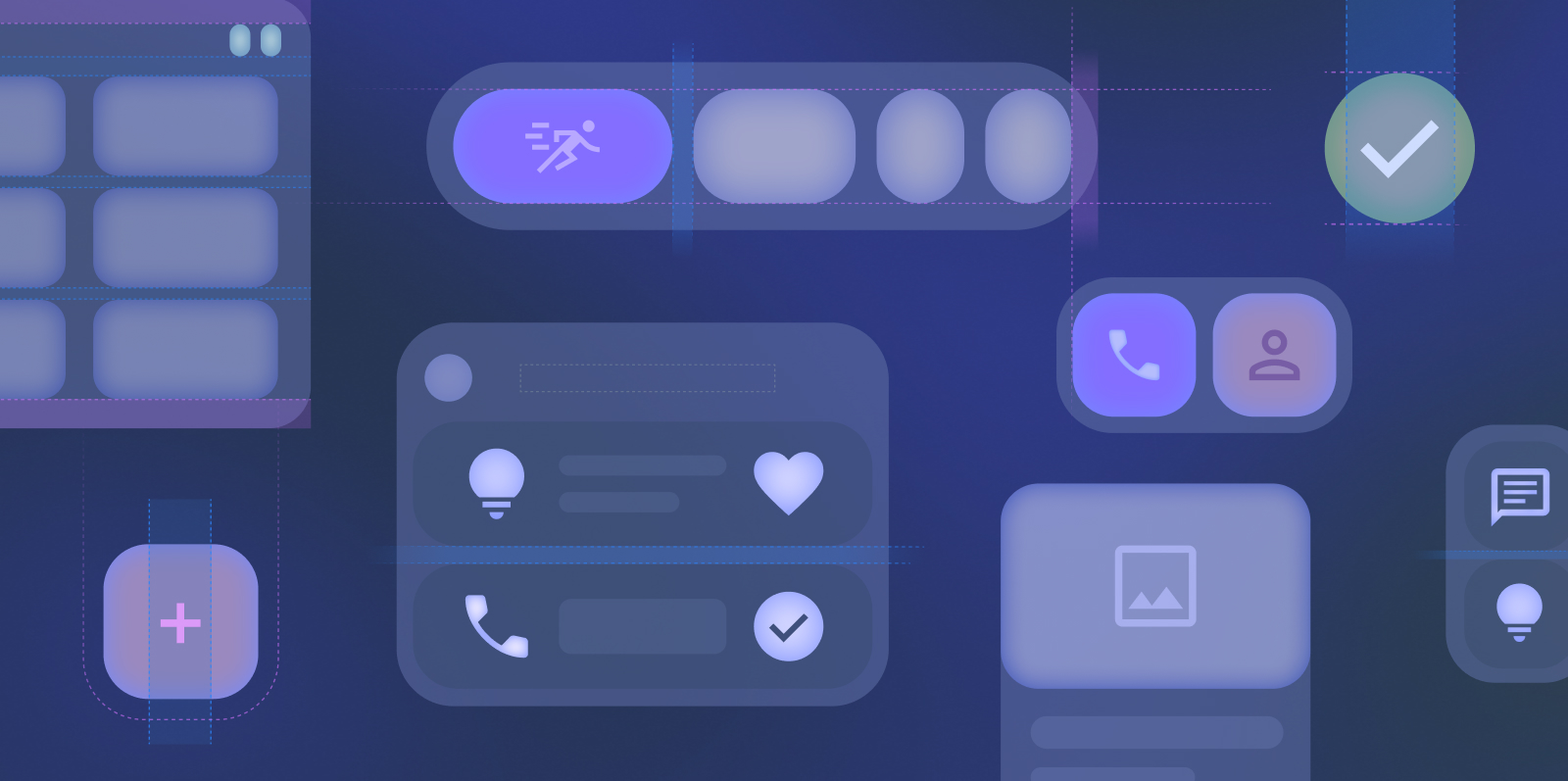
Sử dụng bộ sưu tập để sắp xếp ngăn nắp các trang
Lưu và phân loại nội dung dựa trên lựa chọn ưu tiên của bạn.
Tiện ích là các thành phần trên màn hình chính có thể tuỳ chỉnh, hiển thị chế độ xem rõ ràng và có thể thao tác về nội dung hoặc hành động của ứng dụng. Nội dung này có thể được làm mới định kỳ.
Tiện ích giúp người dùng hoàn thành mục tiêu của họ bằng cách tương tác trực tiếp với nội dung của ứng dụng trong tiện ích hoặc bằng cách mở trải nghiệm ứng dụng đầy đủ.
Bắt đầu
Khi tạo tiện ích, hãy hoàn tất các bước sau:
Chọn một trường hợp sử dụng chính của người dùng để làm nổi bật trong tiện ích.
Bố cục quy định cách sắp xếp thông tin và các thành phần tương tác trong tiện ích. Tìm hiểu thêm về các bố cục tạo sẵn cho tiện ích dạng văn bản, danh sách và lưới.
Tìm hiểu thêm về cách thiết kế các tiện ích có thể điều chỉnh theo tỷ lệ liền mạch cho nhiều kích thước. Xem kích thước tiện ích mặc định và tìm hiểu cách sử dụng tối đa không gian lưới được cung cấp.
Nội dung và mã mẫu trên trang này phải tuân thủ các giấy phép như mô tả trong phần Giấy phép nội dung. Java và OpenJDK là nhãn hiệu hoặc nhãn hiệu đã đăng ký của Oracle và/hoặc đơn vị liên kết của Oracle.
Cập nhật lần gần đây nhất: 2025-07-26 UTC.
[[["Dễ hiểu","easyToUnderstand","thumb-up"],["Giúp tôi giải quyết được vấn đề","solvedMyProblem","thumb-up"],["Khác","otherUp","thumb-up"]],[["Thiếu thông tin tôi cần","missingTheInformationINeed","thumb-down"],["Quá phức tạp/quá nhiều bước","tooComplicatedTooManySteps","thumb-down"],["Đã lỗi thời","outOfDate","thumb-down"],["Vấn đề về bản dịch","translationIssue","thumb-down"],["Vấn đề về mẫu/mã","samplesCodeIssue","thumb-down"],["Khác","otherDown","thumb-down"]],["Cập nhật lần gần đây nhất: 2025-07-26 UTC."],[],[],null,["# Widgets are customizable home screen elements that display a clear and\nactionable view of an app's content or actions. This content can periodically\nrefresh.\n\nWidgets help users complete their goals, either by interacting with your app's\ncontent directly in the widget or by opening your full app experience.\n\nGet started\n-----------\n\nWhen creating your widget, complete the following steps:\n\n1. Choose a single primary user case to highlight in your widget.\n2. Check out the [Widget template examples](https://www.figma.com/community/file/1237551184114564748/android-ui-kit) on Figma.\n3. Design the UI within the [sizing](/design/ui/mobile/guides/widgets/sizing) guidelines.\n4. Test for multiple screen sizes.\n5. Ensure your widget meets the [Widget quality guides](/docs/quality-guidelines/widget-quality).\n\n### Canonical widget layouts\n\nLayouts dictate how information and interactive elements are organized within your widget. Learn more about prebuilt layouts for text, list \\& grid-type widgets. \n[Learn more](/design/ui/mobile/guides/widgets/layouts) \n\n### Sizing\n\nLearn more about designing widgets that scale seamlessly to multiple sizes. See the default widget sizes and learn how to fully use the grid space given. \n[Learn more](/design/ui/mobile/guides/widgets/sizing) \n\n### Style\n\nLearn how to style your widget to enhance your widget's visual impact and to fit with the user's device theme. \n[Learn more](/design/ui/mobile/guides/widgets/style) \n\n### Discovery and promotion\n\nLearn to promote your widget on the widget picker through appropriate sizing and information shown. \n[Learn more](/design/ui/mobile/guides/widgets/discovery-promotion)"]]