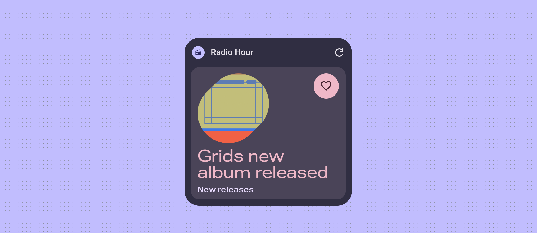
Styling widgets effectively is crucial for achieving a visually appealing and consistent user experience. This section delves into the key concepts and techniques for defining the color and typography to create the most helpful and engaging Android widgets.
Color
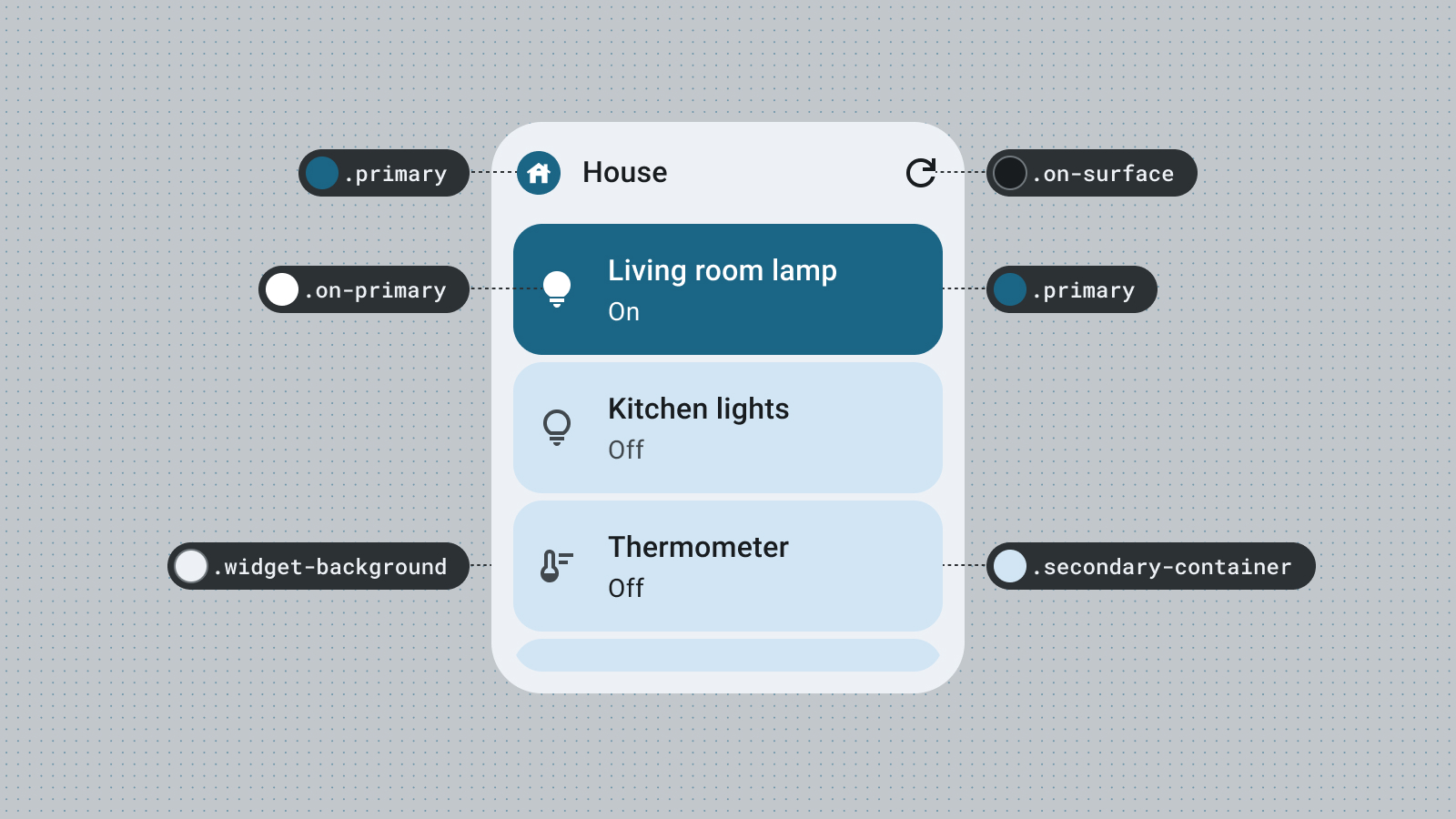
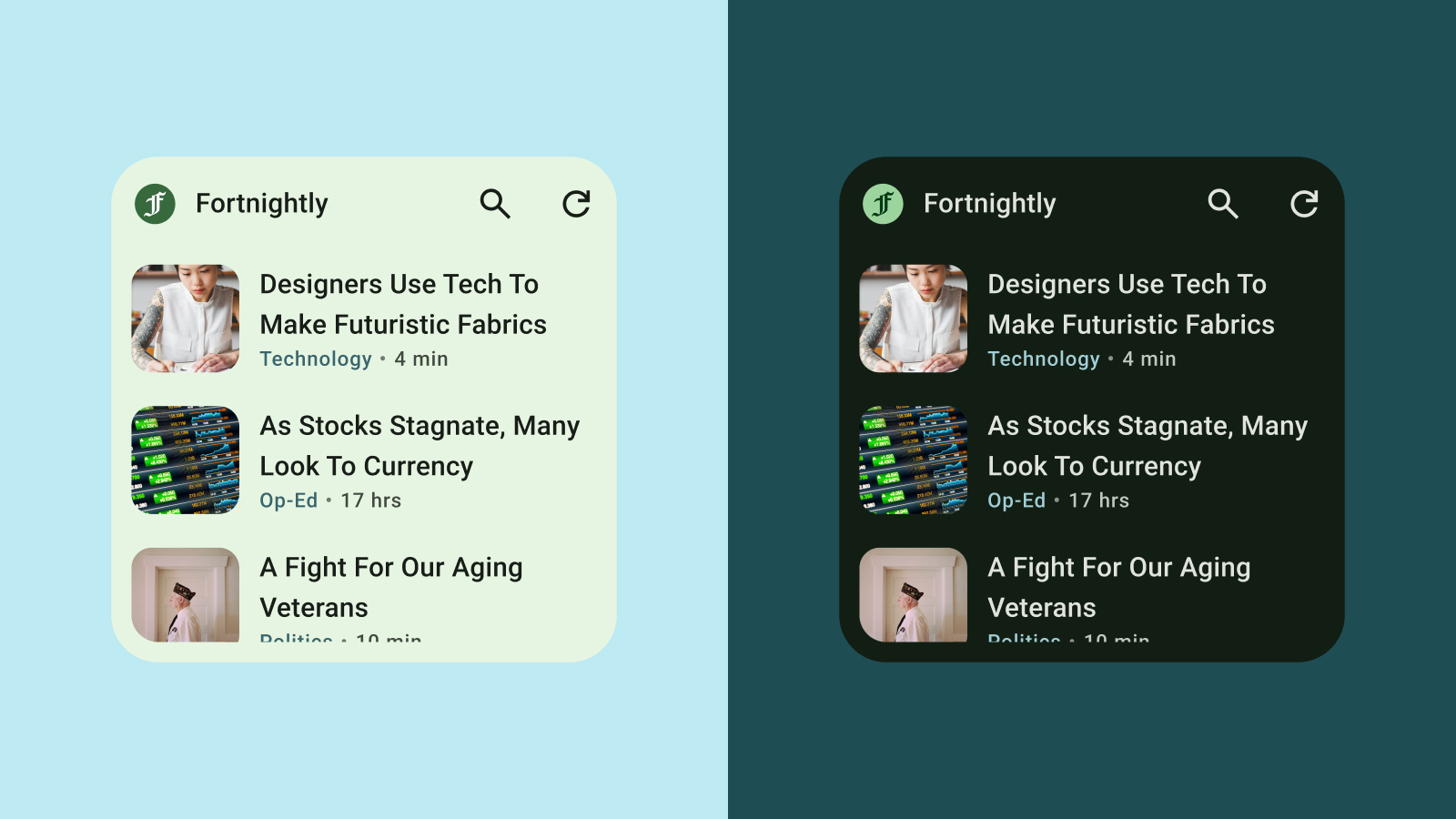
Use color to express style and communicate meaning. Setting appropriate colors for your widget colors are crucial for legibility, personalization, and of course expressing your app's brand identity.
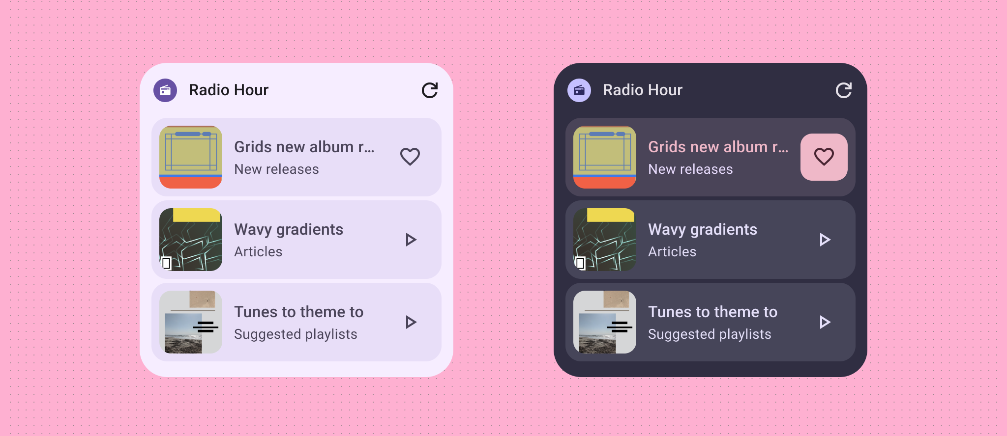
Use Material color roles and tokens to fulfill accessibility contrast guidelines and support dynamic color features, such as user-generated color and dark or light themes.
Explore visual hierarchy through accent roles to create vibrant contrast in elements or explore a more playful custom theme that expresses your brand.
Refer to Material Design Color guidance to learn more about color roles.
Shape
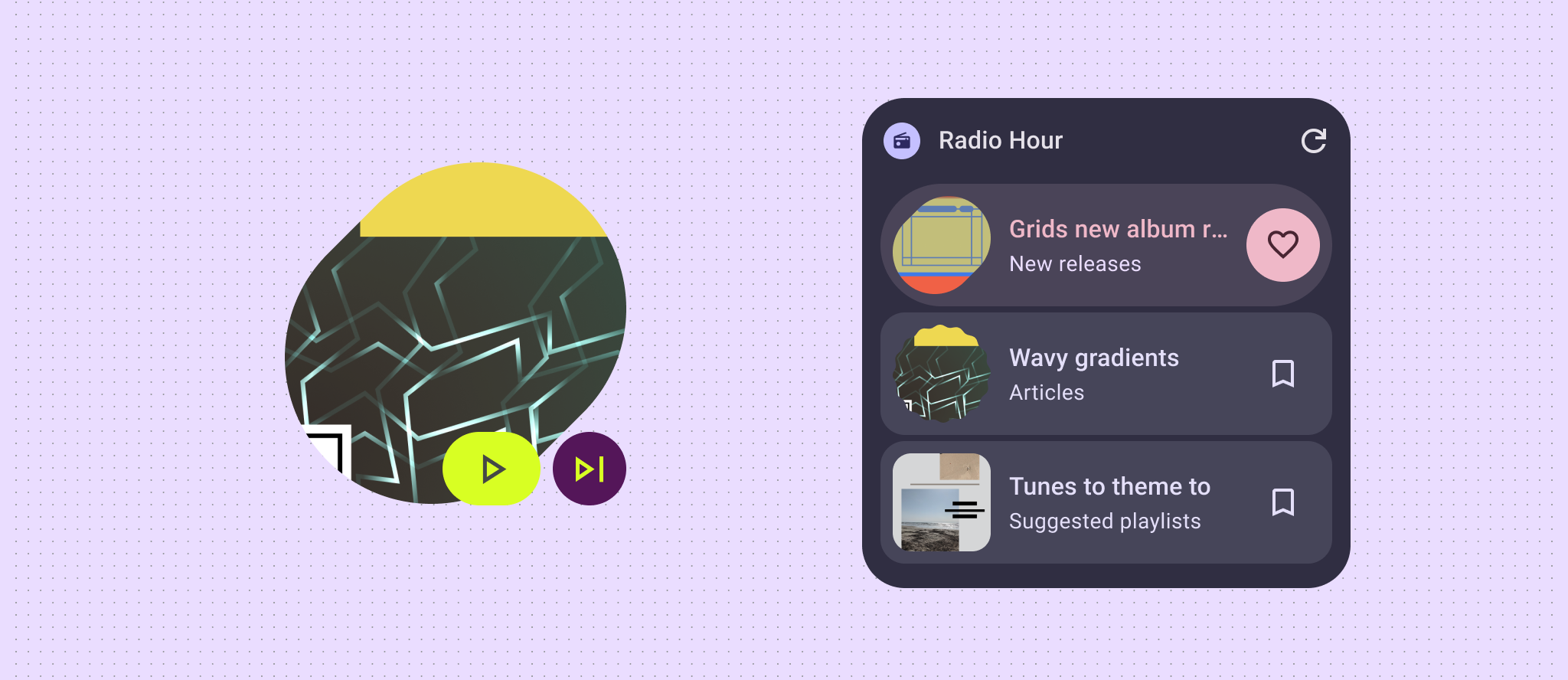
The shape of your widget sets the mood of your widget. For rectangular widgets, use the system corner radius property. This property creates consistency across different devices and helps prevent widget content from being clipped.
If your widget displays minimal data content, like a photo, weather, or current song playback then try out making your whole widget an expressive shape to bring an exciting burst of energy to your user's home screen. If you have more complex layouts and data, consider using expressive shapes for visual hierarchy, highlighting new content or a call to action.
To learn more, see Implement rounded corners.
Dynamic themes
Starting in Android 12, a widget can use the device theme colors for buttons, backgrounds, and other components. This provides visual consistency across different widgets, home screen icons, and wallpapers, offering Android users a more cohesive user experience. Using the provided color tokens helps your widget look integrated across device themes provided by different device manufacturers and the dynamic themes set by the user.
Light and dark theme
A dark theme is a low-light version of the device UI that displays mostly dark surface colors. Users are increasingly switching to dark theme for better battery life and eye comfort. If your widget doesn't adapt to dark theme, it will appear out of place and could potentially frustrate users.
Typography
Typography helps make writing legible and beautiful. Utilize font sizes and weights to establish a clear hierarchy, guiding the user's eye to the most important elements. Pay attention to line spacing and letter spacing (kerning) to improve readability, especially for smaller text displays within the restricted space of a widget.
Hierarchy
Hierarchy is communicated through differences in font weight, size, line height, and letter spacing. The updated type scale organizes text styles into five roles that are named to describe their purposes. The five text styles are display, headline, title, subtitle and body. The new roles are device-agnostic, allowing easier application across a variety of use cases.
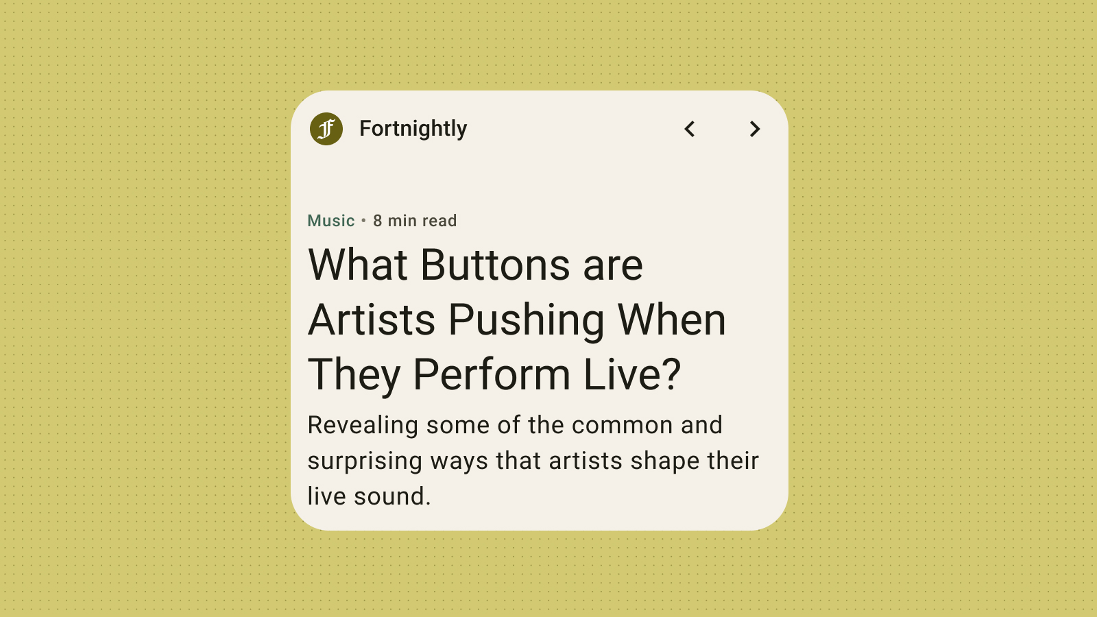
Although widgets use system fonts, you can still add expressive details with dramatic typescales: get bolder with headlines, labels, and data.
