
A design system is a collection of reusable design decisions expressed as guidance, components, and patterns. The system can be broken down into smallest design primitives: things like color, type, or shape which build into larger complex component pieces. For example, an icon and text label make up a button component, while multiple buttons and a surface make up a card. Design systems also come with a set of guidance composed of these existing design decisions around the components and patterns.
Material Design is an open-source design system developed by Google to help you build beautiful user-focused products. Material 3 is the latest iteration of Material Design.
Material Design Components
Material Design provides an array of code-backed components that are interactive building blocks for creating a user interface. These components can be organized into five categories based on their purpose: action, containment, navigation, selection, and text input.
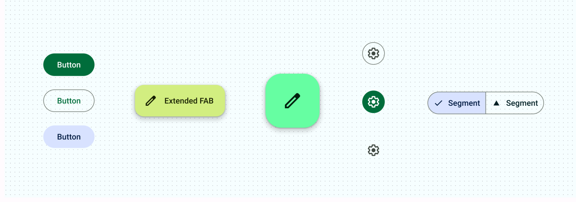
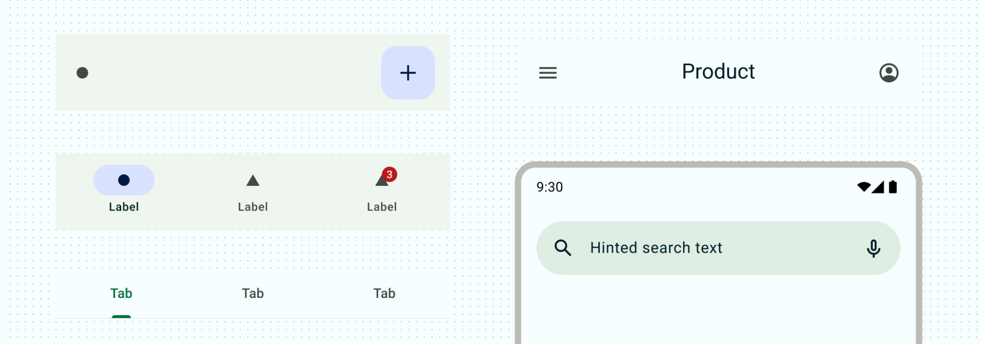
Action components
Action components help people achieve an aim.
Material has multiple types of buttons to help define priority of actions and interaction in different contexts. From FABs or extended FABs for primary actions to supporting icon buttons to selecting options with segmented buttons.
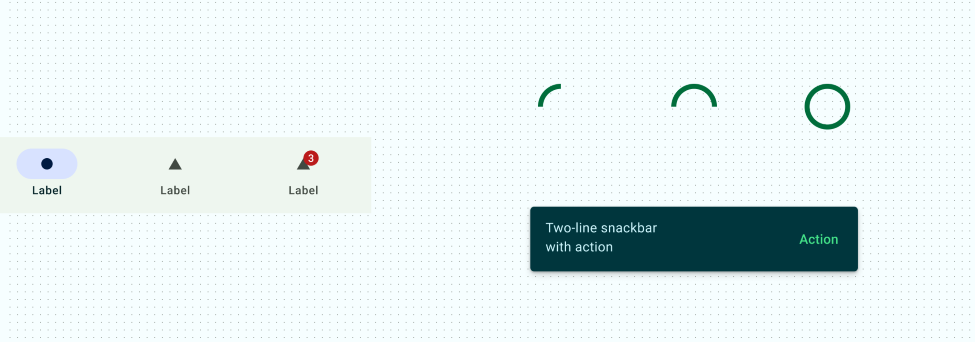
Communication components
Communication components provide helpful information, by alerting users with badges, informing of status through progress indicators, and providing brief process messages with snackbars.
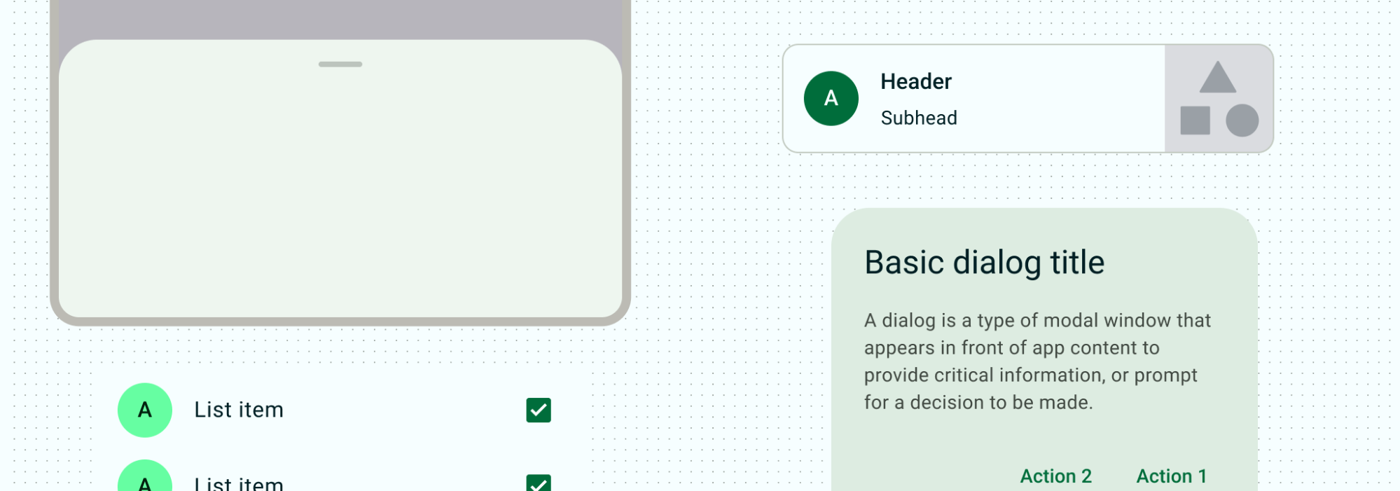
Containment components
Containment components hold information and actions – including other components like buttons, menus, or chips. Most Material components use explicit containment, grouping together related content and actions with visual objects: cards, dialogs, bottom sheets, side sheets, carousels, and tooltips. Lists can be provided with implicit containment or explicit by showing visible dividers. These components provide common patterns for displaying groups of content.
Navigation components
Navigation components help people move through the UI. For mobile, the navigation bar or navigation drawer contain your primary navigation destinations. Tabs, the bottom app bar, and the top app bar provide different ways to navigate supporting information and actions. Read more about how to work with navigation within your layouts.
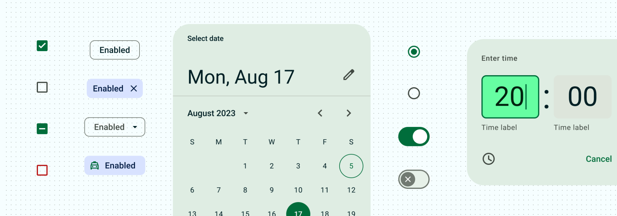
Selection components
Selection components let people specify choices. Whether building out a form with checkboxes and radio buttons, filtering using chips, or toggling settings with switches and sliders, selection components allow users to control and input their decisions.
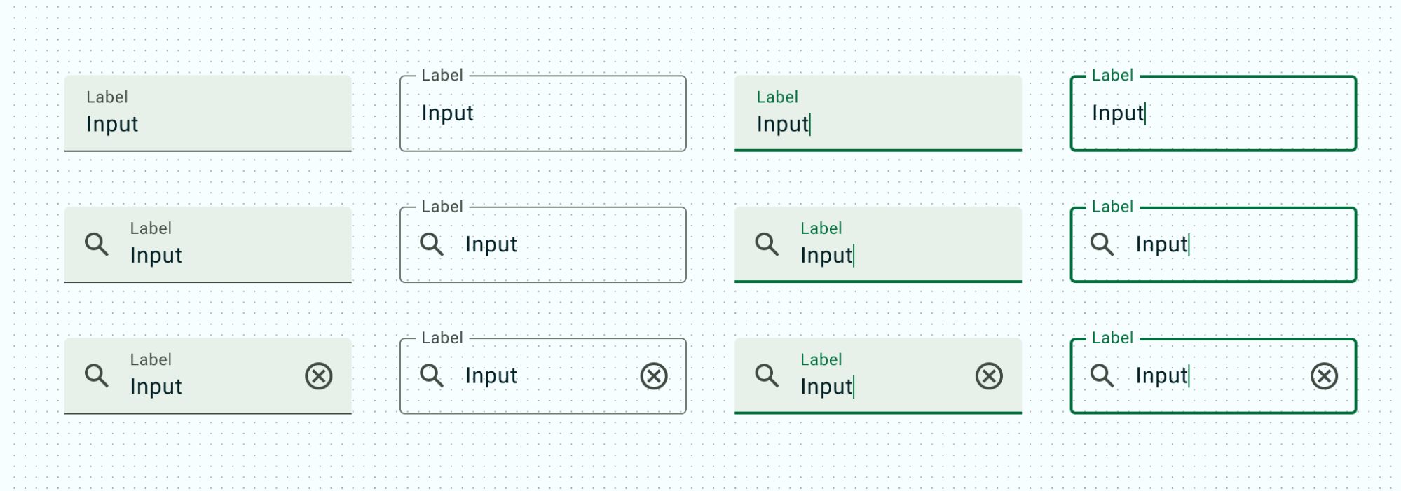
Text input components
Text input components let people enter and edit text. Text fields allow users to enter text into a UI.
Design systems for Compose
Read Design systems in Compose for details about how to use Compose to more smoothly implement a design system and give your app a consistent look and feel with theming, components, and other aspects of the design system.