

App settings let users indicate preferences for how an app behaves.
Takeaways
Keep the following in mind when designing your app settings:
- Respect system settings. Your app may not need its own settings.
- Use clear and precise language.
- If necessary, provide an overview and divide your settings up by groups and screens.
- Use appropriate selection UX patterns.
- Use polite defaults.
- Provide clear and access to settings.
Select appropriate settings
Settings should be well-organized, predictable, and contain a manageable number of options. Keep the following tips in mind when deciding what to include:
- Do include infrequently accessed preferences.
- Don't include frequently accessed actions. These should be contextual to the feature they most affect.
- Do save user preferences.
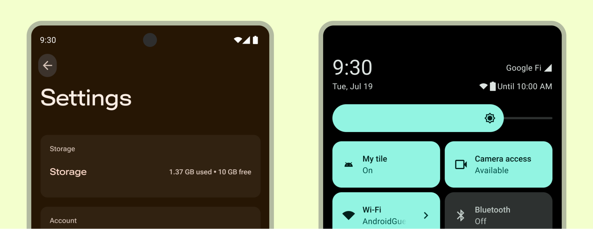
- Avoid information about the app, such as a version number or licensing information in settings.
- Avoid account management.
- Avoid replicating preferences available at the device settings level.
Choose common defaults
Define the defaults for preferences that are common, don't pose risk, don't interrupt the user, and don't negatively affect battery and performance.
The initial value for each setting should do the following:
- Represent the default most users would choose.
- Be neutral and pose little risk to the user.
- Use less battery or mobile data.
- Only interrupt when important.
Decide on placement.
Choose which settings should be determined in-app and eliminate preferences better decided in device settings or handled by a service. For example, avoid overriding system themes unless extending with greater customization for your app experience.
Consider if certain settings are accessed frequently enough to be surfaced outside the settings nearest to their feature they affect.
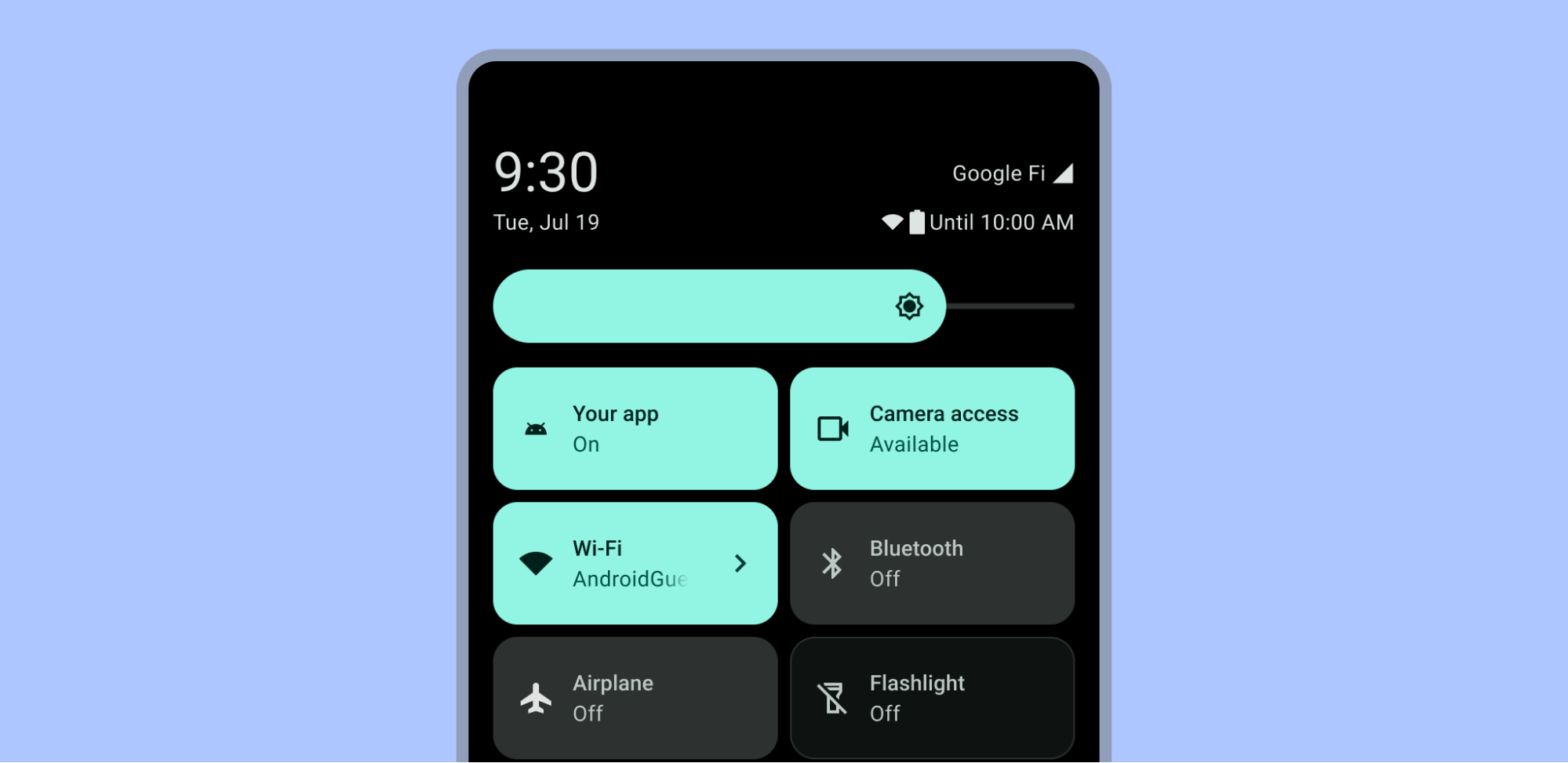
Device settings
System settings within the device Settings app and Quick Settings can affect your app.
Provide additional or alternative personalization options to enhance your user's experience, but don't replicate or replace settings provided by the system. For example, your app may extend the theming system for greater personalization or give more granular sound controls.
Don't override settings provided by the system, as they can be personal accessibility needs.
Quick settings representing actions that users can tap to quickly complete recurring tasks are displayed in the Quick Settings panel when the user pulls down on the notification shade. Your app can provide a prominent Quick Settings tile to allow your users frequent access. For more on building a tile, read Create custom Quick Settings tiles for your app and check out the Android UI Kit for the Quick Settings template.
Context based settings
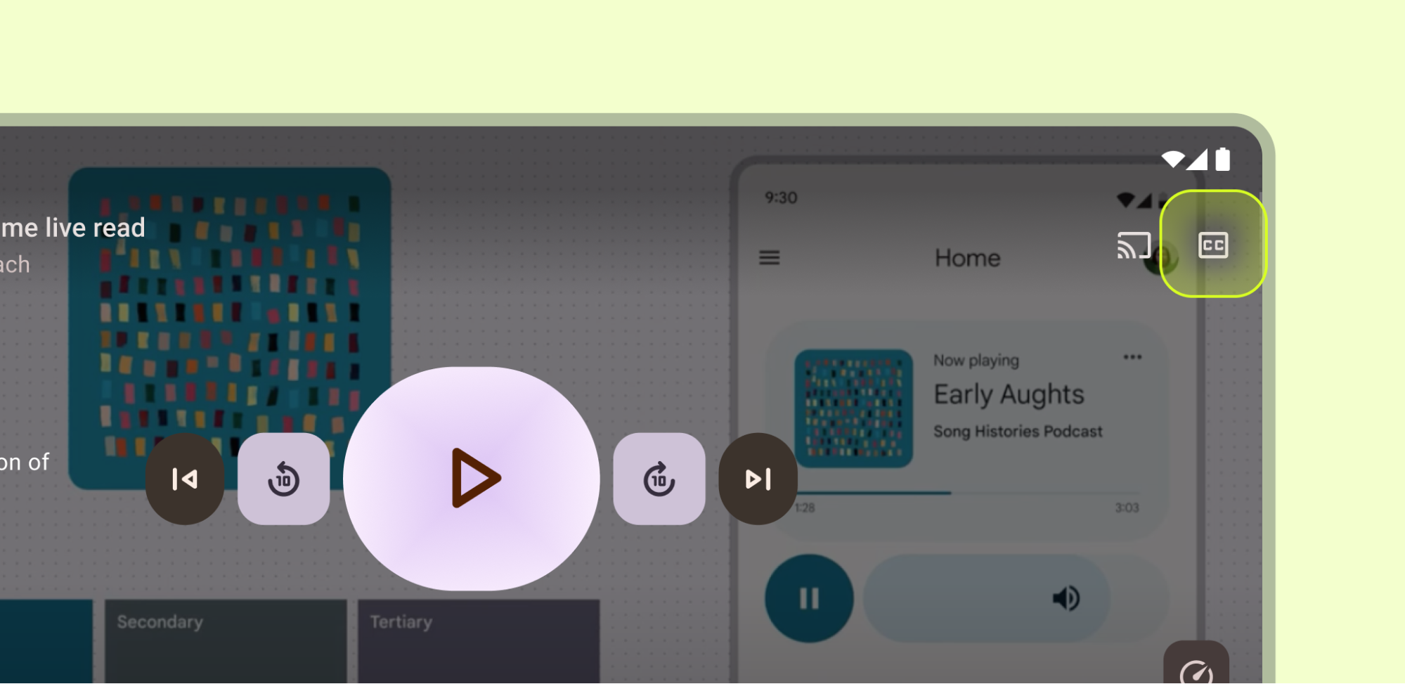
Place frequent contextual preferences close to the feature it affects. For example, Closed Captioning settings can be placed on a video player. Don't place the remaining infrequently accessed settings so prominently.
Navigation
Typically settings aren't classified as a top-level navigation destination. However, if certain settings are crucial to your user's journey, place them in a primary navigation component such as the navigation bar, drawer, or navigation rail.
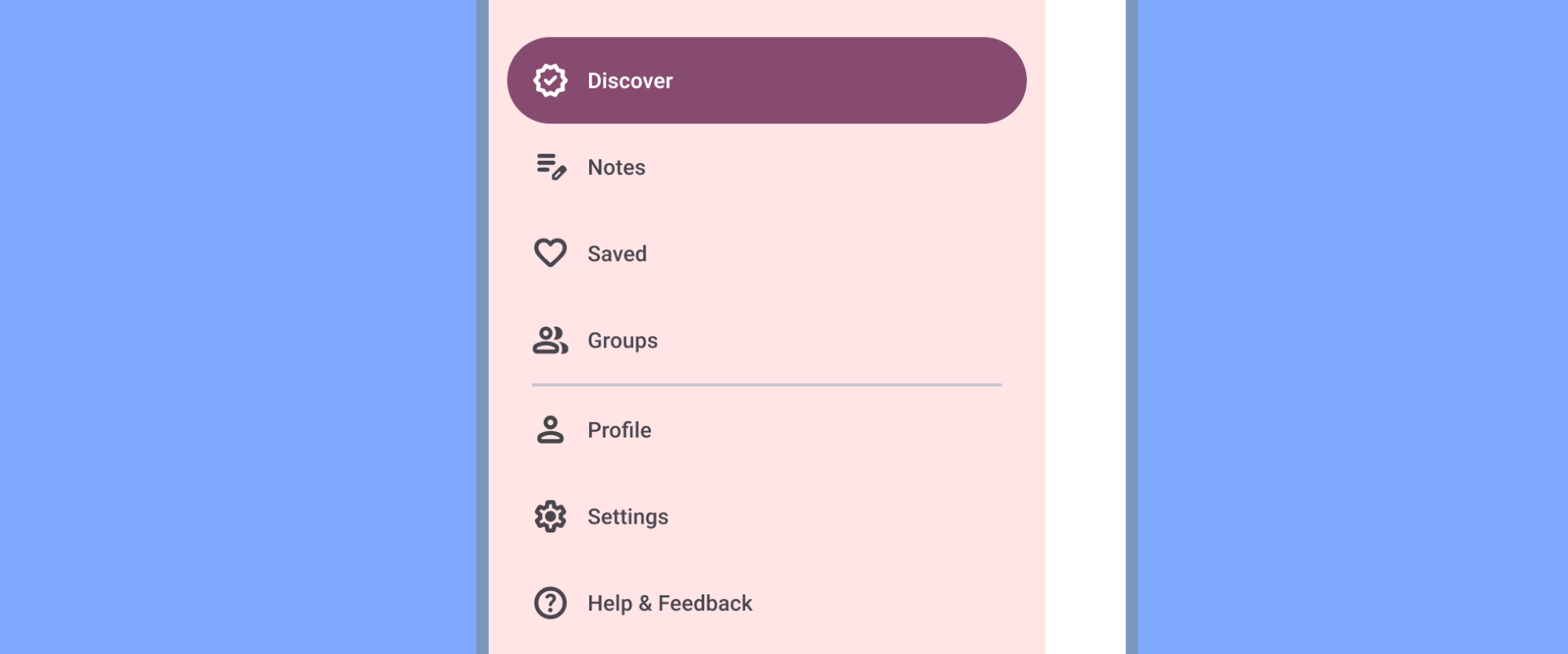
If side navigation such as a navigation drawer exists, include Settings after all other items (except Help & Feedback). Don't use synonyms such as "Options" or "Preferences."

Usually settings are not essential to the primary user journeys of the app and are placed in secondary navigation locations, such as top bars or menus.
You can place Settings in the top app bar menu after all other items, except Help & Feedback, otherwise surface it in the top app bar or in another destination.
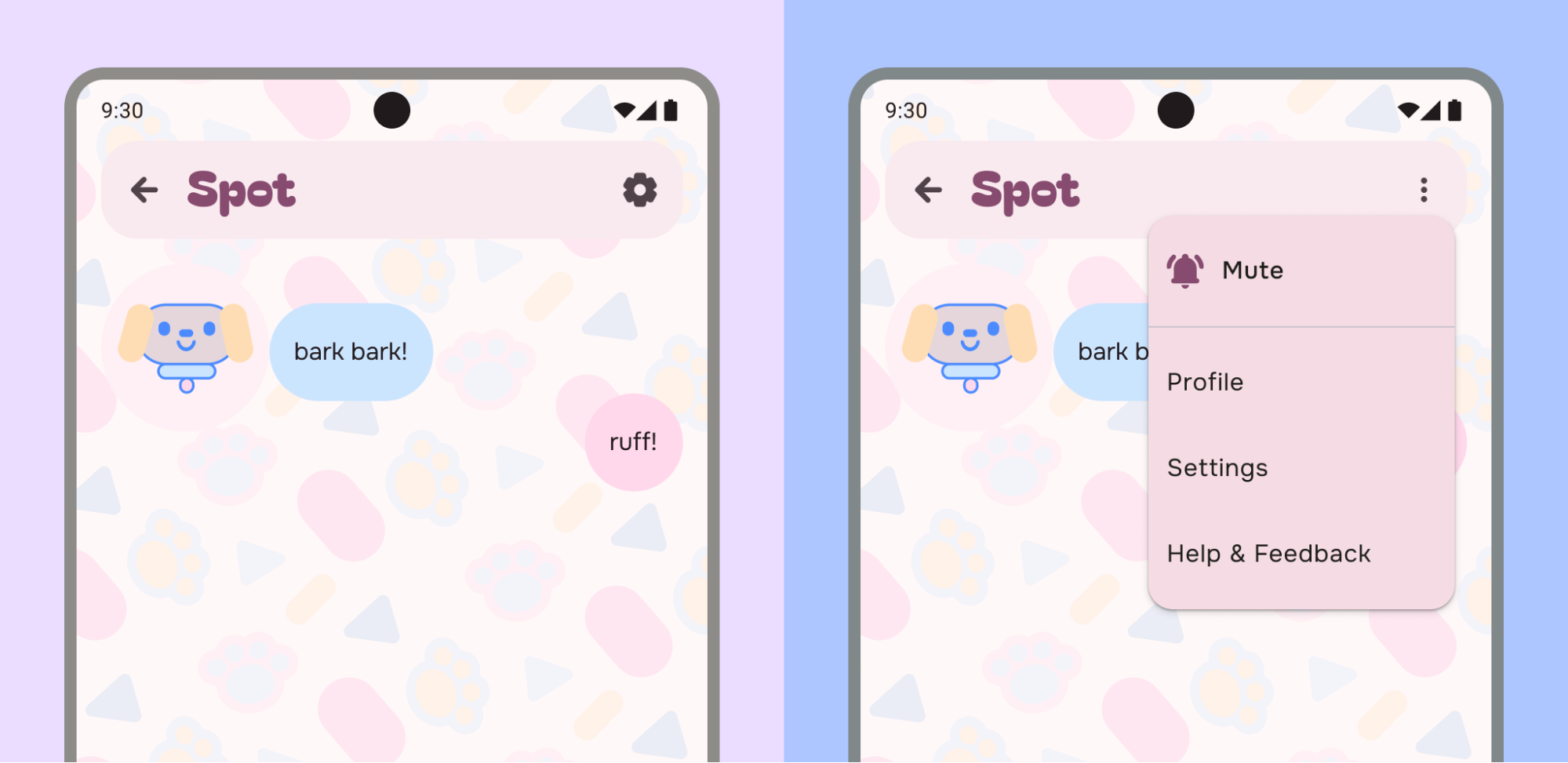
For example, on the left the app has placed a Settings icon into the top app bar to more directly access settings. The example on the right has combined Profile, Settings, Help & Feedback, along with a preference action into an overflow menu.
You can combine settings with other destinations, such as Account if the taxonomy makes sense:
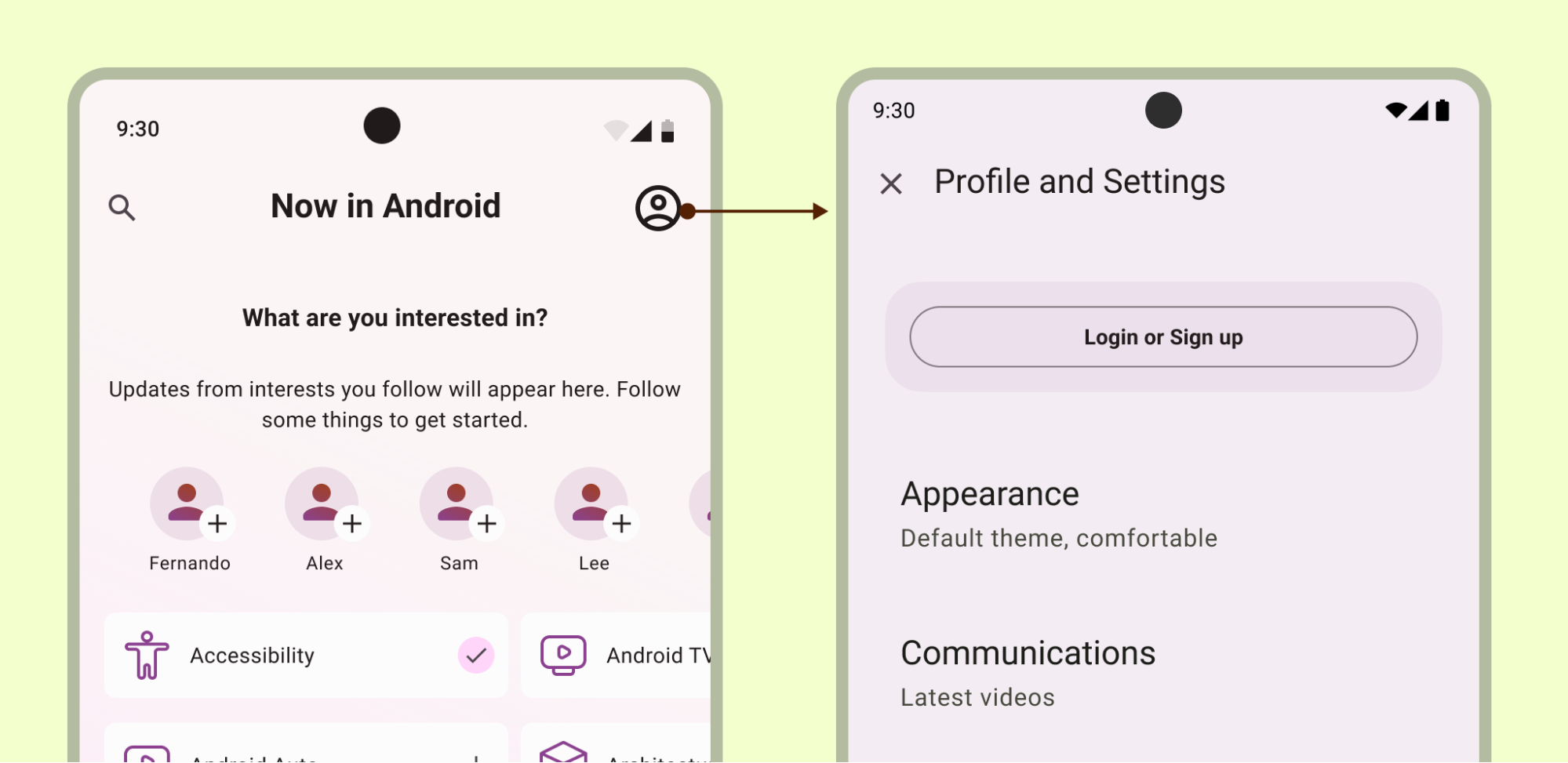
Make sure that settings are always accessible, even in a signed out state, if combining sections.
Layout and selection Patterns
Create a settings section by using the list or list-detail layout. Settings can utilize Material lists, allowing for labels, supporting text, icons, and selection controls.

Use the primary label to provide the name of the item, and optionally use secondary text for status. In this example, status is reinforced with an icon to the right of the label. Icons should help clarify a setting's meaning or communicate status.
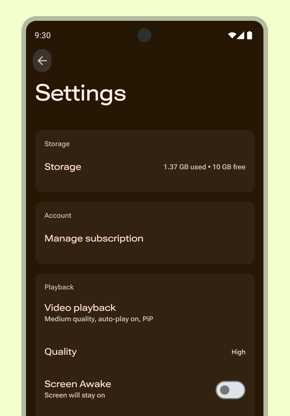
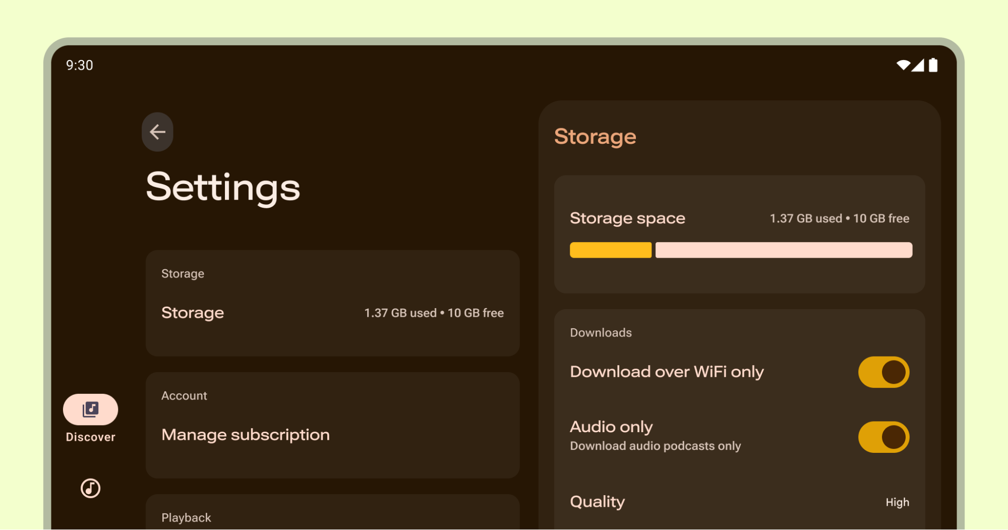
Provide an overview
Users can quickly see the most important and frequently used settings and their values. Create an overview page using a list layout. Use Material Design components to provide a cohesive experience. If necessary, create a separate screen in your app for destinations such as account, app info, help, and feedback.
Try to avoid placing these destinations on the settings overview. If there are many settings, prioritize the settings that users find the most important. Group any remaining settings and place them on a separate screen.
Containment
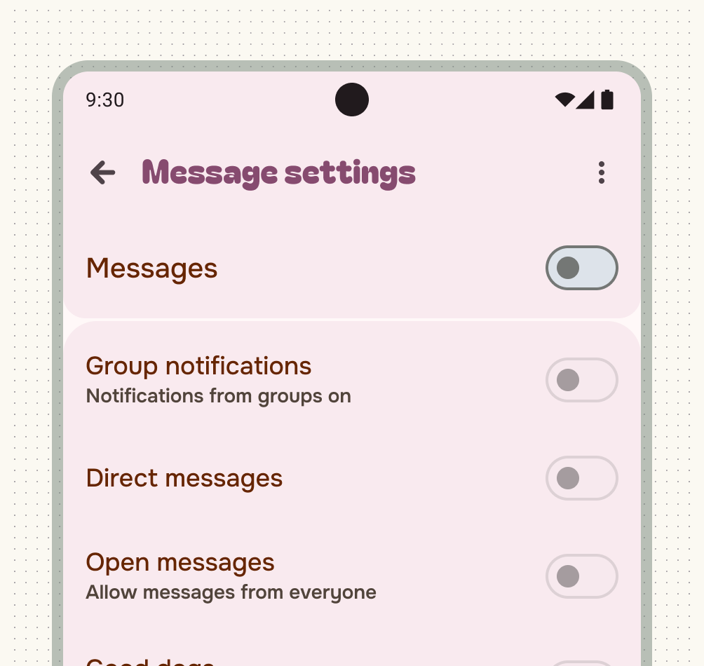
Group settings in smaller relevant groups. Use visual or intrinsic containment and headings between groups instead of individual items.
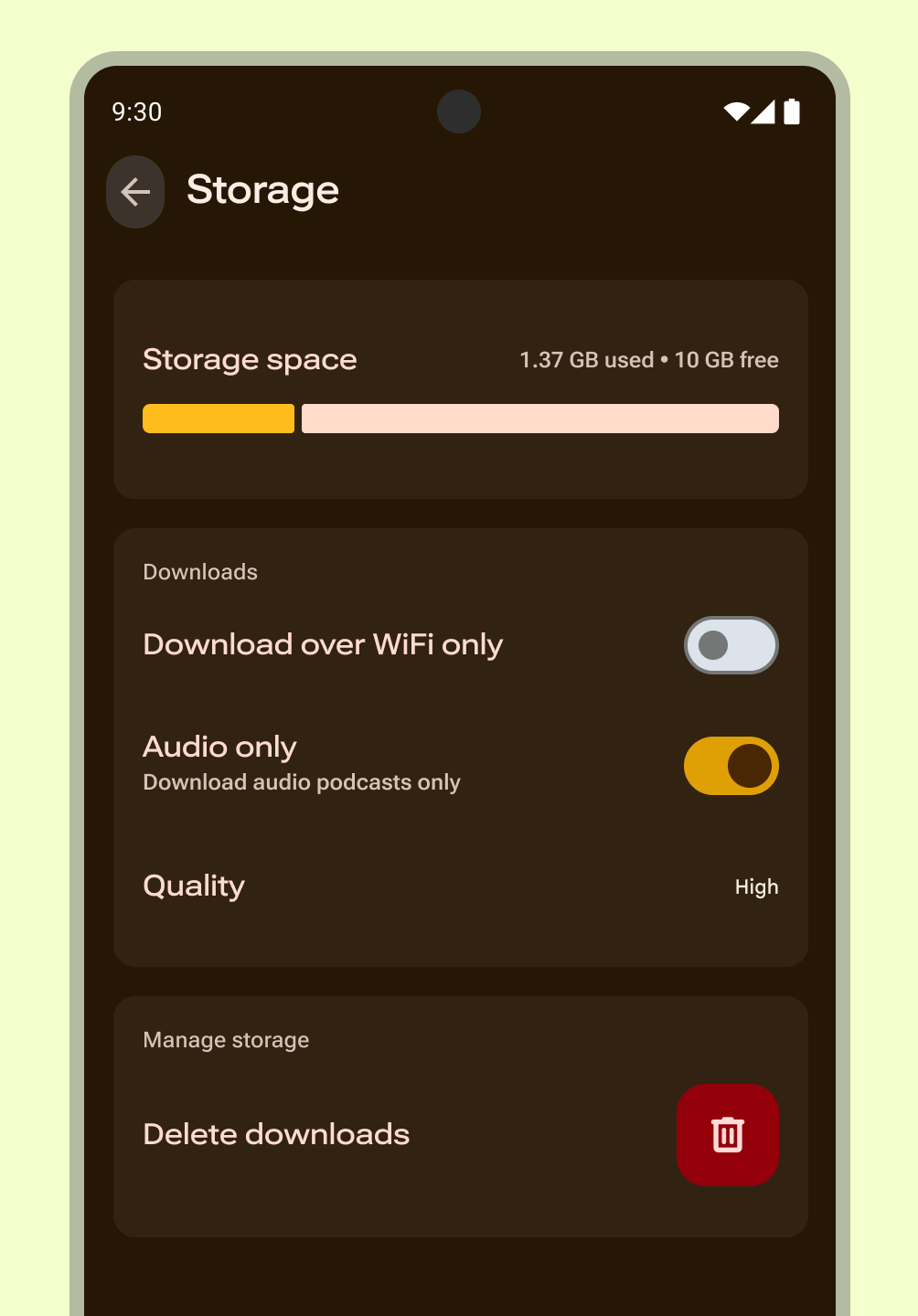
List subscreen
Use subscreens to simplify multiple settings or extensive categories, helping users focus on fewer choices. For complex or deep settings hierarchies, add search functionality so users can find the correct preference.
For 15 or more settings, group related settings under a subscreen.
Use this pattern for a setting or category of settings that contains a list of equivalent items.
Follow these guidelines for subscreens:
- Access them through the settings overview.
- Use consistent terms: the label of the setting that opens a group must match the subscreen title.
Patterns and components
The following are suggested UX selection patterns and components for settings:
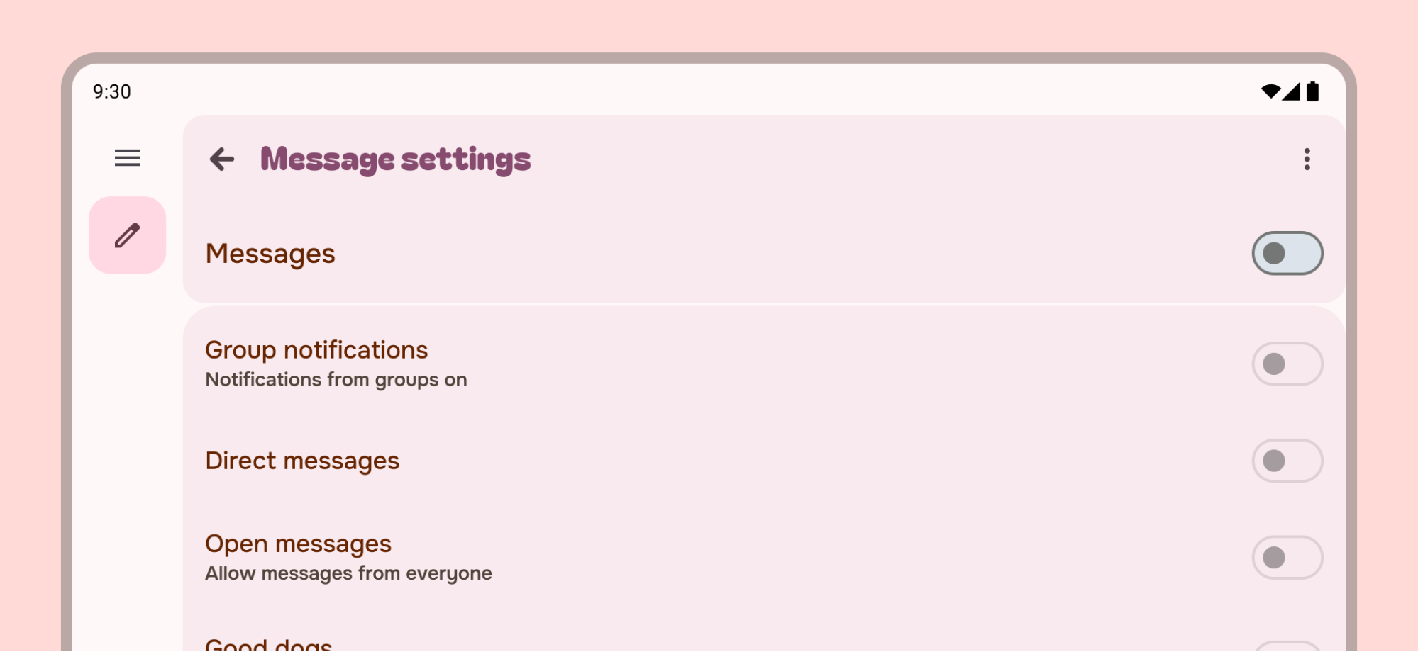
Individual switch
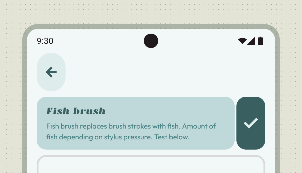
Use this pattern for a setting that requires a more detailed description than typically shown with checkboxes. The subscreen displays the control and its longer description simultaneously, allowing users to toggle the setting only while viewing the additional information. Secondary text below the setting label reflects the current selection.
Dependency
Use this section if the value of one setting controls the availability of one or more other settings.
Place a dependent setting below the setting on which it depends, with a brief explanation of why the dependent setting is unavailable. Use a parent switch on a subscreen to toggle a group of dependent settings. Disabling the parent switch disables the dependent controls. If the setting depends on a system setting, explain the dependency and direct users to the appropriate device setting.
Single choice
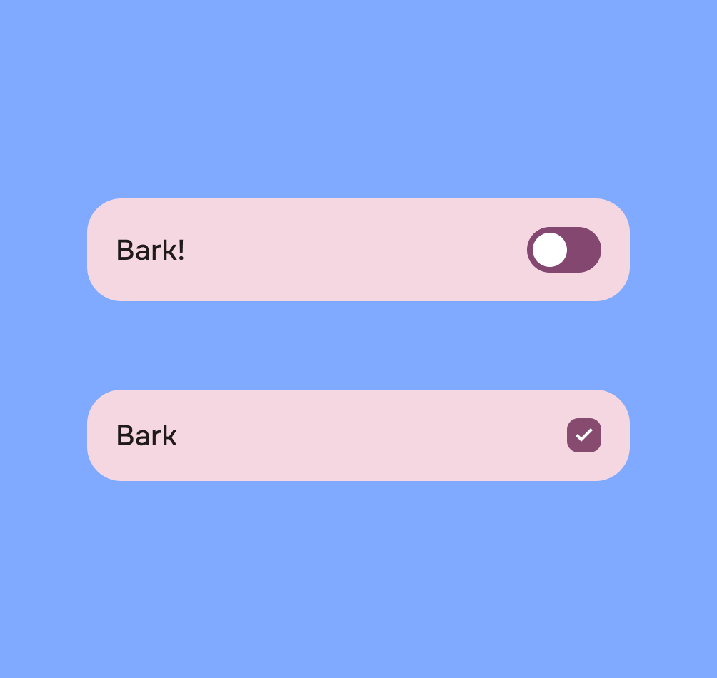
A setting that is either selected or unselected state. Use a switch or checkbox for a clear on and off state. Don't use radio buttons for settings with a single option.
Multiple choices
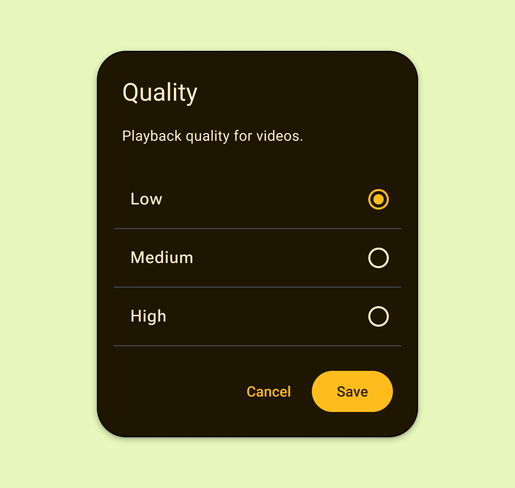
Use this pattern for a setting that needs to present a discrete set of options, from which the user can choose only one.
Present radio buttons in a dialog or child screen. Don’t use radio buttons if the setting has a boolean status or less than 2 choices.
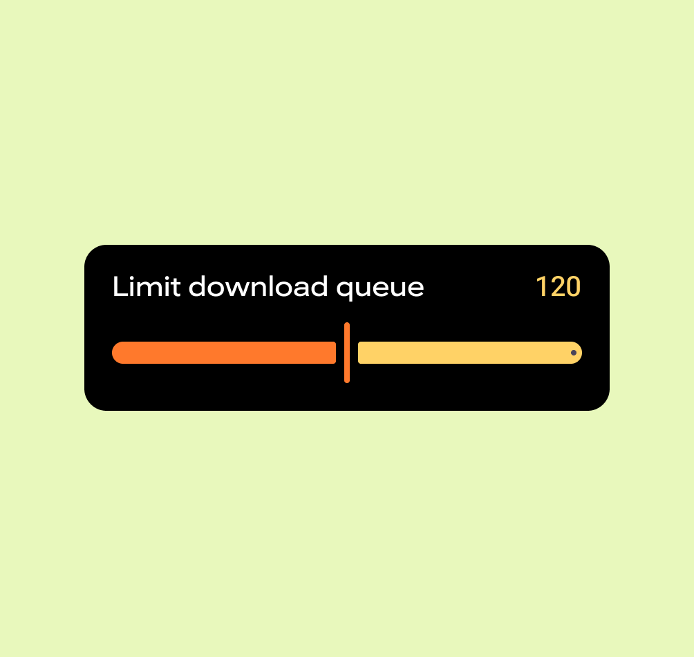
Slider
Use this pattern for a setting with a range of values, or to quickly set larger values, or when a setting can be less precise.
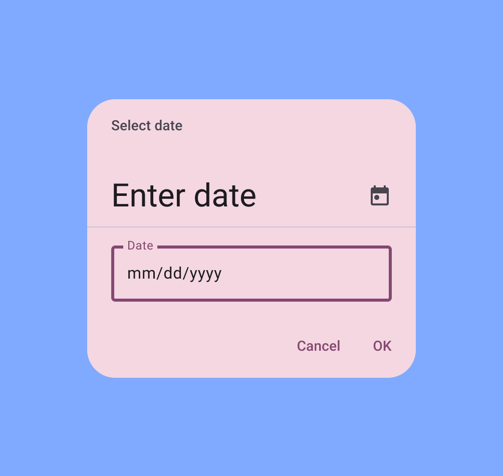
Date and time
Use this pattern for a setting that needs to collect a date or time from the user.
Adaptive layout
Using list-detail canonical layout lets you quickly adapt your settings screens to larger screens. Think about each screen as a containment pane to make adapting seamless.
The settings overview provides the primary list, while subsequent subscreens adapt to detail panes.
Don't allow single pane settings items to stretch to full width, instead set a max-width or add supplementary content.
Write for settings
Make your labels for your settings brief and meaningful. Labels can wrap to multiple lines if necessary.
Do write labels that:
- Start with the most important text
- Avoid negative terms like "Don't" or "Never," in favor of neutral terms like "Block"
- Use impersonal labels like "Notifications" instead of "Notify me". If referring to the user is necessary for understanding the setting, use the second person ("you") rather than the first person ("I").
- Are direct and understandable.
- Use familiar acronyms if there aren't better alternatives.
- Convey how and why an unfamiliar setting exists.
Don't write labels that:
- Use generic terms, such as: Set, Change, Edit, Modify, Manage, Use, Select, or Choose.
- Repeat words from the section title.
- Include technical jargon, unless it's widely understood by your target audience.
Supporting text helps the user better understand the current state of a setting or indicate what happens when a setting is enabled. If the label is sufficient on its own, don't add secondary text. Keep explanations brief and show the setting status instead of describing the setting.
If a setting requires a longer explanations, add a description on a second screen.
Follow UX writing best practices when creating labels and supporting text.
Settings versus filters
While you can use both filters and settings to save user preferences and share patterns, filters are contextual to the current content the user is trying to augment.