

Notifications provide brief, timely, and relevant information related to your app when it's not in use.
The Android OS controls many aspects of notifications, but you have control over other aspects. Follow these steps when implementing notifications:
- Understand the anatomy of a notification.
- Choose the type of notification for your use case.
- Set the notification category that aligns with the type of notification you've chosen.
Takeaways
- Consider the purpose of the notification: why are you alerting your users?
- Determine notification permission pattern, consider how important notifications are to your app and where to ask in your user's journey.
- Pick your notification template.
- Create notification content:
- Header text should succinctly summarize the notification.
- Content text should preview the notification.
- Image content if applicable to your app's content.
- Media keyart and metadata for media template.
- Make it obvious what your user can do with a notification by providing actions based on their content either with text buttons, typing, or media controls.
- Include your app icon and set the app icon background color.
- Set channels and categories for your notifications. This allows the system and your user to customize what notifications they receive and provides priority behavior.
- If your app may deliver multiple notifications at once, group notifications.
- Check out the Android UI Kit on Figma for notification templates.
Anatomy of a notification
Notifications are designed to make it easy to scan and use a notification's most important elements. These elements are:
- Primary content: this constitutes the most prominent element of a notification. Secondary information, such as a timestamp, is smaller and consolidated above the primary content.
- People: if the notification involves a person, an avatar stands out from the rest of the content.
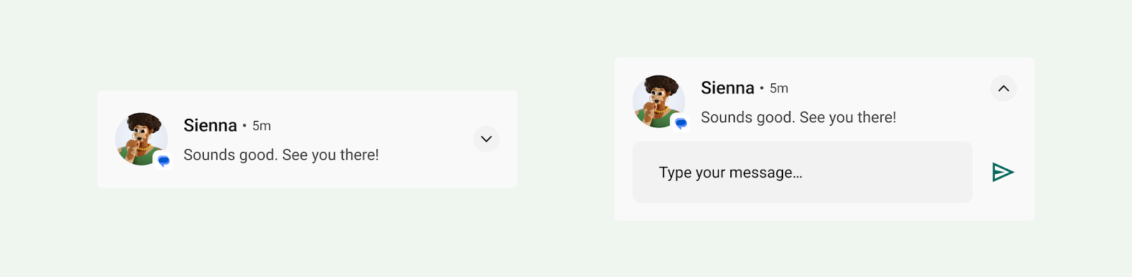
- Actions: users can expand notifications by tapping an indicator icon. Actions are displayed with text labels on a separate background color and location.
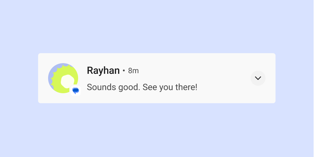
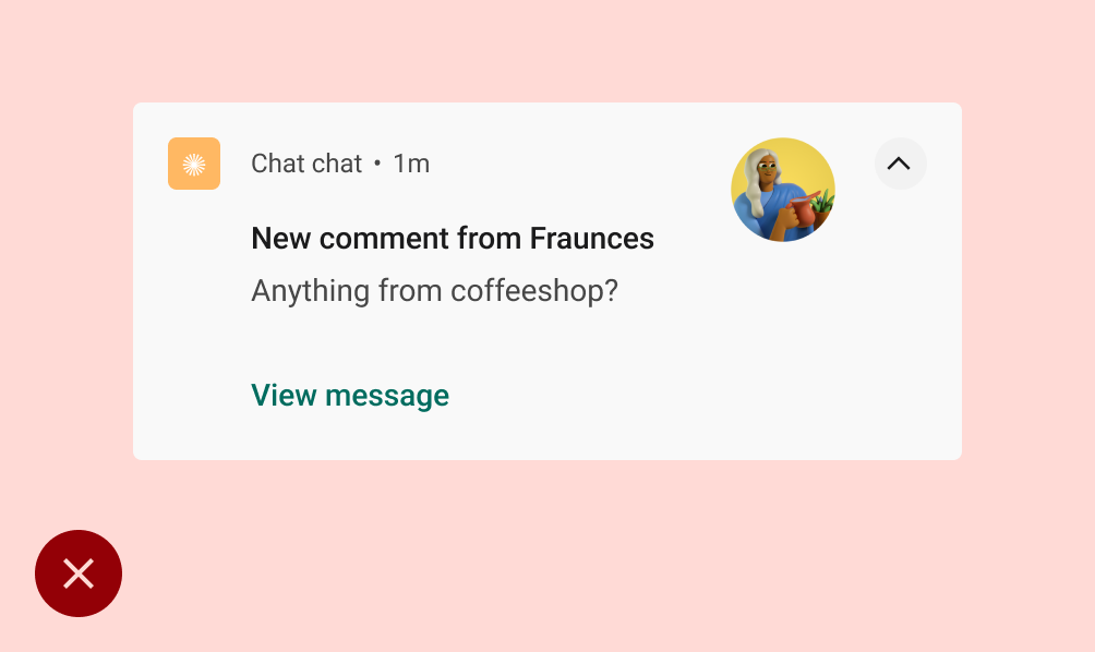
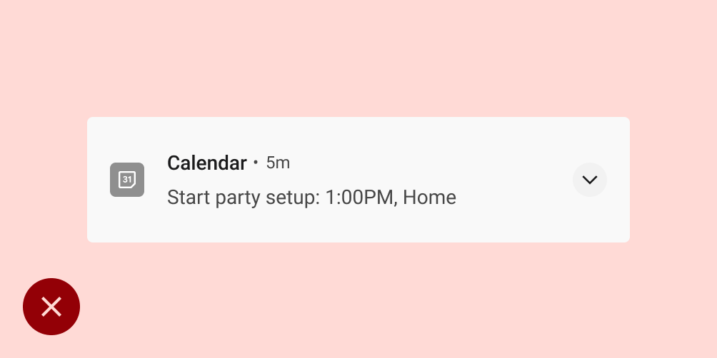
Notification header and content
When collapsed, a notification shows the app icon, header text, timestamp, expand indicator, and content text. It can also optionally show a large icon.
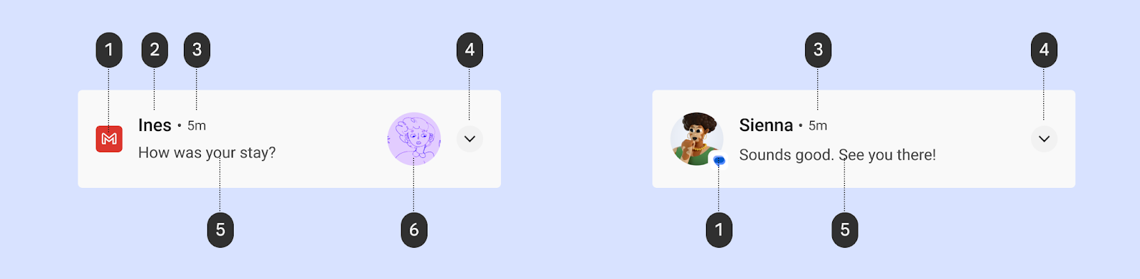
1 App icon: The app icon is a two-dimensional representation of your app's identity. It appears in monochrome in the status bar. If your app sends a wide variety of notifications, consider replacing your app icon with a symbol to distinguish between the different kinds of notifications. See Apply the icon color for details.
2 Header text: a brief headline for the notification or source, such as the account name for users. Content is the most prominent element of a notification.
3 Timestamp: indicates when a notification was sent, such as the time of a missed call.
4 Expand indicator: indicates whether the notification is in a collapsed or expanded state.
5 Content text: supporting information.
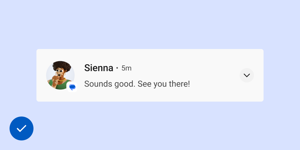
6 Large icon (optional): An image may be added to reinforce the notification in a meaningful way, such as a message that includes an avatar of the sender.
Apply the icon color
Starting in Android 12 (API level 31), the system derives the icon color from the notification color you set in the app. If the app doesn't set the color, it uses the system theme color. Previously, the color was gray.
For most styles, the system applies this color only if the notification is
for a foreground service notification. However, there is no such requirement
for MediaStyle and DecoratedMediaCustomViewStyle notifications that have
a media session attached.
The following snippet shows how to apply the icon color.
val notification = Notification.Builder()
    .setColor(Color.GREEN)
    .setColorized(true)
    .setSmallIcon(R.drawable.app_icon)
    .setStyle(Notification.DecoratedCustomViewStyle())
    .build()
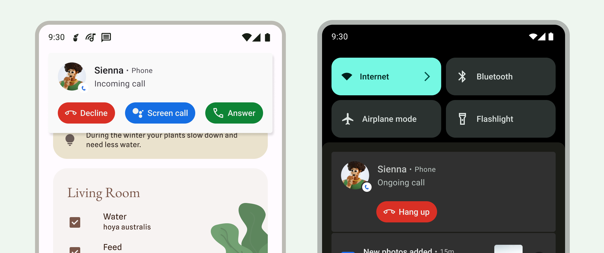
Notification actions
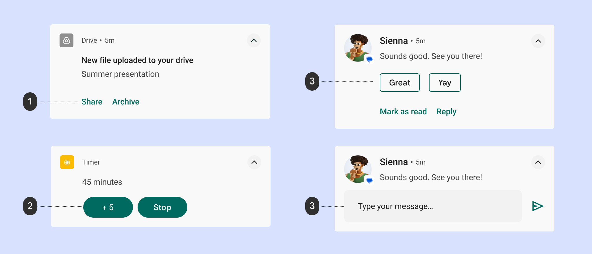
1 Text button actions
2 Filled action buttons
3 Suggested replies
4 Reply text field
Starting with Android 7.0 (API level 24), the system shows actions without icons to accommodate more text. To accommodate Android Wear devices and devices running Android 6.0 (API level 23) and lower, your app must still provide an icon.
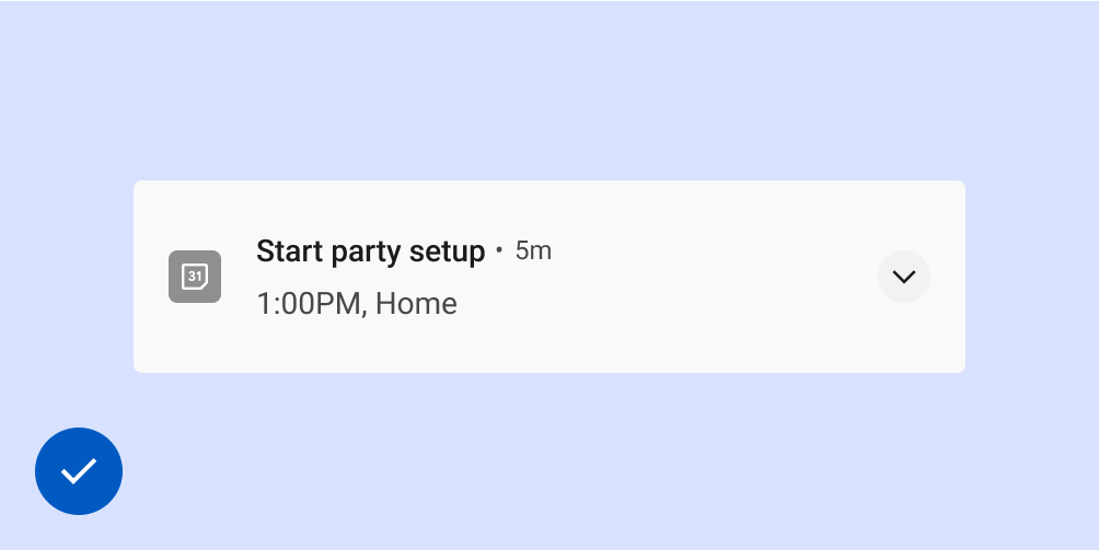
Expanded views
You can use an expanded view to display more information to the user without navigating away from the notification.
When expanded, a notification can provide up to three of any of the following kinds of actions:
- Suggested replies
- Emphasized actions (pill-shaped buttons)
- Standard text actions
Don't
Do
Enable typing in notifications
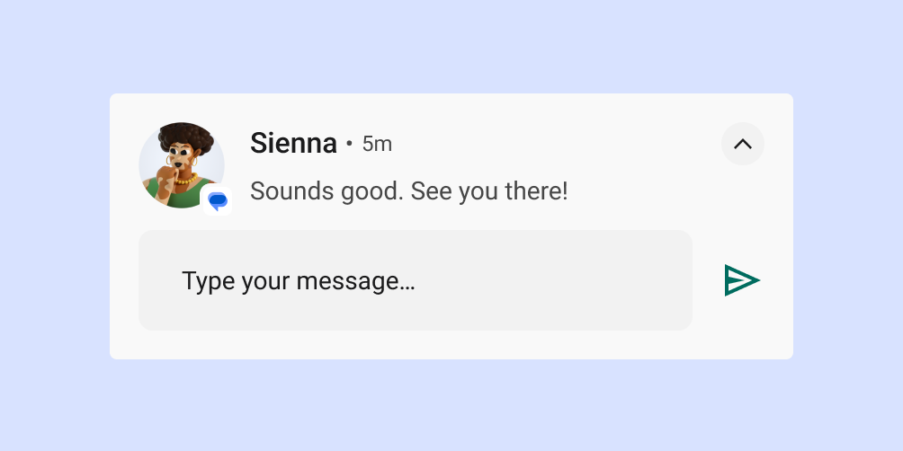
You enable the user to type directly into a notification by including a Reply action. This is designed for typing a small amount of text, such as replying to a text message or jotting a brief note.
For longer-form typing, navigate users to your app to provide them more space to view and edit text.
For messaging apps, we recommend keeping the notification present after the user has sent the reply, and waiting until the conversation is paused before automatically dismissing it.
Choose the notification type depending on your use case
Google uses the following notification templates in its Android apps. These templates can be customized to some extent for your app.
Check out the Android UI Kit on Figma for notification templates.
Standard template
The standard template is suitable for most notifications, allowing succinct text, a large icon (when applicable), and actions.
Big text template
The big text template is ideal for displaying blocks of longer text. It lets the user preview more text after they expand the notification.
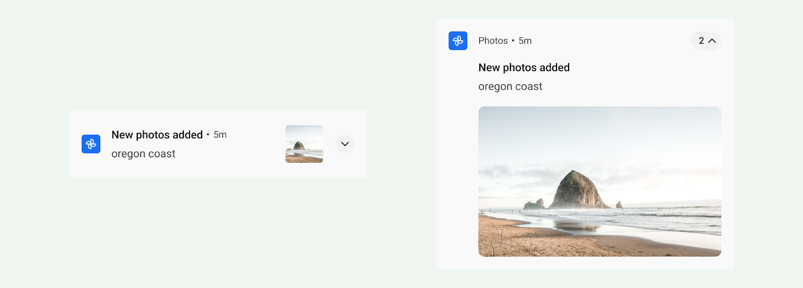
Big picture template
The big picture template is designed for notifications containing an image. When collapsed, the notification shows a large icon thumbnail of the picture. When expanded, the notification shows a much larger preview.
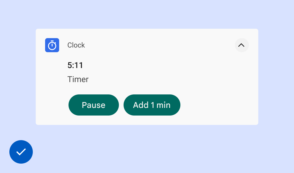
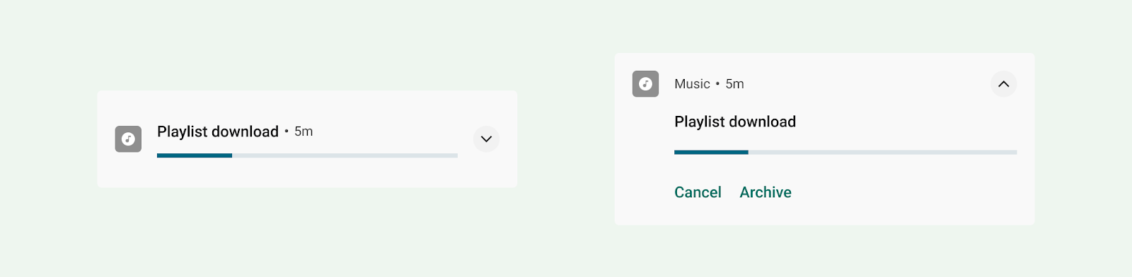
Progress template
The progress template is designed for user-initiated activities that take time to complete. When expanded, a notification that uses this template shows a progress bar and also includes a "cancel" action that lets the user terminate this activity. (Non-cancelable activities don't warrant notifications.)
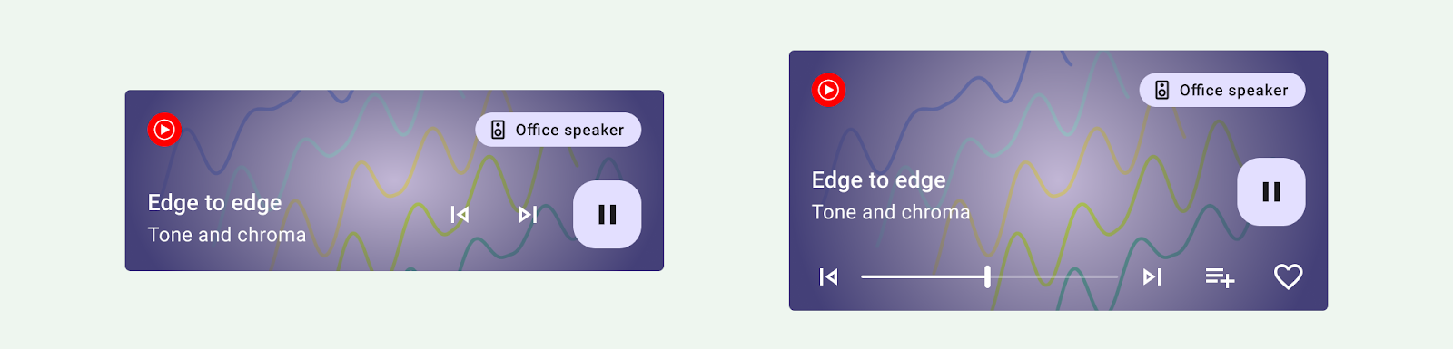
Media template
The media template is designed for letting the user control media currently playing from an app.
- When collapsed, the notification can display up to three actions. The large icon can show a related image such as an album cover.
- When expanded, the notification displays up to five actions with a larger image, or six actions with no image. The background and other elements of the notification automatically inherit the colors from the image.
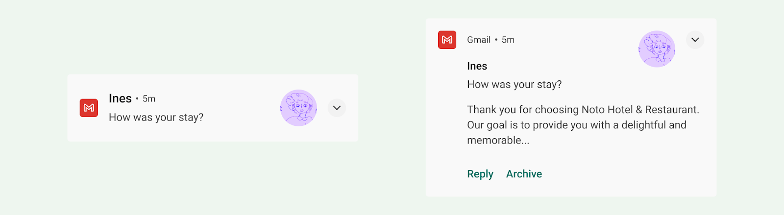
Messaging template
The MessagingStyle template is designed for real-time communication. When expanded, a notification using this template lets the user reply to messages from within the notification.
Call template
Use the CallStyle template to generate large-format notifications that include a large image attachment and indicate an incoming or outgoing call.
Notification permissions
As relevant and timely as notifications can be, most notifications are non-exempt, that is, the user must consent to receiving notifications from your app.
There is one exception to this: starting in Android 13 (API level 33), media sessions and apps that manage phone calls are exempt from asking for user consent. Pre-existing apps may also be eligible if the user already has notifications on. See more details in Exemptions.
We strongly recommend that your app provide notification options in settings to allow users to update their notifications preferences.
Prompt the user to opt-in to non-exempt notifications
For non-exempt notifications, prompt the user to indicate whether they want to to opt-in to receiving notifications. Users who explicitly choose to receive notifications are likely to find them more useful and less intrusive.
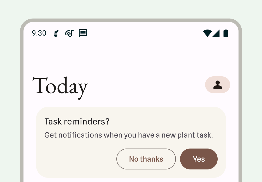
Wait to show the notification dialog prompt:
- Describe the benefits notifications provide, and the result of not granting permissions for notifications.
- Provide contextual UI, relating the notification to its features or what it affects. This UI can take any form to integrate best within your app: for example card within a fee, bottom sheet, or onboarding screen. Any of these should be dismissable.
- Don't show the notification permission dialog, if the user has dismissed the UI.
Starting in Android 13, users can be re-prompted for notification permissions.
Required notifications
Foreground services perform operations that are noticeable to the user but while they're not directly interacting with your app. These services show a status bar notification to make users aware that your app is performing a task in the foreground and is consuming system resources.
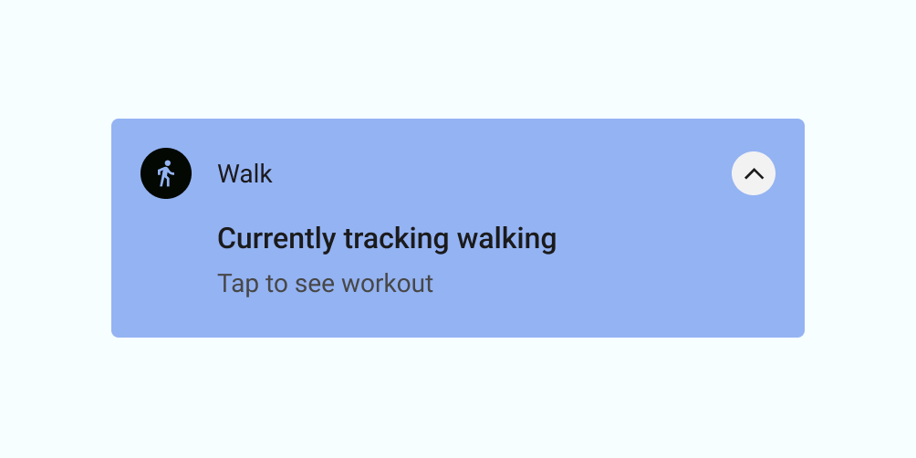
Because these processes use battery and possibly data, your app must make users aware of them by showing a non-dismissible notification. The user can't dismiss the notification, so you must provide an action for the user to stop the service.
The following example shows a notification from a fitness app. The user has started an active workout session, which instantiates a foreground service tracking the workout session. The app shows the notification to indicate it's tracking walking, with an option to see the workout.
When not to use a notification
Don't use notifications for any of the following use cases:
- For cross-promotion or advertisement of another product (this is strictly prohibited by the Play Store)
- If the user has never opened your app
- As the primary method of communication with users
- To encourage the user to return to an app, but provide no direct value (for example, "Haven't seen you in a while!")
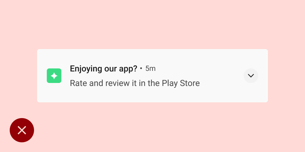
- For requests to rate your app
- For operations that don't require user involvement, such as syncing information
- To announce error states the app may recover from without user interaction
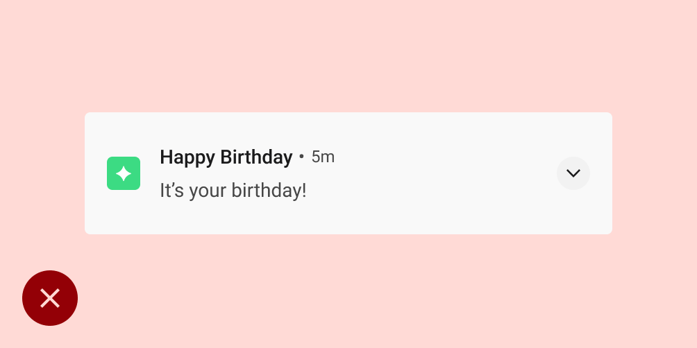
- For holiday or birthday messages
Don't
Don't
Behavior
Be aware of the following notification behaviors and how to handle them in certain contexts.
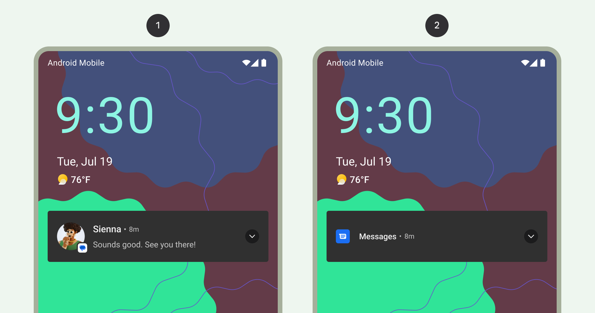
Notification arrival
When a notification arrives, Android adds it to the notification drawer. Depending on the parameters you set and the current state of the device, the notification may perform any of the following actions:
- Make a sound or cause phone vibration.
- Display in the status bar with an icon; this is typically your app icon, but if you have multiple types of notifications, use a symbol that captures the notification's purpose.
- Display as a heads-up notification, peeking onto the current screen to grab the user's attention.
As always, the user can choose to alter the notification behaviors you set.
1 Notification indicator in the status bar, indicating that there's a notification in the notification drawer.
2 Notification "peeking" onto the current screen to grab a user's attention in the middle of a task.
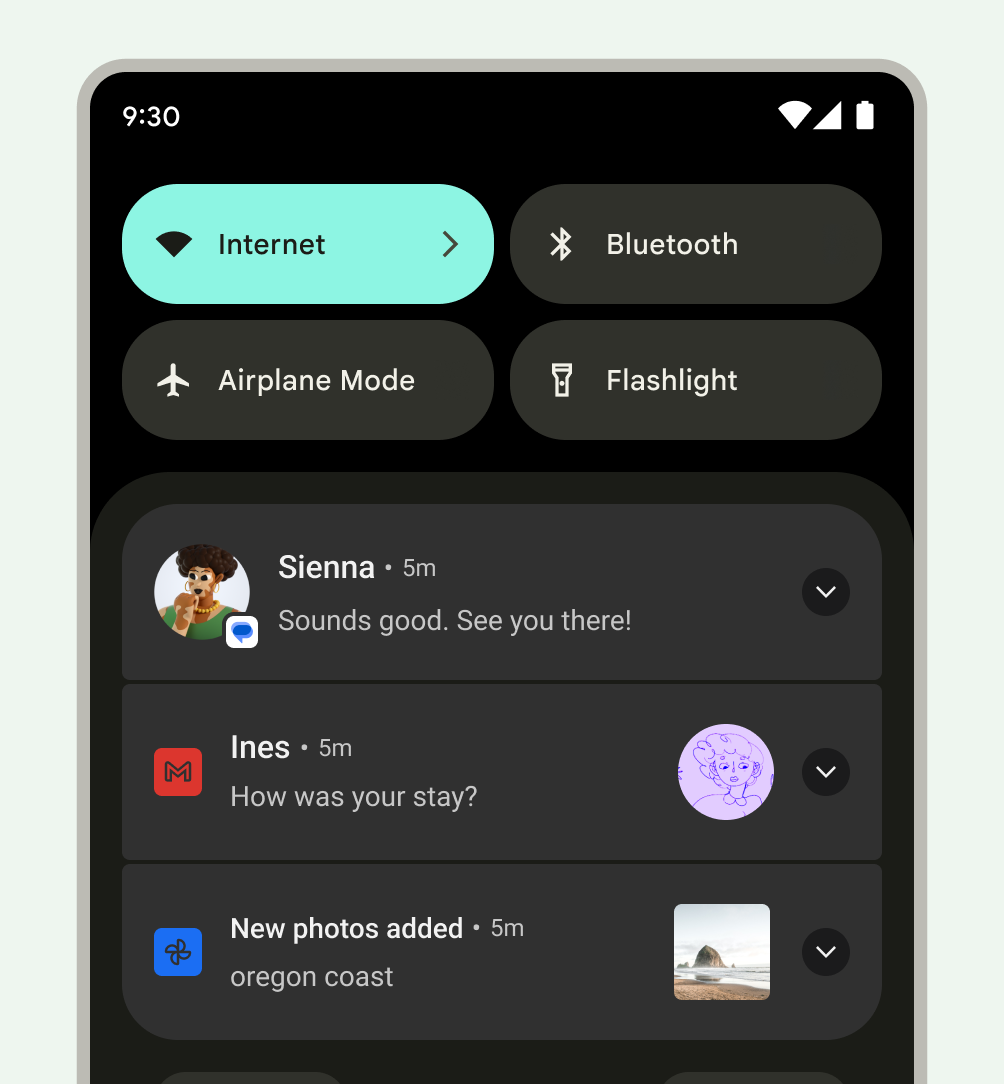
Notification drawer
The notification drawer in Android typically shows notifications in reverse-chronological order, with adjustments influenced by the following conditions:
- The app's stated notification priority or importance
- Whether the notification recently alerted the user with a sound or vibration
- Any people attached to the notification and whether they are starred contacts
- Whether the notification represents an important ongoing activity, such as a phone call in progress or music playing
- Alterations of the appearance of some notifications by the Android OS at the top and bottom of the list by adding emphasis or deemphasis, which helps the user scan content
Handle stale notifications
The notification drawer is designed to show users information that is relevant for the current moment in time. If an earlier notification is stale, that is, no longer relevant, dismiss it so the user doesn't see it.
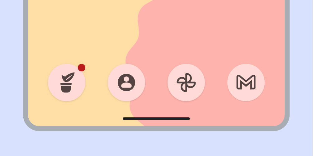
New notifications indicated by app icon badge
In supported launchers on devices running Android 8.0 (API level 26) and higher, app icons display a notification dot to indicate that the app has a new notification associated with it. These dots appear by default in launcher apps that support them, and there's nothing your app needs to do. Badging can also be disabled and limited.
Actions users can perform with notifications
Notifications can enable users to perform any of the following actions:
Navigate to a destination: to navigate, a user may tap a notification. If the notification displays on a locked screen, the user needs to double-tap it and then enter their PIN, pattern, or password.
When the user taps a notification, your app must display UI that relates directly to that notification and lets the user take immediate action. For example, if the notification says it's their turn in a two-player game, tapping the notification should take them directly to that game.
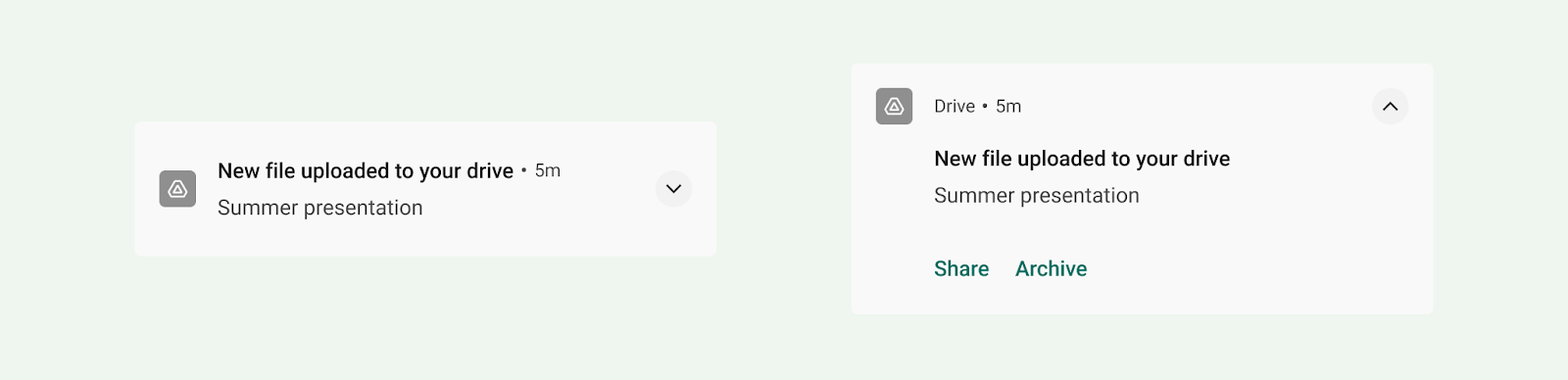
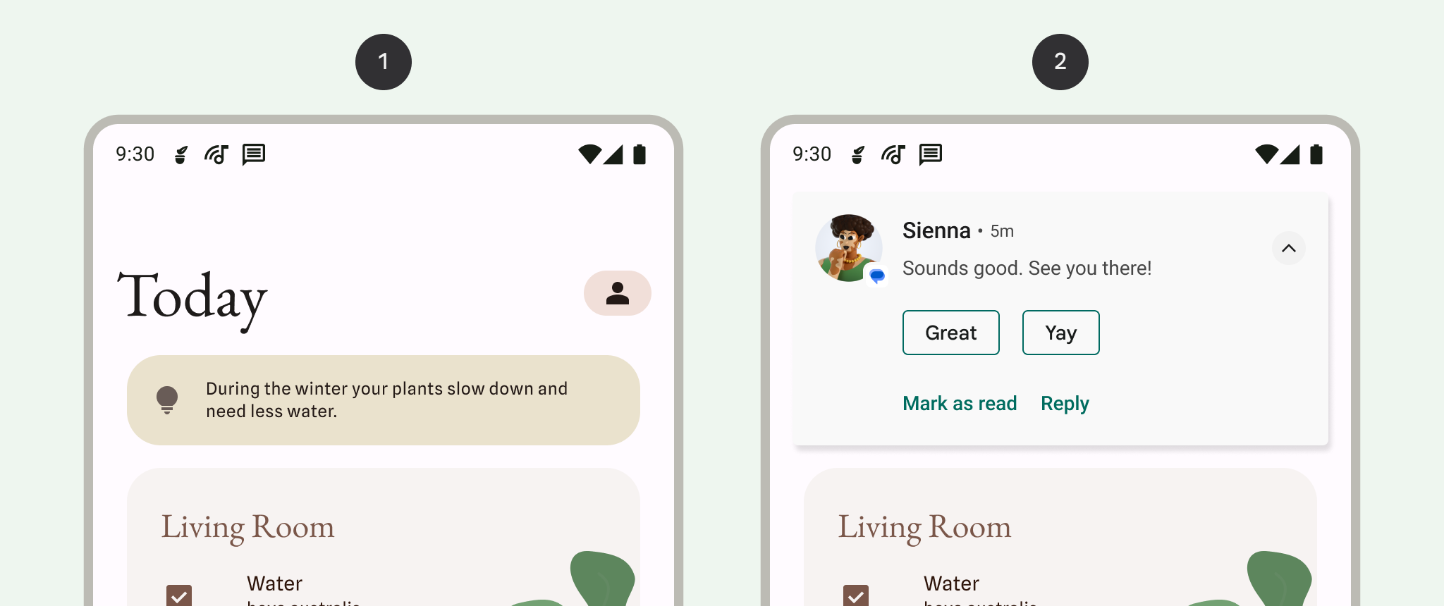
See an expanded view of the notification: an expand indicator appears in the header. A user can tap the indicator or swipe down the notification body to expand it.
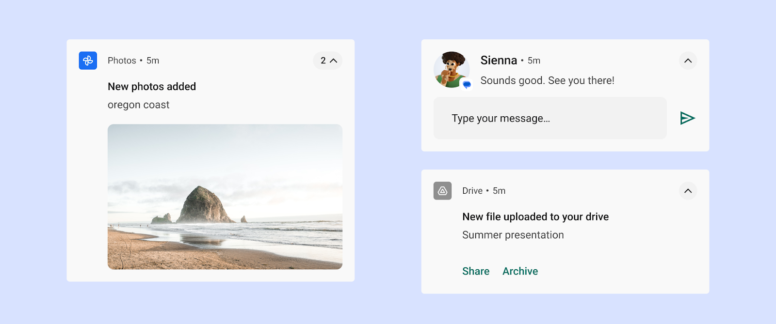
Figure 18: Expanded notification Dismiss the notification (if permitted): a user can dismiss it by swiping it left or right.
Ongoing notifications that indicate a continuing process in the background, such as music playing, may not be dismissed with a swipe.
Snooze a heads-up notification: a user can swipe up on a heads-up notification, and no further notifications from that event are allowed to pulse for one minute.
Control similar notifications in the future: users can access notification controls by:
- Touching & holding an individual notification
- Swiping the notification left or right, and then tapping the settings icon
The controls displayed vary depending on the Android version and whether the app has channels for its notifications (starting in Android 8.0).
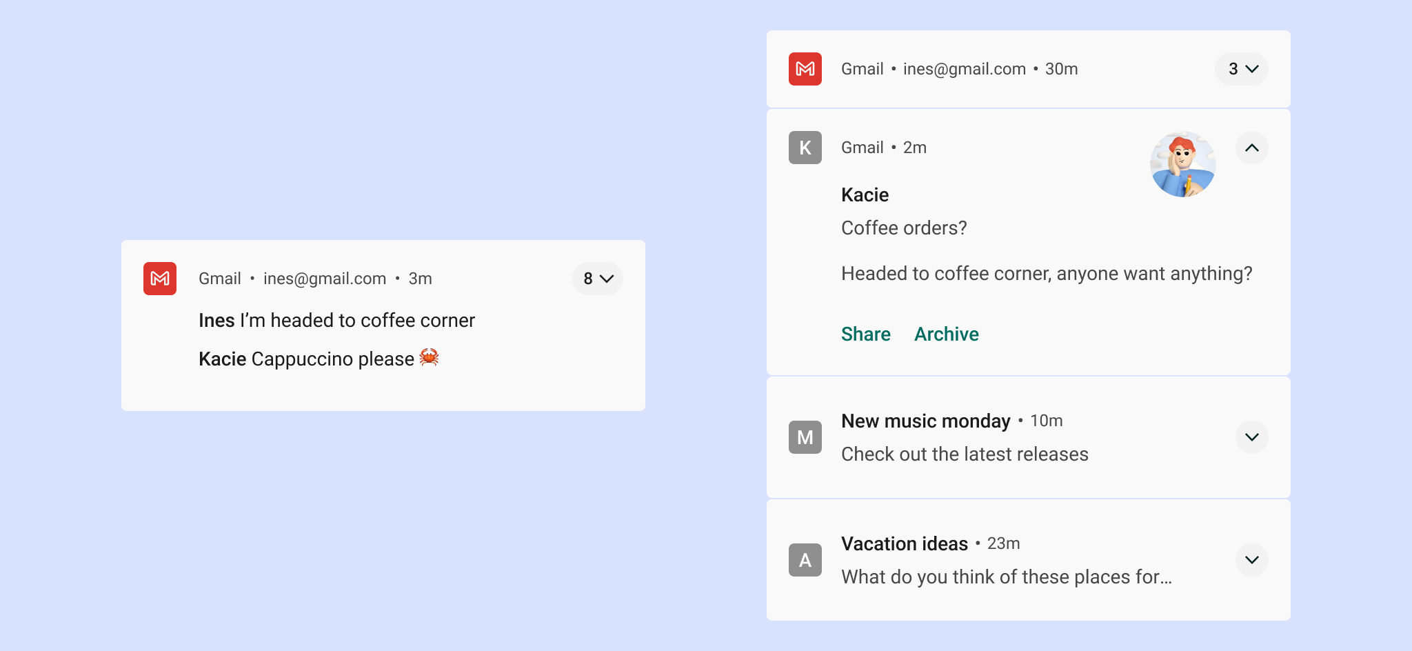
Group multiple notifications
For apps that generate multiple notifications of the same type, Android offers notification grouping to avoid overwhelming users.
Your app can present multiple notifications according to the following hierarchy.
- A parent notification displays a summary of its child notifications.
- If the user expands the parent notification, Android reveals all child notifications.
- A user can expand a child notification to reveal its entire content.
Android presents child notifications without duplicate header information. For example, if a child notification has the same app icon as its parent, the child's header doesn't include an icon.
Child notifications must be understandable if they appear solo, as the system may show them outside of the group when they arrive.
Settings
Channels
Starting in Android 8.0 (API level 26), all notifications must be assigned to a channel. For each channel, you can set the visual and auditory behavior that is applied to all notifications in that channel. Users can change these settings and decide which notification channels from your app can be intrusive or visible.
For details on how to implement this, see Create and manage notification channels.
Importance should be chosen with consideration for the user's time and attention. When an unimportant notification is disguised as urgent, it can produce unnecessary alarm.
| Importance | Behavior | Usage | Examples |
|---|---|---|---|
HIGH |
Makes a sound and appears on screen | Time-critical information that the user must know, or act on, immediately | Text messages, alarms, phone calls |
DEFAULT |
Makes a sound | Information that should be seen at the user’s earliest convenience, but not interrupt what they're doing | Traffic alerts, task reminders |
LOW |
No sound | Notification channels that don't meet the requirements of other importance levels | New content the user has subscribed to, social network invitations |
MIN |
No sound or visual interruption | Non-essential information that can wait or isn’t specifically relevant to the user | Nearby places of interest, weather, promotional content |
Predefined categories
Whether you're using channels or not, assign each individual notification to the most suitable predefined category. Android may use this information to make ranking and filtering decisions.
| Category | Description |
|---|---|
CATEGORY_CALL |
Incoming call (voice or video) or similar synchronous communication request |
CATEGORY_MESSAGE |
Incoming direct message (SMS, instant message, etc.) |
CATEGORY_EMAIL |
Asynchronous bulk message (email) |
CATEGORY_EVENT |
Calendar event |
CATEGORY_PROMO |
Promotion or advertisement |
CATEGORY_ALARM |
Alarm or timer |
CATEGORY_PROGRESS |
Progress of a long-running background operation |
CATEGORY_SOCIAL |
Social network or sharing update |
CATEGORY_ERROR |
Error in background operation or authentication status |
CATEGORY_TRANSPORT |
Media transport control for playback |
CATEGORY_SYSTEM |
System or device status update. Reserved for system use. |
CATEGORY_SERVICE |
Indication of running background service |
CATEGORY_RECOMMENDATION |
A specific, timely recommendation for a single thing. For example, a news app might recommend a news story the user might want to read next. |
CATEGORY_STATUS |
Ongoing information about device or contextual status |
Lock screen notifications
If a user has opted to show notifications when their screen is locked, these notifications can conceal any content that your app marks as sensitive. Android evaluates each notification's visibility level to determine what can safely be shown.
Set sensitivity level for content on lock screens
User privacy is critically important, so be aware that there are different levels of notification that can be visible on the lock screen. For each notification you create, you must set the visibility level to public, private, or secret.
- Public notifications are fully visible on secure lock screens.
- Secret notifications are hidden.
- Private notifications fall in the middle: they show only basic information,
including the name of the app that posted it and its icon. Instead of the
regular content—which is hidden—you can optionally to show text that
doesn't reveal personal information, such as
2 new messages.
In the following example, lock screen notifications for the Gmail and Photos apps show all content after the user has chosen to show this information on the lock screen.
1 All notification content shown on the lock screen
2 Sensitive notification content hidden on the lock screen
Style
Clear and concise text
Android truncates content titles to a single line (even when expanded).
A good content title adheres to the following guidelines:
- Doesn't exceed 30 characters
- Contains the most important information
- Avoids variables (unless they contain a number or short text string, or are preceded by text)
- Excludes the app's name, which already appears in the header
Don't
Do
Good content text adheres to the following guidelines:
- Avoids exceeding the 40-character limit
- Avoids repeating what's in the content title
The large icon
Use the large icon for use cases in which imagery meaningfully reinforces the notification's content. Some examples are:
- Communications from another person, such as the image of someone sending a message
- The source of content if it's different than the app sending the notification, such as the logo from a YouTube channel a user is subscribed to
- Meaningful symbols about the notification, such as an arrow symbol for driving directions
Large icons must be circular when showing a person, but square in all other cases.
Don't
Do
Android version updates
The Android notification system UI and the notification-related APIs continually evolve. For a list of these changes check out the notification compatibility.
Platform Considerations
Wear
If the user has a paired Wear OS device, all your notifications appear there automatically, including expandable detail and action buttons. For details, see the design page for notifications on Wear.