
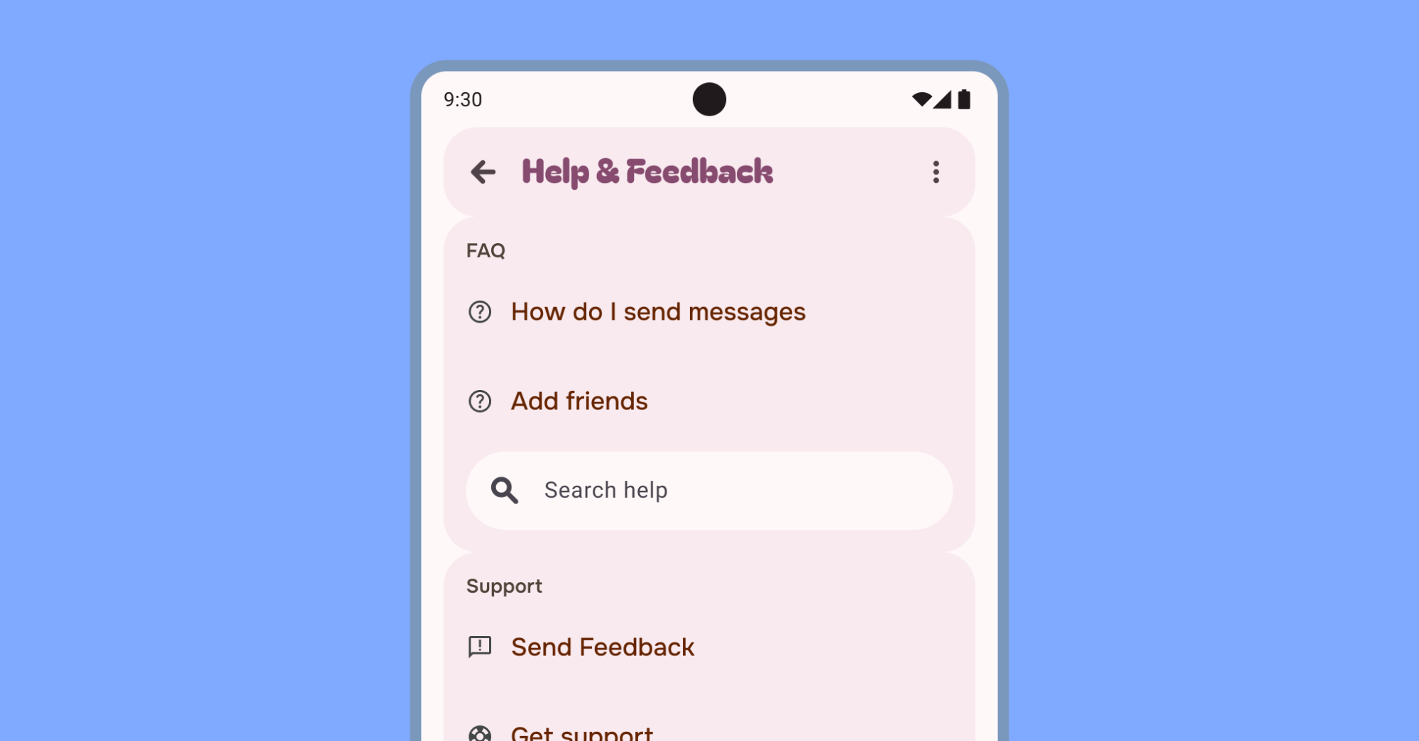
Help content addresses common user questions. Beyond this, users often submit comments, report bugs, and ask questions not covered in the existing documentation. Therefore, providing a channel for user feedback is crucial.
Help and Feedback is a secondary use case. Consequently, place it in secondary navigation. Appropriate locations include:
- Overflow menus
- Bottom of a navigation drawer
- Settings section
Maintain consistent naming across platforms. While "Help" and "Send Feedback" are standard Android labels, your app might use alternative labels like "Help Center." Consistency ensures a seamless user experience.
The help screen can include options to report issues. Consider using the Google In-App Reviews API to motivate users to leave a review.
Consider your app's information hierarchy to improve user experience. Prioritize frequently accessed help content. Place common help scenarios near the top of the screen, linking directly to relevant features or settings. This ensures quick access to important information. Place less frequently accessed content such as Privacy or Terms of service less prominently. This declutters the main interface while still providing access.
Consider these options for less prominent placement:
- Overflow menu
- Lower screen position
Support instructions with relevant images, icons, videos, or animation to explain user tasks.