A theme is a set of styles or attributes such as color, type, and shape, which can affect the look and feel of a user's mobile or large-screen device and in-app experience.
Takeaways
- To give users a more personalized and accessible experience, ensure your app adopts system preferences, including themes, like light or dark, dynamic, and contrast.
- Create a custom theme to use as a fallback if dynamic is not available.
- Consider type settings when using various themes.
- Always check for text and surface contrast to ensure legibility.
Types of themes
Themes are system-based or app-based. System themes can affect the user's entire device UI and provide corresponding controls in device settings, while an app theme affects only the app in which it's implemented.
Your app must implement either type of theme to display it, but app themes apply only within the app and not elsewhere on the device. You can also override some system theme settings with in-app settings.
System themes
System themes apply across an entire Android device, including individual apps depending on user settings. System themes include light and dark themes, user-generated themes, and manufacturer themes.
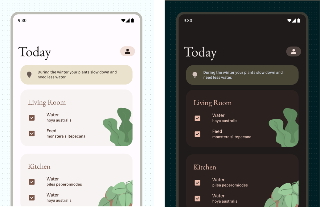
Light and dark themes
Light theme, or Day mode, consists of a bright display mode with higher luminance and surfaces built from high tonal values. Conversely, the dark theme, or Night mode, shifts the UI to reduce luminance. Surfaces are built from dark grays or low tonal values.
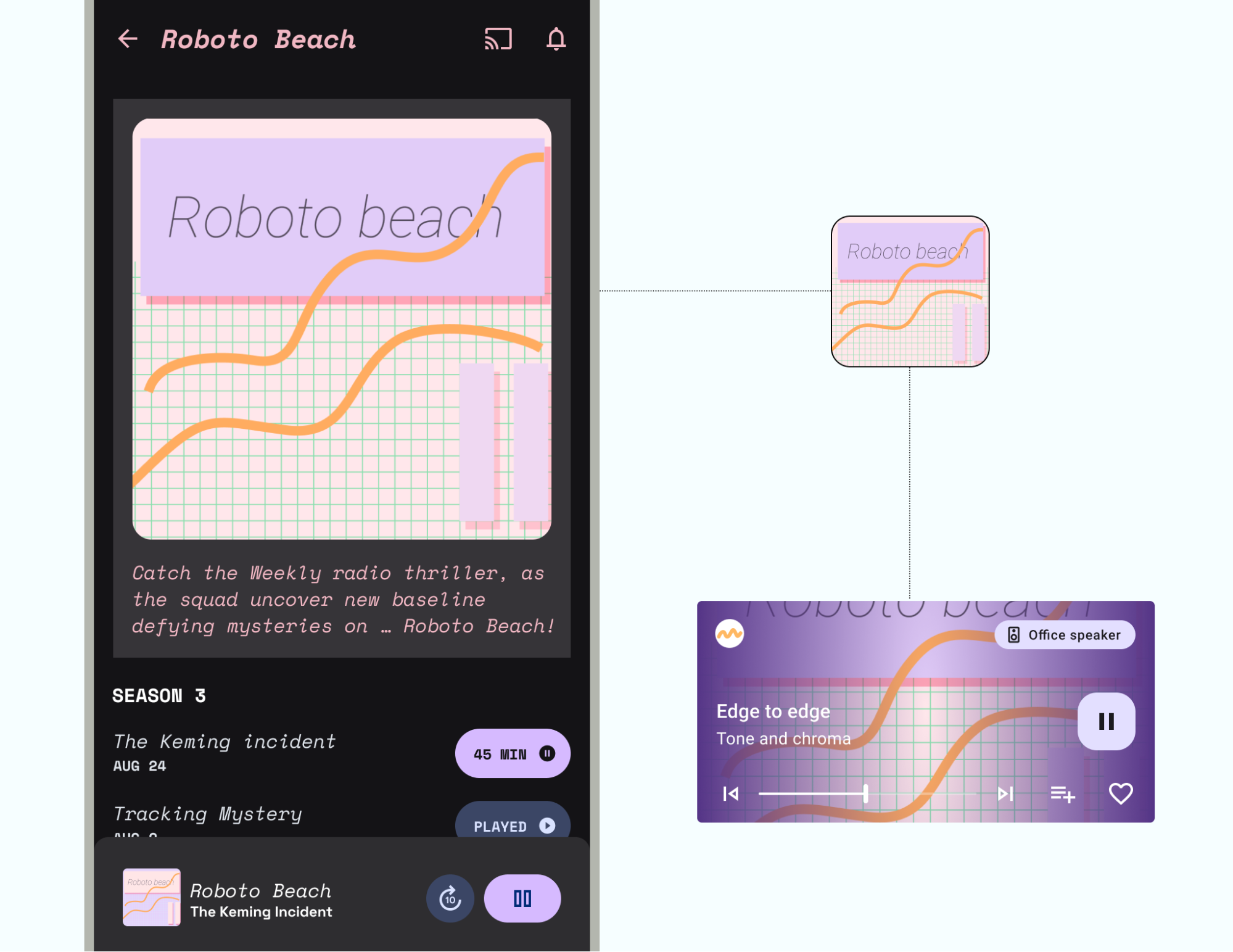
Dark theme has multiple benefits: helping with screen legibility in sunny or low light conditions, reducing eye strain due to lower brightness, and conserving battery. Also, it's often the most requested app feature amongst users.
Consider the following takeaways when implementing light and dark themes:
- You can customize a color scheme for greater expression. If you're using Material Theme Builder to create a scheme, it automatically creates a dark scheme. Read more about Customizing Material and the Color system to create a branded theme.
- Users can set a light theme or dark theme at the system-level Display settings to always on, always off, or automatic based on time of day. We recommend reflecting the user's preferred system settings, but it's also a good idea to create in-app controls to provide users with more granular modifications.
- Web content in WebViews can also use light, dark, or default styling. Read how dark theme in webviews is supported.
- If users have enabled it, Android can force a dark theme. You can also create a custom dark theme for greater control.
- If the user hasn't enabled other themes or settings, you do have the option of "locking" your app to the light theme. However, we don't recommend doing this, as it can go against a user's accessibility and personalization needs.
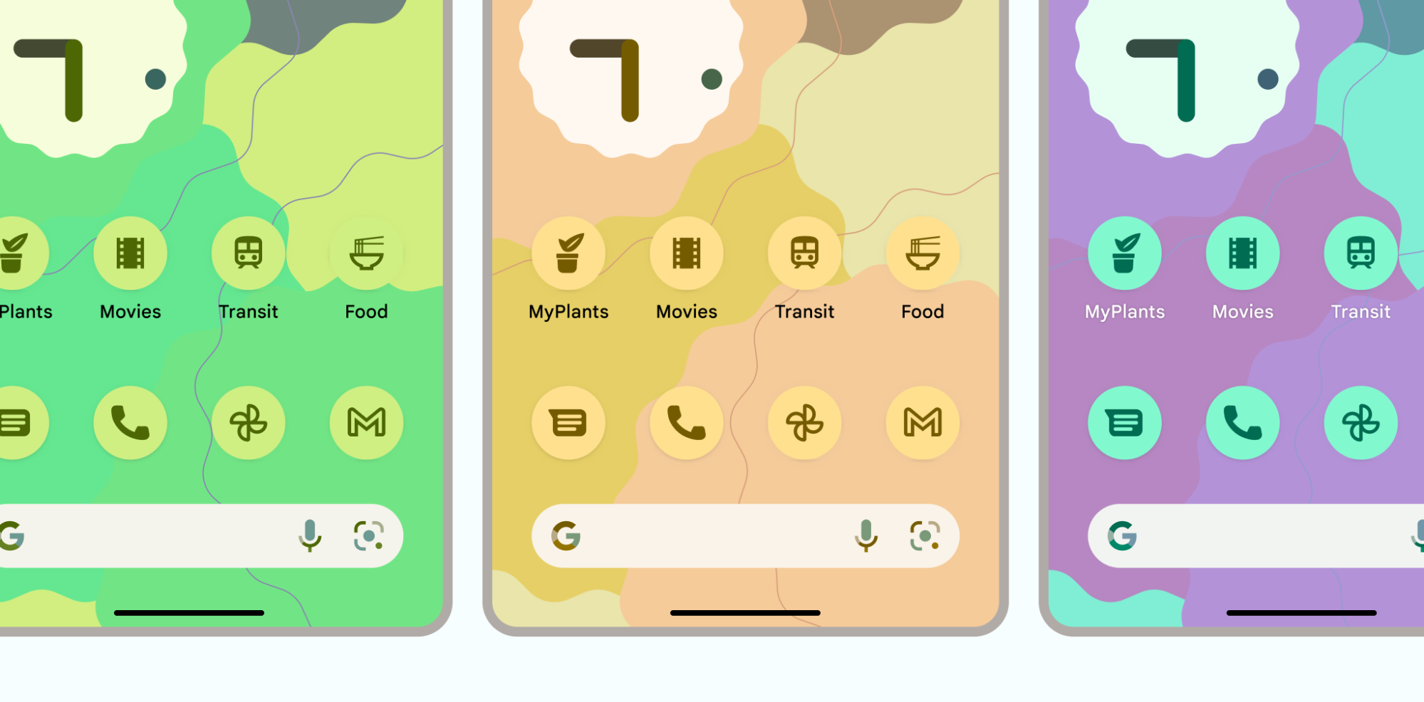
User-generated themes
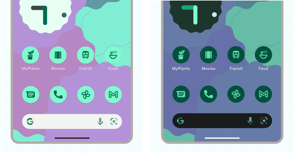
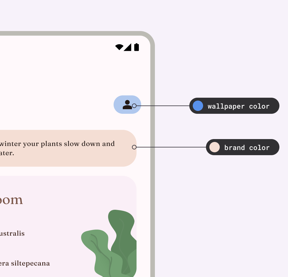
User-generated themes are supported by dynamic color, which we made available with Material You starting in Android 12. When enabled, dynamic color derives custom colors from a user's wallpaper to be applied to their apps and system UI. This color palette is used as the starting point to generate light and dark color schemes.
Font settings can also be updated within device settings to meet the user's preferences and accessibility needs. These settings can and should carry into apps, so make sure to utilize scalable pixel values for fonts.
Manufacturer themes
Device manufacturers may provide additional proprietary theming capabilities that can affect system UI and display settings.
App themes
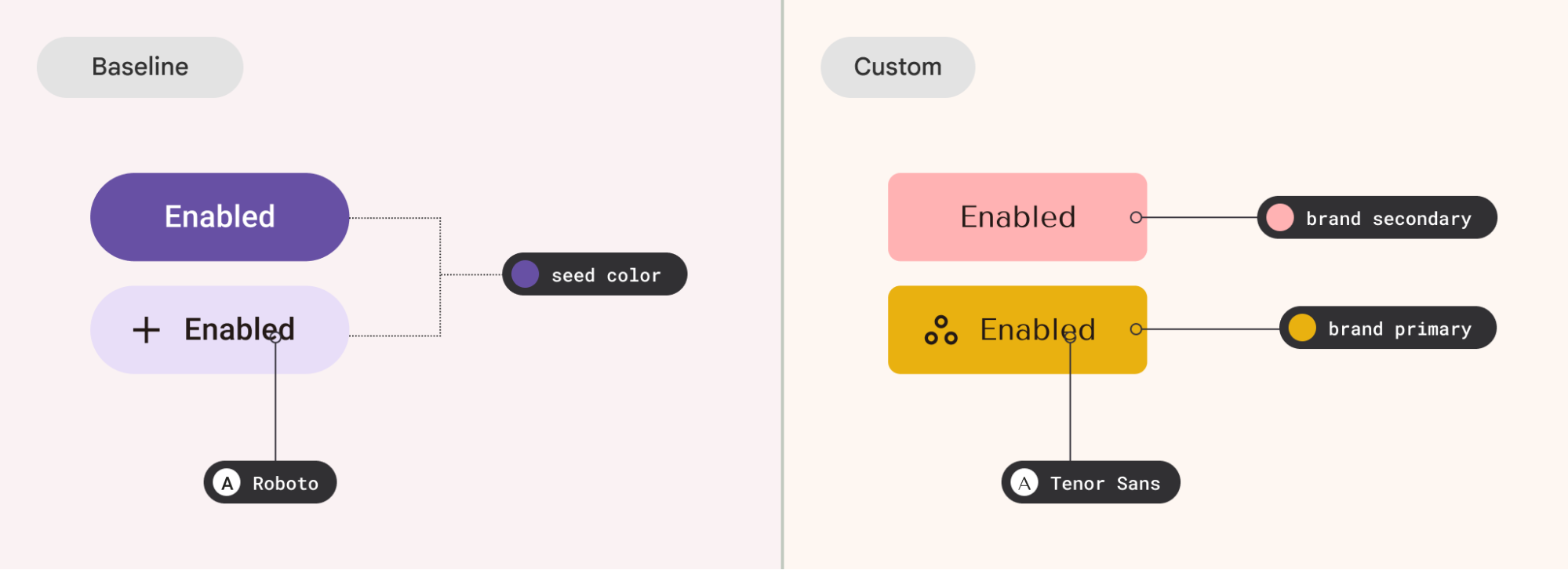
Baseline
The Material components in the Material library provide a baseline theme that uses a purple color scheme and Roboto font. Any app that doesn't define theme attributes reverts to these baseline attributes.
Custom (brand)
Using custom themes gives you a greater range of expression for your app's look and feel, or to act as a fallback when certain system themes are not available. This is useful whether you're working with a full custom design system, a small brand guide, or a few of your favorite colors.
Your app can also have multiple custom schemes, whether full schemes a user can choose from, content inspired, or sub-branded elements.
Content
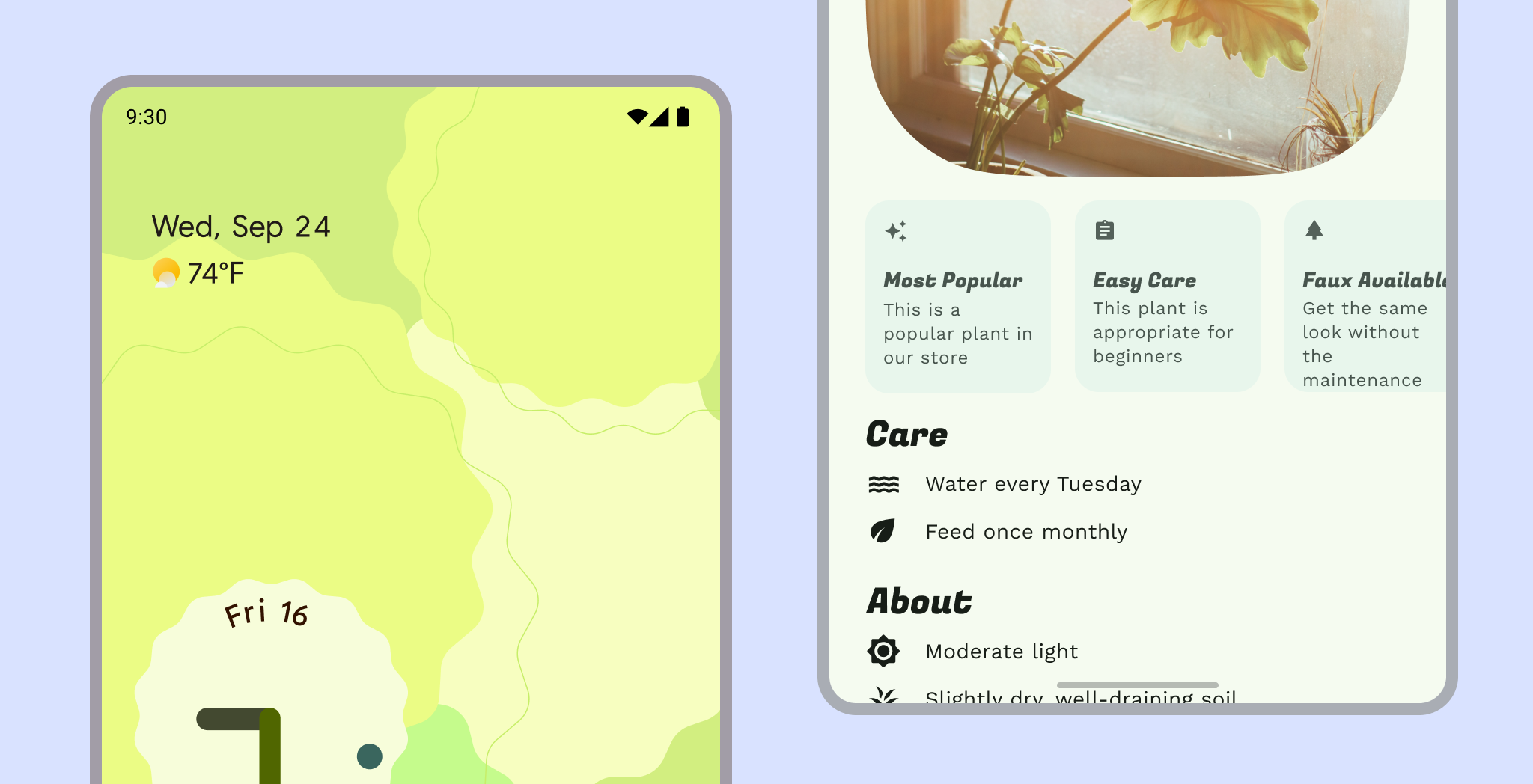
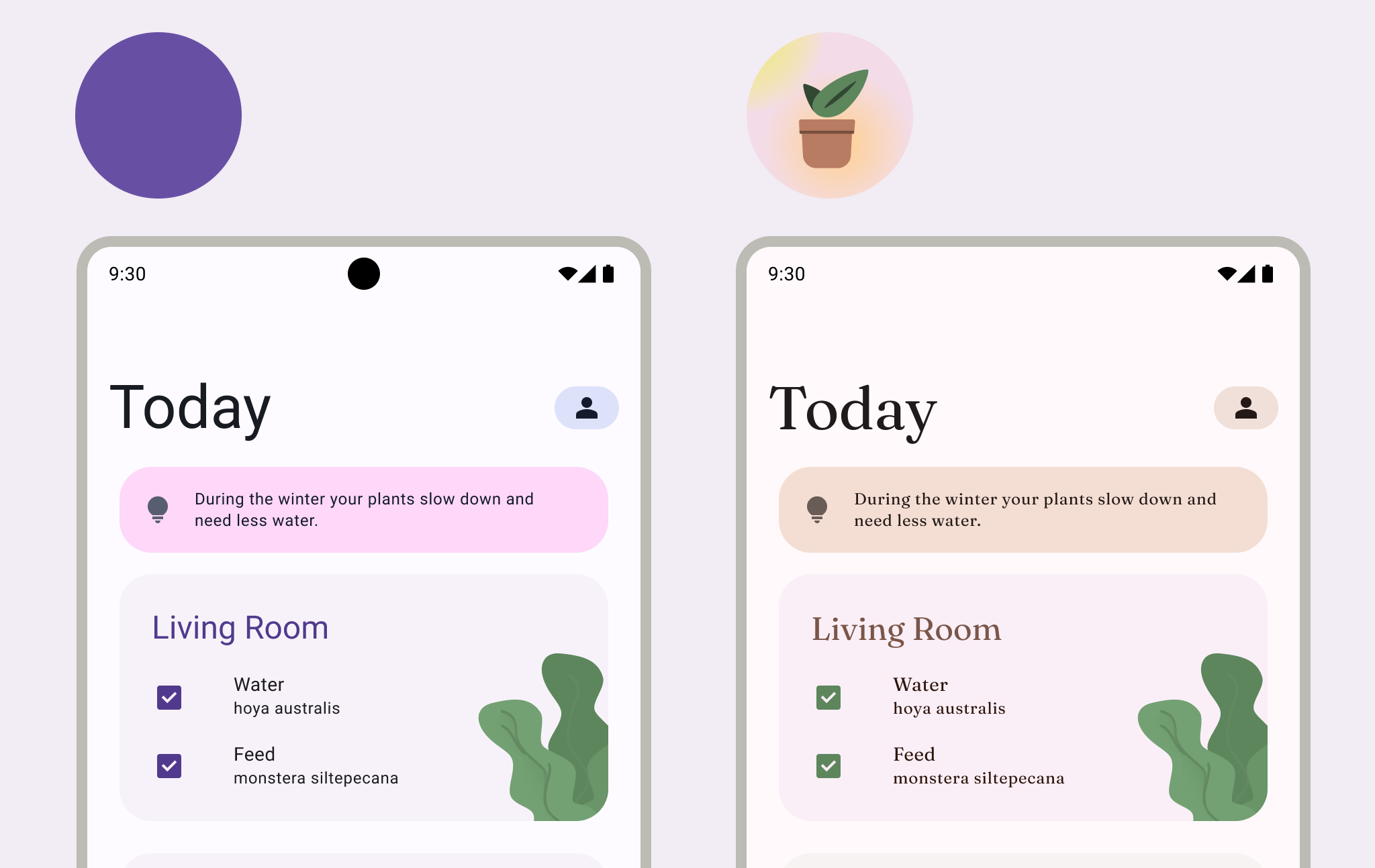
To bring more focus to some content, UI can use dynamic color to inherit color from that content. Content color works well with one primary content source, but make sure to use it with caution in views with multiple content sources.
A theme typically impacts an overall app, but can also be applied selectively and alongside other themes. Avoid too many themes and combinations by keeping with a hierarchy: a primary theme source (whether dynamic or custom) that applies to the majority of the UI.
Material
Material Design provides a baseline theme and theming systems (Color, Type, Shape). Material Theming can also be extended to accomplish additional attributes to the theme.
Brand
If the Material Design theme systems don't align with the look and feel you want in your app, you can implement a fully custom theme. Make sure to test custom properties for contrast and legibility.
See how to implement a custom system in Compose.
Theme attributes
Theme attributes are aligned with common visual styles used in UI design to evoke a range of aesthetics. In-app, these properties are often tied to Material theming systems to allow app maker customization.
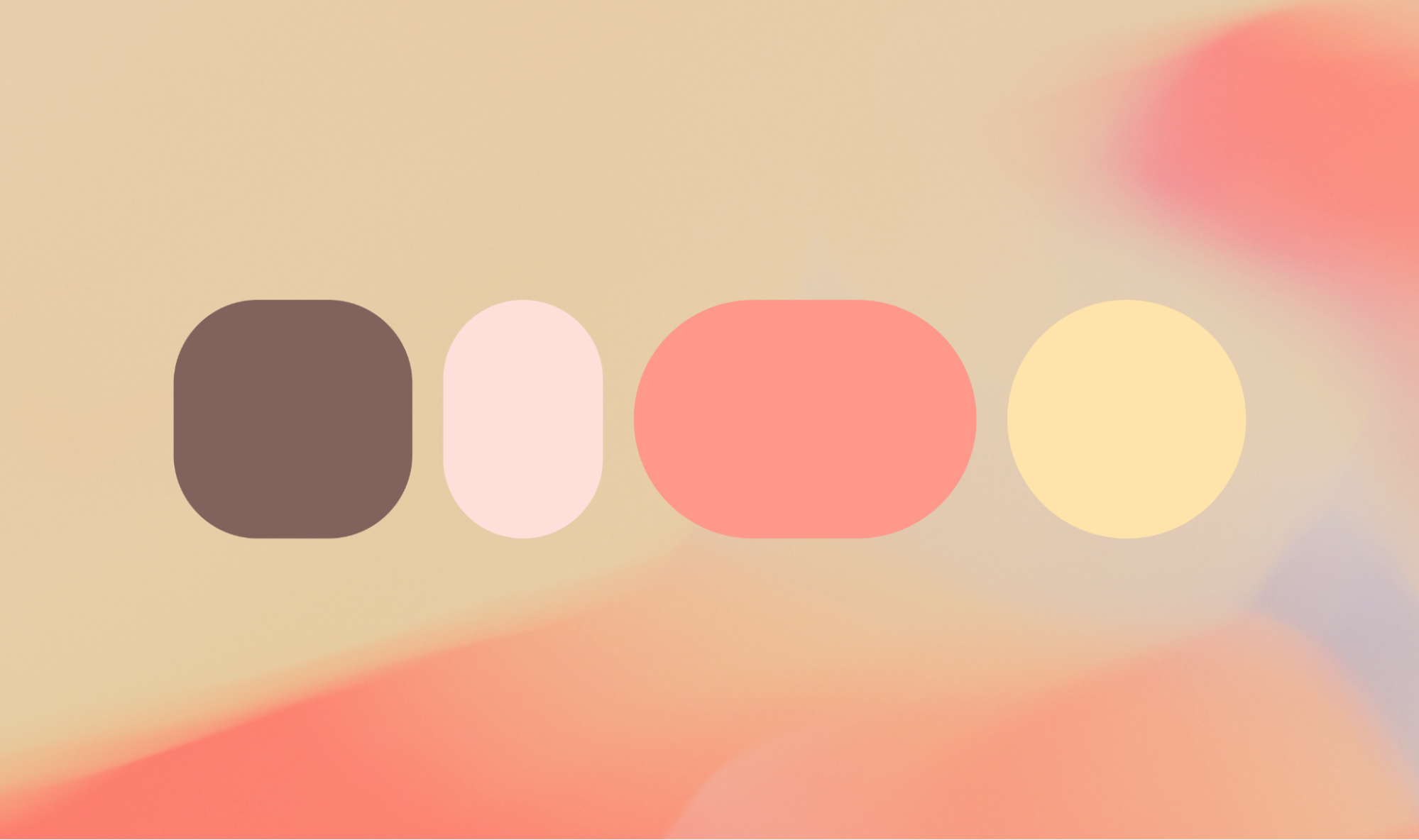
Color
Use color to express style and communicate meaning. Setting your app's colors can be crucial for personalization, defining semantic purpose, and of course defining brand identity.
Within a theme, a color scheme is the group of tones assigned to specific roles that are mapped to components. Learn more about color in Android UI and the Material Color System.
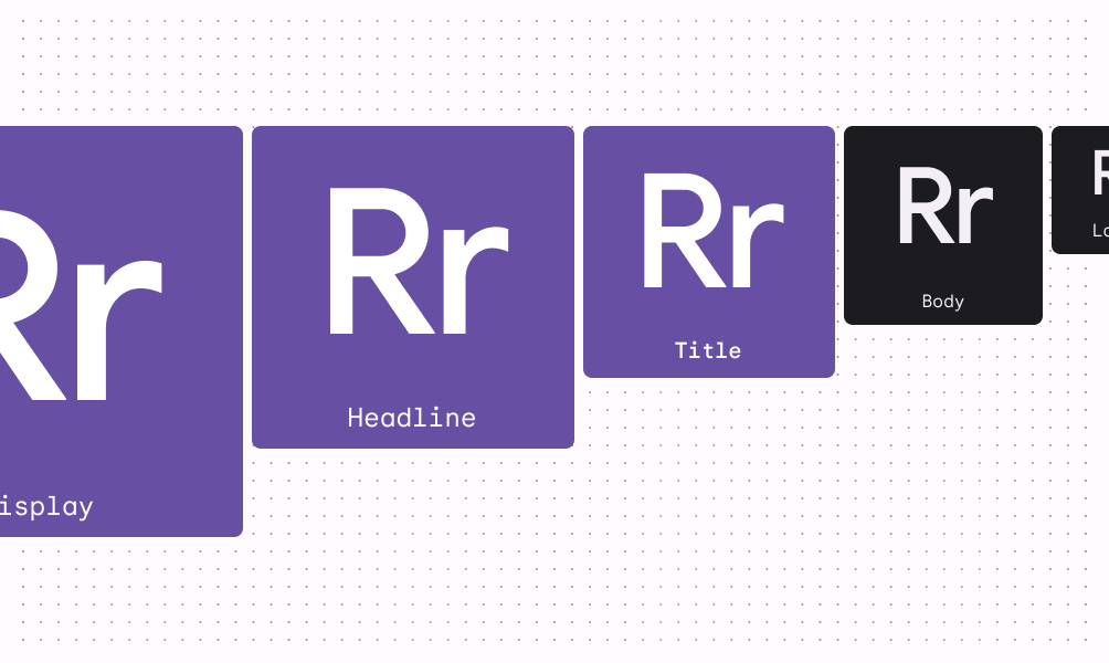
Type
Android's system font is Roboto (which is freely available to all apps) but you can customize type. Consider the legibility of the chosen fonts to align to their roles. Read about applying type.
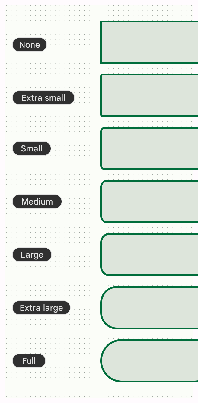
Shape
Customizing the shape of container corners past the baseline defaults helps define your app's character. For example, you might use full rounded corners to bring a softer and fun feel with or use an angular cut for a more serious feel. Check out the shape tokens and styles for Material components.
Icons
Material Icons are available to use in your app in five styles: Filled, Outlined, Sharp, Rounded, Two Tone. Utilize the same icon style throughout your app to maintain a consistent and polished look.
Other theme attributes
While color, type, and shape make up the primary Material theming systems, design systems are not limited to the concepts Material relies on. You can modify existing systems and introduce entirely new ones — with new classes and types — to make other concepts compatible with themes. You may also need to extend or replace the existing systems to utilize custom attributes beyond what is provided. For example, you may want to add a system of gradients or spacing dimensions.
Apply a theme in your app
Theme versus style plus classes
Both themes and styles can have multiple design attributes. A style can be independent of a theme and refers to the look of an individual element (or View), while you can set a theme across multiple elements and even the entire app. A style is a reusable stylistic choice, analogous to a style or token in your design software. For example, Body Large is a style, while Light and Dark are themes.
Implement a theme in Compose
A theme typically consists of multiple systems that group common visual and behavioral concepts, which you model using classes with theming values.
See Material Design 3 in Compose for more information on using Jetpack Compose to create an implementation of the Material Design 3 theme.
Color.kt
val md_theme_light_primary = Color(0xFF476810)
val md_theme_light_onPrimary = Color(0xFFFFFFFF)
val md_theme_light_primaryContainer = Color(0xFFC7F089)
val md_theme_dark_primary = Color(0xFFACD370)
val md_theme_dark_onPrimary = Color(0xFF213600)
val md_theme_dark_primaryContainer = Color(0xFF324F00)
Implement a theme in Views
Themes are a collection of semantically-named resources that can be used throughout your app. Themes share the same style syntax.
Colors.xml
<resources>
<color name="home_yellow">#E8D655</color>
</resources>
Webviews
Web content in WebView can also use light, dark, or default styling. Read how dark theme in webviews is supported.
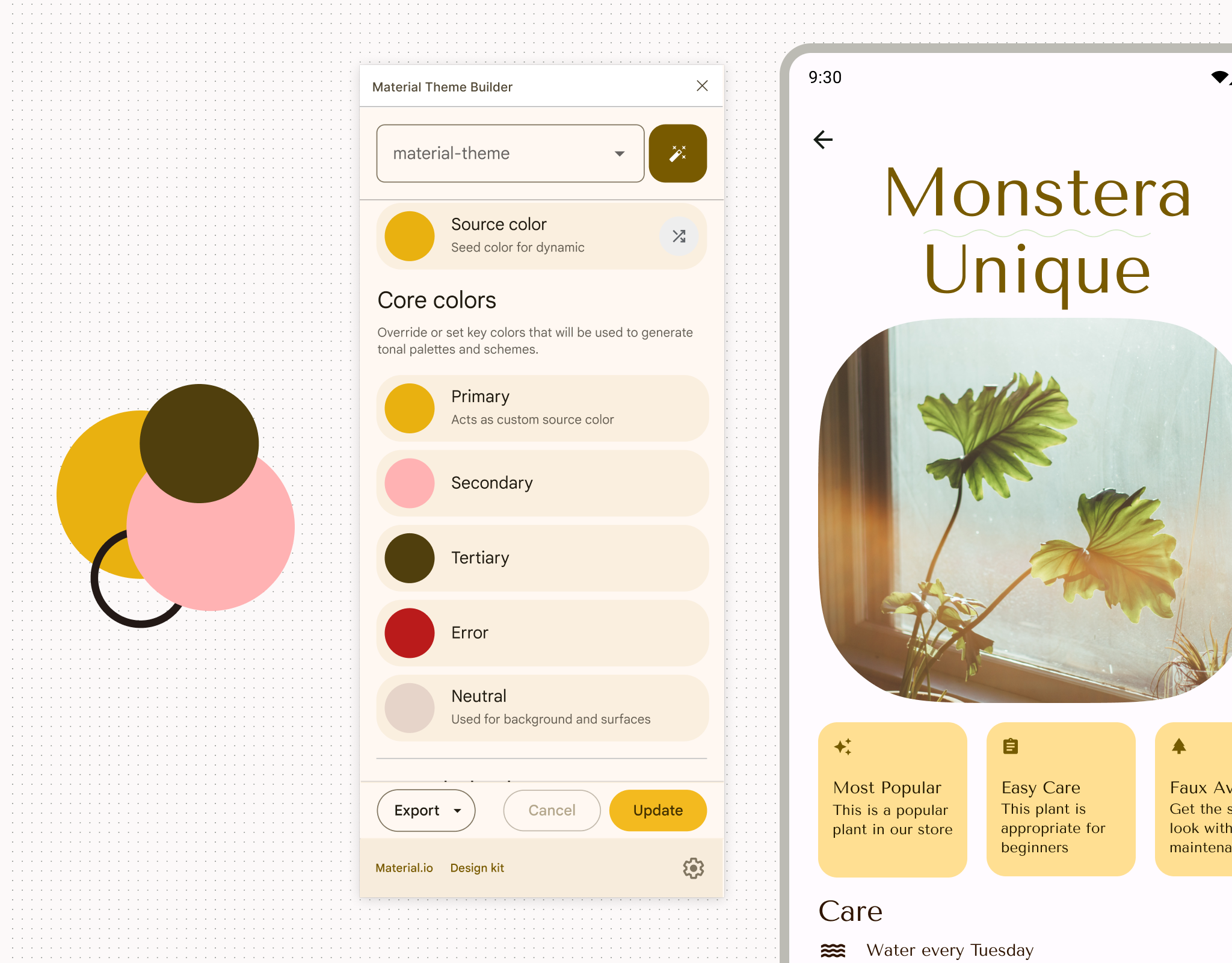
Customize a Material theme
You can use the Material Theme Builder Figma plugin to customize a Material Theme. Building a theme with it gives you implementable theming files with light and dark color schemes already generated, allowing you to take the customization further by updating the exported theme file with your exact values.