

The status bar, caption bar, and navigation bar are the system bars. They display important information such as battery level, the time, and notification alerts, and provide direct device interaction from anywhere.
Always take the presence and prominence of system bars into account, whether you're designing layouts, input methods, or other device capabilities.
Takeaways
Include system bars in your layouts for different screen sizes and form factors. Account for UI safe zones, system interactions, input methods, display cutouts, status bars, caption bars, navigation bars, and other device capabilities.
Keep the system status and navigation bars transparent or translucent and draw content behind these bars to go edge-to-edge.
Use
WindowInsetsto properly handle system bar intrusions and ensure your content is not obscured in your adaptive layouts.Use canonical layouts, which use the screen space efficiently.
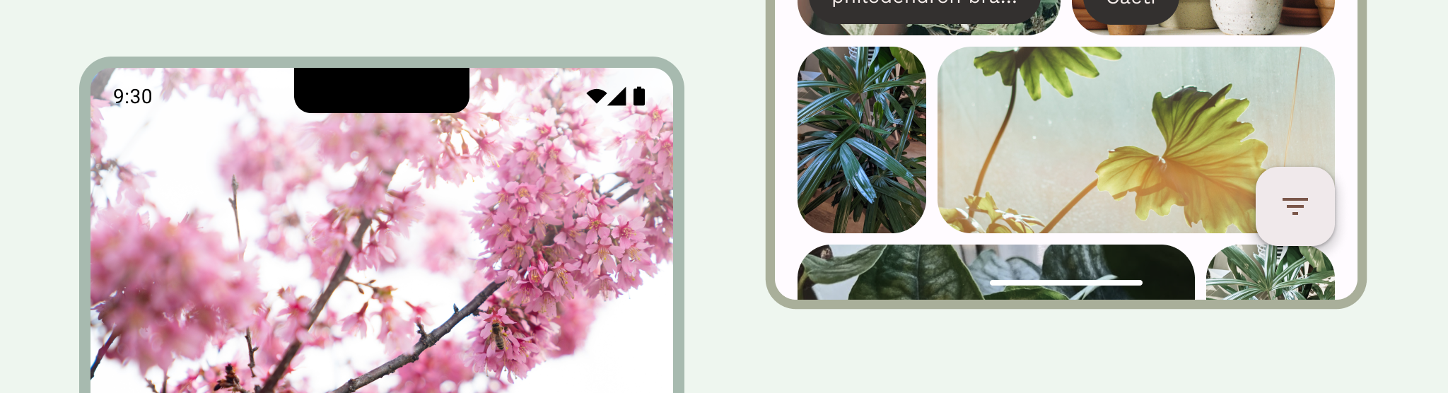
Status bar
The status bar contains notification icons and system icons. The user interacts with the status bar by pulling it down to access the notification shade. Status bar styles can be transparent or translucent.
Status bar icons
Status bar icons can appear differently depending on the context, time of day, user-set preferences or themes, and other parameters. For more information, see System bar icons.
When a notification arrives, an icon usually appears in the status bar. This signals to the user that there's something to see in the notification drawer. This can be your app icon or symbol to represent the channel. See Notifications design.
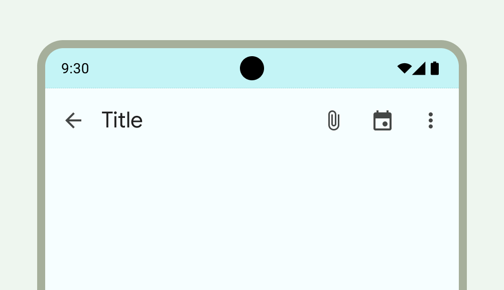
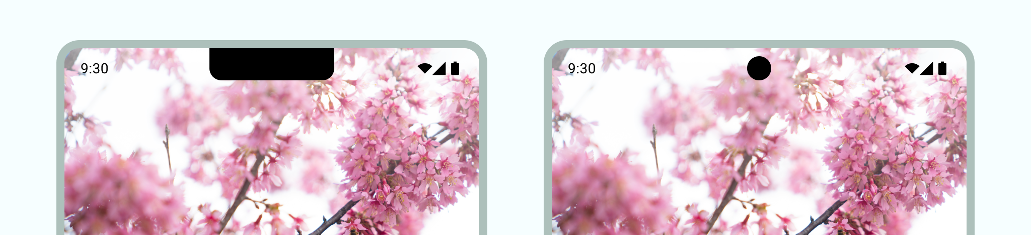
Set the status bar style
Make the status bar transparent or translucent to ensure your app content spans the entire screen. Then, set the style of your system bar icons so that the icons have proper contrast.
Edge-to-edge is enforced on Android 15 making the status bar transparent by
default. Call enableEdgeToEdge() for backward compatibility.
In the following left-side image, the status bar is transparent and the
TopAppBar's green background draws behind the status bar.
Transparent status bars are ideal when the UI doesn't appear underneath the status bar or an image draws underneath the status bar. Translucent status bars are ideal when the UI scrolls underneath the status bar. For more on gradient protection see Edge-to-edge design.
Navigation
Android lets users control navigation using back, home, and overview controls:
- Back returns to the previous view.
- Home transitions out of the app and to the device's home screen.
- Overview shows active apps and recent undismissed apps.
Users can choose from various navigation configurations including gesture navigation and adaptive navigation. To deliver an optimal user experience, account for multiple types of navigation.
Gesture navigation
Gesture navigation doesn't use buttons for back, home, and overview, instead it shows a single gesture handle for affordance. Users interact by swiping from the left or right edge of the screen to go back and up from the bottom to go home. Swiping up and holding opens the overview.
Gesture navigation is a more scalable navigation pattern for designing across mobile and larger screens. To provide the best user experience, account for gesture navigation by doing the following:
- Supporting edge-to-edge content.
- Avoid adding interactions or touch targets under gesture navigation insets.
For more information, see Add support for gesture navigation.
Adaptive navigation
Another common navigation pattern on Android is to switch between a navigation rail and a navigation bar depending on the window size class of the display. The adaptive navigation components in Jetpack Compose handle multiple form factors while also keeping the system bars from interfering with the layout of navigation components.
In adaptive layouts, consider how the system bars might behave or be styled differently across various contexts, such as compact or expanded window sizes or different foldable postures.
For more information, see Build adaptive navigation.
Navigation icons
Navigation icons can also appear differently depending on user-set preferences or themes. For more information, see System bar icons.
Set a navigation style
Android handles visual protection of the user interface in gesture navigation mode and in the button modes. The system applies dynamic color adaptation, in which the contents of the system bars change color based on the content behind them.
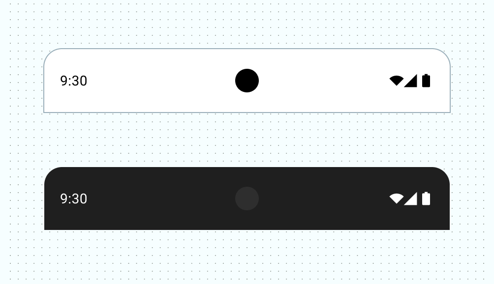
Gesture navigation mode
After targeting Android 15 or calling enableEdgeToEdge on the Activity, the
system draws a transparent gesture navigation bar and applies dynamic color
adaptation. In the following example, the handle in the navigation bar changes
to a dark color if it's placed above light content, and vice-versa.
Transparent gesture navigation bars are always recommended.
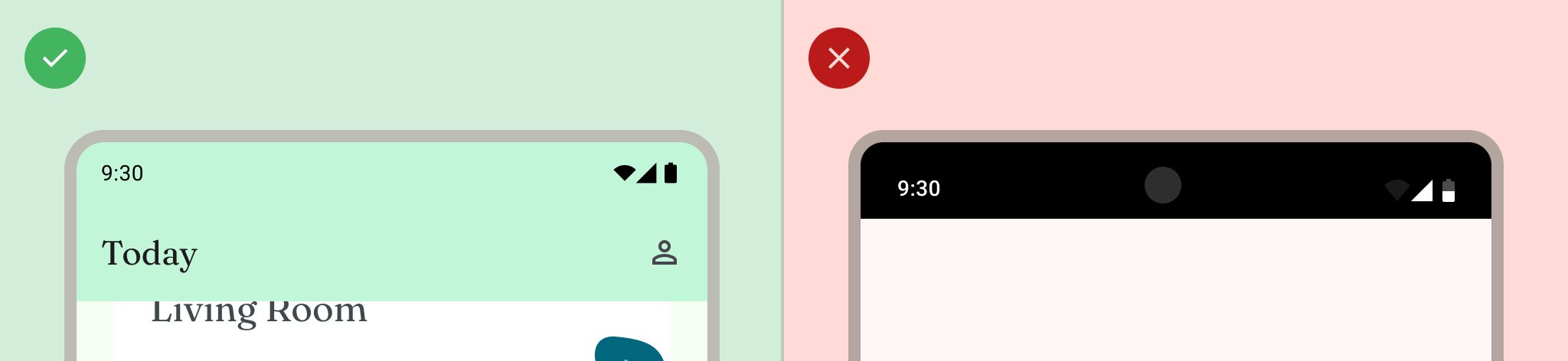
Do
Don't
Button modes
After targeting Android 15 or calling enableEdgeToEdge on the Activity, the
system applies a translucent scrim behind button navigation bars, which you can
remove by setting Window.setNavigationBarContrastEnforced() to false.
Use transparent three-button navigation bars when there is a bottom app bar or
bottom app navigation bar, or when the UI doesn't scroll underneath the
three‑button navigation bar. To get a transparent navigation bar, set
Window.setNavigationBarContrastEnforced() to false and pad bottom app bars to
draw underneath system navigation bars, as seen in figures 7, 8, and 9. See
System bar protection for more information.
Use a translucent three-button navigation bar for scrolling content. For more on translucent navigation bar considerations, see Edge-to-edge design.
Keyboard and navigation
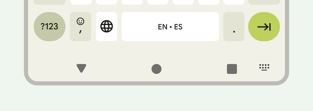
Each navigation type reacts appropriately to the on-screen keyboard to allow
the user to perform actions such as dismissing or even changing the keyboard
type. To ensure a smooth transition that synchronizes the transition of the app
with the keyboard sliding up and down from the bottom of the screen, use
WindowInsetsAnimationCompat.
Layouts
Adaptive layouts optimize available display space. They organize the app UI by moving content into secondary or tertiary panes.
When designing adaptive layouts, consider how the system bars interact with your
content. Use WindowInsets to ensure your UI is not obscured by the system bars
on displays such as large screens, foldables, and app windows in multi-window
and desktop windowing modes.
When your app is displayed edge-to-edge, verify that content and controls are not obscured by the system UI. If, for example, the navigation bar covers a button, the user might not be able to click the button.
For more information, see Canonical layouts.
Display cutouts
A display cutout is an area on some devices that extends into the display surface to provide space for front-facing sensors. Display cutouts can vary depending on the manufacturer. Consider how display cutouts will interact with content, orientation, and edge-to-edge.
Immersive mode
You can hide system bars when you need a full-screen experience, for example when the user is watching a movie. The user should still be able to tap to reveal system bars and navigate or interact with system controls. For more information, see Immersive content and Hide the system bars for immersive mode.