Widgets

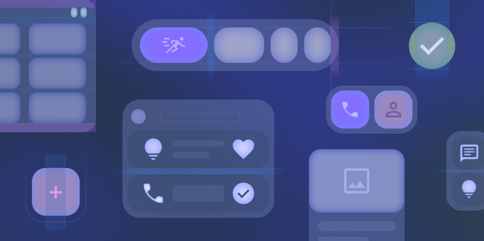
Widgets are customizable home screen elements that display a clear and actionable view of an app’s content or actions. This content can periodically refresh.

Widgets help users complete their goals more easily, either by interacting with your app's content directly in the widget or by opening your full app experience.

Figure 1. Left: A task app allows for greater productivity by adding a grocery shopping list to the home screen. Right: A music app provides playback controls and album art so the user doesn't have to navigate into the app.

Widgets can also highlight content, which might encourage users to open your app.

Figure 2. An audiobook app widget highlighting latest releases.

Takeaways

When creating widgets, keep the following in mind:

  • Keep the content and functionality simple.
  • Choose the right widget shape, layout, and content type.
  • You can create multiple widgets for one app to showcase different actions or information.
  • Consider creating a resizable layout.
  • Keep content fresh and short.
  • Keep controls minimal and relevant.
  • Fill as much of the allotted grid space on the home screen as possible to minimize awkward gaps between widgets.
  • Provide a meaningful description and preview of your widget so your users can make a more informed decision within the widget picker.
  • If your widget supports interactive gestures, don't interfere with common home screen gestures.

Get started

When creating your widget, complete the following steps:

  1. Choose a single primary user case to highlight in your widget.
  2. Check out the Widget template examples on Figma.
  3. Design the UI within the gesture and sizing widget guidelines.
  4. Test for multiple screen sizes.

Adding a widget

Widgets are typically added from the home screen in one of the following ways:

1. Through the widget picker, accessed by a long press on the home screen wallpaper.

The widget picker displays a preview and description. Widgets are grouped by apps and should include a meaningful description. To help users visualize how your widget shows information, use a separate preview layout and preview data. For more information on improving your app's widget preview, see Improve your app's widget preview.

2. Through a shortcut, often by long pressing the app icon.

3. Through app pinning, which is an in app experience to add your widget to the home screen.

Widgets can be dragged onto the home screen to an available space. The "add a widget" experience may vary by device manufacturer, but doesn't require additional consideration. The user can move and resize the widget after placement with a long press.

Widget configuration

You can configure widgets to display selected content or data from your app. Provide a configuration step to let users customize the glanceable content from a set of multiple categories, such as a group of contacts for a communication-based app. Configuration happens between widget selection and appearing on the home screen.

Figure 3. Mail configuration step to choose a folder to display within the widget.

Lead the user through configuration and provide clear feedback.

Fulfill an existing critical user journey

Since a widget is an extension of your app on the home screen, a widget's purpose should align with an existing user journey in your core app. Widgets follow similar design principles as tiles on Wear OS, allowing users to get information at a glance to meet their goals and act quickly.

Keep a widget to a few actions and content types to prevent your widget from being overwhelming.

Figure 4. Mail app shows the latest Inbox and a compose button.

Surface valuable, related, and simple features on your widget. For example, an alarm app could have a widget that provides the current time and next alarm.

Use cases

The following are use cases based on the types of content the widget contains.

Information-based widgets typically display crucial information elements and track how that information changes over time. Some examples of information that would display well on widgets include the following:

  • User health data that can be easily summarized in a compact form.
  • Fitness tracking data and health-related statistics.
  • Weather information, which is highly scannable.
  • Stock data that provides a quick read on a user's home screen.
  • Clock and time information, which you can customize for your home screen.

Some widgets may be a collection of similar content types. Some examples of this include the following:

  • A photo gallery widget that allows the user to scroll through a chosen album.
  • A communication widget that shows the latest emails from a selected folder.
  • A news app that provides articles from your favorite categories.

Control widgets display frequently used functions so that the user can trigger them from the home screen without having to open an app. Some examples of this include the following:

  • Controls for wireless headphones.
  • Smart lightbulb controls to toggle on/off and control luminance.

Widgets can contain different types of content and fulfill multiple purposes. This hybrid functionality is useful to complete critical user journeys that complement each other. Some examples of this include the following:

  • A media app widget that displays brief song metadata and playback controls.
  • A home widget that allows the user to toggle home controls and provides a small gallery.

When not to use a widget

Widgets aren't helpful for all use cases. Because widgets are displayed on the home screen, they shouldn't rely on sensitive or secure information. For example, a banking app shouldn't have a widget that displays account balance data on a locked screen. Instead, it could provide a quick link to access banking services.

Widgets shouldn't deal with complicated user flows, either. For example, a healthcare-related app with an extensive check-in flow and potentially private data is best accessed through the core app experience rather than through a widget.

While widgets and notifications have similarly small footprints outside your core app, some use cases are better served by widgets. For instance, a collection widget that displays the five latest articles posted in the app gives a quick view of the latest content and allows the user to choose an article to continue reading. This widget is more useful than a notification informing the user that there are five unread articles to read. The same app should display a notification for when a new article is released to provide timely information.

Provide a widget that enables glanceable discoverability.
Use a notification that is too generic and not timely.

For more information on when to use notifications rather than widgets, see Notifications.

Gestures

Widgets don't support horizontal swipe and long press gestures to prevent interference from other home screen gestures. Only use tap and vertical swipe gestures for your widget. This constraint limits the use of certain gesture-reliant components, such as a carousel, in your widget.

Theming

Although you can express your app's brand, a widget is still a part of the user's home screen. Balance your branding with the user's customizations by honoring the user's system UI settings. Follow the Material 3 design guidelines whenever possible for shape, color, typography, and components.

To better fit in with a user's home screen, allow your widget to adapt to system device theming. This allows your widget to utilize features like light/dark themes and contrast settings, though your widget's UI may look slightly differently across various device manufacturers. Rounded corners default to no larger than 28 dp, but can also vary by device manufacturer implementation. To appropriately fill the home screen grid, don't set the corner radius on your widget.

Widgets use system fonts provided through the launcher, meaning your app's custom fonts aren't available to the widget. To reference system fonts, use FontFamily.

Dynamic color

Starting in Android 12, a widget can use the device theme colors for buttons, backgrounds, and other components. This provides smoother visual consistency and personalization across different widgets, icons, and wallpapers.

Use Material color roles and tokens to fulfill accessibility contrast guidelines and support dynamic color features, such as user-generated color, dark themes, and contrast themes. For more information see the Material Design Color guidance.

Figure 5. A widget with dynamic color.

Widget shape

Create a widget with a rectangular background container using rows and columns, or a freeform shape with Box. Rectangular widgets have rounded corners that should adapt to system UI and fill their allotted grid space. Freeform widgets have a variety of Material shapes to choose from, including pill or pie. Regardless of shape, the layout should be responsive to sizing.

Figure 6. A. A rectangular gallery widget. B. A freeform style weather widget.

Override system default for rounded corners.

For more information on widget layouts, see Build a UI with Glance.

Anatomy

Figure 8. Basic widget anatomy.

1 App icon 2 App name title 3 Actions 4 Content

App icon, actions and title are optional, but should be anchored to the top if present.

The title bar is an optional component for rectangular widgets that include the app icon and app name. They should be anchored to the top of the widget. Don't replace the app name with another title.

The app icon is a monochrome icon that represents your app. You can use the same monochrome icon from your adaptive color icon.

Content

Content with a low glanceable density is best for Widgets. Use an appropriate refresh rate for your content based on the timeliness of the data.

Figure 7. A contacts widget may be occasionally refreshed while a weather widget is more frequently refreshed.

Sizing

The default home screen positions widgets based on a grid of cells. The number, size, and spacing of cells can vary widely from device to device and launcher to launcher. Hence, it is very important that your widget is flexible and can accommodate more or fewer grid stops than anticipated. Consider devices that use a landscape orientation and large screen size classes.

When determining the size of your widget, keep the following in mind:

  • You can specify a default size for your widget and provide lower and upper bounds on the size of the widget.
  • Fill the space on your home screen grid with rectangular widgets. When designing with Glance, appWidgetBackground provides appropriate defaults to fill the space.
  • Even though freeform widgets are an irregular shape, design them to fill a footprint by filling all available space along a grid boundary vertically and/or horizontally. Use the [fillMaxSize()][/reference/kotlin/androidx/glance/GlanceModifier#(androidx.glance.GlanceModifier).fillMaxSize()] method to do so.
Allow your widget to respond and fill the space. Freeform widgets should go edge to edge of the cell.
Constrain widgets that will not fill the available space.

When designing your widget to be resized, keep the following in mind:

  • To maintain readability of text content, truncate text mindfully.
  • Consider setting minimum size constraints.
  • Consider how images are cropped and resized.
Build a layout so content will be legible when resized.
Keep the same layout when resized if content is no longer legible.

Icons

Iconography can be a crucial element with widgets, allowing for efficient communication of information and actions within a small surface. Use the expansive library of icons provided in the set of Material symbols to provide greater design consistency between your widgets and other widgets on the home screen.

If your app already includes custom icons that you'd like to use within your widget, follow design icon principles. Keep icons simplified and legible at small sizes.

Accessibility

When designing widgets, keep in mind the following accessibility considerations:

  • Don't place text over an image unless the text is large and has a good color contrast with the image background.
  • Widget text size should correspond to font size within the system settings.
  • Don't try to fit more content onto the widget by using a smaller font size.
  • Visual containers should reflect the actual size of touch targets.

Visit Accessibility for more Android accessibility tips.

While users don't navigate through the widget in the same way as an app, they can use a widget to navigate to common actions or destinations in the app. Let users tap on information or content to navigate into the app view for more detail, as shown in the following image.

Including generative functions, or functions that create new content within the app such as compose or add, and create direct access to critical user journeys, as shown in the following email widget.

Figure 9. The mail app widget shows the latest inbox and a compose email button.

Pinning

Widget pinning lets users add widgets to their home screen from within an app. The launcher displays a preview of the widget, which you can customize for your app. This lets you ask the user if they would like to add your widget at a set point or task within your app's workflow. For example, when a user adds a new city in a weather app, you can prompt the user to add a weather widget for that city to their home screen.

States

Include unique states for your widgets as you would within the core app. Some possible unique states include the following:

  • Empty states: Include a prompt to populate the widget or link to a generative function. An empty state can serve as an opportunity to show value to new users and can be treated in a similar way as app onboarding.

Figure 10. A list widget pre-populated with items to show value for new users instead of being empty.

  • Loading state: Include a loading state to indicate that the widget's updated content will finish loading shortly.

  • Error state: Provide a way to resolve the error with clear messaging.

Figure 11. A widget with an error message and a way to solve the error.

Don't add UI flows for data configuration. Instead, create a configuration activity to let users access and adjust widget settings.

Support

Ready to build your widget? Create an app widget with Glance.