
Configure your widget to display selected content or data from your app.
When to use configuration
Let your user configure their widget either during widget selection or through touch & hold. Consider how crucial customization is to your widget experience to decide when to make it available.
- If the widget appears empty without choosing settings or customization is central, directly open the configuration workflow during widget placement.
- If the widget has a preferred default or does not need the user to make a selection before viewing content, then your widget does not need an initial configuration screen. In these cases, let your user access configuration after placement.
Direct users
We suggest that you provide a configuration step to provide a customizable and glanceable experience for apps with multiple categories of content, such as an email app.
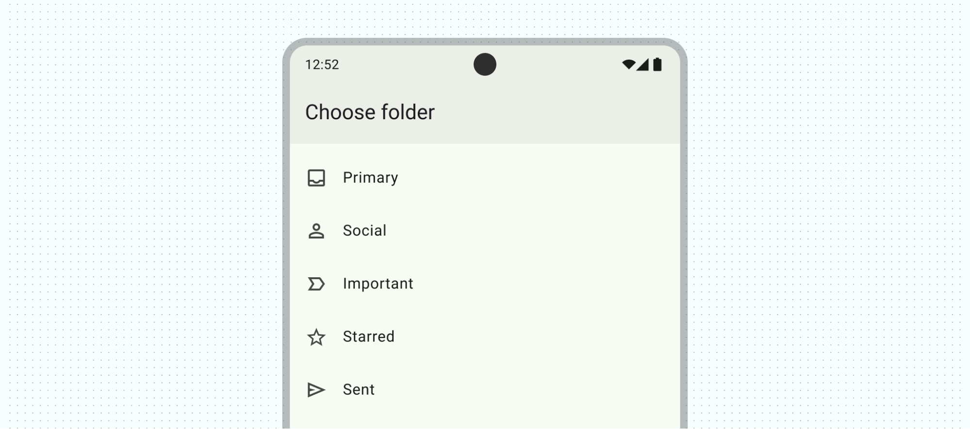
When to use configuration
Allow your user to configure their widget either between widget selection and appearing on the home screen or through touch & hold. Consider how crucial customization is to your widget experience to decide when to make it available.
- If the widget appears empty without choosing settings or customization is central, directly open the configuration workflow during widget placement.
- If the widget has a preferred default or does not need the user to make a selection before viewing content, then your widget does not need an initial configuration screen. In these cases, let your user access configuration after placement.
Direct users
Lead the user through configuration and provide clear feedback. If your app already contains a configuration flow, you can mirror your in-app configuration experience, ideally minimized for 1 to 2 screens.
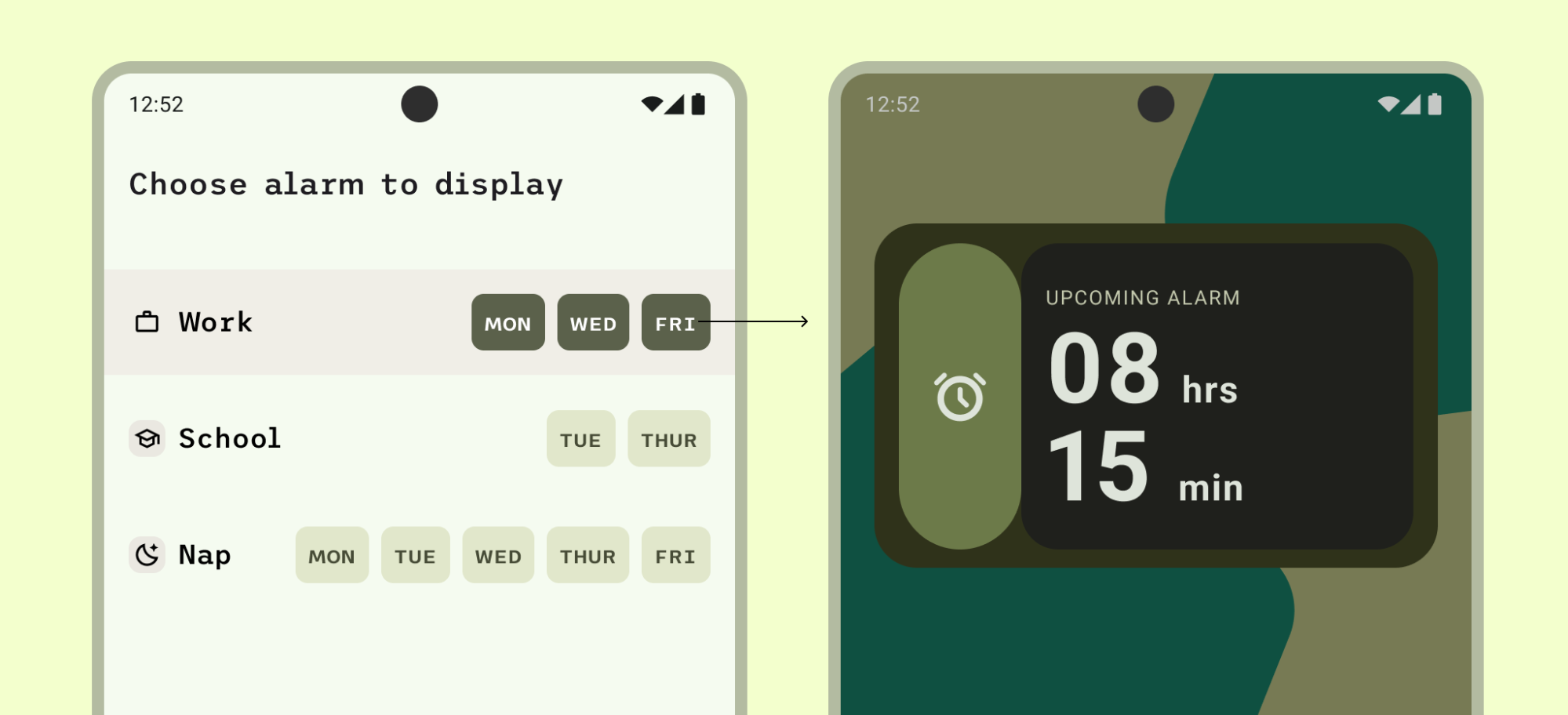
Do
For example, the alarm configuration screen on the left only lets the user select an alarm category, and then adds the widget. Tapping the category closes the configuration step and adds the widget. If configuration is not completed, don't cancel adding the widget. Provide a state to allow for restoring or configuring within the widget.
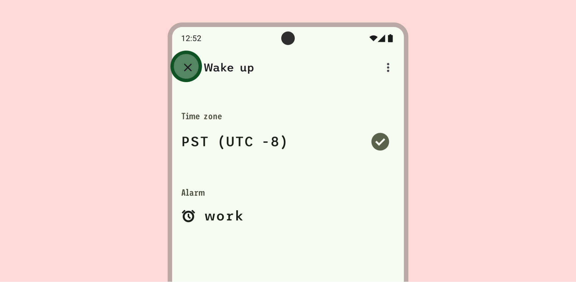
Don't
In this example, it isn't clear that closing the configuration view through the x icon adds the widget, despite choosing content to display.
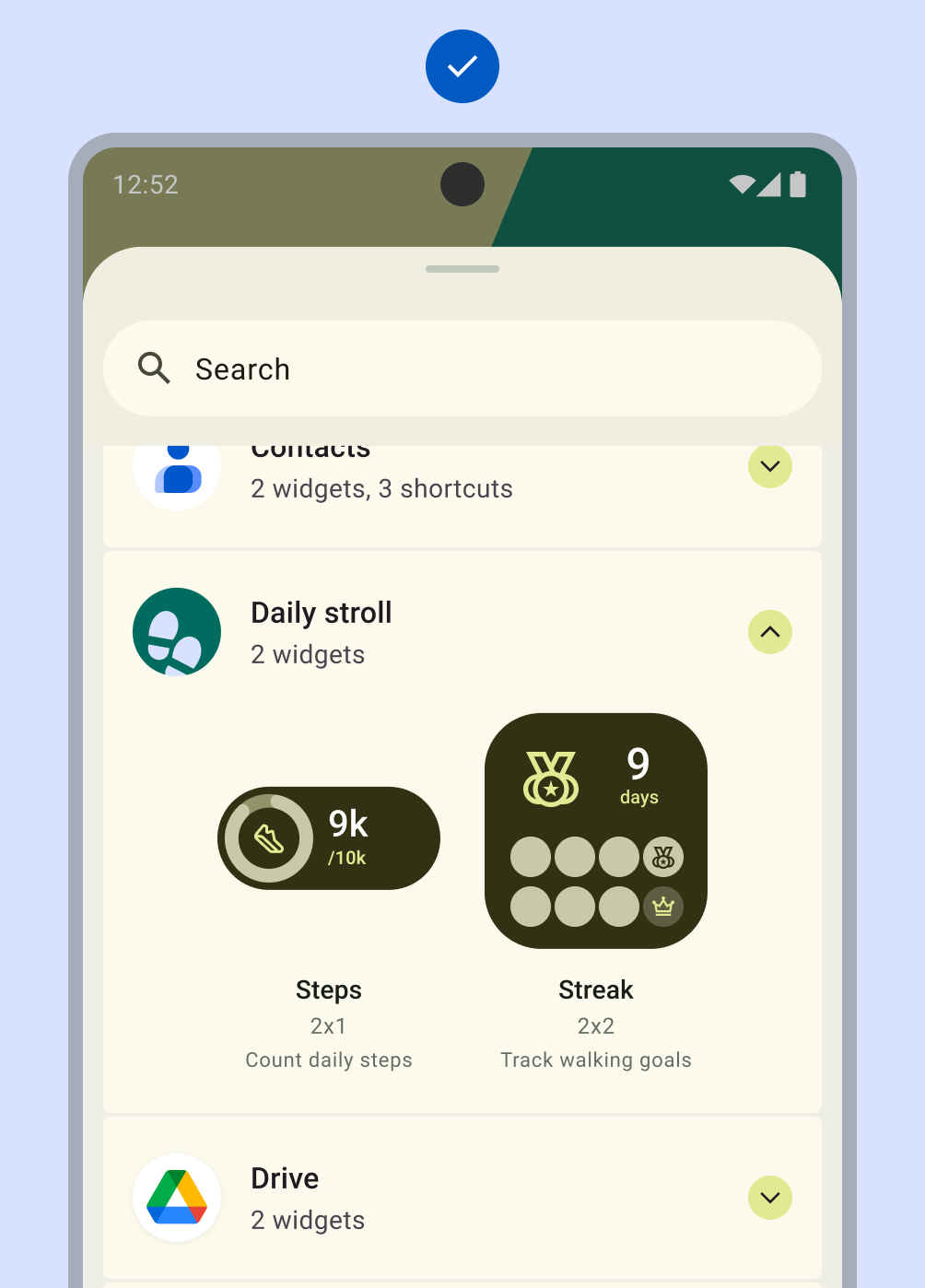
Include an empty state if there is no other preset available. The empty state can show an onboarding or authentication reminder to make sure to direct users.
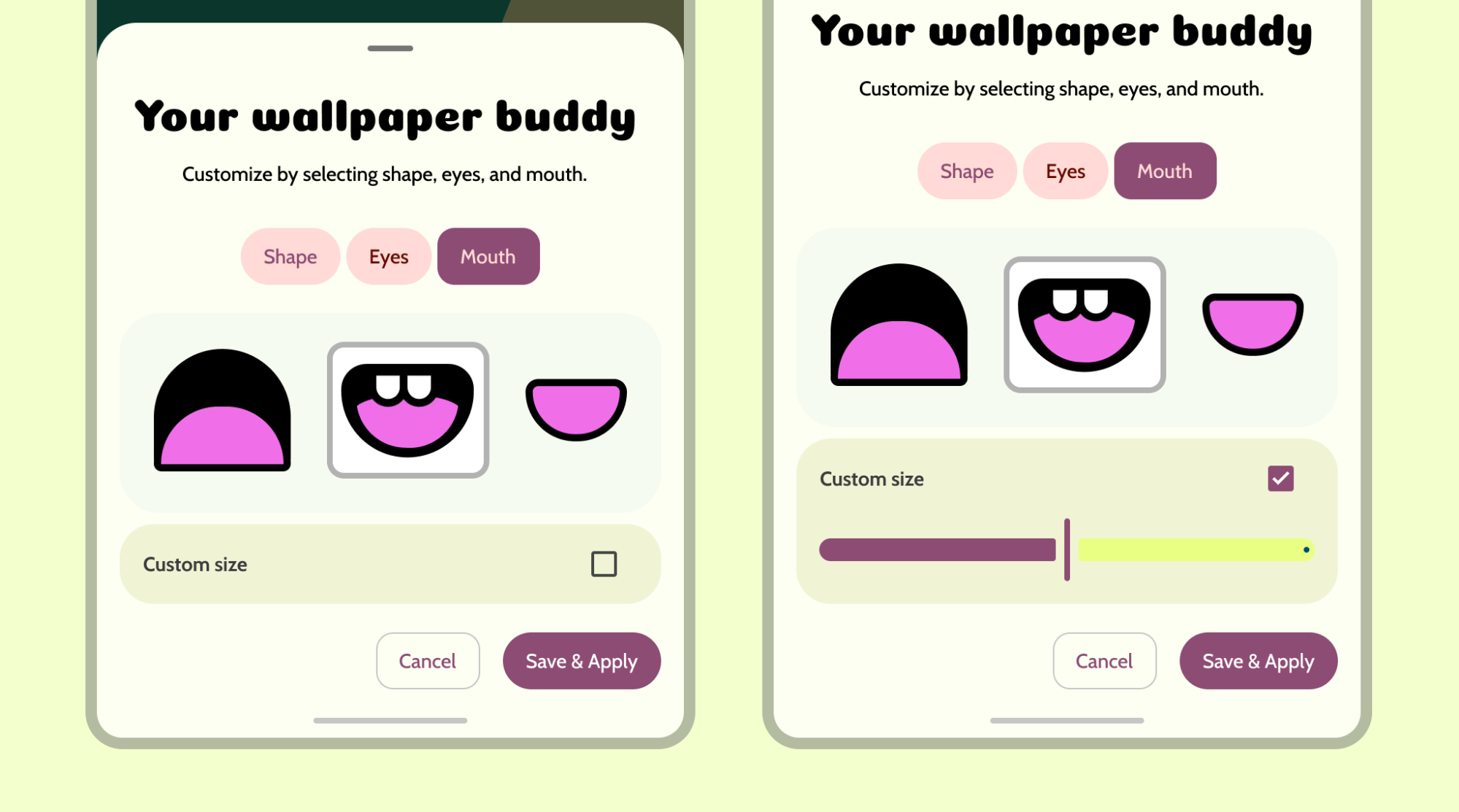
Customize widget appearance
Provide a desirable default widget when possible to let users quickly get started without customization or to help users understand how the widget appears on their home screen.
Show a preview of the widget when customizing the widget appearance.
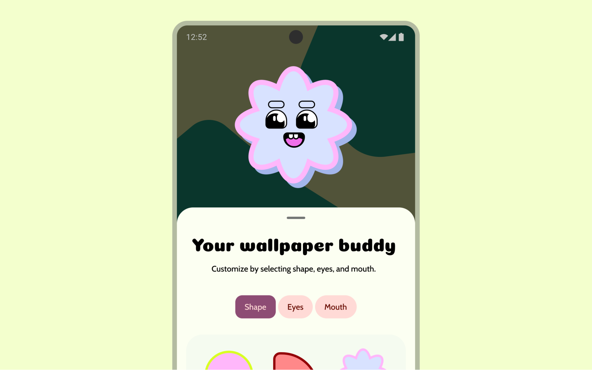
Use progressive disclosure for advanced controls to help users move quickly through customization.
Variations
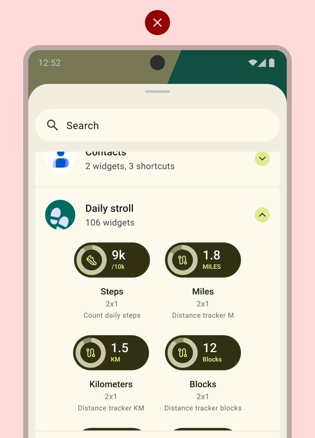
For widgets with limited customization, display popular or distinct configurations directly in the widget picker. This avoids the need for a separate configuration screen.
Apps can support an unlimited number of widgets. However, the widget picker must focus on showcasing only critical tasks and helpful variations. Limit picker previews to 6-8 variations. Allow access to additional variations through a confirmation screen.
Do
Don't
Layout
Follow Layout basics best practices or take advantage of Material Design components, such as list layouts with switches, checkboxes, and toggle buttons, when building your configuration screen. For more information on making your widget layout high quality, see Widget quality.