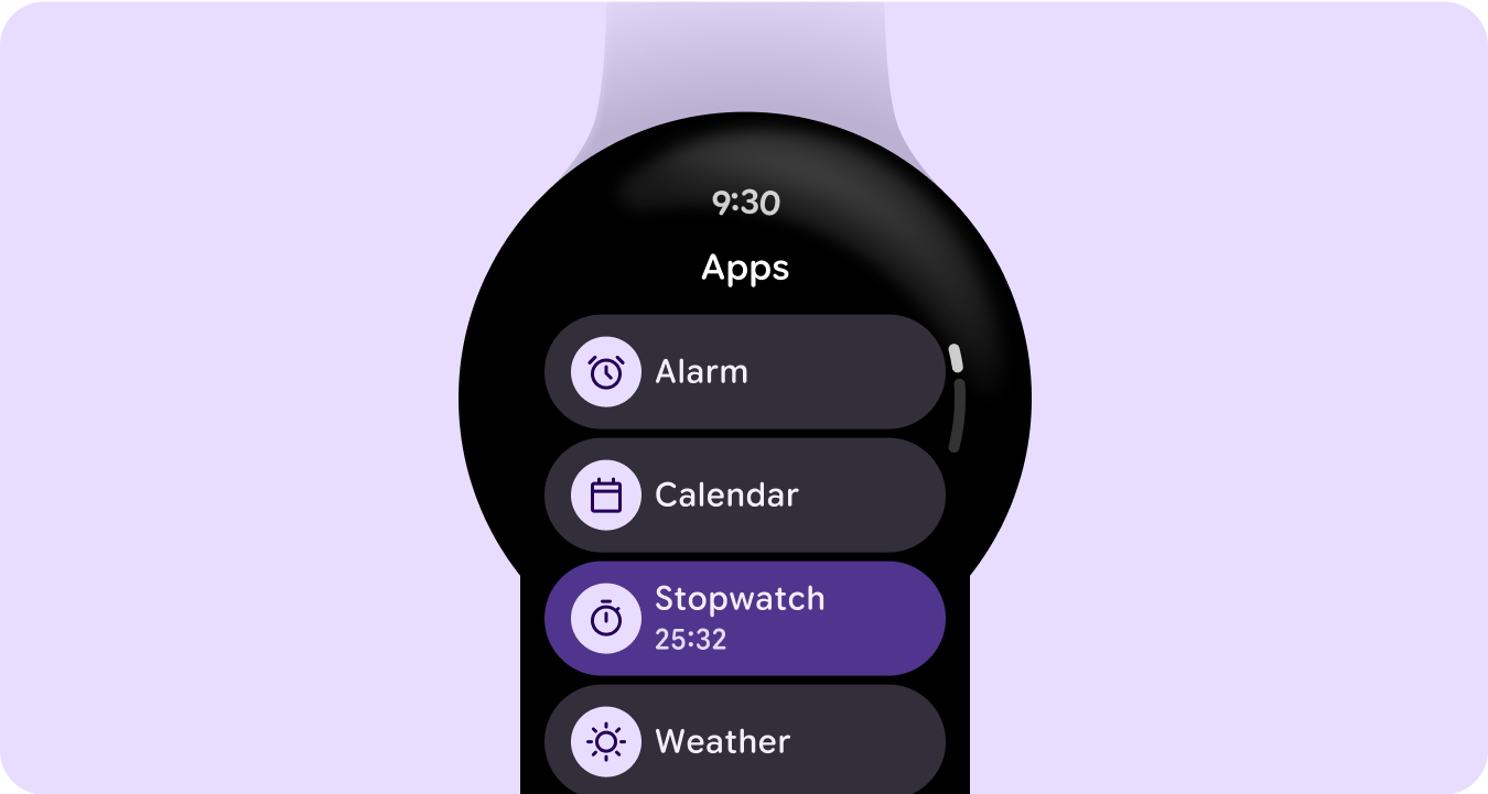
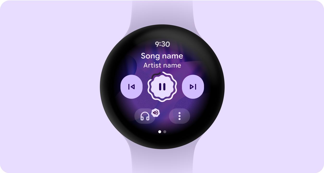
An app is one of the primary surfaces on Wear OS. Apps are different from complications or tiles, which are glanceable representations of app content. Apps display more information and support richer interactivity. The user often enters an app from another surface, such as the launcher, recents, a notification, complication, tile, or voice action.
Principles
Focused Focus on critical tasks to help people get things done within seconds.
Shallow and linear Avoid creating hierarchies deeper than two levels. Aim to display content and navigation inline when possible.
Scrolling Apps can scroll. This is a natural gesture for users to see more content on the watch.
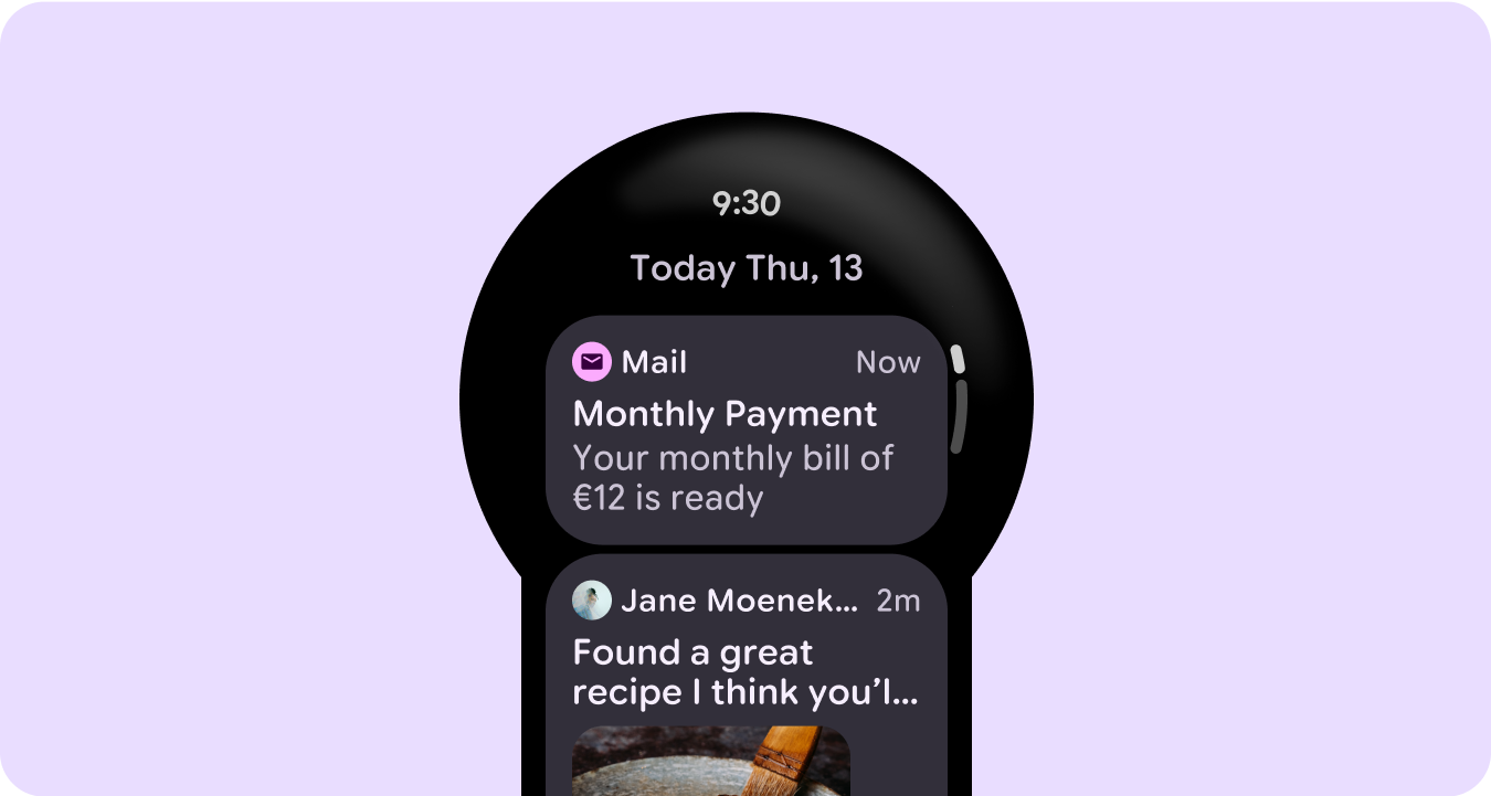
Content container types
Use content containers in your app to group related content and differentiate from distinct content or content groupings.
Fixed height containers
Variable height containers
Height and width greater than viewport
Paginated container
Full screen takeovers
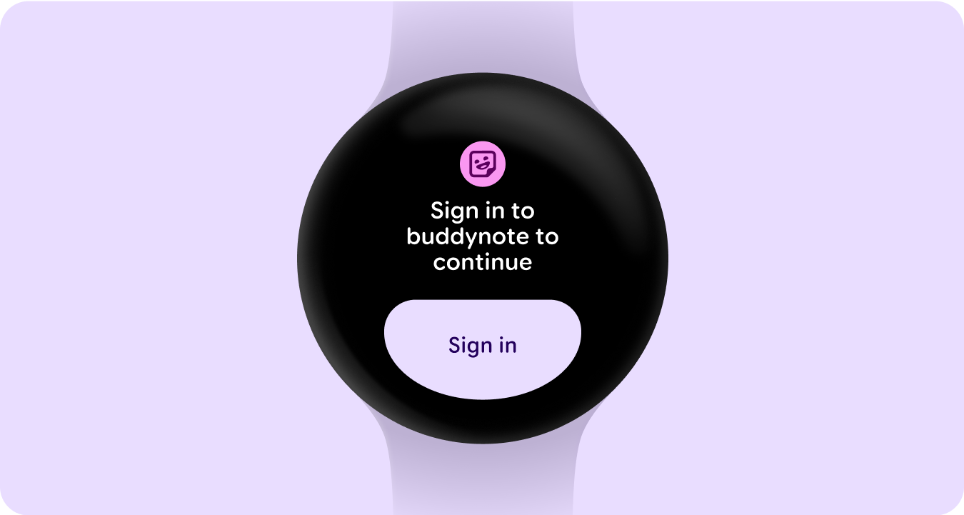
Sign in states
Tell the user that they need to update their settings or preferences, log into their account, or create an account either from their watch or mobile app from the tile.