
The Chip component is an interactive element that represents an input, attribute, or action.
Line Recommendations
Minimum
Primary Text > 1 Lines
Secondary Label > 1 Lines
Maximum
Primary Text > 2 Lines
Secondary Label > 3 Lines
Anatomy
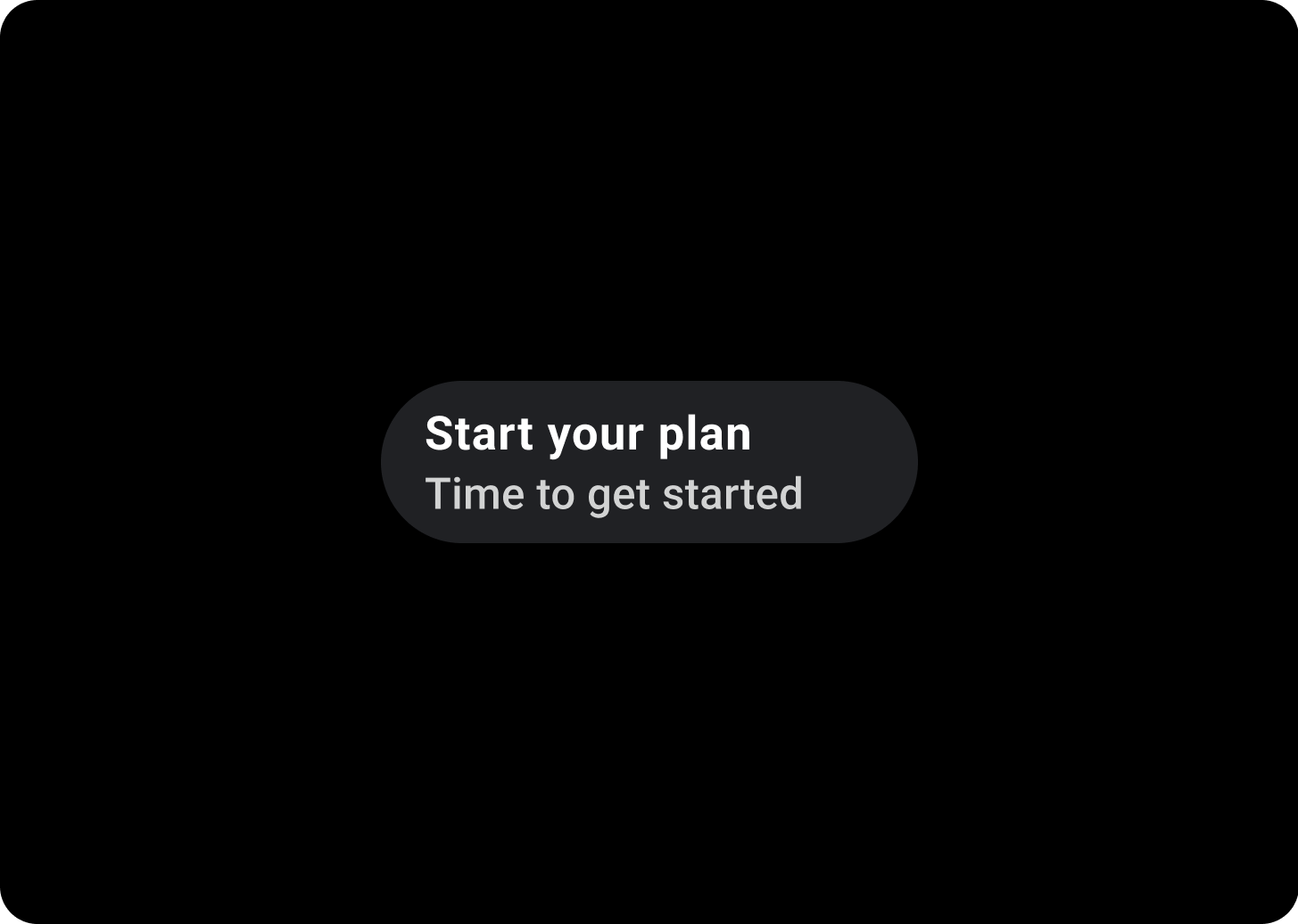
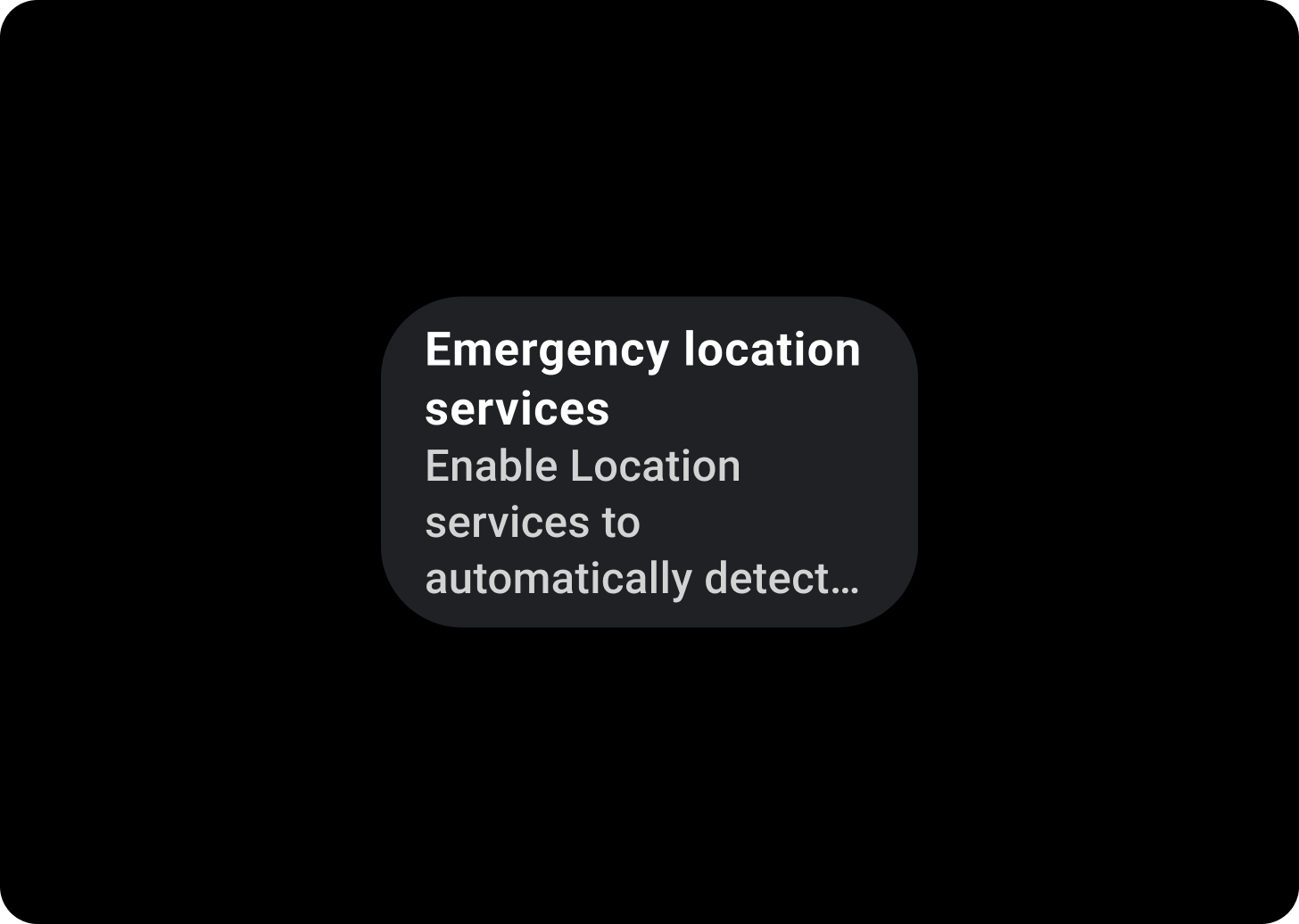
Chips can contain up to two text labels and an optional icon. At least one text label or an icon must be provided. Chips may truncate text if the text label is too long. The primary label is one line of text if the secondary label is present. The primary label can contain two lines of text if the secondary label is not present.
If there's only one label, it should be centered. If a secondary label or icon is present, the labels should be left-aligned.
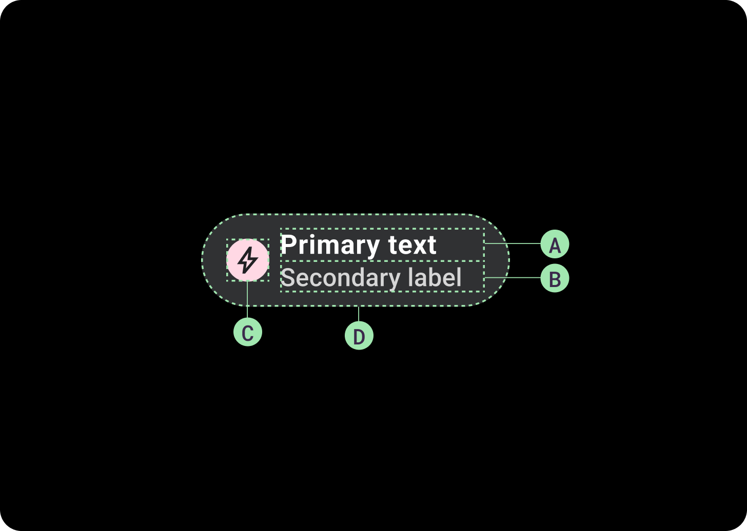
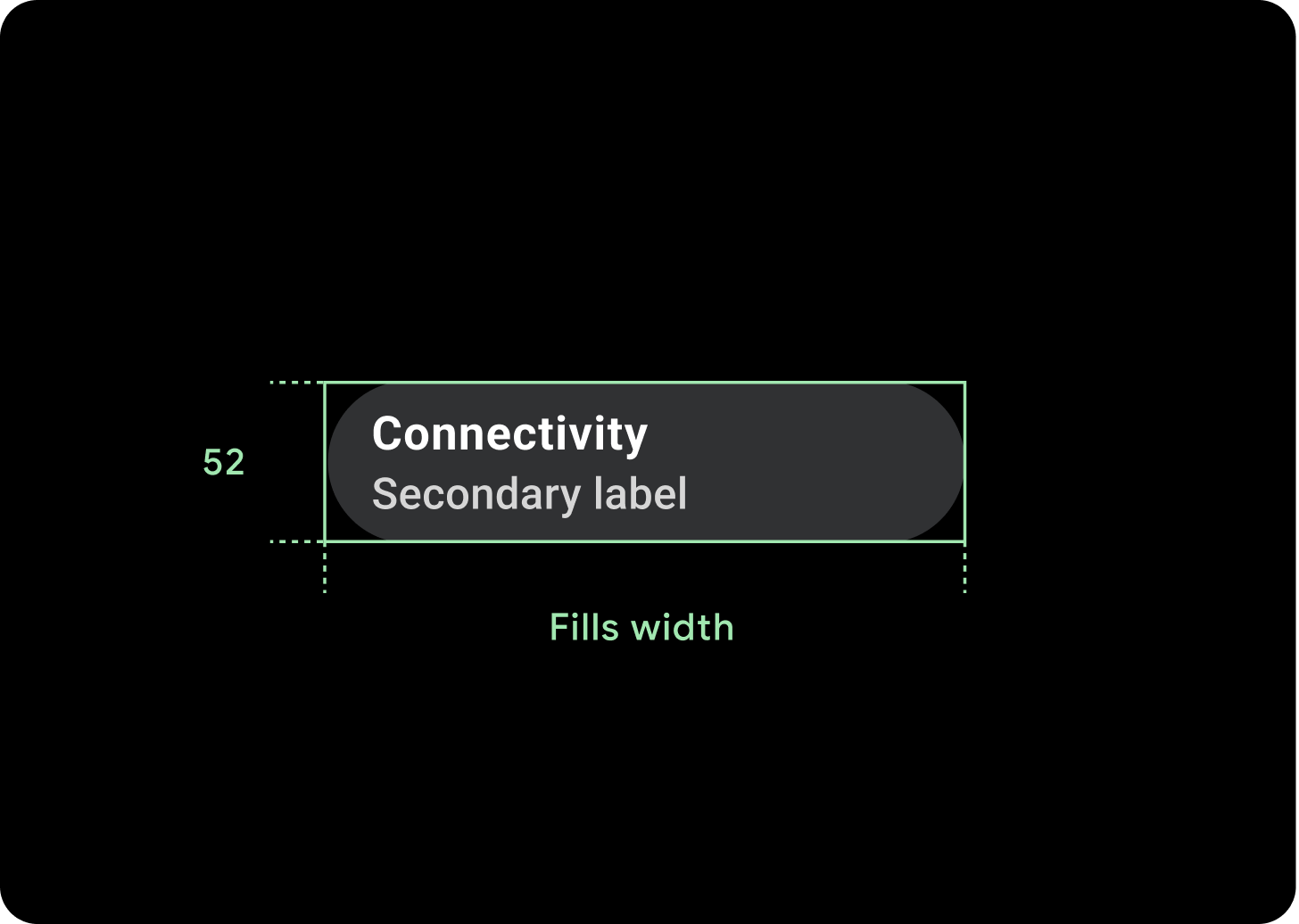
A. Primary label
B. Secondary label (optional)
C. Icon (optional)
D. Container
Chips Gradient
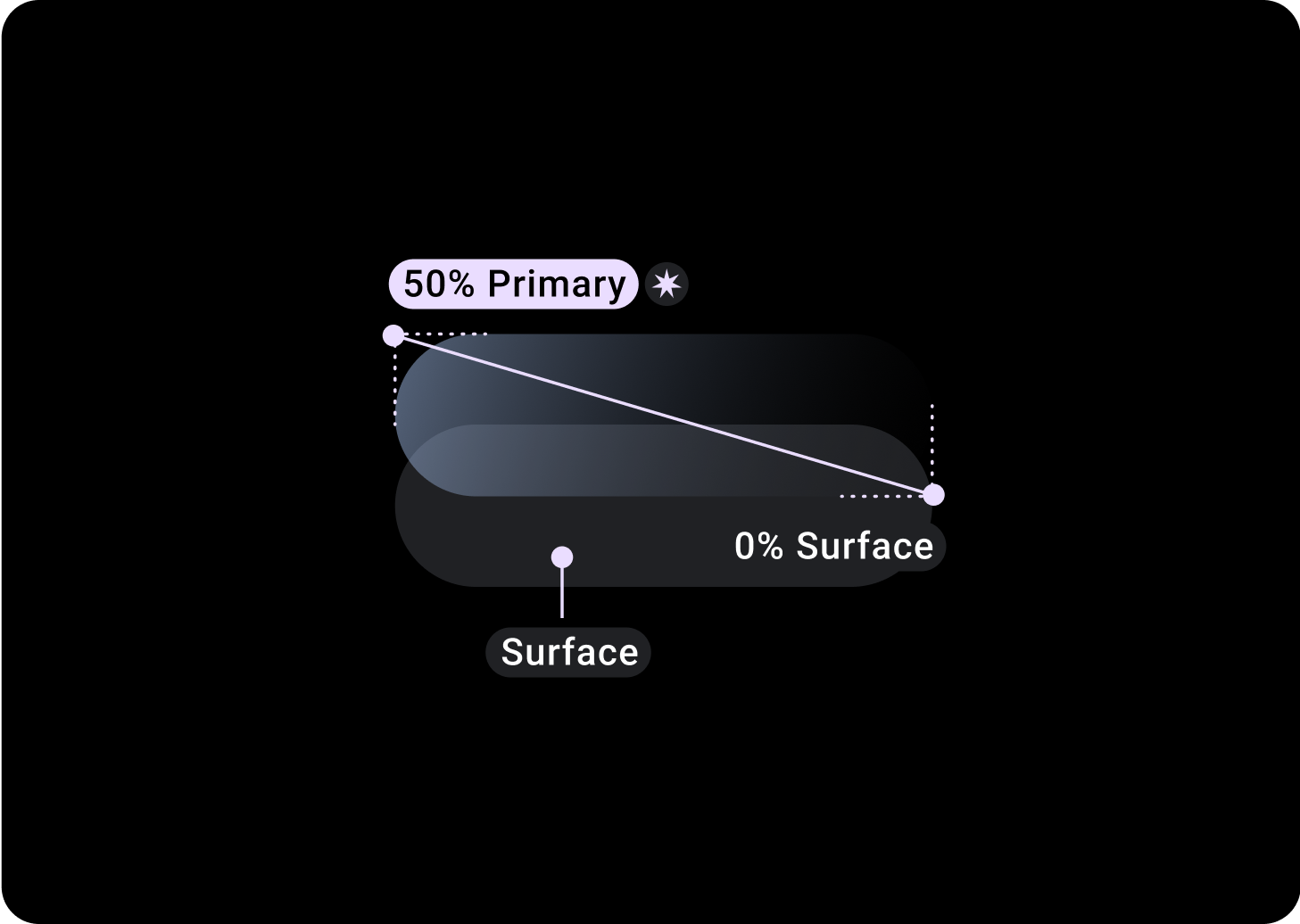
Standard Chip
Top/Left = 50% Primary
Bottom/Right = 0% Surface
(Gradient overlays on a background of Surface color)
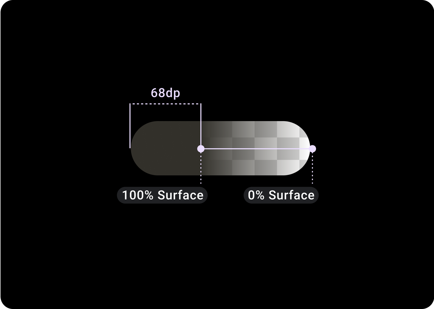
Image Chip
Top/Left = 30% Primary
0, 0, 45° (Below Bottom/Right) = 20% On Surface Variant
Alternative Chip types
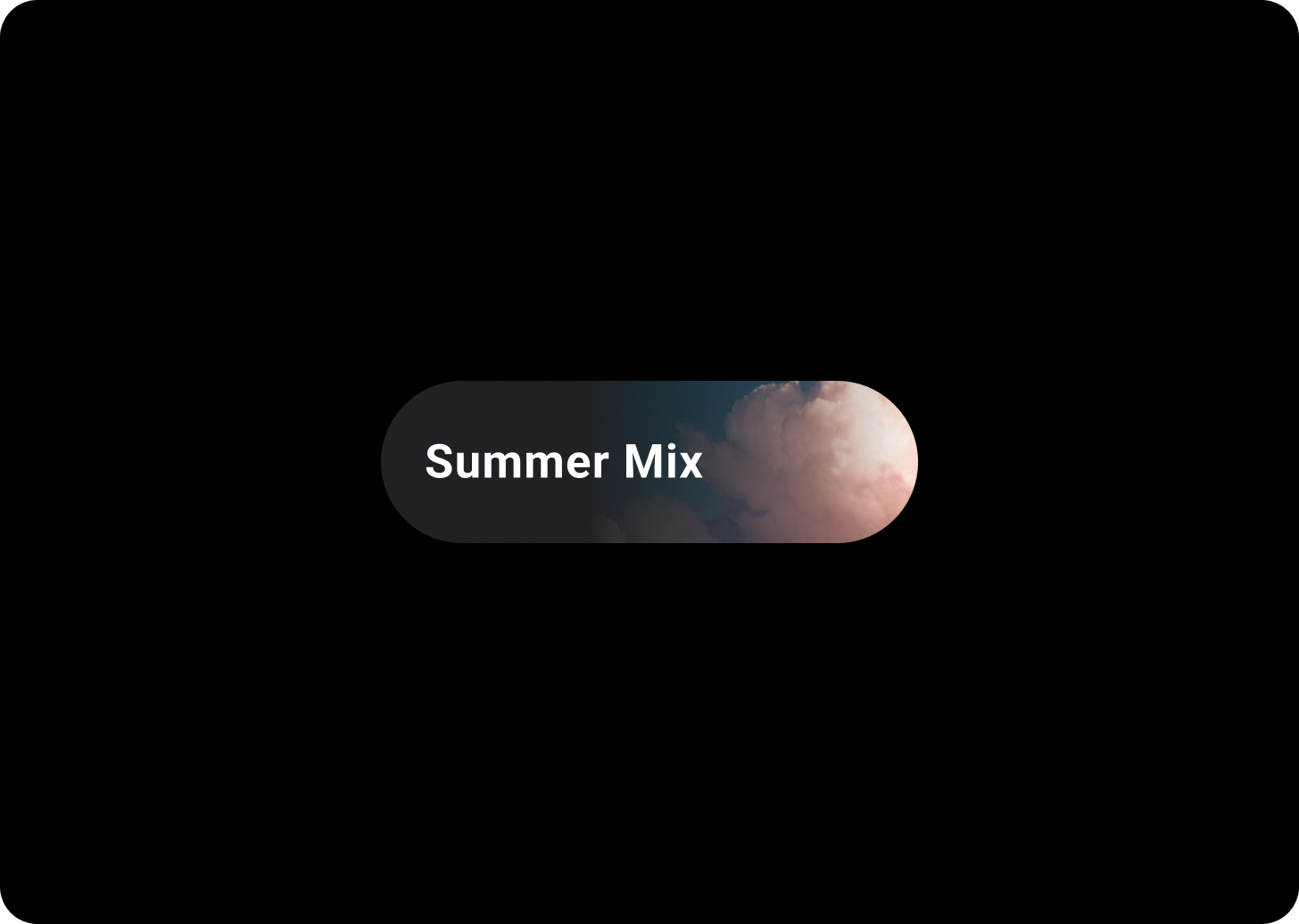
Chip with background image
Image chips contain actions which relate to a chosen image. Image chips work well to communicate a more specific look and feel.
It is recommended that these Chips should have a fixed height of 52 dp.
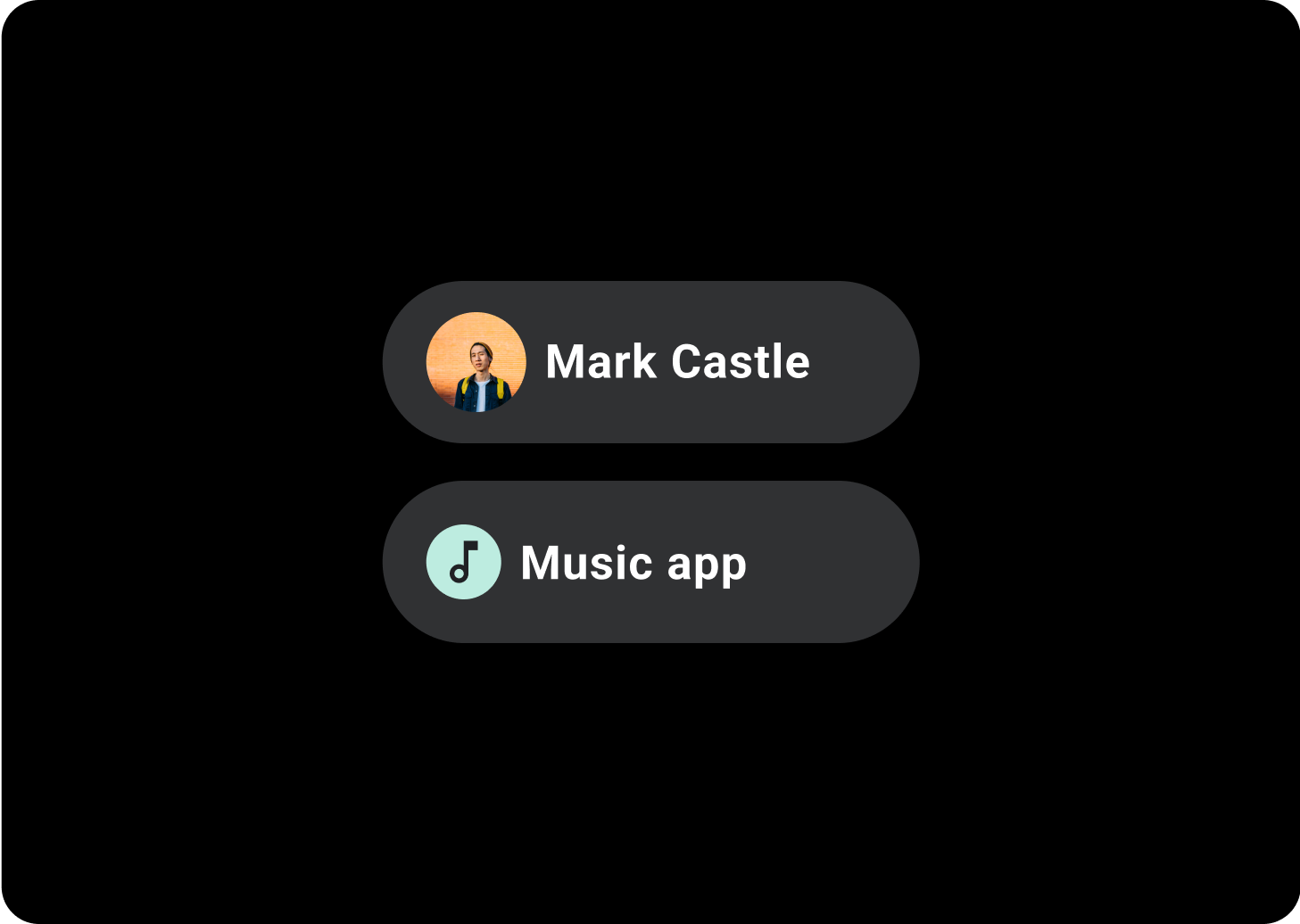
Avatar Chip
Use avatar chips for actions that are related to a chosen avatar. Avatar chips can also have icons used to make the avatar more easily recognizable, such as a contact ID photo. Avatar icons are 32x32 dp.
Related components
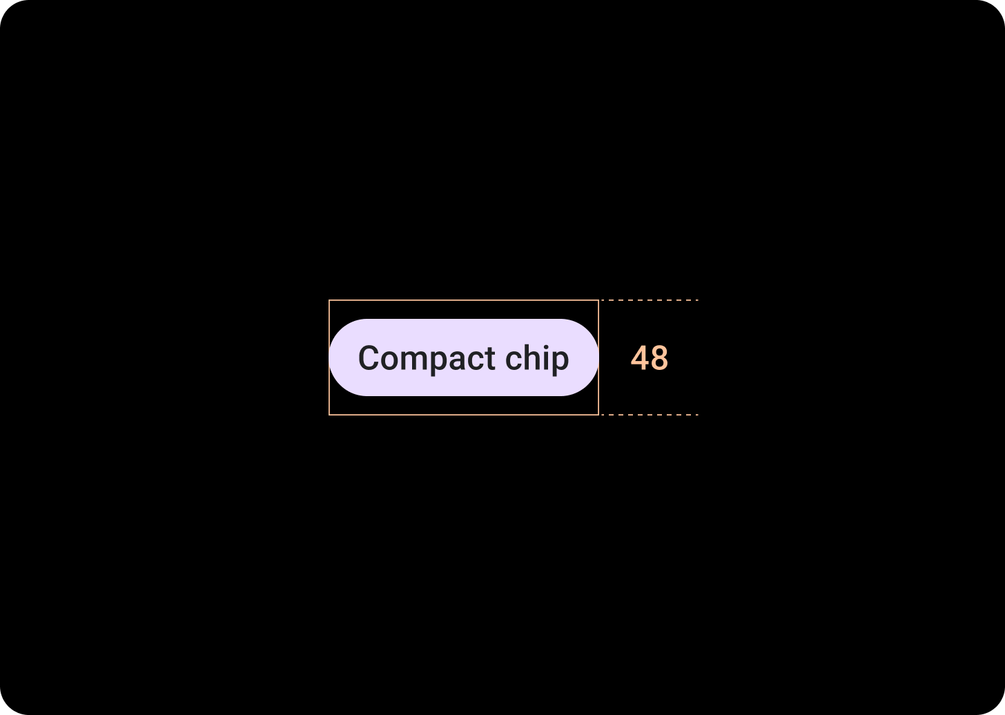
Compact Chip
The related component, CompactChip is a variant of the Chip component that appears smaller and is designed for use cases where there is less space.
Compact chips have a slot for an icon and a slot for a single line text label. Compact chips have a tappable area with a height of 48 dp.
Hierarchy
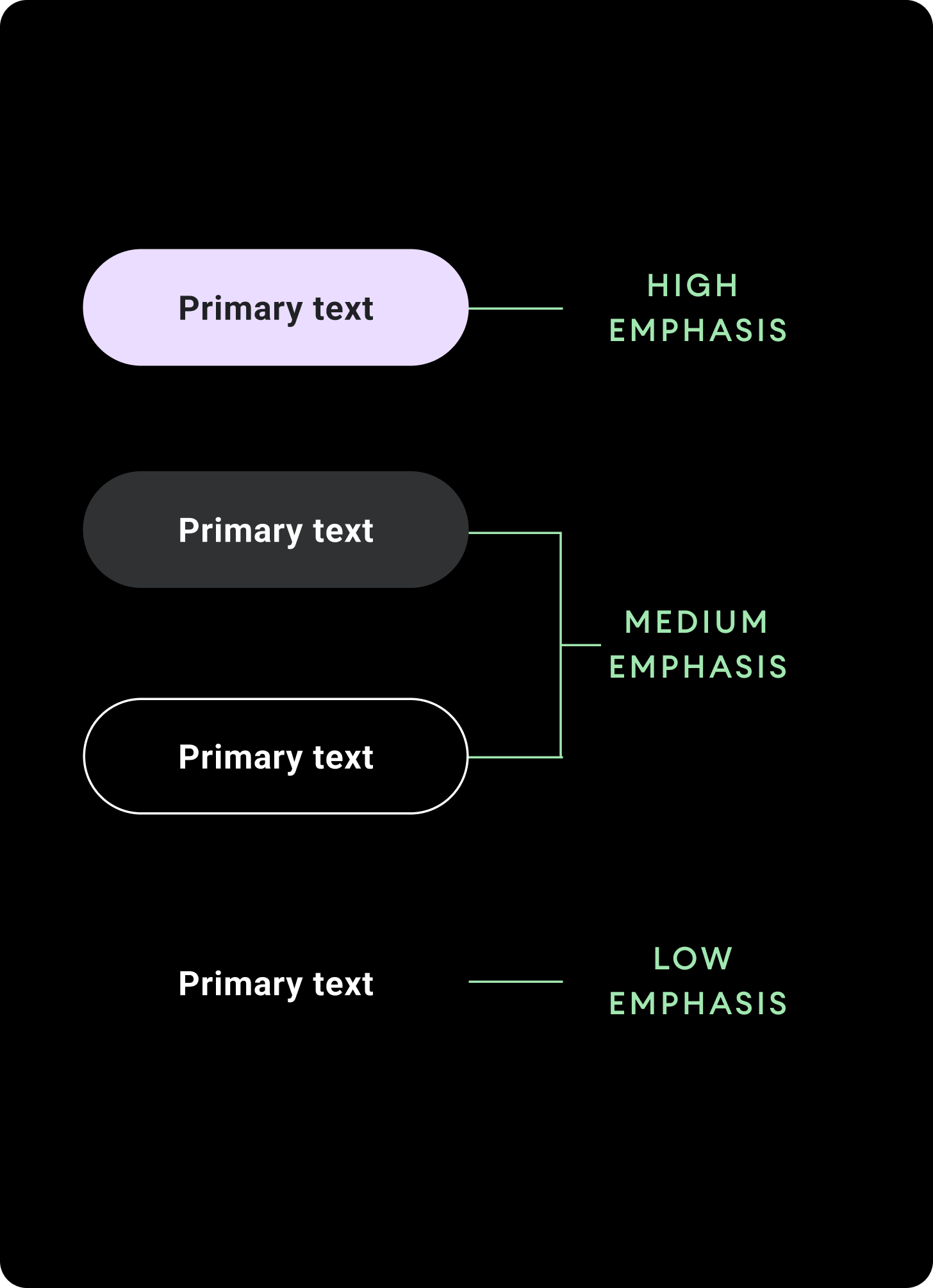
Use different color fills to denote chip hierarchy. Design each screen to contain a single prominent chip for the primary action.
High emphasis
Use high-emphasis chips for actions that are primary to the page. Use primary colors as the fill of a high emphasis chip.
Medium emphasis
Use medium emphasis chips for actions that are less important than the primary actions. Use secondary colors for the fill of a medium emphasis chip.
Alternatively, use the custom OutlinedChip component. The outlined chip has a transparent background, a primary variant colored stroke of 60% opacity, and primary colored content.
Low emphasis
Low emphasis chips have a transparent fill and only a text label. Use low emphasis chips to indicate a child relationship to a primary or secondary chip.
Sizes
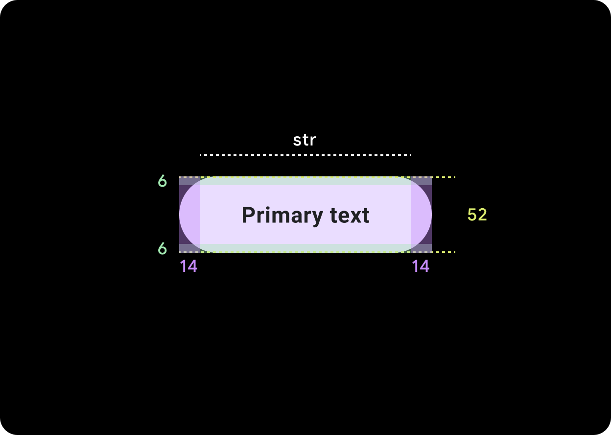
Default Chip
Icon: 24 dp
Height: 52 dp
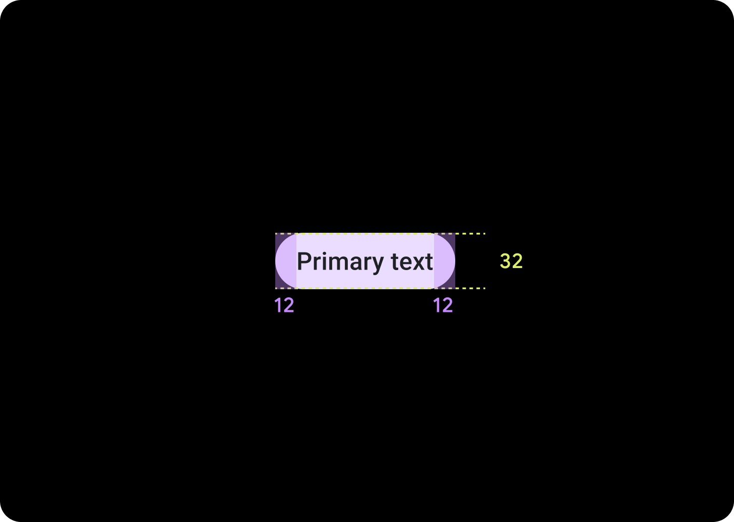
Compact Chip
Icon: 20 dp
Height: 32 dp
Tappable Area: 48 dp
Usage
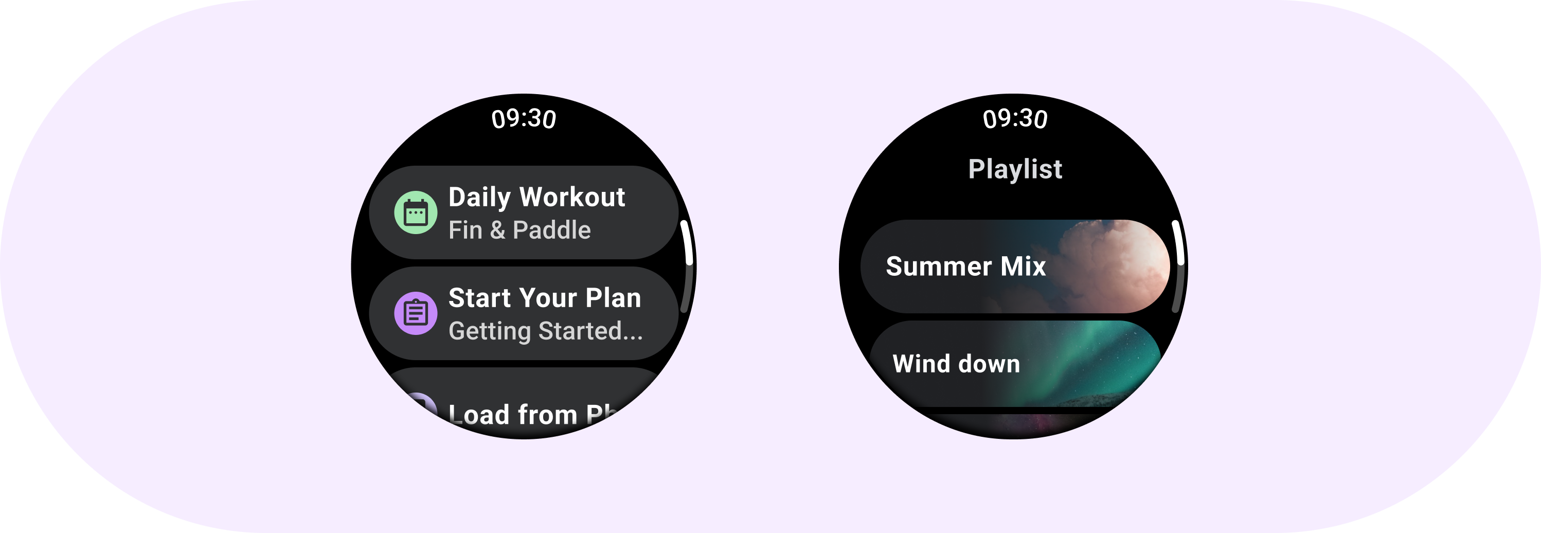
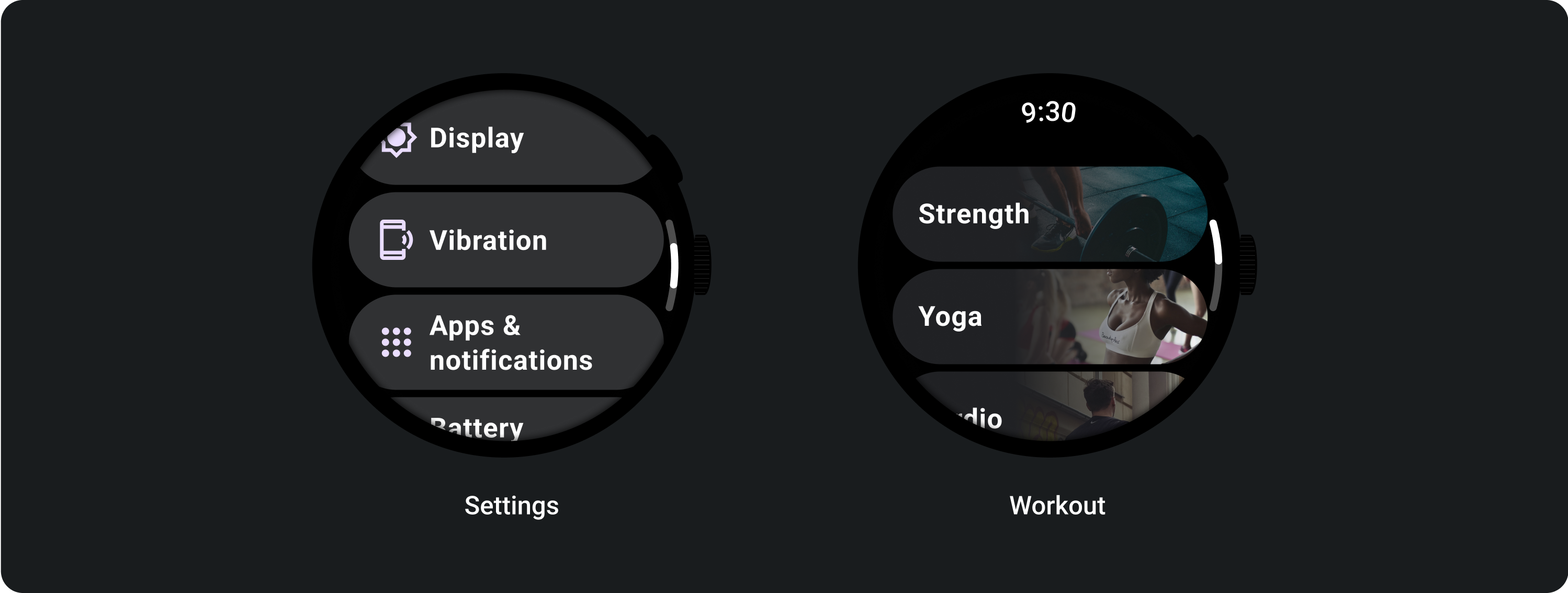
See examples of chip usage such as standard chips in Settings and image chips in an exercise app.
Adaptive layouts
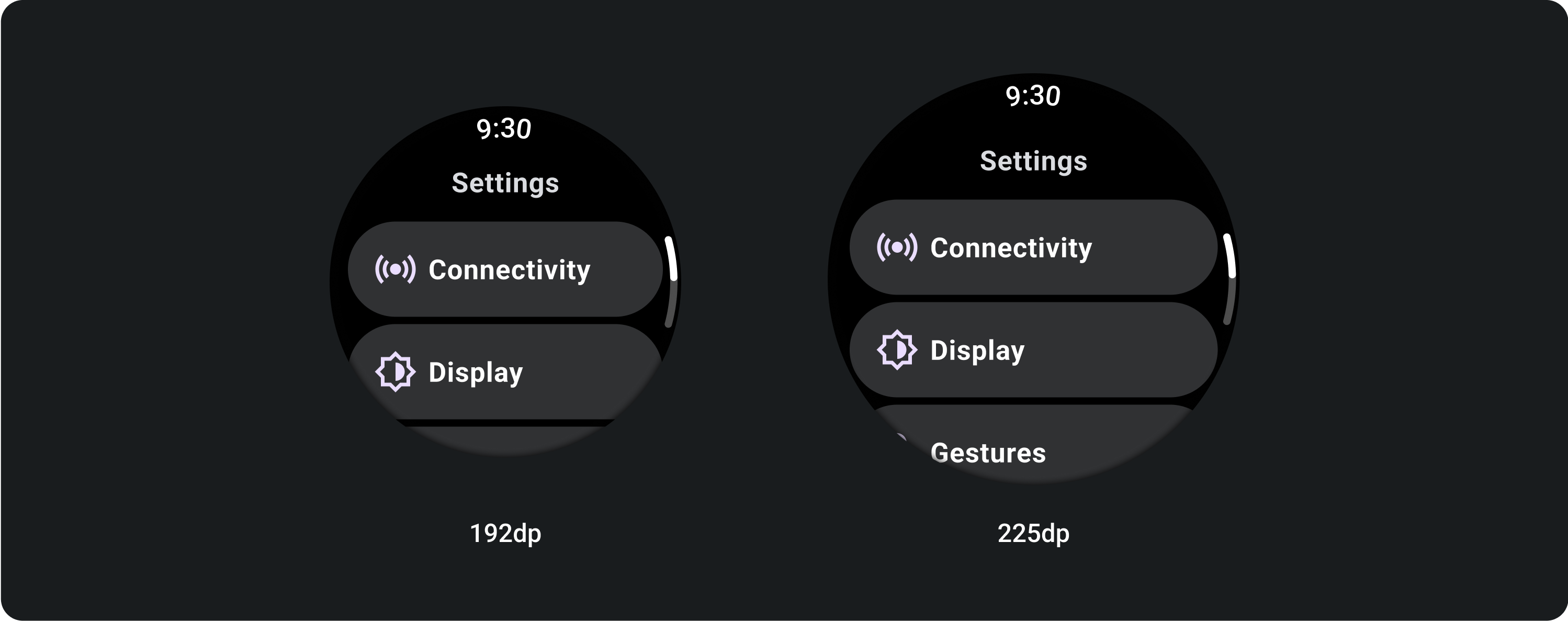
Responsive behavior
Chips stretch to fill the available width on larger displays.
Icon (24 x 24 dp)
Container (52 x XX dp)