


アプリで静止画像を表示する必要がある場合、Drawable クラスとそのサブクラスを使用して、図形と画像を描画できます。Drawable は、描画可能なものの一般的な抽象概念です。 さまざまなサブクラスが特定の画像シナリオで役に立ち、拡張して独自の方法で動作する独自のドローアブル オブジェクトを定義できます。
クラス コンストラクタを使用する以外に、Drawable を定義しインスタンス化する方法には次の 2 つがあります。
- プロジェクトに保存されている画像リソース(ビットマップ ファイル)をインフレートする。
- ドローアブル プロパティを定義する XML リソースをインフレートする。
注: 代わりに、関連する色情報とともに点、線、曲線のセットで画像を定義するベクター型ドローアブルを使用することをおすすめします。これにより、品質を損なうことなく、ベクター型ドローアブルをさまざまなサイズに変更できます。詳細については、ベクター型 ドローアブルの概要をご覧ください。
リソースの画像からドローアブルを作成する
プロジェクト リソースから画像ファイルを参照することで、アプリに画像を追加できます。サポートされているファイル形式は、PNG(推奨)、JPG(使用可能)、GIF(非推奨)です。アプリのアイコン、ロゴ、またゲームなどで使用されるその他のグラフィックが、この手法に適しています。
画像リソースを使用するには、プロジェクトの res/drawable/ ディレクトリにファイルを追加します。プロジェクトに追加すると、コードまたは XML レイアウトから画像リソースを参照できます。いずれの場合も、リソース ID(ファイル形式拡張子のないファイル名)を使用します。たとえば、my_image.png は my_image として参照します。
注: res/drawable/ ディレクトリに配置された画像リソースは、ビルドプロセス時、aapt によって可逆画像圧縮で自動的に最適化されます。たとえば、256 色を超える色を必要としないトゥルーカラーの PNG を、カラーパレットを使用する 8 ビットの PNG に変換できます。これにより、画質を変えずにメモリ使用量を少なくできます。その結果、このディレクトリに配置された画像バイナリは、ビルド時間に変更される可能性があります。画像をビットマップに変換するためにビットストリームとして読み込む場合は、代わりに画像を res/raw/ フォルダに保存し、aapt ツールで変更しないようにします。
次のコード スニペットは、ドローアブル リソースから作成された画像を使用してレイアウトに追加する ImageView の作成方法を示しています。
Kotlin
private lateinit var constraintLayout: ConstraintLayout

override fun onCreate(savedInstanceState: Bundle?) {
    super.onCreate(savedInstanceState)

    // Instantiate an ImageView and define its properties
    val i = ImageView(this).apply {
        setImageResource(R.drawable.my_image)
        contentDescription = resources.getString(R.string.my_image_desc)

        // set the ImageView bounds to match the Drawable's dimensions
        adjustViewBounds = true
        layoutParams = ViewGroup.LayoutParams(
                ViewGroup.LayoutParams.WRAP_CONTENT,
                ViewGroup.LayoutParams.WRAP_CONTENT)
    }

    // Create a ConstraintLayout in which to add the ImageView
    constraintLayout = ConstraintLayout(this).apply {

        // Add the ImageView to the layout.
        addView(i)
    }

    // Set the layout as the content view.
    setContentView(constraintLayout)
}
Java
ConstraintLayout constraintLayout;

protected void onCreate(Bundle savedInstanceState) {
  super.onCreate(savedInstanceState);

  // Create a ConstraintLayout in which to add the ImageView
  constraintLayout = new ConstraintLayout(this);

  // Instantiate an ImageView and define its properties
  ImageView i = new ImageView(this);
  i.setImageResource(R.drawable.my_image);
  i.setContentDescription(getResources().getString(R.string.my_image_desc));

  // set the ImageView bounds to match the Drawable's dimensions
  i.setAdjustViewBounds(true);
  i.setLayoutParams(new ViewGroup.LayoutParams(
          ViewGroup.LayoutParams.WRAP_CONTENT,
          ViewGroup.LayoutParams.WRAP_CONTENT));

  // Add the ImageView to the layout and set the layout as the content view.
  constraintLayout.addView(i);
  setContentView(constraintLayout);
}
また、次の例に示すように、画像リソースを Drawable オブジェクトとして処理することもできます。
Kotlin
val myImage: Drawable = ResourcesCompat.getDrawable(context.resources, R.drawable.my_image, null)
Java
Resources res = context.getResources();
Drawable myImage = ResourcesCompat.getDrawable(res, R.drawable.my_image, null);
警告: プロジェクト内の一意の各リソースは、インスタンス化するオブジェクトの数に関係なく、状態を 1 つしか維持できません。たとえば、同じ画像リソースから 2 つの Drawable オブジェクトをインスタンス化し、一方のオブジェクトのプロパティ(アルファなど)を変更すると、他方のオブジェクトにも影響します。画像リソースの複数のインスタンスを処理する場合は、
Drawable オブジェクトを直接変換するのではなく、
トゥイーン
アニメーションを行う必要があります。
次の XML スニペットは、XML レイアウトの ImageView にドローアブル リソースを追加する方法を示しています。
<ImageView
        android:layout_width="wrap_content"
        android:layout_height="wrap_content"
        android:src="@drawable/my_image"
        android:contentDescription="@string/my_image_desc" />
プロジェクト リソースの使用方法の詳細については、リソースとアセットをご覧ください。
注: ドローアブルのソースとして画像リソースを使用する場合、画像がさまざまなピクセル密度に適したサイズであることを確認してください。画像が適切でない場合、サイズに合わせて拡大され、ドローアブルに画質の乱れが生じるおそれがあります。 詳細については、各種の ピクセル密度をサポートするをご覧ください。
XML リソースからドローアブルを作成する
作成する Drawable オブジェクトがあり、最初はコードまたはユーザー インタラクションによって定義された変数に依存しない場合、XML で Drawable を定義することをおすすめします。ユーザーがアプリを操作している間に Drawable でプロパティが変更されることが予想される場合でも、オブジェクトのインスタンス化後にプロパティを変更できるため、XML でオブジェクトを定義することを検討してください。
XML で Drawable を定義したら、ファイルをプロジェクトの
res/drawable/ ディレクトリに保存します。次の例は、
TransitionDrawable
リソースを定義する XML を示しています。これは Drawable から継承します。
<!-- res/drawable/expand_collapse.xml -->
<transition xmlns:android="http://schemas.android.com/apk/res/android">
    <item android:drawable="@drawable/image_expand"/>
    <item android:drawable="@drawable/image_collapse"/>
</transition>
次に、
Resources#getDrawable()
を呼び出し XML ファイルのリソース ID を渡すことで、オブジェクトを取得し、インスタンス化します。
Drawable サブクラス
はすべて、inflate() メソッドをサポートし、XML で定義でき、アプリでインスタンス化できます
。
XML インフレーションをサポートする各ドローアブル クラスは、オブジェクト プロパティの定義に役立つ特定の XML 属性
を利用します。次のコードは、
TransitionDrawable
をインスタンス化し、
ImageView オブジェクトのコンテンツとして設定します。
Kotlin
val transition= ResourcesCompat.getDrawable(
        context.resources,
        R.drawable.expand_collapse,
        null
) as TransitionDrawable

val image: ImageView = findViewById(R.id.toggle_image)
image.setImageDrawable(transition)

// Description of the initial state that the drawable represents.
image.contentDescription = resources.getString(R.string.collapsed)

// Then you can call the TransitionDrawable object's methods.
transition.startTransition(1000)

// After the transition is complete, change the image's content description
// to reflect the new state.
Java
Resources res = context.getResources();
TransitionDrawable transition =
    (TransitionDrawable) ResourcesCompat.getDrawable(res, R.drawable.expand_collapse, null);

ImageView image = (ImageView) findViewById(R.id.toggle_image);
image.setImageDrawable(transition);

// Description of the initial state that the drawable represents.
image.setContentDescription(getResources().getString(R.string.collapsed));

// Then you can call the TransitionDrawable object's methods.
transition.startTransition(1000);

// After the transition is complete, change the image's content description
// to reflect the new state.
サポートされている XML 属性の詳細については、上記のクラスを参照してください。
シェイプ ドローアブル
2 次元のグラフィックを動的に描画する場合、ShapeDrawable オブジェクトを使用すると効果的です。ShapeDrawable オブジェクトにプログラムで基本的な図形を描画し、アプリに必要なスタイルを適用できます。
ShapeDrawable は Drawable のサブクラスです。そのため、
ShapeDrawable が必要な場所ではどこでも Drawable を使用できます。たとえば ShapeDrawable オブジェクトを使用して、ビューの setBackgroundDrawable() メソッドに渡すことでビューの背景を設定できます。独自のカスタムビューとして図形を描画し、アプリのレイアウトに追加することもできます。
ShapeDrawable には独自の draw() メソッドがあるため、次のコード例に示すように、onDraw() イベントの際に ShapeDrawable
オブジェクトを描画する View のサブクラスを作成できます。
Kotlin
class CustomDrawableView(context: Context) : View(context) {
    private val drawable: ShapeDrawable = run {
        val x = 10
        val y = 10
        val width = 300
        val height = 50
        contentDescription = context.resources.getString(R.string.my_view_desc)

        ShapeDrawable(OvalShape()).apply {
            // If the color isn't set, the shape uses black as the default.
            paint.color = 0xff74AC23.toInt()
            // If the bounds aren't set, the shape can't be drawn.
            setBounds(x, y, x + width, y + height)
        }
    }

    override fun onDraw(canvas: Canvas) {
        drawable.draw(canvas)
    }
}
Java
public class CustomDrawableView extends View {
  private ShapeDrawable drawable;

  public CustomDrawableView(Context context) {
    super(context);

    int x = 10;
    int y = 10;
    int width = 300;
    int height = 50;
    setContentDescription(context.getResources().getString(
            R.string.my_view_desc));

    drawable = new ShapeDrawable(new OvalShape());
    // If the color isn't set, the shape uses black as the default.
    drawable.getPaint().setColor(0xff74AC23);
    // If the bounds aren't set, the shape can't be drawn.
    drawable.setBounds(x, y, x + width, y + height);
  }

  protected void onDraw(Canvas canvas) {
    drawable.draw(canvas);
  }
}
上記のコードサンプルでは、他のカスタムビューと同様に、CustomDrawableView クラスを使用できます。たとえば、次の例に示すように、アプリのアクティビティにプログラムで追加できます。
Kotlin
private lateinit var customDrawableView: CustomDrawableView

override fun onCreate(savedInstanceState: Bundle?) {
    super.onCreate(savedInstanceState)
    customDrawableView = CustomDrawableView(this)

    setContentView(customDrawableView)
}
Java
CustomDrawableView customDrawableView;

protected void onCreate(Bundle savedInstanceState) {
  super.onCreate(savedInstanceState);
  customDrawableView = new CustomDrawableView(this);

  setContentView(customDrawableView);
}
XML レイアウトでカスタムビューを使用する場合は、CustomDrawableView クラスで View(Context, AttributeSet) コンストラクタをオーバーライドする必要があります。このコンストラクタは、クラスが XML からインフレートされたときに呼び出されます。次の例は、XML レイアウトで CustomDrawableView を宣言する方法を示しています。
<com.example.shapedrawable.CustomDrawableView
        android:layout_width="fill_parent"
        android:layout_height="wrap_content"
        />
ShapeDrawable クラスでは、android.graphics.drawable パッケージの他の多くのドローアブル タイプと同様に、パブリック メソッドを使用してオブジェクトのさまざまなプロパティを定義できます。調整したほうがよいプロパティの例として、アルファ透過、カラーフィルタ、ディザ、不透明度、色があります。
XML リソースを使用して基本的なドローアブル図形を定義することもできます。詳細については、 ドローアブル リソースタイプの シェイプ ドローアブルをご覧ください。
NinePatch ドローアブル
NinePatchDrawable グラフィックは、ビューの背景として使用できる伸縮可能なビットマップ画像です。Android では、ビューのコンテンツに合わせてグラフィックのサイズが自動的に変更されます。NinePatch 画像の使用例としては、標準の Android ボタンで使用される背景があります。ボタンは、さまざまな長さの文字列に合わせて伸縮する必要があります。NinePatch グラフィックは、1 ピクセルの枠線を含む標準の PNG 画像です。
9.png 拡張子 でプロジェクトの res/drawable/ ディレクトリに保存する必要があります。
枠線を使用して、画像の伸縮領域と静止領域を定義します。 伸縮可能なセクションであることを示すには、枠線の左と上の部分に 1 ピクセル幅の黒い線を(1 本以上)描画します(他の枠線ピクセルは完全に透明または白にします)。伸縮可能なセクションは、必要に応じていくつでも指定できます。伸縮可能なセクションの相対的なサイズは同じままであるため、最大のセクションは常に最大のままです。
また、右と下に線を描画することで、画像の任意のドローアブル セクション(事実上のパディング ライン)も定義できます。View オブジェクトで NinePatch グラフィックを背景として設定し、ビューのテキストを指定すると、すべてのテキストが右と下の線で指定された領域(ある場合)のみに表示されるように、オブジェクトが拡大されます。パディング ラインがない場合、Android は左と上の線を使用して、このドローアブル領域を定義します。
線の違いについて説明します。左と上の線は、画像を引き伸ばすために複製できる画像のピクセルを定義します。下と右の線は、ビューのコンテンツを表示できる、画像内の相対的な領域を定義します。
図 1 は、ボタンの定義に使用する NinePatch グラフィックの例を示しています。
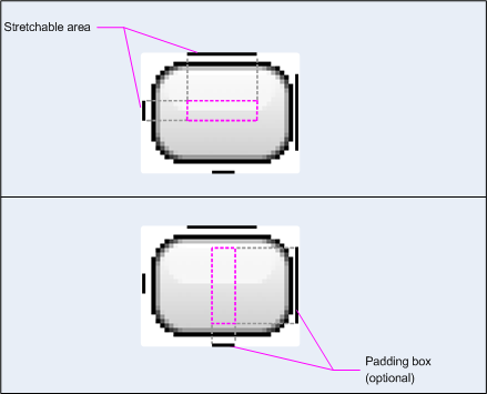
図 1: ボタンを定義する NinePatch グラフィックの例
この NinePatch グラフィックは、伸縮可能な領域を左と上の線で定義し、ドローアブル領域を下と右の線で定義します。上の画像で、灰色の点線は、画像を引き伸ばすために複製される画像の領域を示しています。下の画像にあるピンク色の長方形は、ビューのコンテンツを表示できる領域を示しています。コンテンツがこの領域に収まらない場合、収まるように画像が引き伸ばされます。
Draw 9-patch ツールを利用すると、WYSIWYG グラフィック エディタを使用して NinePatch 画像を とても手軽に作成できます。伸縮可能領域に定義した領域が、ピクセルの複製の結果として描画アーティファクトを生成する危険性がある場合は、警告も表示されます。
次のサンプル レイアウト XML は、NinePatch グラフィックをいくつかのボタンに追加する方法を示しています。NinePatch 画像は res/drawable/my_button_background.9.png に保存されています。
<Button android:id="@+id/tiny"
        android:layout_width="wrap_content"
        android:layout_height="wrap_content"
        android:layout_alignParentTop="true"
        android:layout_centerInParent="true"
        android:text="Tiny"
        android:textSize="8sp"
        android:background="@drawable/my_button_background"/>

<Button android:id="@+id/big"
        android:layout_width="wrap_content"
        android:layout_height="wrap_content"
        android:layout_alignParentBottom="true"
        android:layout_centerInParent="true"
        android:text="Biiiiiiig text!"
        android:textSize="30sp"
        android:background="@drawable/my_button_background"/>
なお、ボタンがテキストの周囲にきちんと収まるように、layout_width 属性と layout_height 属性は wrap_content に設定されています。
図 2 は、上記の XML と NinePatch 画像からレンダリングされた 2 つのボタンを示しています。ボタンの幅と高さはテキストに応じて変化し、背景画像はそれに合わせて伸縮します。
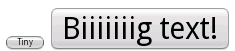
図 2: XML リソースと NinePatch グラフィックを使用してレンダリングされたボタン
カスタム ドローアブル
カスタムの図形描画を作成する場合は、Drawable クラス(またはそのサブクラス)を拡張します。
実装する非常に重要なメソッドは draw(Canvas)
です。これは、図形描画手順を提供するために使用する必要がある Canvas オブジェクトが提供されるためです。
次のコードは、円を描画する Drawable の簡単なサブクラスを示しています。
Kotlin
class MyDrawable : Drawable() {
    private val redPaint: Paint = Paint().apply { setARGB(255, 255, 0, 0) }

    override fun draw(canvas: Canvas) {
        // Get the drawable's bounds
        val width: Int = bounds.width()
        val height: Int = bounds.height()
        val radius: Float = Math.min(width, height).toFloat() / 2f

        // Draw a red circle in the center
        canvas.drawCircle((width / 2).toFloat(), (height / 2).toFloat(), radius, redPaint)
    }

    override fun setAlpha(alpha: Int) {
        // This method is required
    }

    override fun setColorFilter(colorFilter: ColorFilter?) {
        // This method is required
    }

    override fun getOpacity(): Int =
        // Must be PixelFormat.UNKNOWN, TRANSLUCENT, TRANSPARENT, or OPAQUE
        PixelFormat.OPAQUE
}
Java
public class MyDrawable extends Drawable {
    private final Paint redPaint;

    public MyDrawable() {
        // Set up color and text size
        redPaint = new Paint();
        redPaint.setARGB(255, 255, 0, 0);
    }

    @Override
    public void draw(Canvas canvas) {
        // Get the drawable's bounds
        int width = getBounds().width();
        int height = getBounds().height();
        float radius = Math.min(width, height) / 2;

        // Draw a red circle in the center
        canvas.drawCircle(width/2, height/2, radius, redPaint);
    }

    @Override
    public void setAlpha(int alpha) {
        // This method is required
    }

    @Override
    public void setColorFilter(ColorFilter colorFilter) {
        // This method is required
    }

    @Override
    public int getOpacity() {
        // Must be PixelFormat.UNKNOWN, TRANSLUCENT, TRANSPARENT, or OPAQUE
        return PixelFormat.OPAQUE;
    }
}
その後、次に示すように、ドローアブルを任意の場所(ImageView など)に追加できます。
Kotlin
val myDrawing = MyDrawable()
val image: ImageView = findViewById(R.id.imageView)
image.setImageDrawable(myDrawing)
image.contentDescription = resources.getString(R.string.my_image_desc)
Java
MyDrawable mydrawing = new MyDrawable();
ImageView image = findViewById(R.id.imageView);
image.setImageDrawable(mydrawing);
image.setContentDescription(getResources().getString(R.string.my_image_desc));
Android 7.0(API レベル 24)以降では、次のように XML でカスタム ドローアブルのインスタンスを定義することもできます。
- XML 要素名として完全修飾クラス名を使用する。この方法では、カスタム
ドローアブル クラスがパブリック トップレベル クラスである必要があります:
<com.myapp.MyDrawable xmlns:android="http://schemas.android.com/apk/res/android"
    android:color="#ffff0000" />
- XML タグ名として
drawableを使用し、class 属性から完全修飾クラス 名を指定する。この方法は、パブリック トップレベル クラスと パブリック静的内部クラスの両方で使用できます:<drawable xmlns:android="http://schemas.android.com/apk/res/android" class="com.myapp.MyTopLevelClass$MyDrawable" android:color="#ffff0000" />
ドローアブルに色合いを追加する
Android 5.0(API レベル 21)以降では、アルファマスクとして定義されたビットマップと 9-patch の色合いを調整できます。カラーリソース、またはカラーリソースに解決されるテーマ属性(?android:attr/colorPrimary など)を使用して、カラーリソースの色合いを調整できます。通常、こうしたアセットは 1 回だけ作成し、テーマに合わせて自動的に色付けします。
setTint() メソッドで、BitmapDrawable、NinePatchDrawable、または VectorDrawable の各オブジェクトに色合いを適用できます。android:tint 属性と
android:tintMode 属性で、レイアウトの色合いとモードも設定できます。
画像から代表色を抽出する
Android サポート ライブラリには、画像から代表色を抽出できる Palette クラスがあります。
ドローアブルを Bitmap として読み込み、Palette に渡して、その色にアクセスできます。
詳細については、Palette API を使用した色の選択
をご覧ください。