अपने प्रॉडक्ट की हैरारकी, स्थिति, और ब्रैंड के बारे में बताने वाली, ज़्यादा आसान और निजी कलर स्कीम बनाएं. पहने जाने वाले डिवाइसों के लिए डिज़ाइन करते समय, रंग का इस्तेमाल करना ज़रूरी होता है. इससे, डिवाइस को पढ़ने में आसानी होती है, उसे इस्तेमाल करने में आसानी होती है, और वह विज़ुअल तौर पर आकर्षक दिखता है. साथ ही, डिवाइस के बारे में ज़्यादा जानकारी मिलती है. खास तौर पर, छोटी स्क्रीन पर ऐसा करना ज़रूरी होता है.
यहां दिए गए सिद्धांतों में, सभी थीम में रंग इस्तेमाल करने का तरीका बताया गया है.
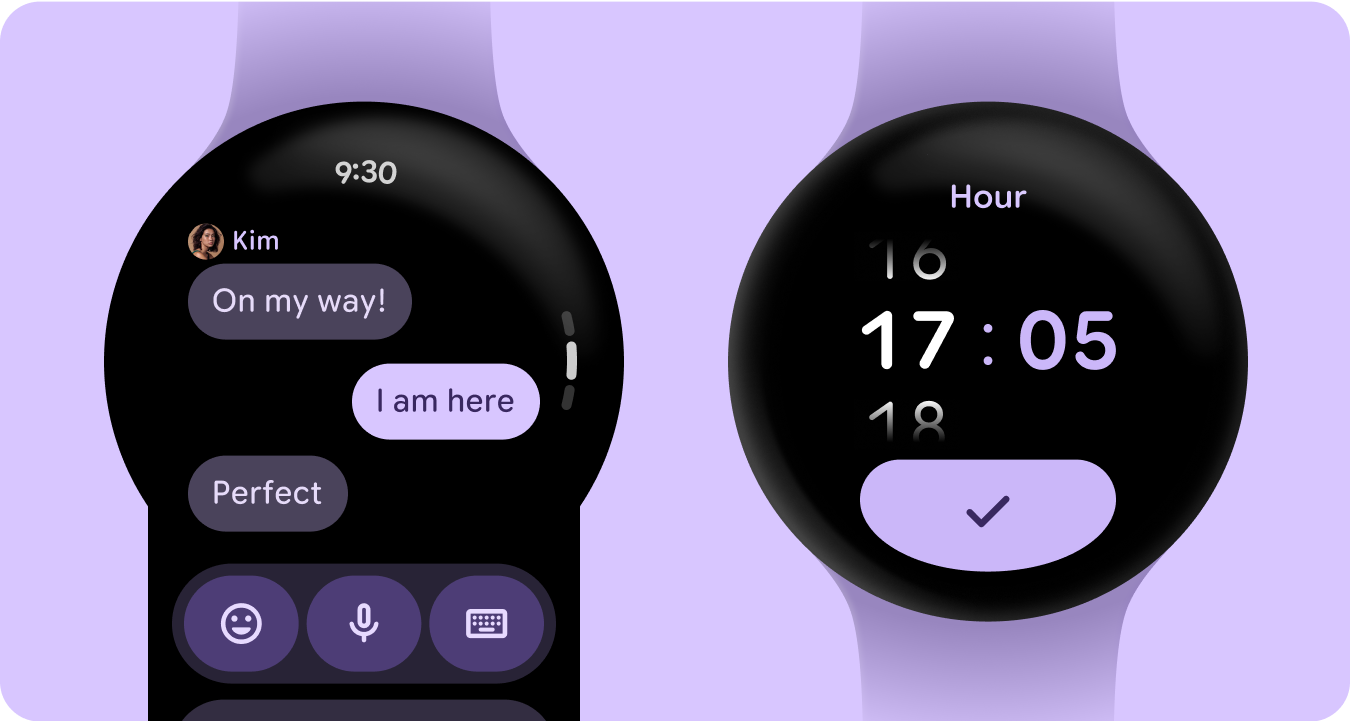
काले रंग से बनाना
स्मार्टवॉच को काले बैकग्राउंड के साथ डिज़ाइन किया गया है, न कि फ़ोन डिवाइसों के लिए इस्तेमाल किए जाने वाले रंगीन बैकग्राउंड के साथ. गहरे रंग वाली थीम, कम रोशनी वाले माहौल के लिए होती हैं और हल्के रंग वाली थीम, दिन के उजाले के लिए होती हैं. हालांकि, स्मार्टवॉच के यूज़र इंटरफ़ेस (यूआई) को दिन और रात, दोनों में आसानी से काम करना चाहिए. इसलिए, स्मार्टवॉच के लिए कलर टोकन खास तौर पर बनाए जाने चाहिए.
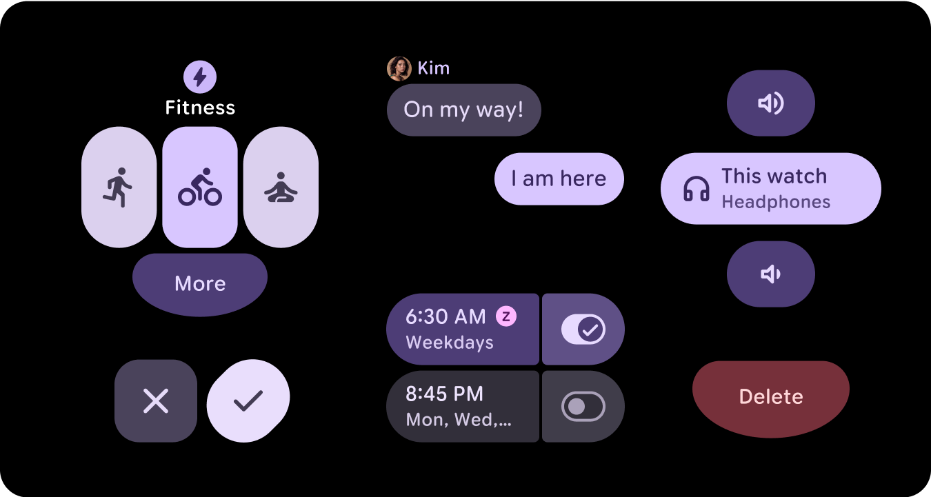
नई कलर भूमिकाएं
Material 3 कलर सिस्टम में तीन ऐक्सेंट कलर और दो नेचुरल सर्फ़ेस कलर का स्ट्रक्चर बरकरार है. हालांकि, इसमें ऐक्सेंट रोल में कंटेनर कलर शामिल किए गए हैं. इन नई भूमिकाओं की मदद से, विज़ुअल के क्रम में बदलाव किए बिना ज़्यादा जानकारी दी जा सकती है. साथ ही, ज़्यादा क्रोम के साथ सतह के रंग में बदलाव किए जा सकते हैं. कंटेनर की भूमिकाएं, खास तौर पर टॉगल बटन जैसी स्थितियों को हाइलाइट करने के लिए काम की होती हैं. इसके अलावा, मुख्य ऐक्सेंट का इस्तेमाल करने के बाद, दूसरी स्टाइल देने के लिए भी ये भूमिकाएं काम की होती हैं.
शब्द का मतलब
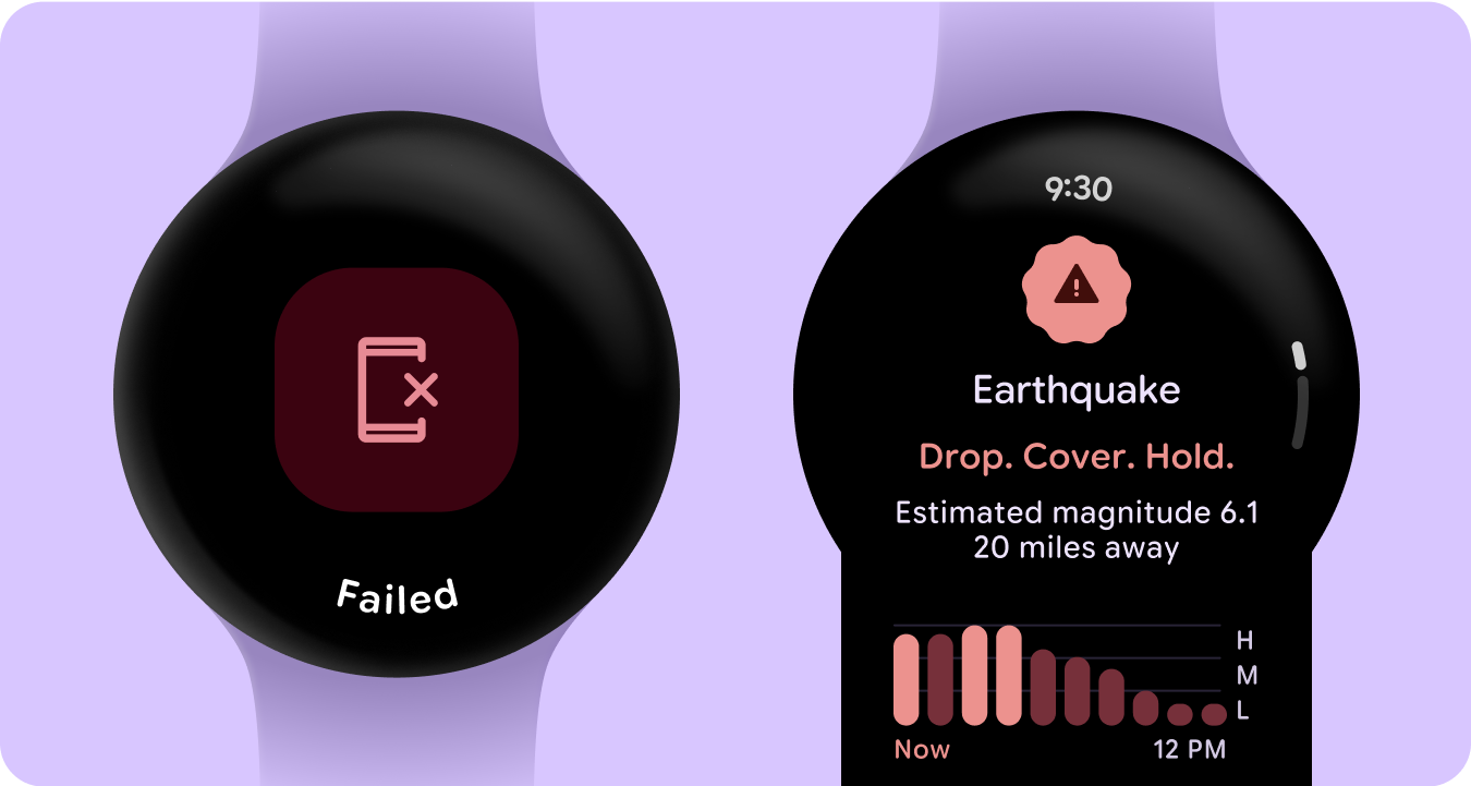
स्मार्टवॉच के यूज़र इंटरफ़ेस (यूआई) में, रंगों का मतलब साफ़ तौर पर और आसानी से समझ में आना चाहिए. उदाहरण के लिए, लाल रंग से गड़बड़ियों का पता चलता है और हरे रंग से सफलता का. इससे उपयोगकर्ताओं को अतिरिक्त जानकारी के बिना, कार्रवाइयों या स्थितियों को तुरंत समझने में मदद मिलती है. रंग के इस सेमैंटिक इस्तेमाल से, उपयोगकर्ताओं को आपके यूज़र इंटरफ़ेस (यूआई) पर नेविगेट करने और भरोसे के साथ कार्रवाई करने में मदद मिलती है.
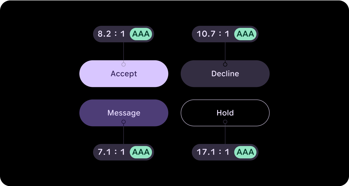
रंग की सुलभता (कंट्रास्ट के मुताबिक)
स्मार्टवॉच के यूज़र इंटरफ़ेस (यूआई) में, रंगों का मतलब साफ़ तौर पर और आसानी से समझ में आना चाहिए. उदाहरण के लिए, लाल रंग से गड़बड़ियों का पता चलता है और हरे रंग से सफलता का. इससे उपयोगकर्ताओं को अतिरिक्त जानकारी के बिना, कार्रवाइयों या स्थितियों को तुरंत समझने में मदद मिलती है. रंग के इस सेमैंटिक इस्तेमाल से, उपयोगकर्ताओं को आपके यूज़र इंटरफ़ेस (यूआई) पर नेविगेट करने और भरोसे के साथ कार्रवाई करने में मदद मिलती है.
नया क्या है
विज़ुअल डिज़ाइन सिस्टम में कई अहम अपडेट किए गए हैं. साथ ही, हमने स्टाइल फ़ाउंडेशन, कॉम्पोनेंट, और टाइल डिज़ाइन लाइब्रेरी में किए गए अपडेट के ज़रिए, बेहतर तरीके से एक्सप्रेशन दिखाने की सुविधा भी जोड़ी है.
Material 3 के एक्सप्रेशनिव कलर सिस्टम में ये सुविधाएं शामिल हैं:
- सुलभ रंग संबंधों का बिल्ट-इन सेट
- Material कॉम्पोनेंट के साथ मैप की गई 28 से ज़्यादा कलर भूमिकाएं
- काले रंग से बनाने के लिए, गहरे रंग वाली थीम के लिए पहले से मौजूद रंग
- बंद की गई कलर वैल्यू को बेहतर बनाया गया
- गड़बड़ी के लिए अन्य रंग
- हर कलर रोल के लिए असाइन किए गए डिफ़ॉल्ट रंगों के साथ स्टैटिक बेसलाइन कलर
- डाइनैमिक कलर की सुविधाएं. इनमें सिस्टम/स्मार्टवॉच की होम स्क्रीन और इमेज पर आधारित कलर थीम शामिल हैं
संसाधन
ज़्यादा जानने के लिए, नीचे दिए गए लेख पढ़ें.
Material Design के कलर से जुड़े दिशा-निर्देश
Material 3 के एक्सप्रेशनिव वर्शन का इस्तेमाल करके, कलर स्कीम बनाने के सबसे सही नए तरीकों के बारे में जानें.