اللون
تنظيم صفحاتك في مجموعات
يمكنك حفظ المحتوى وتصنيفه حسب إعداداتك المفضّلة.
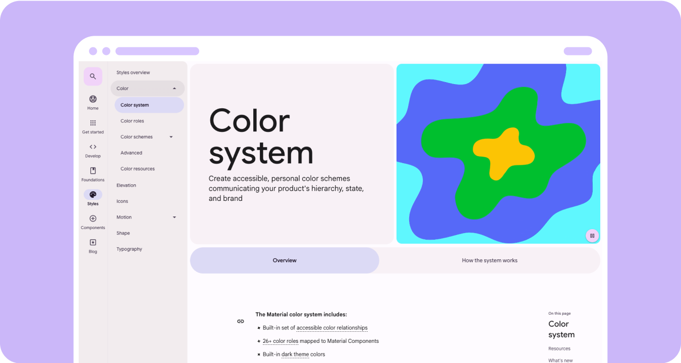
أنشئ تنسيقات ألوان شخصية وسهلة الاستخدام تُظهر التسلسل الهرمي لمنتجاتك
وحالتها وعلامتها التجارية. عند تصميم الأجهزة القابلة للارتداء، يلعب اللون دورًا مهمًا في
تحسين سهولة القراءة وقابلية الاستخدام والجاذبية المرئية والتعبير،
خاصة على الشاشات الأصغر حجمًا.
توضّح المبادئ التالية كيفية استخدام الألوان في جميع المظاهر.
الإنشاء من الأسود
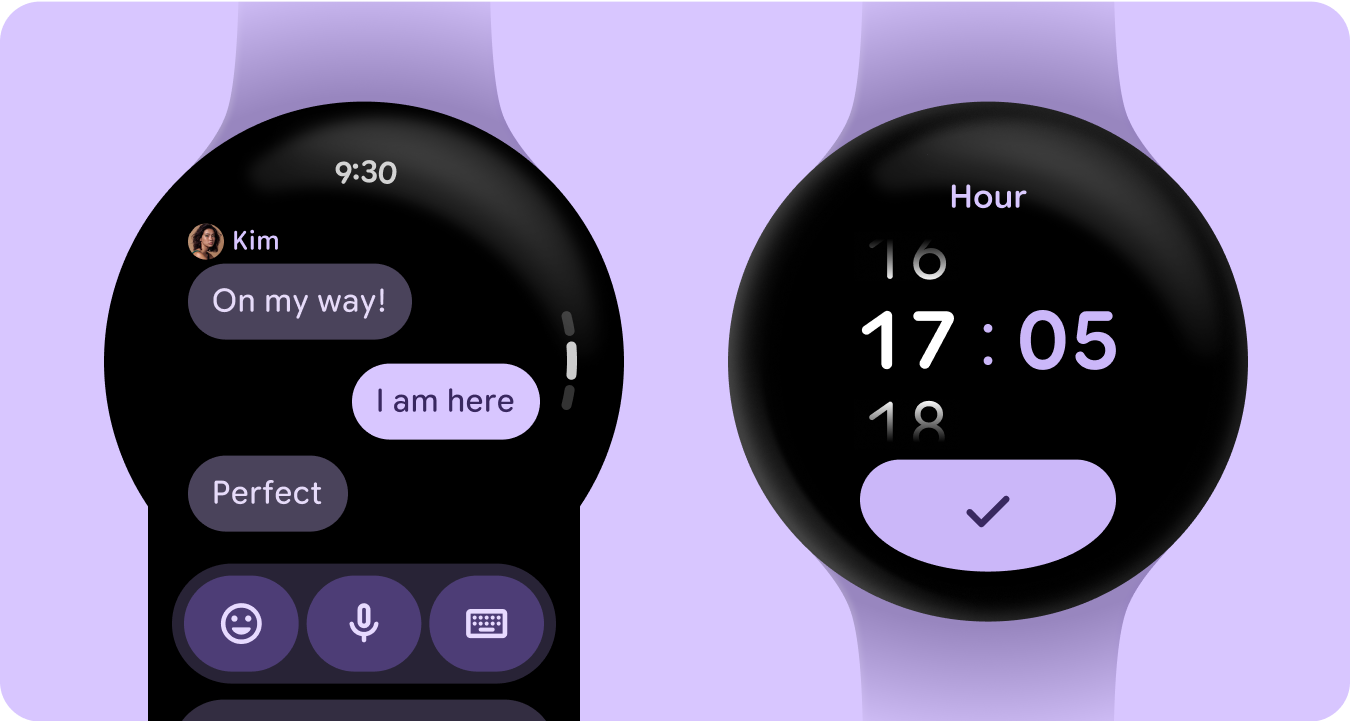
تم تصميم الساعات باستخدام خلفية سوداء بدلاً من الخلفية الملوّنة
التي تستخدمها أجهزة الهواتف. على الرغم من أنّ المظاهر الداكنة مخصّصة للبيئات ذات الإضاءة المنخفضة
والمظاهر الفاتحة للضوء الطبيعي، يجب أن تعمل واجهات مستخدم الساعة بسلاسة سواءً في النهار
أو الليل. لذلك، يجب تصميم الرموز اللونية للساعات خصيصًا.
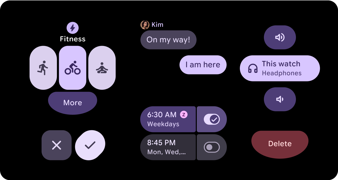
أدوار الألوان الجديدة
يحتفظ نظام ألوان Material 3 ببنية ثلاثة ألوان مميزة و لونَين
محايدين للسطح، ولكنه يقدّم ألوان الحاويات ضمن أدوار الألوان المميزة.
تتيح هذه الأدوار الجديدة إمكانية تعبيرية أكبر بدون التأثير في التسلسل البصري، ما يؤدي إلى توفير اختلافات في لون السطح مع زيادة في التدرّج اللوني.
تكون أدوار الحاوية مفيدة بشكل خاص لتمييز الحالات، مثل أزرار التبديل، أو لتقديم تصميم مكمّل عندما يكون المظهر الأساسي قد تم استخدامه.
المعنى الدلالي
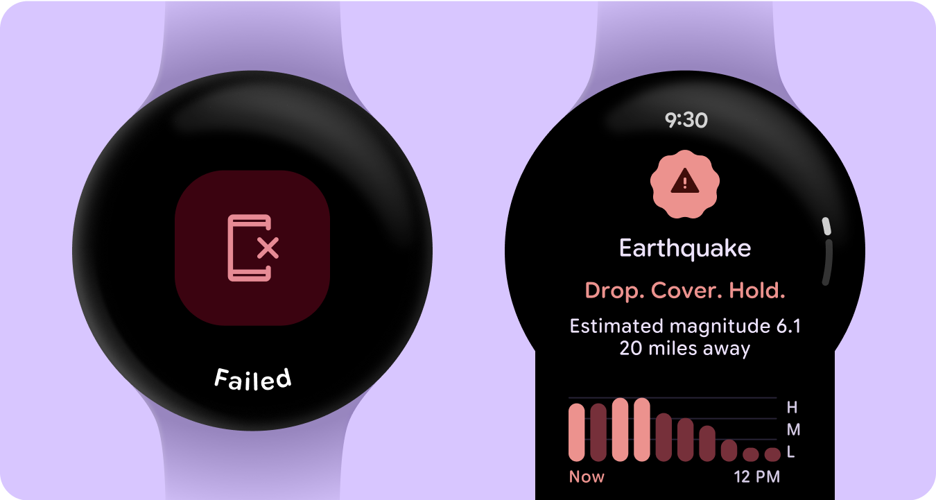
في واجهات المستخدم على الساعة، يجب أن تنقل الألوان المعنى بوضوح وبشكل حدسي. على سبيل المثال، يشير اللون الأحمر إلى الأخطاء ويشير اللون الأخضر إلى النجاح، ما يساعد المستخدمين على فهم الإجراءات أو الحالات بسرعة بدون الحاجة إلى شرح إضافي. يساعد هذا الاستخدام الدلالي
للألوان المستخدمين في التنقّل في واجهة المستخدم واتّخاذ الإجراءات بثقة.
سهولة الوصول إلى الألوان (التوافق مع التباين)
في واجهات المستخدم على الساعة، يجب أن تنقل الألوان المعنى بوضوح وبشكل حدسي. على سبيل المثال، يشير اللون الأحمر إلى الأخطاء ويشير اللون الأخضر إلى النجاح، ما يساعد المستخدمين على فهم الإجراءات أو الحالات بسرعة بدون الحاجة إلى شرح إضافي. يساعد هذا الاستخدام الدلالي
للألوان المستخدمين في التنقّل في واجهة المستخدم واتّخاذ الإجراءات بثقة.
الميزات الجديدة
تم إجراء تعديلات كبيرة على نظام التصميم المرئي وطريقة تحسين
التعبير من خلال تعديلات على مكتبات تصميم الأساسات والمكونات والمربّعات
للنمط.
يتضمّن نظام الألوان التعبيرية في Material 3 الميزات التالية:
- مجموعة مضمّنة من العلاقات بين الألوان السهلة الاستخدام
- أكثر من 28 دورًا للألوان تمّ ربطها بمكونات Material
- ألوان المظهر الداكن المضمّنة لإنشاء تصميمات من الأسود
- قيم ألوان محسّنة غير مفعّلة
- ألوان الأخطاء الإضافية
- لون أساسي ثابت مع ألوان تلقائية تم تعيينها لكل دور لون
- ميزات الألوان الديناميكية، بما في ذلك "النظام"/"خلفية شاشة الساعة" و"مظاهر ألوان"
المستندة إلى الصور
المراجع
لمزيد من المعلومات، يمكنك الاطّلاع على المراجع التالية.
إرشادات الألوان في التصميم المتعدد الأبعاد
يخضع كل من المحتوى وعيّنات التعليمات البرمجية في هذه الصفحة للتراخيص الموضحّة في ترخيص استخدام المحتوى. إنّ Java وOpenJDK هما علامتان تجاريتان مسجَّلتان لشركة Oracle و/أو الشركات التابعة لها.
تاريخ التعديل الأخير: 2025-07-26 (حسب التوقيت العالمي المتفَّق عليه)
[[["يسهُل فهم المحتوى.","easyToUnderstand","thumb-up"],["ساعَدني المحتوى في حلّ مشكلتي.","solvedMyProblem","thumb-up"],["غير ذلك","otherUp","thumb-up"]],[["لا يحتوي على المعلومات التي أحتاج إليها.","missingTheInformationINeed","thumb-down"],["الخطوات معقدة للغاية / كثيرة جدًا.","tooComplicatedTooManySteps","thumb-down"],["المحتوى قديم.","outOfDate","thumb-down"],["ثمة مشكلة في الترجمة.","translationIssue","thumb-down"],["مشكلة في العيّنات / التعليمات البرمجية","samplesCodeIssue","thumb-down"],["غير ذلك","otherDown","thumb-down"]],["تاريخ التعديل الأخير: 2025-07-26 (حسب التوقيت العالمي المتفَّق عليه)"],[],[],null,["# Color\n\nCreate more accessible, personal color schemes communicating your product's\nhierarchy, state, and brand. When designing for wearables, color plays a crucial\nrole in enhancing legibility, usability, visual appeal, and expression,\nespecially on smaller screens.\n\nThe following principles explain how to use color across themes.\n\nBuild from black\n----------------\n\n\nWatches are designed with a black background, instead of the tinted background\nthat phone devices use. While dark themes are meant for low-light environments\nand light themes for daylight, watch UIs need to function seamlessly both day\nand night. Therefore, color tokens for watches must be specifically tailored. \n\n\u003cbr /\u003e\n\nNew color roles\n---------------\n\n\nThe Material 3 color system retains the structure of three accent colors and two\nneutral surface colors, but introduces container colors within the accent roles.\nThese new roles enable greater expressive potential without disrupting visual\nhierarchy, essentially providing surface color variations with increased chroma.\nContainer roles are particularly useful for highlighting states, such as toggle\nbuttons, or for providing complementary styling when the primary accent is\nalready utilized. \n\n\u003cbr /\u003e\n\nSemantic meaning\n----------------\n\n\nIn watch UIs, colors need to communicate meaning clearly and intuitively. For\nexample, red indicates errors and green signals success, helping users quickly\nunderstand actions or states without needing extra explanation. This semantic\nuse of color helps users navigate your UI and take action with confidence. \n\n\u003cbr /\u003e\n\nColor accessibility (contrast compliance)\n-----------------------------------------\n\n\nIn watch UIs, colors need to communicate meaning clearly and intuitively. For\nexample, red indicates errors and green signals success, helping users quickly\nunderstand actions or states without needing extra explanation. This semantic\nuse of color helps users navigate your UI and take action with confidence. \n\n\u003cbr /\u003e\n\nWhat's new\n----------\n\nThere are substantial updates to the visual design system and how we elevate\nexpression throughout updates to our style foundations, components, and tiles\ndesign libraries.\n\nThe Material 3 Expressive color system includes the following features:\n\n- Built-in set of accessible color relationships\n- 28+ color roles mapped to Material components\n- Built-in dark theme colors for building from black\n- Improved disabled color values\n- Additional error colors\n- Static baseline color with default colors assigned to each color role\n- Dynamic color features, including System/Watch face, and image-based color themes\n\nResources\n---------\n\nTo learn more, view the following resources.\n\n### Material Design color guidelines\n\n\n[Learn about the latest best practices](https://material.io/color) for color schemes using Material 3\nExpressive. \n\n\u003cbr /\u003e"]]
