Wear OS 생태계는 다양한 화면 크기를 가진 기기로 구성됩니다. 모든 사용자에게 최고의 품질의 환경을 제공하려면 적응형 UI 원칙을 활용하는 것이 중요합니다.
적응형 UI란 무엇인가요?
적응형 UI는 렌더링되는 화면 크기와 관계없이 사용 가능한 모든 화면 공간을 최대한 활용하도록 늘어나고 변경됩니다.
적응형 UI는 레이아웃 로직에 직접 빌드된 구성요소와 메서드를 사용하여 반응형으로 변경됩니다. 또한 이러한 레이아웃은 화면 크기 브레이크포인트를 활용하여(다양한 화면 크기에 다른 디자인을 적용) 사용자에게 더욱 풍부한 환경을 제공합니다.
주요 화면 크기
새로운 환경을 설계할 때 유의해야 할 주요 참조 크기에 대해 알아보세요.
레이아웃 유형
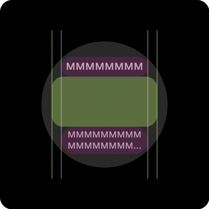
원형 화면에서 적응형 레이아웃을 설계할 때 스크롤 뷰와 스크롤 불가 뷰는 각각 UI 요소 크기 조정 및 균형 잡힌 레이아웃과 구성 유지를 위한 고유한 요구사항이 있습니다.
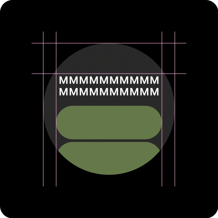
스크롤 뷰
모든 상단, 하단, 측면 여백은 클리핑을 방지하고 요소의 비례 크기 조정을 제공하기 위해 백분율로 정의해야 합니다.
스크롤되지 않는 뷰
모든 여백은 백분율로 정의해야 하며, 가운데에 있는 기본 콘텐츠가 사용 가능한 영역을 채우도록 늘어날 수 있도록 세로 제약 조건을 정의해야 합니다.
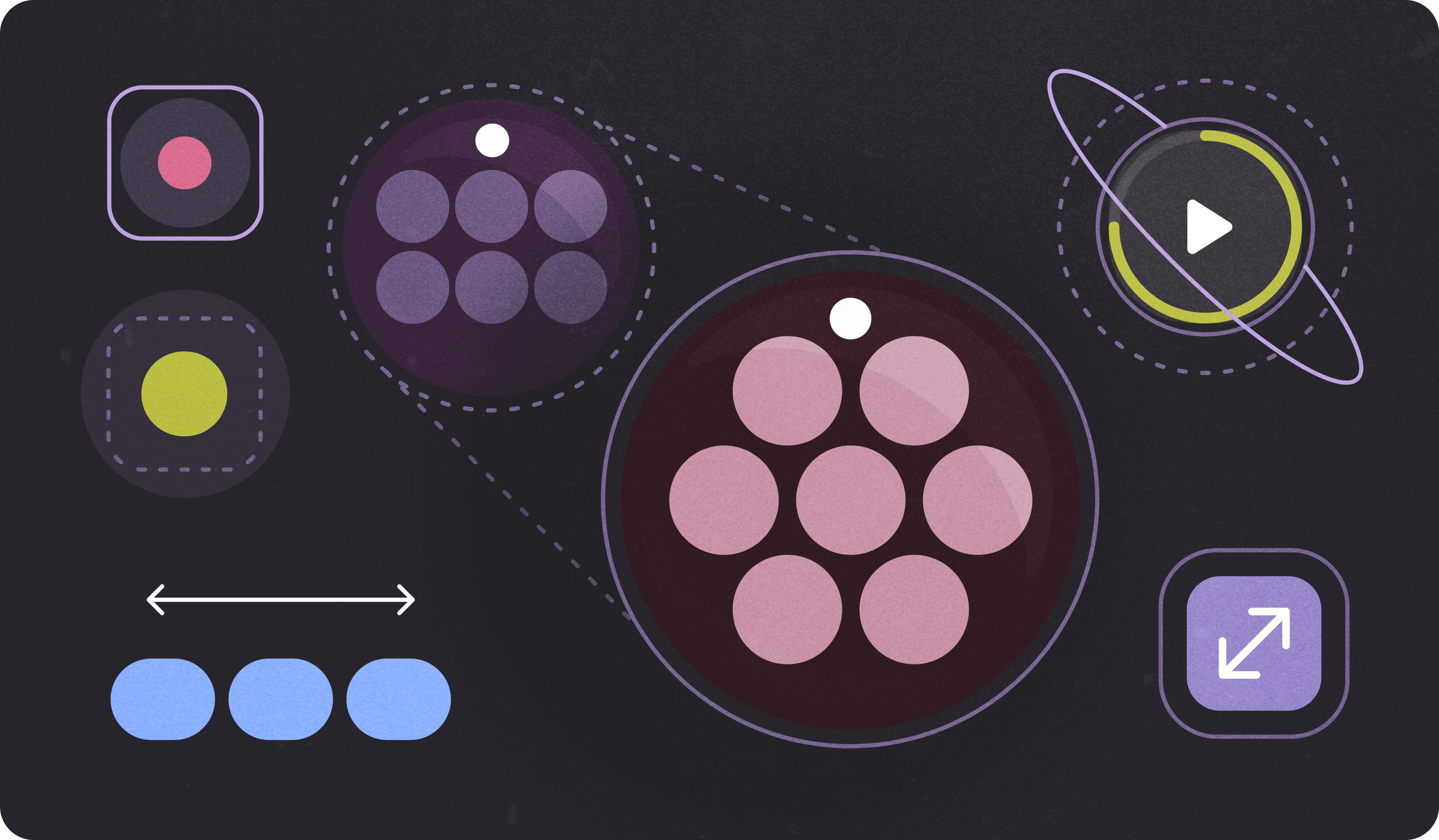
적응형 레이아웃 및 디자인 관행을 통해 가치를 더하세요.
원형 화면에서 적응형 레이아웃을 설계할 때 스크롤 뷰와 스크롤 불가 뷰는 각각 UI 요소 크기 조정 및 균형 잡힌 레이아웃과 구성 유지를 위한 고유한 요구사항이 있습니다.
다음 이미지는 일반적인 제안사항입니다. 예시는 참고용입니다. 각 구성요소 또는 노출 경로 페이지에서 자세한 문맥 기반의 대응형 안내를 확인하세요.
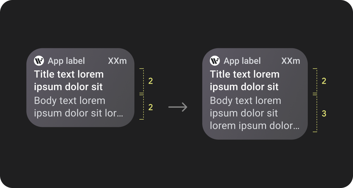
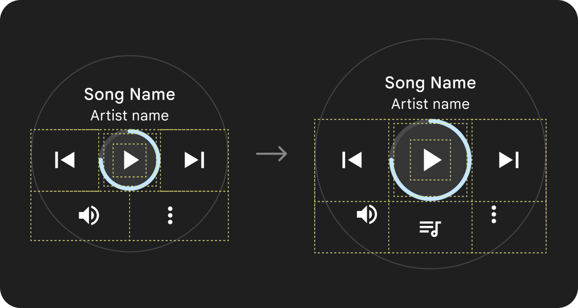
한눈에 더 많은 콘텐츠 보기
반응형 레이아웃을 사용하면 더 많은 칩, 카드, 텍스트 줄, 버튼을 단일 화면에 표시할 수 있습니다.
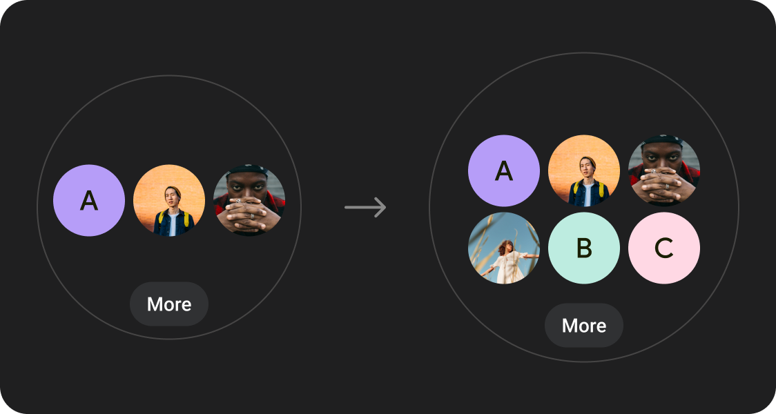
더 많은 콘텐츠 요소가 표시됨
정의된 화면 크기 중단점에 적용된 새 레이아웃을 활용하여 가능하면 새 콘텐츠를 도입하여 대형 화면 기기에서 사용자에게 추가 가치를 제공합니다.
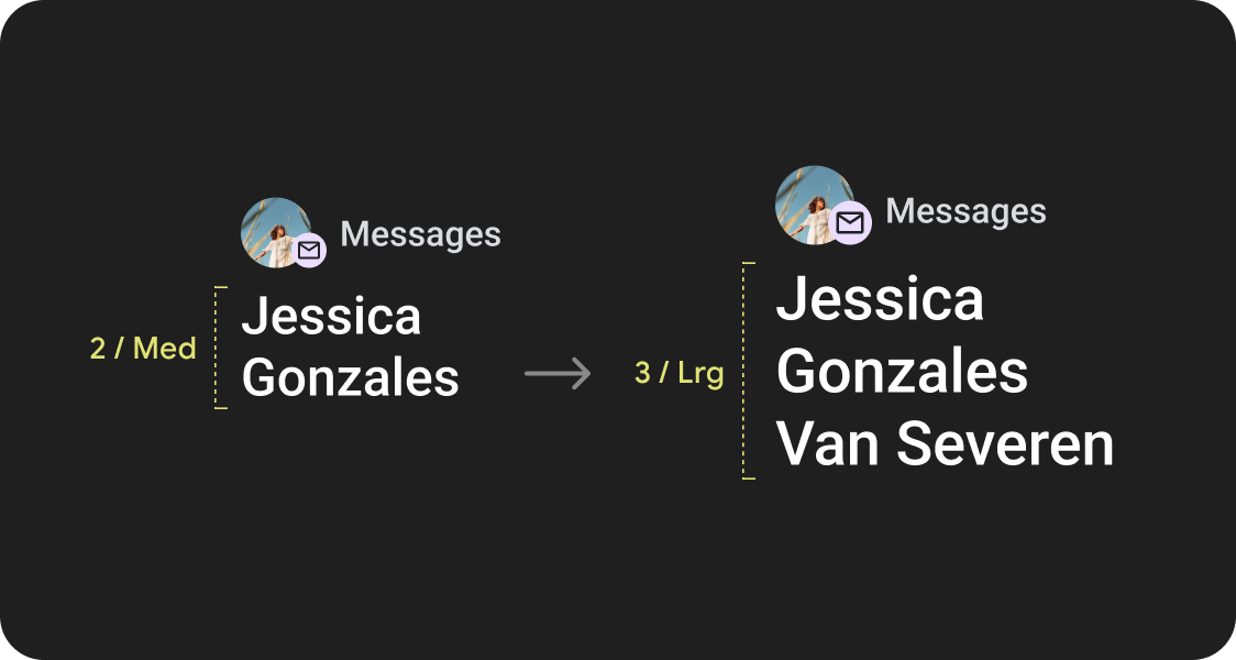
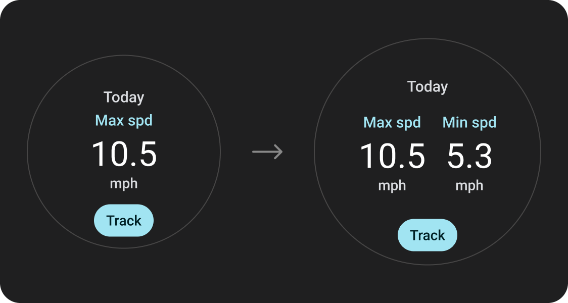
한눈에 보기 개선
추가 화면 공간을 사용하여 더 큰 컨테이너, 더 큰 텍스트, 더 두꺼운 링, 더 상세한 데이터 시각화를 제공하여 사용자가 한눈에 더 쉽게 확인할 수 있도록 합니다.
사용성 개선
추가 화면 공간을 사용하여 더 큰 탭 타겟, 더 나은 시각적 계층 구조, 콘텐츠 항목 간의 추가 공간을 제공하여 인터페이스와 더 쉽고 편안하게 상호작용할 수 있도록 합니다.
최적화된 구성
업데이트된 구성요소와 템플릿을 활용하여 모든 화면 크기에서 UI의 디자인을 개선하세요.
앱 품질
Google의 품질 가이드라인은 3단계로 구성됩니다. 세 가지 등급의 가이드라인을 충족하여 사용자에게 최상의 환경을 제공하세요.
기존 표준 레이아웃 활용
확립된 표준 레이아웃을 사용하여 UI가 다양한 기기 크기에 맞게 원활하게 조정되도록 하세요.
Google의 표준 레이아웃은 모든 화면 크기에서 고품질 환경을 제공하도록 신중하게 개발되었습니다.