Wear OS 생태계에 있는 대부분의 시계는 화면 크기가 다릅니다.
Wear OS용으로 디자인할 때는 앱 노출 영역이 이러한 다양한 화면 크기에 표시된다는 점에 유의하세요.
원칙
다양한 기기에 맞게 디자인할 때는 다음 원칙에 유의하세요.
작은 크기 우선
항상 지원되는 가장 작은 원형 에뮬레이터인 192dp에 맞게 설계합니다. 그런 다음 더 큰 기기에 맞게 최적화하세요.
조정을 감안하여 디자인
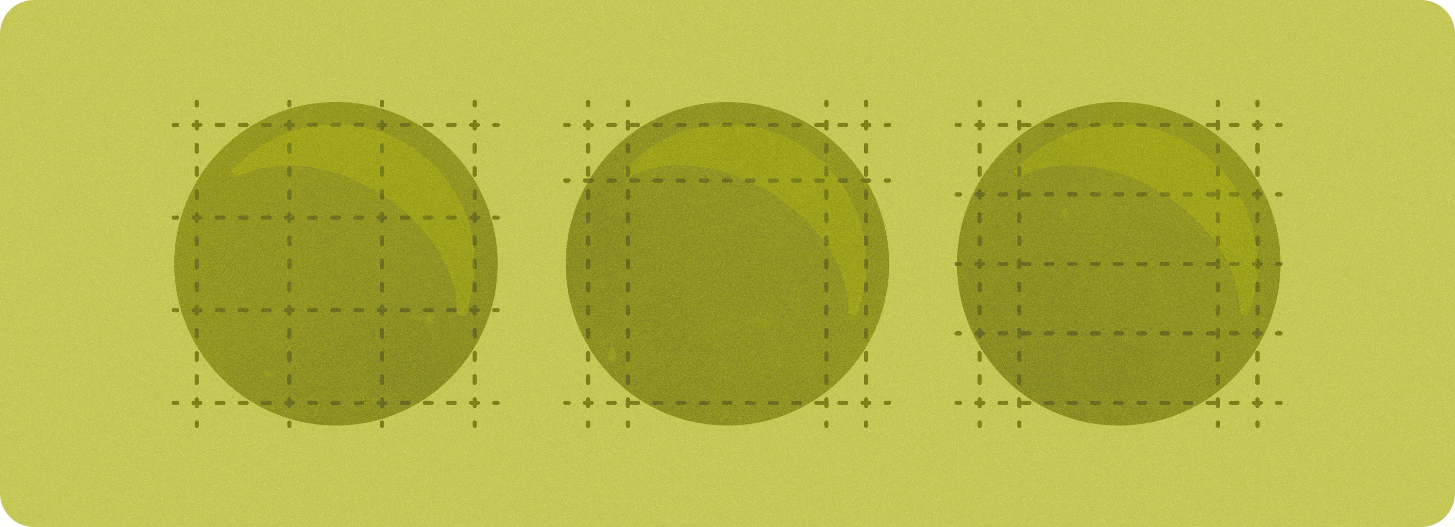
원형 화면에서 여백이 비례적으로 조정되고 UI 요소가 잘리지 않도록 외부 여백을 절댓값이 아닌 백분율로 정의합니다.
글꼴 크기
UI 요소의 높이는 글꼴 크기 조정 및 접근성 설정(예: 굵게 표시된 텍스트)에 따라 비선형으로 변경될 수 있습니다.
일반적인 화면 크기의 예
다음은 Wear OS 기기에서 특히 일반적인 화면 크기입니다.
작은 화면과 큰 화면 간의 중단점으로 225dp를 사용하는 것이 좋습니다.
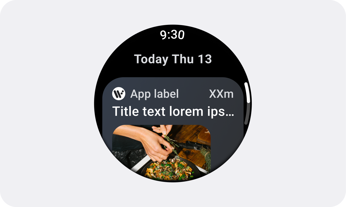
192dp~224dp
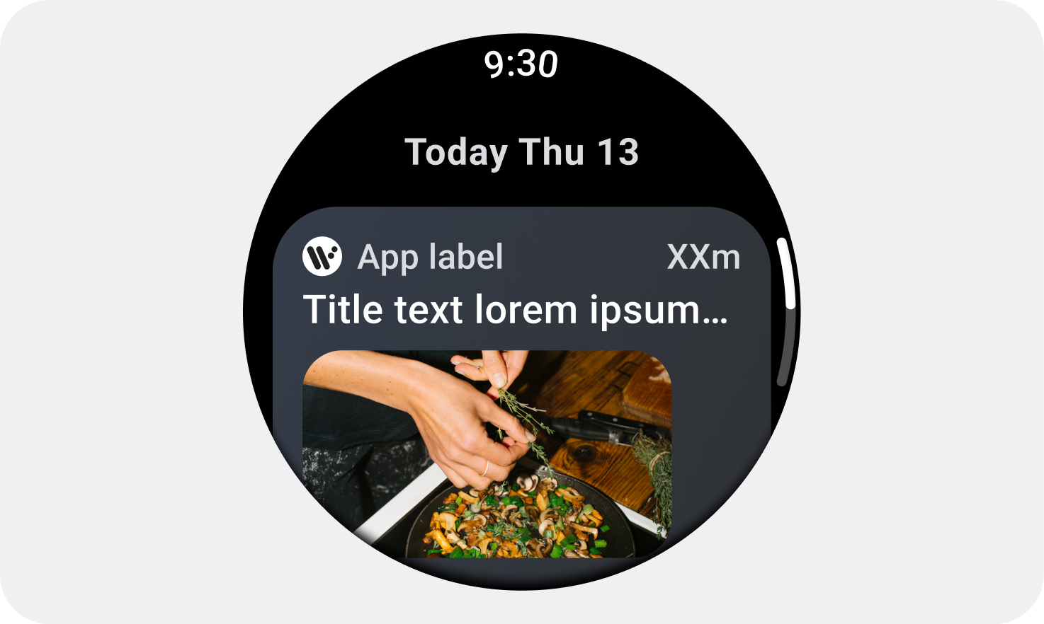
225dp~240+ dp
표준 적응형 레이아웃
다양한 화면 크기에 맞게 디자인하는 방법을 자세히 알아보려면 표준 적응형 레이아웃 페이지를 참고하세요.
이 페이지에 나와 있는 콘텐츠와 코드 샘플에는 콘텐츠 라이선스에서 설명하는 라이선스가 적용됩니다. 자바 및 OpenJDK는 Oracle 및 Oracle 계열사의 상표 또는 등록 상표입니다.
최종 업데이트: 2025-07-27(UTC)
[[["이해하기 쉬움","easyToUnderstand","thumb-up"],["문제가 해결됨","solvedMyProblem","thumb-up"],["기타","otherUp","thumb-up"]],[["필요한 정보가 없음","missingTheInformationINeed","thumb-down"],["너무 복잡함/단계 수가 너무 많음","tooComplicatedTooManySteps","thumb-down"],["오래됨","outOfDate","thumb-down"],["번역 문제","translationIssue","thumb-down"],["샘플/코드 문제","samplesCodeIssue","thumb-down"],["기타","otherDown","thumb-down"]],["최종 업데이트: 2025-07-27(UTC)"],[],[]]
