गतिविधि की स्थिति दिखाने वाले इंडिकेटर, किसी प्रोसेस में लगने वाले समय या इंतज़ार के समय को सर्कुलर डिसप्ले में दिखाते हैं.
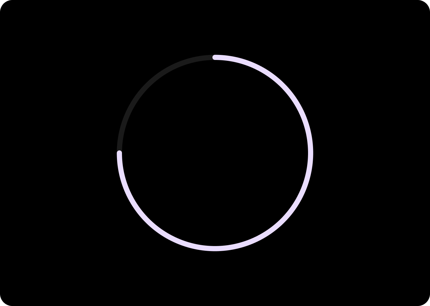
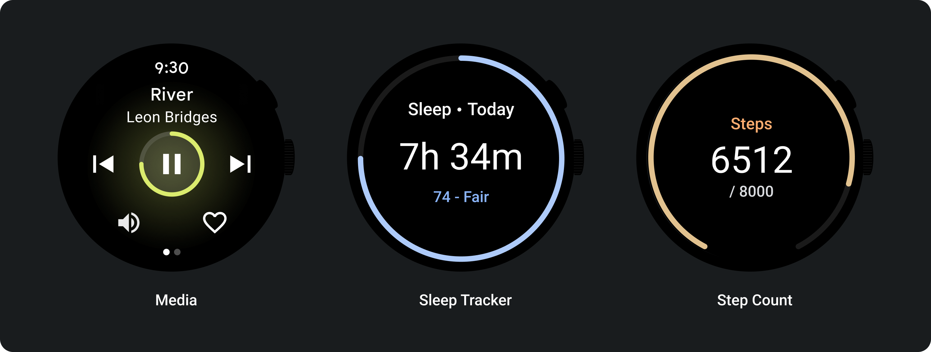
किसी टास्क के पूरे होने का अनुपात दिखाने के लिए, प्रोग्रेस इंडिकेटर का इस्तेमाल करें. प्रोग्रेस दिखाने के लिए, इंडिकेटर को घड़ी की दिशा में सर्कुलर ट्रैक के साथ ऐनिमेट किया जाता है.
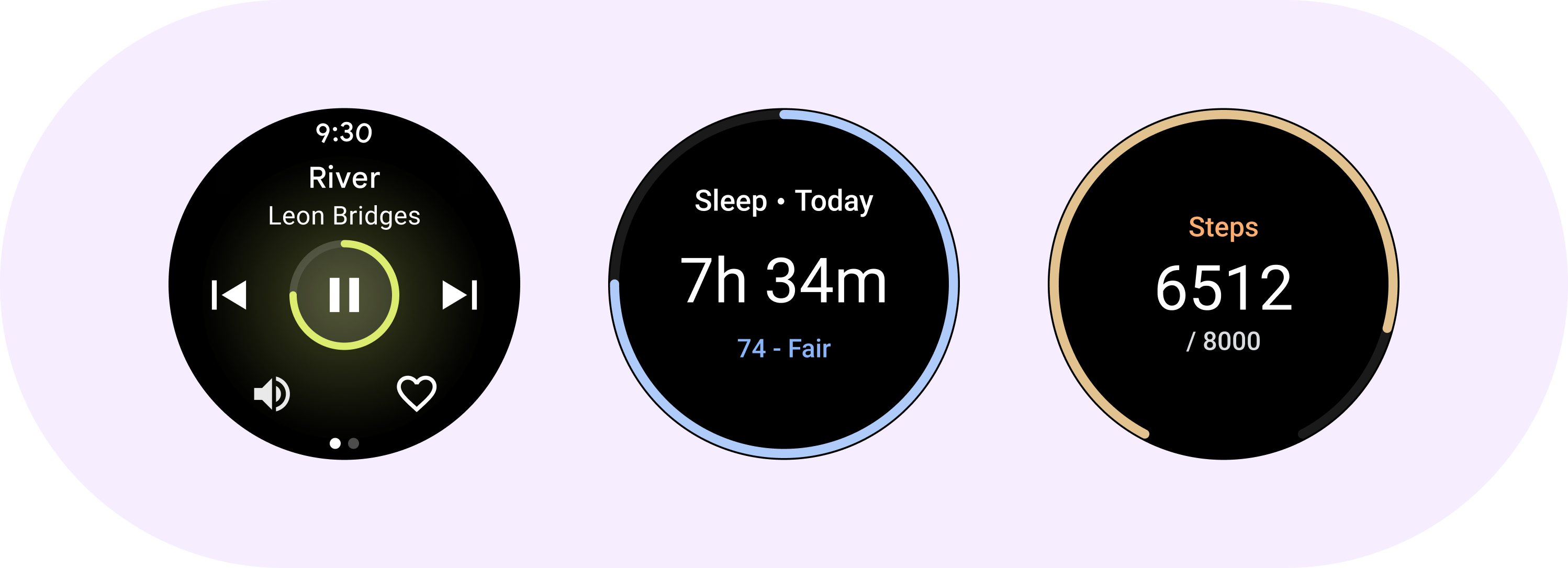
कॉम्पोनेंट पर प्रोग्रेस इंडिकेटर लागू किए जा सकते हैं. जैसे, चलाने के बटन पर.
शरीर-रचना विज्ञान
किसी टास्क के पूरे होने का अनुपात दिखाने के लिए, प्रोग्रेस इंडिकेटर का इस्तेमाल करें. प्रोग्रेस दिखाने के लिए, इंडिकेटर को घड़ी की दिशा में सर्कुलर ट्रैक के साथ ऐनिमेट किया जाता है.
कॉम्पोनेंट पर प्रोग्रेस इंडिकेटर लागू किए जा सकते हैं. जैसे, चलाने के बटन पर.
डिज़ाइन के लिए सुझाव
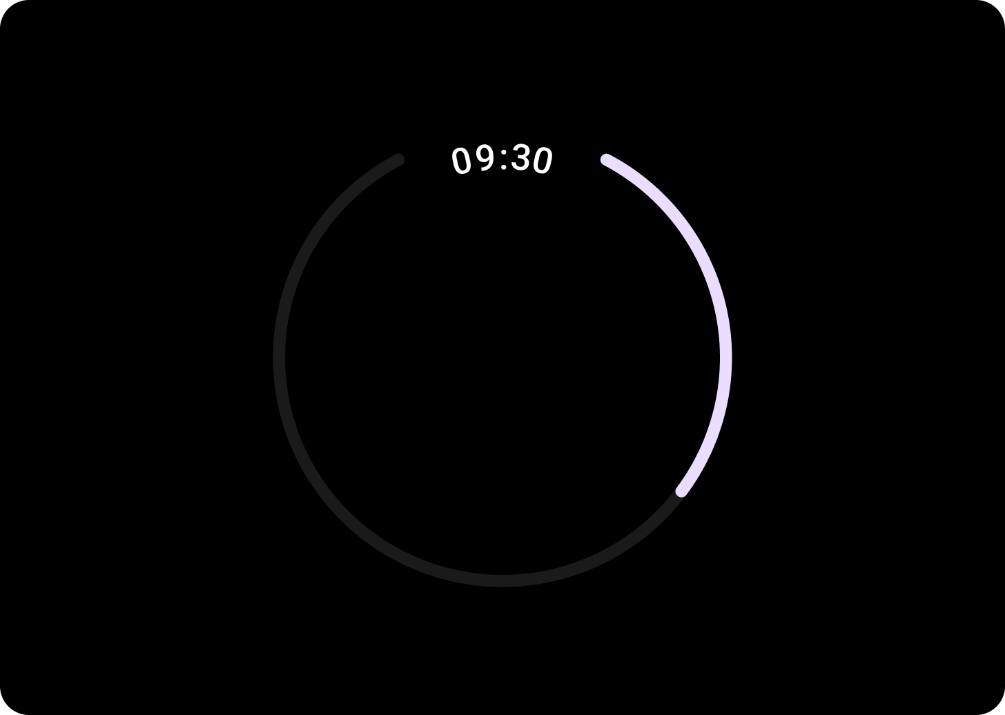
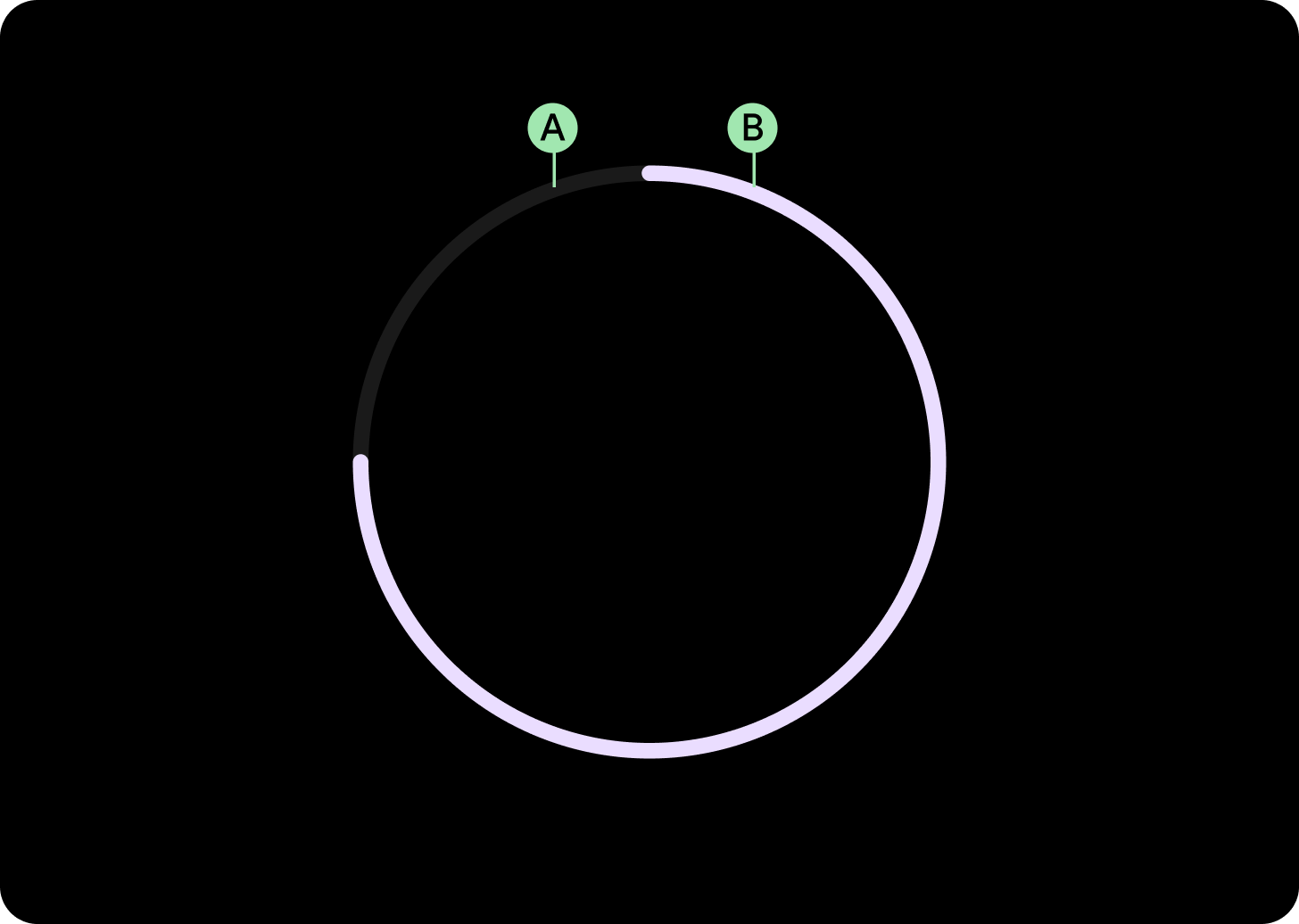
गैप के साथ प्रोग्रेस इंडिकेटर
प्रोग्रेस इंडिकेटर के बीच में गैप रखें, ताकि समय जैसी अहम जानकारी के लिए जगह बच सके. गैप बनाने के लिए, प्रोग्रेस इंडिकेटर के startAngle और endAngle को बदलें.

प्रोग्रेस का छोटा इंडिकेटर
प्रोग्रेस इंडिकेटर के बीच में गैप रखें, ताकि समय जैसी अहम जानकारी के लिए जगह बच सके. प्रोग्रेस इंडिकेटर के शुरू और खत्म होने के ऐंगल में बदलाव करके, गैप बनाएं.
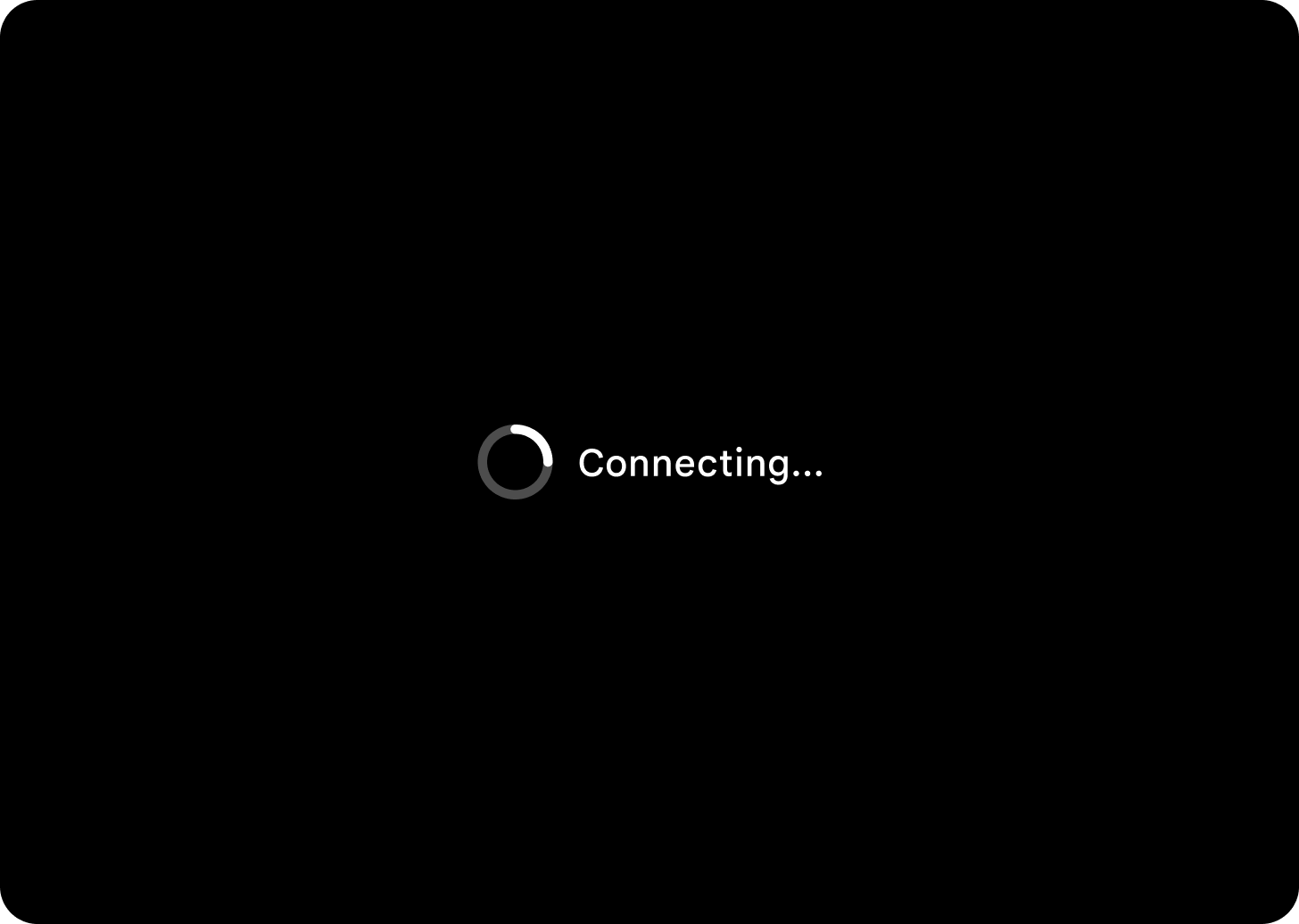
प्रोग्रेस का प्रतिशत नहीं दिखाने वाला इंडिकेटर
जिन स्थितियों में कोई समय तय नहीं होता है वहां प्रोग्रेस इंडिकेटर का इस्तेमाल करते समय, ऐनिमेशन वाली वैल्यू के साथ प्रोग्रेस इंडिकेटर का इस्तेमाल करें. इसे स्पिनर भी कहा जा सकता है. स्पिनर का कम इस्तेमाल करें, क्योंकि इससे लोगों को इंतज़ार का समय ज़्यादा लग सकता है.
इस्तेमाल
अडैप्टिव लेआउट
रिस्पॉन्सिव व्यवहार
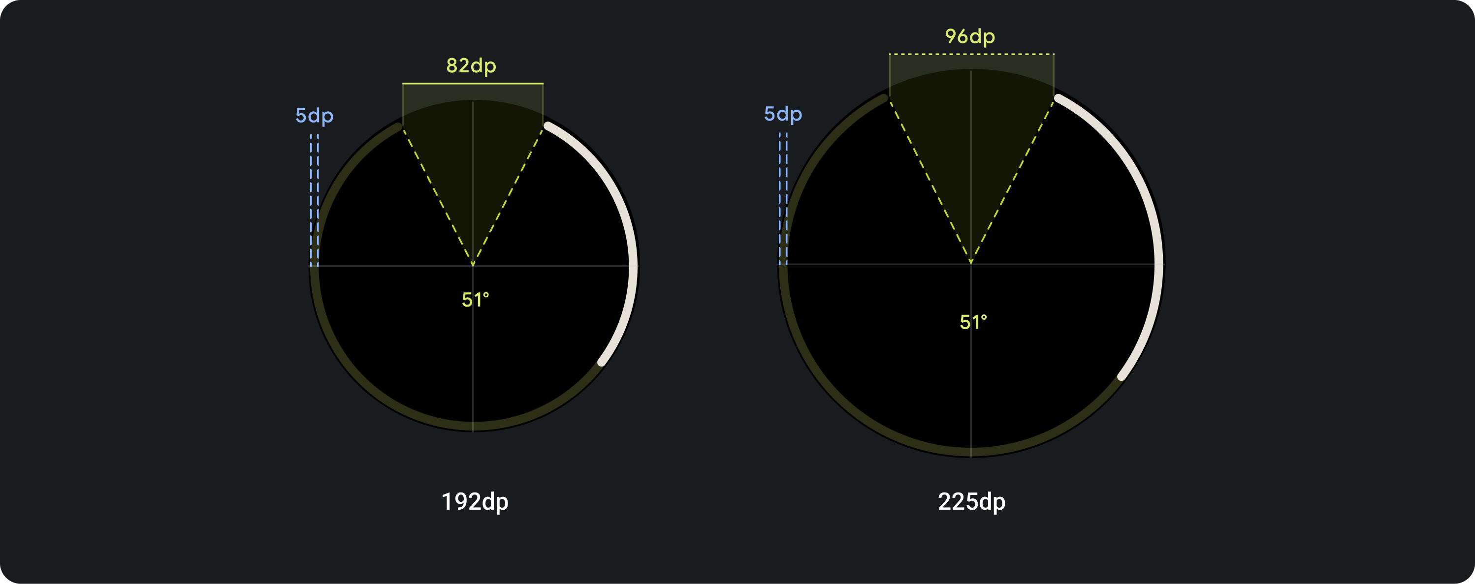
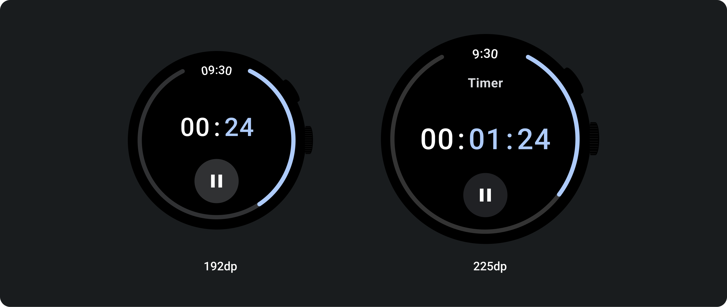
प्रोग्रेस इंडिकेटर की परिधि, स्क्रीन/एलिमेंट (चालू बटन के लिए) की चौड़ाई और ऊंचाई को अनुपात के हिसाब से भरती है. हालांकि, सभी ब्रेकपॉइंट पर स्ट्रोक की चौड़ाई एक जैसी रहती है.
फ़ुल स्क्रीन के लिए गैप डिग्री 51° पर बनी रहेगी. हालांकि, स्क्रीन साइज़ के आधार पर स्वीप, डीपी में बढ़ जाएगा.
रिंग की चौड़ाई और शुरू और खत्म होने के पॉइंट में अपने हिसाब से बदलाव किया जा सकता है.