डायलॉग
संग्रह की मदद से व्यवस्थित रहें
अपनी प्राथमिकताओं के आधार पर, कॉन्टेंट को सेव करें और कैटगरी में बांटें.
समय पर की जाने वाली कार्रवाई या जानकारी पर उपयोगकर्ताओं का ध्यान खींचने के लिए, Dialog
का इस्तेमाल करें.

शरीर-रचना विज्ञान
उपयोगकर्ता के टास्क या कार्रवाई के जवाब में डायलॉग दिखने चाहिए. साथ ही, इनमें काम की या कॉन्टेक्स्ट के हिसाब से जानकारी होनी चाहिए. मोबाइल डिवाइसों के डायलॉग बॉक्स के मुकाबले, Wear OS के डायलॉग बॉक्स पूरी स्क्रीन पर दिखते हैं. साथ ही, ये अन्य कॉन्टेंट के ऊपर लेयर में दिखते हैं.
डायलॉग बॉक्स, 'स्वाइप करके खारिज करें' जेस्चर के साथ काम करते हैं. जब उपयोगकर्ता स्वाइप करने का यह जेस्चर करता है, तो सिस्टम बैकग्राउंड में पैरंट कॉन्टेंट दिखाता है.
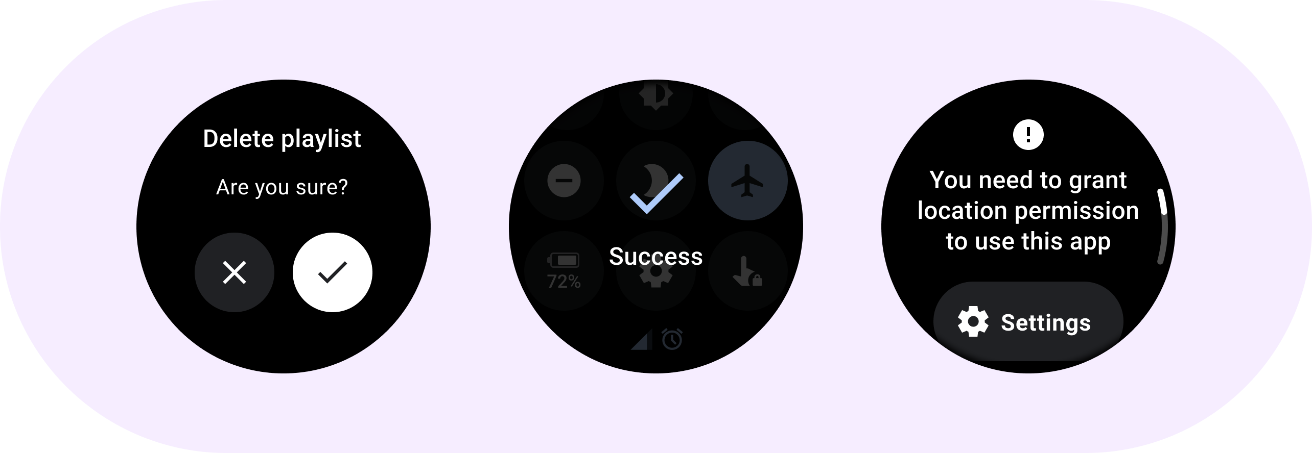
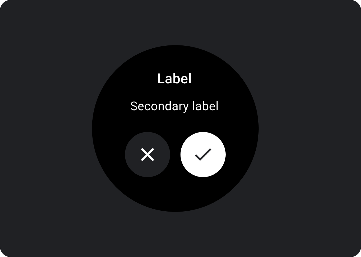
डायलॉग में, राय देने वाले डायलॉग कॉन्टेंट के लिए एक स्लॉट होता है. जैसे,
चेतावनी या
पुष्टि.
सूचना
अहम टास्क के लिए उपयोगकर्ता का जवाब पाने के लिए, सूचना कॉम्पोनेंट का इस्तेमाल करें.
सूचनाएं दिखने पर, ऐप्लिकेशन की सभी सुविधाएं बंद हो जाती हैं. साथ ही, ये तब तक स्क्रीन पर दिखती हैं, जब तक कोई कार्रवाई नहीं की जाती. सूचनाएं जान-बूझकर रुकावट डालने के लिए भेजी जाती हैं, इसलिए उनका कम से कम इस्तेमाल करें.
अगर सूचना का कॉन्टेंट तीन लाइन से ज़्यादा है, तो कॉन्टेंट को बाईं ओर अलाइन करें, ताकि उसे पढ़ना आसान हो. ऐसा न करने पर, टेक्स्ट डिफ़ॉल्ट रूप से बीच में अलाइन हो जाता है.
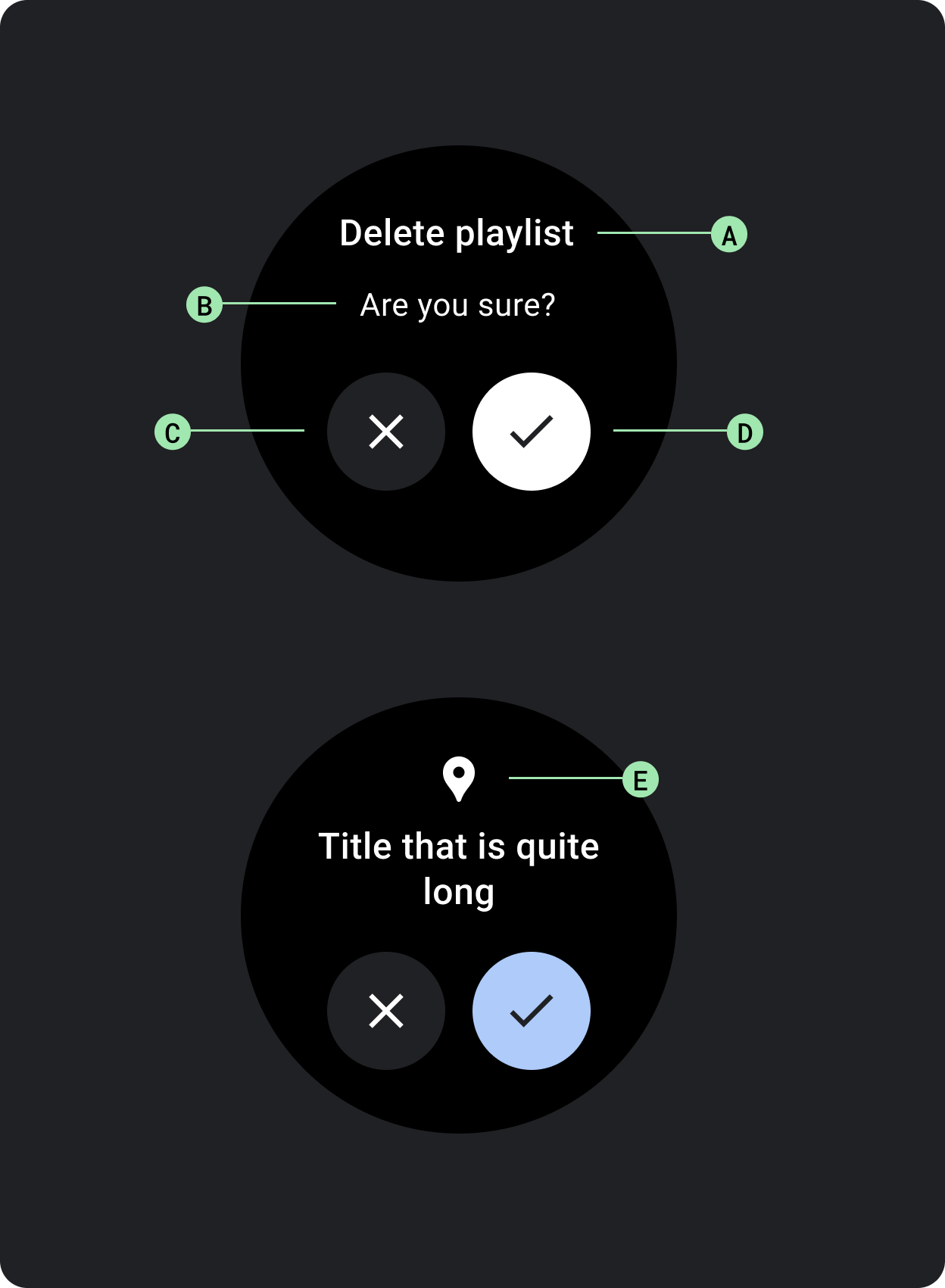
A. टाइटल
B. कॉन्टेंट (ज़रूरी नहीं)
C. नेगेटिव बटन
D. पॉज़िटिव बटन
E. आइकॉन (ज़रूरी नहीं है)
पुष्टि
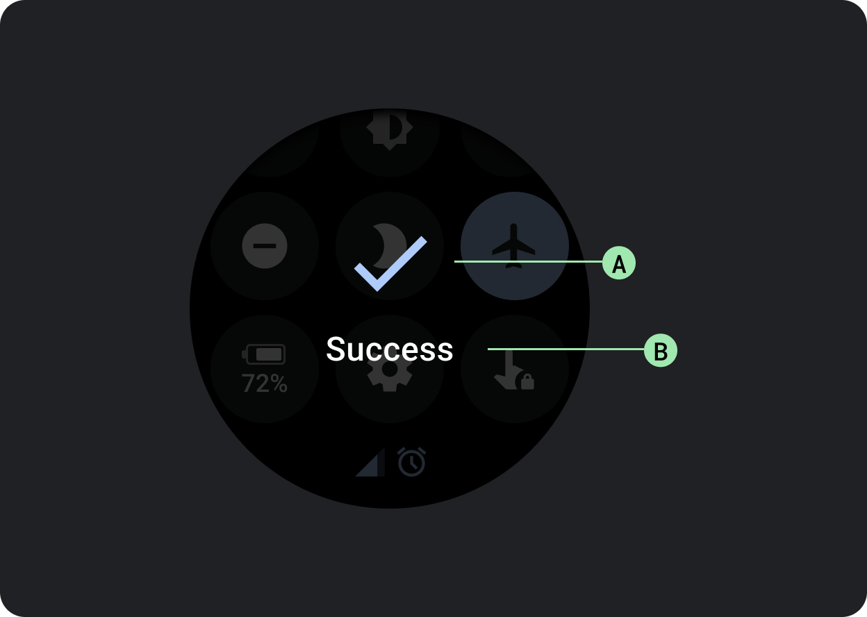
पुष्टि करने वाला कॉम्पोनेंट, उपयोगकर्ता को पुष्टि करने वाला मैसेज थोड़े समय के लिए दिखाता है. Material के मुकाबले, Wear OS में पुष्टि करने वाले कॉम्पोनेंट की मदद से, उपयोगकर्ता किसी विकल्प की पुष्टि नहीं कर सकते.
किसी कार्रवाई को पूरा करने के बाद, उपयोगकर्ता का ध्यान खींचने के लिए इस कॉम्पोनेंट का इस्तेमाल करें.
A. आइकॉन
B. लेबल
इस पेज पर मौजूद कॉन्टेंट और कोड सैंपल कॉन्टेंट के लाइसेंस में बताए गए लाइसेंस के हिसाब से हैं. Java और OpenJDK, Oracle और/या इससे जुड़ी हुई कंपनियों के ट्रेडमार्क या रजिस्टर किए हुए ट्रेडमार्क हैं.
आखिरी बार 2025-07-27 (UTC) को अपडेट किया गया.
[[["समझने में आसान है","easyToUnderstand","thumb-up"],["मेरी समस्या हल हो गई","solvedMyProblem","thumb-up"],["अन्य","otherUp","thumb-up"]],[["वह जानकारी मौजूद नहीं है जो मुझे चाहिए","missingTheInformationINeed","thumb-down"],["बहुत मुश्किल है / बहुत सारे चरण हैं","tooComplicatedTooManySteps","thumb-down"],["पुराना","outOfDate","thumb-down"],["अनुवाद से जुड़ी समस्या","translationIssue","thumb-down"],["सैंपल / कोड से जुड़ी समस्या","samplesCodeIssue","thumb-down"],["अन्य","otherDown","thumb-down"]],["आखिरी बार 2025-07-27 (UTC) को अपडेट किया गया."],[],[],null,["# Dialogs\n\nUse a [`Dialog`](/reference/kotlin/androidx/wear/compose/material/dialog/package-summary) to focus users' attention on a timely action or piece of\ninformation.\n\nAnatomy\n-------\n\n\nDialogs should appear in response to a user task or an action, with\nrelevant or contextual information. Unlike their mobile counterparts,\nDialogs in Wear OS occupy the whole screen and are layered over other\ncontent.\n\n\nDialogs support a swipe-to-dismiss gesture. When the user performs\nthis swipe gesture, the system reveals the parent content in the\nbackground.\n\nDialogs have a single slot for opinionated dialog content, such as an\n[Alert](/reference/kotlin/androidx/wear/compose/material/dialog/package-summary#Alert(kotlin.Function1,kotlin.Function0,kotlin.Function0,androidx.compose.ui.Modifier,kotlin.Function1,androidx.wear.compose.material.ScalingLazyListState,androidx.compose.ui.graphics.Color,androidx.compose.ui.graphics.Color,androidx.compose.ui.graphics.Color,androidx.compose.ui.graphics.Color,androidx.compose.foundation.layout.Arrangement.Vertical,androidx.compose.foundation.layout.PaddingValues,kotlin.Function1)) or\n[Confirmation](/reference/kotlin/androidx/wear/compose/material/dialog/package-summary#Confirmation(kotlin.Function0,androidx.compose.ui.Modifier,kotlin.Function1,androidx.wear.compose.material.ScalingLazyListState,kotlin.Long,androidx.compose.ui.graphics.Color,androidx.compose.ui.graphics.Color,androidx.compose.ui.graphics.Color,androidx.compose.foundation.layout.Arrangement.Vertical,androidx.compose.foundation.layout.PaddingValues,kotlin.Function1)).\n\n\u003cbr /\u003e\n\n\n**Alert**\n\nUse an alert component to get the user's response for important\ntasks.\n\nAlerts disable all app functionality when they appear, and remain on\nscreen until an action has been taken. Alerts are purposefully interruptive,\nso use them sparingly.\n\nIf the content of the alert is longer than three lines of text, consider\nleft aligning the content to improve its readability. Otherwise the text\nis center aligned by default.\n\n\n**A. Title\nB. Content (optional)\nC. Negative button\nD. Positive button\nE. Icon (optional)**\n\n\u003cbr /\u003e\n\n**Confirmation**\n\nThe confirmation component displays a confirmation message to the user\nfor a short period of time. Unlike its Material counterpart, the\nconfirmation component in Wear OS doesn't allow users to provide final\nconfirmation of a choice.\n\nUse this component to capture a user's attention after an action has been\nexecuted.\n\n\n**A. Icon\nB. Label**"]]