البطاقات
تنظيم صفحاتك في مجموعات
يمكنك حفظ المحتوى وتصنيفه حسب إعداداتك المفضّلة.

يتضمّن مكوِّن البطاقة محتوى وإجراءات حول موضوع واحد.
علم التشريح
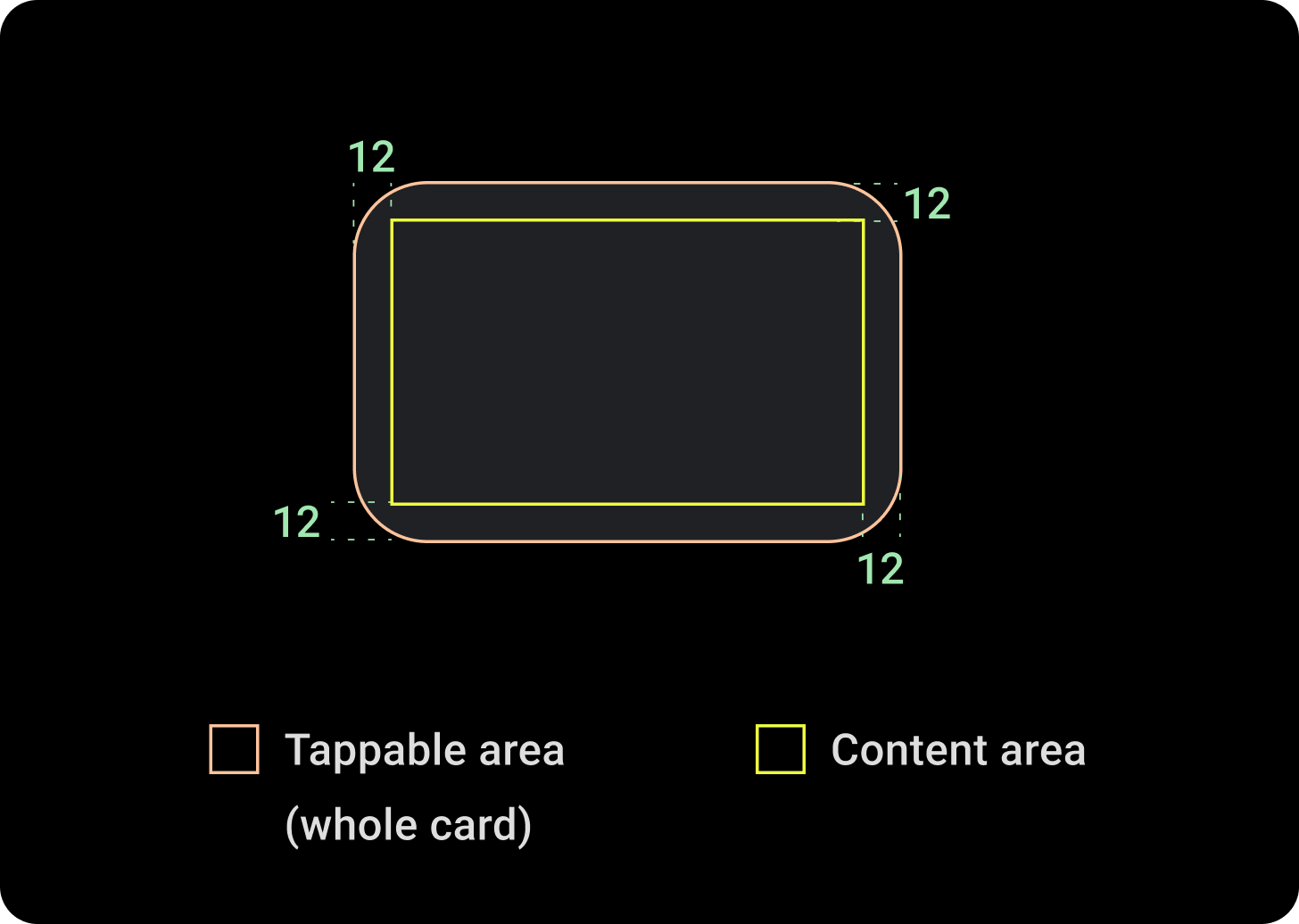
يحتوي مكوّن البطاقة على فتحة واحدة فقط. يمكن أن تحتوي البطاقات على رموز أو صور أو تسميات قابلة للتخصيص.
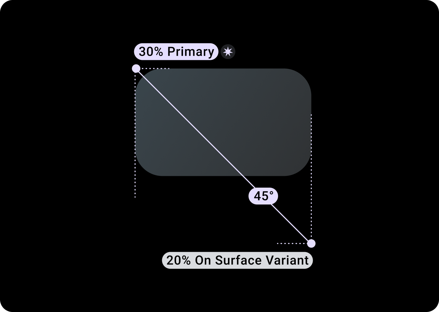
بشكل تلقائي، تكون البطاقات مستطيلة بزوايا مستديرة وخلفية متدرجة. يُرجى ضبط الحدّ الأقصى لارتفاع بطاقتك على 60% لضمان عرضها بالكامل على الشاشة، لأنّ الشاشات الدائرية يمكنها اقتصاص ما يصل إلى% 20 من الجزء العلوي والسفلي من الشاشة.
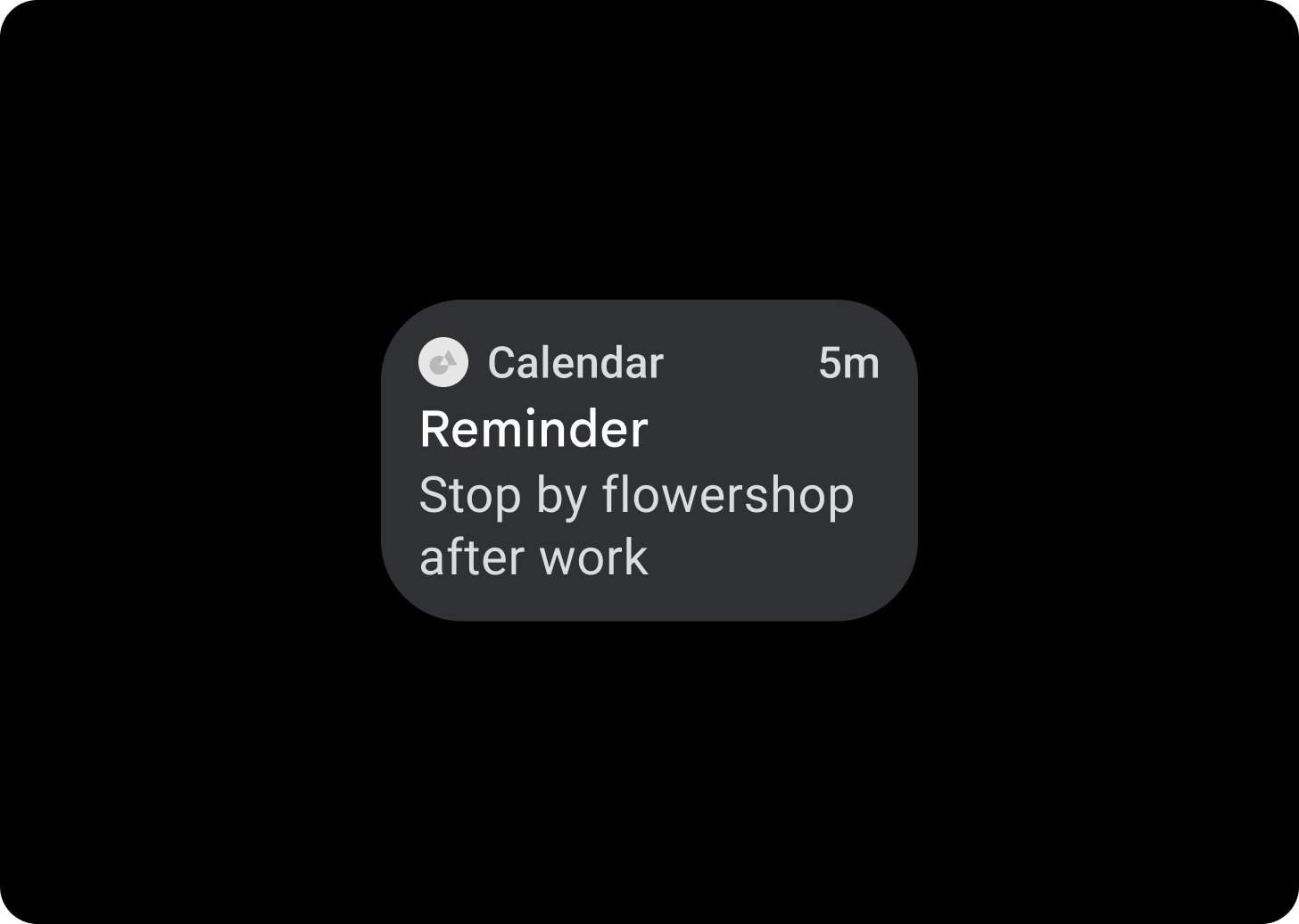
بطاقة العنوان
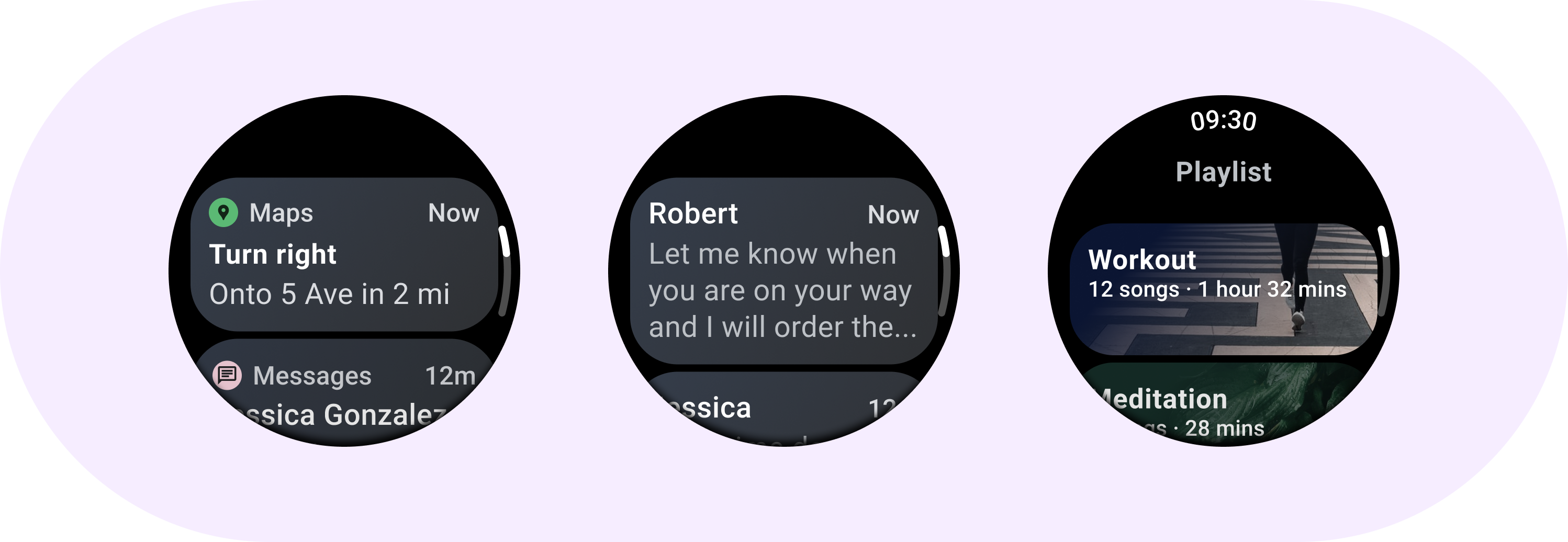
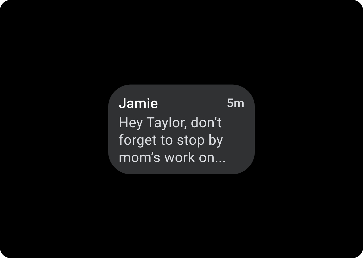
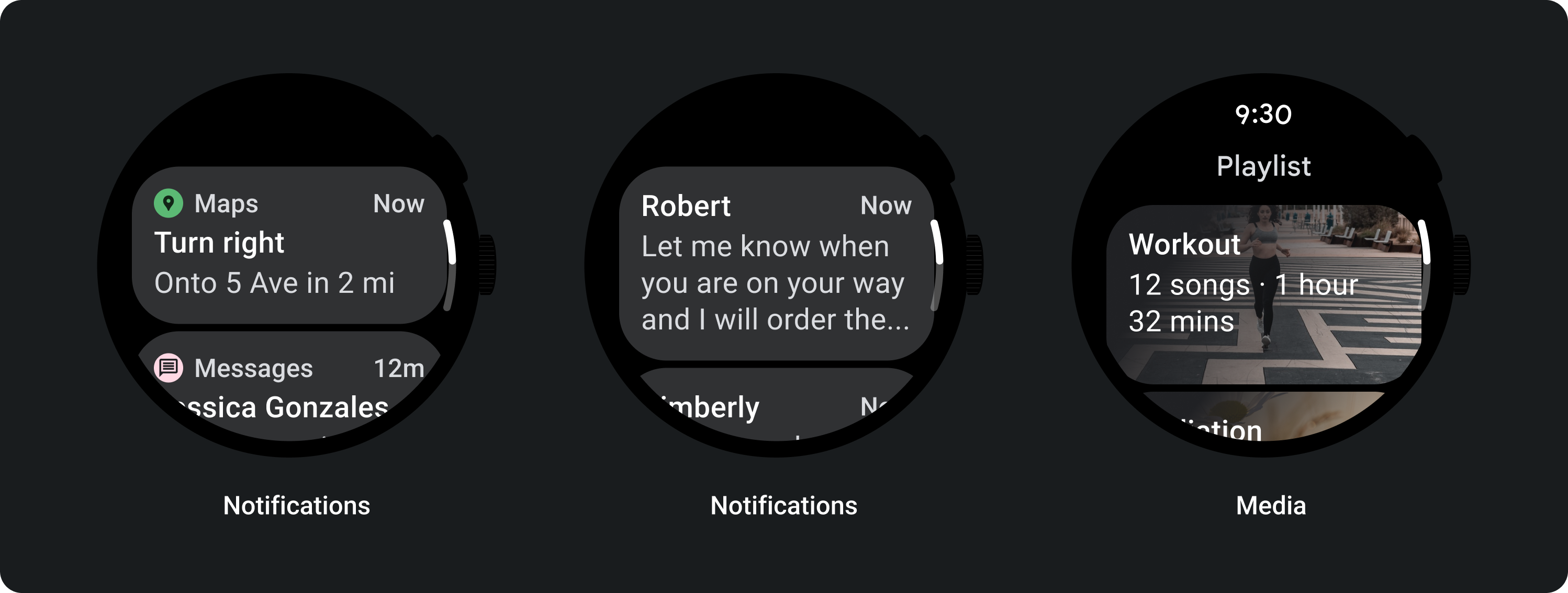
استخدِم بطاقات العناوين لعرض المعلومات داخل التطبيق، مثل رسالة. تحتوي بطاقات العناوين على تخطيط ثلاثي الشرائح يتضمن عنوانًا وحقلًا زمنيًا اختياريًا والمحتوى ذي الصلة، وهو عبارة عن صورة أو نص.
بطاقة التطبيقات
استخدِم بطاقات التطبيقات لعرض عناصر تفاعلية من تطبيقات متعددة. تحتوي بطاقات التطبيق على تخطيط من خمس شرائح يتضمن أيقونة التطبيق، واسم التطبيق، ووقت حدوث النشاط، وعنوان من نوع ما والمحتوى ذي الصلة، وهو إما صورة أو نص.
تدرج البطاقات
تدرج البطاقة
أعلى/يسار + مساحة متروكة بمقدار 68 بكسل مستقل الكثافة من اليسار = سطح بنسبة 100%
الأسفل/الأيمن = 0% من السطح
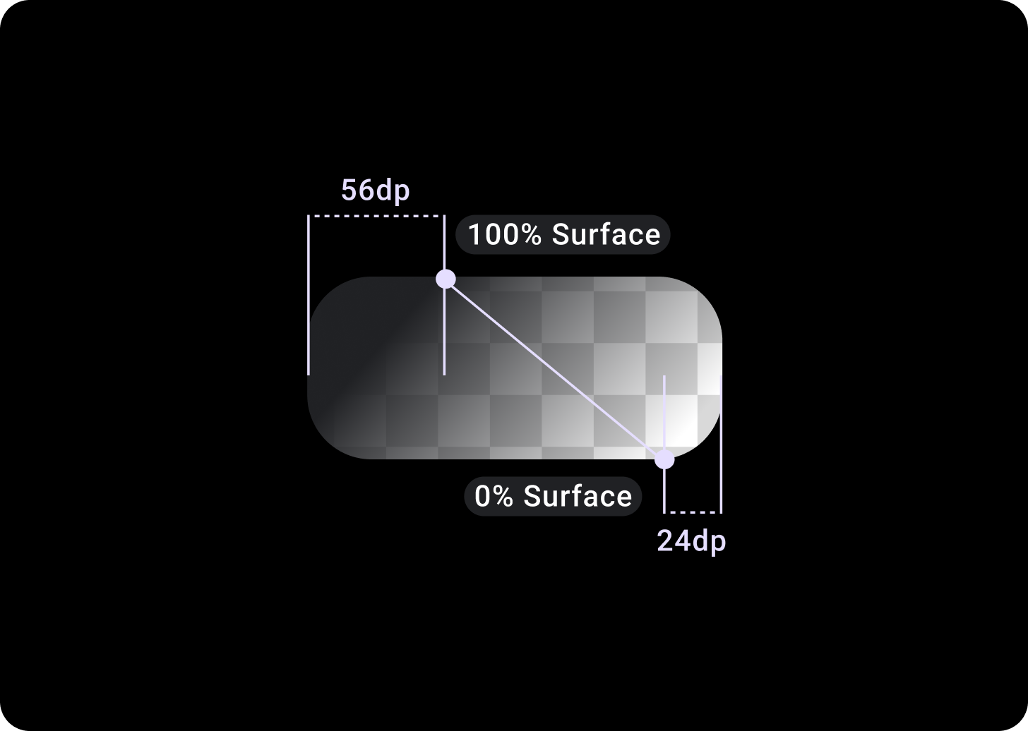
تراكب بطاقة الصور
المساحة المتروكة للأعلى/اليسار + 56 dp من المساحة المتروكة من T/L = 100% من السطح
المساحة السفلية/لليمين + المساحة المتروكة بنسبة 24 dp من B/R = 0% من السطح
(تراكبات متدرجة على خلفية صورة)
الأحجام
عرض البطاقة
يتم ضبط البطاقات تلقائيًا على الحدّ الأقصى لعرض الحاوية.
ارتفاع البطاقة
ارتفاع البطاقة مرن. يتم تحديده من خلال محتوى المكونات.
في خلفيات شاشة الساعة المستديرة، تظهر البطاقات التي يزيد طولها عن 60% من ارتفاع الشاشات.
الاستخدام

التنسيقات التكيُّفية
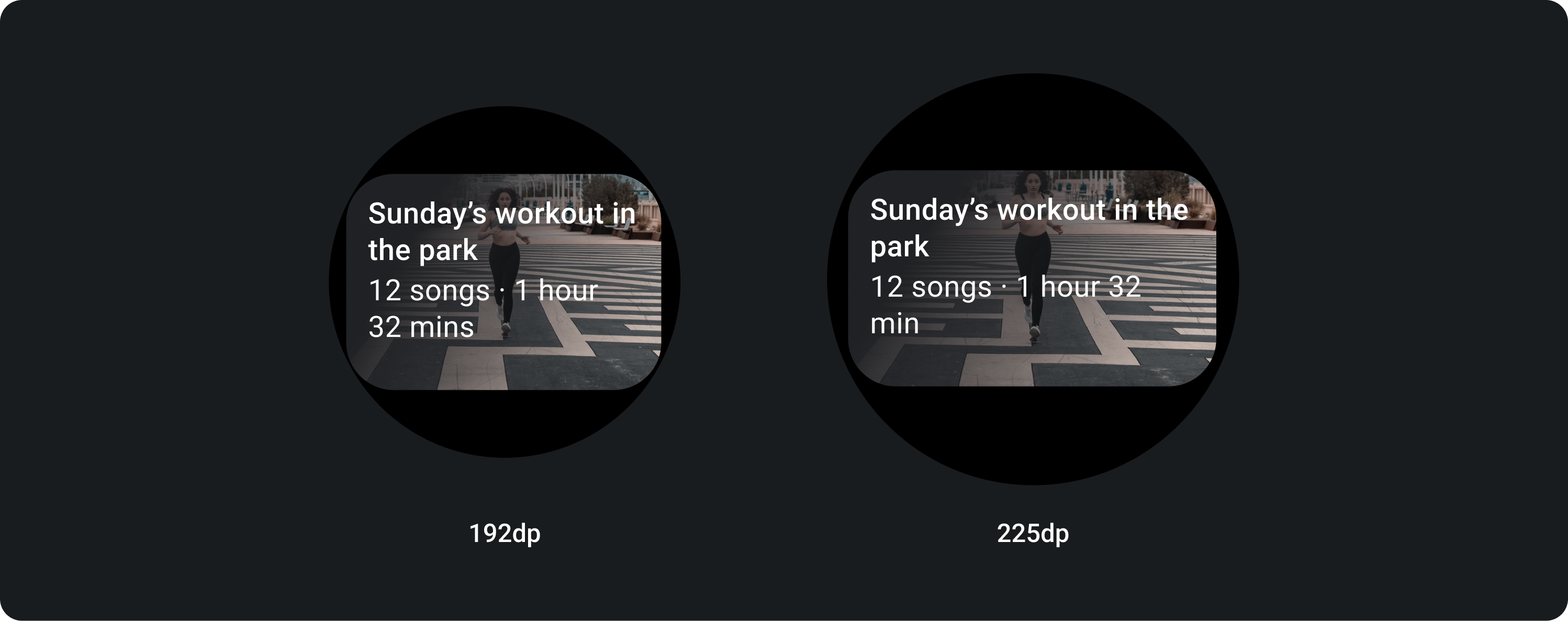
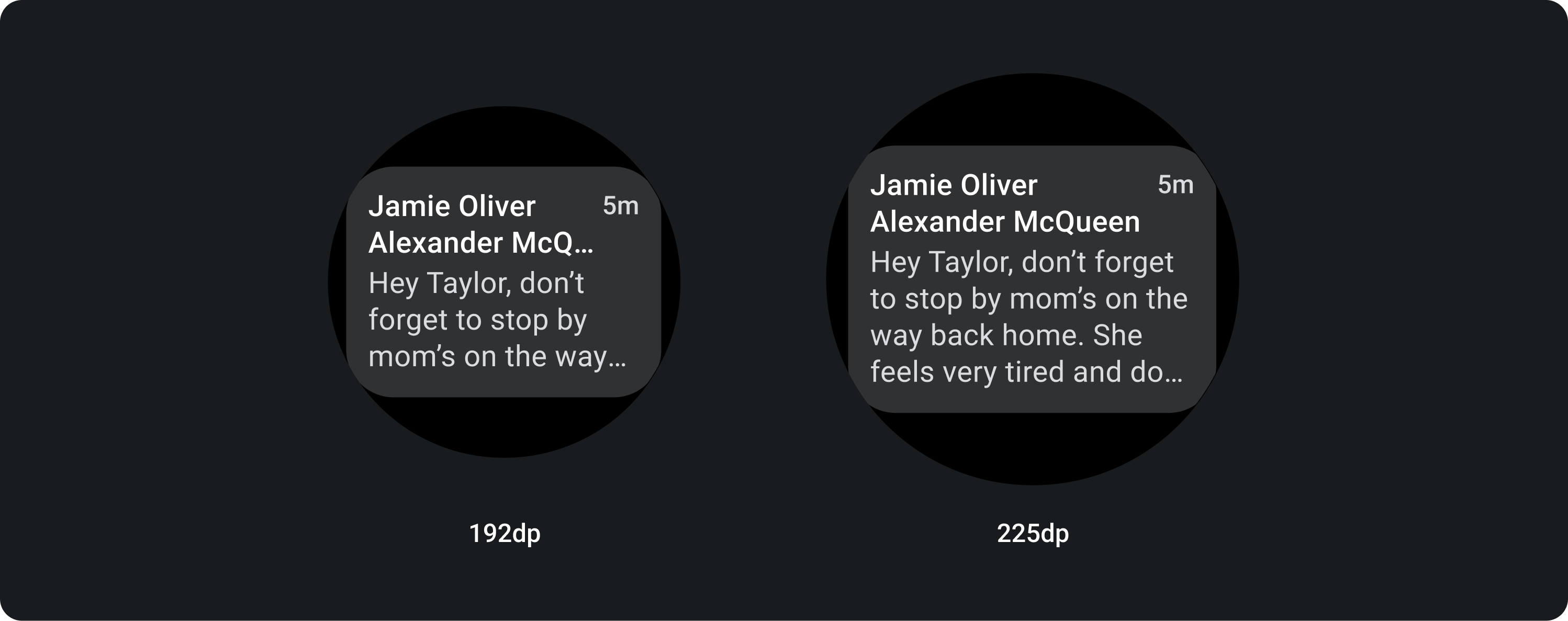
TitleCard
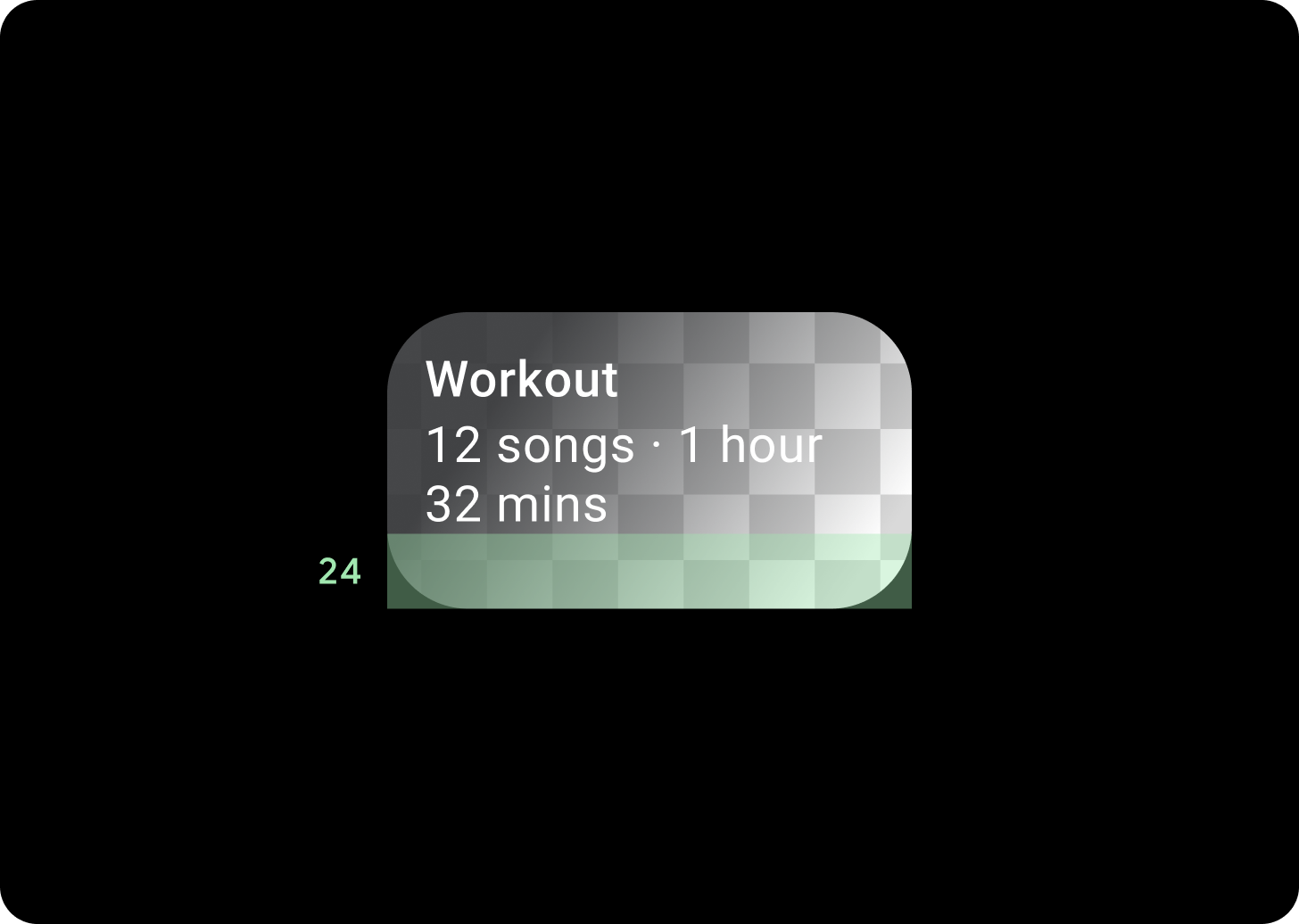
على الشاشات الأكبر حجمًا، نسمح بسطر نص إضافي للنسخة الأساسية. لعرض المزيد من مساحة الصورة، أضِف مساحة متروكة كبيرة بمقدار 24 وحدة بكسل مستقلة الكثافة في الجزء السفلي.

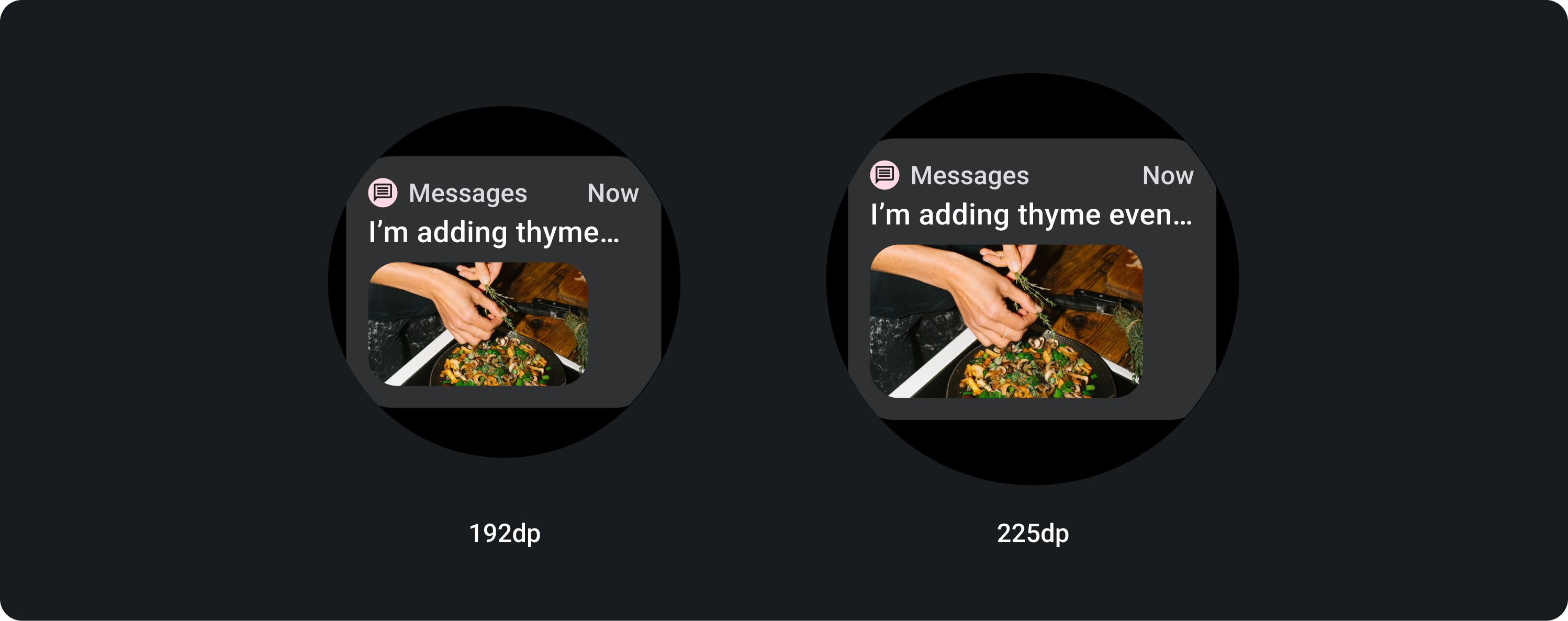
TitleCard مع صورة مضمّنة (استبدال خانة النص الأساسي)
في الشاشات الأكبر حجمًا، لا تتغيّر نسبة العرض إلى الارتفاع للصورة، ويتم ترك مساحة متروكة على اليمين كي لا يكون ارتفاع البطاقة كبيرًا جدًا.

بطاقات بتخصيص إضافي
بطاقة ذات خلفية صورة
من أجل تحقيق هذا التخطيط، ستحتاج إلى التخصيص.
تعرض بطاقات الصور المحتوى المرتبط بموضوع واحد مع استخدام صورة خلفية. يمكن لبطاقات الصور أيضًا عرض صور مستقلة.
يُنصح بزيادة المساحة المتروكة السفلية إلى 24 dp لعرض المزيد من صورة الخلفية بدون نص فوقها.

يخضع كل من المحتوى وعيّنات التعليمات البرمجية في هذه الصفحة للتراخيص الموضحّة في ترخيص استخدام المحتوى. إنّ Java وOpenJDK هما علامتان تجاريتان مسجَّلتان لشركة Oracle و/أو الشركات التابعة لها.
تاريخ التعديل الأخير: 2025-07-27 (حسب التوقيت العالمي المتفَّق عليه)
[[["يسهُل فهم المحتوى.","easyToUnderstand","thumb-up"],["ساعَدني المحتوى في حلّ مشكلتي.","solvedMyProblem","thumb-up"],["غير ذلك","otherUp","thumb-up"]],[["لا يحتوي على المعلومات التي أحتاج إليها.","missingTheInformationINeed","thumb-down"],["الخطوات معقدة للغاية / كثيرة جدًا.","tooComplicatedTooManySteps","thumb-down"],["المحتوى قديم.","outOfDate","thumb-down"],["ثمة مشكلة في الترجمة.","translationIssue","thumb-down"],["مشكلة في العيّنات / التعليمات البرمجية","samplesCodeIssue","thumb-down"],["غير ذلك","otherDown","thumb-down"]],["تاريخ التعديل الأخير: 2025-07-27 (حسب التوقيت العالمي المتفَّق عليه)"],[],[],null,["# Cards\n\nThe [Card](/reference/kotlin/androidx/wear/compose/material/package-summary#Card(kotlin.Function0,androidx.compose.ui.Modifier,androidx.compose.ui.graphics.painter.Painter,androidx.compose.ui.graphics.Color,kotlin.Boolean,androidx.compose.foundation.layout.PaddingValues,androidx.compose.ui.graphics.Shape,androidx.compose.foundation.interaction.MutableInteractionSource,androidx.compose.ui.semantics.Role,kotlin.Function1)) component contains content and actions about a single subject.\n\nAnatomy\n-------\n\nA card component only has a single slot. Cards can contain icons, images or labels, are customizable.\n\nBy default, cards are rectangular with rounded corners and a gradient background. Set the maximum height of your card to 60% to ensure that it's fully displayed on the screen because circular displays can clip up to 20% of the top and bottom of the screen.\n\n\u003cbr /\u003e\n\n\u003cbr /\u003e\n\n**Title Card**\n\nUse [Title cards](/reference/kotlin/androidx/wear/compose/material/package-summary#TitleCard(kotlin.Function0,kotlin.Function1,androidx.compose.ui.Modifier,kotlin.Boolean,kotlin.Function1,androidx.compose.ui.graphics.painter.Painter,androidx.compose.ui.graphics.Color,androidx.compose.ui.graphics.Color,androidx.compose.ui.graphics.Color,kotlin.Function1)) to show information within an application, such as a message. Title cards have a three-slot layout which includes a title, an optional time field, and the relevant content, which is either an image or text. \n**App Card**\n\nUse [App cards](/reference/kotlin/androidx/wear/compose/material/package-summary#AppCard(kotlin.Function0,kotlin.Function1,kotlin.Function1,kotlin.Function1,androidx.compose.ui.Modifier,kotlin.Boolean,kotlin.Function1,androidx.compose.ui.graphics.painter.Painter,androidx.compose.ui.graphics.Color,androidx.compose.ui.graphics.Color,androidx.compose.ui.graphics.Color,androidx.compose.ui.graphics.Color,kotlin.Function1)) to show interactive elements from multiple applications. App cards have a five-slot layout that includes an application icon, the application name, the time that the activity occurred, a title of some sort and the relevant content, which is either an image or text.\n\n\u003cbr /\u003e\n\n\u003cbr /\u003e\n\nCards gradient\n--------------\n\n**Card Gradient**\n\nTop/Left + 68dp padding from Left = 100% Surface \n\nBottom/Right = 0% Surface\n\n\u003cbr /\u003e\n\n\u003cbr /\u003e\n\n**Image Card Overlay**\n\nTop/Left + 56 dp padding from T/L = 100% Surface \n\nBottom/Right + 24 dp padding from B/R = 0% Surface \n\n(Gradient overlays on a image background)\n\n\u003cbr /\u003e\n\n\u003cbr /\u003e\n\nSizes\n-----\n\n**Card width**\n\nCards default to the maximum width of the container.\n\n\u003cbr /\u003e\n\n**Card height**\n\n\u003cbr /\u003e\n\nCard height is flexible. It is determined by the components' content.\n\nOn round watch faces, cards that are taller than 60% of the height of the screens are clipped.\n\n\u003cbr /\u003e\n\n\u003cbr /\u003e\n\nUsage\n-----\n\nAdaptive layouts\n----------------\n\n**TitleCard**\n\nOn larger screens we allow an extra line of text for body copy. And in order to display more of the image, add an enlarged 24 dp padding at the bottom.\n\n**TitleCard with in-line image (replacing the body copy slot)**\n\nOn larger screens, the image doesn't change its aspect ratio and has the padding on the right in order to not make the height of the card too big.\n\n### Cards with additional customization\n\n**Card with an image background** \nIn order to achieve this layout you will need customization. \n\n\nImage cards display content relating to a single topic with a background image. Image cards can also display standalone images. \n\n\nIt is recommended that the bottom padding is increased to 24 dp in order to display more of the background image without text over it.\n\n\u003cbr /\u003e\n\n\u003cbr /\u003e"]]