संग्रह की मदद से व्यवस्थित रहें
अपनी प्राथमिकताओं के आधार पर, कॉन्टेंट को सेव करें और कैटगरी में बांटें.
Material 3 Expressive, शेप लैंग्वेज का इस्तेमाल ज़्यादा बेहतर और ज़्यादा मायने में करता है. इसके लिए, यह कंटेनर के फ़्लेक्सिबल शेप का इस्तेमाल करता है, ताकि कॉर्नर के रेडियस को गोल और शार्प किया जा सके. इससे शेप मॉर्फ़िंग लिस्ट और बटन की स्थितियों को बेहतर बनाया जा सकता है.
इस डिज़ाइन सिस्टम में, Wear OS पर मौजूद गोल डिवाइसों के लिए, किनारे से चिपके हुए बटन भी पेश किए गए हैं. ये बटन, आइकॉनिक और मालिकाना हक वाले डिज़ाइन पैटर्न के तौर पर उपलब्ध हैं.
यूज़र इंटरफ़ेस (यूआई) एलिमेंट की स्केलिंग को बनाए रखना
गोल स्क्रीन पर लेआउट डिज़ाइन करते समय, स्क्रोल करने और स्क्रोल न करने वाले व्यू, दोनों के लिए यूज़र इंटरफ़ेस (यूआई) एलिमेंट की स्केलिंग को बनाए रखने की अलग-अलग ज़रूरतें होती हैं. साथ ही, संतुलित लेआउट और कंपोज़िशन को बनाए रखने की भी अलग-अलग ज़रूरतें होती हैं.
स्क्रोल करने वाले व्यू
स्क्रोल करने वाले व्यू के लिए, सभी टॉप, बॉटम, और साइड मार्जिन तय करने के लिए प्रतिशत का इस्तेमाल करें. इससे क्लिपिंग से बचा जा सकता है और एलिमेंट को ज़रूरत के हिसाब से स्केल किया जा सकता है.
ऊपर, नीचे, और साइड के सभी मार्जिन को प्रतिशत में तय किया जाना चाहिए, ताकि क्लिपिंग से बचा जा सके और एलिमेंट को ज़रूरत के हिसाब से स्केल किया जा सके.
ऐसे व्यू जिन्हें स्क्रोल नहीं किया जा सकता
स्क्रोल न किए जा सकने वाले व्यू के लिए, सभी मार्जिन के लिए प्रतिशत और वर्टिकल कंस्ट्रेंट का इस्तेमाल करें. इस तरह, बीच में मौजूद मुख्य कॉन्टेंट को उपलब्ध जगह के हिसाब से बढ़ाया जा सकता है.
सभी मार्जिन को प्रतिशत में तय किया जाना चाहिए. साथ ही, वर्टिकल कंस्ट्रेंट को इस तरह से तय किया जाना चाहिए कि बीच में मौजूद मुख्य कॉन्टेंट, उपलब्ध जगह को भरने के लिए स्ट्रेच हो सके.
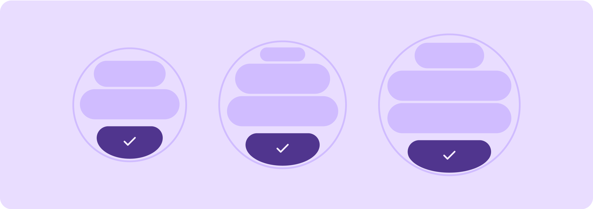
क्वालिटी के लिए दिशा-निर्देशों के टियर
क्वालिटी के लिए बने हमारे दिशा-निर्देशों को तीन टियर में बांटा गया है. तीनों टियर में दिए गए दिशा-निर्देशों का पालन करके, अपने उपयोगकर्ताओं को सबसे अच्छा अनुभव दें.
सभी स्क्रीन साइज़ के लिए तैयार
पक्का करें कि आपका ऐप्लिकेशन, सभी स्क्रीन साइज़ पर बेहतर अनुभव दे रहा हो.
ऐसे लेआउट बनाएं जो ऐप्लिकेशन के उपलब्ध स्पेस का पूरा इस्तेमाल करें.
रिस्पॉन्सिव और ऑप्टिमाइज़ किया गया
उपयोगकर्ताओं को उन डिवाइसों पर ज़्यादा कॉन्टेंट दिखाएं जिन पर ऐसा किया जा सकता है. साथ ही, रिस्पॉन्सिव लेआउट का इस्तेमाल करें. ये लेआउट, अलग-अलग स्क्रीन साइज़ के हिसाब से अपने-आप अडजस्ट हो जाते हैं.
ज़रूरत के हिसाब से और अलग-अलग
ब्रेकपॉइंट का इस्तेमाल करके, बड़ी स्क्रीन पर ज़्यादा से ज़्यादा जगह का फ़ायदा पाएं. इससे बड़ी स्क्रीन पर नए और बेहतर अनुभव दिए जा सकते हैं. ऐसा छोटी स्क्रीन वाले डिवाइसों पर नहीं किया जा सकता.
इस पेज पर मौजूद कॉन्टेंट और कोड सैंपल कॉन्टेंट के लाइसेंस में बताए गए लाइसेंस के हिसाब से हैं. Java और OpenJDK, Oracle और/या इससे जुड़ी हुई कंपनियों के ट्रेडमार्क या रजिस्टर किए हुए ट्रेडमार्क हैं.
आखिरी बार 2025-07-26 (UTC) को अपडेट किया गया.
[[["समझने में आसान है","easyToUnderstand","thumb-up"],["मेरी समस्या हल हो गई","solvedMyProblem","thumb-up"],["अन्य","otherUp","thumb-up"]],[["वह जानकारी मौजूद नहीं है जो मुझे चाहिए","missingTheInformationINeed","thumb-down"],["बहुत मुश्किल है / बहुत सारे चरण हैं","tooComplicatedTooManySteps","thumb-down"],["पुराना","outOfDate","thumb-down"],["अनुवाद से जुड़ी समस्या","translationIssue","thumb-down"],["सैंपल / कोड से जुड़ी समस्या","samplesCodeIssue","thumb-down"],["अन्य","otherDown","thumb-down"]],["आखिरी बार 2025-07-26 (UTC) को अपडेट किया गया."],[],[],null,["# Design quality tiers\n\nMaterial 3 Expressive leans into shape language in a much more expansive and\nmeaningful way by utilizing flexible container shapes to apply rounding and\nsharpening of corner radii to support shape morphing lists and button states.\nThe design system also introduces edge-hugging buttons as an ownable and iconic\ndesign pattern for round devices on Wear OS.\n\nMaintain UI element scaling\n---------------------------\n\nWhen designing layouts on a round screen, scrolling and non-scrolling\nviews each have unique requirements to maintain UI element scaling and preserve\na balanced layout and composition.\n\n\n**Scrolling views**\n\nFor scrolling views, use percentages to define all top, bottom, and side\nmargins to avoid clipping and provide proportional scaling of elements.\n\nAll top, bottom, and side margins should be defined in percentages to avoid\nclipping and provide proportional scaling of elements. \n**Non-scrolling views**\n\nFor non-scrolling views, use percentages and vertical constraints for all\nmargins. That way, the main content in the middle can stretch to fill the\navailable area.\n\nAll margins should be defined in percentages and vertical constraints should be\ndefined such that the main content in the middle can stretch to fill the\navailable area.\n\n\u003cbr /\u003e\n\nTiers of quality guidelines\n---------------------------\n\nOur quality guidelines are organized into three tiers. Enable the best possible\nexperience for your users by meeting guidelines in all three tiers.\n\n\n**Ready for all screen sizes**\n\nEnsure your app is delivering a quality experience across all screen sizes.\nCreate layouts that fully use the available app space. \n\n**Responsive and optimized**\n\nDeliver more content to users on devices which allow for it, and utilize\nresponsive layouts that automatically adapt to different screen sizes. \n\n**Adaptive and differentiated**\n\nMake the most of additional real estate by utilizing breakpoints to offer\npowerful new experiences on larger screens which are not possible on devices\nwith smaller screens.\n\n\u003cbr /\u003e\n\n| **Caution:** A larger display size should *never* display less information than ones that are smaller than it, this is especially relevant for custom behaviors added in at the breakpoint. A common example of this is when components or text sizes are increased past the breakpoint and end up showing less are the larger screens. Screens should always show \"more value\" and never \"less value\" with increasing size."]]
