Smartwatches have smaller screen sizes than handheld devices, so it's critical to arrange and display elements in a manner that users can access and that efficiently uses the available screen space. To help your items fit the screen, use the correct amount of padding and margins as specified by the Material guidelines.
Even when your design fits the screen, elements of your interface may be truncated or clipped when the user does one of the following:
- Changes the display language.
- Changes the text size.
- Enables the Bold text system setting.
It's crucial to test your designs with these considerations in mind to ensure they adapt seamlessly to different user environments.
Keep interactive elements fully visible
If your interface includes interactive elements, check that users can scroll
these elements fully into view, especially if these elements are placed at the
edges of a page. If your app uses the Horologist library, use the
responsive() layout factory. Otherwise, use spacers and add margins to
the top and bottom of a ScalingLazyColumn object to prevent the first and
last list items from always being clipped.
Use chips instead of cards for dense layouts
If you need a denser layout, use CompactChip instead of cards. The larger
surface area of cards makes it much more difficult to prevent text truncation
and content clipping.
Consider screen size effects on truncation and clipping
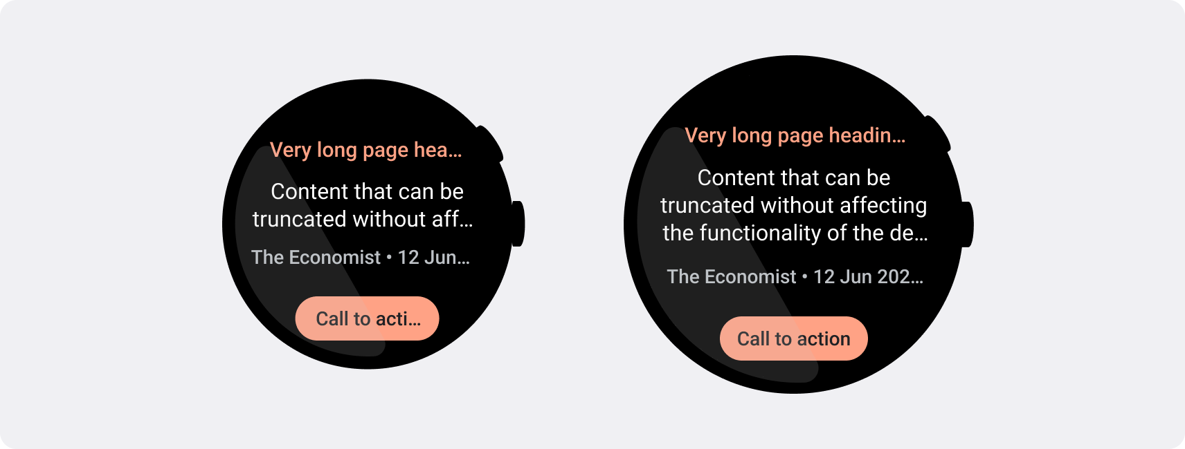
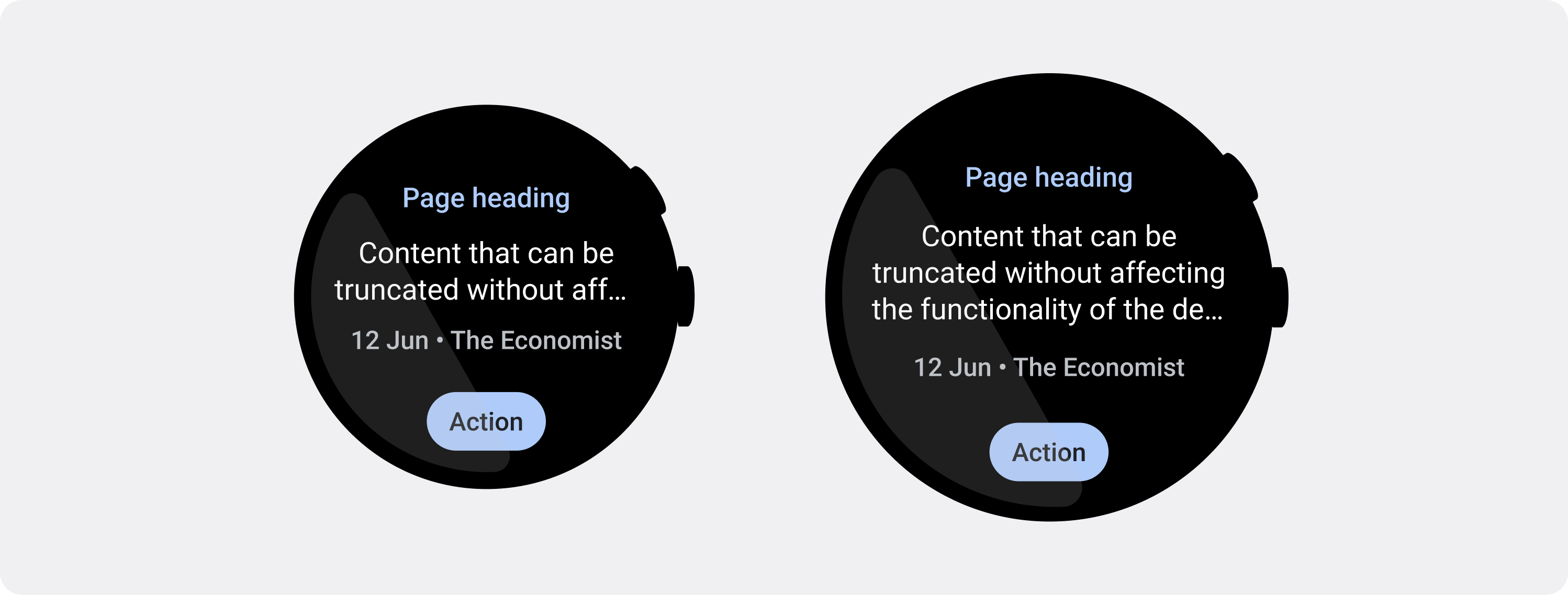
Depending on the Wear OS device's screen size, you have a smaller or larger space for additional text and buttons to be visible:
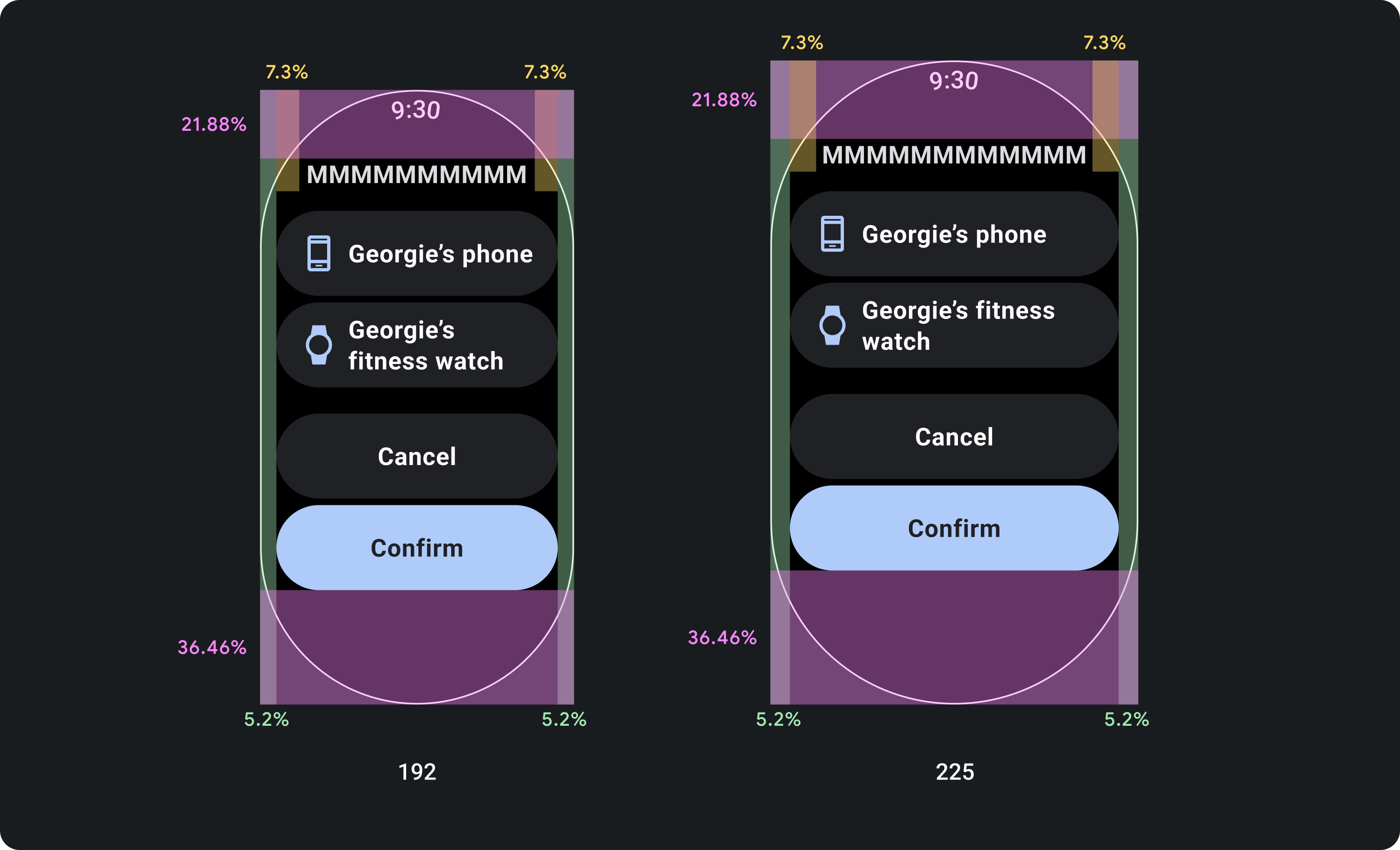
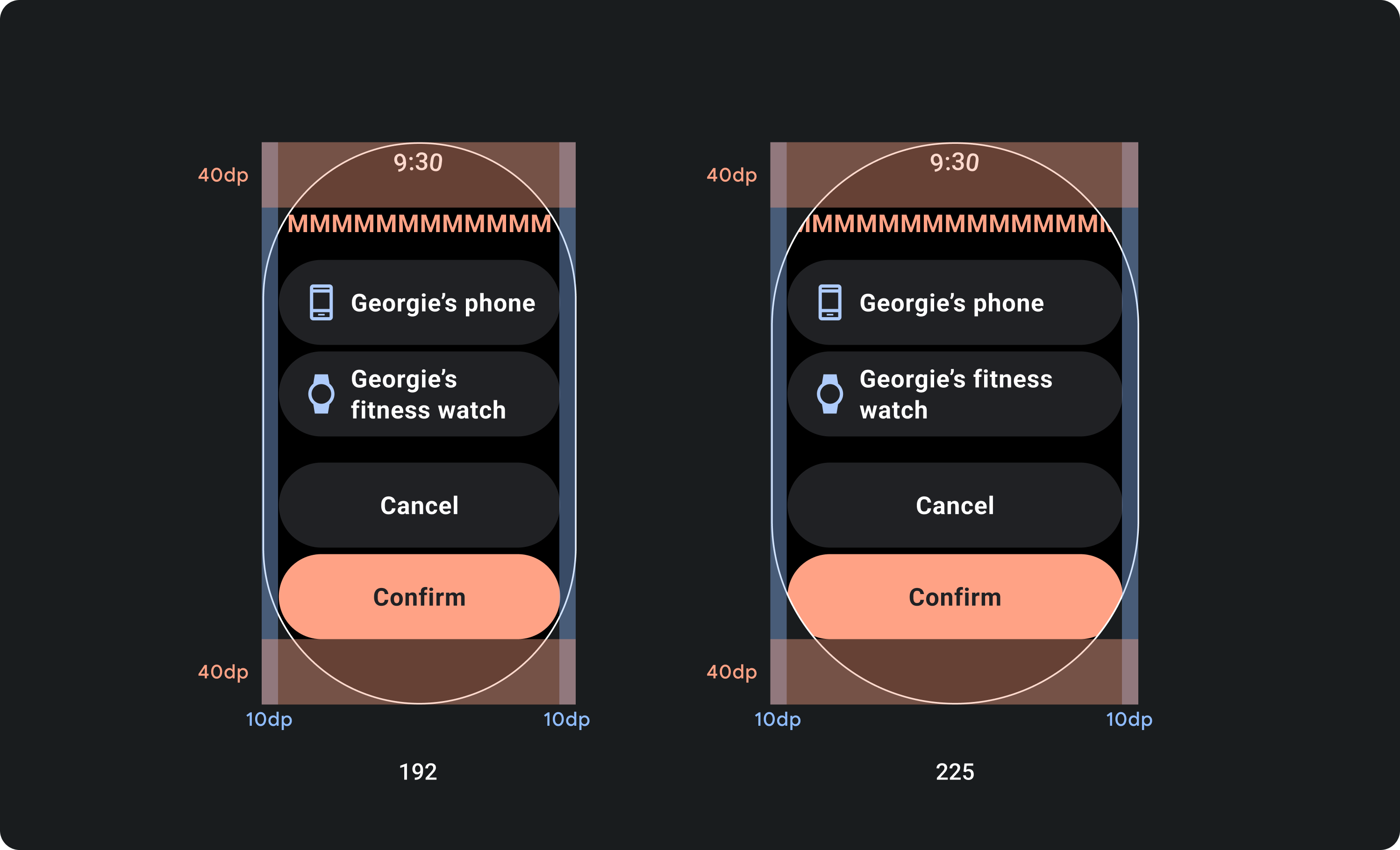
Design for percentage margins, not fixed margins
To create content that adapts responsively to the Wear OS device's screen size, apply percentage margins, where the size of each margin is relative to the screen size. In cases where items sit on the top or bottom of the screen, apply additional inner padding to minimize content clipping from the screen's curved edge. In contrast, the space at the top and bottom increases when a group of content is small enough to fit on one screen.
Do
Don't
Use the character limits required by smaller screens
In most cases, larger screens can show more text and content before truncation. Even though more horizontal space might be available, however, always design for the smallest screen size to create a consistent experience across devices.
For example, a button may have space for more characters on a larger screen before truncation, but if it's an important call to action that is vital to the user experience, then use text that's short enough to appear entirely, without truncating, on a small device's screen.
Alternatively, if the tile shows variable content, such as text fetched from a server, plan for the possibility that this text is truncated on smaller screens.
Do