시계 화면
컬렉션을 사용해 정리하기
내 환경설정을 기준으로 콘텐츠를 저장하고 분류하세요.
시계 화면은 사용자가 스마트시계를 확인할 때 상호작용하는 첫 번째 표시 경로이자 Wear OS에서 가장 많이 사용되는 표시 경로입니다. 사용자는 자신의 스타일이나 필요에 맞게 시계 화면을 맞춤설정할 수 있습니다.

UX 원칙
다음 섹션에서는 시계 화면을 만들 때 유의해야 할 원칙을 설명합니다.
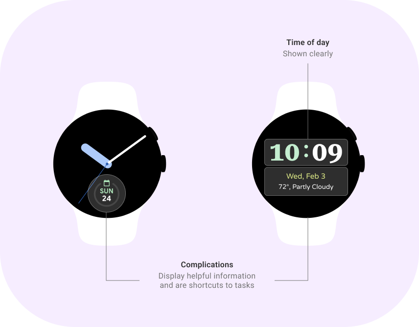
시간 안내 |
표현력 |
유용성 |
시계 화면의 주된 목적은 시간 안내입니다. 사람들은 하루 평균 150번씩 시간을 확인합니다. 화면에서 시간이 눈에 잘 띄어야 합니다. |
시계 화면은 사용자가 자신의 개성과 스타일을 표현할 수 있는 특별한 방법을 제공합니다. 시계 화면 디자인을 다양하게 제공하고 맞춤설정을 지원하세요. |
시계 화면은 사용자가 중요한 정보를 한눈에 확인할 수 있는 기능을 제공합니다. 사용자가 원하는 정보를 볼 수 있도록 시계 화면에서 정보 표시를 사용하세요. |
가이드라인
시계 화면은 모든 시계의 핵심 경험입니다. 시계 화면을 설계할 때는 사용자의 마음을 사로잡을 고유한 시계 화면을 유연하게 만들 수 있습니다. 다음 가이드라인에 유의하세요.
 |
한눈에 확인할 수 있도록 만들기
선명한 글꼴, 눈에 잘 띄는 아이콘, 단순한 레이아웃으로 시계 화면을 한눈에 확인할 수 있도록 만듭니다. 이렇게 하면 사용자가 중요한 정보에 빠르게 액세스할 수 있습니다.
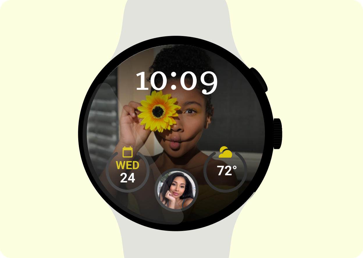
|
 |
정보 표시 포함
정보 표시는 중요한 정보에 빠르게 액세스할 수 있게 해 주며 사용자에게 유용한 정보를 표시하도록 맞춤설정할 수 있습니다.
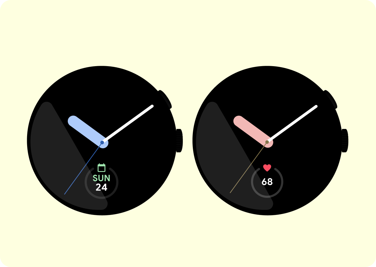
|
 |
맞춤설정 지원
시계 화면에서 색상, 맞춤설정 가능한 침, 정보 표시와 같은 맞춤설정 옵션을 제공합니다. 이를 통해 사용자는 자신의 스타일과 기능 요구사항에 따라 스마트시계를 맞춤설정할 수 있고, 이 과정에서 시계 화면의 미적인 매력과 실용성이 향상됩니다.
|
 |
검은색을 사용합니다.
시계의 배터리 수명을 절약하는 데 도움이 되는 검은색을 기본 색상으로 사용합니다. 검은색은 다목적이면서도 중립적이기 때문에 다른 디자인 요소를 눈에 띄게 만들어 주기도 합니다.
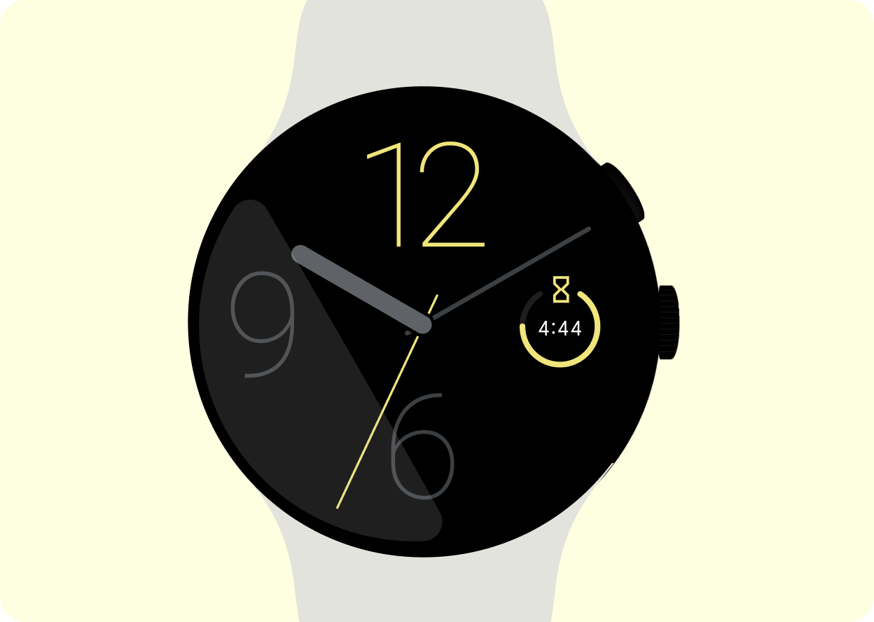
|
 |
베젤을 벗어나지 않기
디자인이 깔끔하고 필수 요소가 잘리거나 베젤에 가려지지 않도록 시계 화면이 스마트시계의 베젤을 벗어나지 않게 설계합니다.
|
전력 고려사항
단순한 그래픽, 어두운 배경, 최적화된 코드를 사용하여 배터리 수명을 절약하는 시계 화면을 설계합니다. 이렇게 하면 사용자 환경이 개선되고 배터리가 더 오래 유지됩니다.
모든 시계 화면에는 두 가지 모드가 있습니다.
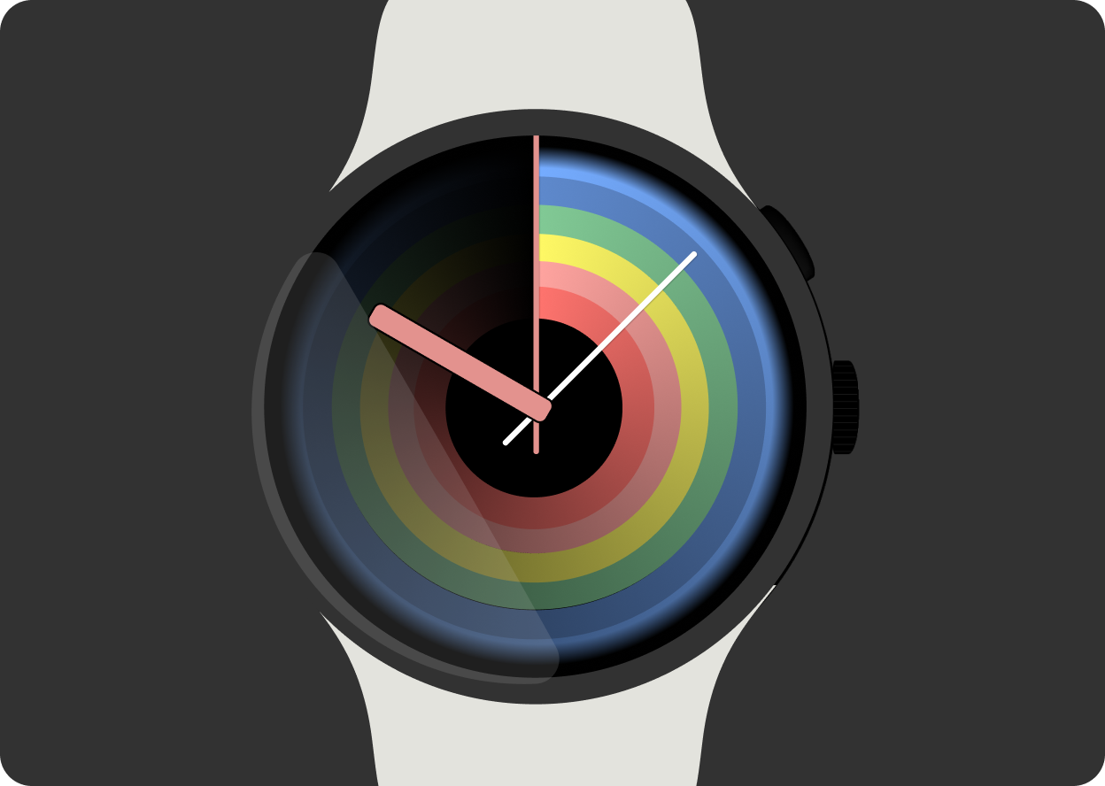
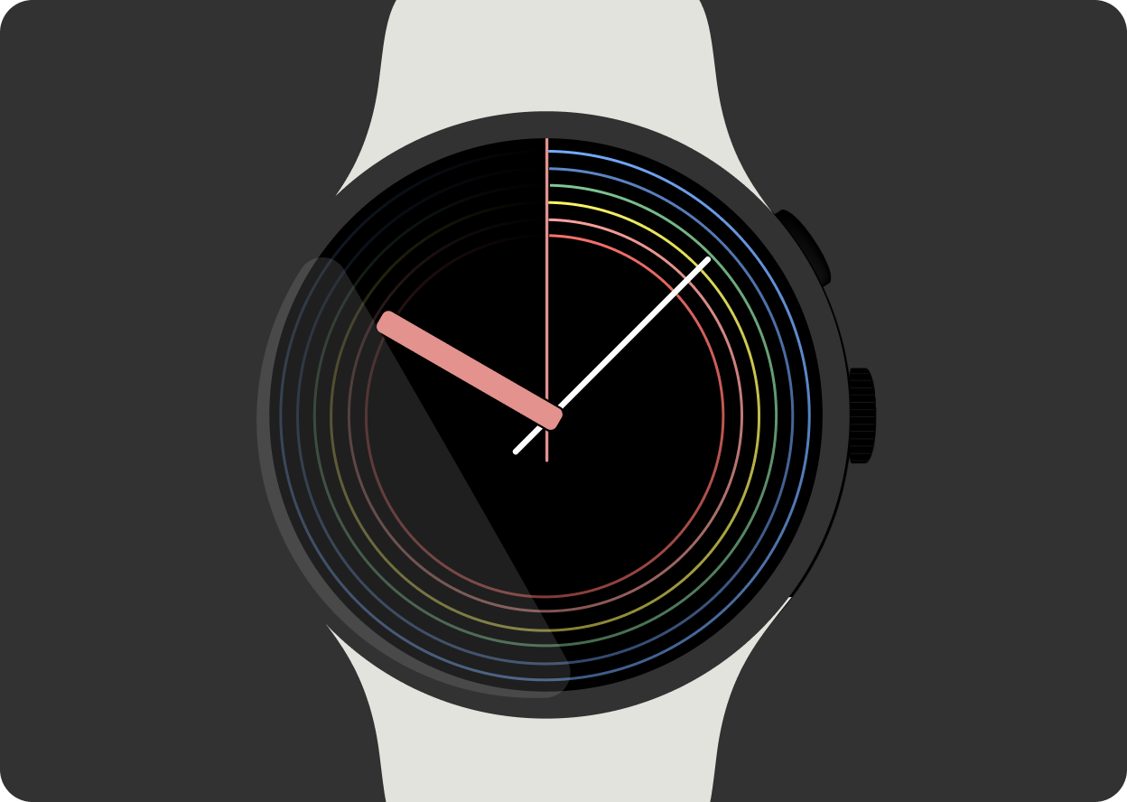
 |
 |
상호작용
사용자가 시계와 상호작용할 때 표시되는 시계 화면입니다.
|
AOD (항상 켜져 있는 화면)
사용자가 시계와 상호작용하지 않을 때 표시되는 시계 화면입니다. AoD 시계 화면은 배터리 수명을 절약하기 위해 시계 화면의 픽셀 중 15% 이하를 밝혀야 합니다.
|
시계 화면에 관한 자세한 내용은 시계 화면 빌드를 참고하세요.
이 페이지에 나와 있는 콘텐츠와 코드 샘플에는 콘텐츠 라이선스에서 설명하는 라이선스가 적용됩니다. 자바 및 OpenJDK는 Oracle 및 Oracle 계열사의 상표 또는 등록 상표입니다.
최종 업데이트: 2025-07-27(UTC)
[[["이해하기 쉬움","easyToUnderstand","thumb-up"],["문제가 해결됨","solvedMyProblem","thumb-up"],["기타","otherUp","thumb-up"]],[["필요한 정보가 없음","missingTheInformationINeed","thumb-down"],["너무 복잡함/단계 수가 너무 많음","tooComplicatedTooManySteps","thumb-down"],["오래됨","outOfDate","thumb-down"],["번역 문제","translationIssue","thumb-down"],["샘플/코드 문제","samplesCodeIssue","thumb-down"],["기타","otherDown","thumb-down"]],["최종 업데이트: 2025-07-27(UTC)"],[],[],null,["# Watch faces\n\nA watch face is the first surface users interact with when they check their\nsmartwatch and the most used surface of Wear OS. Users can customize their\nwatch face to their style or for their needs.\n\nUX Principles\n-------------\n\nThe following sections describe principles to keep in mind when creating\nwatch faces.\n\n|-----------------------------------------------------------------------------------------------------------------------------------------------------------------|------------------------------------------------------------------------------------------------------------------------------------------------------------|-----------------------------------------------------------------------------------------------------------------------------------------------------------------|\n| Time-telling ------------ | Expressive ---------- | Useful ------ |\n| The purpose of a watch face is foremost to tell the time. On average, people check the time 150 times a day. Ensure that time is highly visible on your screen. | Watch faces provide unique ways for users to express their personality and style. Include variety in your watch face designs and facilitate customization. | Watch faces provide users with the ability to quickly glance at important information. Use complications on the watch face to let users to view what they want. |\n\nGuidelines\n----------\n\nWatch faces are a core experience on every watch. When designing watch faces\nyou have flexibility to create unique watch faces that resonate with users. Keep\nin mind the following guidelines.\n\n|---|-------------------------------------------------------------------------------------------------------------------------------------------------------------------------------------------------------------------------------------------------------------------------------------------------|\n| | **Make glanceable** Make watch faces glanceable with clear fonts, legible icons, and a simple layout. This lets users access important information quickly. |\n| | **Include complications** Complications provide quick access to important information and can be personalized to display what is relevant to the user. |\n| | **Allow for customization** Offer customization options for watch faces such as color ways, customizable hands and complications. This allows users to personalize their smartwatch to their style and functional needs. This enhances the aesthetic appeal and practicality of the watch face. |\n| | **Use the color black** Use black as the primary color as this helps to conserve battery life on your watch. Black is also versatile and neutral, so it allows other design elements to stand out. |\n| | **Stay within the bezel** Design watch faces to fit within the bezel of the smartwatch to ensure a clean appearance and minimize essential elements being cropped or covered by the bezel. |\n\nPower considerations\n--------------------\n\nDesign watch faces to conserve battery life with simple graphics, dark\nbackgrounds, and optimized code. This improves the user experience and allows\nthe battery to last longer.\n\nEvery watch face has two modes.\n\n|-------------------------------------------------------------------------------------------|-------------------------------------------------------------------------------------------------------------------------------------------------------------------------------------------------------------------|\n| | |\n| **Interactive** This is the watch face shown when the user is interacting with the watch. | **Always-on display (AoD)** This is the watch face shown when the users are not interacting with the watch. AoD watch faces must illuminate 15% or less of the pixels on the watch face to conserve battery life. |\n\nFor more information about watch faces, see\n[Build watch faces](/training/wearables/watch-faces)."]]