

다양한 버전의 Android에서 알림이 최상의 상태로 표시되도록 하려면 표준 알림 템플릿을 사용하여 알림을 빌드하세요. 알림에 더 많은 콘텐츠를 제공하려면 확장 가능한 알림 템플릿 중 하나를 사용하는 것이 좋습니다.
하지만 시스템 템플릿이 요구사항을 충족하지 않는 경우 알림에 자체 레이아웃을 사용할 수 있습니다.
콘텐츠 영역의 맞춤 레이아웃 만들기
맞춤 레이아웃이 필요한 경우
NotificationCompat.DecoratedCustomViewStyle을 알림에 적용할 수 있습니다. 이 API를 사용하면 알림 아이콘, 타임스탬프, 하위 텍스트, 작업 버튼에 시스템 장식을 계속 사용하면서 일반적으로 제목과 텍스트 콘텐츠가 차지하는 콘텐츠 영역에 맞춤 레이아웃을 제공할 수 있습니다.
이 API는 다음과 같이 기본 알림 레이아웃을 기반으로 빌드하여 확장 가능한 알림 템플릿과 유사하게 작동합니다.
- 기본 알림을(를)
NotificationCompat.Builder을(를) 사용하여 빌드합니다. setStyle()을 호출하여NotificationCompat.DecoratedCustomViewStyle의 인스턴스를 전달합니다.- 맞춤 레이아웃을
RemoteViews의 인스턴스로 확장합니다. setCustomContentView()를 호출하여 축소된 알림의 레이아웃을 설정합니다.- 선택적으로
setCustomBigContentView()를 호출하여 확장된 알림의 다른 레이아웃을 설정할 수도 있습니다.
레이아웃 준비
small 및 large 레이아웃이 필요합니다. 이 예에서 small 레이아웃은 다음과 같이 표시될 수 있습니다.
<LinearLayout xmlns:android="http://schemas.android.com/apk/res/android" android:layout_width="match_parent" android:layout_height="wrap_content" android:orientation="vertical"> <TextView android:id="@+id/notification_title" style="@style/TextAppearance.Compat.Notification.Title" android:layout_width="wrap_content" android:layout_height="0dp" android:layout_weight="1" android:text="Small notification, showing only a title" /> </LinearLayout>
large 레이아웃은 다음과 같이 표시될 수 있습니다.
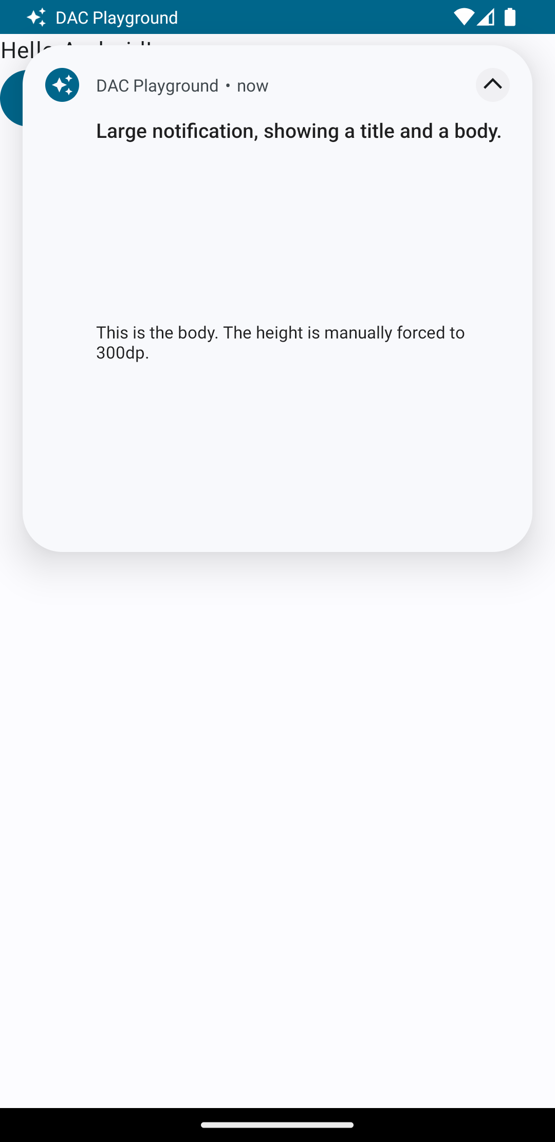
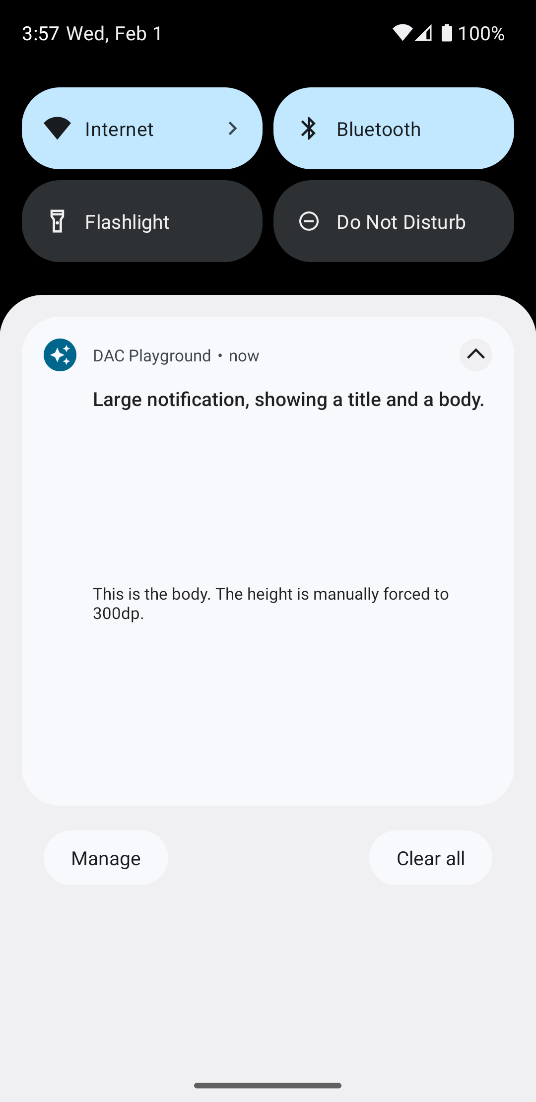
<LinearLayout xmlns:android="http://schemas.android.com/apk/res/android" android:layout_width="match_parent" android:layout_height="300dp" android:orientation="vertical"> <TextView android:id="@+id/notification_title" style="@style/TextAppearance.Compat.Notification.Title" android:layout_width="wrap_content" android:layout_height="wrap_content" android:layout_weight="1" android:text="Large notification, showing a title and a body." /> <TextView android:id="@+id/notification_body" style="@style/TextAppearance.Compat.Notification.Line2" android:layout_width="wrap_content" android:layout_height="wrap_content" android:layout_weight="1" android:text="This is the body. The height is manually forced to 300dp." /> </LinearLayout>
알림 빌드 및 표시
레이아웃이 준비되면 다음 예와 같이 사용할 수 있습니다.
val notificationManager = getSystemService(Context.NOTIFICATION_SERVICE) as NotificationManager // Get the layouts to use in the custom notification. val notificationLayout = RemoteViews(packageName, R.layout.notification_small) val notificationLayoutExpanded = RemoteViews(packageName, R.layout.notification_large) // Apply the layouts to the notification. val customNotification = NotificationCompat.Builder(context, CHANNEL_ID) .setSmallIcon(R.drawable.notification_icon) .setStyle(NotificationCompat.DecoratedCustomViewStyle()) .setCustomContentView(notificationLayout) .setCustomBigContentView(notificationLayoutExpanded) .build() notificationManager.notify(666, customNotification)
알림의 배경 색상은 기기 및 버전에 따라 다를 수 있습니다. 다음 예와 같이 맞춤 레이아웃에서 텍스트에
TextAppearance_Compat_Notification 제목에
TextAppearance_Compat_Notification_Title과 같은 지원 라이브러리 스타일을 적용합니다. 이러한 스타일은 색상 변화에 맞게 조정되므로 검은색 텍스트가 검은색 배경에 표시되거나 흰색 텍스트가 흰색 배경에 표시되는 상황을 방지할 수 있습니다.
<TextView
    android:layout_width="wrap_content"
    android:layout_height="match_parent"
    android:layout_weight="1"
    android:text="@string/notification_title"
    android:id="@+id/notification_title"
    style="@style/TextAppearance.Compat.Notification.Title" />
텍스트가 읽을 수 없게 될 수 있으므로 RemoteViews 객체에 배경 이미지를 설정하지 마세요.
사용자가 앱을 사용하는 동안 알림을 트리거하면 결과는 그림 1과 비슷합니다.
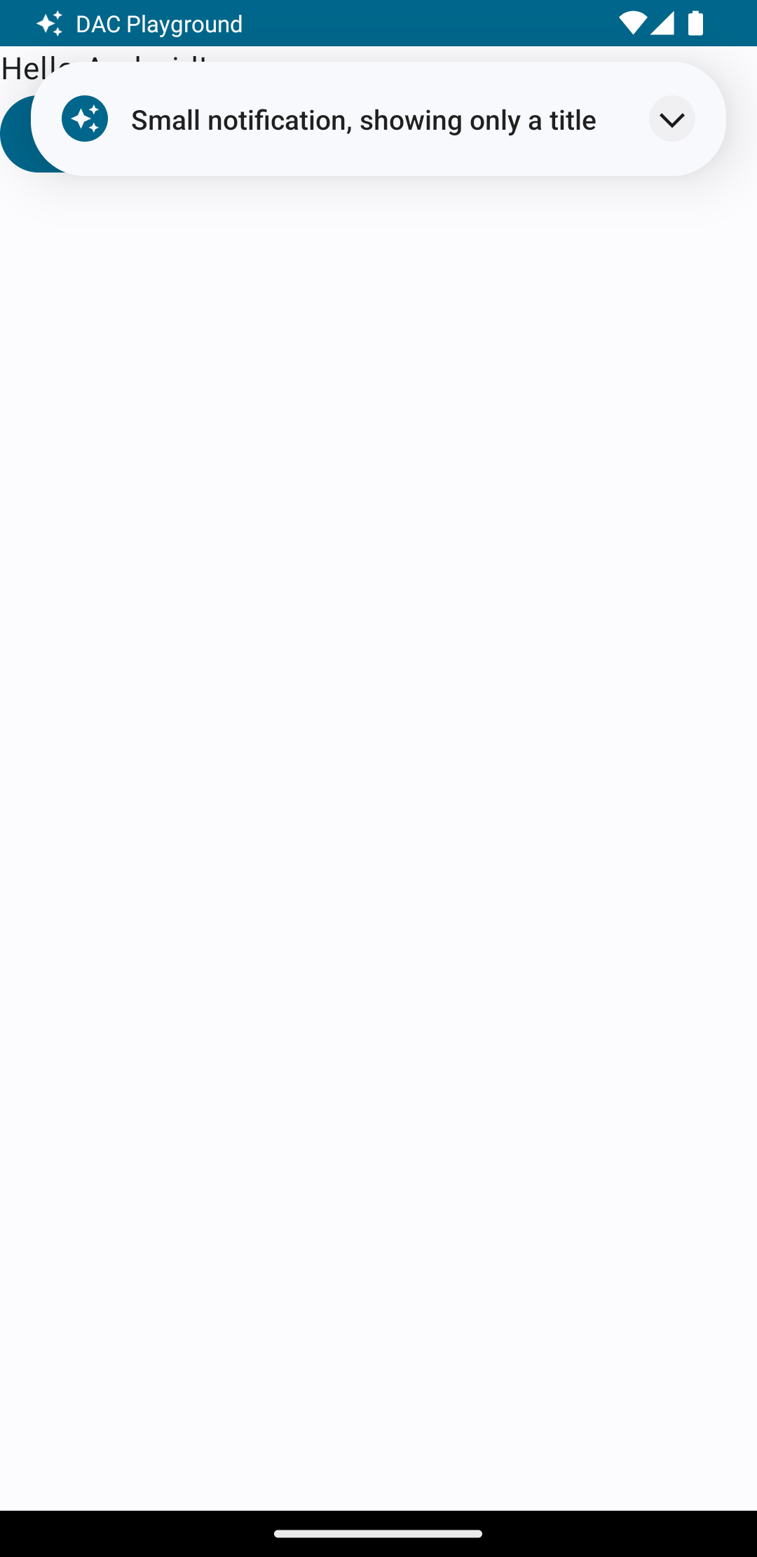
그림 2와 같이 확장기 화살표를 탭하면 알림이 확장됩니다.
알림 제한 시간이 지나면 알림은 그림 3과 같은 시스템 표시줄에만 표시됩니다.
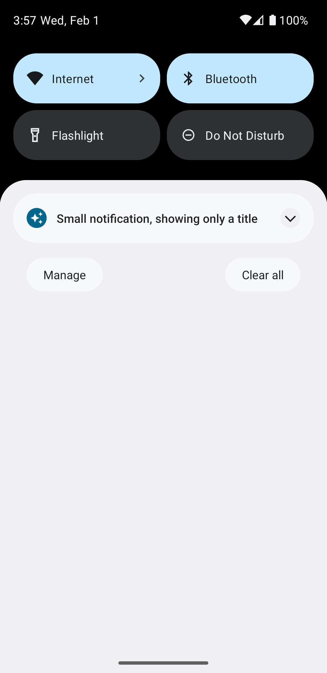
그림 4와 같이 확장기 화살표를 탭하면 알림이 확장됩니다.
완전한 맞춤 알림 레이아웃 만들기
표준 알림
아이콘과 헤더로 알림을 장식하지 않으려면 이전 단계를 따르되 호출하지 마세요 setStyle().