
Xây dựng giao diện người dùng thích ứng bằng ConstraintLayout Một phần của Android Jetpack.
ConstraintLayout cho phép bạn tạo các bố cục lớn, phức tạp bằng một hệ phân cấp chế độ xem phẳng – không có nhóm chế độ xem lồng nhau. Phương thức này tương tự như RelativeLayout ở chỗ tất cả thành phần hiển thị được bố trí theo mối quan hệ giữa các thành phần hiển thị đồng cấp và bố cục mẹ, nhưng linh hoạt hơn RelativeLayout và dễ sử dụng hơn với Layout Editor của Android Studio.
Bạn có thể sử dụng tất cả các tính năng của ConstraintLayout ngay trong các công cụ trực quan của Layout Editor, vì API bố cục và Layout Editor được xây dựng dành riêng cho nhau. Bạn có thể tạo bố cục bằng ConstraintLayout hoàn toàn bằng cách kéo thay vì chỉnh sửa XML.
Trang này cho biết cách tạo bố cục bằng ConstraintLayout trong Android Studio 3.0 trở lên. Để biết thêm thông tin về Layout Editor, hãy xem phần Tạo giao diện người dùng bằng Layout Editor.
Để xem nhiều bố cục mà bạn có thể tạo bằng ConstraintLayout, hãy xem dự án Ví dụ về bố cục ràng buộc trên GitHub.
Tổng quan về quy tắc ràng buộc
Để xác định vị trí của thành phần hiển thị trong ConstraintLayout, bạn cần thêm ít nhất một quy tắc ràng buộc theo chiều ngang và một quy tắc ràng buộc theo chiều dọc cho thành phần hiển thị đó. Mỗi điều kiện ràng buộc thể hiện sự kết nối hoặc căn chỉnh với một khung hiển thị khác, bố cục mẹ hoặc một nguyên tắc không hiển thị. Mỗi điều kiện ràng buộc xác định vị trí của thành phần hiển thị dọc theo trục dọc hoặc ngang. Mỗi thành phần hiển thị phải có ít nhất một quy tắc ràng buộc cho mỗi trục, nhưng thường cần có nhiều quy tắc hơn.
Khi bạn thả một thành phần hiển thị vào Layout Editor, thành phần hiển thị đó sẽ vẫn ở vị trí bạn thả ngay cả khi không có quy tắc ràng buộc. Việc này chỉ nhằm giúp bạn chỉnh sửa dễ dàng hơn. Nếu một thành phần hiển thị không có điều kiện ràng buộc khi bạn chạy bố cục trên một thiết bị, thì thành phần hiển thị đó sẽ được vẽ ở vị trí [0,0] (góc trên cùng bên trái).
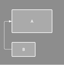
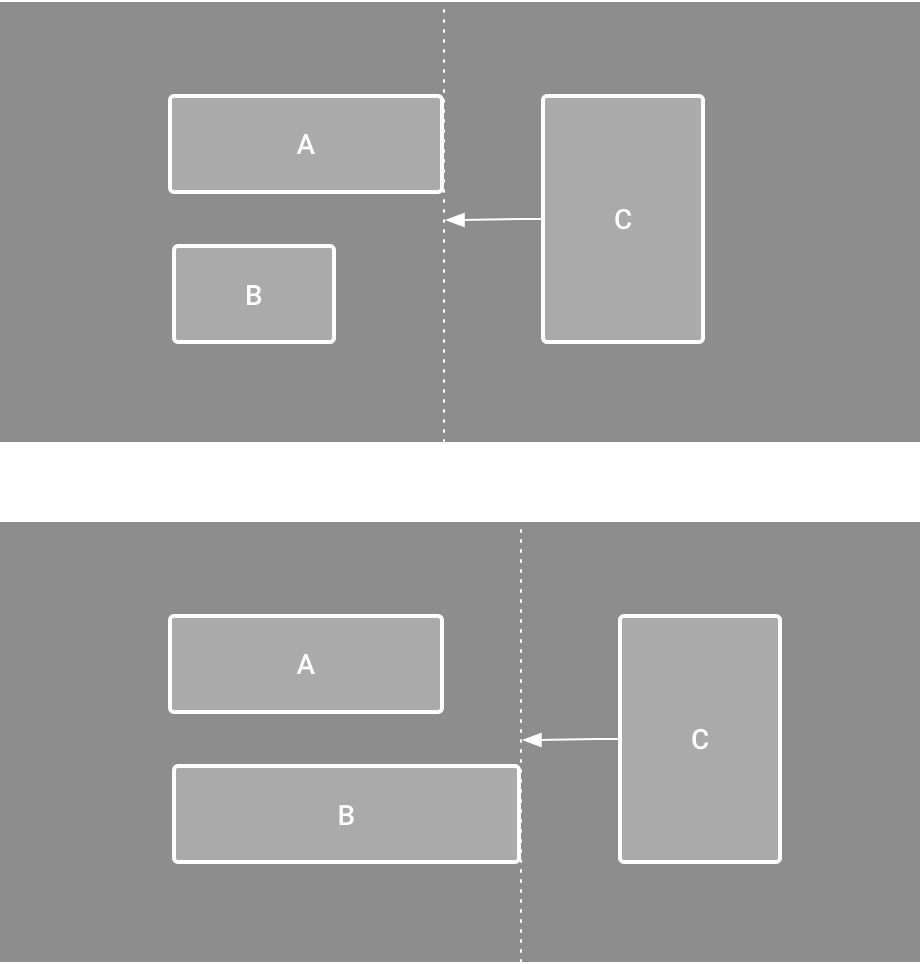
Trong hình 1, bố cục trông ổn trong trình chỉnh sửa, nhưng không có quy tắc ràng buộc theo chiều dọc trên thành phần hiển thị C. Khi bố cục này vẽ trên một thiết bị, thành phần hiển thị C sẽ căn chỉnh theo chiều ngang với các cạnh trái và phải của thành phần hiển thị A, nhưng thành phần hiển thị này sẽ xuất hiện ở đầu màn hình vì không có quy tắc ràng buộc theo chiều dọc.
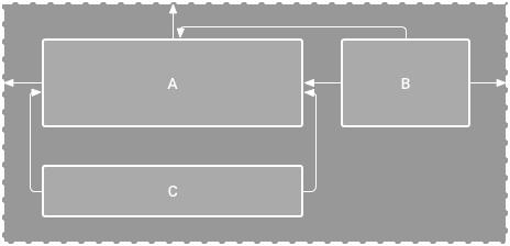
Hình 1. Trình chỉnh sửa hiển thị thành phần hiển thị C bên dưới A, nhưng thành phần hiển thị này không có quy tắc ràng buộc theo chiều dọc.
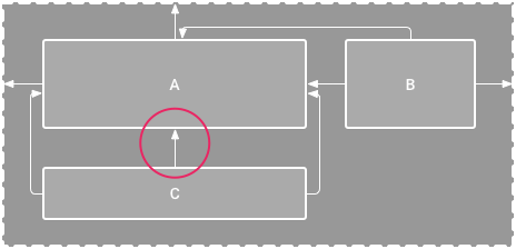
Hình 2. Chế độ xem C hiện bị ràng buộc theo chiều dọc bên dưới chế độ xem A.
Mặc dù việc thiếu điều kiện ràng buộc không gây ra lỗi biên dịch, nhưng Layout Editor sẽ cho biết điều kiện ràng buộc bị thiếu dưới dạng lỗi trong thanh công cụ. Để xem các lỗi và cảnh báo khác, hãy nhấp vào biểu tượng Hiện cảnh báo và lỗi
 .
Để giúp bạn tránh thiếu các quy tắc ràng buộc, Layout Editor (Trình chỉnh sửa bố cục) sẽ tự động thêm các quy tắc ràng buộc cho bạn bằng các tính năng Tự động kết nối và suy luận các quy tắc ràng buộc.
.
Để giúp bạn tránh thiếu các quy tắc ràng buộc, Layout Editor (Trình chỉnh sửa bố cục) sẽ tự động thêm các quy tắc ràng buộc cho bạn bằng các tính năng Tự động kết nối và suy luận các quy tắc ràng buộc.
Thêm ConstraintLayout vào dự án
Để sử dụng ConstraintLayout trong dự án, hãy tiến hành như sau:
- Đảm bảo bạn đã khai báo kho lưu trữ
maven.google.comtrong tệpsettings.gradle:Groovy
    dependencyResolutionManagement {
      ...
      repositories {
          google()
      }
    )
Kotlin
    dependencyResolutionManagement {
      ...
      repositories {
          google()
      }
    }
- Thêm thư viện làm phần phụ thuộc trong tệp
build.gradleở cấp mô-đun, như trong ví dụ sau. Phiên bản mới nhất có thể khác với phiên bản trong ví dụ.Groovy
dependencies {
    implementation "androidx.constraintlayout:constraintlayout:2.2.1"
    // To use constraintlayout in compose
    implementation "androidx.constraintlayout:constraintlayout-compose:1.1.1"
}
Kotlin
dependencies {
    implementation("androidx.constraintlayout:constraintlayout:2.2.1")
    // To use constraintlayout in compose
    implementation("androidx.constraintlayout:constraintlayout-compose:1.1.1")
}
- Trong thanh công cụ hoặc thông báo đồng bộ hoá, hãy nhấp vào Đồng bộ hoá dự án với tệp Gradle.
Giờ đây, bạn đã sẵn sàng tạo bố cục bằng ConstraintLayout.
Chuyển đổi bố cục
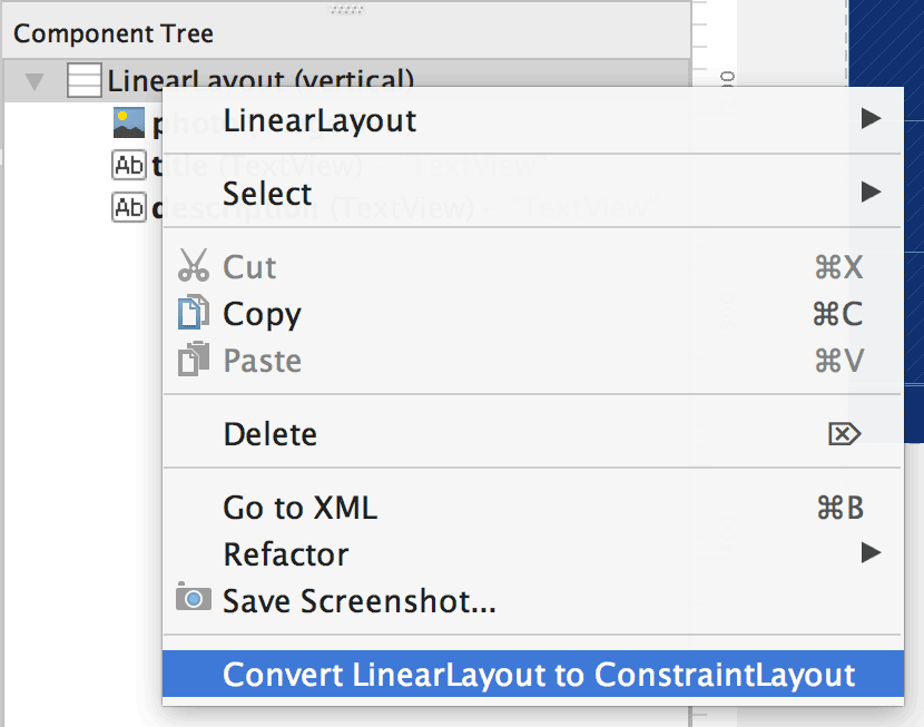
Hình 3. Trình đơn để chuyển đổi bố cục thành ConstraintLayout.
Để chuyển đổi một bố cục hiện có thành bố cục ràng buộc, hãy làm theo các bước sau:
- Mở bố cục trong Android Studio rồi nhấp vào thẻ Design (Thiết kế) ở cuối cửa sổ trình chỉnh sửa.
- Trong cửa sổ Component Tree (Cây thành phần), hãy nhấp chuột phải vào bố cục đó rồi nhấp vào Convert LinearLayout to ConstraintLayout (Chuyển đổi LinearLayout thành ConstraintLayout).
Tạo bố cục mới
Để bắt đầu một tệp bố cục ràng buộc mới, hãy làm theo các bước sau:
- Trong cửa sổ Project (Dự án), hãy nhấp vào thư mục mô-đun rồi chọn File > New > XML > Layout XML (Tệp > Mới > XML > XML bố cục).
- Nhập tên cho tệp bố cục và nhập "androidx.constraintlayout.widget.ConstraintLayout" cho Thẻ gốc.
- Nhấp vào Hoàn tất.
Thêm hoặc xoá quy tắc ràng buộc
Để thêm một quy tắc ràng buộc, hãy làm như sau:
Video 1. Phần bên trái của thành phần hiển thị bị ràng buộc với phần bên trái của thành phần mẹ.
Kéo một thành phần hiển thị từ cửa sổ Palette (Bảng chế độ xem) vào trình chỉnh sửa.
Khi bạn thêm một thành phần hiển thị trong
ConstraintLayout, thành phần hiển thị đó sẽ hiển thị trong một hộp giới hạn có các ô điều khiển đổi kích thước hình vuông ở mỗi góc và các ô điều khiển ràng buộc hình tròn ở mỗi bên.- Nhấp vào chế độ xem để chọn chế độ xem đó.
- Thực hiện một trong những thao tác sau:
- Nhấp vào một tay điều khiển quy tắc ràng buộc rồi kéo tay điều khiển đó đến một điểm neo có sẵn. Điểm này có thể là cạnh của một thành phần hiển thị khác, cạnh của bố cục hoặc một nguyên tắc. Lưu ý rằng khi bạn kéo tay nắm điều kiện ràng buộc, Layout Editor sẽ hiển thị các điểm neo kết nối tiềm năng và lớp phủ màu xanh dương.
Nhấp vào một trong các nút Create a connection (Tạo kết nối)
 trong mục Layout (Bố cục) của cửa sổ Attributes (Thuộc tính), như minh hoạ trong hình 4.
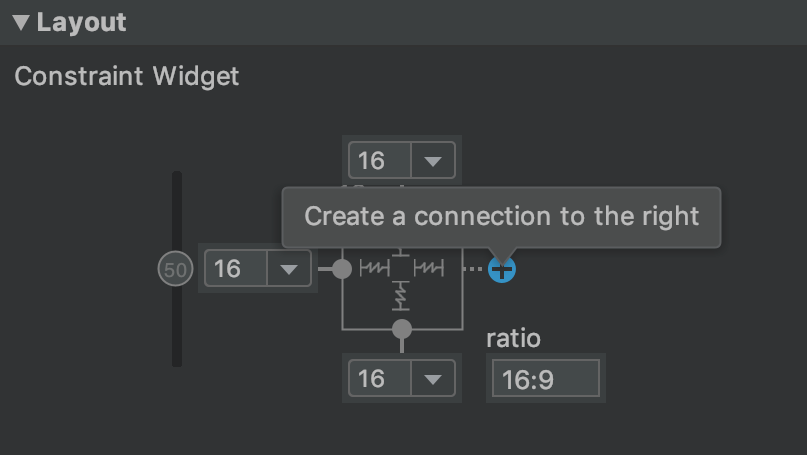
Hình 4. Phần Bố cục trong cửa sổ Thuộc tính cho phép bạn tạo các mối kết nối.
Khi tạo quy tắc ràng buộc, trình chỉnh sửa sẽ cung cấp cho quy tắc đó một lề mặc định để phân tách hai thành phần hiển thị.
Khi tạo quy tắc ràng buộc, hãy nhớ các quy tắc sau:
- Mỗi thành phần hiển thị phải có ít nhất hai điều kiện ràng buộc: một điều kiện ràng buộc theo chiều ngang và một điều kiện ràng buộc theo chiều dọc.
- Bạn chỉ có thể tạo quy tắc ràng buộc giữa một tay điều khiển quy tắc ràng buộc và một điểm neo có cùng một mặt phẳng. Một mặt phẳng dọc (các cạnh bên trái và bên phải) của một thành phần hiển thị chỉ có thể bị ràng buộc với một mặt phẳng dọc khác và các đường cơ sở chỉ có thể ràng buộc với các đường cơ sở khác.
- Mỗi tay điều khiển quy tắc ràng buộc chỉ có thể được dùng cho một quy tắc ràng buộc, nhưng bạn có thể tạo nhiều quy tắc ràng buộc từ nhiều thành phần hiển thị đến cùng một điểm neo.
Bạn có thể xoá một quy tắc ràng buộc bằng cách làm theo một trong những cách sau:
- Nhấp vào một quy tắc ràng buộc để chọn quy tắc đó, rồi nhấp vào Xoá.
Nhấn phím Control và nhấp (nhấn phím Command và nhấp trên macOS) vào một điểm neo quy tắc ràng buộc. Quy tắc ràng buộc chuyển sang màu đỏ để cho biết bạn có thể nhấp để xoá quy tắc đó, như minh hoạ trong hình 5.
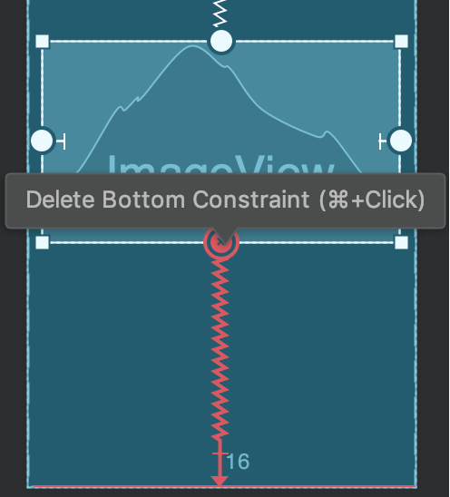
Hình 5. Quy tắc ràng buộc màu đỏ cho biết bạn có thể nhấp vào để xoá quy tắc đó.
Trong phần Layout (Bố cục) của cửa sổ Attributes (Thuộc tính), hãy nhấp vào một neo ràng buộc, như minh hoạ trong hình 6.
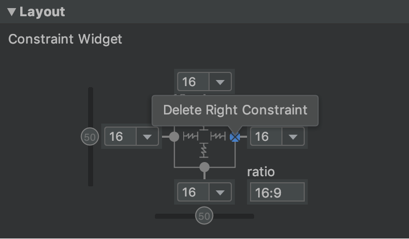
Hình 6. Nhấp vào một neo ràng buộc để xoá neo đó.
Video 2. Thêm một quy tắc ràng buộc đối lập với quy tắc ràng buộc hiện có.
Nếu bạn thêm các điều kiện ràng buộc đối lập trên một thành phần hiển thị, các đường điều kiện ràng buộc sẽ cuộn lại như một lò xo để cho biết các lực đối lập, như trong video 2. Hiệu ứng này rõ ràng nhất khi kích thước khung hiển thị được đặt thành "cố định" hoặc "gói nội dung", trong trường hợp này khung hiển thị được căn giữa giữa các điều kiện ràng buộc. Nếu bạn muốn thành phần hiển thị kéo giãn kích thước để đáp ứng các quy tắc ràng buộc, hãy chuyển kích thước thành "khớp với quy tắc ràng buộc". Nếu bạn muốn giữ nguyên kích thước hiện tại nhưng di chuyển thành phần hiển thị để không nằm ở giữa, hãy điều chỉnh độ lệch quy tắc ràng buộc.
Bạn có thể sử dụng các quy tắc ràng buộc để đạt được nhiều loại hành vi bố cục, như mô tả trong các phần sau.
Vị trí mẹ
Ràng buộc cạnh của thành phần hiển thị với cạnh tương ứng của bố cục.
Trong hình 7, bên trái của thành phần hiển thị được kết nối với cạnh trái của bố cục mẹ. Bạn có thể xác định khoảng cách từ cạnh bằng lề.
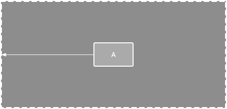
Hình 7. Điều kiện ràng buộc theo chiều ngang với thành phần mẹ.
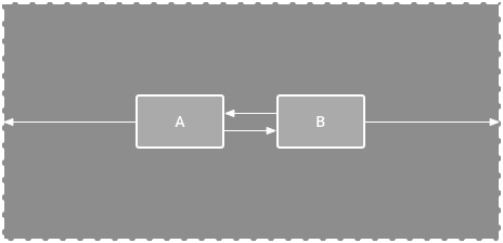
Vị trí thứ tự
Xác định thứ tự xuất hiện của hai thành phần hiển thị, theo chiều dọc hoặc ngang.
Trong hình 8, B bị buộc phải luôn ở bên phải A, còn C bị buộc phải ở bên dưới A. Tuy nhiên, các quy tắc ràng buộc này không ngụ ý việc căn chỉnh, vì vậy B vẫn có thể di chuyển lên và xuống.
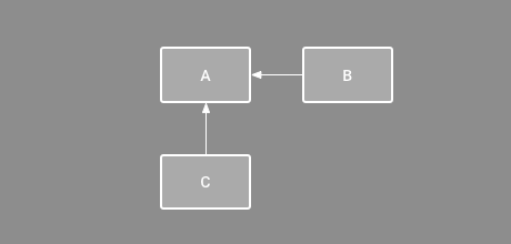
Hình 8. Quy tắc ràng buộc theo chiều ngang và chiều dọc.
Căn chỉnh
Căn chỉnh cạnh của một thành phần hiển thị với cạnh của một thành phần hiển thị khác.
Trong hình 9, bên trái của B được căn chỉnh với bên trái của A. Nếu bạn muốn căn chỉnh tâm chế độ xem, hãy tạo điều kiện ràng buộc ở cả hai bên.
Bạn có thể bù cho việc căn chỉnh bằng cách kéo thành phần hiển thị vào trong từ điều kiện ràng buộc. Ví dụ: hình 10 cho thấy B với căn chỉnh chênh lệch 24 dp. Độ dời được xác định bằng lề của thành phần hiển thị bị ràng buộc.
Bạn cũng có thể chọn tất cả thành phần hiển thị mà bạn muốn căn chỉnh, sau đó nhấp vào biểu tượng Căn chỉnh
 trong thanh công cụ để chọn loại căn chỉnh.
Hình 9. Quy tắc ràng buộc căn chỉnh theo chiều ngang.
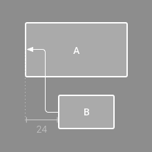
Hình 10. Quy tắc ràng buộc căn chỉnh ngang với độ dời.
Căn theo đường cơ sở
Căn chỉnh đường cơ sở văn bản của một khung hiển thị với đường cơ sở văn bản của một khung hiển thị khác.
Trong hình 11, dòng đầu tiên của B được căn chỉnh với văn bản trong A.
Để tạo điều kiện ràng buộc cơ sở, hãy nhấp chuột phải vào thành phần hiển thị văn bản mà bạn muốn ràng buộc, sau đó nhấp vào Show Baseline (Hiển thị đường cơ sở). Sau đó, nhấp vào đường cơ sở văn bản rồi kéo dòng đó đến một đường cơ sở khác.
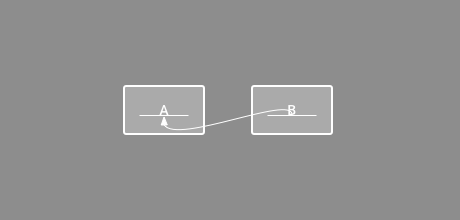
Hình 11. Quy tắc ràng buộc căn chỉnh đường cơ sở.
Ràng buộc theo nguyên tắc
Bạn có thể thêm một nguyên tắc dọc hoặc ngang để ràng buộc các thành phần hiển thị và người dùng ứng dụng sẽ không nhìn thấy nguyên tắc này. Bạn có thể định vị nguyên tắc trong bố cục dựa trên đơn vị dp hoặc tỷ lệ phần trăm so với cạnh của bố cục.
Để tạo nguyên tắc, hãy nhấp vào biểu tượng Nguyên tắc
 trong thanh công cụ, sau đó nhấp vào Thêm nguyên tắc dọc hoặc Thêm nguyên tắc ngang.
Kéo đường kẻ chấm để định vị lại đường kẻ đó, rồi nhấp vào vòng tròn ở cạnh của đường kẻ để bật/tắt chế độ đo lường.
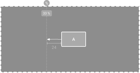
Hình 12. Một thành phần hiển thị bị ràng buộc theo một đường căn.
Ràng buộc với một rào cản
Tương tự như nguyên tắc, rào cản là một đường vô hình mà bạn có thể ràng buộc các thành phần hiển thị, ngoại trừ rào cản không xác định vị trí của chính nó. Thay vào đó, vị trí của rào cản sẽ di chuyển dựa trên vị trí của các thành phần hiển thị có trong đó. Điều này rất hữu ích khi bạn muốn ràng buộc một thành phần hiển thị với một nhóm thành phần hiển thị thay vì một thành phần hiển thị cụ thể.
Ví dụ: trong hình 13, thành phần hiển thị C bị ràng buộc ở bên phải của một rào cản. Rào chắn được đặt thành "cuối" (hoặc bên phải, trong bố cục từ trái sang phải) của cả thành phần hiển thị A và thành phần hiển thị B. Hàng rào di chuyển tuỳ thuộc vào việc bên phải của thành phần hiển thị A hay thành phần hiển thị B nằm ở ngoài cùng bên phải.
Để tạo một rào cản, hãy làm theo các bước sau:
- Nhấp vào biểu tượng Guidelines (Nguyên tắc) trên thanh công cụ, rồi nhấp vào Add Vertical Barrier (Thêm rào chắn dọc) hoặc Add Horizontal Barrier (Thêm rào chắn ngang).
- Trong cửa sổ Component Tree (Cây thành phần), hãy chọn các thành phần hiển thị mà bạn muốn bên trong rào cản rồi kéo các thành phần đó vào thành phần rào cản.
- Chọn rào chắn trong Component Tree (Cây thành phần), mở cửa sổ Attributes (Thuộc tính)
 , sau đó đặt barrierDirection.
Bây giờ, bạn có thể tạo một điều kiện ràng buộc từ một thành phần hiển thị khác đến rào cản.
Bạn cũng có thể ràng buộc các thành phần hiển thị bên trong rào cản với rào cản. Bằng cách này, bạn có thể căn chỉnh tất cả các thành phần hiển thị trong rào cản với nhau, ngay cả khi bạn không biết thành phần hiển thị nào dài nhất hoặc cao nhất.
Bạn cũng có thể đưa một nguyên tắc vào bên trong rào chắn để đảm bảo vị trí "tối thiểu" cho rào chắn.
Hình 13. Chế độ xem C bị ràng buộc với một rào cản, rào cản này di chuyển dựa trên vị trí và kích thước của cả chế độ xem A và chế độ xem B.
Điều chỉnh độ chệch của hạn chế
Khi bạn thêm một điều kiện ràng buộc vào cả hai bên của một thành phần hiển thị và kích thước thành phần hiển thị cho cùng một phương diện là "cố định" hoặc "gói nội dung", thì thành phần hiển thị sẽ nằm giữa hai điều kiện ràng buộc với độ lệch là 50% theo mặc định. Bạn có thể điều chỉnh độ chệch bằng cách kéo thanh trượt độ chệch trong cửa sổ Attributes (Thuộc tính) hoặc bằng cách kéo thành phần hiển thị, như trong video 3.
Nếu bạn muốn thành phần hiển thị kéo giãn kích thước để đáp ứng các quy tắc ràng buộc, hãy chuyển kích thước thành "khớp với các quy tắc ràng buộc".
Video 3. Điều chỉnh độ chệch của quy tắc ràng buộc.
Điều chỉnh kích thước chế độ xem
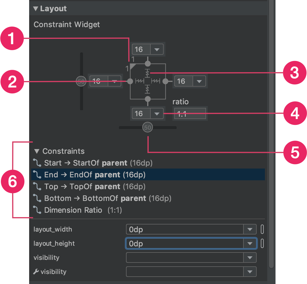
Hình 14. Khi chọn một thành phần hiển thị, cửa sổ Attributes (Thuộc tính) sẽ bao gồm các chế độ điều khiển cho 1 tỷ lệ kích thước, 2 xoá quy tắc ràng buộc, 3 chế độ chiều cao hoặc chiều rộng, 4 lề và 5 độ lệch quy tắc ràng buộc. Bạn cũng có thể làm nổi bật từng quy tắc ràng buộc trong Layout Editor (Trình chỉnh sửa bố cục) bằng cách nhấp vào các quy tắc ràng buộc đó trong danh sách quy tắc ràng buộc 6.
Bạn có thể sử dụng các ô điều khiển ở góc để đổi kích thước thành phần hiển thị, nhưng việc này sẽ mã hoá cứng kích thước – thành phần hiển thị không đổi kích thước cho nhiều nội dung hoặc kích thước màn hình. Để chọn một chế độ định cỡ khác, hãy nhấp vào một thành phần hiển thị rồi mở cửa sổ Attributes (Thuộc tính) ở bên phải trình chỉnh sửa.
Ở gần đầu cửa sổ Attributes (Thuộc tính) là trình kiểm tra khung hiển thị, bao gồm các chế độ điều khiển cho một số thuộc tính bố cục, như minh hoạ trong hình 14. Tính năng này chỉ có sẵn cho các thành phần hiển thị trong bố cục ràng buộc.
Bạn có thể thay đổi cách tính chiều cao và chiều rộng bằng cách nhấp vào các biểu tượng được chỉ định bằng chú thích 3 trong hình 14. Các biểu tượng này thể hiện chế độ kích thước như sau. Nhấp vào biểu tượng để bật/tắt giữa các chế độ cài đặt sau:
-
 Đã cố định: chỉ định một kích thước cụ thể trong hộp văn bản sau hoặc bằng cách
đổi kích thước thành phần hiển thị trong trình chỉnh sửa.
Đã cố định: chỉ định một kích thước cụ thể trong hộp văn bản sau hoặc bằng cách
đổi kích thước thành phần hiển thị trong trình chỉnh sửa. -
 Gói nội dung: thành phần hiển thị chỉ mở rộng khi cần thiết để vừa với nội dung.
 - layout_constrainedWidth
-
 Match Constraints (So khớp các quy tắc ràng buộc): thành phần hiển thị mở rộng nhiều nhất có thể để đáp ứng các quy tắc ràng buộc ở mỗi bên, sau khi tính đến lề của thành phần hiển thị. Tuy nhiên, bạn có thể sửa đổi hành vi đó bằng các thuộc tính và giá trị sau. Các thuộc tính này chỉ có hiệu lực khi bạn đặt chiều rộng khung hiển thị thành "khớp với các quy tắc ràng buộc":
- layout_constraintWidth_min
Phương thức này sẽ lấy kích thước
dpcho chiều rộng tối thiểu của thành phần hiển thị. - layout_constraintWidth_max
Thao tác này sẽ lấy kích thước
dpcho chiều rộng tối đa của thành phần hiển thị.
Tuy nhiên, nếu phương diện đã cho chỉ có một quy tắc ràng buộc, thì thành phần hiển thị sẽ mở rộng để phù hợp với nội dung của nó. Việc sử dụng chế độ này trên chiều cao hoặc chiều rộng cũng cho phép bạn đặt tỷ lệ kích thước.
- layout_constraintWidth_min
Đặt giá trị này thành true để cho phép kích thước theo chiều ngang thay đổi để tuân thủ các điều kiện ràng buộc. Theo mặc định, một tiện ích được đặt thành WRAP_CONTENT sẽ không bị giới hạn bởi các quy tắc ràng buộc.
Đặt kích thước dưới dạng tỷ lệ
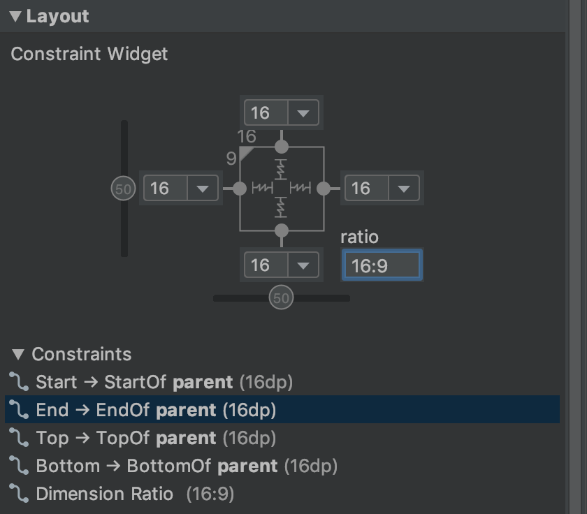
Hình 15. Thành phần hiển thị được đặt thành tỷ lệ khung hình 16:9 với chiều rộng dựa trên tỷ lệ chiều cao.
Bạn có thể đặt kích thước thành một tỷ lệ, chẳng hạn như 16:9, nếu ít nhất một trong các kích thước chế độ xem được đặt thành "khớp với quy tắc ràng buộc" (0dp). Để bật tỷ lệ, hãy nhấp vào Bật/tắt quy tắc ràng buộc về tỷ lệ khung hình (chú thích 1 trong hình 14) rồi nhập tỷ lệ width:height vào trường nhập xuất hiện.
Nếu cả chiều rộng và chiều cao đều được đặt thành "khớp với các quy tắc ràng buộc", bạn có thể nhấp vào Bật/tắt quy tắc ràng buộc về tỷ lệ khung hình để chọn kích thước dựa trên tỷ lệ của kích thước còn lại. Trình kiểm tra thành phần hiển thị cho biết kích thước nào được đặt làm tỷ lệ bằng cách kết nối các cạnh tương ứng bằng một đường liền.
Ví dụ: nếu bạn đặt cả hai bên thành "khớp với các quy tắc ràng buộc", hãy nhấp đúp vào Bật/tắt quy tắc ràng buộc về tỷ lệ khung hình để đặt chiều rộng thành tỷ lệ của chiều cao. Toàn bộ kích thước được xác định theo chiều cao của thành phần hiển thị, bạn có thể xác định chiều cao theo bất kỳ cách nào, như minh hoạ trong hình 15.
Điều chỉnh lề chế độ xem
Để các thành phần hiển thị có khoảng cách đều nhau, hãy nhấp vào biểu tượng Lề
 trên thanh công cụ để chọn lề mặc định cho mỗi thành phần hiển thị mà bạn thêm vào bố cục. Mọi thay đổi bạn thực hiện đối với lề mặc định chỉ áp dụng cho các thành phần hiển thị bạn thêm từ đó trở đi.
Bạn có thể kiểm soát lề cho mỗi thành phần hiển thị trong cửa sổ Attributes (Thuộc tính) bằng cách nhấp vào số trên dòng đại diện cho từng quy tắc ràng buộc. Trong hình 14, chú thích 4 cho thấy lề dưới được đặt thành 16 dp.
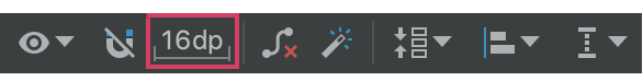
Hình 16. Nút Lề trên thanh công cụ.
Tất cả lề mà công cụ cung cấp đều là các hệ số của 8 dp để giúp các thành phần hiển thị của bạn căn chỉnh với đề xuất lưới hình vuông 8 dp của Material Design.
Kiểm soát các nhóm tuyến tính bằng chuỗi
Hình 17. Một chuỗi ngang có hai chế độ xem.
Chuỗi là một nhóm khung hiển thị được liên kết với nhau bằng các điều kiện ràng buộc vị trí hai chiều. Các khung hiển thị trong một chuỗi có thể được phân phối theo chiều dọc hoặc chiều ngang.
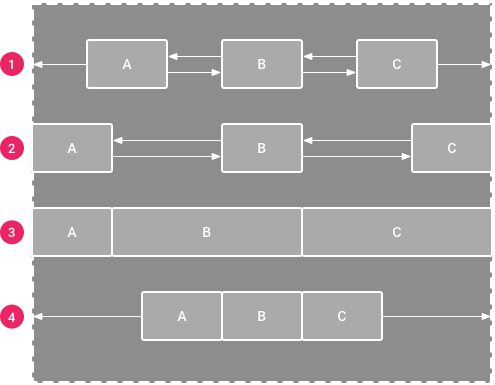
Hình 18. Ví dụ về từng kiểu chuỗi.
Chuỗi có thể được tạo kiểu theo một trong các cách sau:
- Spread (Phân tán): các thành phần hiển thị được phân bổ đồng đều sau khi tính đến lề. Đây là tuỳ chọn mặc định.
- Phân bố bên trong: thành phần hiển thị đầu tiên và cuối cùng được gắn vào các điều kiện ràng buộc ở mỗi đầu chuỗi và phần còn lại được phân bổ đồng đều.
- Được tính trọng số: khi chuỗi được đặt thành phát tán hoặc phát tán bên trong, bạn có thể lấp đầy không gian còn lại bằng cách đặt một hoặc nhiều thành phần hiển thị thành "khớp với quy tắc ràng buộc" (
0dp). Theo mặc định, không gian được phân bổ đồng đều giữa mỗi thành phần hiển thị được đặt thành "khớp với quy tắc ràng buộc", nhưng bạn có thể chỉ định trọng số quan trọng cho mỗi thành phần hiển thị bằng cách sử dụng các thuộc tínhlayout_constraintHorizontal_weightvàlayout_constraintVertical_weight. Cách này hoạt động giống nhưlayout_weighttrong bố cục tuyến tính: thành phần hiển thị có giá trị trọng số cao nhất sẽ nhận được nhiều không gian nhất và các thành phần hiển thị có cùng trọng số sẽ nhận được cùng một không gian. - Đã đóng gói: các thành phần hiển thị được đóng gói với nhau sau khi tính đến lề. Bạn có thể điều chỉnh độ lệch của toàn bộ chuỗi (sang trái hoặc sang phải, lên trên hoặc xuống dưới) bằng cách thay đổi độ lệch chế độ xem "đầu" của chuỗi.
Thành phần hiển thị "đầu" của chuỗi – thành phần hiển thị ở ngoài cùng bên trái trong chuỗi ngang (trong bố cục từ trái sang phải) và thành phần hiển thị ở trên cùng trong chuỗi dọc – xác định kiểu của chuỗi trong XML.
Tuy nhiên, bạn có thể chuyển đổi giữa chế độ rải, rải bên trong và đóng gói bằng cách chọn bất kỳ thành phần hiển thị nào trong chuỗi và nhấp vào nút chuỗi  xuất hiện bên dưới thành phần hiển thị đó.
Để tạo một chuỗi, hãy làm như sau (như trong video 4):
- Chọn tất cả thành phần hiển thị sẽ có trong chuỗi.
- Nhấp chuột phải vào một trong các thành phần hiển thị.
- Chọn Chuỗi.
- Chọn Đặt chính giữa theo chiều ngang hoặc Đặt chính giữa theo chiều dọc.
Video 4. Tạo chuỗi ngang.
Sau đây là một vài điều cần cân nhắc khi sử dụng chuỗi:
- Một thành phần hiển thị có thể là một phần của cả chuỗi ngang và chuỗi dọc, nhờ đó, bạn có thể tạo bố cục lưới linh hoạt.
- Chuỗi chỉ hoạt động đúng cách nếu mỗi đầu của chuỗi được ràng buộc với một đối tượng khác trên cùng một trục, như minh hoạ trong hình 14.
- Mặc dù hướng của một chuỗi là dọc hoặc ngang, nhưng việc sử dụng một chuỗi sẽ không căn chỉnh các thành phần hiển thị theo hướng đó. Để đạt được vị trí thích hợp cho mỗi thành phần hiển thị trong chuỗi, hãy thêm các điều kiện ràng buộc khác, chẳng hạn như các điều kiện ràng buộc căn chỉnh.
Tự động tạo quy tắc ràng buộc
Thay vì thêm các điều kiện ràng buộc vào mọi thành phần hiển thị khi bạn đặt các thành phần đó vào bố cục, bạn có thể di chuyển từng thành phần hiển thị vào vị trí bạn muốn trong Layout Editor (Trình chỉnh sửa bố cục) rồi nhấp vào biểu tượng Infer Constraints (Suy luận các điều kiện ràng buộc)  để tự động tạo các điều kiện ràng buộc.
Tính năng Infer Constraints (Suy luận các điều kiện ràng buộc) sẽ quét bố cục để xác định tập hợp điều kiện ràng buộc hiệu quả nhất cho tất cả thành phần hiển thị. Phương thức này ràng buộc các thành phần hiển thị ở vị trí hiện tại trong khi vẫn đảm bảo tính linh hoạt. Bạn có thể cần điều chỉnh để bố cục phản hồi như mong muốn cho nhiều kích thước và hướng màn hình.
Tự động kết nối với mẹ là một tính năng riêng biệt mà bạn có thể bật. Khi bạn bật tính năng này và thêm thành phần hiển thị con vào thành phần hiển thị mẹ, tính năng này sẽ tự động tạo ra hai hoặc nhiều quy tắc ràng buộc cho mỗi thành phần hiển thị khi bạn thêm các thành phần hiển thị đó vào bố cục, nhưng chỉ khi thích hợp để ràng buộc thành phần hiển thị với bố cục mẹ. Tính năng tự động kết nối không tạo quy tắc ràng buộc cho các thành phần hiển thị khác trong bố cục.
Tính năng Tự động kết nối bị tắt theo mặc định. Bật tính năng này bằng cách nhấp vào Enable Autoconnection to Parent (Bật tính năng Tự động kết nối với mẹ)  trên thanh công cụ Layout Editor.
Ảnh động khung hình chính
Trong ConstraintLayout, bạn có thể tạo ảnh động cho các thay đổi về kích thước và vị trí của các phần tử bằng cách sử dụng ConstraintSet và TransitionManager.
ConstraintSet là một đối tượng nhẹ đại diện cho các điều kiện ràng buộc, lề và khoảng đệm của tất cả phần tử con trong ConstraintLayout. Khi bạn áp dụng ConstraintSet cho một ConstraintLayout hiển thị, bố cục sẽ cập nhật các điều kiện ràng buộc của tất cả phần tử con.
Để tạo ảnh động bằng ConstraintSet, hãy chỉ định hai tệp bố cục đóng vai trò là khung hình bắt đầu và kết thúc cho ảnh động. Sau đó, bạn có thể tải ConstraintSet từ tệp khung hình chính thứ hai và áp dụng tệp đó cho ConstraintLayout hiển thị.
Mã ví dụ sau đây cho thấy cách tạo ảnh động di chuyển một nút duy nhất xuống cuối màn hình.
// MainActivity.kt

fun onCreate(savedInstanceState: Bundle?) {
    super.onCreate(savedInstanceState)
    setContentView(R.layout.keyframe_one)
    constraintLayout = findViewById(R.id.constraint_layout) // member variable
}

fun animateToKeyframeTwo() {
    val constraintSet = ConstraintSet()
    constraintSet.load(this, R.layout.keyframe_two)
    TransitionManager.beginDelayedTransition()
    constraintSet.applyTo(constraintLayout)
}
// layout/keyframe1.xml
// Keyframe 1 contains the starting position for all elements in the animation
// as well as final colors and text sizes.

<?xml version="1.0" encoding="utf-8"?>
<androidx.constraintlayout.widget.ConstraintLayout xmlns:android="http://schemas.android.com/apk/res/android"
    xmlns:app="http://schemas.android.com/apk/res-auto"
    android:layout_width="match_parent"
    android:layout_height="match_parent">

    <Button
        android:id="@+id/button2"
        android:layout_width="0dp"
        android:layout_height="wrap_content"
        android:text="Button"
        app:layout_constraintEnd_toEndOf="parent"
        app:layout_constraintStart_toStartOf="parent"
        app:layout_constraintTop_toTopOf="parent" />
</androidx.constraintlayout.widget.ConstraintLayout>
// layout/keyframe2.xml
// Keyframe 2 contains another ConstraintLayout with the final positions.

<?xml version="1.0" encoding="utf-8"?>
<androidx.constraintlayout.widget.ConstraintLayout xmlns:android="http://schemas.android.com/apk/res/android"
    xmlns:app="http://schemas.android.com/apk/res-auto"
    android:layout_width="match_parent"
    android:layout_height="match_parent">

    <Button
        android:id="@+id/button2"
        android:layout_width="0dp"
        android:layout_height="wrap_content"
        android:text="Button"
        app:layout_constraintEnd_toEndOf="parent"
        app:layout_constraintStart_toStartOf="parent"
        app:layout_constraintBottom_toBottomOf="parent" />
</androidx.constraintlayout.widget.ConstraintLayout>
Tài nguyên khác
ConstraintLayout được dùng trong ứng dụng minh hoạ Sunflower.