앱의 UI 디자인은 특정 기기 폼 팩터에 구속되지 않습니다.
Android 애플리케이션은 4인치 핸드셋에서 50인치 TV, 창 크기를 조절할 수 있는 Chrome OS 기기까지 다양한 유형의 기기에 맞게 조정해야 합니다.
앱의 사용자 인터페이스는 창 내부에 그려지며 크기를 자유롭게 변경할 수 있습니다. 다양한 창 크기에 따라 다른 레이아웃을 제공하려면 리소스 한정자를 사용하세요. 이러한 차이는 기기 화면 크기의 제약으로 인한 것이거나 사용자가 창 크기를 변경하기 위해 멀티 윈도우 모드를 사용하는 경우 발생할 수 있습니다.
반응형 콘텐츠 설계
모든 사용자에게 풍부한 경험을 제공해야 하므로 앱의 각 화면에서 사용할 수 있는 창 공간을 최대한 활용해야 합니다.
예를 들어, 휴대전화 화면의 전체 너비를 차지하는 창에서 실행되는 앱을 멀티 윈도우 모드로 전환하면 콘텐츠 일부의 세부정보를 숨길 수 있으며 Chrome OS 기기 화면의 전체 너비를 차지하는 창에서 실행하면 더 많은 콘텐츠를 제공하기 위해 사용자 인터페이스를 확장할 수 있습니다.
이러한 사용자 기대치 충족 외에도 더 큰 기기에서 공백을 너무 많이 남기거나 의도치 않게 부자연스러운 상호작용을 도입하는 것을 방지하기 위해 더 많은 콘텐츠를 제공하는 것이 필요한 경우도 있습니다. 다음 그림에서는 더 큰 창에 맞춰 사용자 인터페이스 디자인을 조정할 때 발생할 수 있는 몇 가지 문제를 보여줍니다.
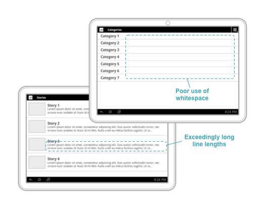
그림 1. 폭이 넓은 창에 콘텐츠가 충분하지 않으면 공백이 어색해지고 선 길이가 지나치게 길어집니다.
이러한 예는 모두 사용자가 어디에서 앱을 실행하든 좋은 환경을 누릴 수 있는 좋은 방법입니다.
반응형 디자인 패턴의 예와 적응형 레이아웃에 관한 아이디어를 더 보려면 material.io를 참고하세요.
이 페이지에 나와 있는 콘텐츠와 코드 샘플에는 콘텐츠 라이선스에서 설명하는 라이선스가 적용됩니다. 자바 및 OpenJDK는 Oracle 및 Oracle 계열사의 상표 또는 등록 상표입니다.
최종 업데이트: 2025-07-27(UTC)
[[["이해하기 쉬움","easyToUnderstand","thumb-up"],["문제가 해결됨","solvedMyProblem","thumb-up"],["기타","otherUp","thumb-up"]],[["필요한 정보가 없음","missingTheInformationINeed","thumb-down"],["너무 복잡함/단계 수가 너무 많음","tooComplicatedTooManySteps","thumb-down"],["오래됨","outOfDate","thumb-down"],["번역 문제","translationIssue","thumb-down"],["샘플/코드 문제","samplesCodeIssue","thumb-down"],["기타","otherDown","thumb-down"]],["최종 업데이트: 2025-07-27(UTC)"],[],[],null,["# Design for different form factors\n\nThe design of your app's UI isn't tied to a particular device form factor.\nAndroid applications need to adapt to a number of different types of devices,\nfrom 4-inch handsets to 50-inch TVs to ChromeOS devices with resizable windows.\n| **Note:** Designing applications for television sets also requires attention to other factors, including interaction methods (i.e., dealing with the lack of a touch screen), legibility of text at large reading distances, and more. You can find more information on designing for TVs in the [Android TV documentation](/tv).\n\nYour app's user interface is drawn inside of a window, the size of which can\nchange at will. You use resource qualifiers to provide different layouts for\nvarying window sizes. These differences can be due to constraints in the size of\nthe device's screen, or they can be driven by the user using multi-window mode\nto change the window size.\n\nDesigning responsive content\n----------------------------\n\nYou should provide a rich experience for all of your users, so you should have\neach screen in your app take full advantage of the window real estate available\nto you.\n\nFor example, an app running in a window taking up the full width of a phone\nscreen could perhaps hide details for a piece of content when entering\nmulti-window mode, and it could expand its user interface to provide more\ncontent when running in a window taking up the full width of a ChromeOS\ndevice's screen.\n\nIn addition to addressing these user expectations, it's often necessary to\nprovide more content on larger devices to avoid leaving too much whitespace or\nunwittingly introducing awkward interactions. In the following figure, you can\nsee some of the problems that can arise when adapting a user interface design\nfor a larger window:\n\n**Figure 1.** Not enough content on large-width windows leads to awkward whitespace and exceedingly long line lengths.\n| **Note:** After deciding at which window sizes you will provide difference resources, see [Providing Alternate Resources](/guide/topics/resources/providing-resources#AlternativeResources) for more detail on how to implement your designs.\n\nTo learn more about designing responsive navigation experiences, see [Navigation\nfor responsive UIs](/guide/topics/large-screens/navigation-for-responsive-uis).\n\nProviding tailored user experiences\n-----------------------------------\n\nIt's important to provide unique experiences that go beyond expanding your\ncontent views to fill available space. You can tailor user interfaces to provide\nthe ideal user experience for given window sizes, even using entirely different\nlayouts and widgets.\n\nIn figure 2, a\n[`BottomNavigationView`](/reference/com/google/android/material/bottomnavigation/BottomNavigationView)\nis used as top-level navigation when there is adequate vertical space to do so.\nWhen the size of the window is reduced, as shown on the right side of the\nfigure, top-level navigation is instead implemented using a\n[`DrawerLayout`](/reference/androidx/drawerlayout/widget/DrawerLayout).\n\n**Figure 2.** The bottom nav bar is replaced with a nav drawer when vertical\nspace is limited.\n\nHere are some other examples:\n\n- A [`Toolbar`](/reference/android/widget/Toolbar) can show or hide action menu items given the amount of available space.\n- A [`RecyclerView.LayoutManager`](/reference/androidx/recyclerview/widget/RecyclerView.LayoutManager) could change its span count to take full advantage of the size of a window\n- You can increase the amount of detail you show for custom views as you have more space to do so.\n\nThese are all great ways to make sure that your users have great experiences\nwherever they're running your app.\n\nYou can find more examples of responsive design patterns and ideas for adaptive\nlayouts on\n[material.io](https://material.io/design/layout/component-behavior.html#responsive-patterns)."]]