फ़ॉन्ट
संग्रह की मदद से व्यवस्थित रहें
अपनी प्राथमिकताओं के आधार पर, कॉन्टेंट को सेव करें और कैटगरी में बांटें.
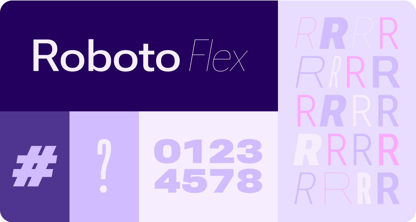
Roboto के सभी इंस्टेंस को Roboto Flex से बदलें. स्मार्टवॉच और Material 3 एक्सप्रेशनिव डिज़ाइन लैंग्वेज के लिए ऑप्टिमाइज़ किया गया, बेसलाइन टाइप स्केल बनाएं.
वैरिएबल ऐक्सिस, वैरिएबल चौड़ाई, और वेट का इस्तेमाल करके, हम बड़े डिसप्ले और टाइटल टेक्स्ट को स्टाइल करते हैं. इससे स्टाइल बेहतर होती है और छोटे साइज़ के लिए, ज़्यादा उपयोगिता और टेक्स्ट को पढ़ने में आसानी होती है.
Roboto Flex
Roboto Flex, वैरिएबल ऐक्सिस का एक सेट उपलब्ध कराता है, जो आपके ऐप्लिकेशन के इस्तेमाल के उदाहरणों के हिसाब से काम करता है.
अक्षों को अडजस्ट करना
वैरिएबल फ़ॉन्ट में, एक्सप्रेशन के लिए कई वैरिएबल फ़ॉन्ट एट्रिब्यूट हो सकते हैं. हालांकि, प्रॉडक्ट डिज़ाइन के लिए, पसंद के मुताबिक बनाए जा सकने वाले दो स्टाइल एट्रिब्यूट (या ऐक्सिस) सबसे ज़्यादा काम के होते हैं: वेट और चौड़ाई.
वज़न
वज़न मुख्य एट्रिब्यूट है. इससे किसी भी फ़ॉन्ट में टाइपफ़ेस के स्ट्रोक की कुल चौड़ाई तय होती है. आम तौर पर, वज़न के लिए रेगुलर और बोल्ड फ़ॉन्ट का इस्तेमाल किया जाता है. हालांकि, वज़न बहुत हल्के से लेकर बहुत भारी तक हो सकते हैं. अगर टाइपफ़ेस वैरिएबल है, तो यह स्ट्रोक की पूरी और लगातार रेंज उपलब्ध कराता है. इससे वज़न की संख्या असीमित हो जाती है.
याद रखने वाली बातें
warning
सावधान
मुख्य टेक्स्ट के लिए, बहुत हल्के वज़न वाले फ़ॉन्ट का इस्तेमाल करने से बचें.
कम रिज़ॉल्यूशन वाले डिसप्ले पर, खास तौर पर छोटे टेक्स्ट को पढ़ने में मुश्किल हो सकती है. बड़े फ़ॉन्ट साइज़ के लिए, कम मोटाई वाले फ़ॉन्ट का इस्तेमाल करें. जैसे, डिसप्ले टाइप.
warning
सावधान
इसके उलट, छोटे साइज़ में ज़्यादा वज़न होने पर, टेक्स्ट को पढ़ने में मुश्किल हो सकती है. बहुत ज़्यादा मोटे टाइप को पढ़ना मुश्किल हो सकता है.
चौड़ाई
चौड़ाई का मतलब है कि टाइपफ़ेस के वर्णों के लिए, कितनी हॉरिज़ॉन्टल जगह का इस्तेमाल किया गया है. कम चौड़ाई वाली फ़ॉन्ट स्टाइल में, हर लाइन में ज़्यादा वर्ण फ़िट होते हैं, जबकि ज़्यादा चौड़ाई वाली फ़ॉन्ट स्टाइल में ज़्यादा व्यक्तित्व दिखता है.
याद रखने वाली बातें
check_circle
यह करें
कम चौड़ाई वाले फ़ॉन्ट में, छोटे साइज़ में ज़्यादा वर्ण फ़िट हो सकते हैं. जैसे, नाम या लंबा नंबर.
cancel
यह न करें
चौड़े स्टाइल ज़्यादा जगह लेते हैं. इसलिए, उनका इस्तेमाल उन जगहों के लिए न करें जहां जगह कम होती है. जैसे, ऐप्लिकेशन पेज के हेडर में.
इस पेज पर मौजूद कॉन्टेंट और कोड सैंपल कॉन्टेंट के लाइसेंस में बताए गए लाइसेंस के हिसाब से हैं. Java और OpenJDK, Oracle और/या इससे जुड़ी हुई कंपनियों के ट्रेडमार्क या रजिस्टर किए हुए ट्रेडमार्क हैं.
आखिरी बार 2025-07-27 (UTC) को अपडेट किया गया.
[[["समझने में आसान है","easyToUnderstand","thumb-up"],["मेरी समस्या हल हो गई","solvedMyProblem","thumb-up"],["अन्य","otherUp","thumb-up"]],[["वह जानकारी मौजूद नहीं है जो मुझे चाहिए","missingTheInformationINeed","thumb-down"],["बहुत मुश्किल है / बहुत सारे चरण हैं","tooComplicatedTooManySteps","thumb-down"],["पुराना","outOfDate","thumb-down"],["अनुवाद से जुड़ी समस्या","translationIssue","thumb-down"],["सैंपल / कोड से जुड़ी समस्या","samplesCodeIssue","thumb-down"],["अन्य","otherDown","thumb-down"]],["आखिरी बार 2025-07-27 (UTC) को अपडेट किया गया."],[],[],null,["# Fonts\n\nReplace all instances of Roboto with Roboto Flex. Tailor a baseline type scale\nthat is optimized for the watch and the Material 3 Expressive design language.\n\nUsing variable axis, variable width and weight to curate how we style big\ndisplay and title text to elevate style and bring more utility and legibility\nfor smaller sizes.\n\nRoboto Flex\n-----------\n\n\nRoboto Flex offers a set of variable axis that serves your app's use cases. \n\n\u003cbr /\u003e\n\nAdjustable axes\n---------------\n\nWhile variable fonts can have a multitude of variable font attributes for\nexpression, there are two customizable stylistic attributes (or axes) that are\nmost applicable for product design: weight and width.\n\n### Weight\n\n\n[Weight](https://fonts.google.com/knowledge/choosing_type/exploring_typefaces_with_multiple_weights_or_grades) is the primary attribute that defines the overall thickness of a\ntypeface's strokes in any given font. The most common weights are regular and\nbold, but weights can cover extremes from the very light to the very heavy. If\nthe typeface is variable, it provides a full, continuous range of stroke\nthicknesses, making the number of weights effectively unlimited. \n\n\u003cbr /\u003e\n\n#### Things to remember\n\nwarning\n\n### Caution\n\nBe careful of using too light a weight type for body text.\nLower resolution displays can struggle with delicate, especially small\ntypography. Use lighter weights at larger font sizes, such as display\ntype. \nwarning\n\n### Caution\n\nConversely, excessive weight at smaller sizes may affect\nlegibility. Too thick a type may be difficult to read.\n\n### Width\n\n\n[Width](https://fonts.google.com/knowledge/glossary/width) is the result of how much horizontal space is taken up by a\ntypeface's characters. A narrow width allows more characters to fit per line\nwhile a wider width may offer more personality. \n\n\u003cbr /\u003e\n\n#### Things to remember\n\ncheck_circle\n\n### Do\n\nA thinner width can allow for more characters to fit at\nsmall sizes, such as name or a long number. \ncancel\n\n### Don't\n\nSince wider styles take up more space, avoid using them for\nareas with limited space, such as in the app page header."]]