Fonts
Stay organized with collections
Save and categorize content based on your preferences.
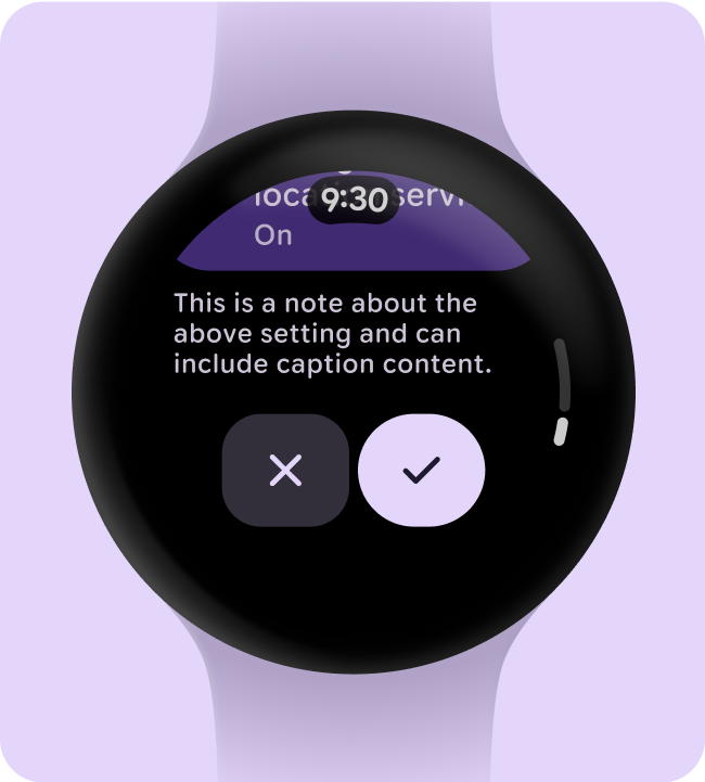
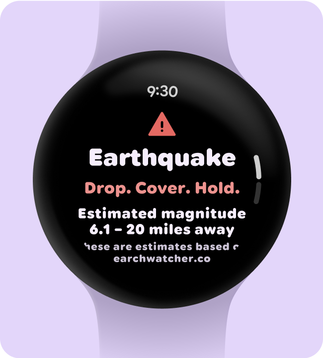
Replace all instances of Roboto with Roboto Flex. Tailor a baseline type scale
that is optimized for the watch and the Material 3 Expressive design language.
Using variable axis, variable width and weight to curate how we style big
display and title text to elevate style and bring more utility and legibility
for smaller sizes.
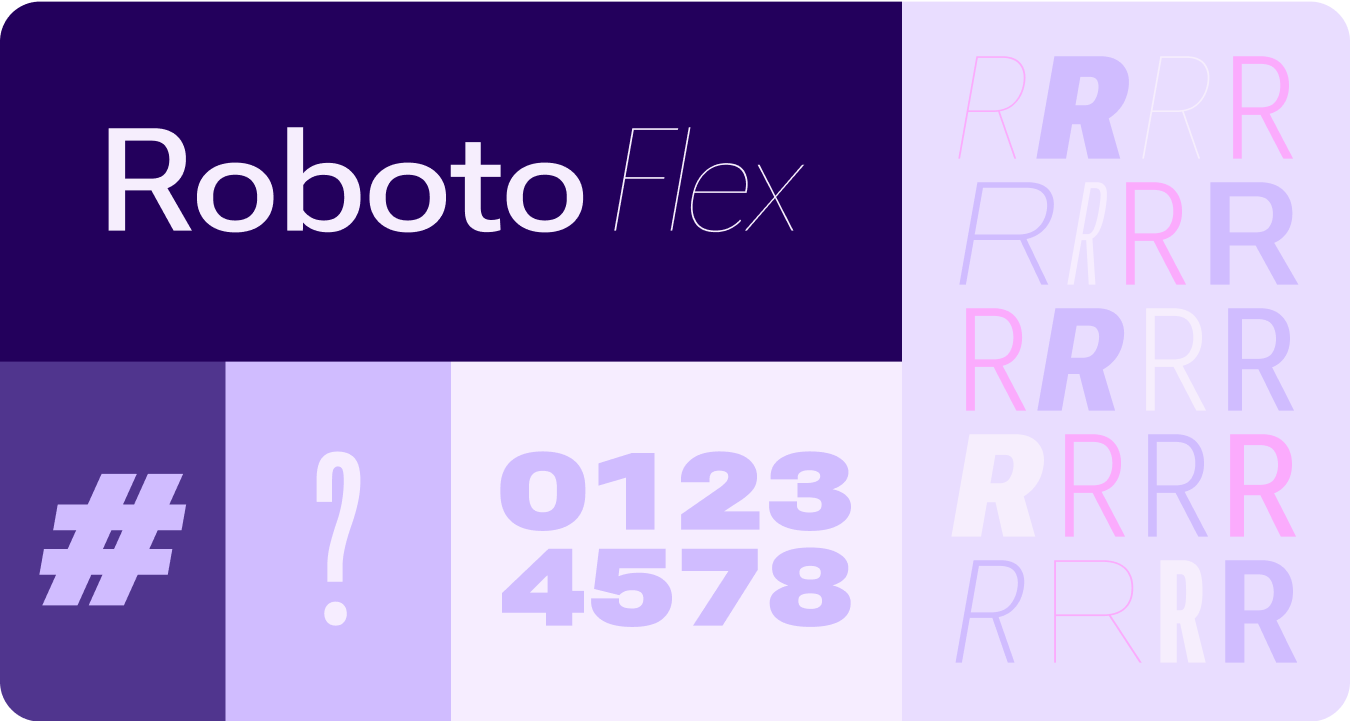
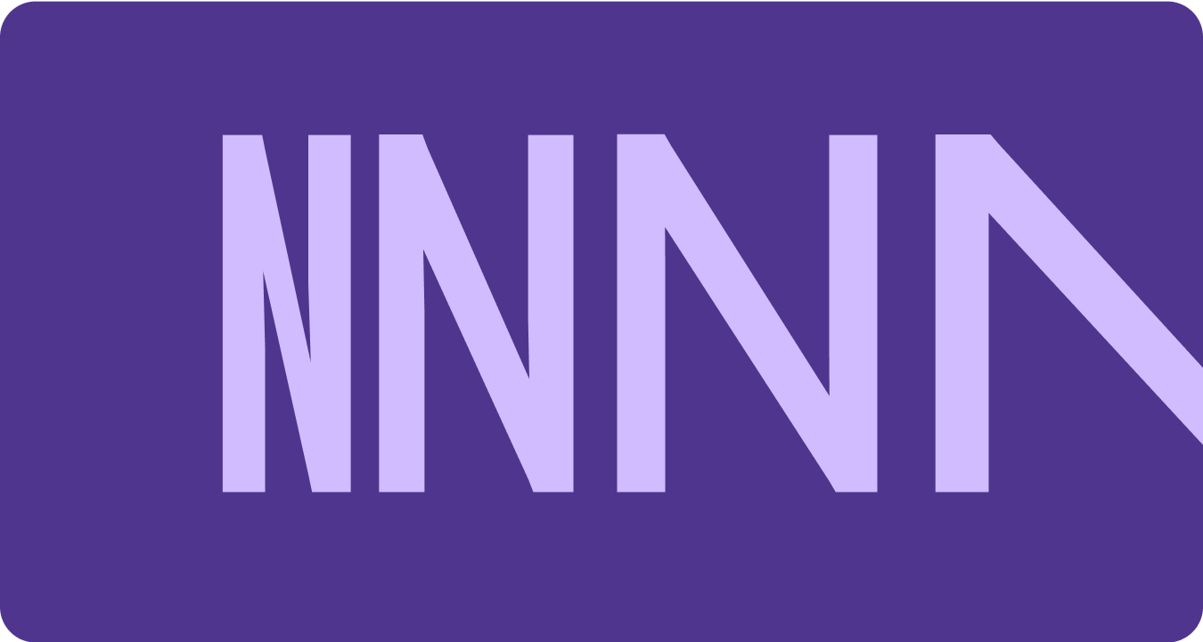
Roboto Flex
Roboto Flex offers a set of variable axis that serves your app's use cases.
Adjustable axes
While variable fonts can have a multitude of variable font attributes for
expression, there are two customizable stylistic attributes (or axes) that are
most applicable for product design: weight and width.
Weight
Weight is the primary attribute that defines the overall thickness of a
typeface's strokes in any given font. The most common weights are regular and
bold, but weights can cover extremes from the very light to the very heavy. If
the typeface is variable, it provides a full, continuous range of stroke
thicknesses, making the number of weights effectively unlimited.
Things to remember
warning
Caution
Be careful of using too light a weight type for body text.
Lower resolution displays can struggle with delicate, especially small
typography. Use lighter weights at larger font sizes, such as display
type.
warning
Caution
Conversely, excessive weight at smaller sizes may affect
legibility. Too thick a type may be difficult to read.
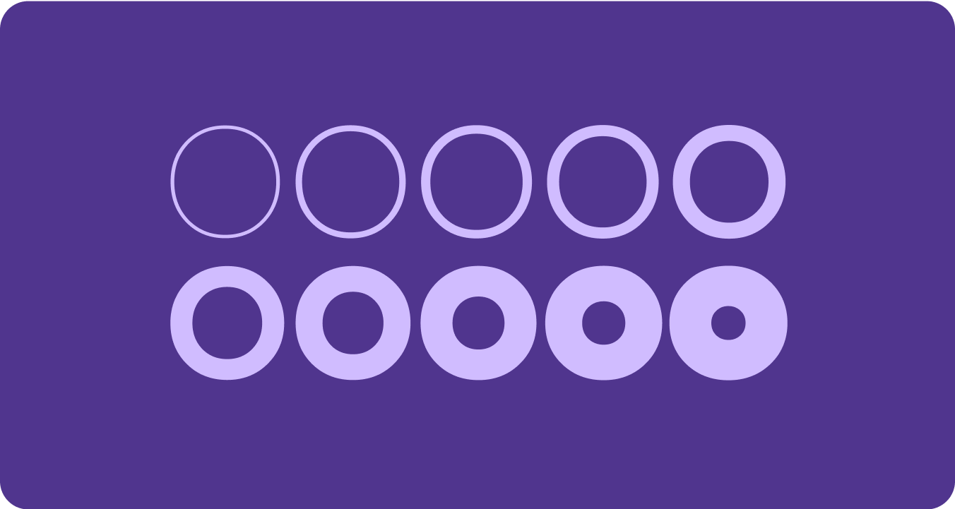
Width
Width is the result of how much horizontal space is taken up by a
typeface's characters. A narrow width allows more characters to fit per line
while a wider width may offer more personality.
Things to remember
check_circle
Do
A thinner width can allow for more characters to fit at
small sizes, such as name or a long number.
cancel
Don't
Since wider styles take up more space, avoid using them for
areas with limited space, such as in the app page header.
Content and code samples on this page are subject to the licenses described in the Content License. Java and OpenJDK are trademarks or registered trademarks of Oracle and/or its affiliates.
Last updated 2025-05-20 UTC.
[[["Easy to understand","easyToUnderstand","thumb-up"],["Solved my problem","solvedMyProblem","thumb-up"],["Other","otherUp","thumb-up"]],[["Missing the information I need","missingTheInformationINeed","thumb-down"],["Too complicated / too many steps","tooComplicatedTooManySteps","thumb-down"],["Out of date","outOfDate","thumb-down"],["Samples / code issue","samplesCodeIssue","thumb-down"],["Other","otherDown","thumb-down"]],["Last updated 2025-05-20 UTC."],[],[],null,["# Fonts\n\nReplace all instances of Roboto with Roboto Flex. Tailor a baseline type scale\nthat is optimized for the watch and the Material 3 Expressive design language.\n\nUsing variable axis, variable width and weight to curate how we style big\ndisplay and title text to elevate style and bring more utility and legibility\nfor smaller sizes.\n\nRoboto Flex\n-----------\n\n\nRoboto Flex offers a set of variable axis that serves your app's use cases. \n\n\u003cbr /\u003e\n\nAdjustable axes\n---------------\n\nWhile variable fonts can have a multitude of variable font attributes for\nexpression, there are two customizable stylistic attributes (or axes) that are\nmost applicable for product design: weight and width.\n\n### Weight\n\n\n[Weight](https://fonts.google.com/knowledge/choosing_type/exploring_typefaces_with_multiple_weights_or_grades) is the primary attribute that defines the overall thickness of a\ntypeface's strokes in any given font. The most common weights are regular and\nbold, but weights can cover extremes from the very light to the very heavy. If\nthe typeface is variable, it provides a full, continuous range of stroke\nthicknesses, making the number of weights effectively unlimited. \n\n\u003cbr /\u003e\n\n#### Things to remember\n\nwarning\n\n### Caution\n\nBe careful of using too light a weight type for body text.\nLower resolution displays can struggle with delicate, especially small\ntypography. Use lighter weights at larger font sizes, such as display\ntype. \nwarning\n\n### Caution\n\nConversely, excessive weight at smaller sizes may affect\nlegibility. Too thick a type may be difficult to read.\n\n### Width\n\n\n[Width](https://fonts.google.com/knowledge/glossary/width) is the result of how much horizontal space is taken up by a\ntypeface's characters. A narrow width allows more characters to fit per line\nwhile a wider width may offer more personality. \n\n\u003cbr /\u003e\n\n#### Things to remember\n\ncheck_circle\n\n### Do\n\nA thinner width can allow for more characters to fit at\nsmall sizes, such as name or a long number. \ncancel\n\n### Don't\n\nSince wider styles take up more space, avoid using them for\nareas with limited space, such as in the app page header."]]