संग्रह की मदद से व्यवस्थित रहें
अपनी प्राथमिकताओं के आधार पर, कॉन्टेंट को सेव करें और कैटगरी में बांटें.
Wear OS के लिए Material 3 Expressive, कलर रोल को अलग-अलग ह्यू, क्रोमा, और टोन वैल्यू असाइन करके विज़ुअल हैरारकी तय करता है. इससे बोल्ड ऐक्सेंट कलर और नेचुरल सर्फ़ेस कलर के बीच का फ़र्क़ साफ़ तौर पर दिखता है. सिस्टम में प्राइमरी, सेकंडरी, और तीसरे दर्जे के ऐक्सेंट की भूमिकाओं को शामिल करने से, न सिर्फ़ विज़ुअल को बेहतर तरीके से दिखाया जा सकता है, बल्कि अलग-अलग रंगों के विकल्पों की मदद से, विज़ुअल के लेआउट को बेहतर तरीके से कंट्रोल किया जा सकता है. रंगों का ज़रूरत के हिसाब से इस्तेमाल करने से, Watch के यूज़र इंटरफ़ेस (यूआई) में एक जैसा और बेहतर अनुभव मिलता है. ऐसा, थीम इस्तेमाल करने पर भी होता है.
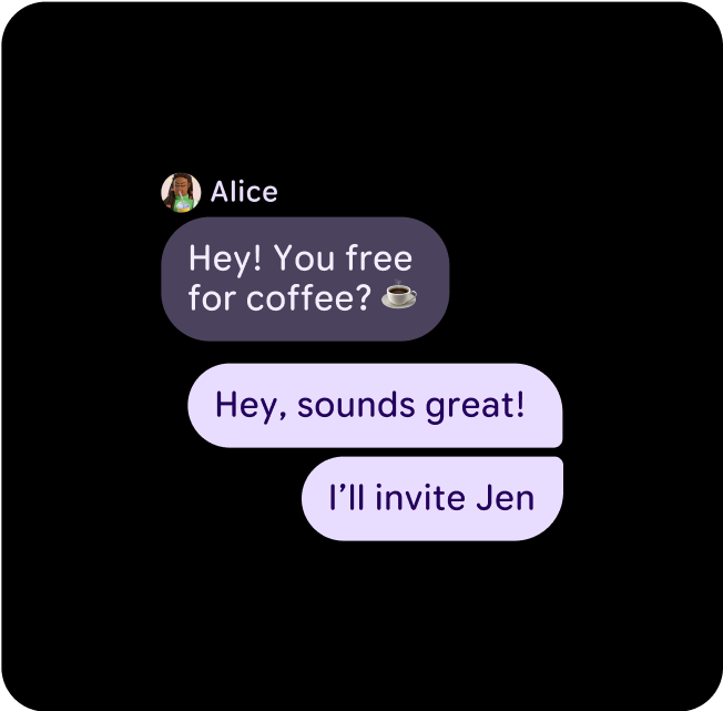
अलग-अलग थीम में अलग-अलग लेआउट, कॉम्पोनेंट, और यूज़र इंटरफ़ेस (यूआई) का उदाहरण, लेकिन फिर भी कलर कंट्रास्ट सही है.
रंगों को जोड़ना और लेयर बनाना
विज़ुअल ऐक्सेस बनाए रखने के लिए, सिर्फ़ उन पेयर कलर टोक़न में रंग लागू करें जिनका इस्तेमाल करना है. रंगों को गलत तरीके से जोड़ने से, विज़ुअल ऐक्सेसिविटी के लिए ज़रूरी कंट्रास्ट खराब हो सकता है. ऐसा खास तौर पर तब होता है, जब डाइनैमिक रंग की मदद से रंगों में बदलाव किया जाता है.
रंगों को सही तरीके से जोड़ना और लेयर करना
सही विज़ुअल और ऐक्सेस को पक्का करने के लिए, पक्का करें कि आपने सही टोक़न को सही जगह पर मैप किया हो. रंग की गलत मैपिंग की वजह से, अनचाहे विज़ुअल दिख सकते हैं और सुलभता की सुविधा काम नहीं कर सकती.
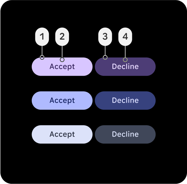
check_circle
यह करें
सही विज़ुअल और सुलभता के लिए, कलर की भूमिकाओं को सही तरीके से जोड़ें और लेयर करें.
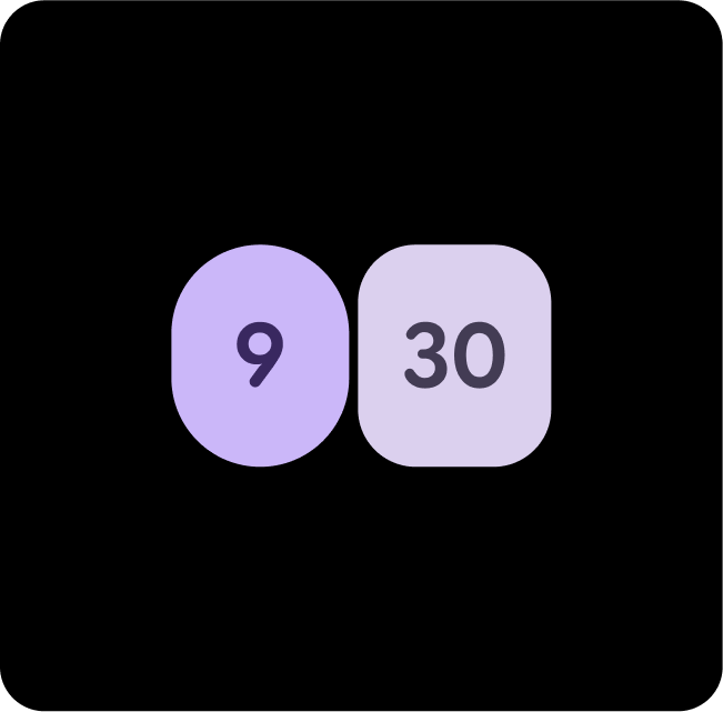
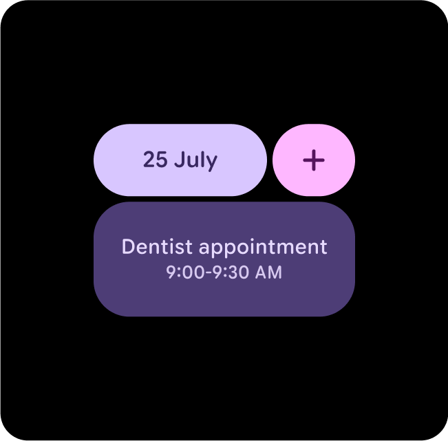
इस उदाहरण में, (1) प्राइमरी पर (2)
on-प्राइमरी या (3) प्राइमरी-कंटेनर पर (4) on-प्राइमरी-कंटेनर वाले बटन, कंट्रास्ट लेवल में बदलाव होने पर भी साफ़-साफ़ दिखते हैं. साथ ही, इनकी रेटिंग AAA है और कंट्रास्ट रेशियो 7:1 या इससे ज़्यादा है.
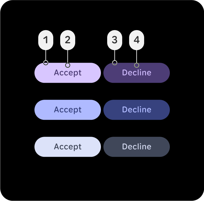
cancel
यह न करें
अमान्य कलर मैपिंग की वजह से, अनचाहे विज़ुअल दिख सकते हैं और ऐक्सेस करने में समस्या आ सकती है.
इस उदाहरण में, (1) primary पर (2) primary-container या (3) primary-container पर (4) primary-dim वाले बटन, पढ़ने लायक नहीं होते. ऐसा इसलिए होता है, क्योंकि कंट्रास्ट लेवल बदल जाते हैं और सामान्य टेक्स्ट के लिए कम से कम 7:1 के कंट्रास्ट रेशियो का पालन नहीं किया जाता. ये कंट्रास्ट
लेवल, प्राइमरी, सेकंडरी, और टर्शियरी भूमिकाओं पर लागू होते हैं.
रंगों के सुझाव
प्राइमरी + प्राइमरी डाइमेंशन
मुख्य ऐक्शन के लिए प्राइमरी और साथ में खरीदे जाने वाले आइटम के लिए प्राइमरी-डिम का इस्तेमाल करें. इससे, प्राइमरी ऐक्शन को हाइलाइट करने के साथ-साथ, ऐप्लिकेशन को बेहतर बनाया जा सकता है.
प्राइमरी-डिम + टर्शीयरी
अहम एलिमेंट को हाइलाइट करने के लिए, प्राइमरी-डिम का इस्तेमाल करें. साथ ही, टैप किए जाने पर मिलने वाले जवाबों जैसे बेहतर फ़ीडबैक देने के लिए, टियररी का इस्तेमाल करें.
प्राइमरी + सेकंडरी-कंटेनर
कम अहमियत वाले कॉन्टेंट के लिए सेकंडरी कंटेनर का इस्तेमाल करें. वहीं, मुख्य एलिमेंट पर प्राइमरी कंटेनर का इस्तेमाल किया जाता है, ताकि वे अलग दिखें और लोगों का ध्यान खींच सकें.
प्राइमरी + प्राइमरी-कंटेनर
मुख्य कार्रवाइयों के लिए प्राइमरी और साथ में दिए जाने वाले या सेकंडरी आइटम के लिए प्राइमरी-कंटेनर का इस्तेमाल करें. इससे प्राइमरी ऐक्शन को हाइलाइट करने के साथ-साथ, कॉन्टेंट को बेहतर बनाया जा सकता है.
प्राइमरी-डिम + टियरसीरी-डिम
अहम एलिमेंट को हाइलाइट करने के लिए प्राइमरी-डिम और बेहतर फ़ीडबैक देने के लिए, तीसरे दर्जे के डाइमेंशन का इस्तेमाल करें. जैसे, कोई लक्ष्य पूरा होना.
तीसरे लेवल + पहले लेवल + दूसरे लेवल का कंटेनर
जब यह साफ़ तौर पर नहीं पता कि मुख्य कार्रवाई क्या है, तो मुख्य कार्रवाइयों के लिए, तीसरे और मुख्य के कॉम्बिनेशन का इस्तेमाल करें. साथ ही, पूरक कार्रवाइयों के लिए, सेकंडरी-कंटेनर का इस्तेमाल करें.
सेकंडरी + प्राइमरी-कंटेनर
जब आपको दो ऐसे विकल्प या कंटेनर दिखाने हों जो एक जैसे अहम हों, लेकिन दोनों के बीच अंतर हो, तो प्राइमरी-डाइमेंशन और सेकंडरी का इस्तेमाल करें.
प्राइमरी + टियर्री + प्राइमरी-कंटेनर
जब यह साफ़ तौर पर नहीं पता कि मुख्य ऐक्शन क्या है, तो मुख्य ऐक्शन के लिए, तीसरे और मुख्य के कॉम्बिनेशन का इस्तेमाल करें. साथ ही, पूरक ऐक्शन के लिए, मुख्य-कंटेनर का इस्तेमाल करें.
प्राइमरी + टियर्री-डिम
मुख्य ऐक्शन के लिए प्राइमरी और साथ में बेचे जाने वाले आइटम के लिए प्राइमरी डाइमेंशन का इस्तेमाल करें. इससे प्राइमरी ऐक्शन को हाइलाइट करने के साथ-साथ, इमेज में गहराई भी आती है.
इस पेज पर मौजूद कॉन्टेंट और कोड सैंपल कॉन्टेंट के लाइसेंस में बताए गए लाइसेंस के हिसाब से हैं. Java और OpenJDK, Oracle और/या इससे जुड़ी हुई कंपनियों के ट्रेडमार्क या रजिस्टर किए हुए ट्रेडमार्क हैं.
आखिरी बार 2025-07-27 (UTC) को अपडेट किया गया.
[[["समझने में आसान है","easyToUnderstand","thumb-up"],["मेरी समस्या हल हो गई","solvedMyProblem","thumb-up"],["अन्य","otherUp","thumb-up"]],[["वह जानकारी मौजूद नहीं है जो मुझे चाहिए","missingTheInformationINeed","thumb-down"],["बहुत मुश्किल है / बहुत सारे चरण हैं","tooComplicatedTooManySteps","thumb-down"],["पुराना","outOfDate","thumb-down"],["अनुवाद से जुड़ी समस्या","translationIssue","thumb-down"],["सैंपल / कोड से जुड़ी समस्या","samplesCodeIssue","thumb-down"],["अन्य","otherDown","thumb-down"]],["आखिरी बार 2025-07-27 (UTC) को अपडेट किया गया."],[],[],null,["# Apply color\n\nMaterial 3 Expressive for Wear OS establishes visual hierarchy by assigning\ndifferent hue, chroma, and tone values to its color roles, effectively\ndistinguishing bold accent colors from neutral surface colors. The system's\ninclusion of primary, secondary, and tertiary accent roles not only enhances\nexpressive possibilities but also offers more granular control over visual\nhierarchy through distinct color choices. This intentional use of color ensures\na consistent and cohesive feel within the Watch UI, even with theming.\nExample of different layouts, components and UIs in various themes, but\nstill maintaining adequate color contrast.\n\nPair and layer colors\n---------------------\n\nTo maintain visual accessibility, apply colors only in the intended pairs color\ntokens. Combining colors improperly may break contrast necessary for visual\naccessibility, particularly when colors are adjusted through dynamic color.\n\n### Pair and layer colors correctly\n\nIn order to ensure proper visuals and accessibility, make sure you are mapping\nthe correct token to its correct position. An improper color mapping can lead to\nunintended visuals and break accessibility. \ncheck_circle\n\n### Do\n\n**Pair and layer color roles correctly to ensure proper\nvisuals and accessibility.**\n\nIn this example, buttons with (2)\n**on-primary** on (1) **primary** or (4) **on-primary** -container\non (3) **primary-container** stay legible as the contrast level changes\nand have an AAA rating with a contrast ratio of 7:1 or more. \ncancel\n\n### Don't\n\n**Improper color mappings can lead to unintended visuals\nand break accessibility.**\n\nIn this example, buttons with (2)\n**primary-container** on (1) **primary** or (4) **primary-dim** on\n(3) **primary-container** become illegible as contrast levels shift and\ndon't follow the 7:1 contrast ratio minimum for normal text. These contrast\nlevels apply to primary, secondary and tertiary roles.\n\n### Recommended color pairings\n\n\n**Primary + Primary Dim**\n\nUse Primary for main actions, and Primary-Dim for complementary items. This\ncreates depth while ensuring the primary action stands out. \n\n**Primary-Dim + Tertiary**\n\nUse Primary-Dim to highlight important elements and Tertiary to provide standout\nfeedback, such as tap responses. \n\n**Primary + Secondary-Container**\n\nUse Secondary-Container for less prominent content, while Primary is applied to\nkey elements to ensure they stand out and grab attention.\n\n\u003cbr /\u003e\n\n\n**Primary + Primary-Container**\n\nUse Primary for main actions, and Primary-Container for complementary or\nsecondary items. This creates depth while ensuring the primary action stands\nout. \n\n**Primary-Dim + Tertiary-Dim**\n\nUse Primary-Dim to highlight important elements and Tertiary-Dim to provide\nstandout feedback, such as a goal being met. \n\n**Tertiary + Primary + Secondary-Container**\n\nWhen it's not clear what the main action is, use a combination of Tertiary and\nPrimary for a main actions and Secondary-Container for a complementary actions.\n\n\u003cbr /\u003e\n\n\n**Secondary + Primary-Container**\n\nUse Primary-Dim and Secondary when you want to show two equally as important\noptions or containers, but still have contrast between the two. \n\n**Primary + Tertiary + Primary-Container**\n\nWhen it's not clear what the main action is, use a combination of Tertiary and\nPrimary for a main actions and Primary-Container for a complementary actions. \n\n**Primary + Tertiary-Dim**\n\nUse Primary for main actions and Primary Dim for complementary items. This\ncreates depth while helping the primary action to stand out.\n\n\u003cbr /\u003e"]]