
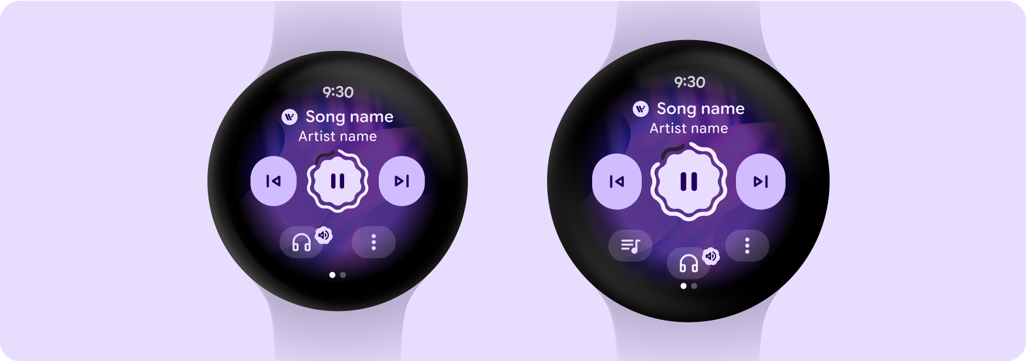
The media controls screen is essential to help users control the media that they're listening to. Create media controls using a 5-button layout to verify that minimum tap targets are met. On larger screens that are 225 dp or larger, you can add value by including a shortcut button for an important action such as playback queue.
Layout sections
The media controls screen is a fixed height screen. It's made up of three vertical sections that have different responsive layouts and behavior.
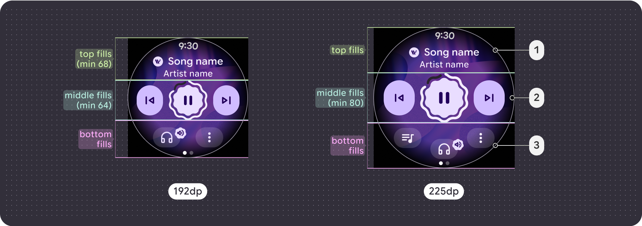
- Top section: Contains media details
- Middle section: Media controls
- Bottom section: Configurable secondary buttons
Considerations for larger screen
The large screen adaptations for media are solely focused on the media controls screen. All other elements are captured in chip, button, and dialog items or in the lists breakdown of large screen behavior.
Buttons
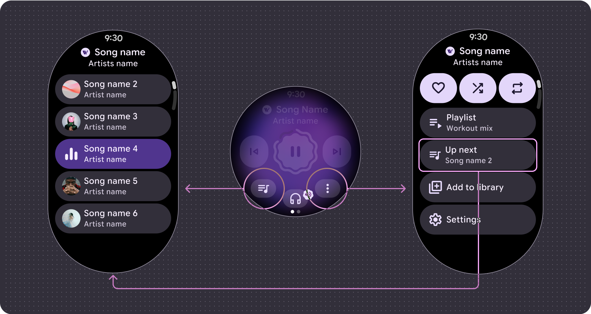
You can add value by including a shortcut button for an important action, such as playback queue. Using the overflow menu verifies that the additional functionality is still consistent and accessible no matter what's the screen size. The bottom section gains an additional slot for a button after the 225 dp breakpoint making the maximum number of buttons 2 on smaller screens and 3 on larger screens.
Main control
The main control is usually a play and pause button. After the 225 dp breakpoint, the control scales from 64dp to 80dp, which increases tap targets for all controls within it.
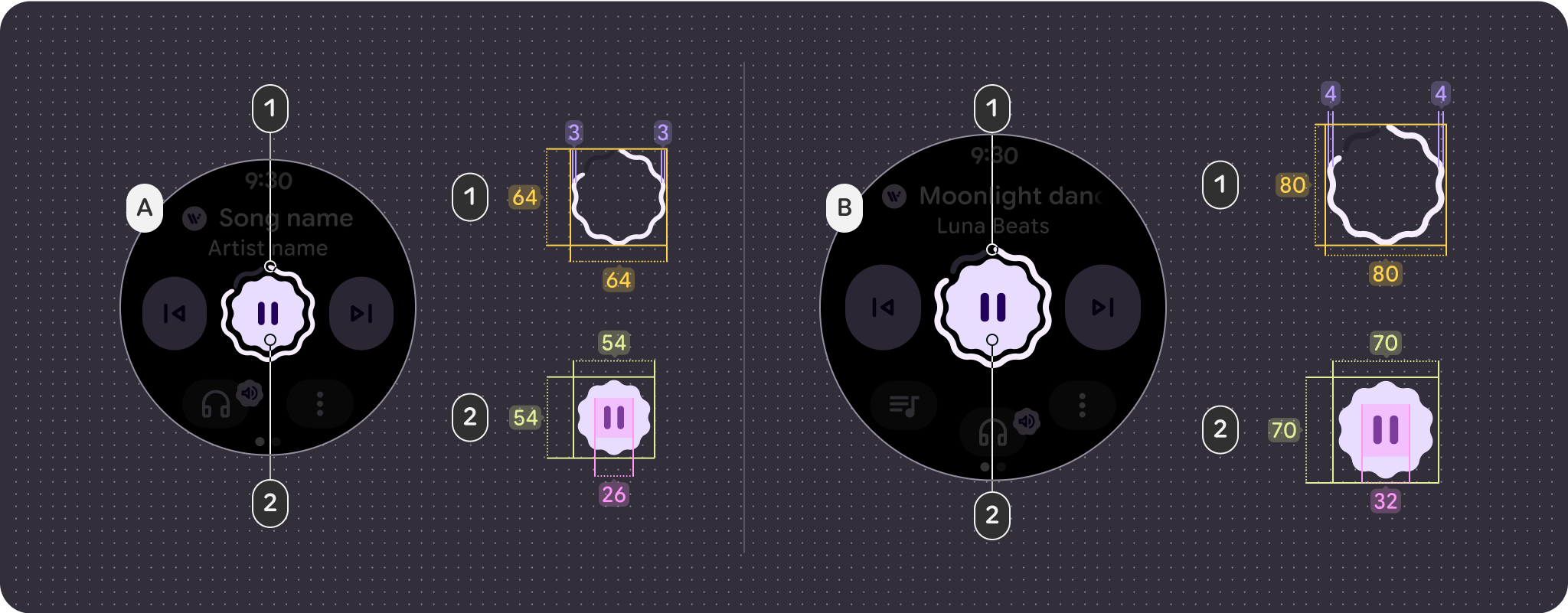
- Progress ring = 64 x 64 dp / 3 dp stroke
- Button = 54 x 54 dp / 26 icon size
- Progress ring = 80 x 80 dp / 4 dp stroke
- Button = 70 x 70 dp / 32 icon size
Button configuration
To follow touch target size principles, show only the 2-button layout before the 225 dp breakpoint and 3-button layouts past it.
The following examples show different button configurations:
1 Button Layout with overflow, smaller screen (192 dp)
1 Button Layout with overflow, larger screen (225 dp)
2 Button Layout with overflow, smaller screen (192 dp)
2 Button Layout with overflow, larger screen (225 dp)

2 Button (max) Layout with overflow, smaller screen (192 dp)
3 Button Layout with overflow, larger screen (225 dp)
Marquee behavior
The header has a number of updates to improve readability and general experience:
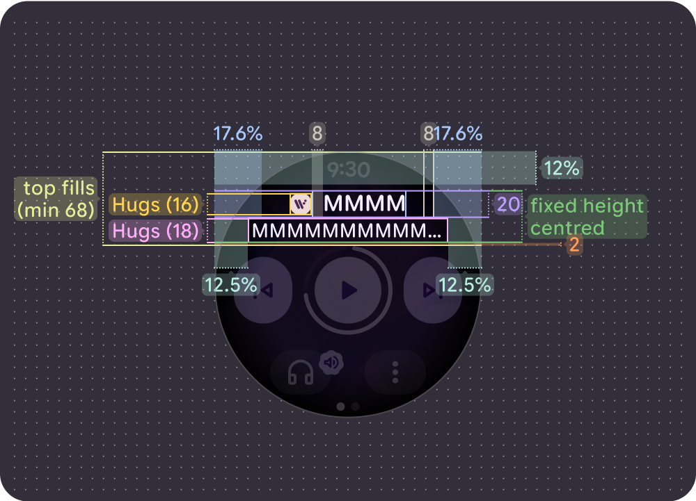
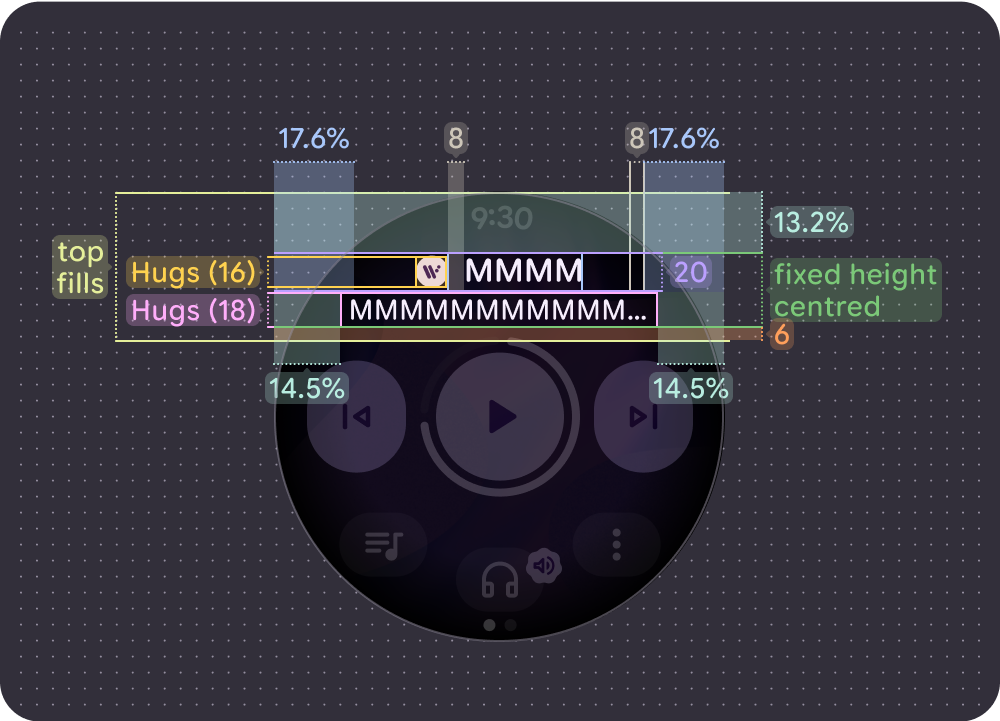
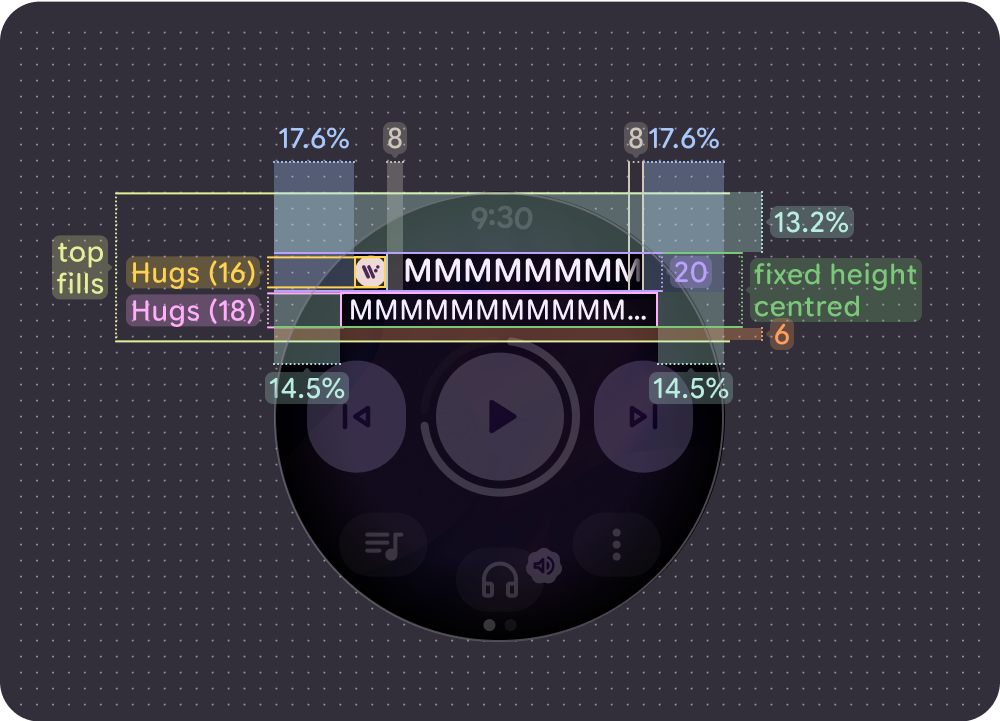
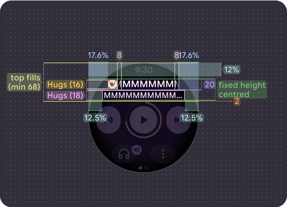
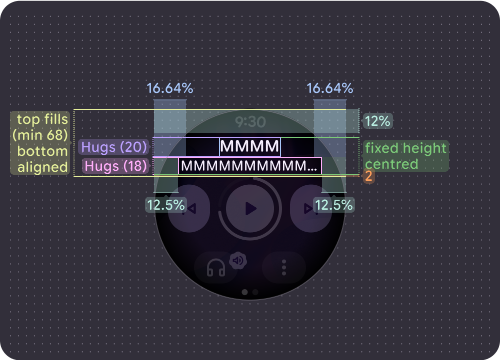
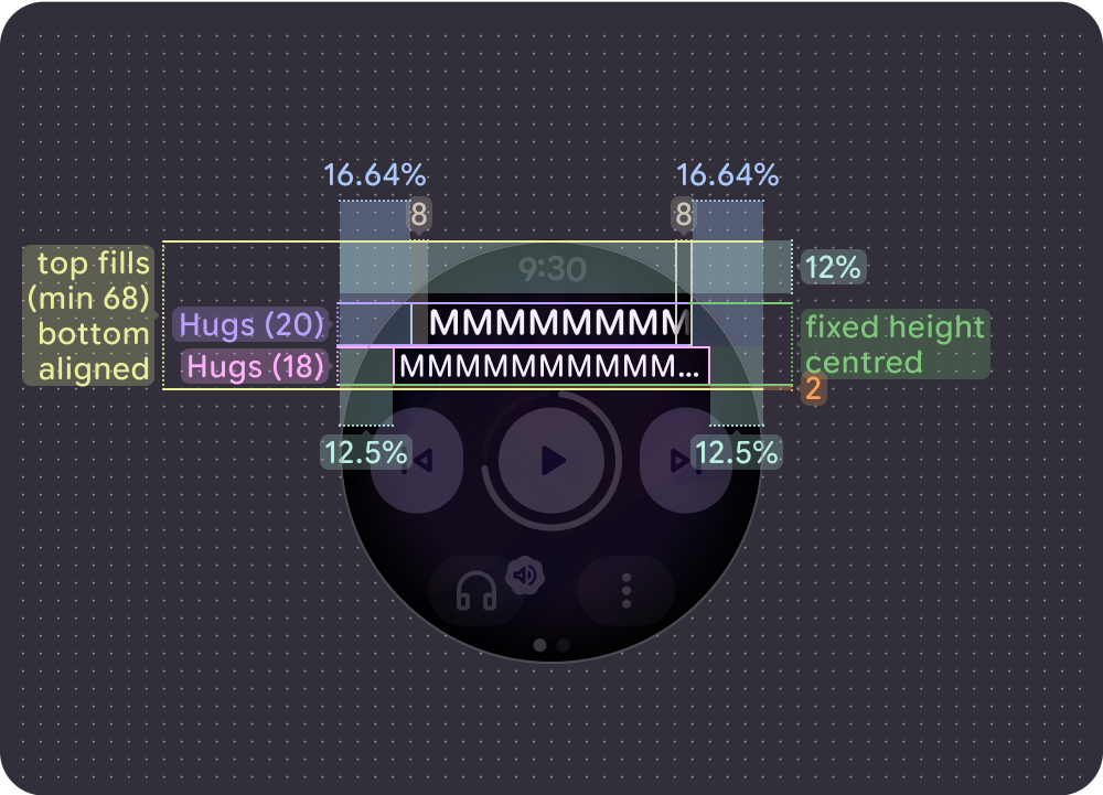
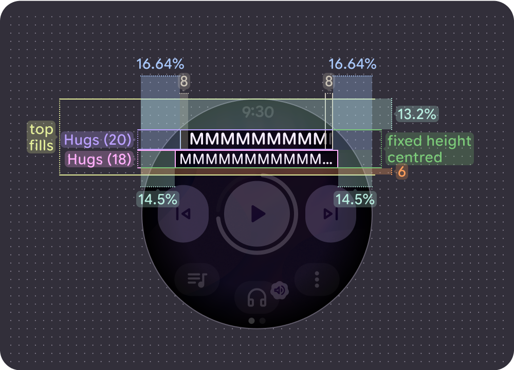
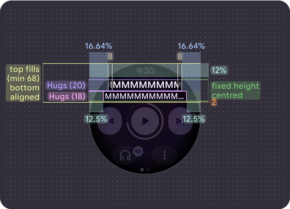
- A top margin of 12% on smaller screens and 13.2% on larger screens.
- Side margins for the song title of 17.6%
- Artist title margin of 12.5% on smaller screens and 14.5% on larger screens.
- Artist title truncates, while 8-dp gradients are used for scrolling song titles. If an icon is present, an additional 8 dp gap separates the song title from the icon. (The icon doesn't scroll with the song title.)
With an icon
Non-scrolling (short) song title on smaller screens (192 dp)
Non-scrolling (short) song title on larger screens (225 dp)

Scrolling (long) song title (left-aligned) on smaller screens (192 dp)
Scrolling (long) song title (left-aligned) on larger screens (225 dp)
Scrolling (long) song title (center-aligned) on smaller screens (192 dp)

Scrolling (long) song title (center-aligned) on larger screens (225 dp)
Without an icon
Non-scrolling (short) song title on smaller screens (192 dp)
Non-scrolling (short) song title on larger screens (225 dp)
Left aligned / non-scrolling (long) song title on smaller screens (192 dp)
Left aligned / non-scrolling (long) song title on larger screens (225 dp)
Scrolling (long) song title (center-aligned) on smaller screens (192 dp)
Scrolling (long) song title (center-aligned) on larger screens (225 dp)
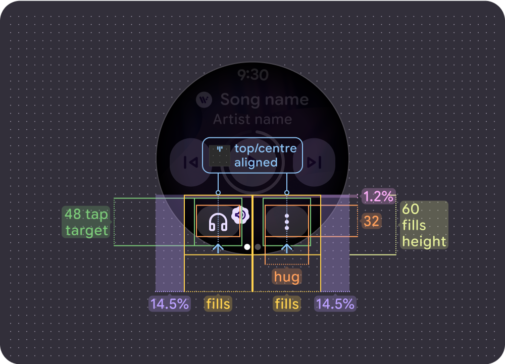
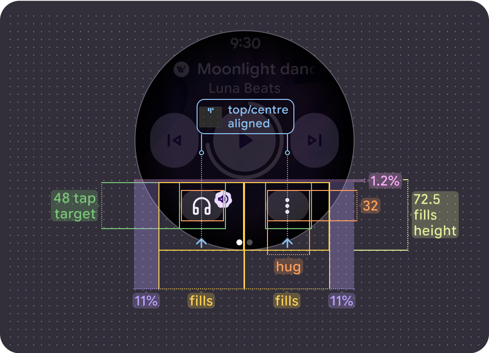
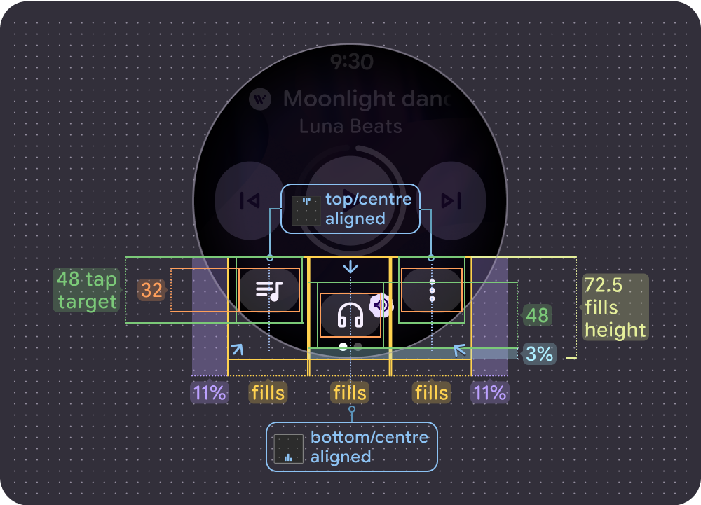
Tap targets
Main controls and bottom buttons use the available space to maximize the tap target. The minimum tap target size is 48 x 48 dp on Wear OS devices, with icons and buttons aligned to the center of the tap target.
Main controls
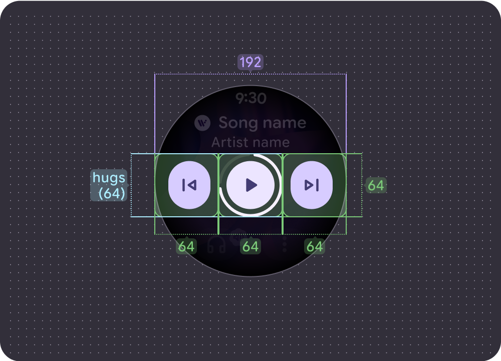
Small screen (192dp):
- Main control = 64 x 64 dp
- Side controls = 64 x 64 dp
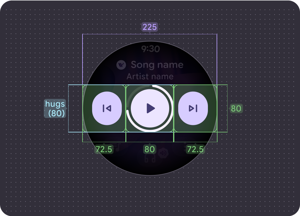
Large screen (225dp):
- Main control = 80 x 80 dp
- Side controls = 72.5 x 80 dp
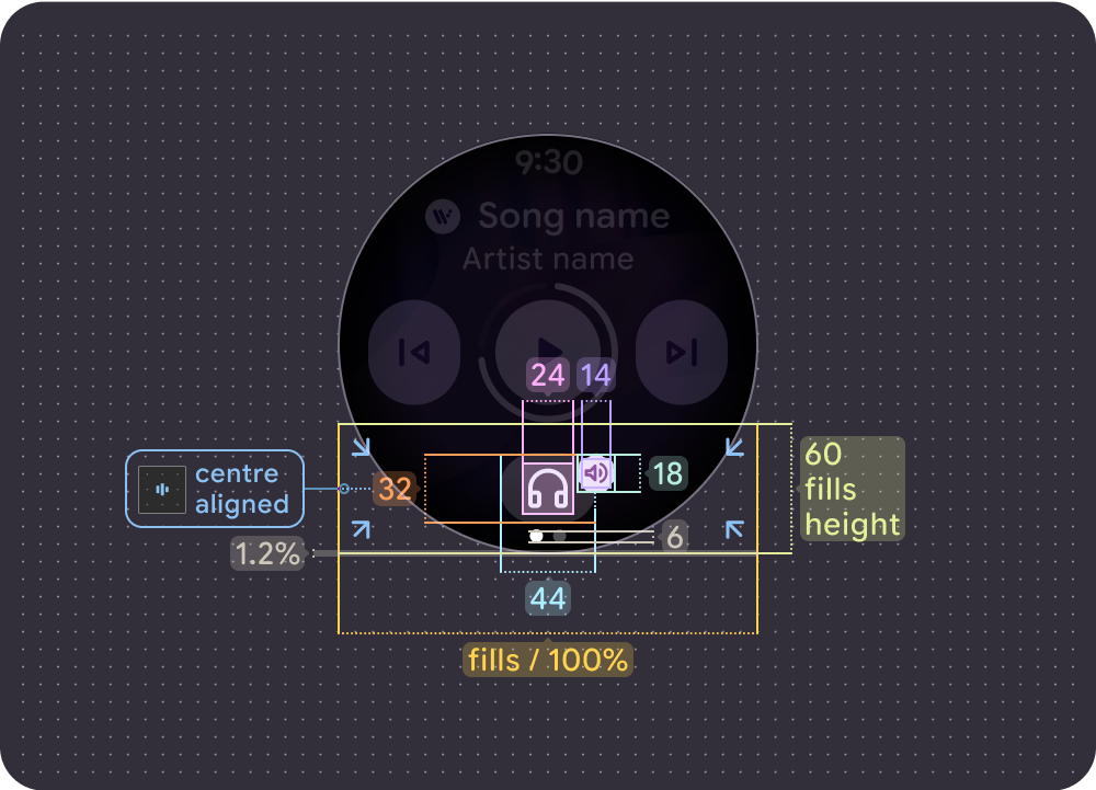
Bottom controls
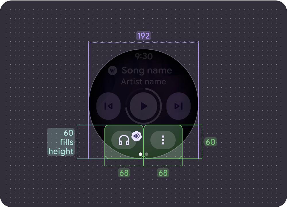
Smaller screens (192 dp) with a maximum of 2 buttons:
Both buttons = 68 x 60 dp
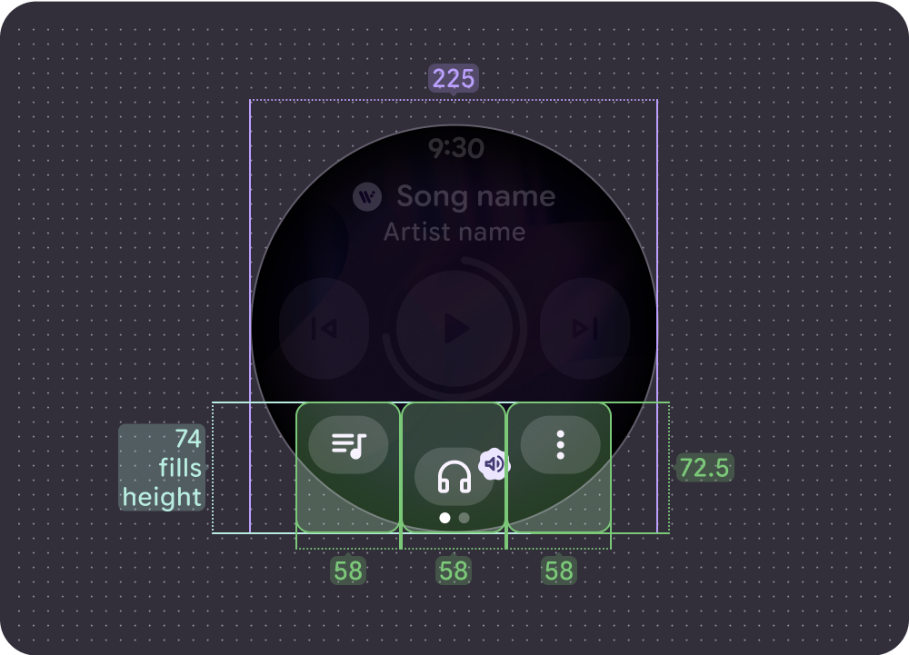
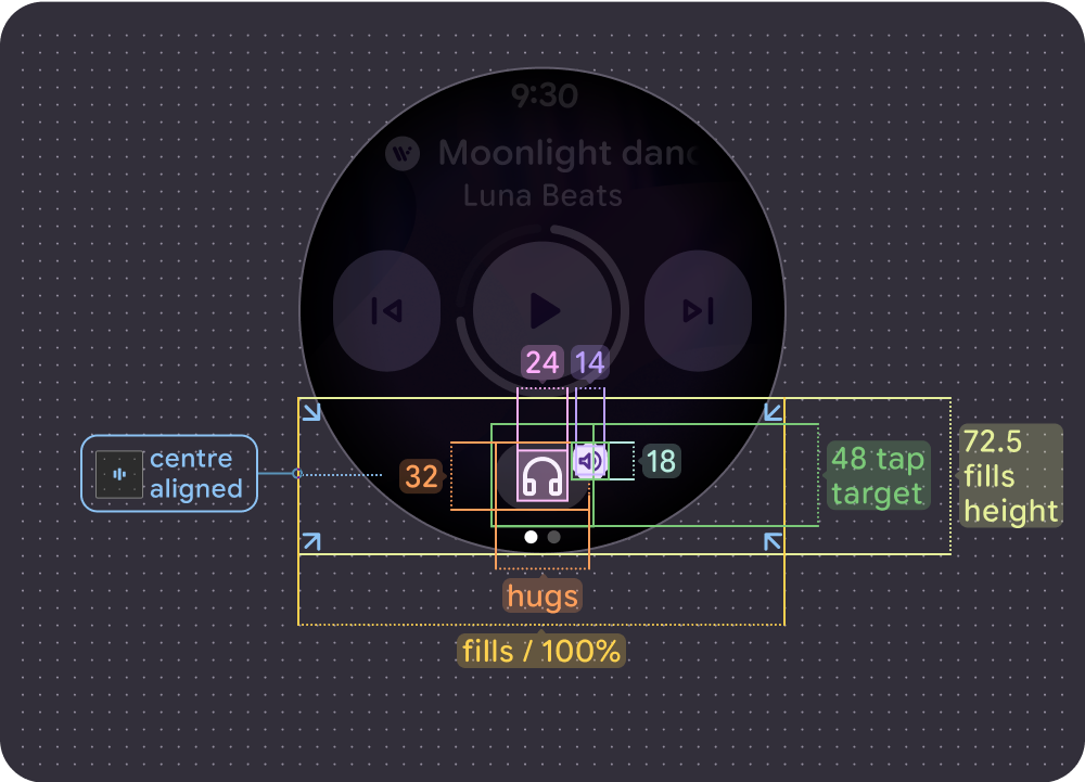
Larger screens (225 dp) with a maximum of 3 buttons:
All buttons = 58 x 72.5 dp