
An app is one of the primary surfaces on Wear OS. Apps are different from complications or tiles, which are glanceable representations of app content. Apps display more information and support richer interactivity. The user often enters an app from another surface, such as a notification, complication, Tile, or voice action.
Principles
Keep the following principles in mind when designing apps:
Focused: Focus on critical tasks to help people get things done within seconds.
Shallow and linear: Avoid creating hierarchies deeper than two levels. Aim to display content and navigation inline when possible.
Scrolling: Apps can scroll. This is a natural gesture for users to see more content on the watch.
Guidelines
Follow these guidelines when designing apps.
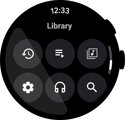
Optimize for vertical layouts
Simplify your app's design by using vertical layouts, which allow users to scroll in a single direction to move through content.
Do
Don't
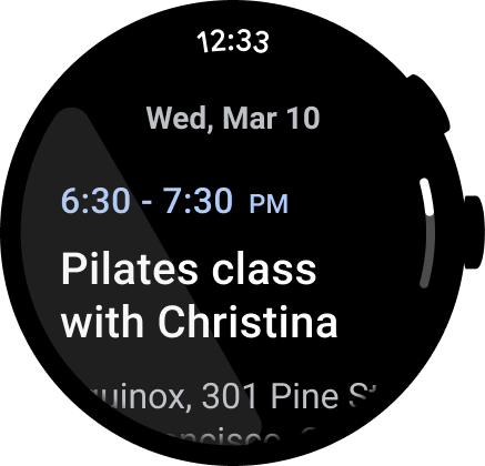
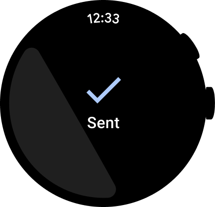
Show the time
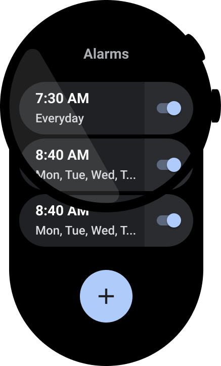
Users tend to spend more time in apps, so it's important to provide quick access to the time.
Do
Don't
For more information about design and usage, see Time text.
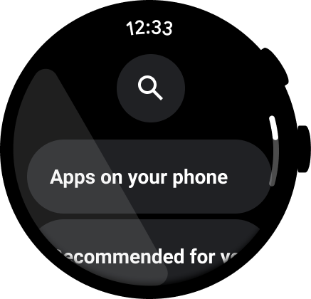
Accessible inline entry points
Ensure all actions are displayed inline, using clear iconography and labels for accessibility. This includes entry points to settings and preferences.
Do
Don't
Elevate primary actions
Help users take action in your app by pulling primary actions to the top of the app. Elevate non-ambiguous primary actions to the top of the app.
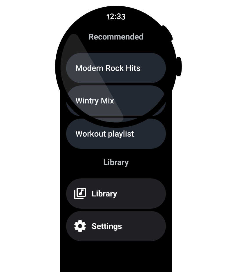
Use labels to orient users
For longer apps, help orient the user with labels as they scroll through the content.
Do
Don't
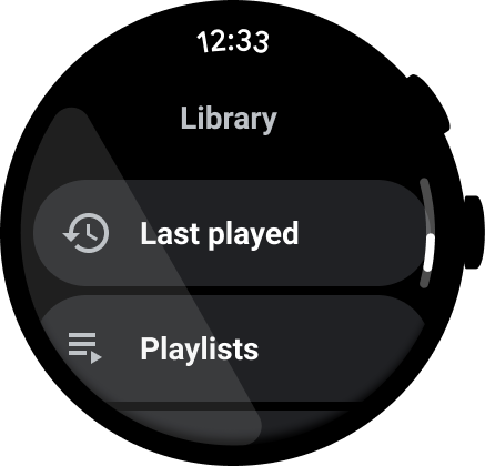
Show the scrollbar
Show the scrollbar if the entire view scrolls, as shown in the following image. For more information, see Position indicator.

Content containers
See the following examples of content containers.
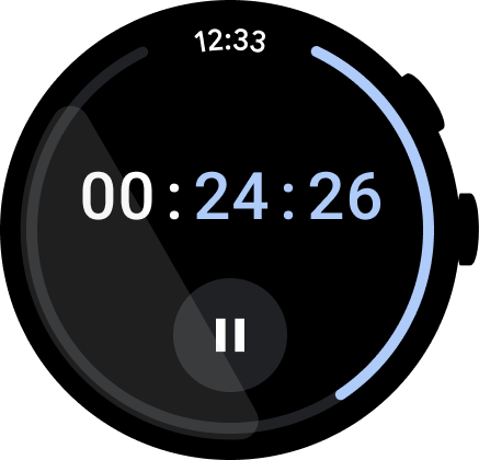
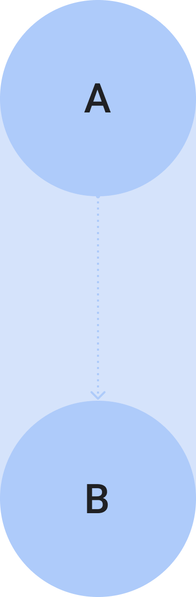
Figure 1. Container of fixed height.
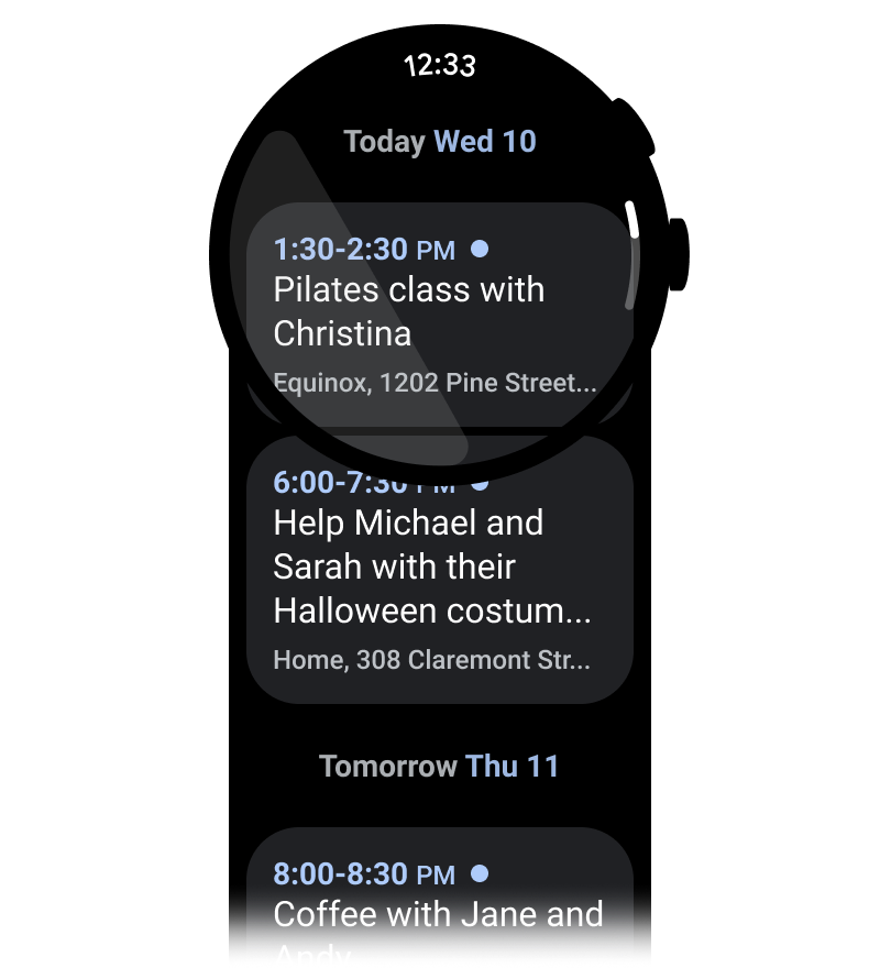
Figure 2. Container of variable height.
Figure 3. Container of height and width greater than the viewport.
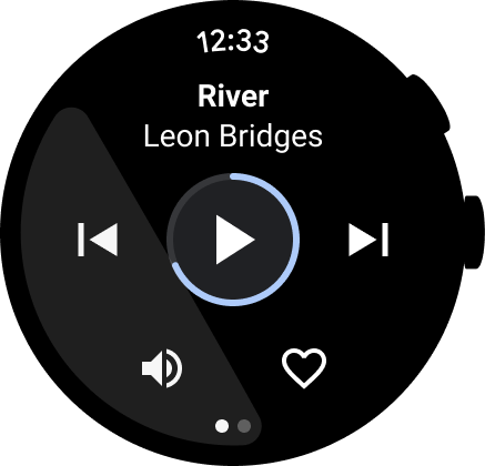
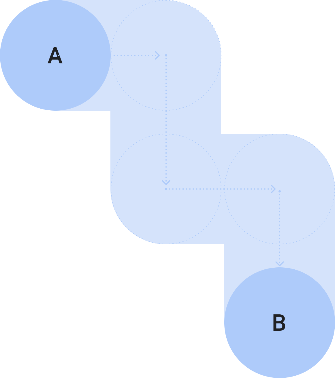
Figure 4. A paginated container.
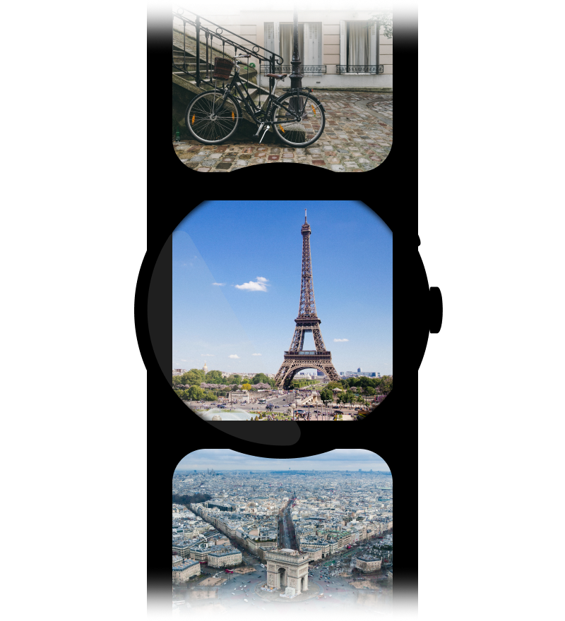
Figure 5a. Content pages that take the full dimension of the screen and are paginated vertically.