Wear Material Design 主題設定
透過集合功能整理內容
你可以依據偏好儲存及分類內容。

Wear 質感主題設定可讓您有系統地自訂 Wear 質感設計,以便符合品牌風格。當您開始變更 UI 如顏色和字體排版等層面時,Wear 質感設計主題設定工具便會為您所有的使用者體驗套用您的設計風格。本工具能夠為所有自訂屬性提供特定的值,讓您能夠輕鬆在設計和程式碼等工作流程之間切換。自訂屬性值便會為您的產品建立 Wear 質感主題。
使用 Wear 質感主題設定
Wear 質感主題設定由三種主要操作組成:自訂主題、套用至所有設計樣本,以及在程式碼中使用。
Wear 質感設計提供內建主題,您可以直接套用,或自訂內建主題,讓產品使用質感設計。
實際進行主題設定
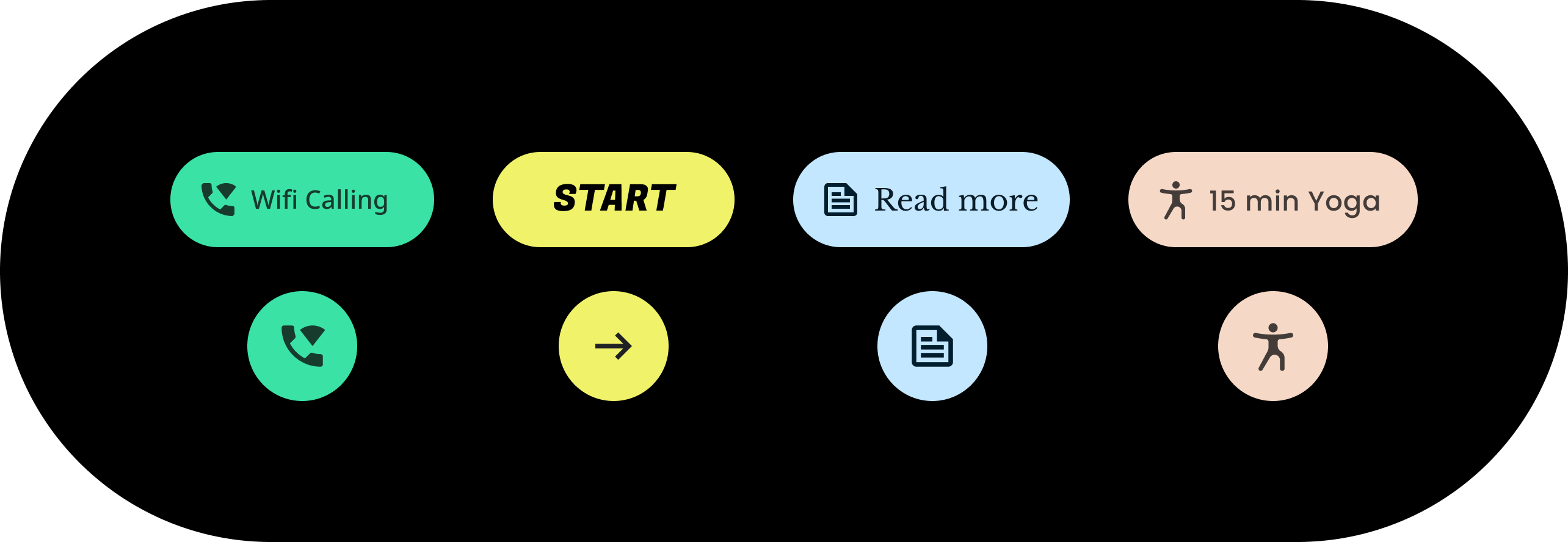
主題設定會影響整體 UI,包括方塊等各個元件。以下範例可展示如何自訂方塊元件的預設值。
系統會為內含的方塊指派值,以便指定顏色、形狀及類型分類。請按照您的應用程式樣式調整預設值。
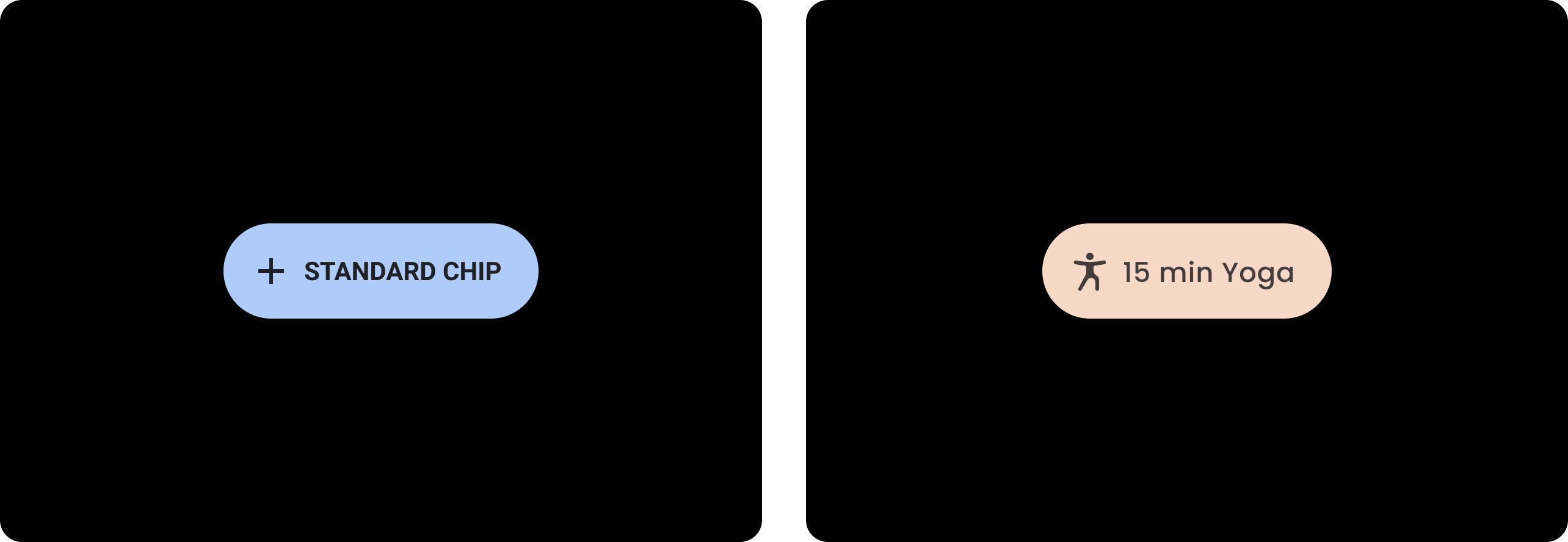
變更前
使用預設樣式的基礎 Wear 質感方塊。
|
變更後
自訂的 Wear 質感方塊。
|
顏色
顏色系統可以讓您設定元件、文字、圖示、表面及自訂顏色。您可以為以下 13 種類別設定主題顏色:
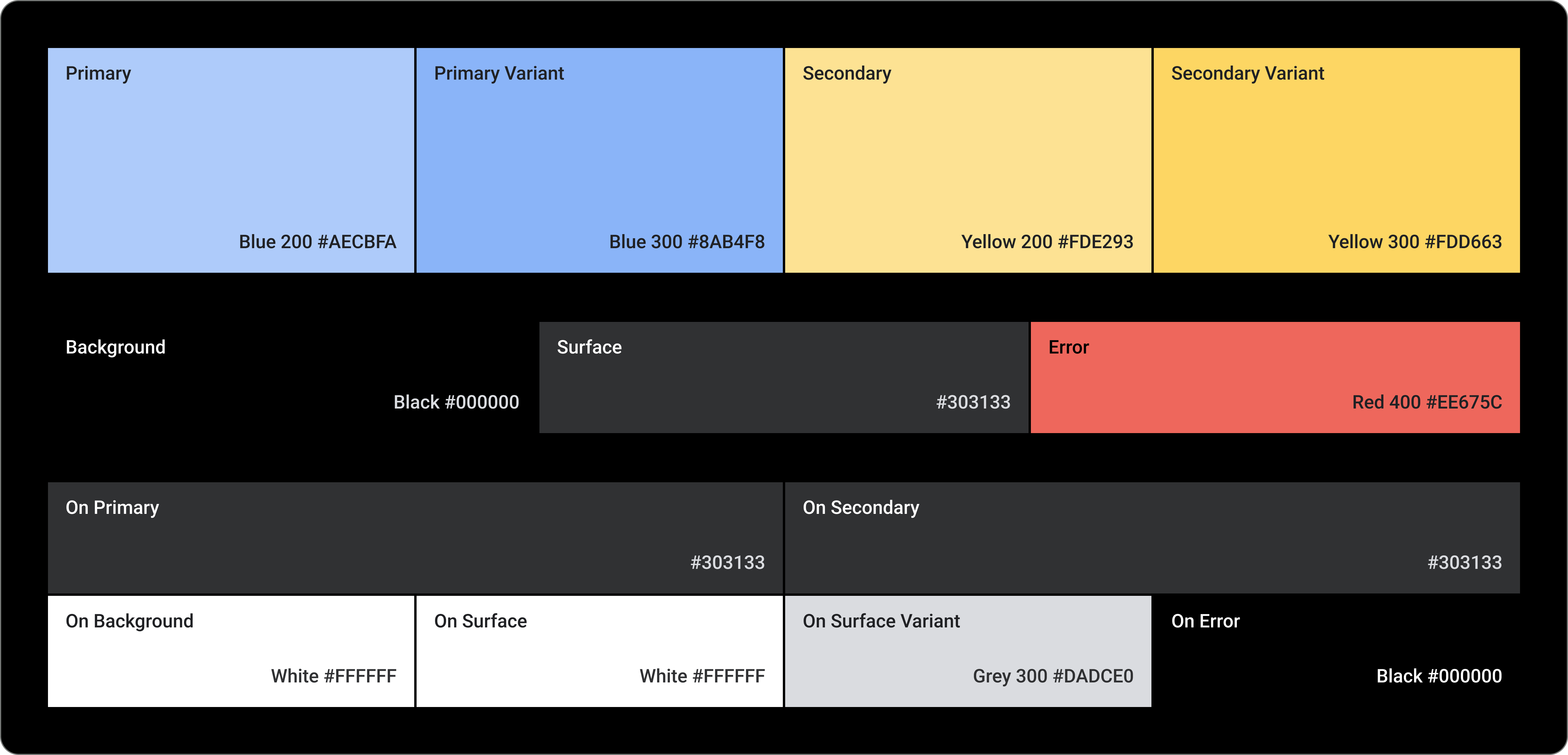
Primary
Primary Variant
Secondary
Secondary Variant
背景
Surface
錯誤
On Primary
On Secondary
On Background
On Surface
On Surface Variant
On Error
字體排版
字體排版系統支援 11 種類別,這些類別合起來可形成類型量尺。類型量尺可以決定螢幕上各種類型的樣式和大小,並可從內文文案排列到按鈕文字。
您可以自訂類型分類、字型、大小寫、大小及追蹤的值,而這些值可以控製字體排版屬性。

這個頁面中的內容和程式碼範例均受《內容授權》中的授權所規範。Java 與 OpenJDK 是 Oracle 和/或其關係企業的商標或註冊商標。
上次更新時間:2025-07-27 (世界標準時間)。
[[["容易理解","easyToUnderstand","thumb-up"],["確實解決了我的問題","solvedMyProblem","thumb-up"],["其他","otherUp","thumb-up"]],[["缺少我需要的資訊","missingTheInformationINeed","thumb-down"],["過於複雜/步驟過多","tooComplicatedTooManySteps","thumb-down"],["過時","outOfDate","thumb-down"],["翻譯問題","translationIssue","thumb-down"],["示例/程式碼問題","samplesCodeIssue","thumb-down"],["其他","otherDown","thumb-down"]],["上次更新時間:2025-07-27 (世界標準時間)。"],[],[],null,["# Wear Material Theming is the ability to systematically customize Wear Material\nDesign to reflect your brand. When you begin changing aspects of your UI such\nas color and typography, Wear Material Theming tools apply your design vision\nthroughout your user experience. The tools allow easy switching between\ndesign and code workflows by providing specific values for all customizable\nattributes. Customizing the attribute values creates a Wear Material Theme for\nyour product.\n\nUse Wear Material Theming\n-------------------------\n\nWear Material Theming consists of three main actions: customizing your theme,\napplying it across your design mocks, and using it in code.\n\nWear Material Design comes with a built-in theme that can be used as is.\nCustomize the built-in theme to make Material work for your product.\n\n### Theming in practice\n\nTheming affects your entire UI, including individual components such as chips.\nThe following example shows how to customize a chip component's default values.\n\nA contained chip is assigned values for a specific color, shape, and type\nfamily. Adjust the default values to suit your app's style.\n\n|---------------------------------------------------------------|--------------------------------------------|\n| **Before** A baseline Wear Material chip with default styles. | **After** A customized Wear Material chip. |\n\nColor\n-----\n\nThe color system supports setting custom colors for components, text, icons, and\nsurfaces. Set your theme colors for the 13 following categories:\n\n1. Primary\n\n2. Primary Variant\n\n3. Secondary\n\n4. Secondary Variant\n\n5. Background\n\n6. Surface\n\n7. Error\n\n8. On Primary\n\n9. On Secondary\n\n10. On Background\n\n11. On Surface\n\n12. On Surface Variant\n\n13. On Error\n\nTypography\n----------\n\nThe typography system supports 11 categories that together form the type scale.\nThis type scale determines the various type styles and sizes that appear\non-screen, ranging from body copy to button text.\n\nTypography attributes are controlled by values that can be customized for the\ntype family, font, case, size, and tracking."]]