Card 구성요소에는 단일 주제에 관한 콘텐츠와 작업이 포함되어 있습니다.
분석
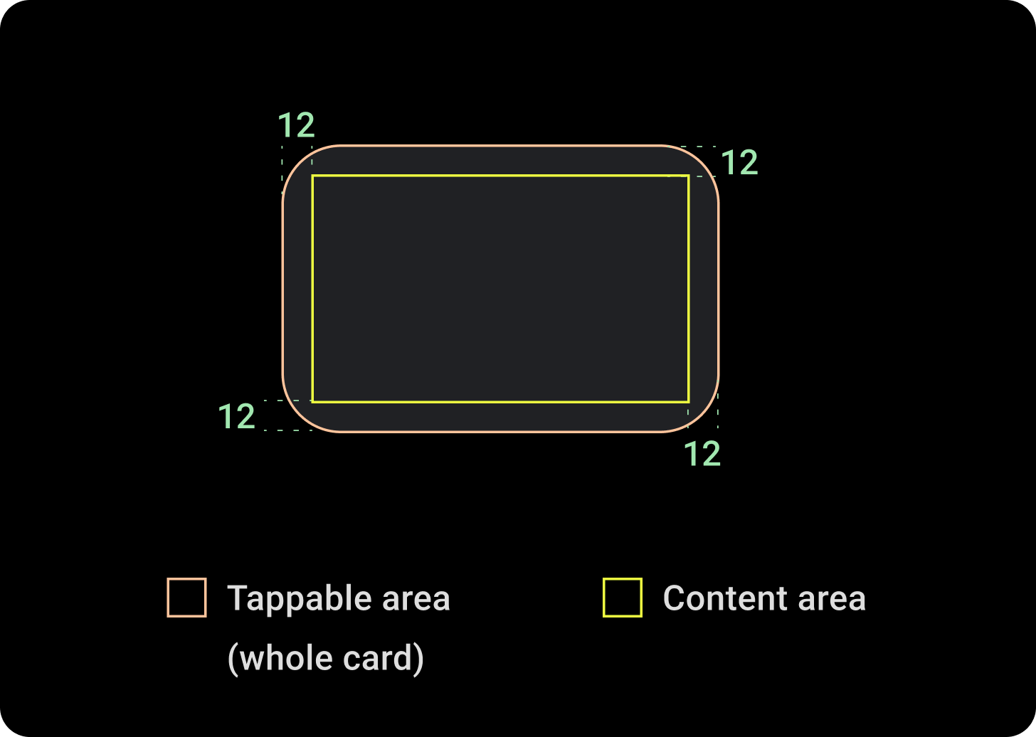
카드 구성요소에는 슬롯이 하나만 있습니다. 카드는 아이콘이나 이미지, 라벨을 포함할 수 있으며 맞춤설정할 수 있습니다.
기본적으로 카드는 둥근 모서리와 그라데이션 배경이 적용된 직사각형입니다. 원형 디스플레이는 화면의 상단과 하단을 최대 20%까지 자를 수 있으므로 카드의 최대 높이를 60%로 설정하여 화면에 전체가 표시되도록 합니다.

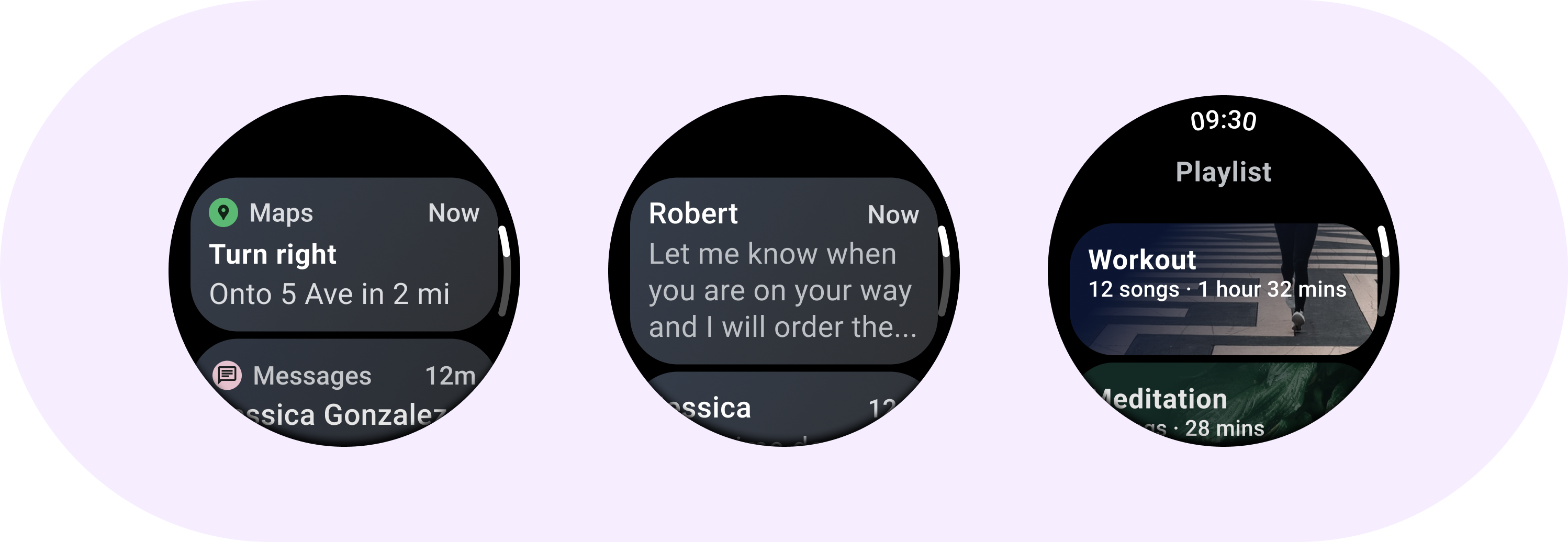
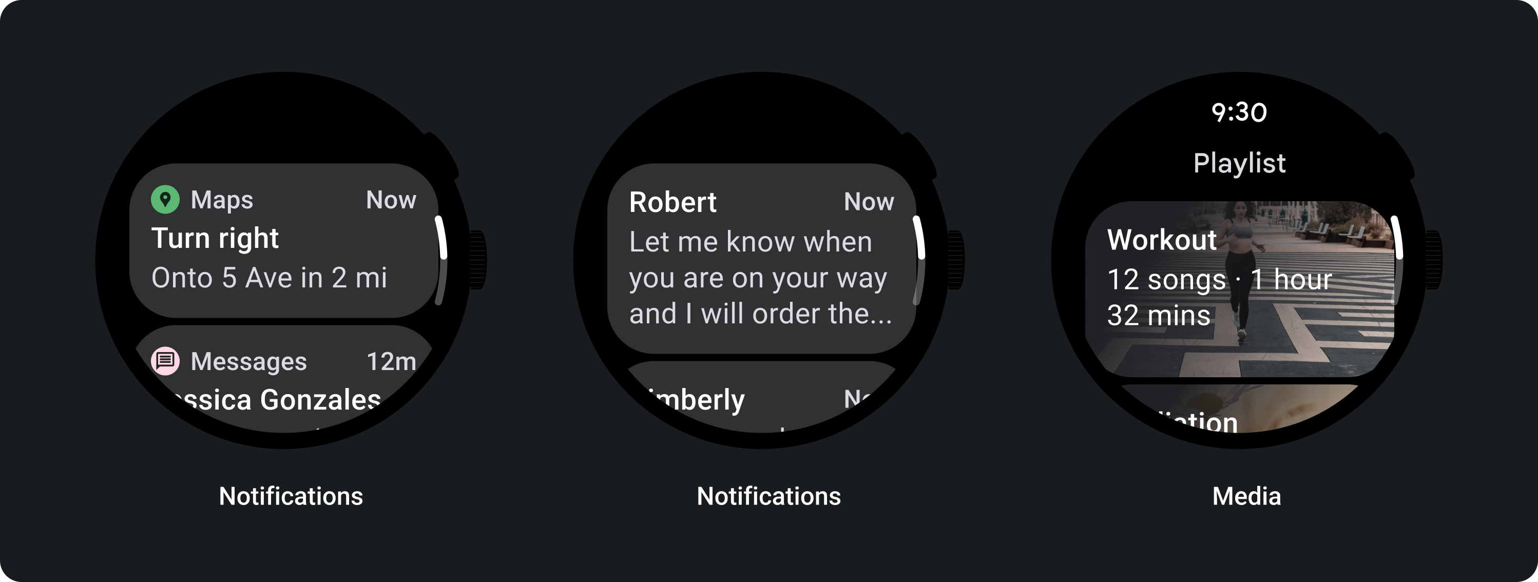
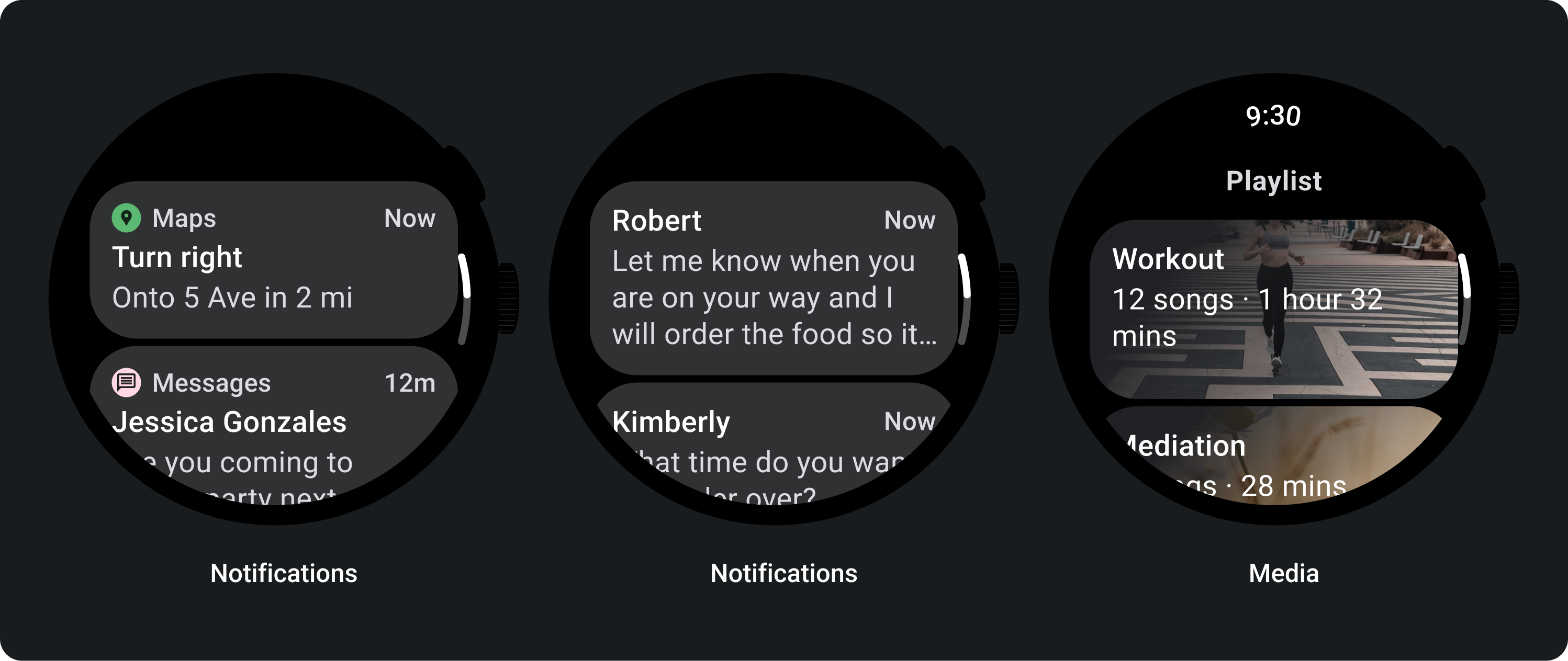
제목 카드
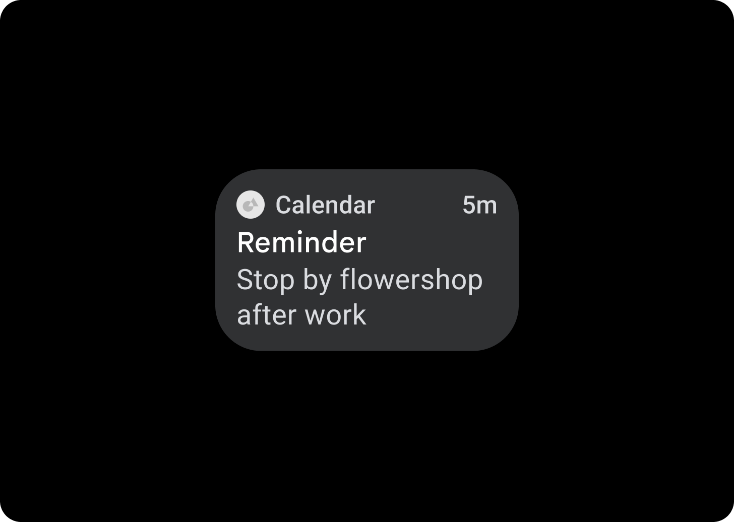
타이틀 카드를 사용하여 애플리케이션 내에서 메시지와 같은 정보를 표시하세요. 타이틀 카드에는 제목, 시간 필드(선택사항), 관련 콘텐츠(이미지 또는 텍스트)를 포함하는 3개의 슬롯 레이아웃이 있습니다.
앱 카드
앱 카드를 사용하여 여러 애플리케이션의 양방향 요소를 표시합니다. 앱 카드에는 애플리케이션 아이콘, 애플리케이션 이름, 활동이 발생한 시간, 일종의 제목, 관련 콘텐츠(이미지 또는 텍스트)가 포함된 슬롯 5개 레이아웃이 있습니다.
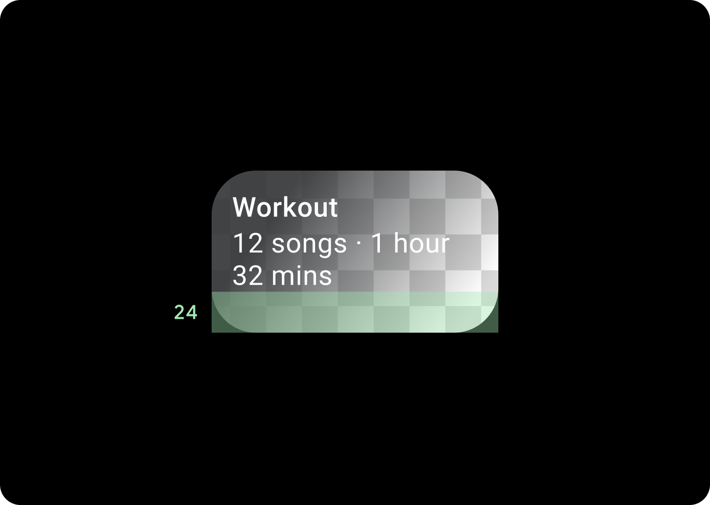
카드 그라데이션
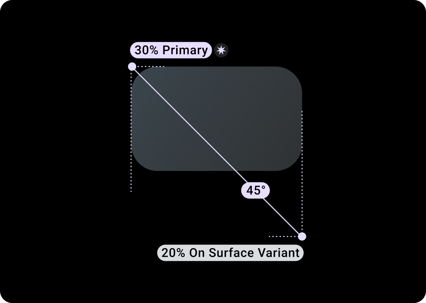
카드 그라데이션
상단/왼쪽 + 왼쪽으로부터 68dp 패딩 = 100% 표면
하단/오른쪽 = 표면 0%
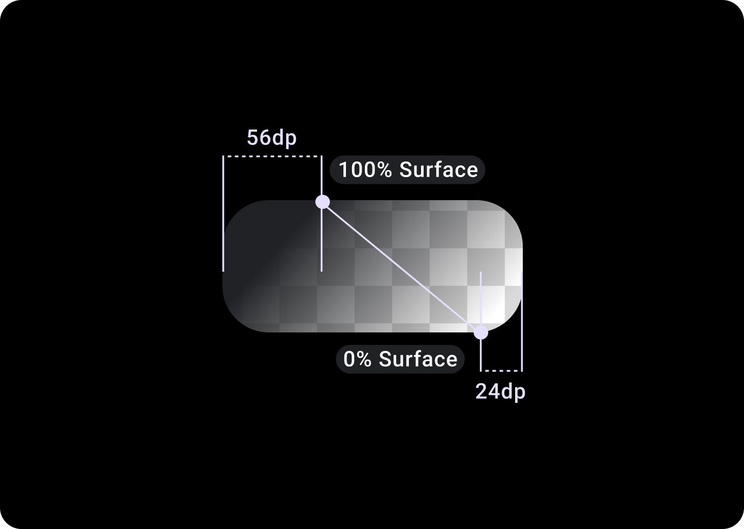
이미지 카드 오버레이
T/L의 상단/왼쪽 + 56dp 패딩 = 100% 표면
하단/오른쪽 + B/R의 24dp 패딩 = 0% 표면
(이미지 배경의 그라데이션 오버레이)
크기
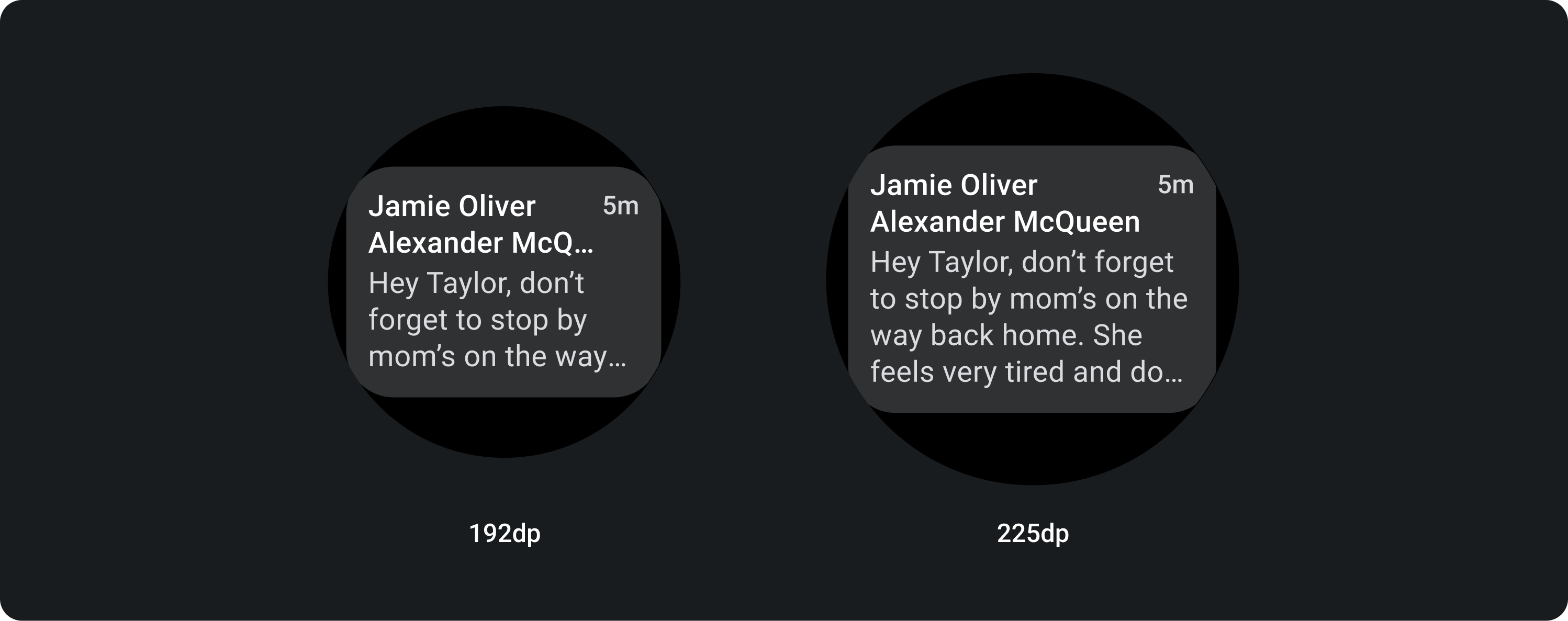
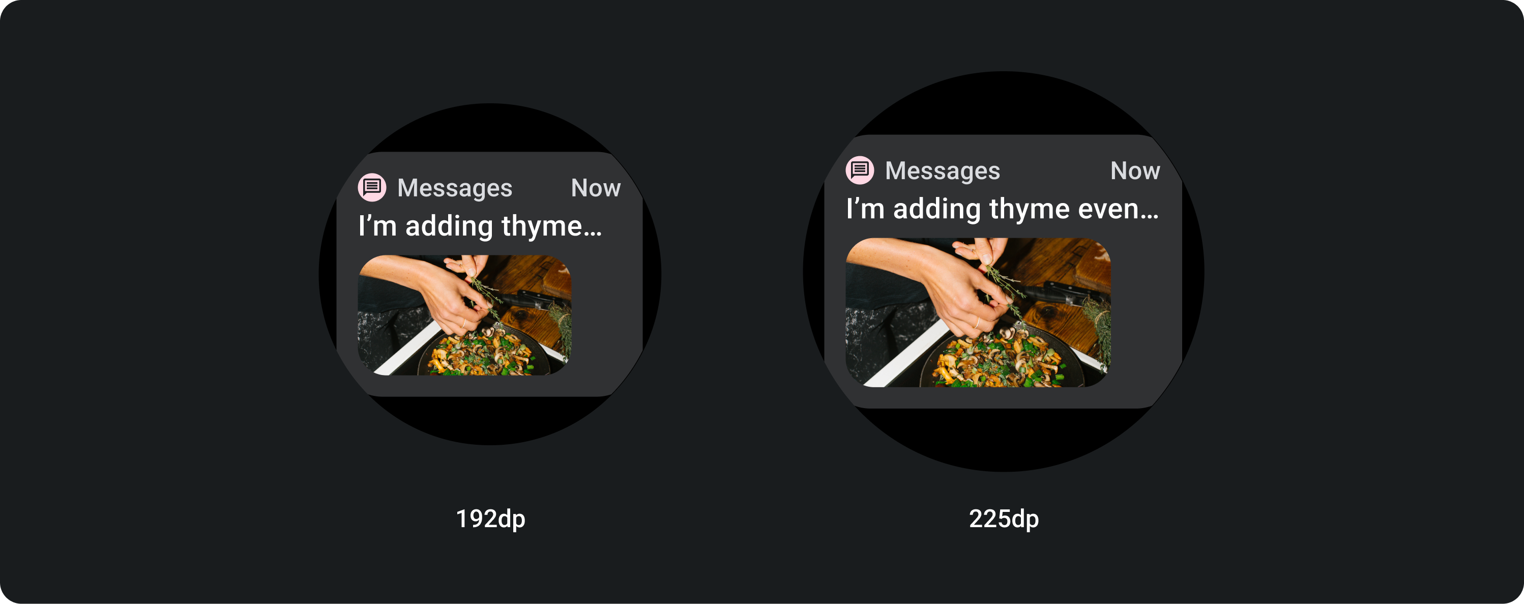
카드 너비
카드는 컨테이너의 최대 너비로 기본 설정됩니다.
카드 높이는 유연합니다. 구성요소의 콘텐츠에 따라 결정됩니다.
원형 시계 화면에서는 화면 높이의 60% 보다 큰 카드가 잘립니다.
사용
적응형 레이아웃
제목 카드
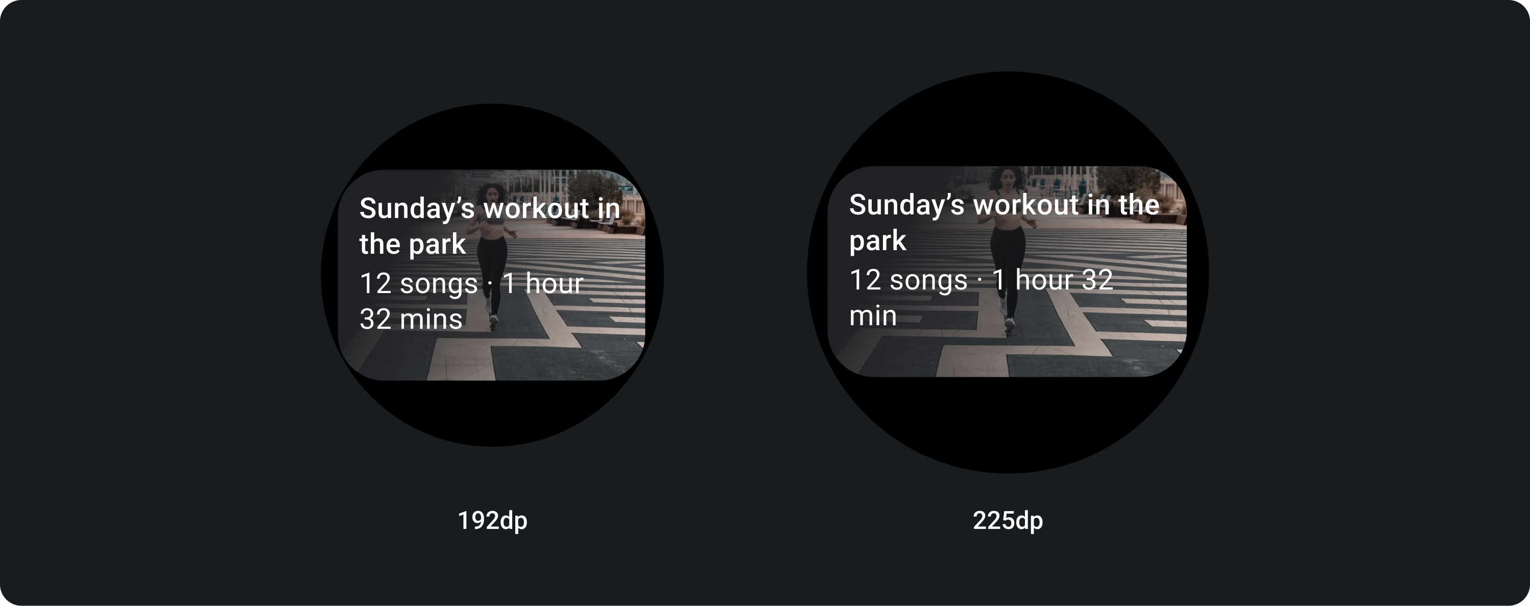
대형 화면에서는 본문 문구를 위한 추가 텍스트 줄이 허용됩니다. 이미지를 더 많이 표시하려면 확대된 24dp 패딩을 하단에 추가합니다.
인라인 이미지가 포함된 TitleCard (본문 문구 슬롯 대체)
큰 화면에서는 이미지의 가로세로 비율이 변경되지 않으며 카드의 높이를 너무 크지 않도록 오른쪽에 패딩이 있습니다.
추가 맞춤설정이 포함된 카드
이미지 배경이 있는 카드
이 레이아웃을 사용하려면 맞춤설정이 필요합니다.
이미지 카드는 단일 주제와 관련된 콘텐츠를 배경 이미지와 함께 표시합니다. 이미지 카드에는 독립형 이미지도 표시될 수 있습니다.
위에 텍스트 없이 배경 이미지를 더 많이 표시하려면 하단 패딩을 24dp로 늘리는 것이 좋습니다.