
Common design layouts—also known as canonical design layouts—are proven, versatile app layouts that provide an optimal user experience on the wide variety of screen sizes that are available with Wear OS.
Use adaptive and responsive UI principles to deliver the highest quality experience for everyone. Adaptive UIs stretch and change to make the most of all available screen space, no matter what size screen they're rendered on.
Adaptive UIs change responsively, using components and methods built directly into the layout logic. These layouts also utilize screen size breakpoints—applying a different design on different screen sizes—to create an even richer experience for everyone.
Use established common layouts
Use established canonical layouts to help your UIs adapt smoothly across a range of device sizes. These canonical layouts offer a high quality experience across all screen sizes.
Tiles (non-scrolling layouts)
Tiles are non-scrolling view layouts which provide quick access to information and actions users need to get things done. With a swipe from the watch face, a user can see how they are progressing towards their fitness goals, check the weather, and more. Launch an app or get essential tasks done quickly from tiles.
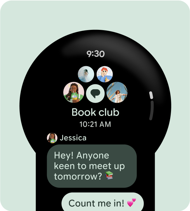
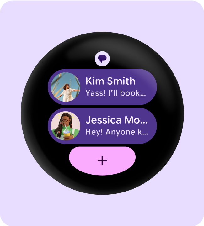
Apps (scrolling layouts)
Scrolling app view layouts include lists (ScalingLazyColumn) and dialogs.
These layouts make up the majority of app screens, and they represent a
collection of components which need to adapt to larger screen sizes.
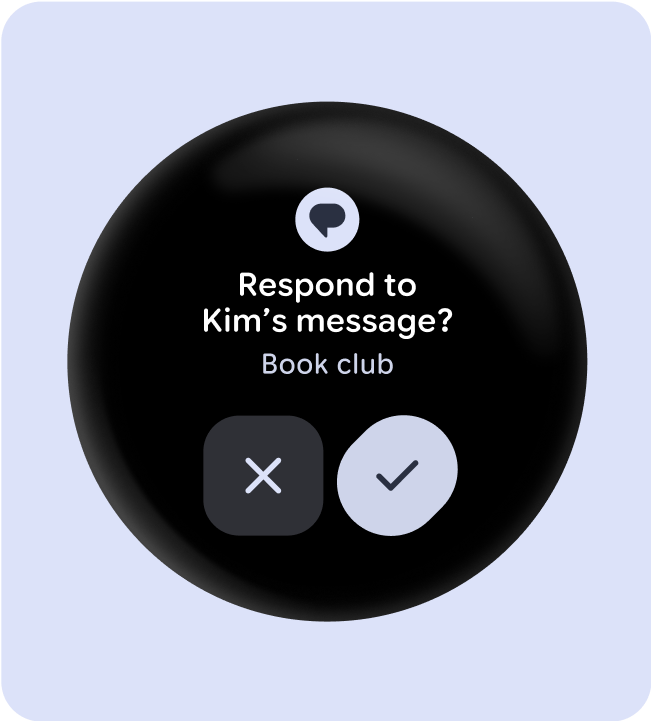
Apps (non-scrolling layouts)
Non-scrolling app view layouts include media players, pickers, switchers, some dialogs, and special fitness or tracking screens that use progress indicators.